NEWSON
Product, UX/UI
Live, local, late-breaking news where ever you are
Client
NewsOn
Role
Product design, UX/UI, user research
Timeline
12 weeks
The Problem
NewsOn also users to watch live and local television newscasts for free. With over 200 local news stations across the US 75%+ coverage users can easily watch their local news live or VOD, and watch previous newscast or clips. Users can set their favorite stations to quickly navigate to the most up to date or breaking content that is relevant to them. The goal of this project was to improve the viewing experience by making it easier for users to discover, access, and watch the local news content most relevant to them.
Considerations
Designing for a news streaming experience required balancing the needs of a broad audience with different viewing habits, technical comfort levels, and geographic interests. The product also needed to support both live broadcast viewing and on-demand clips while maintaining a simple, intuitive interface optimized for TV viewing environments
Criteria
The experience needed to prioritize quick access to local news, clear content hierarchy, and effortless navigation using a remote control. Designs were developed specifically for Apple TV and Roku OS, ensuring patterns, focus states, and navigation structures aligned with each platform’s interaction model while still delivering a consistent viewing experience across devices.
Focus area
In this project, I worked as a product designer responsible for both design execution and user research. I conducted user interviews and usability testing to better understand how viewers discover and consume local news in a streaming environment. These insights informed design decisions around navigation, content discovery, and viewing flows, helping ensure the product aligned with real user behaviors and needs.
PROCESS
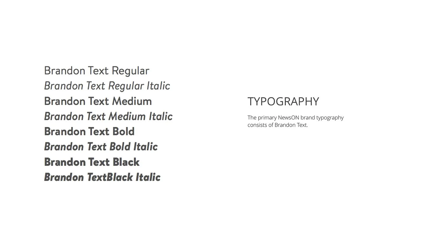
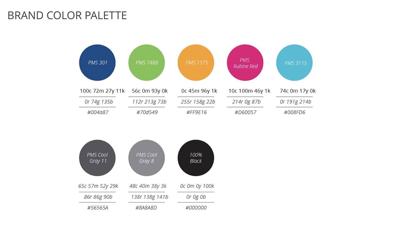
Guidelines, playbooks and toolkits provide creative teams with a shared foundation, establishing clear standards, processes, and best practices that enable consistent, high-quality work. They reduce ambiguity and rework, allowing teams to move faster while maintaining brand integrity across a wide range of partners, projects, and stakeholders. Here are a selection of examples.
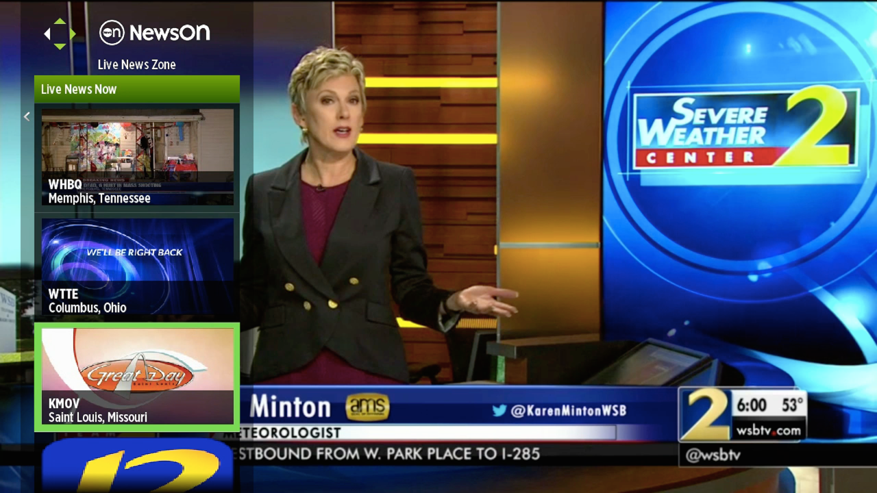

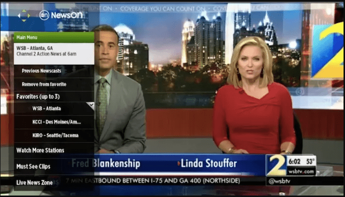
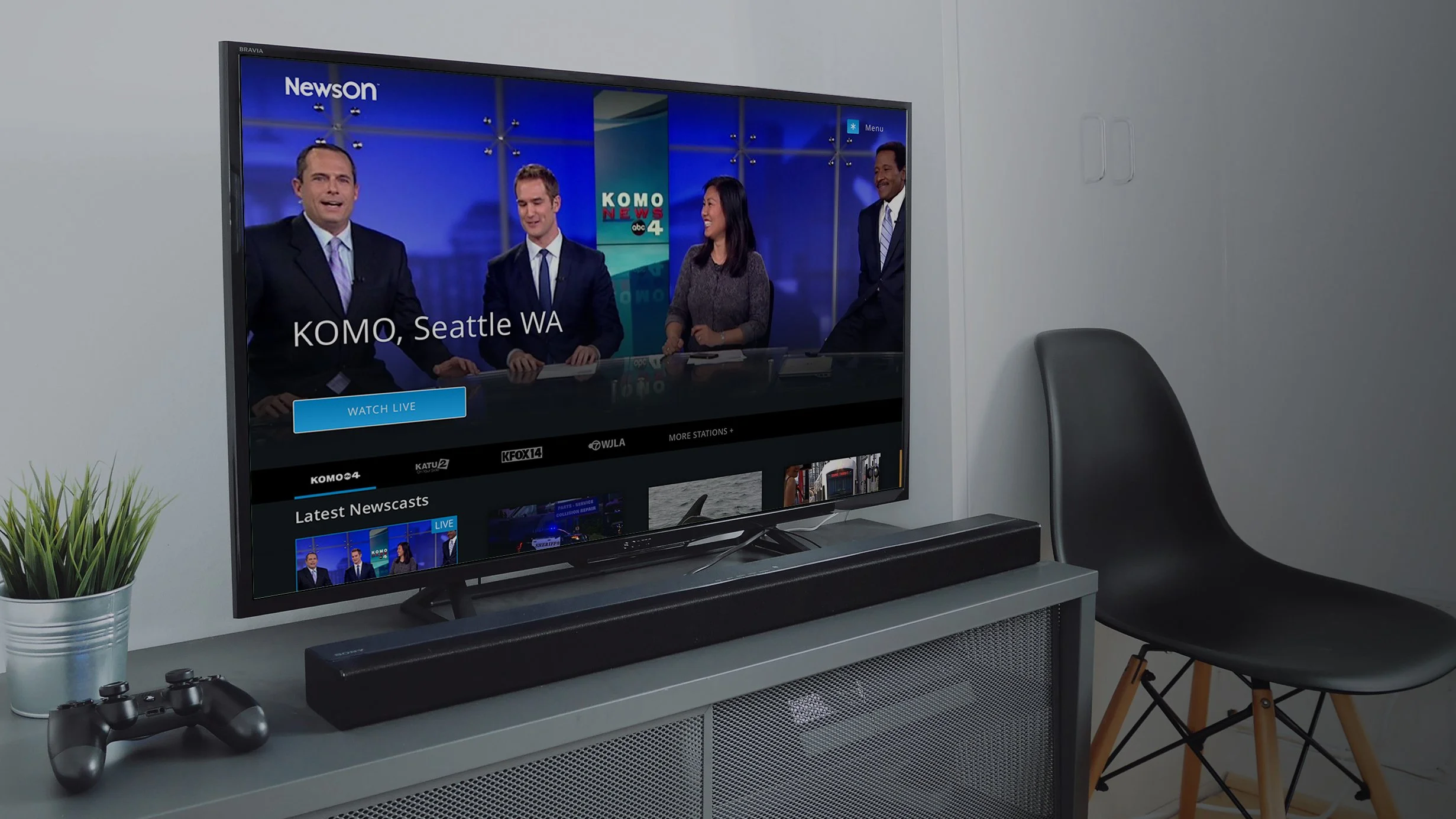
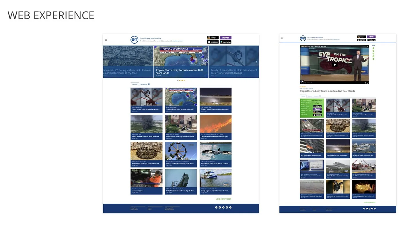
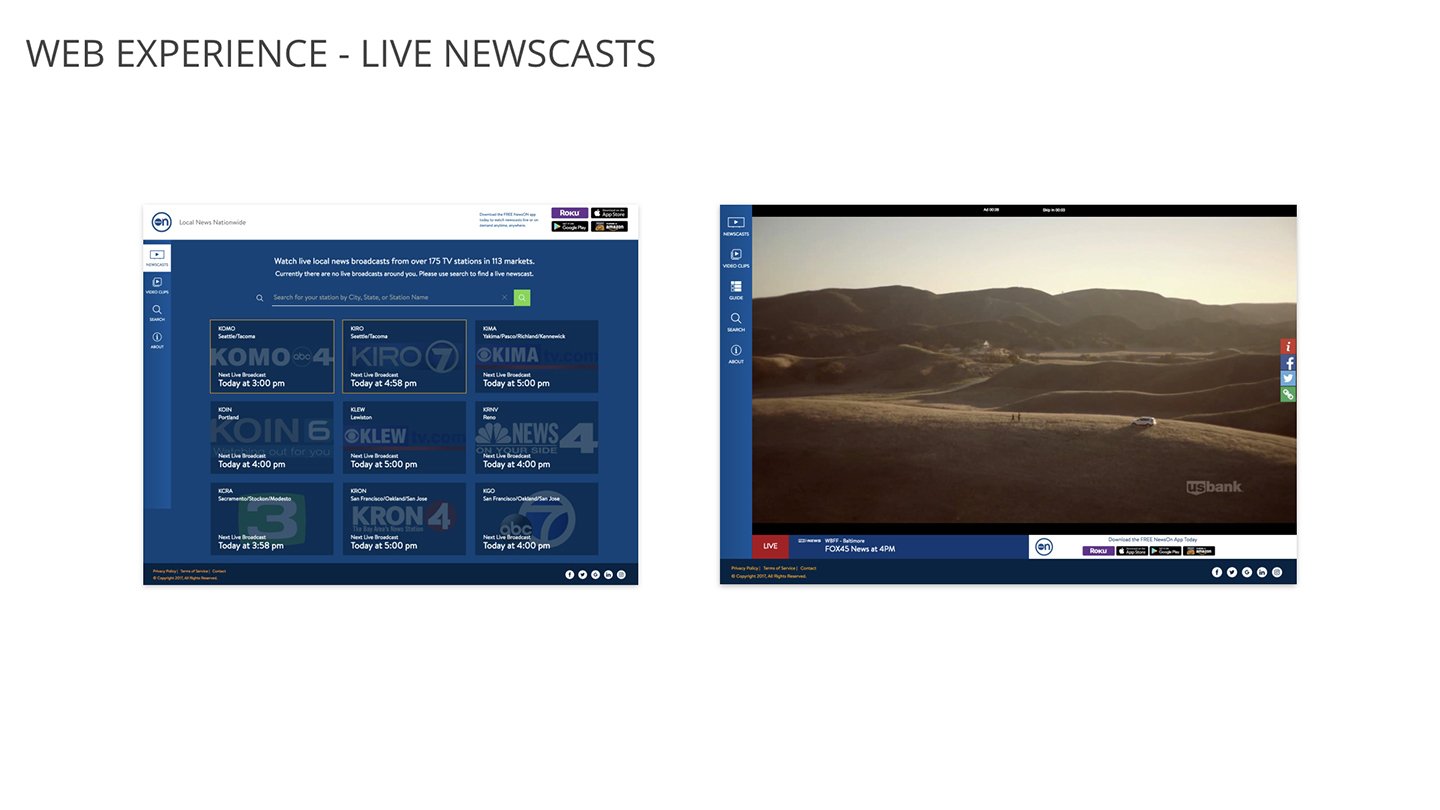
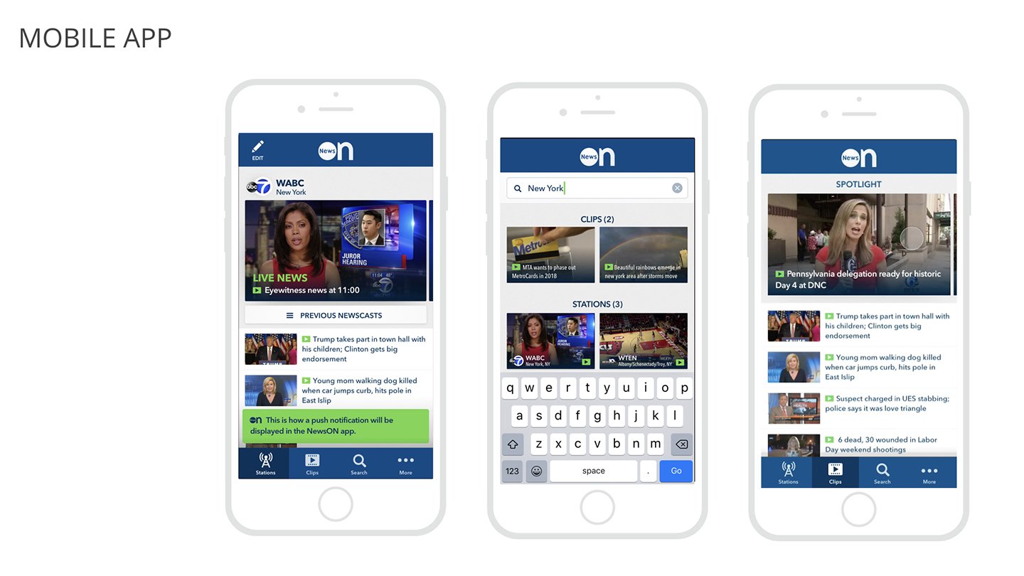
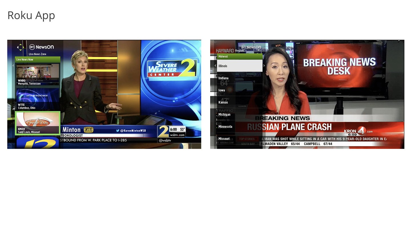
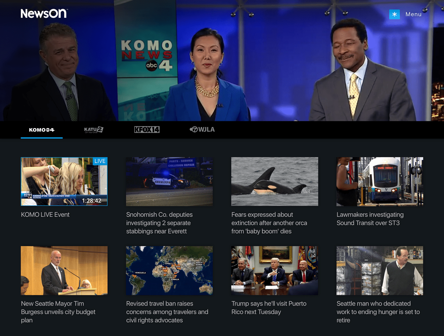
The existing app offered a relatively minimal experience. Users could favorite up to three stations, with the first automatically playing when the app launched. Content discovery relied on a basic search flow that required users to navigate from region to state to individual station call letters. The app also included a “Live News Zone,” which aggregated all stations currently broadcasting live across the country for users simply looking to watch live news.
01. Existing Experience


To ground the work, I began with a deep dive into the existing brand standards, product ecosystem, and the company’s overall product philosophy. I paired this with an initial competitive analysis to understand how other streaming and news platforms approached content discovery, navigation, and live viewing experiences. This research helped identify gaps in the current product and establish a foundation for design decisions.
02. BRAND ANALYSIS
After reviewing the brand, product goals, and broader market landscape, the next step was identifying who the primary users of the platform would be. Through research and analysis, we defined four key user personas that represented the main motivations and behaviors driving how people discover and consume local news.
04. User persona

The Browser
Information Hunters and Gatherers
These users enjoy the process of searching and browsing for news. Discovery itself is part of the experience—they are often exploring without a specific destination in mind. The ability to navigate, scan, and uncover new content is just as important as the information they ultimately find.
How NewsON Supports Them
A robust set of navigation and discovery tools helps them browse stations, explore regions, and easily surface new or interesting content.

The In-The-Know
First-to-Know Information Pioneers
These users want to stay ahead of the news cycle. Being the first to know, and often the first to share, gives them social currency. They value timely updates and breaking news that allows them to stay informed and pass along important or viral stories.
How NewsON Supports Them
Breaking news alerts and easy access to live broadcasts help them stay current and quickly tap into unfolding stories.

The Journalist
Curators of Insightful Information
These users approach news with curiosity and depth. They enjoy gathering information from multiple perspectives and sharing thoughtful insights. Their goal is not just to stay informed, but to contribute meaningfully to conversations and discussions.
How NewsON Supports Them
Access to a wide range of local stations and viewpoints allows them to explore stories from different regions and perspectives, helping them build a more informed and balanced understanding of the news.

The PARENT
Information for Protecting Their Circle
This group is focused on information that helps them protect and support their family, friends, and local community. They prioritize practical, timely updates such as weather, traffic, safety alerts, and major local developments.
How NewsON Supports Them
Quick access to location-based updates, like weather, traffic, and breaking local news, helps them stay aware of issues that could affect the people they care about.
SOLUTIONS
Taking insights from market research and stakeholder requirements, I translated key findings into an initial product concept. The goal was to create a streamlined viewing and discovery experience that better aligned with how users actually search for and consume local news on streaming platforms.
The primary concept for the new experience was centered on two goals: getting users to the content they want as quickly as possible and making it easy to move between the content most relevant to them.
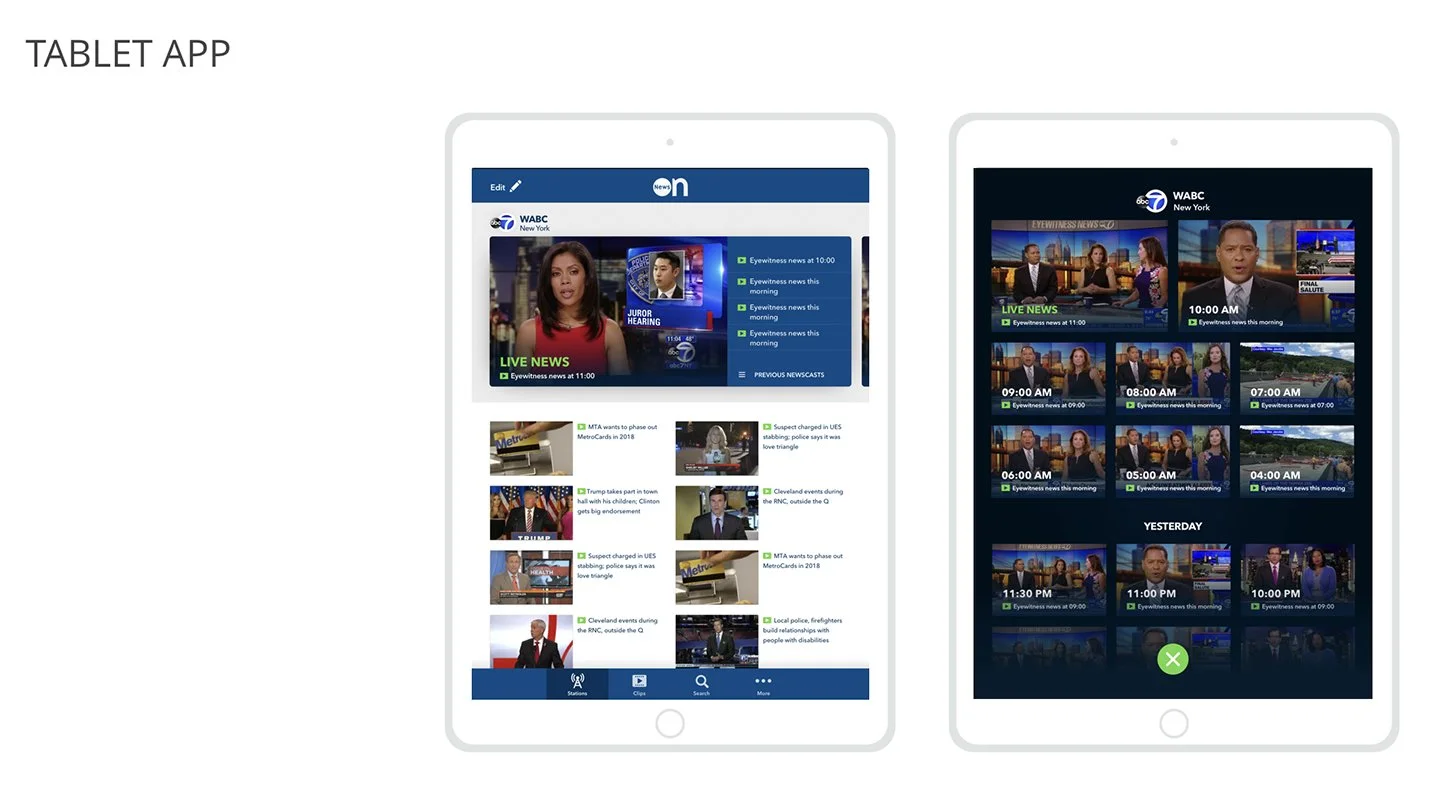
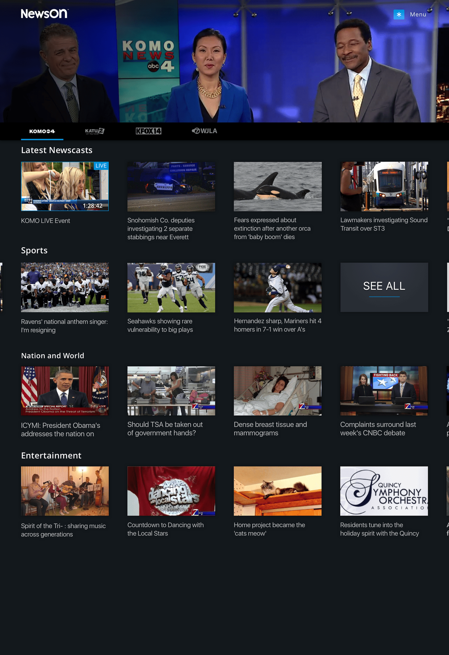
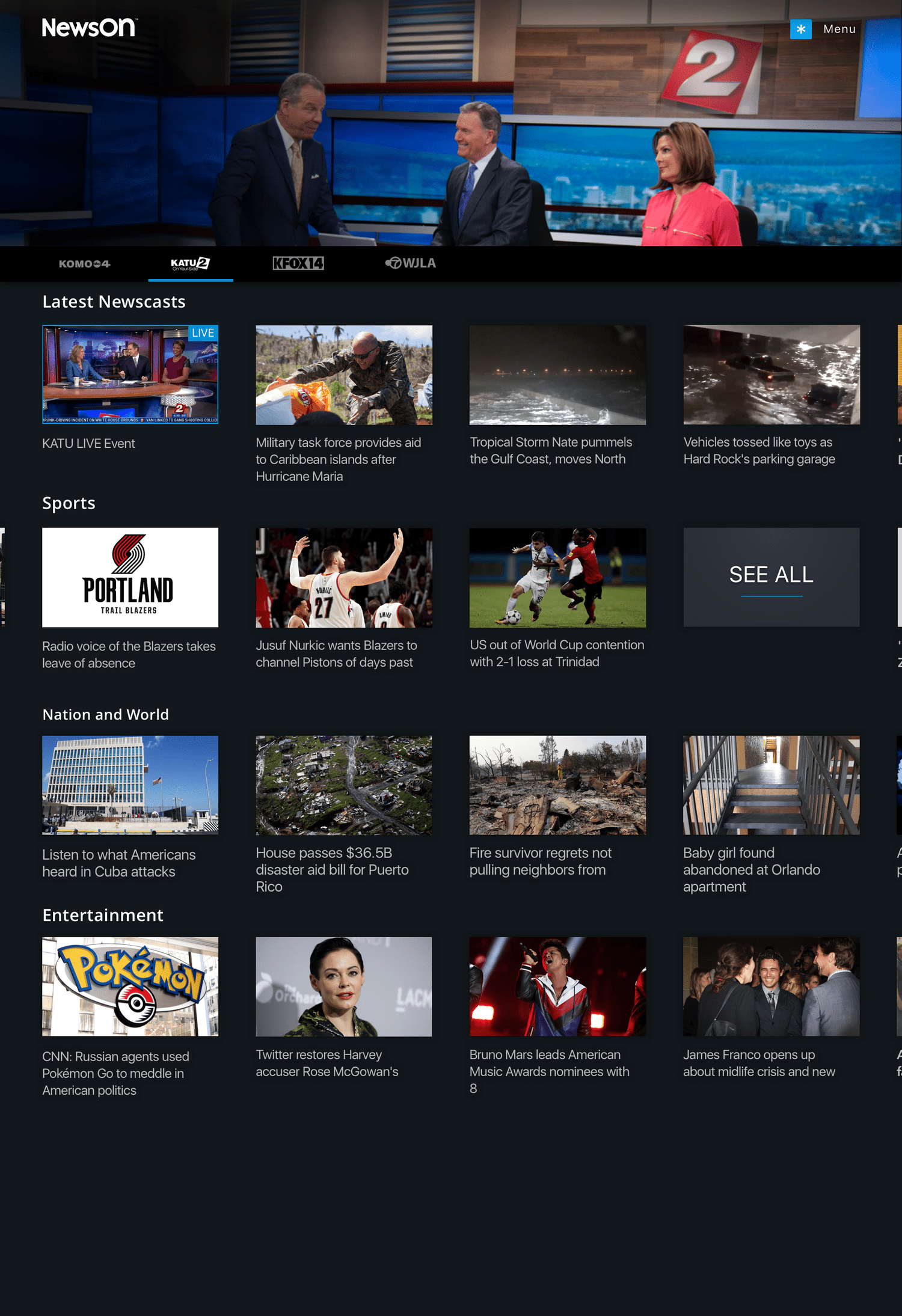
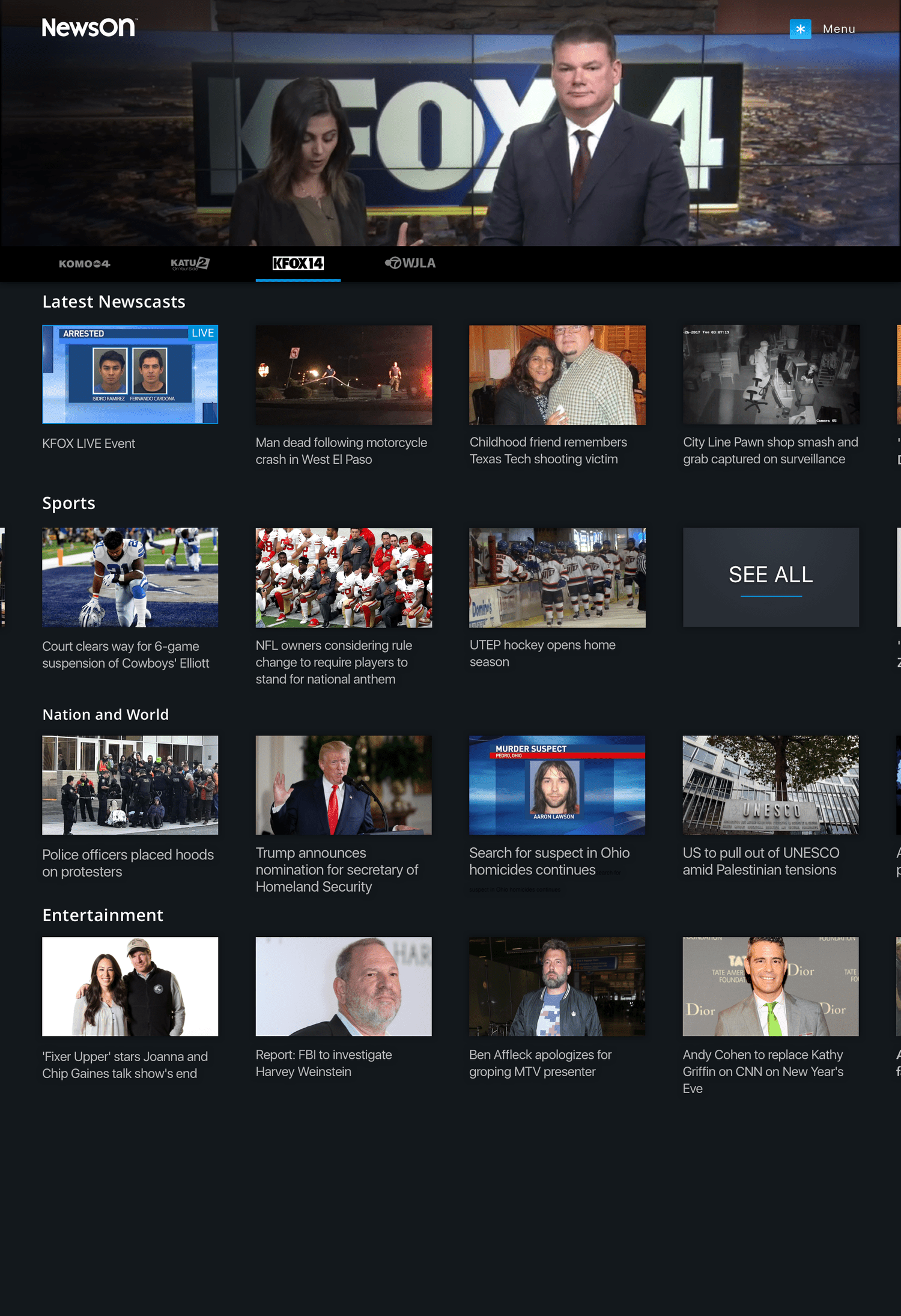
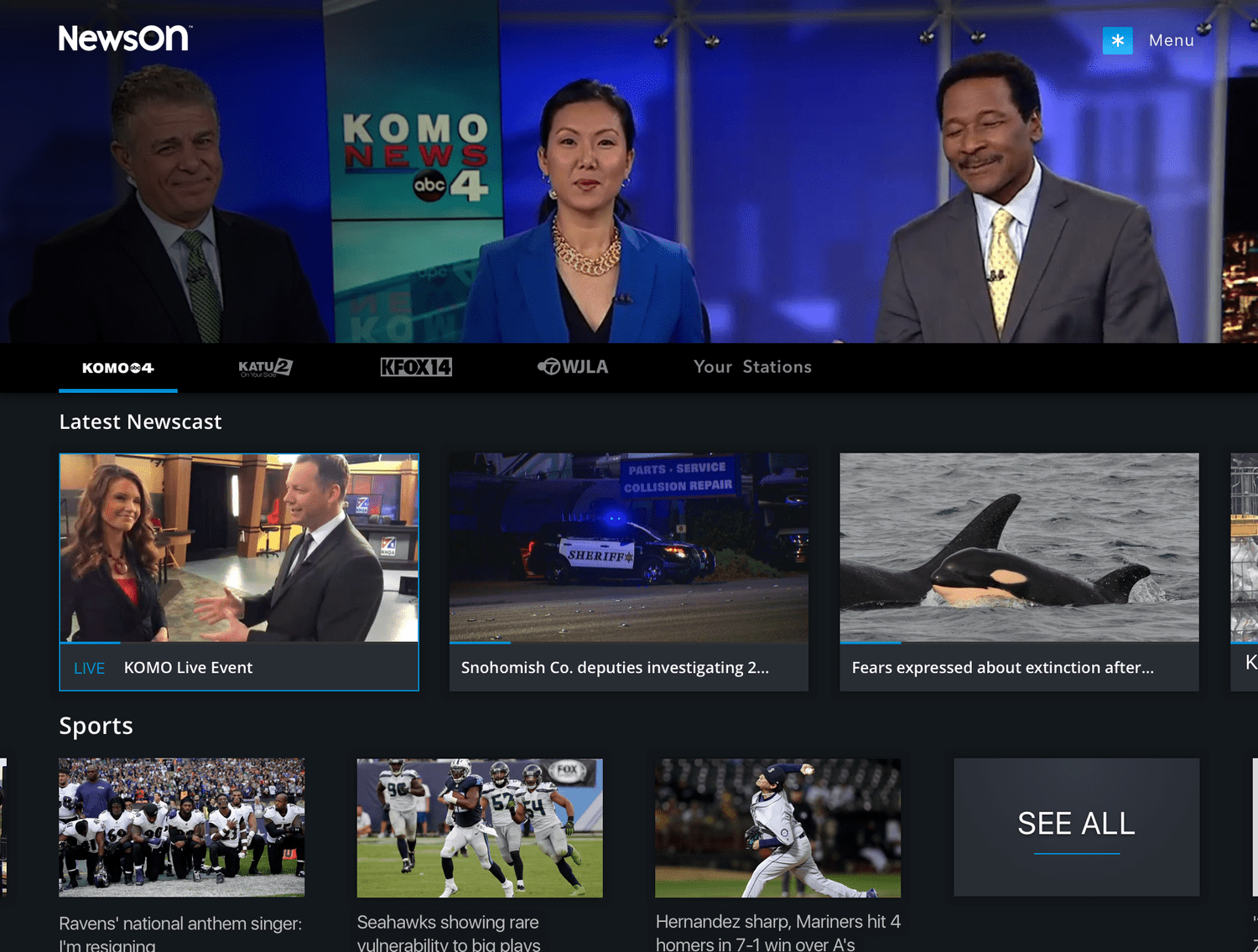
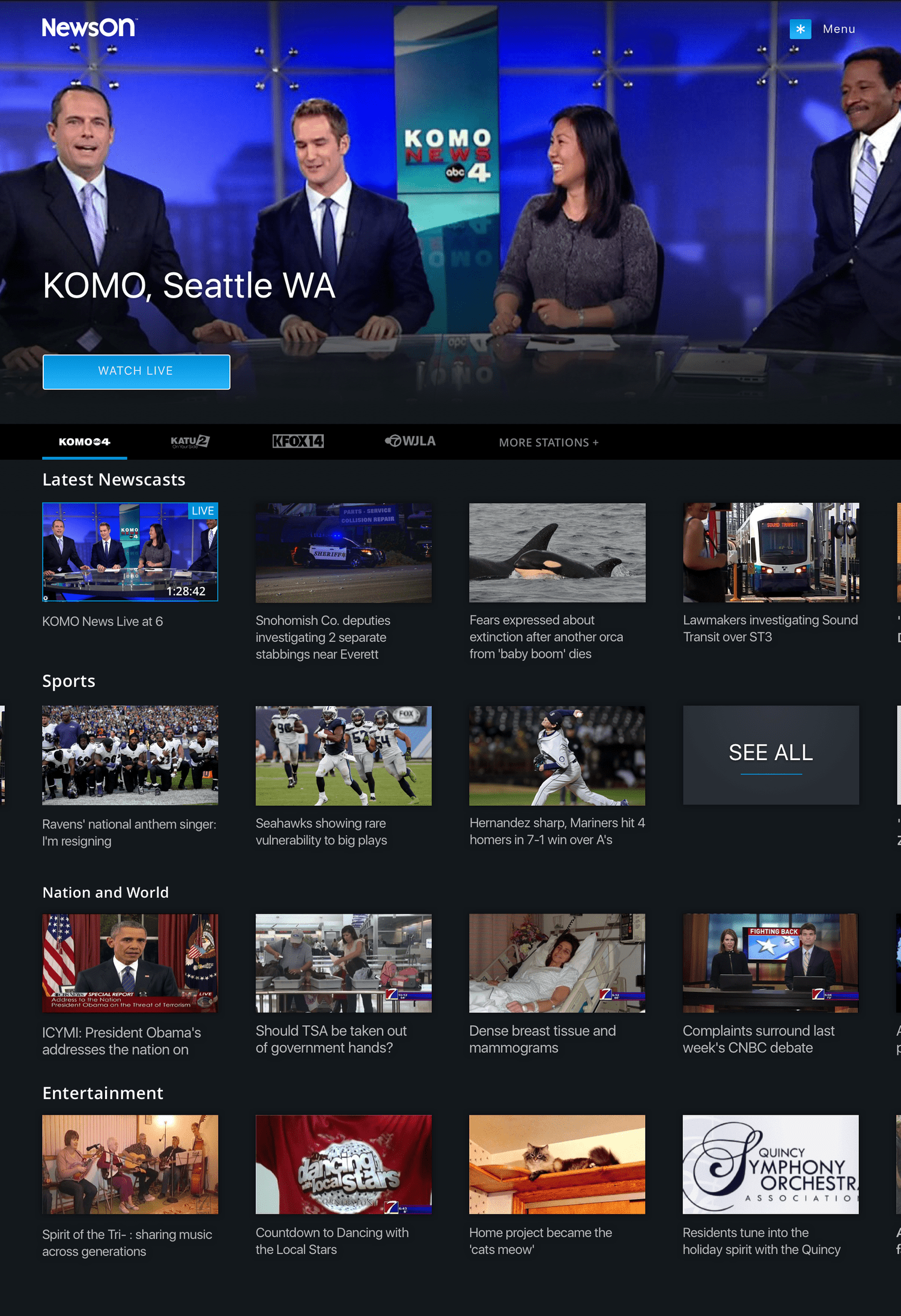
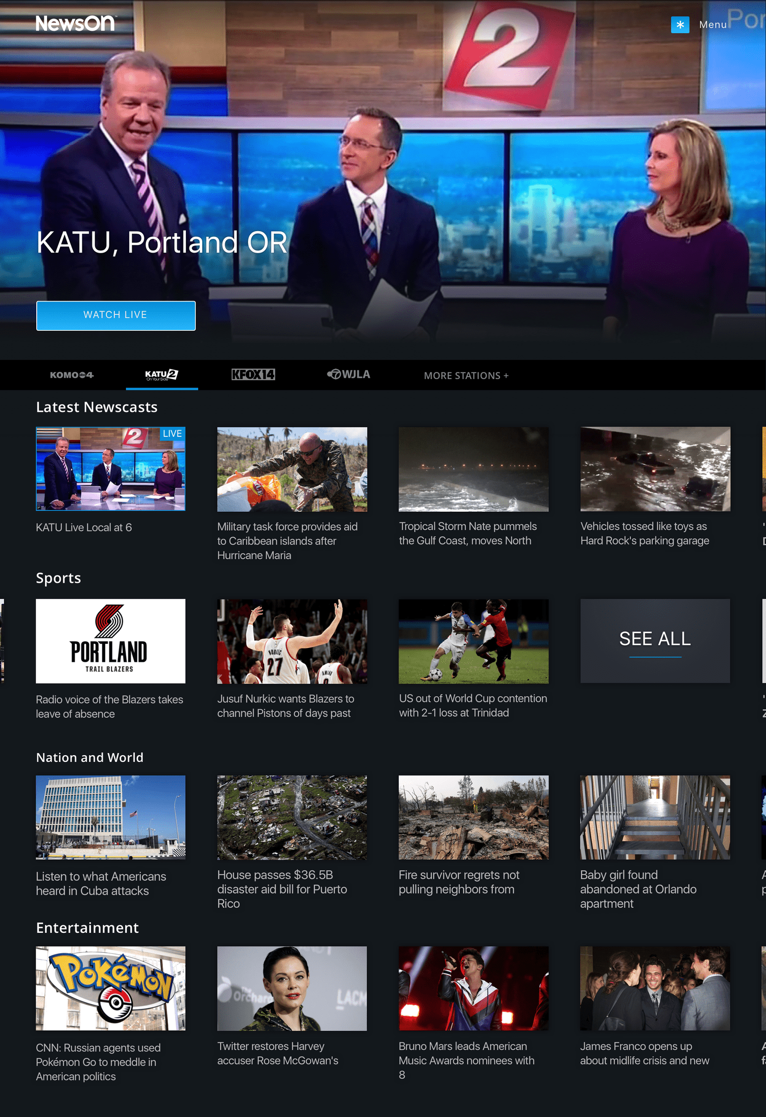
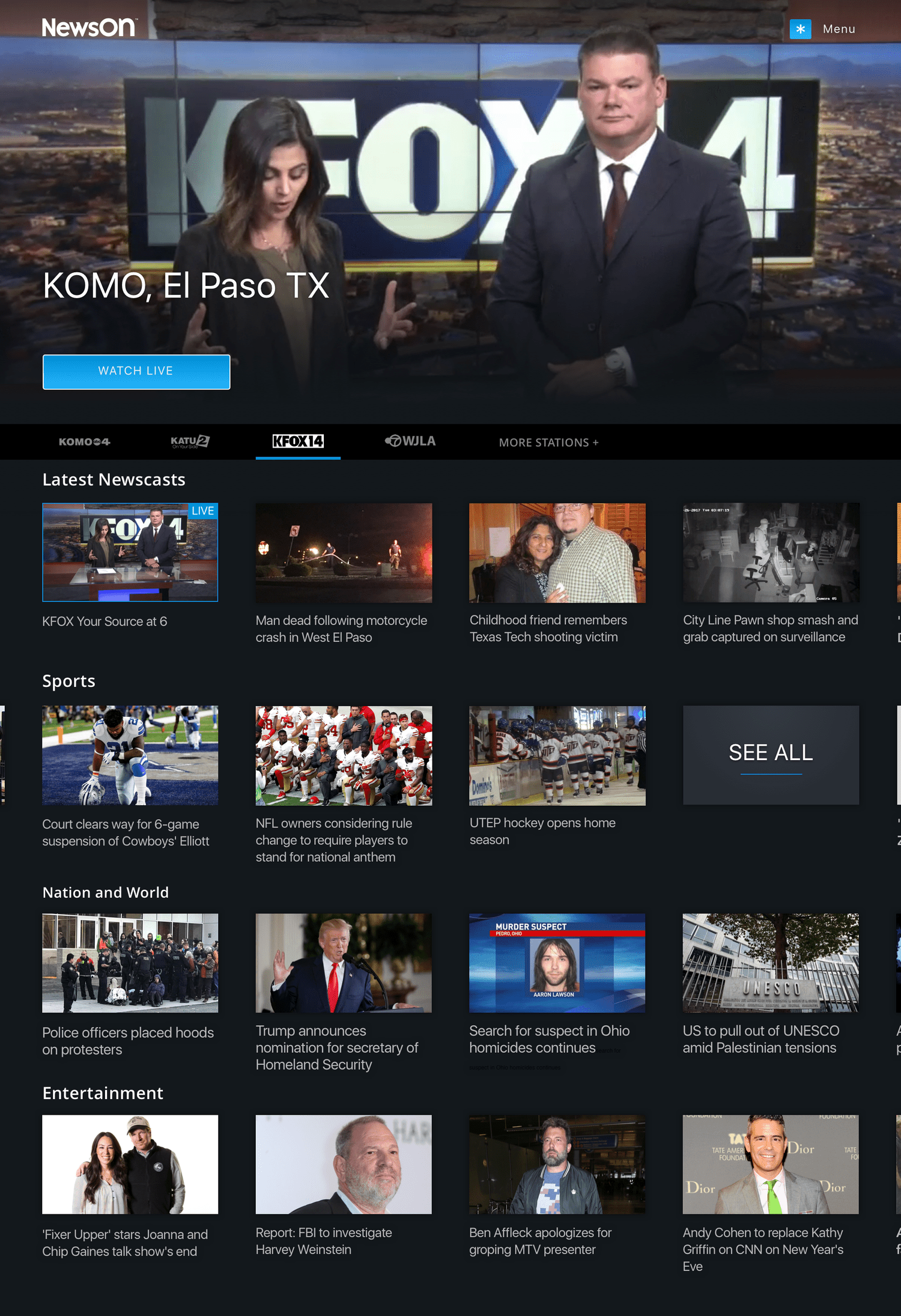
The home experience was designed around immediate access to live or recent news. At the top of the screen, the latest newscast or live broadcast automatically plays as a hero element, allowing users to instantly begin watching. From there, users can either expand the hero into a full-screen viewing experience or continue browsing other stations, clips, or newscasts.
Rather than relying on a traditional home page filled with mixed content, the experience is anchored around the user’s stations. Directly below the hero player is a navigation bar generated from the user’s saved or favorited stations. As users “flip” between stations, both the hero video and the content modules below dynamically update to reflect that station’s latest broadcasts and clips.
To support users looking for specific types of stories, additional categories surface curated content such as sports, national news, or other key topics—making it easy for viewers to quickly find the stories they care about most.
01. Home
In addition to the primary home experience, we explored several alternate variations to evaluate different approaches to content discovery and technical feasibility.
1. Chronological Content Grid
One concept simplified the page structure by eliminating content sections in favor of a single chronological grid of station content. This approach emphasized recency and would significantly reduce development complexity while still allowing users to quickly browse the latest clips and broadcasts.
2. Emphasizing Live Broadcasts
Another variation introduced larger teaser modules for live or most recent newscasts. By giving this content greater visual prominence, the design reinforced the platform’s core value of providing immediate access to live local news.
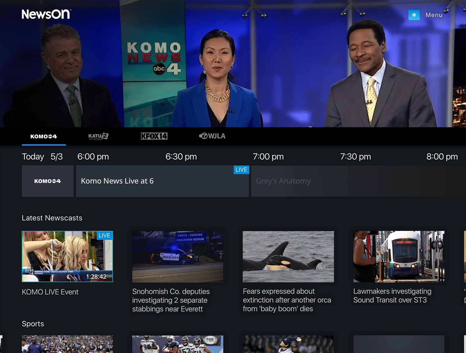
3. Integrated Program Guide (EPG)
A third concept incorporated the electronic program guide directly within the show or station page. This allowed users to easily see when the next live broadcast would air, helping them plan when to return to the station for upcoming newscasts.
02. HOME VARIANT
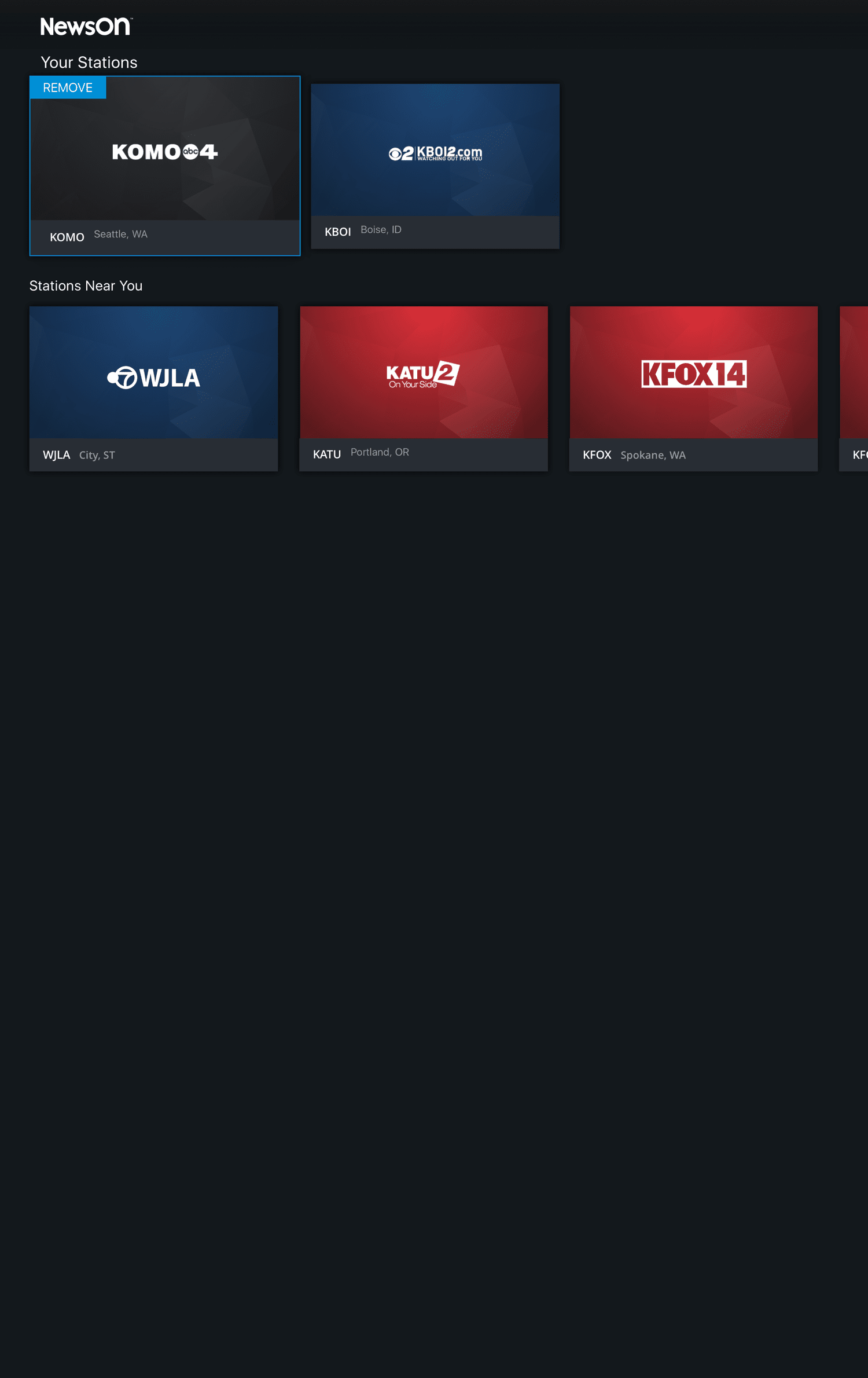
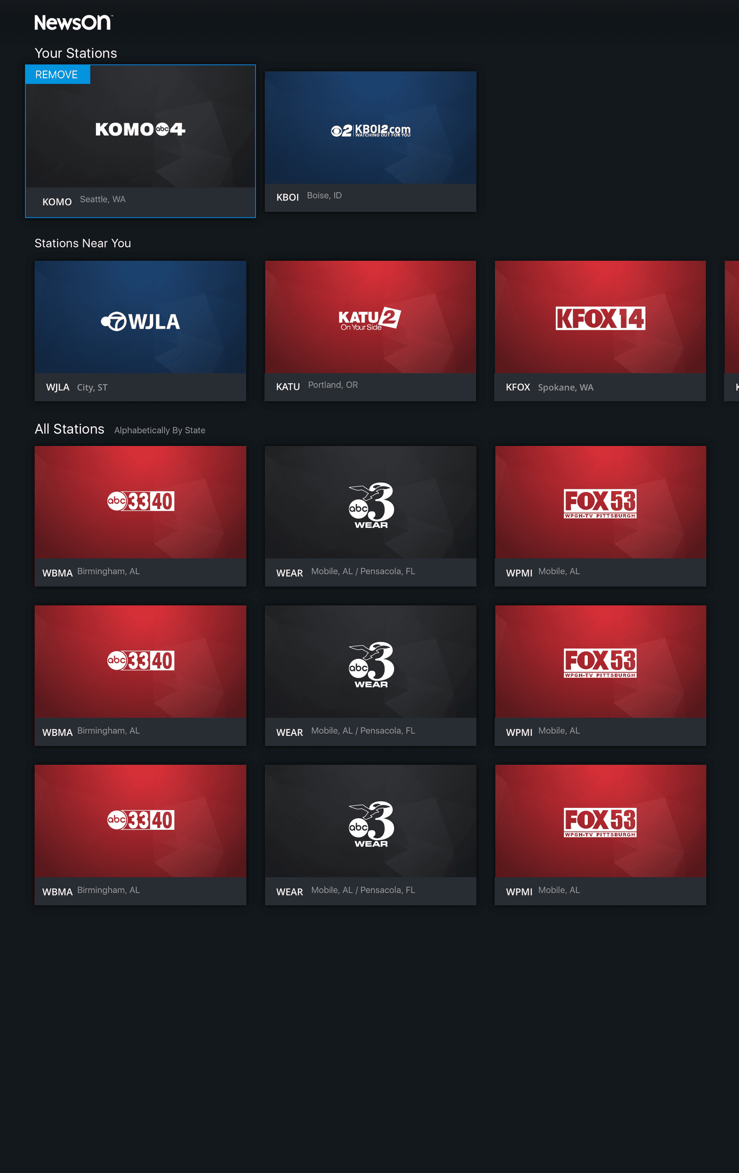
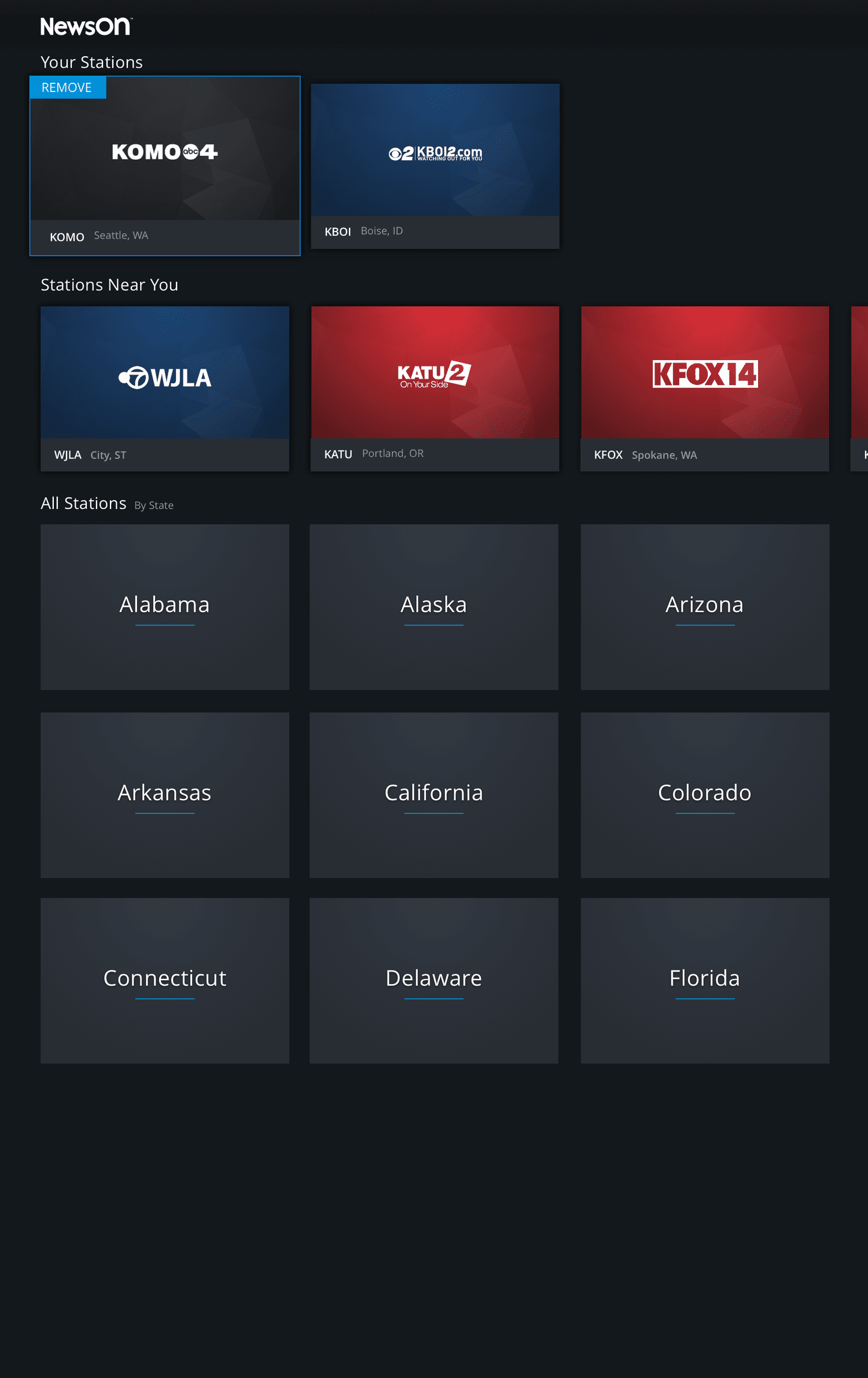
To support personalization, users needed a dedicated place to manage the stations most relevant to them. The Your Stations section was designed to combine two key functions: allowing users to easily manage their favorited stations while also providing a simple way to discover and add new ones.
Version 1: Your Stations with Geolocation
The first concept leveraged geolocation to automatically surface the stations closest to the user. Since the majority of users primarily followed local stations, this approach focused on simplicity, presenting nearby options first and reducing the effort required to find and favorite relevant stations.
Version 2: Your Stations with Geolocation + Full Directory
While most users preferred local stations, we also considered the importance of flexibility. This version included geolocated recommendations while still allowing users to browse and search the full directory of stations nationwide. This approach supported users who may want to follow news from other regions, such as a hometown, where family members live, or places they frequently travel to without limiting discovery.
03. Personalization
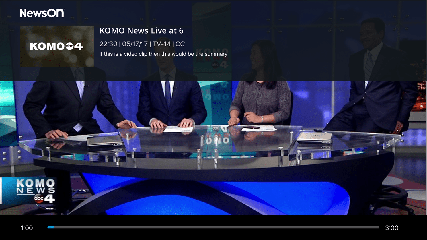
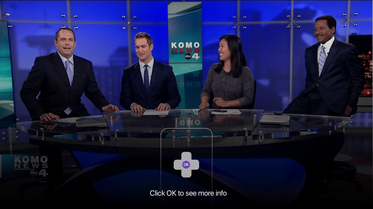
The full-screen viewing experience was designed to follow established Roku interaction patterns, ensuring a familiar and intuitive interface for users watching on TV. By aligning with platform conventions, the design minimized friction and allowed users to focus on the content rather than learning new controls.
When playback is paused, contextual information appears on screen, including the station name and details about the current newscast. This overlay provides helpful context while maintaining a clean viewing experience and quick access back to the broadcast.
04. Watch Experience
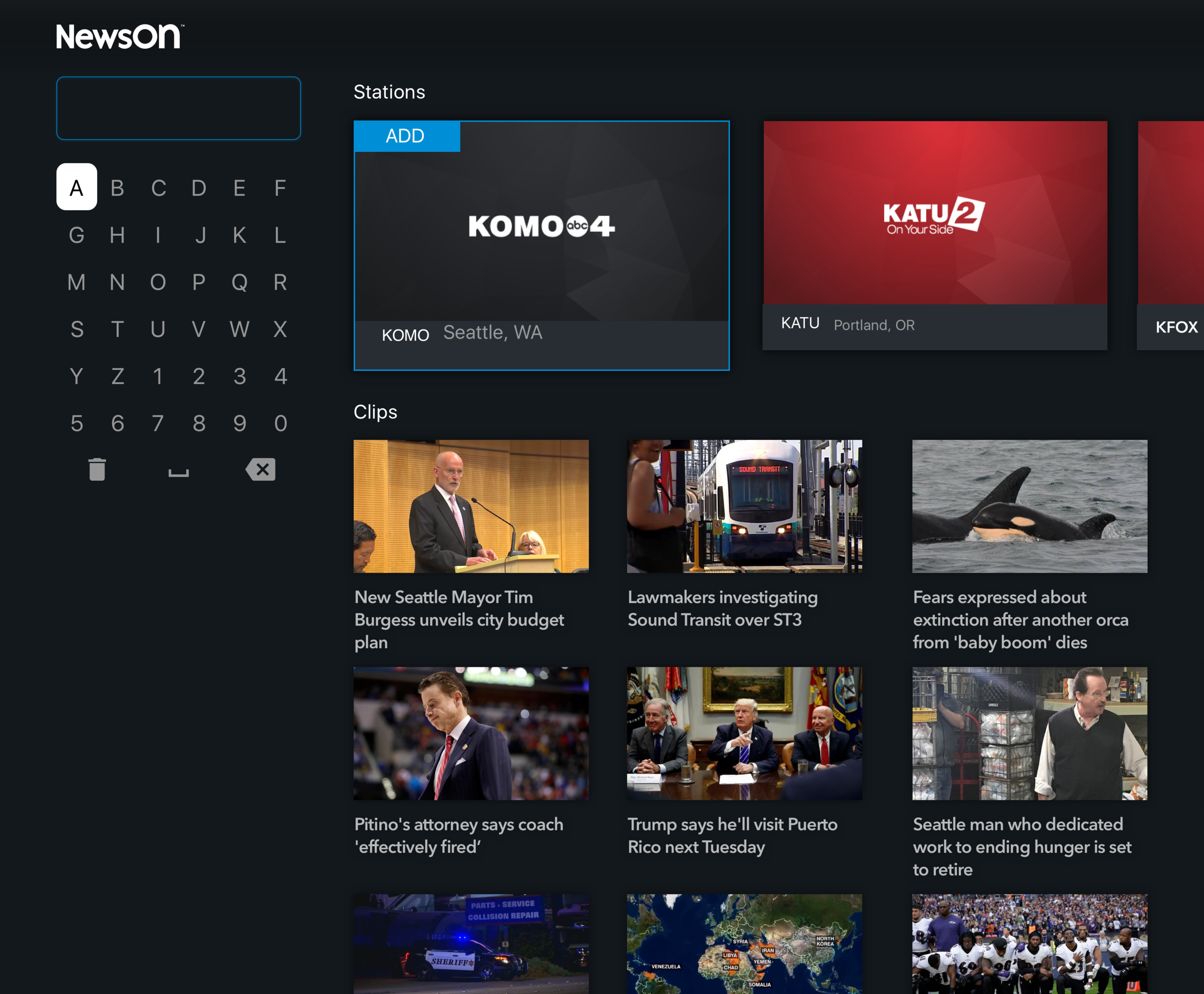
In the previous version of the app, search behavior was inconsistent depending on context. Searching from the stations section allowed users to find stations by call letters, while searching by city in other areas surfaced local stations, and in some cases search acted as a keyword query for clips or content. This fragmented approach created confusion and made discovery unnecessarily complex.
The redesigned search unifies all queries into a single, consistent experience. Users can search for station names, call letters, or cities in one place, with results prioritized to first show stations—which can be quickly added to favorites—followed by relevant clips and newscasts based on the search terms. This simplification makes finding content faster, more intuitive, and fully integrated across the platform.
05. Search
UPdates
After initial designs were completed, a series of updates were made to enhance usability, highlight content, and better support user needs across the app. These updates introduced new features and refined existing interactions to improve discovery, navigation, and personalization.
The primary update to the home page was a larger autoplaying hero, designed to better showcase content and immediately engage users. Additionally, station management was moved from the app menu into the station navigation bar, making it easier for users to access and update their favorite stations.
01. Home
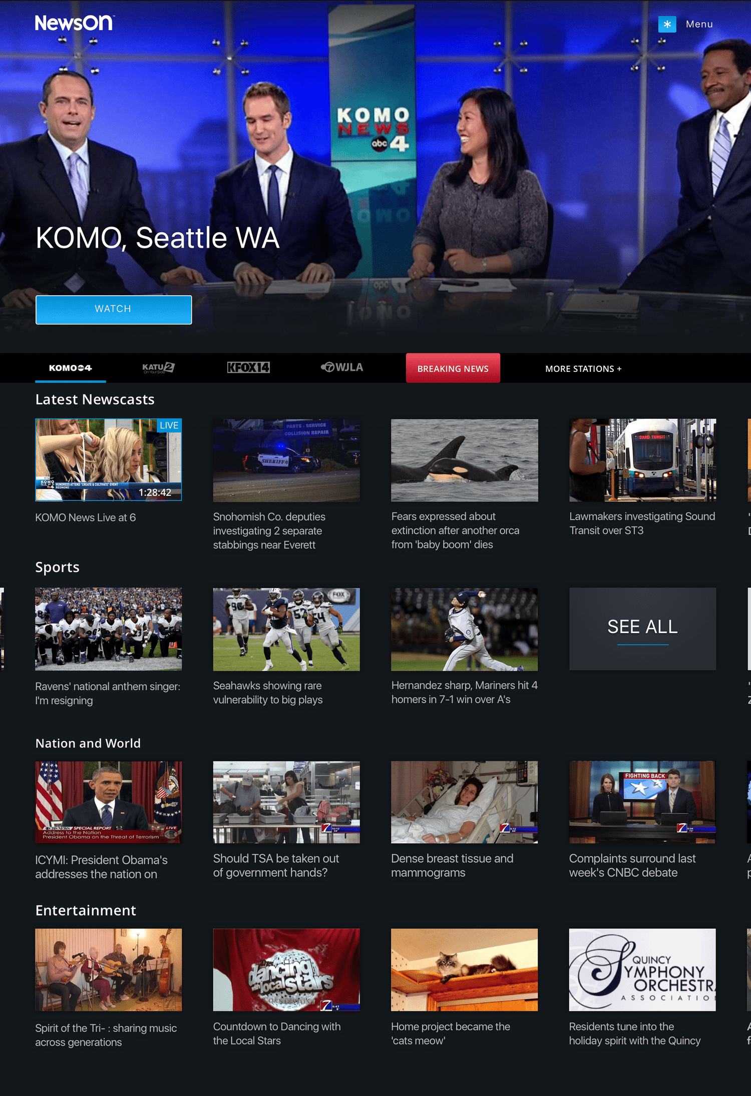
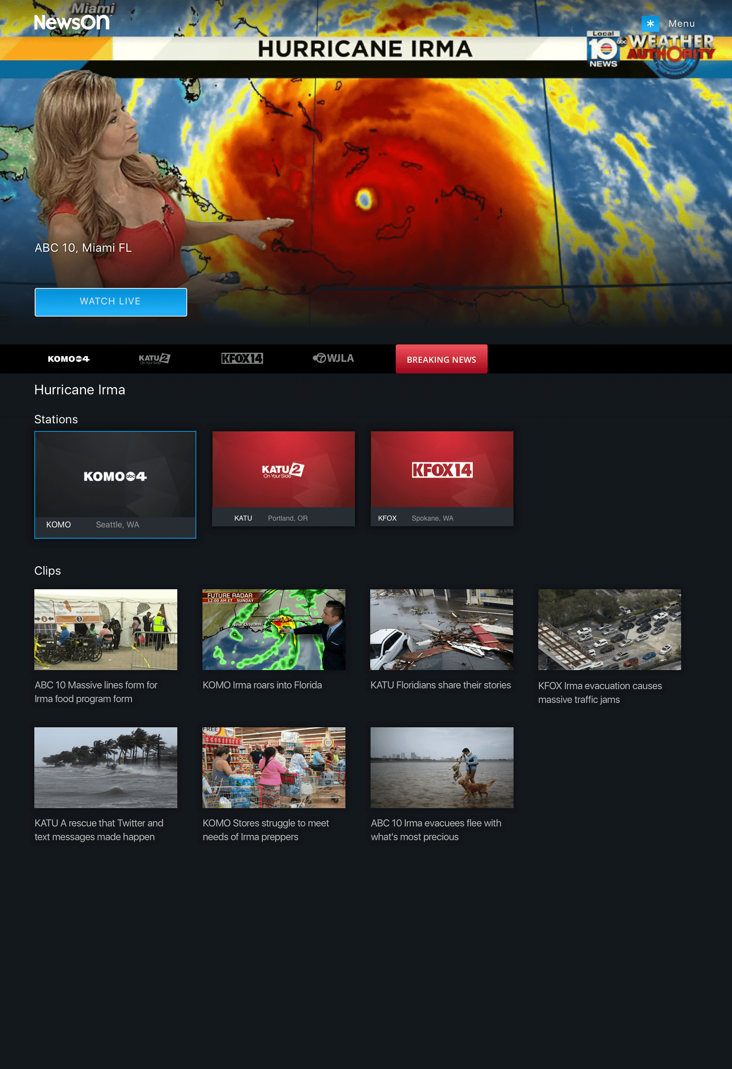
Given the importance of timely news, a “Breaking News” feature was added. When a major national or local story occurs, such as a hurricane or emergency, an attention-grabbing badge appears in the station bar, allowing users to quickly access coverage. On the Breaking News page, the first live station automatically plays in the hero, while additional stations and relevant clips/past newscasts appear below for comprehensive coverage.
02. Breaking news
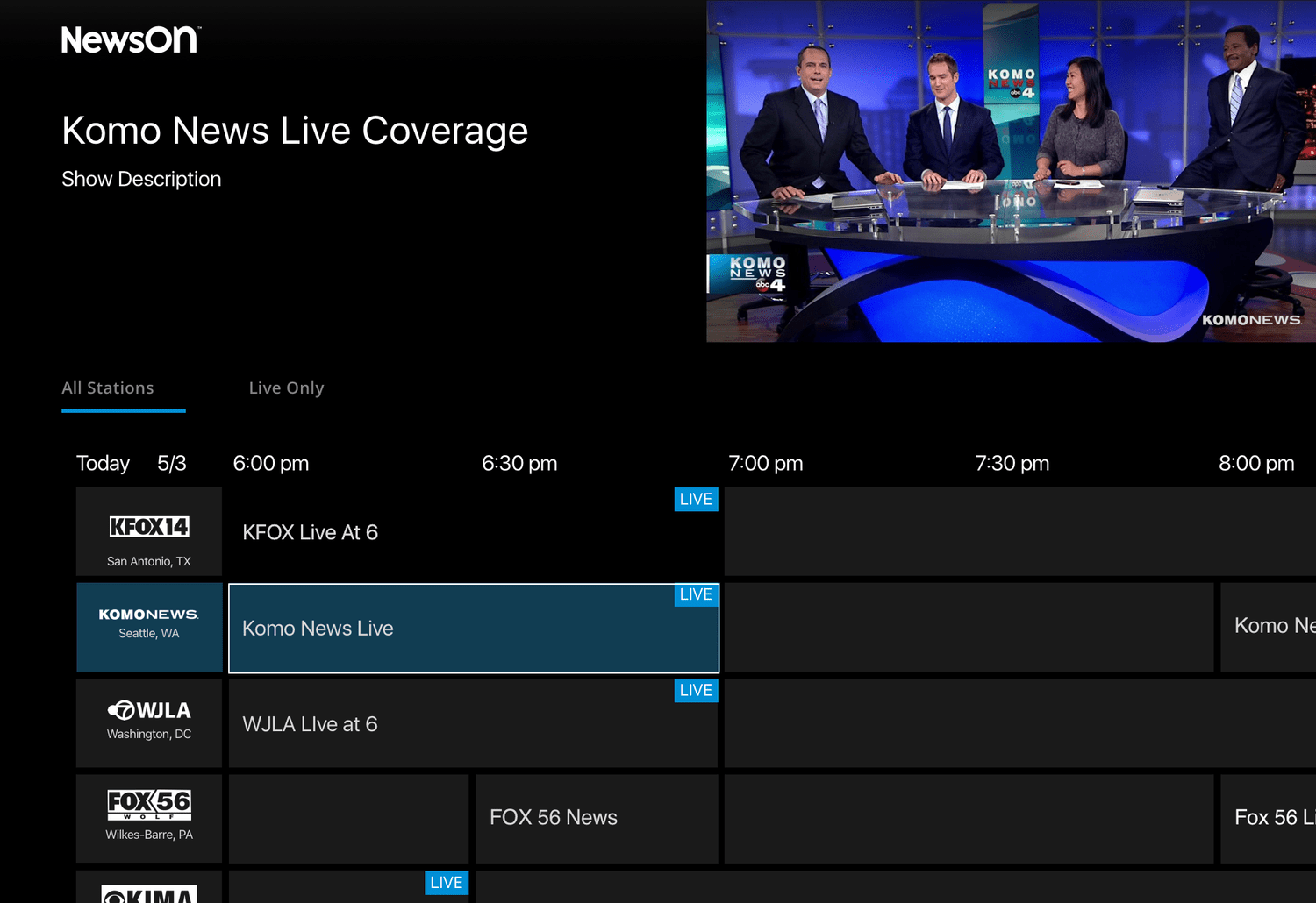
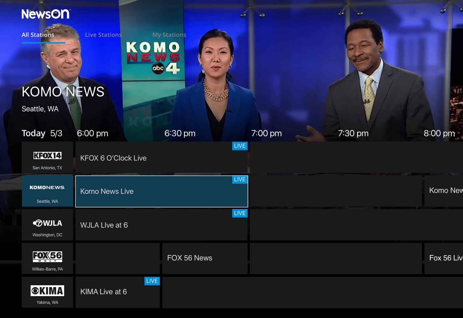
Although a future feature, initial explorations for the EPG considered conventions from other streaming services and traditional cable. Only live newscasts available via NewsON could be displayed at launch.
Version 1: Small Player – A traditional EPG-style interface allowing users to quickly “flip” between channels and filter for currently live content.
Version 2: Large Player – Uses the larger station page player and adds filtering options for live content or just the user’s favorited stations.
03. ELECTRONIC PROGRAM GUIDE (EPG)
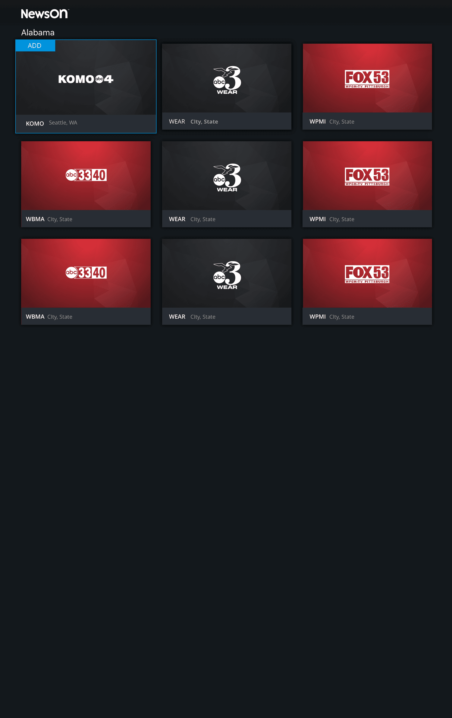
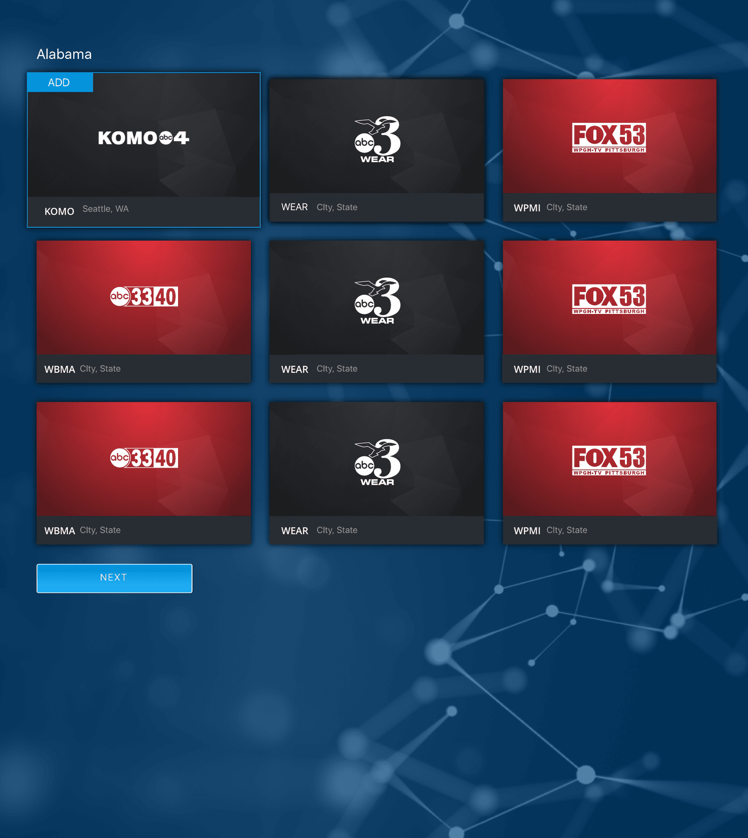
To simplify navigation and discovery, the show page was redesigned to present stations grouped by state rather than a single A-Z list or multiple carousels. Users can quickly navigate to their desired region and see only the relevant stations.
04. YOur Stations
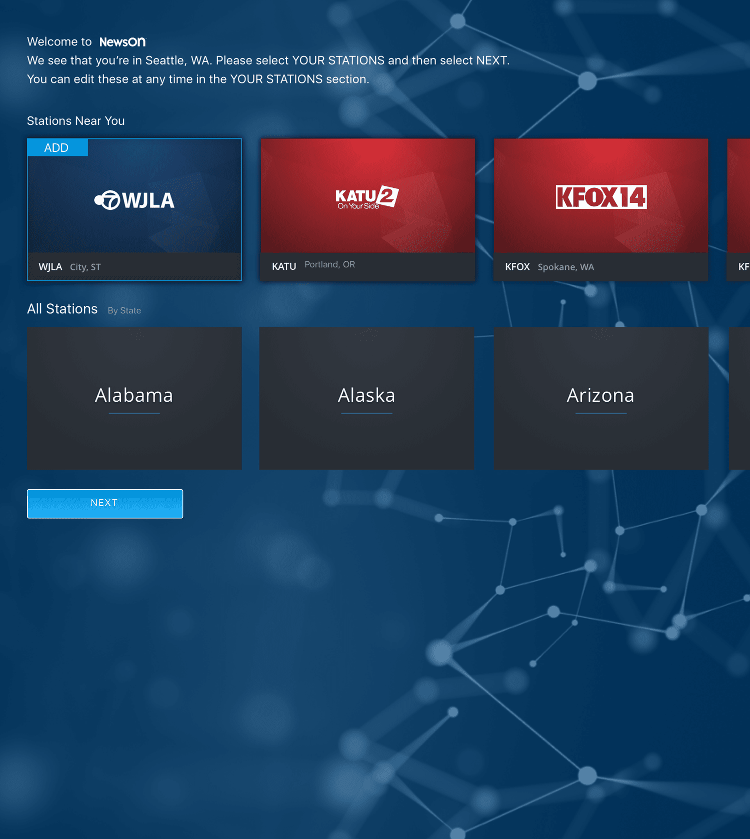
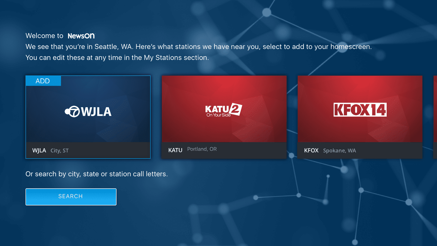
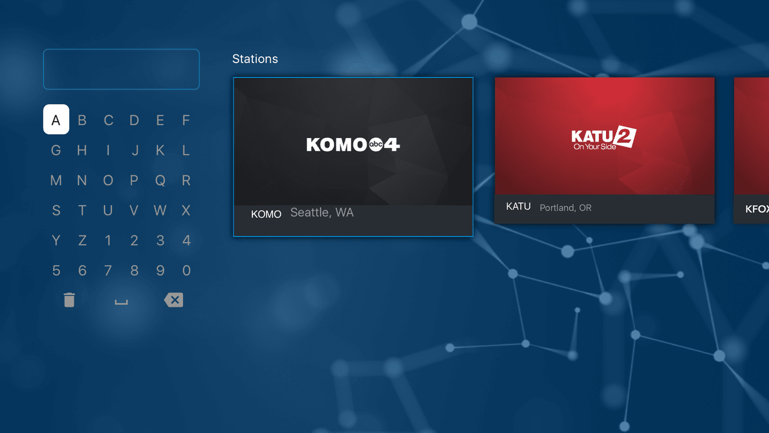
Because the app heavily relied on users’ favorited stations, a basic onboarding flow was introduced to guide first-time users:
Version 1: My Stations – Highlights nearby stations first, then surfaces additional options grouped by state.
Version 2: Search – Combines geolocation-based suggestions with the ability to search stations by city, state, or call letters, giving users flexibility in discovering content.
These updates collectively improved content visibility, simplified navigation, and ensured the app was more aligned with both user needs and stakeholder goals.