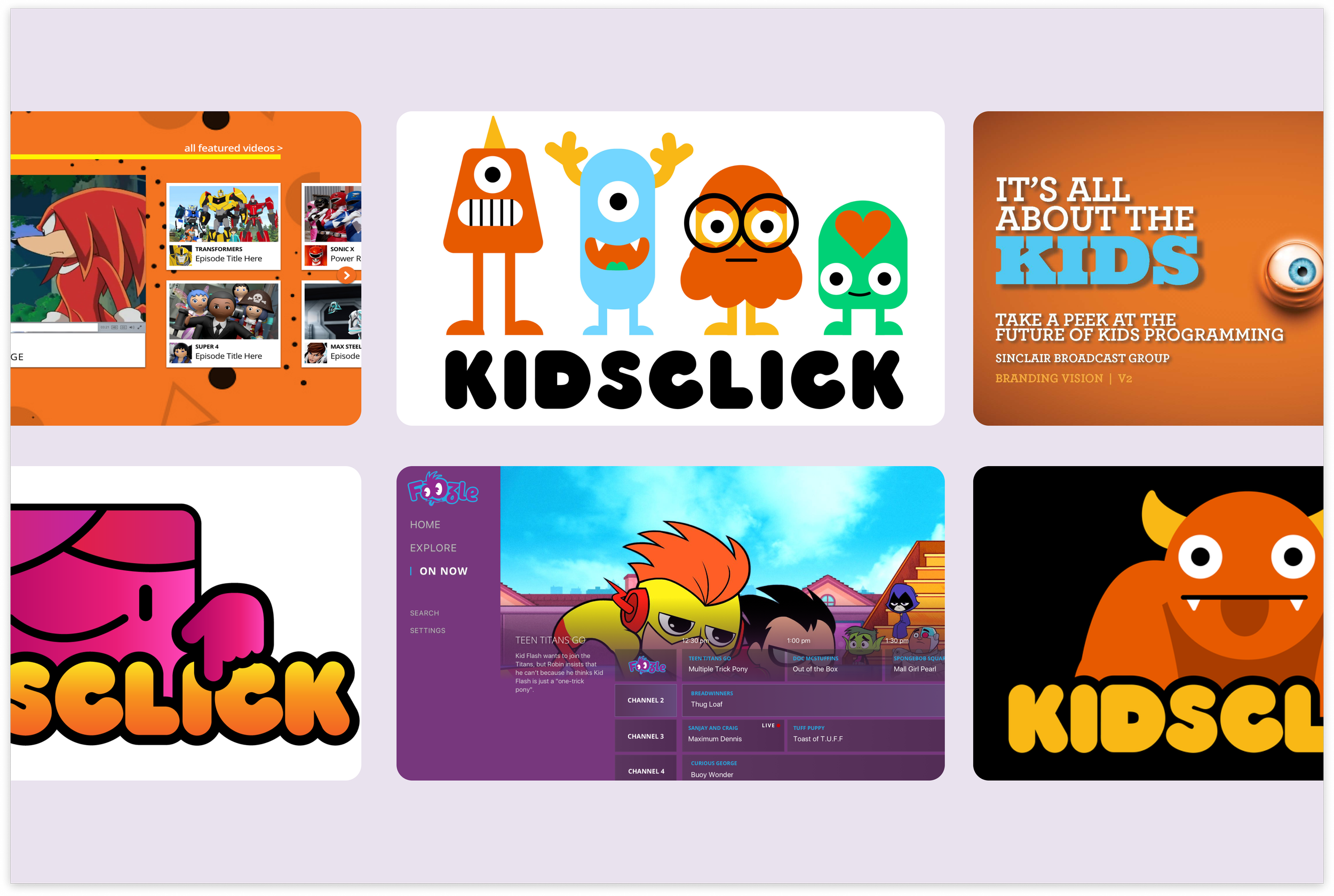
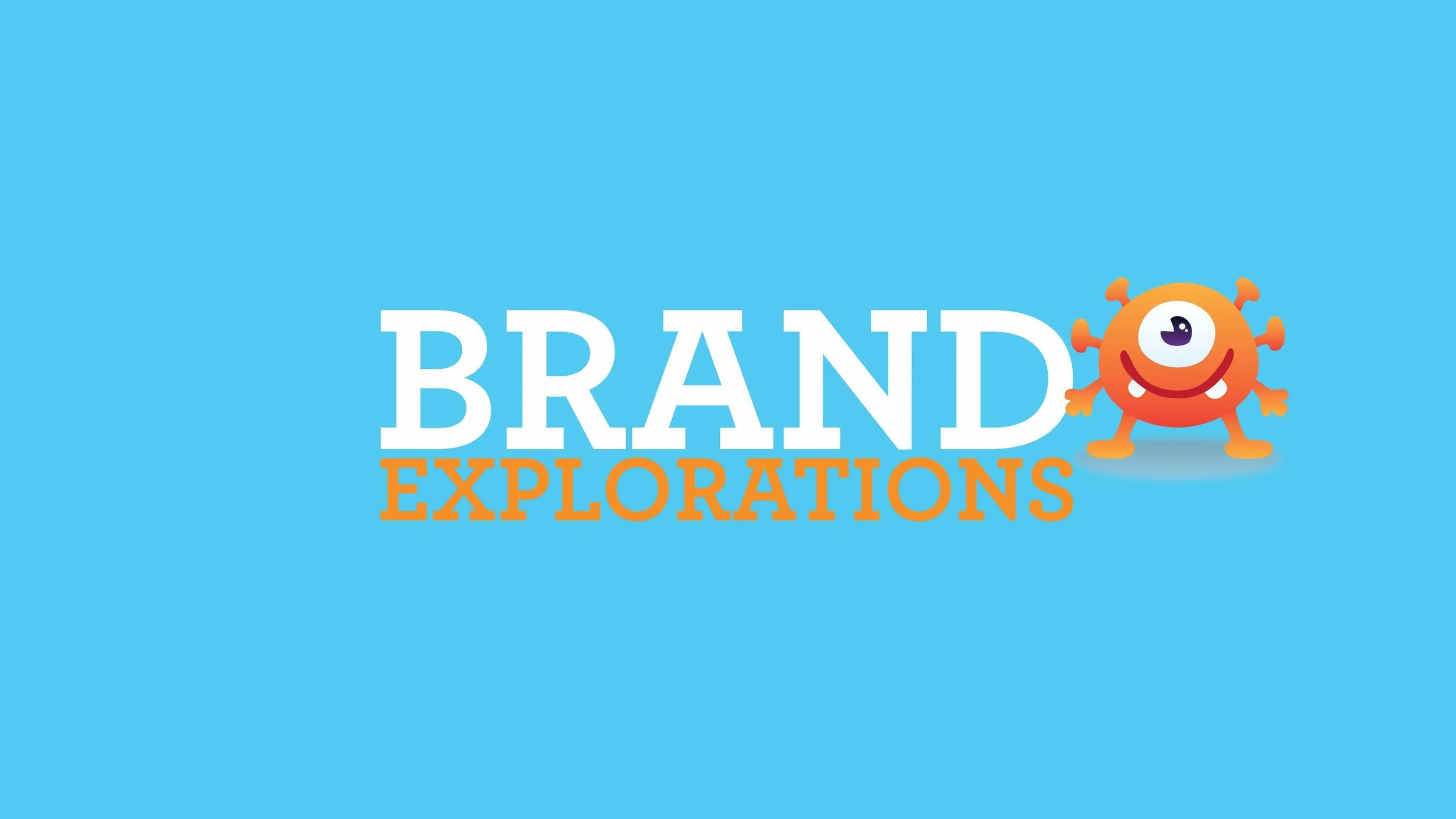
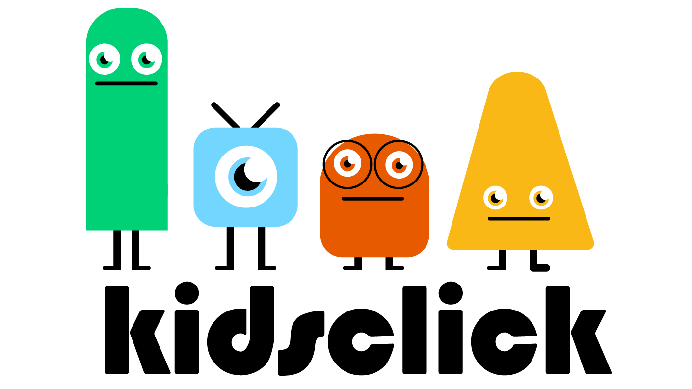
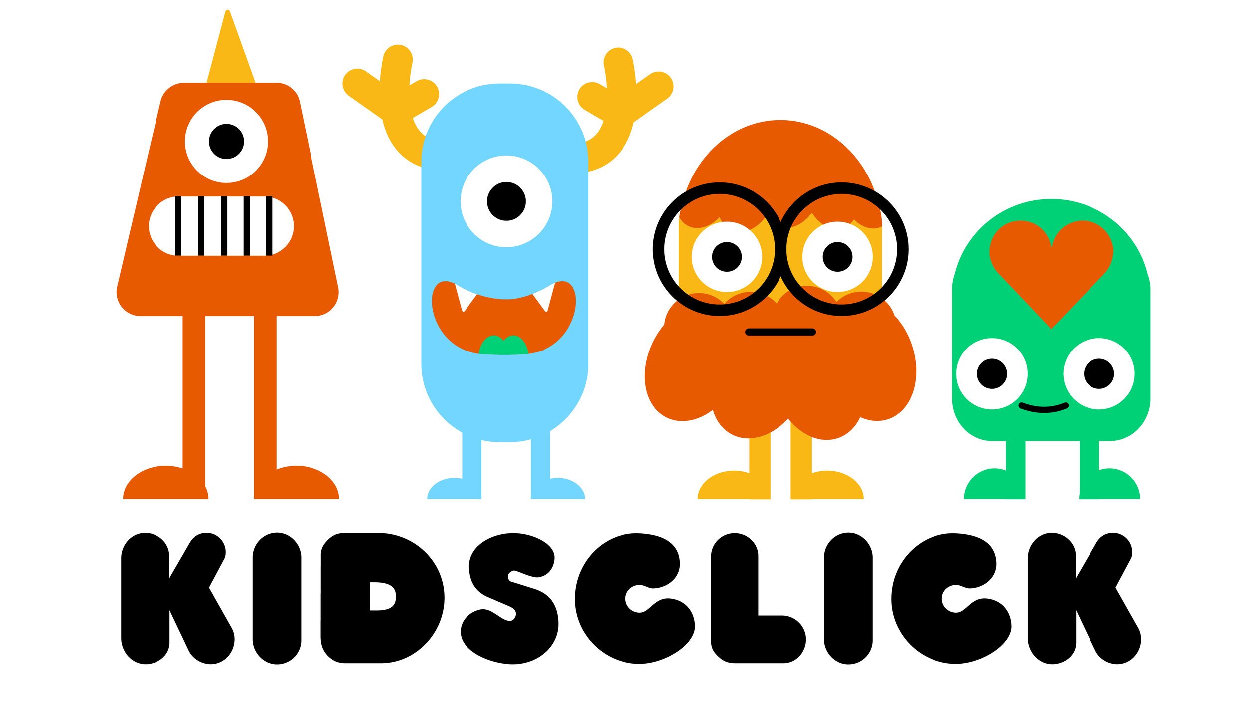
KidsClick
Brand, Product
Big adventures for little viewers
Client
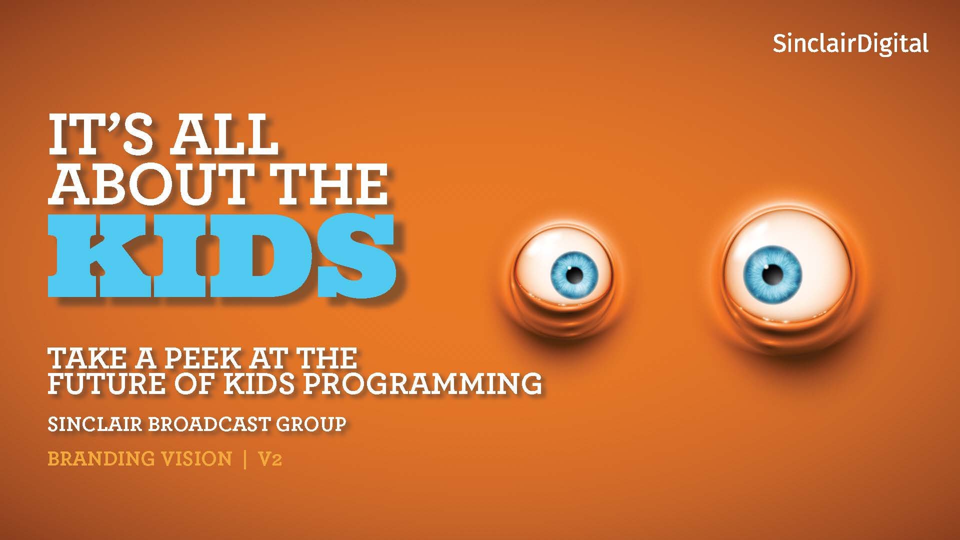
Sinclair Digital
Role
Visual design, branding, UX/UI, product design
Timeline
12 weeks
The Problem
Considerations
Designing Kidsclick required balancing the needs of multiple audiences across platforms. Our primary users included children ages 4–10, who are digitally savvy but still require extra safety, privacy, and simplified navigation. Parents formed the second key audience: younger parents (24–34) tend to be familiar with streaming apps and want quick access to content for their children, while older parents (34+) may use digital services less frequently and are primarily focused on content suitability.
Beyond audience considerations, the design needed to create a unified identity across linear TV, digital streaming, and web platforms. The experience had to support quick content discovery and engagement without relying on advanced features like subscriptions or favorites, while balancing a playful, child-friendly look with a clean, modern design that also appeals to parents.
Kidsclick is Sinclair Broadcast Group’s entry into children’s programming, launching initially as a national daily TV block with plans to expand across broadcast, online, pay TV, mobile, and OTT platforms. The challenge was to create a cohesive, engaging experience across multiple platforms while building a memorable brand for children ages 4–10. This included: Branding, Streaming App, and Web Experience.
Criteria
Brand Identity: Create a memorable, character-driven visual identity that appeals to children ages 4–10 while remaining approachable and reassuring to parents. The brand needed to work across television, digital streaming, and web platforms.
Streaming App (Apple TV OS): Design an intuitive, content-forward experience optimized for TV screens, including easy navigation, featured content, watch experiences, and discovery features like genre pages, carousels, and search.
Web Experience: Build a flexible, responsive web interface supporting both on-demand and live content. The homepage needed to balance content discovery, promotions, ad placements, and future expansion for live streams while remaining simple and approachable.
Focus area
I contributed across branding, the streaming app, and web experience, leading the development of the visual identity, logo, and character-driven branding. I also designed the streaming app’s homepage, content, and watch experiences, and created an intuitive, content-forward web interface with live streaming capabilities
Branding
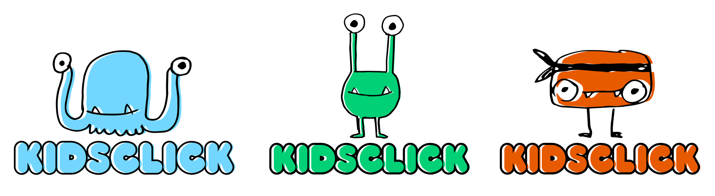
I was selected to join the branding team responsible for creating the logo and establishing the overall visual identity for a new children’s programming service. When the project began, the name had not yet been determined—only that the platform would target children ages 4–10 and span both digital streaming and a linear television presence. Our task was to develop a flexible brand foundation that could work across both environments while appealing to a young, playful audience.
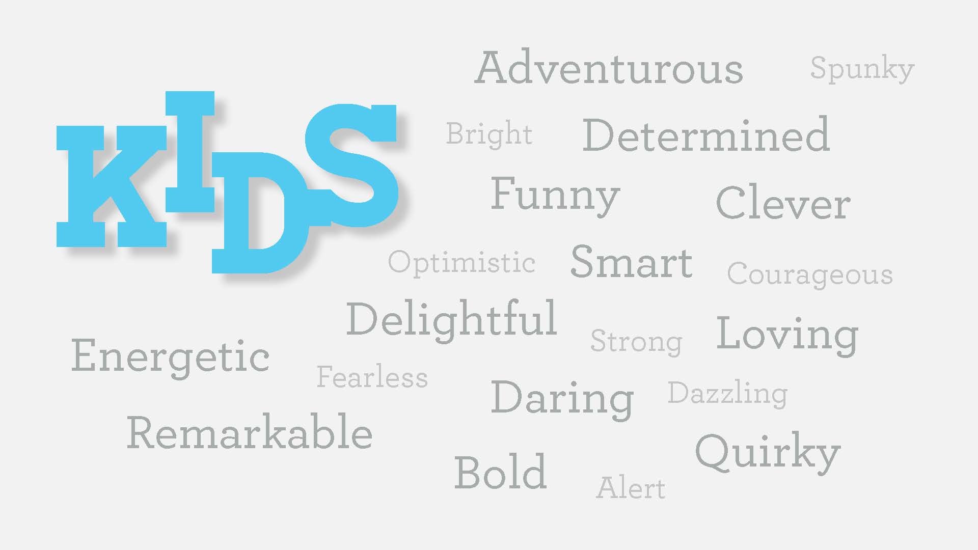
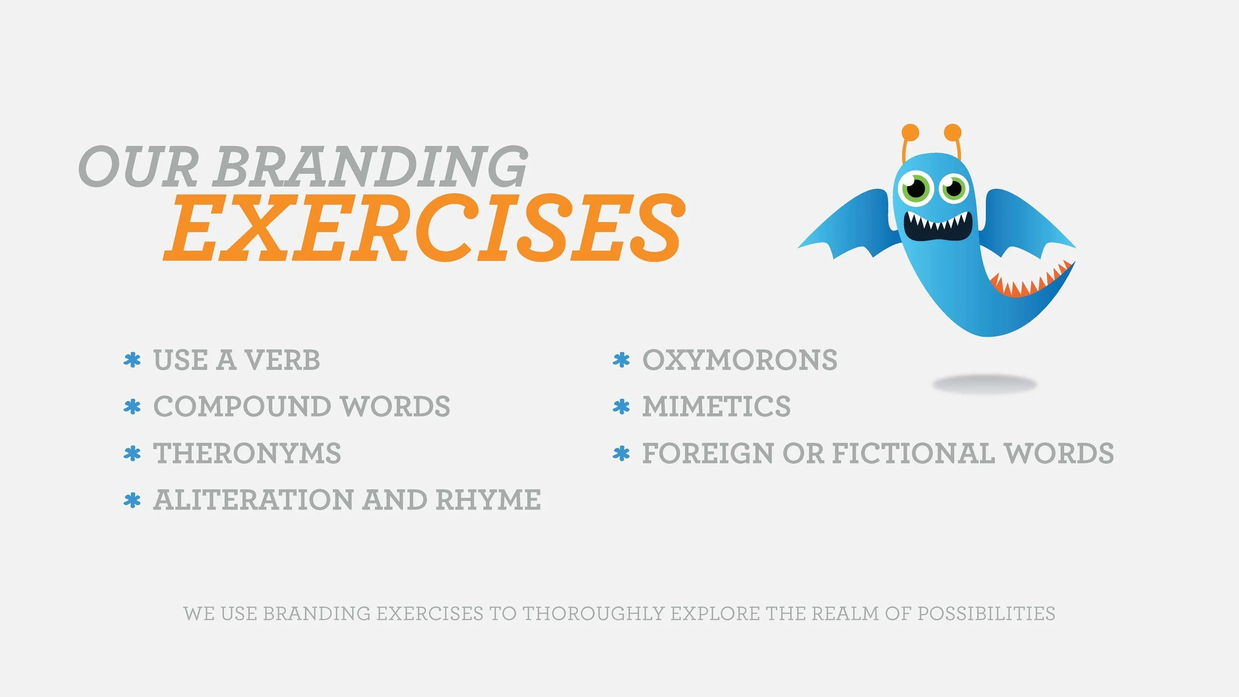
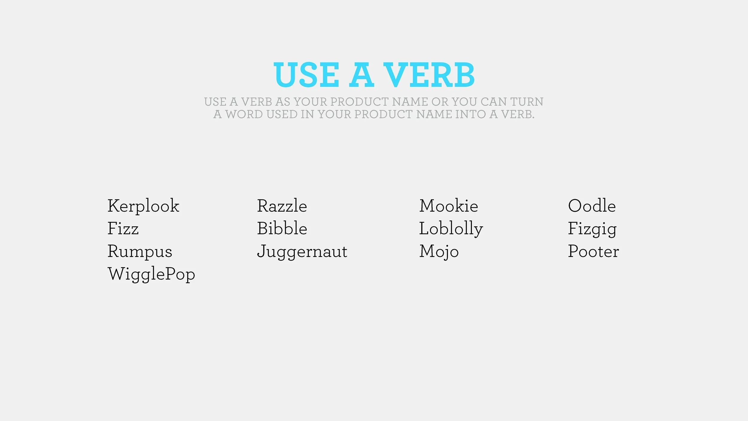
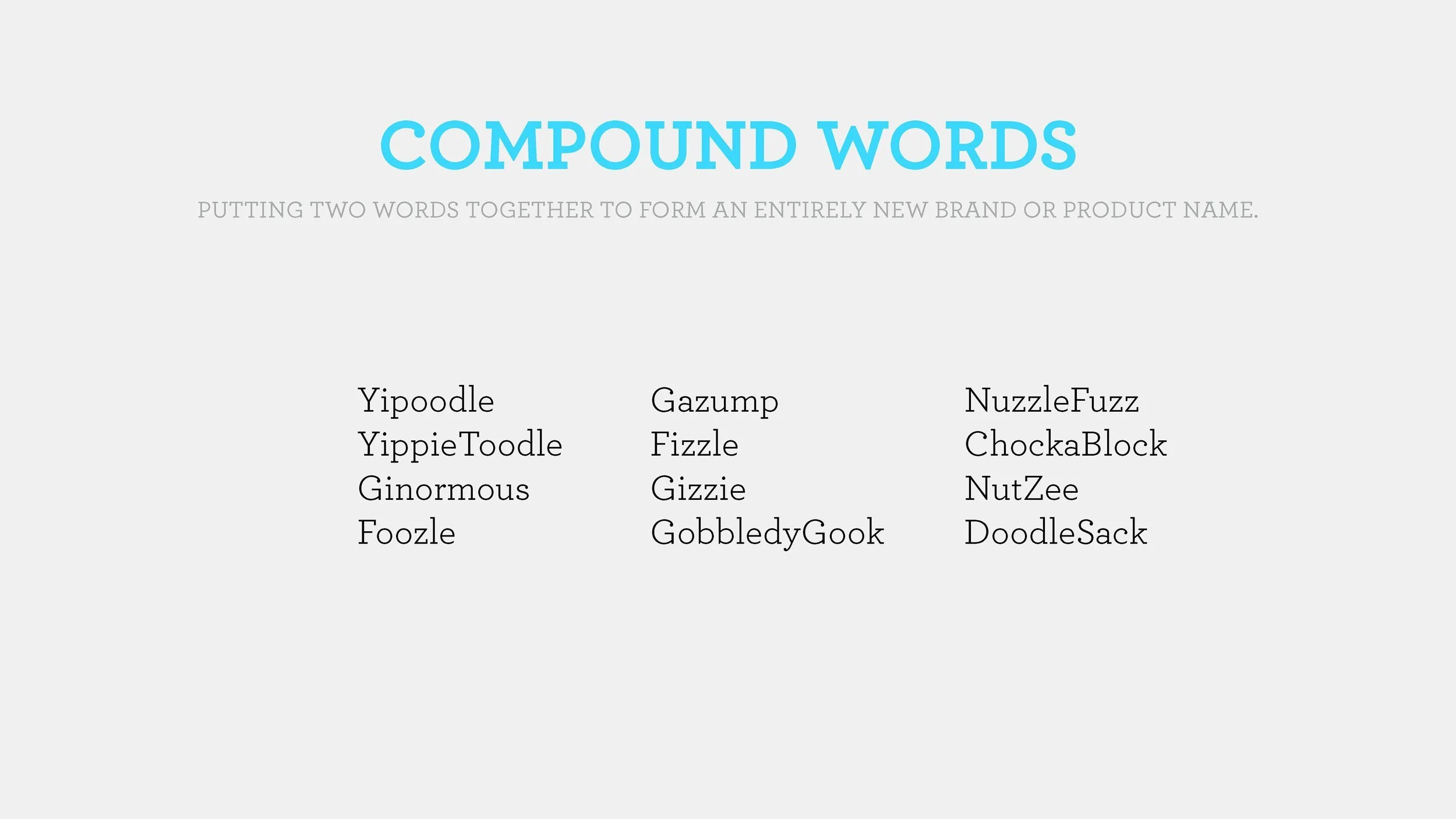
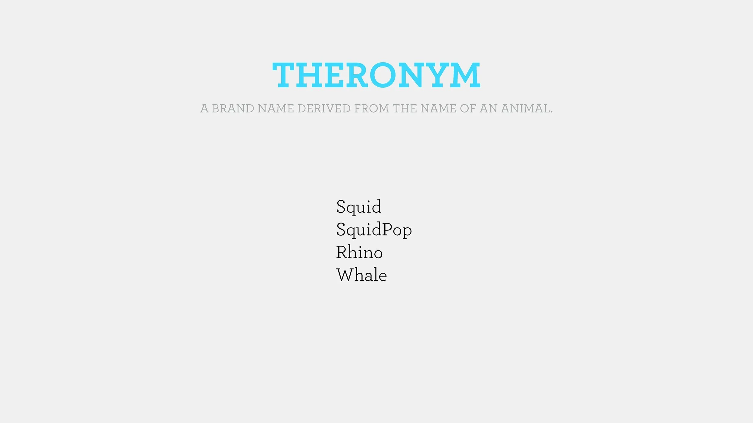
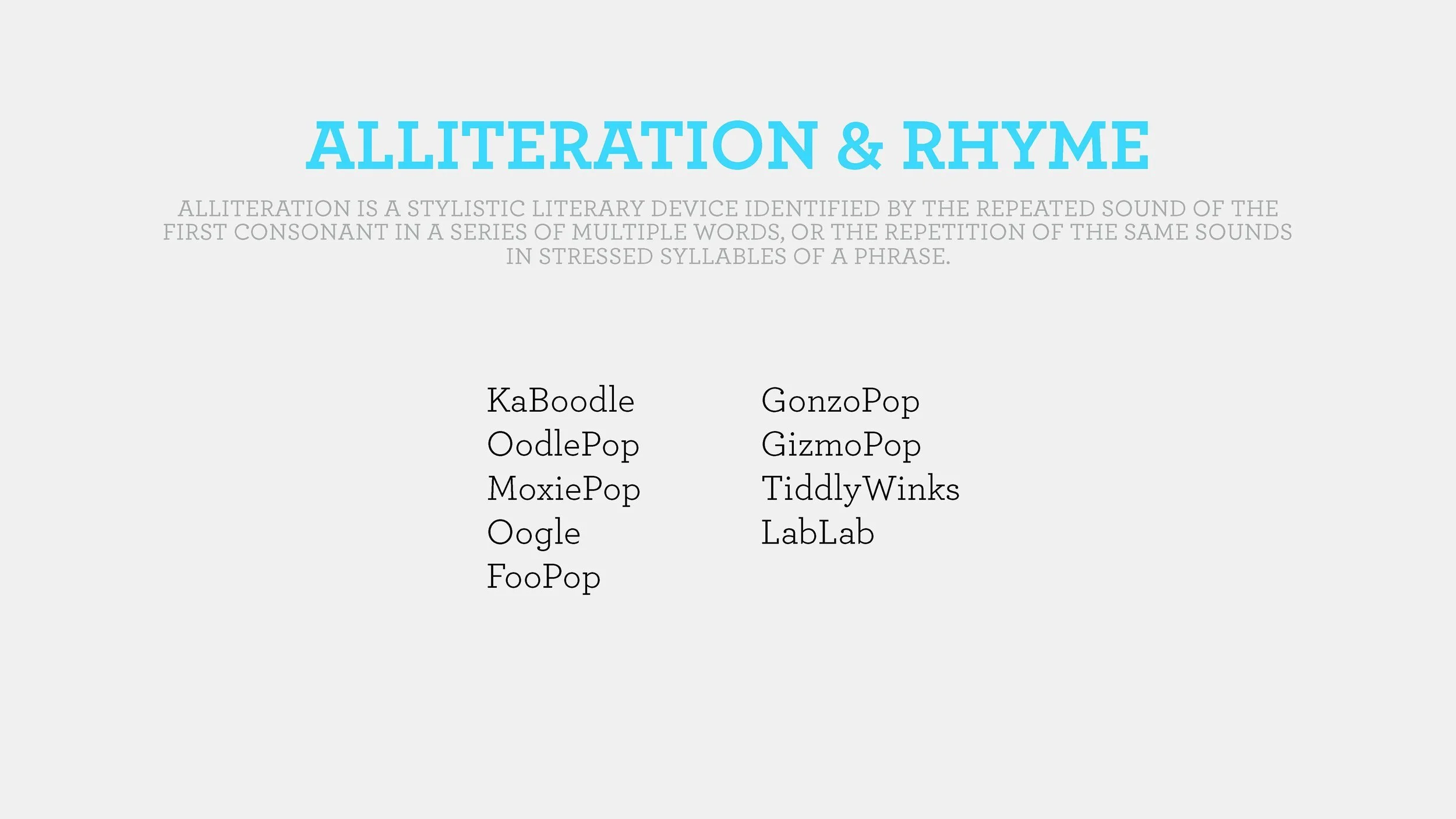
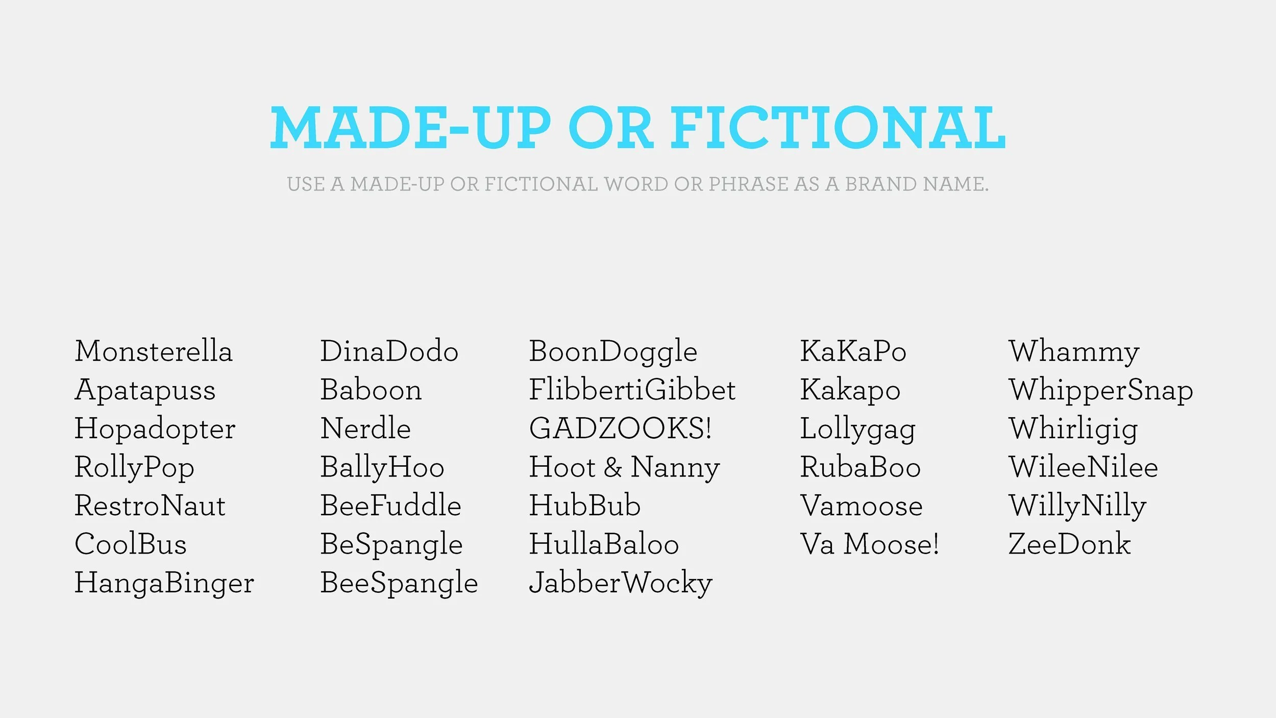
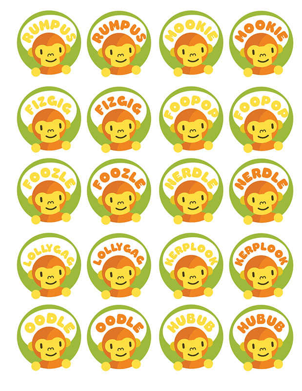
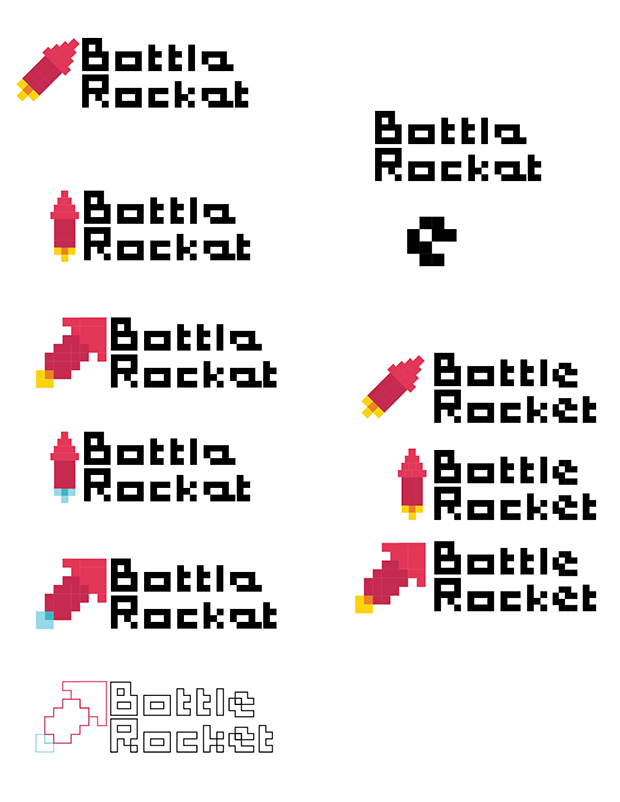
We started by gathering descriptive keywords from stakeholders, energetic, bold, and quirky, and reviewing competitor logos in the kids entertainment space. Through collaborative word games and exercises, we generated a list of potential names, which we narrowed to: Foozle, Razzle, Juggernaut, Rocket/Rocket TV, Go Gizmo, Rumpus, and Squidpop.
01 NAMING
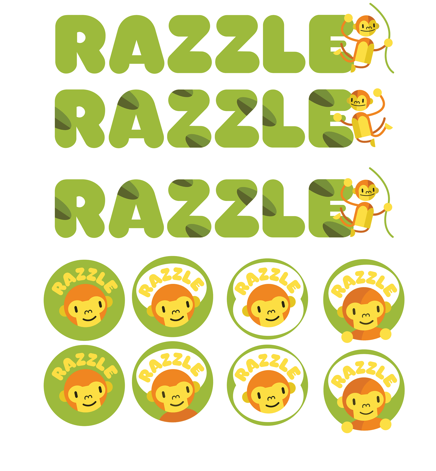
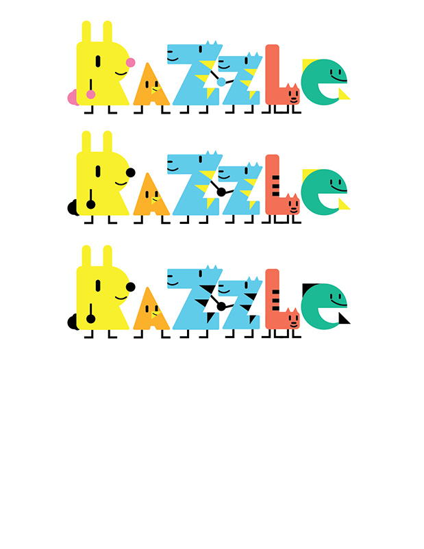
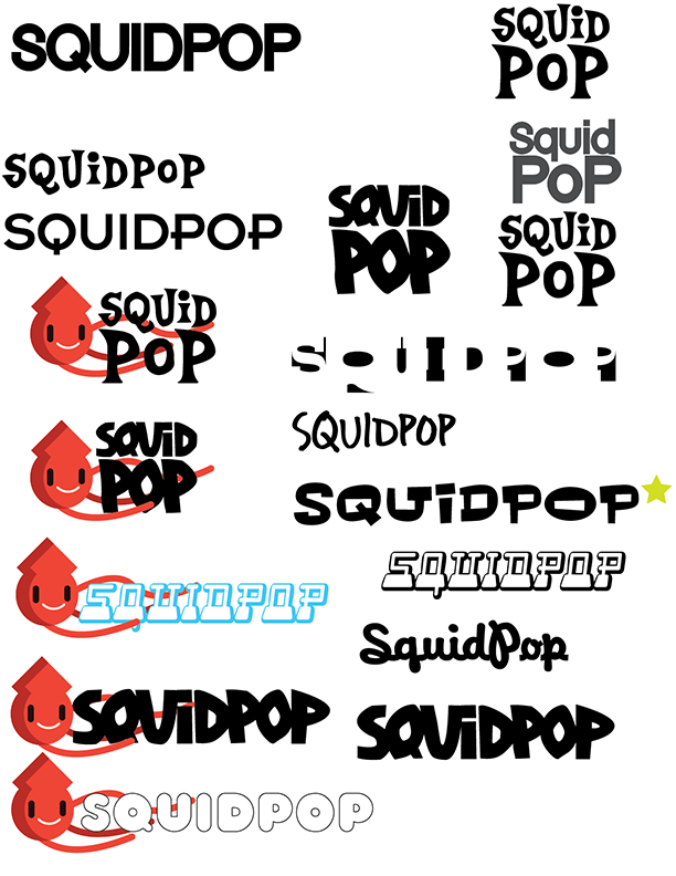
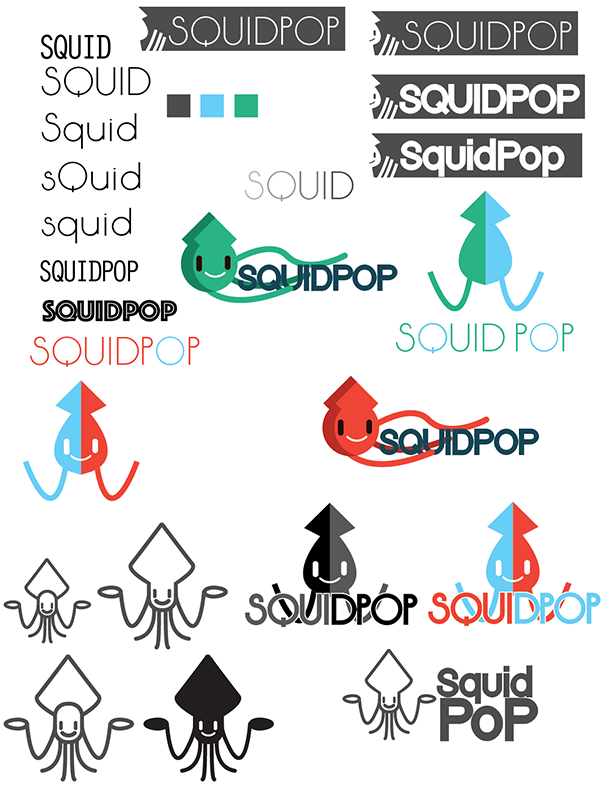
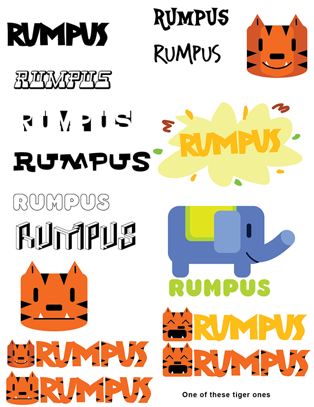
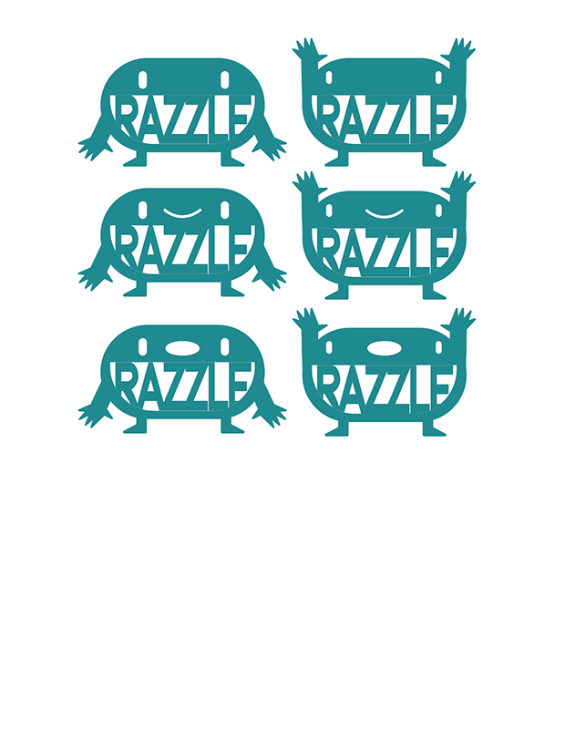
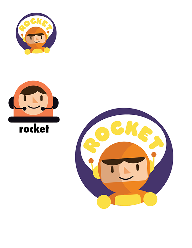
With our shortlisted names, we explored logo styles, colors, and typography to capture the brand’s playful, energetic personality. I focused on incorporating a character to make the brand accessible to kids and create flexible opportunities for future assets and promotions.
02 Early Explorations
Round 1 Explorations
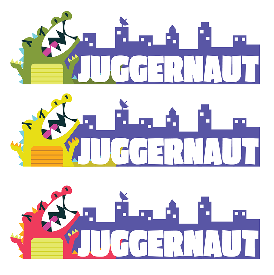
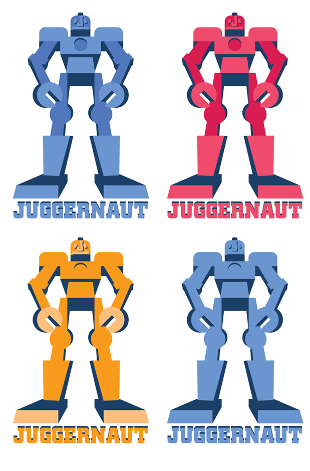
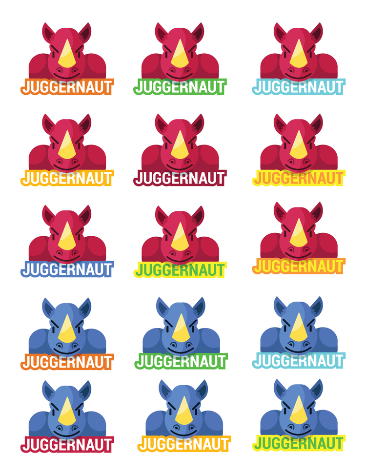
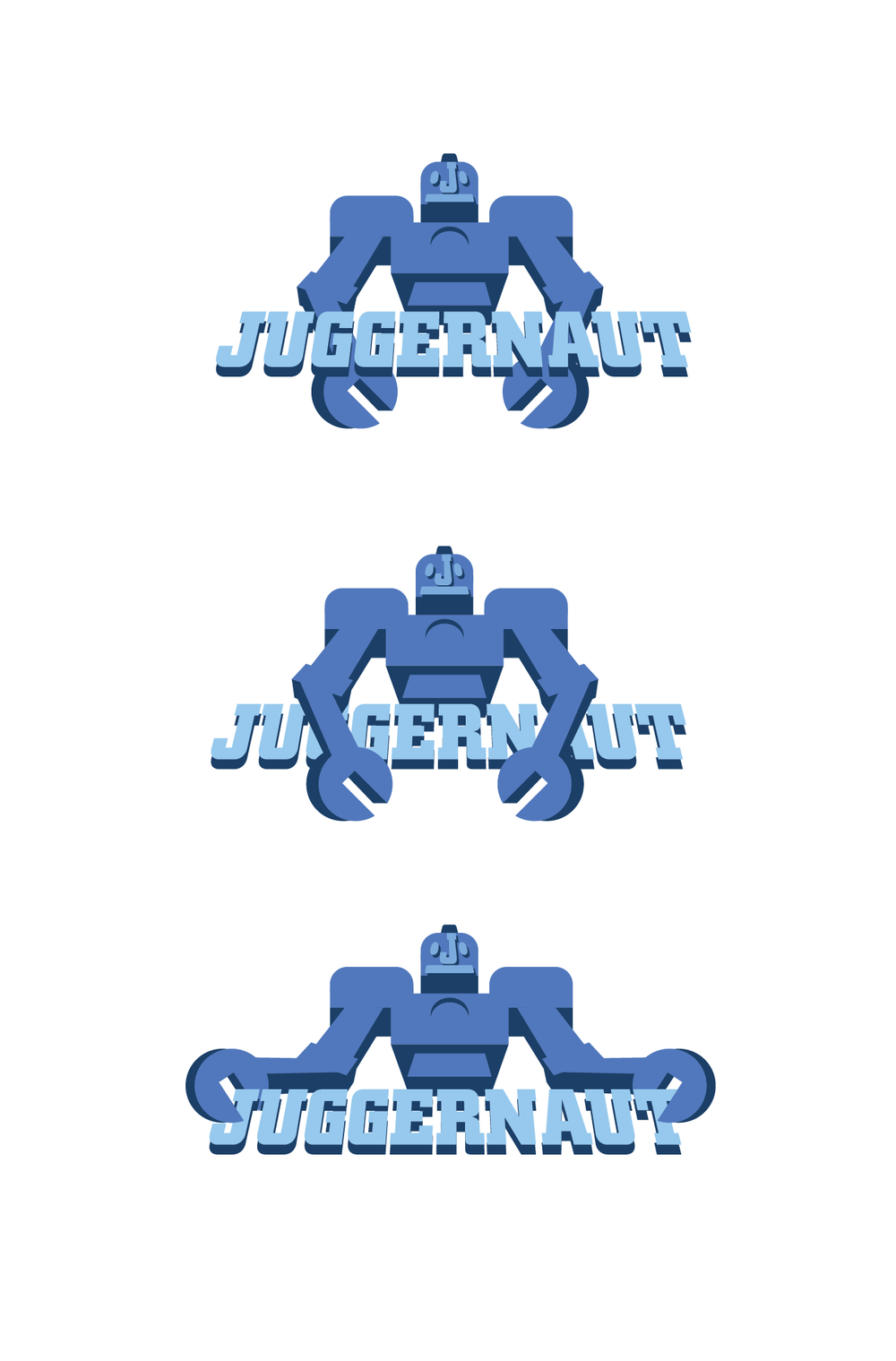
By this stage, the name shortlist had narrowed to three finalists: Juggernaut, Gizmo Go, and Foozle. I chose to focus on Juggernaut and refined the concepts I had begun developing.
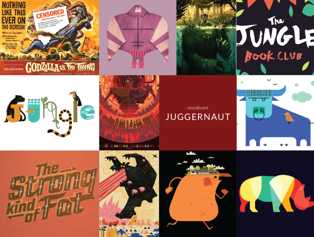
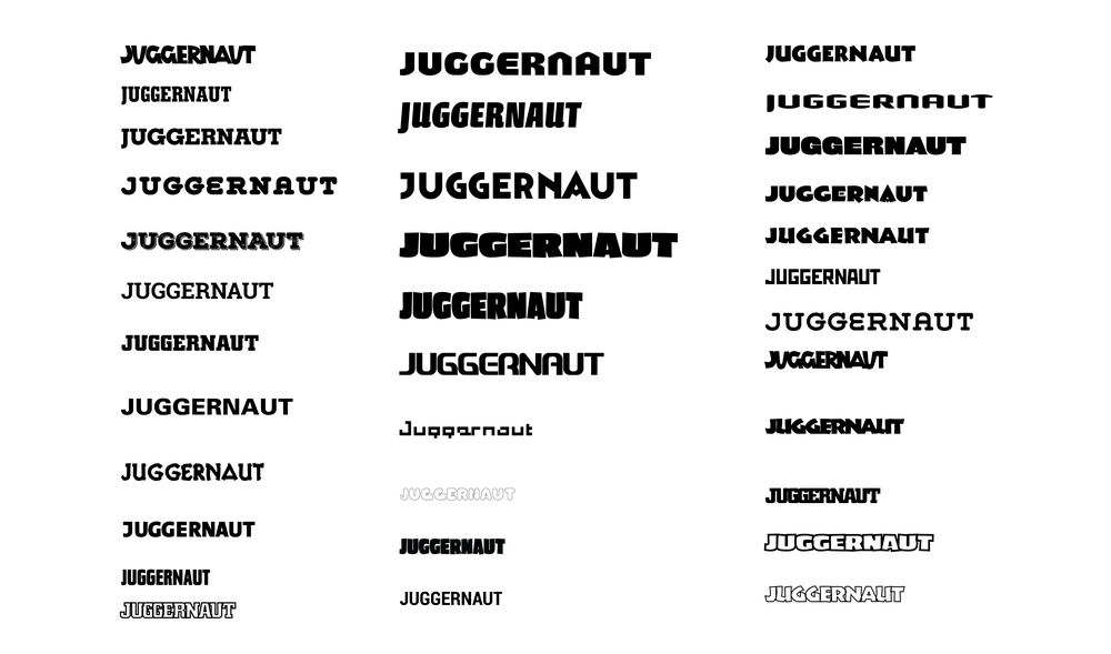
The process started with moodboards inspired by the word Juggernaut: imagery that felt bulky, chunky, and action-driven—think hulking creatures smashing through cities. From this, I explored typefaces that were big and bold without feeling aggressive.
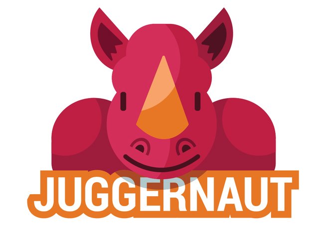
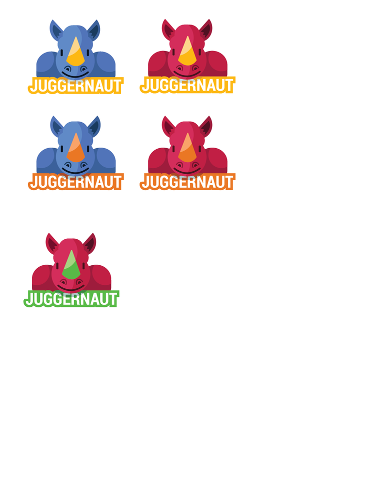
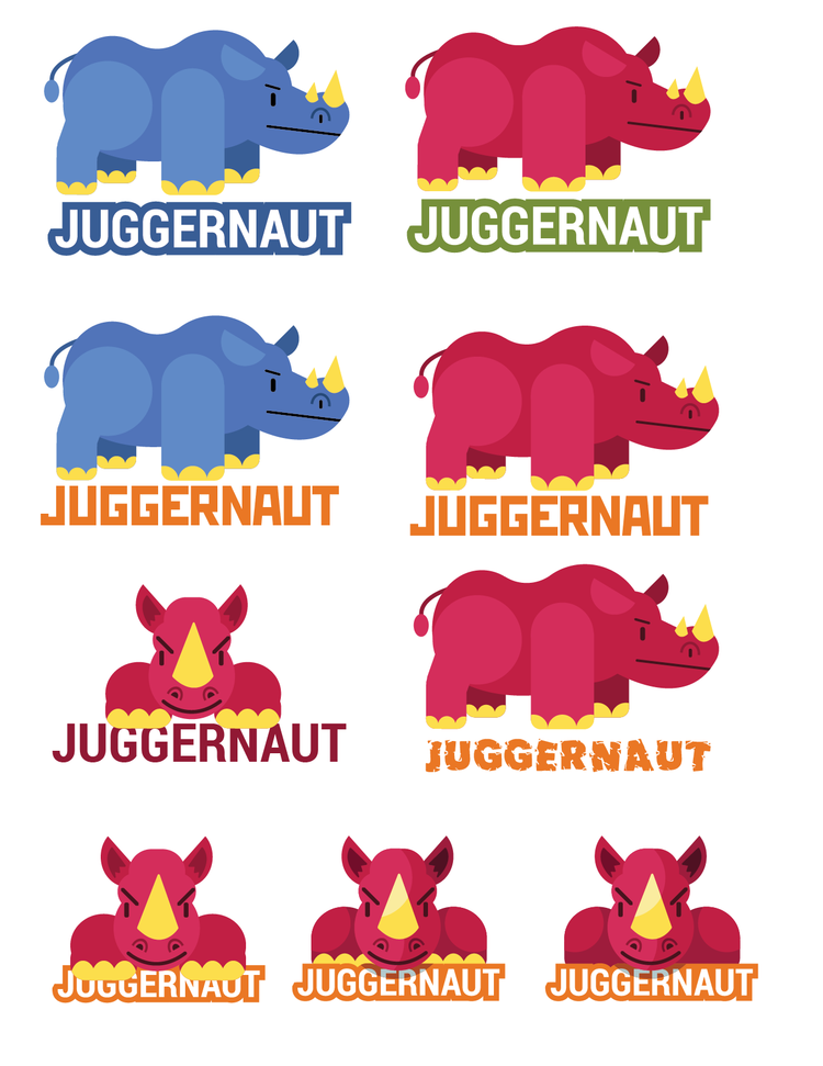
Option A: Rhino – I began with a full-body rhinoceros, inspired by the fun fact that a group of rhinos is called a “crash.” I eventually cropped to a front-view to create a stronger lockup with the type and a more cohesive visual.
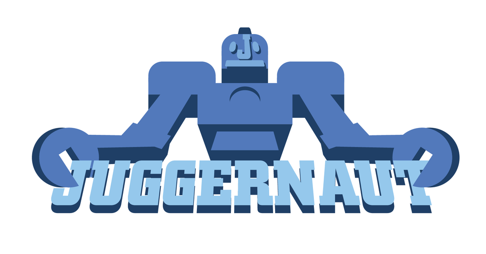
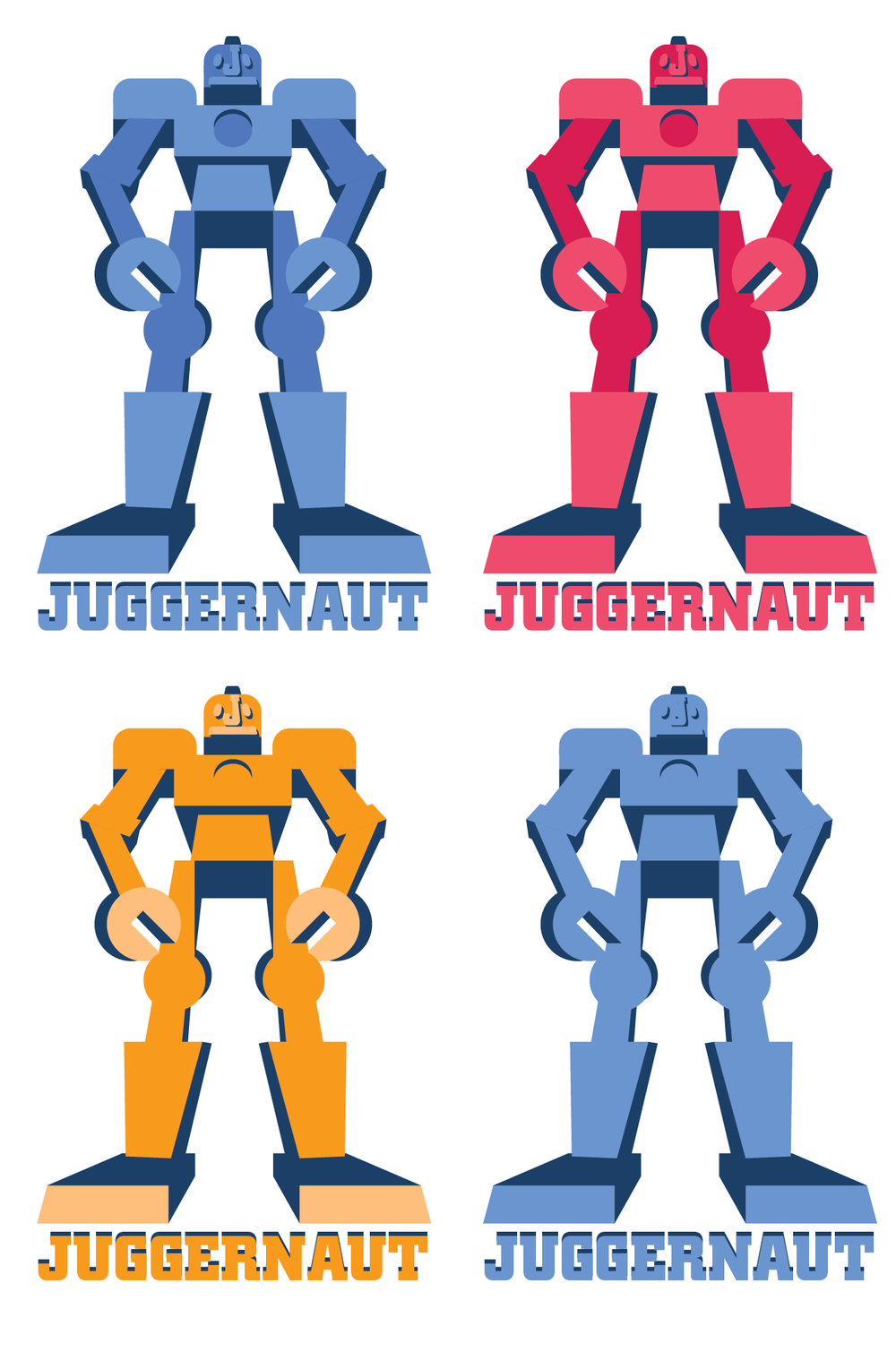
Option B: Robot – A giant robot concept played into the service’s content and skewed slightly older. Using a low-angle perspective emphasized scale and presence.
03 Juggernaut

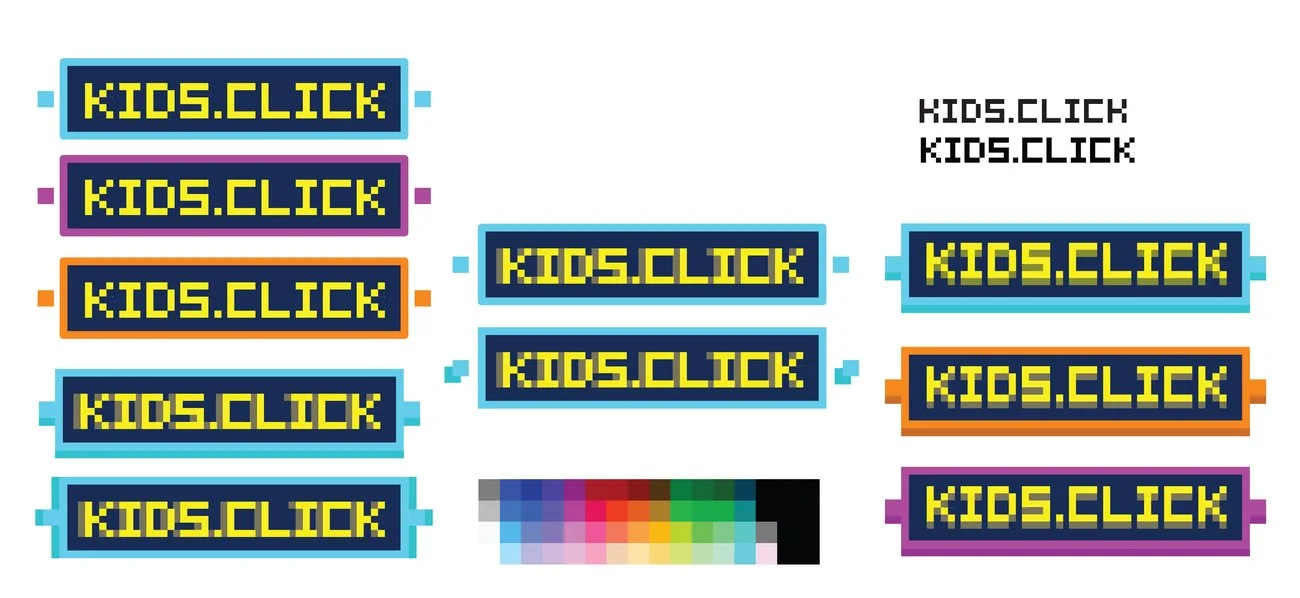
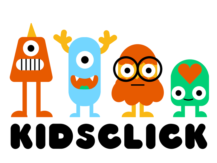
After the initial designs, stakeholders informed us that the previous name explorations were scrapped and the new name would be Kidsclick—“Kids” to speak directly to the audience and “Click” as a nod to interaction.
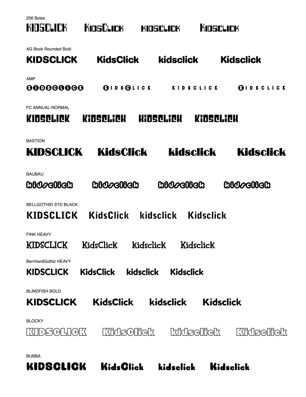
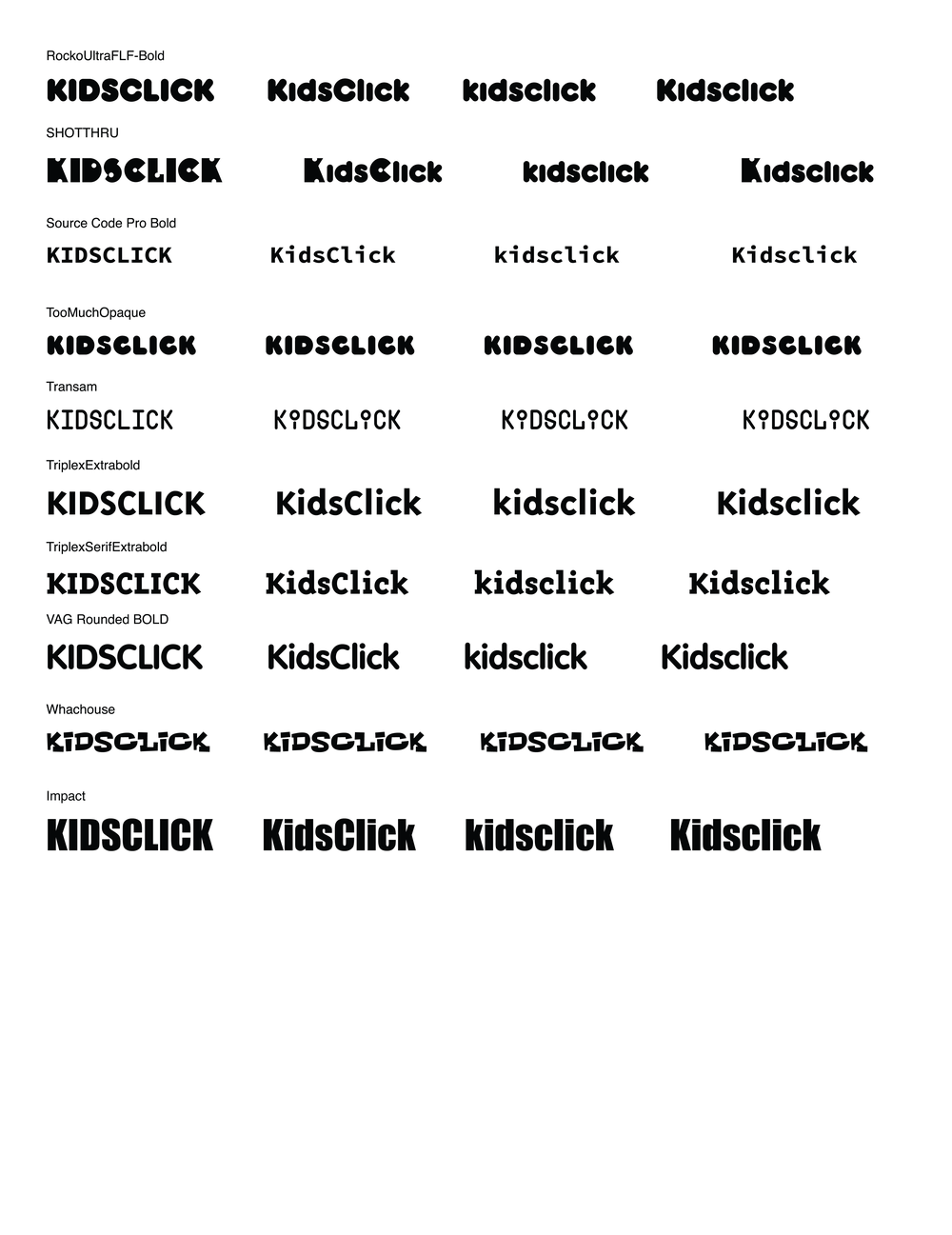
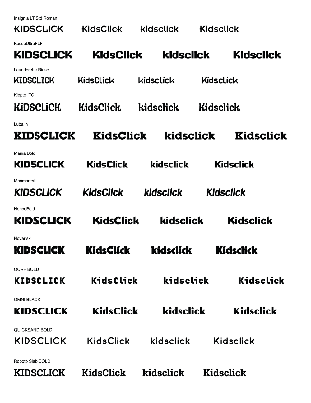
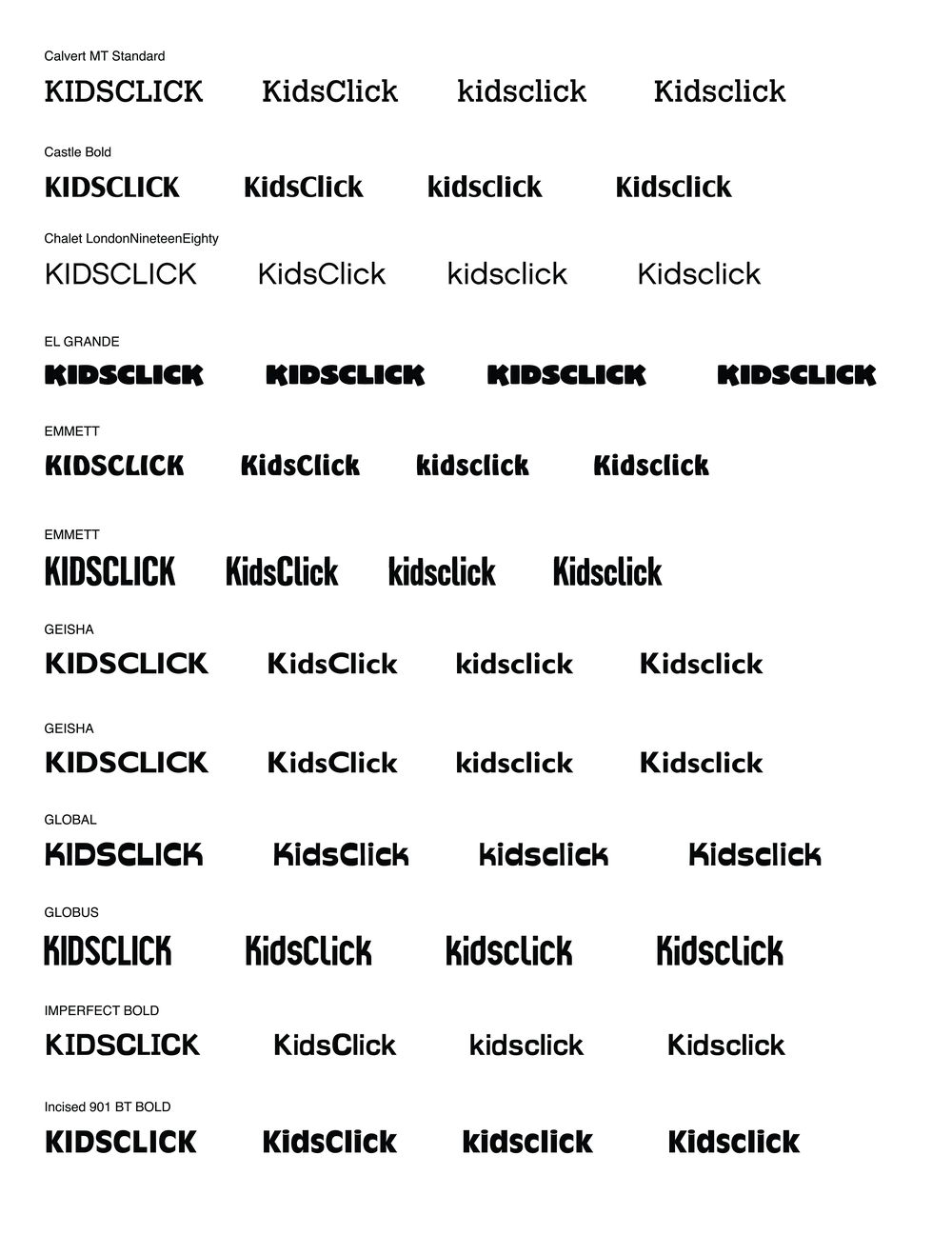
With the new name in place, I revisited competitor brands for inspiration, noting the use of bright colors, bold typography, and characters. I then focused on typography, exploring styles that balanced the client’s desired qualities: sticky, freeing, clean, creative, and destination-focused. Throughout, the brand direction emphasized a clean, flat, and modern aesthetic that would appeal to both kids and their parents.
04 KIDSCLICK
Concept 1: "Clicking Kid"
I focused on presenting a character-driven concept to create an immediate connection for kids. Characters serve as a playful, human analogue, allowing users to project themselves onto the brand. With a fairly general name like Kidsclick, a character also helped the brand stand out and feel memorable.
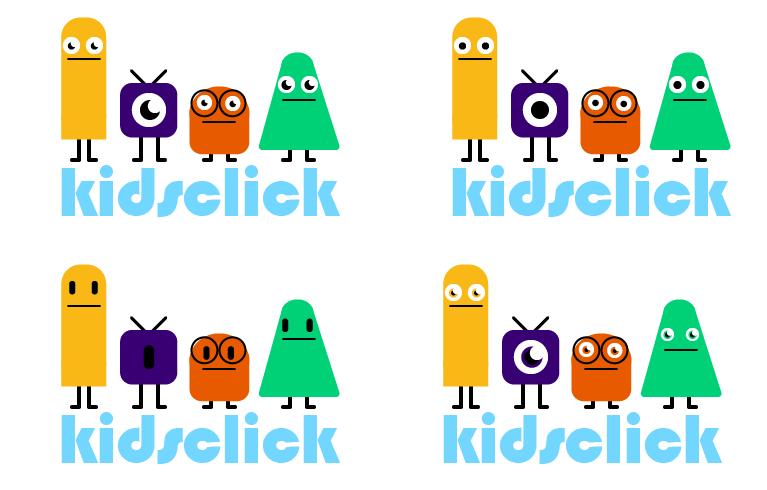
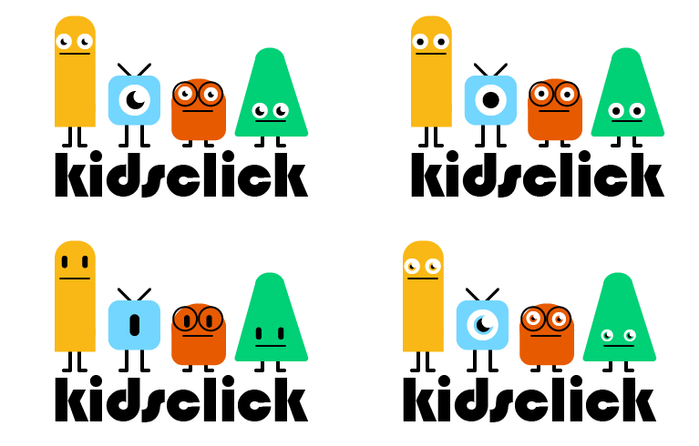
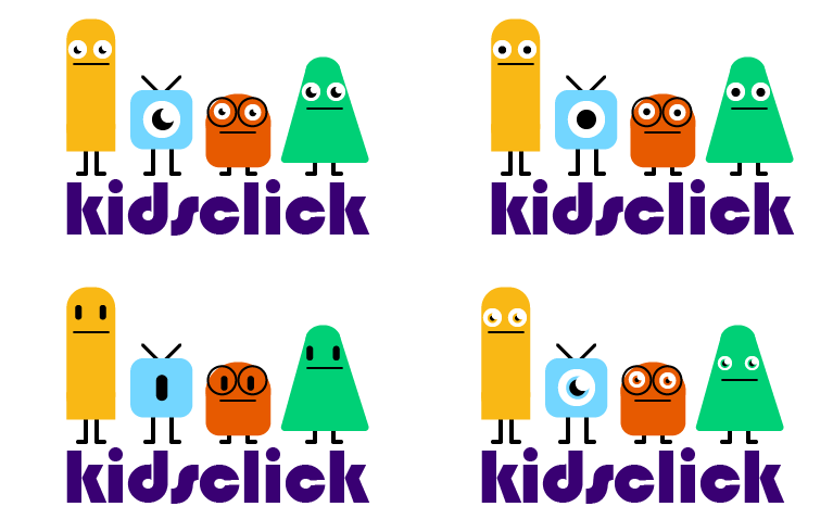
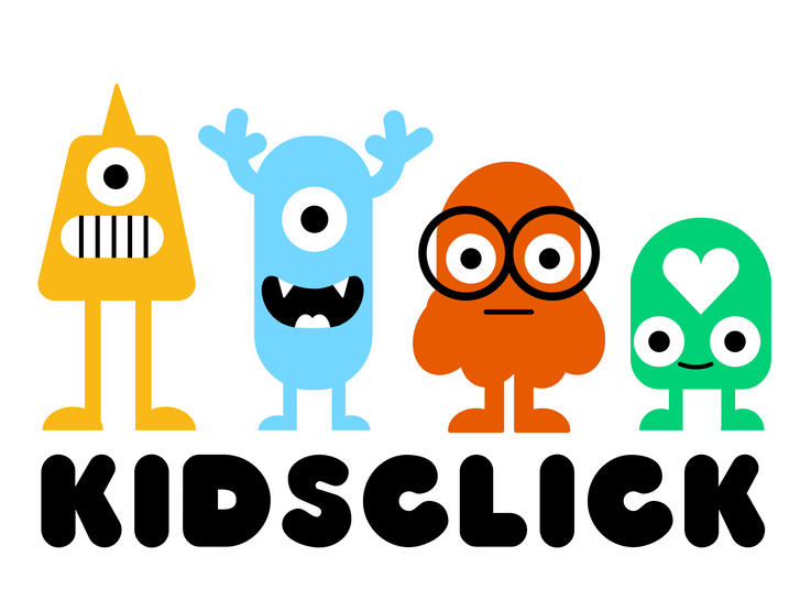
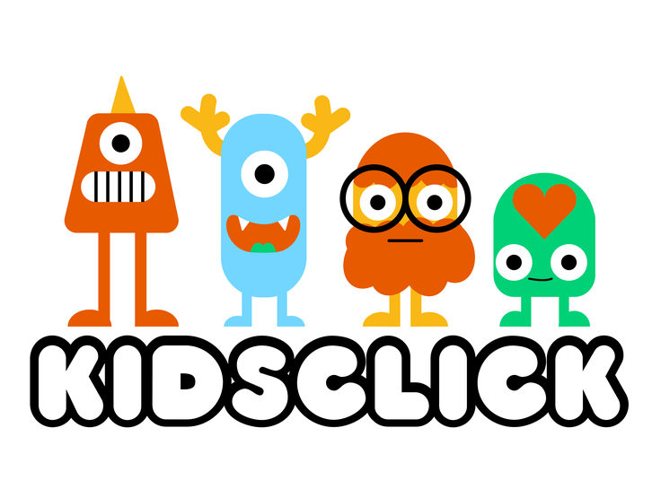
Concept 2 "Geometric Monsters"
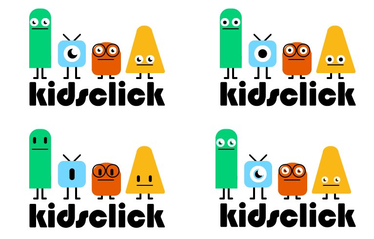
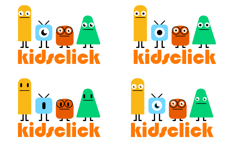
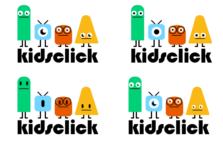
This concept extended the character idea with four distinct characters integrated with the text. These figures are easy to animate for promos or bumpers and adaptable for future merchandise. The “cute but slightly offbeat” style makes the brand approachable for younger kids while engaging older ones.
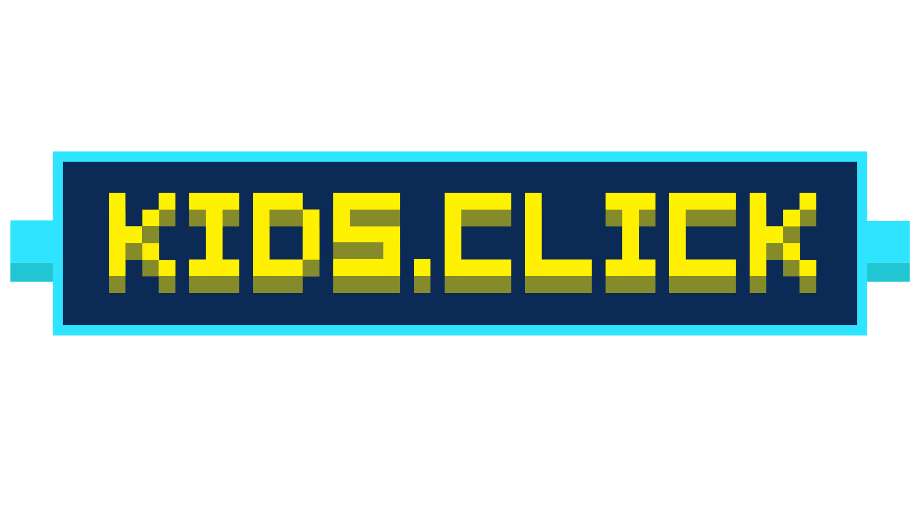
Option 3: "8-Bit"
Drawing inspiration from video games and retro graphics like Minecraft, this concept explored 8-bit visuals. I started with original Nintendo palettes and grid-based graphics but introduced slight dimensionality for more visual interest. The result emphasized the playful idea of “clicking” while creating a simplified, accessible character that could resonate broadly with the audience.
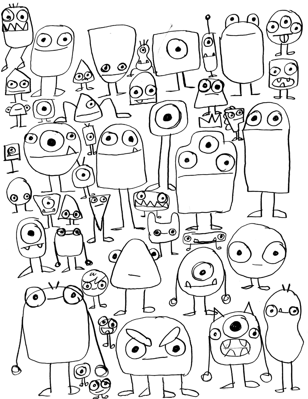
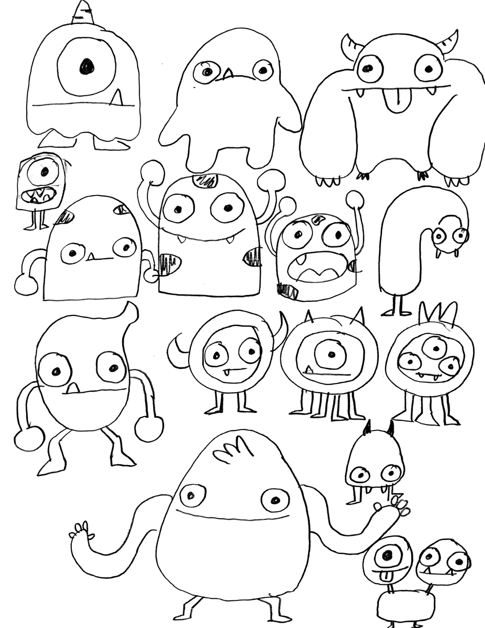
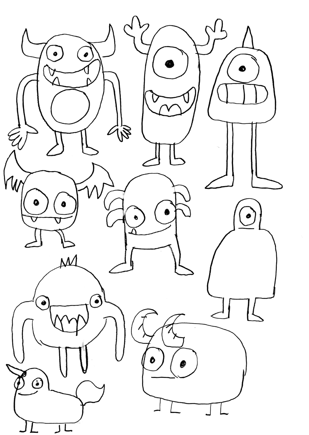
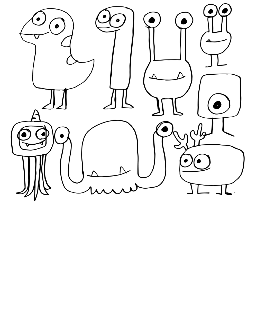
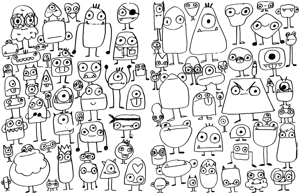
After sharing the initial options, the client decided to restart the branding process. Since they were most excited by the idea of a character, I returned to the literal drawing board spending an afternoon sketching creatures to spark new ideas. I then shared these sketches with fellow designers, selecting the strongest concepts to refine and clean up in Illustrator for further development.
04 Back To The Drawing Board
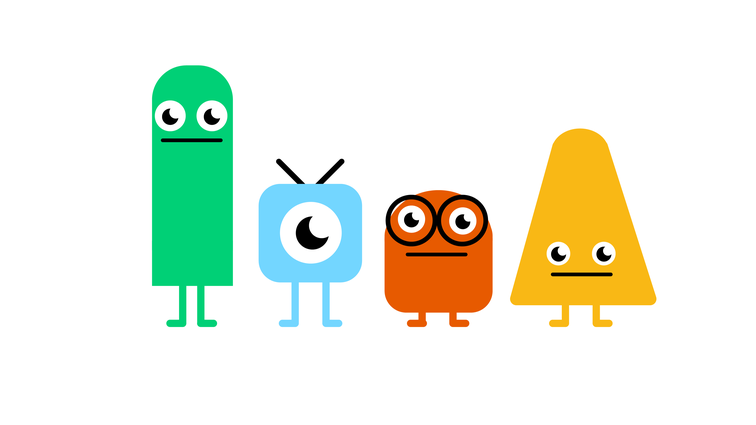
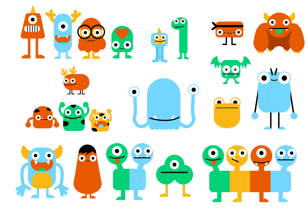
Option A: "Detailed Geometric Monsters"
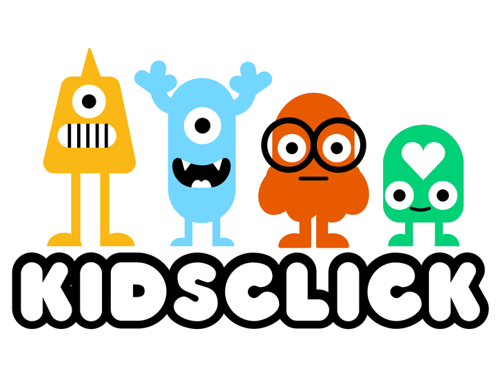
Building on the original Geometric Monsters, I added detail to make the characters stand out from competitors. Each character works individually or as a group across promos, merchandise, bumpers, and more, while appealing to a broad range of kids across ages and genders.
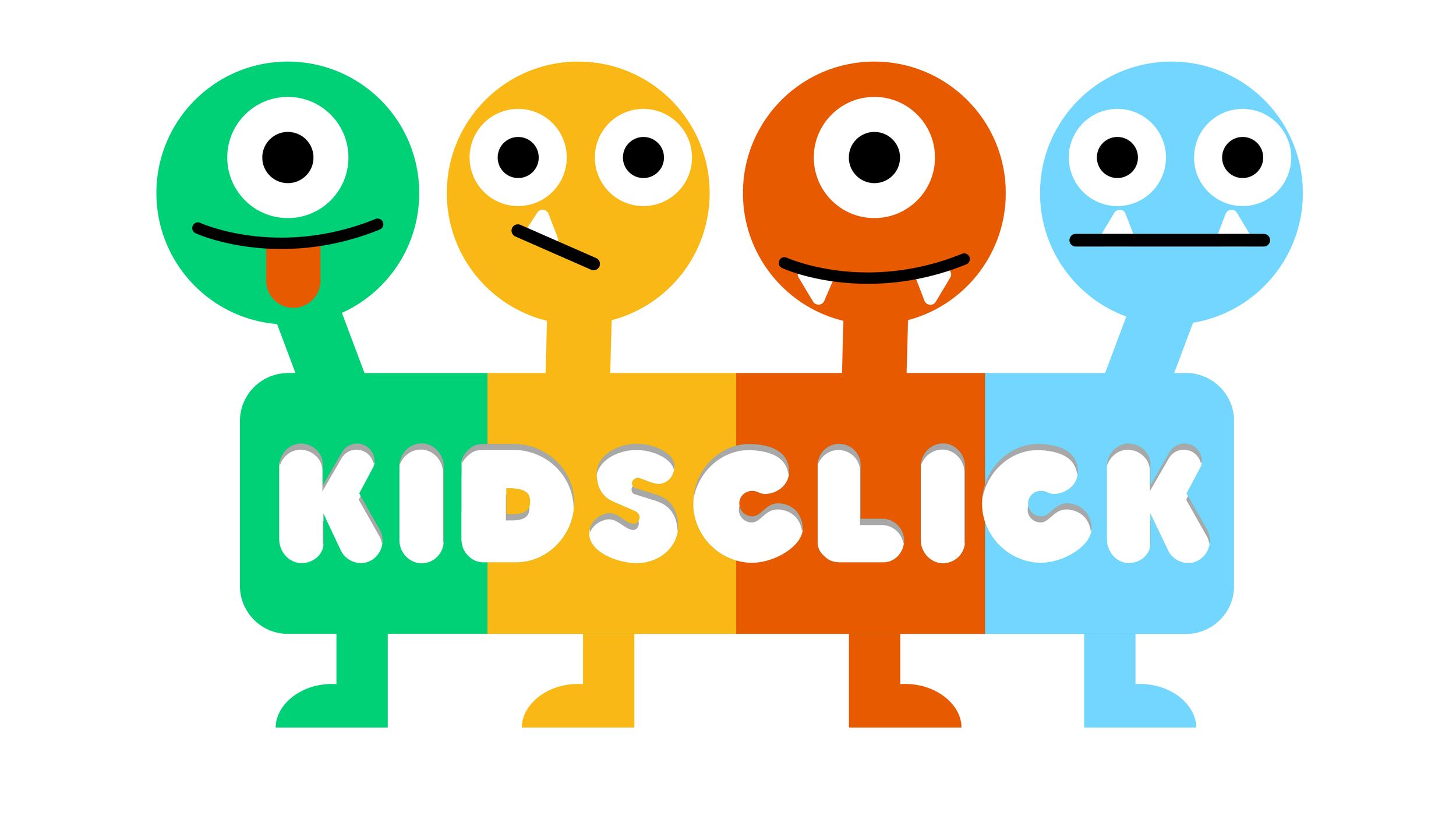
Option b: "4 heads"
Designed with digital experiences in mind, each head represents a different aspect of the brand and could serve as a playful navigation element in an OTT or mobile app, helping differentiate sections while reinforcing brand personality.
Option C "Sketchy Monsters"
This concept embraced the energy of rough sketches rather than polished vector art. The offset colors and spontaneous style captured a playful spirit that could be applied to a rotating cast of monsters within the logo or other brand touchpoints.
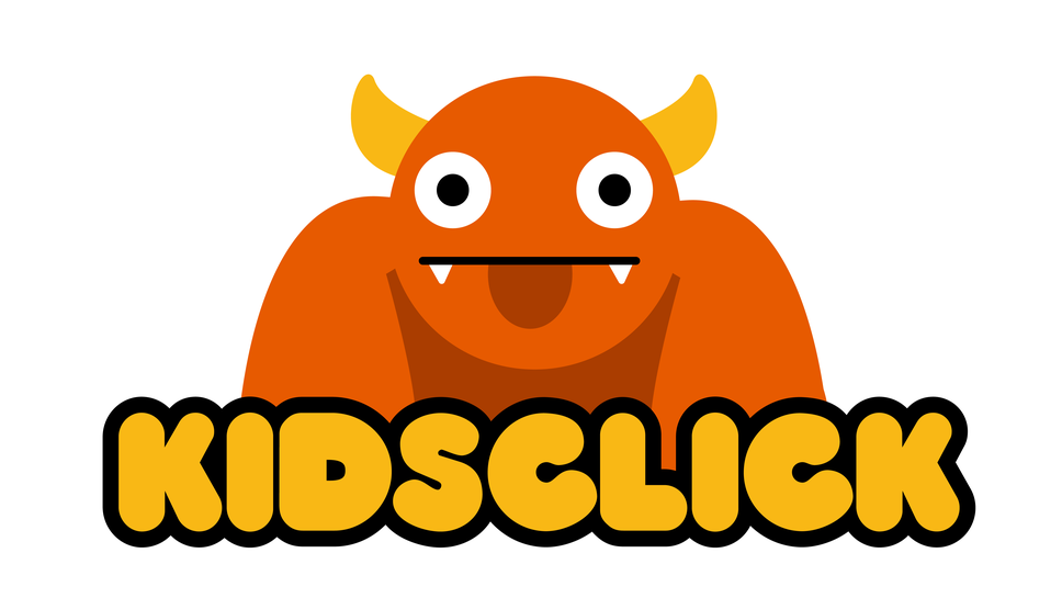
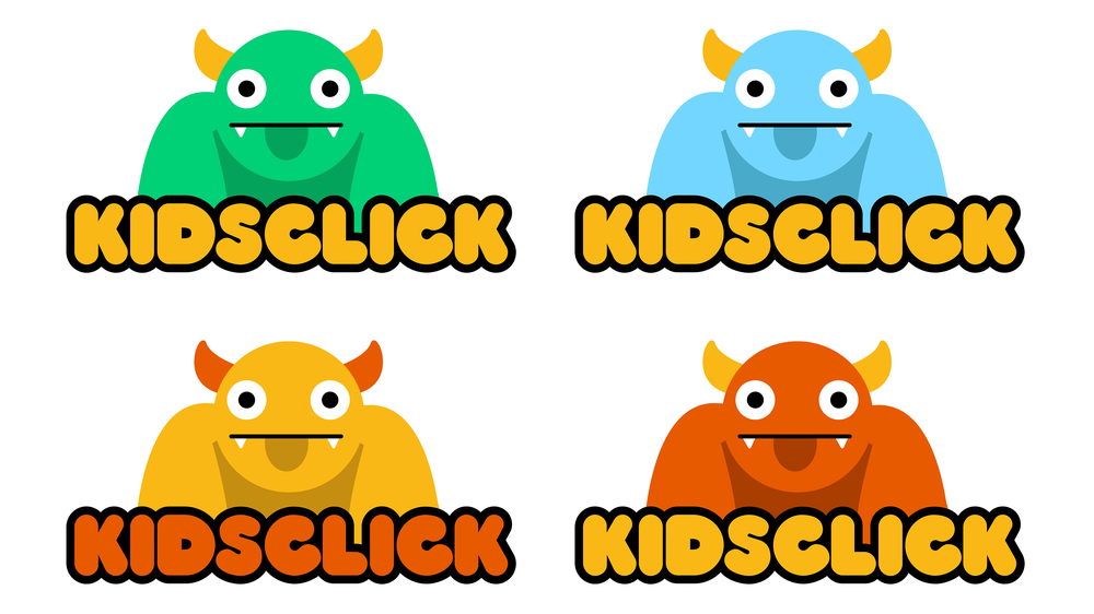
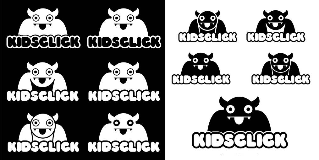
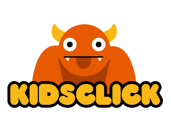
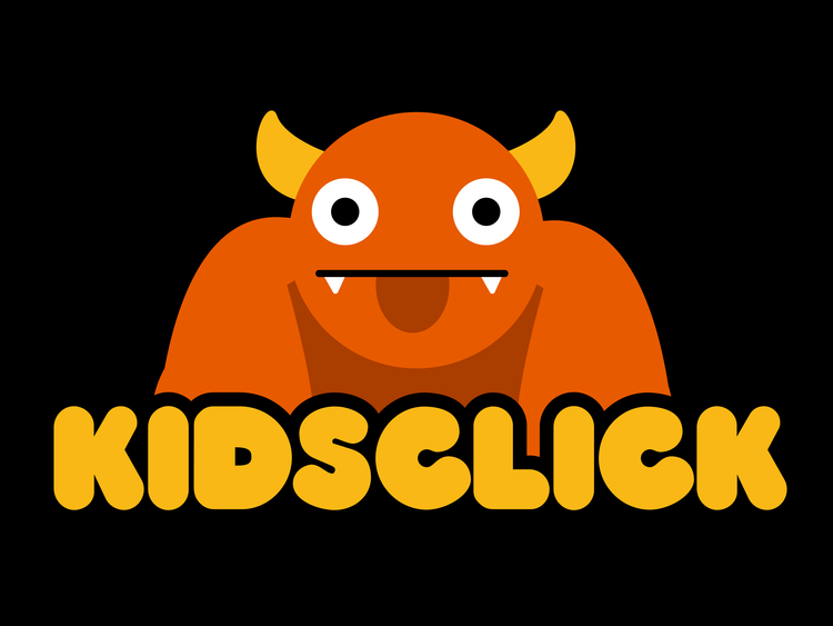
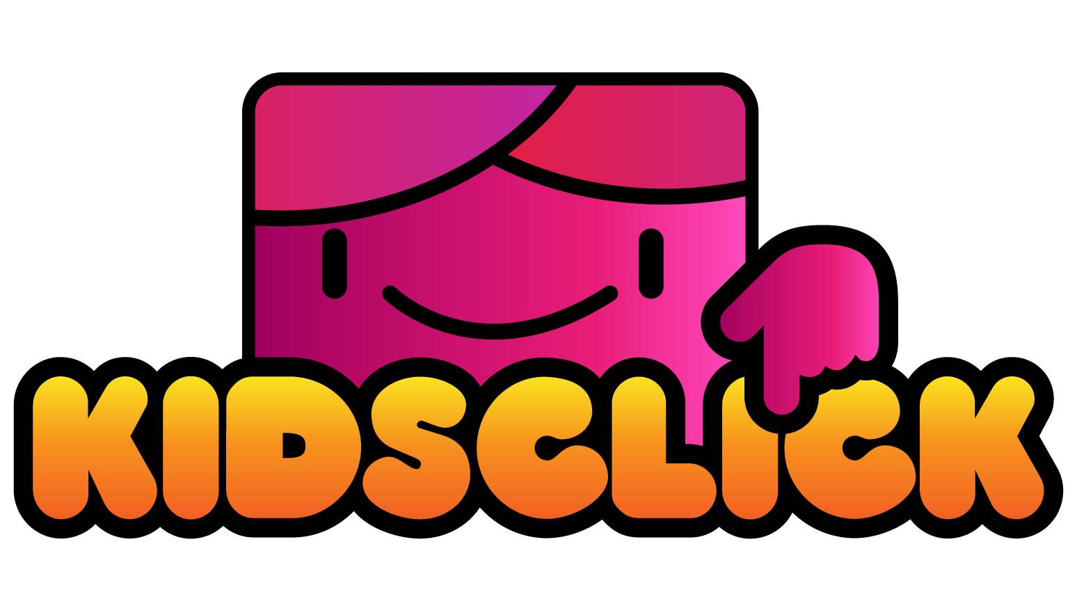
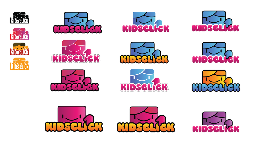
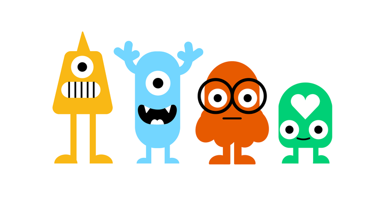
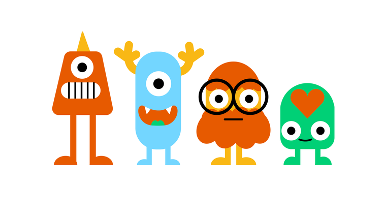
Option D: "The Big Guy"
The big orange monster balanced approachability for younger kids with quirky appeal for older viewers. It became the client favorite and was further refined to work in simplified forms, including as a TV bug or watermark, ensuring flexibility across platforms.
Streaming App
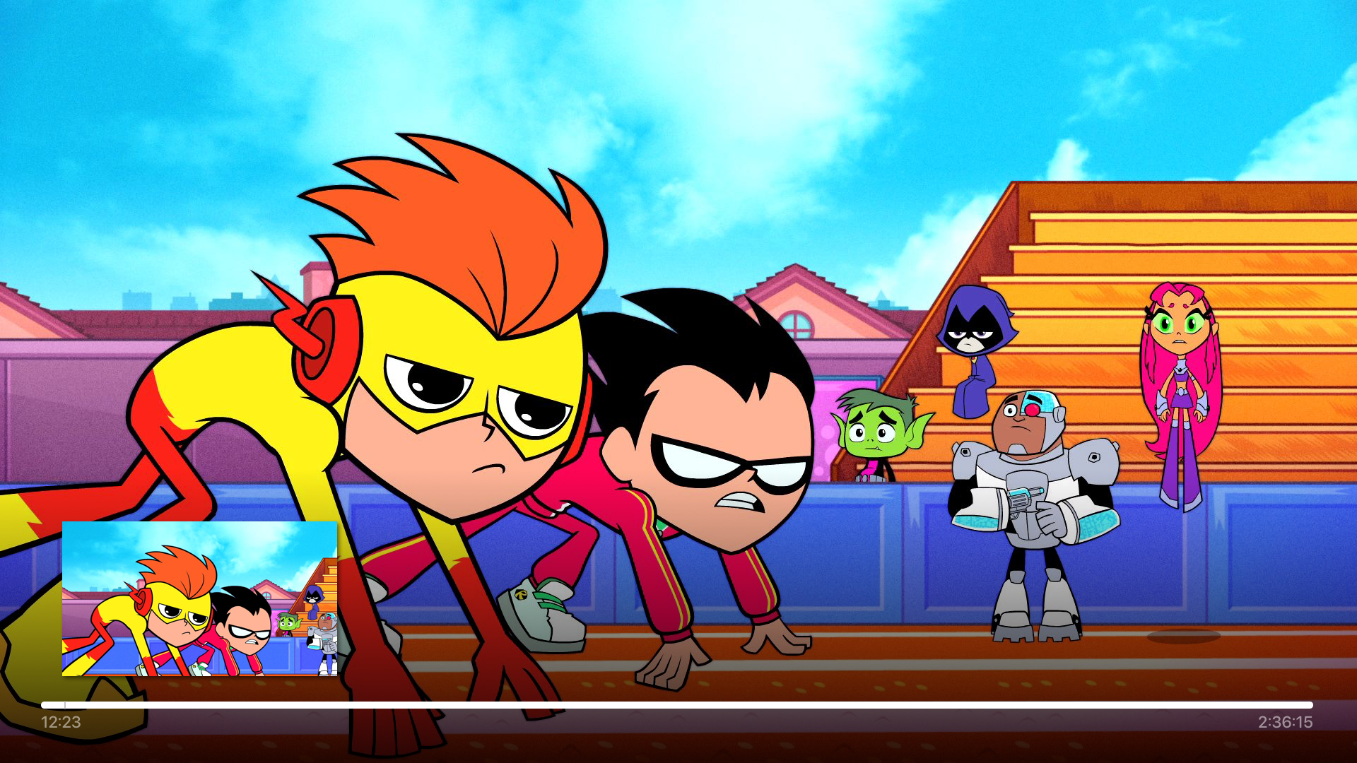
Concurrent to the branding I additional worked the streaming app, referred to Foozle while in development, an Apple TV app devoted to children's programming primarily consists of long-form animated series as well as some short-form content and aimed at children ages 4-10. It would provide both free and subscription based programming as well as linear and on demand streaming content.
The Foozle Apple TV app was designed while business and content strategies were still evolving, so early requirements focused primarily on establishing the core viewing, navigation, and account experience needed for a functional streaming platform.
Content Discovery
The Home screen prioritizes discoverability through a large featured carousel, a “What’s New” row, and category-based navigation that links to genre and show pages.
Navigation Structure
Primary navigation includes Explore for browsing genres, On Now for live programming, Search for direct content lookup, and Settings for account and app management.
Genre & Show Browsing
Genre sections present recent releases alongside a full grid of shows within that category. Individual show pages support multiple seasons, with organized sections for episodes, clips, latest videos, and related content.
Playback Experience
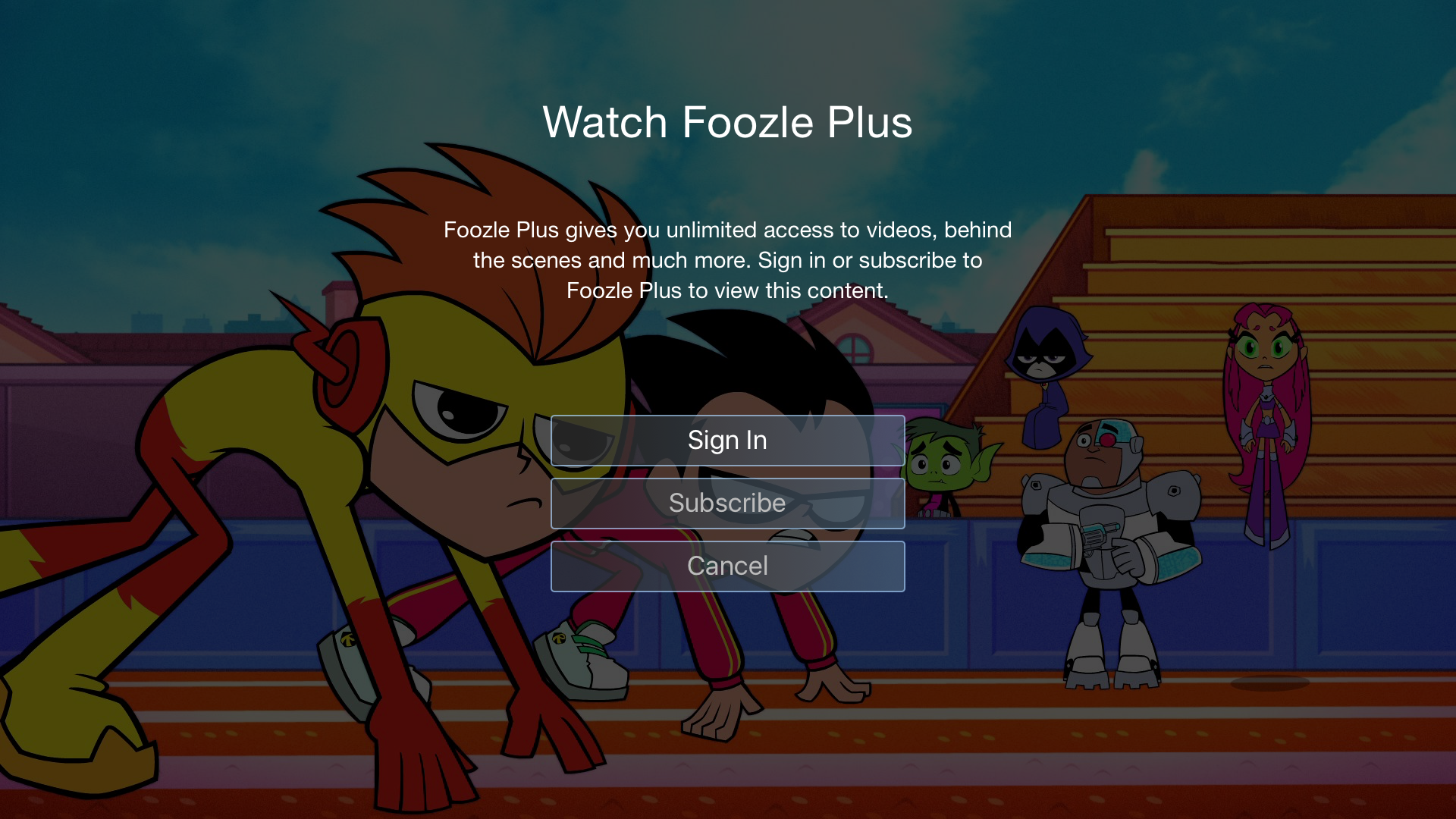
The video player supports scrubbing with preview thumbnails, autoplaying “Next Up” content, and related content recommendations. Live programming includes an EPG overlay for schedule browsing and a dedicated On Now viewing experience. A paywall integration supports subscription access.
Account & Settings
The settings area enables account activation, subscription management (Foozle Plus), login/password entry, account switching, sign-out, and access to subscription terms and legal information.
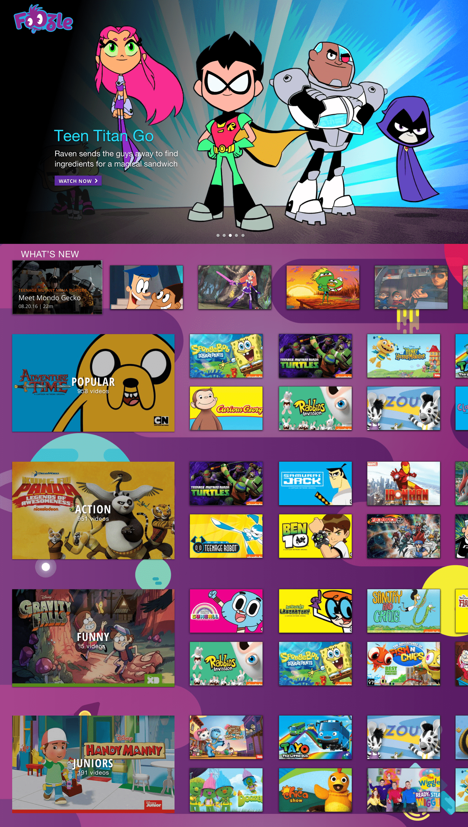
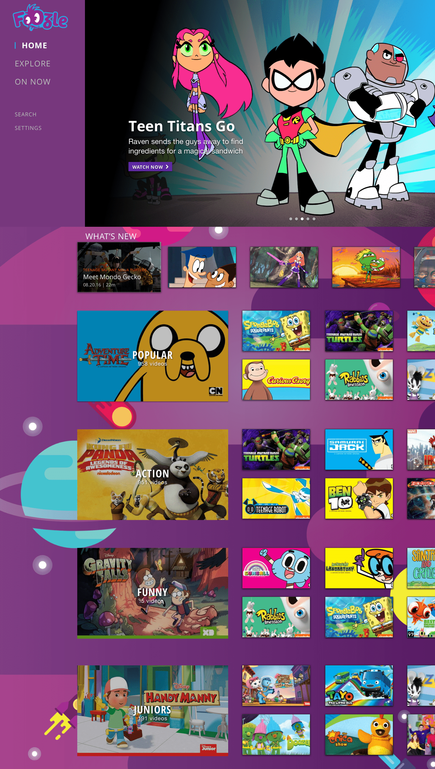
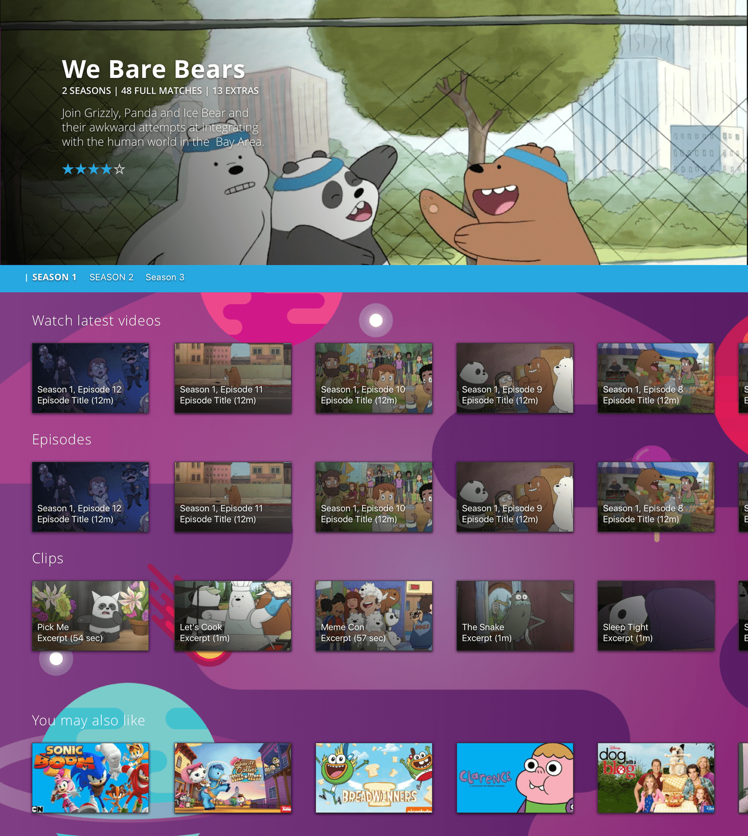
The homepage was designed around user needs and key requirements. A large hero carousel highlights featured content while allowing quick navigation for users who just want to start watching.
Because this page is often the first experience users see, we also prioritized discovery of the latest content. With no favorites or show subscription features initially available, we added four additional categories for easy access: Popular (a familiar convention from competitor apps), Action, Funny, and Junior to support younger viewers and their parents.
An expandable menu provides access to Explore, On Now, Search, and Settings, ensuring both frequent and occasional features are easy to reach.
01 Home
Genre Page
The genre page serves as a hub for discovery, letting users explore new content or find their favorite shows and the latest episodes. It features a hero for promoted content, a carousel for recently added titles, and a grid displaying all shows within the genre.
Show Page
Each show has its own page, designed in two versions to accommodate different content volumes:
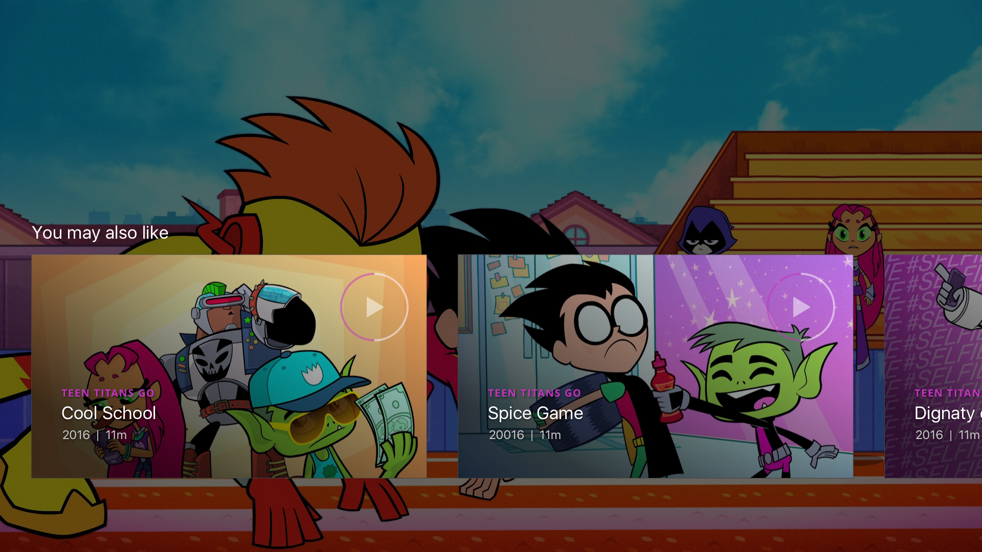
Single-Season Shows – All episodes appear in a carousel, alongside Clips (previews and trailers) and a Watch Latest section that aggregates the newest content. A You May Also Like carousel encourages continued discovery based on user preferences.
Multi-Season Shows – For shows with multiple seasons, users can filter content by season. Selecting a season updates all relevant sections on the page, keeping navigation intuitive even with large amounts of content.
02 Content pages
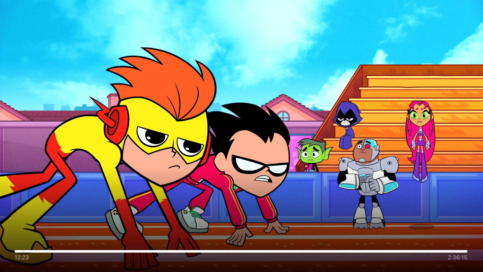
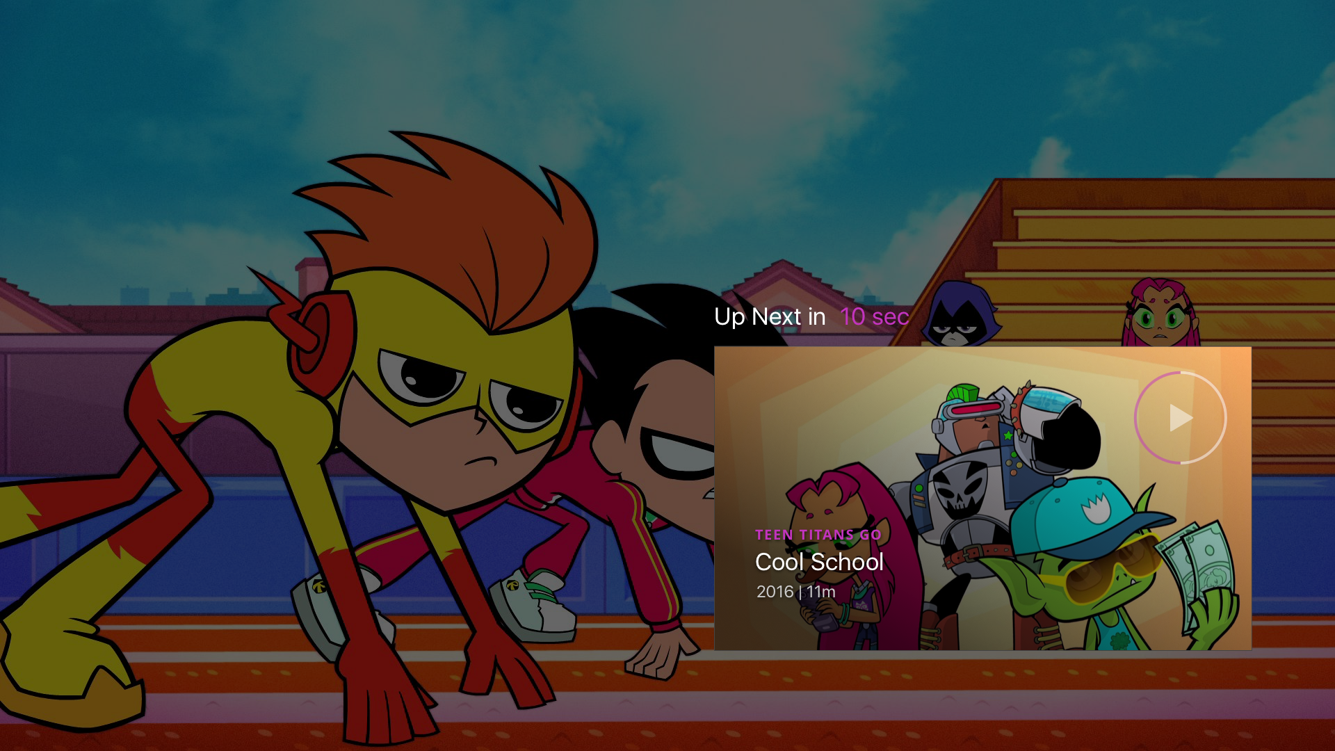
The full-screen watch experience follows industry standards, featuring pause, scrub, and autoplay for the next episode. Users can also select related content once a season or show finishes, keeping engagement seamless and intuitive.
03 Watch Experience
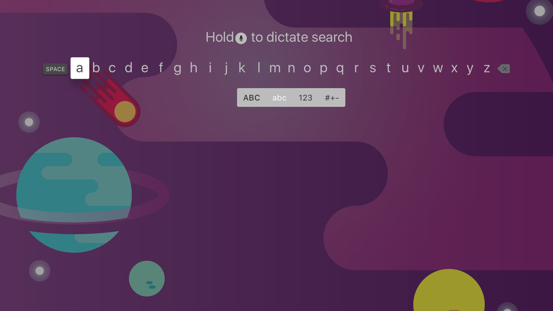
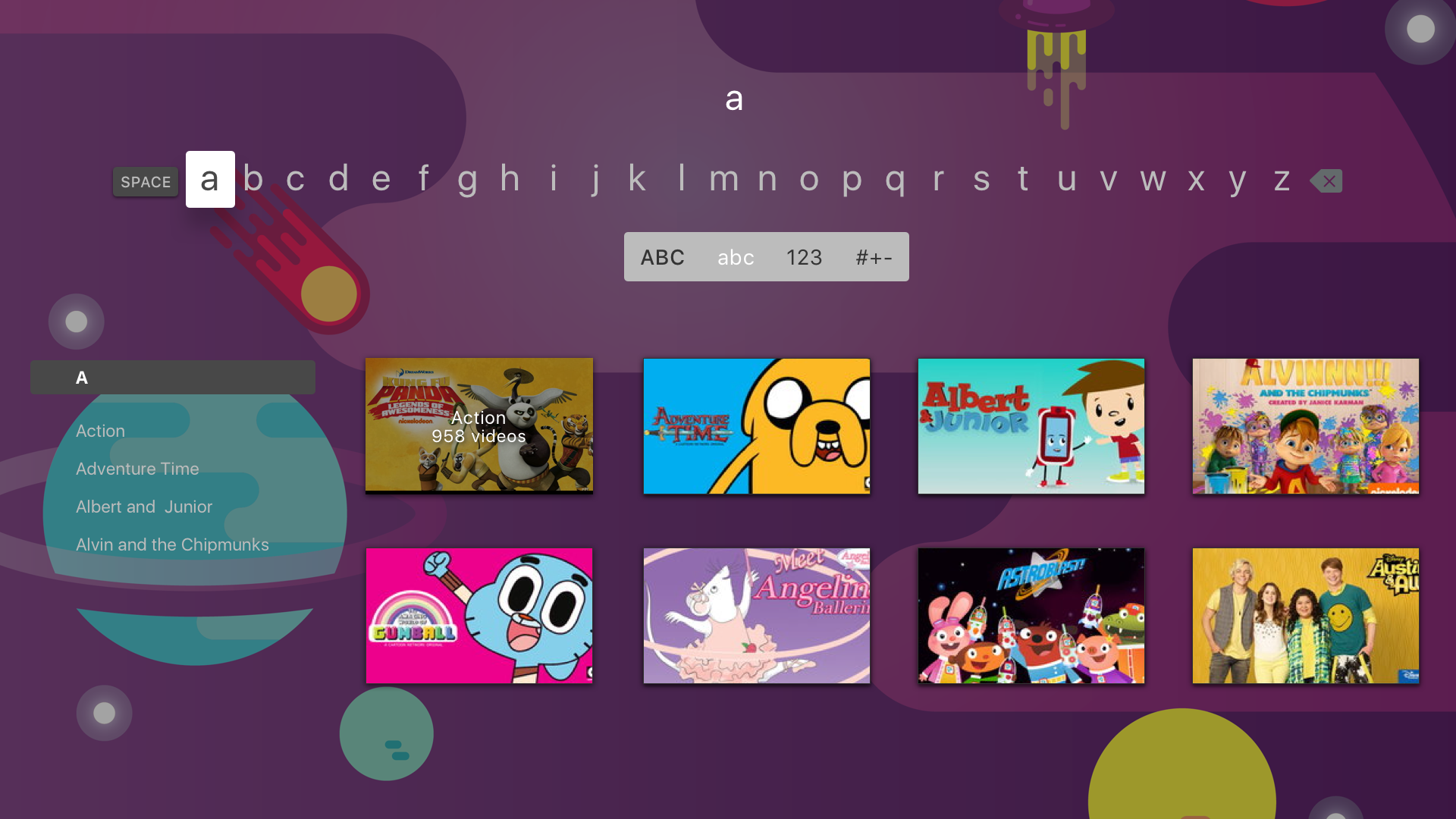
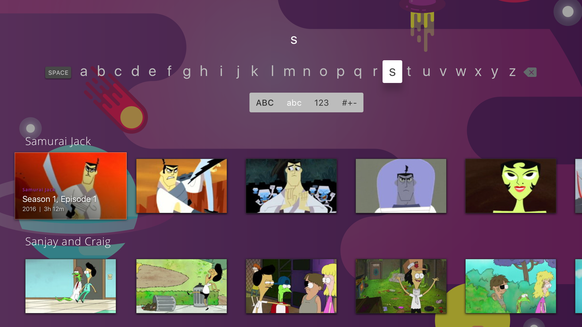
Two versions of the search experience were designed to accommodate different technical possibilities:
Version 1: Show & Genre – Returns matching genres first, followed by show cards linking to the genre or show page. An autocomplete helps users find results as they type.
Version 2: Show & Episode – Focuses on shows with directly accessible episodes, dynamically populating results as users type, allowing quicker access to specific content.
04 Search Experience
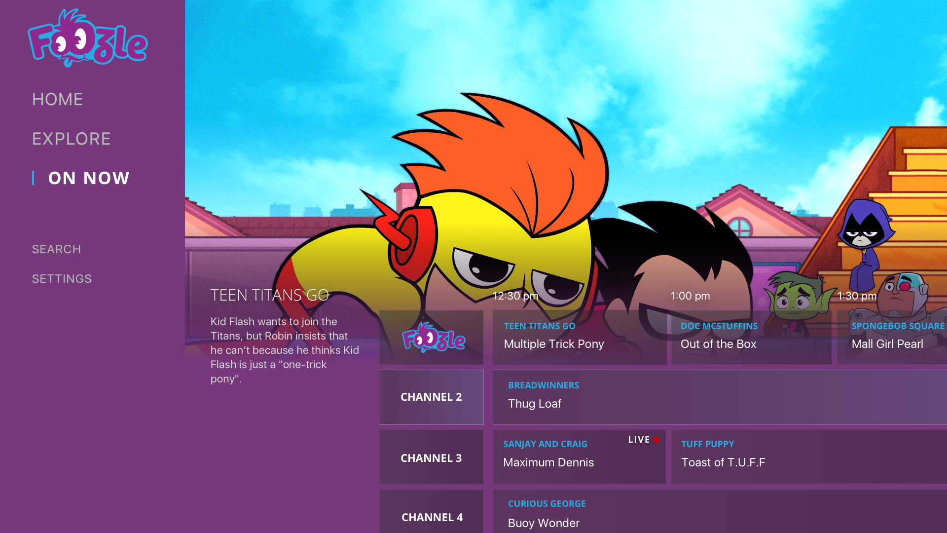
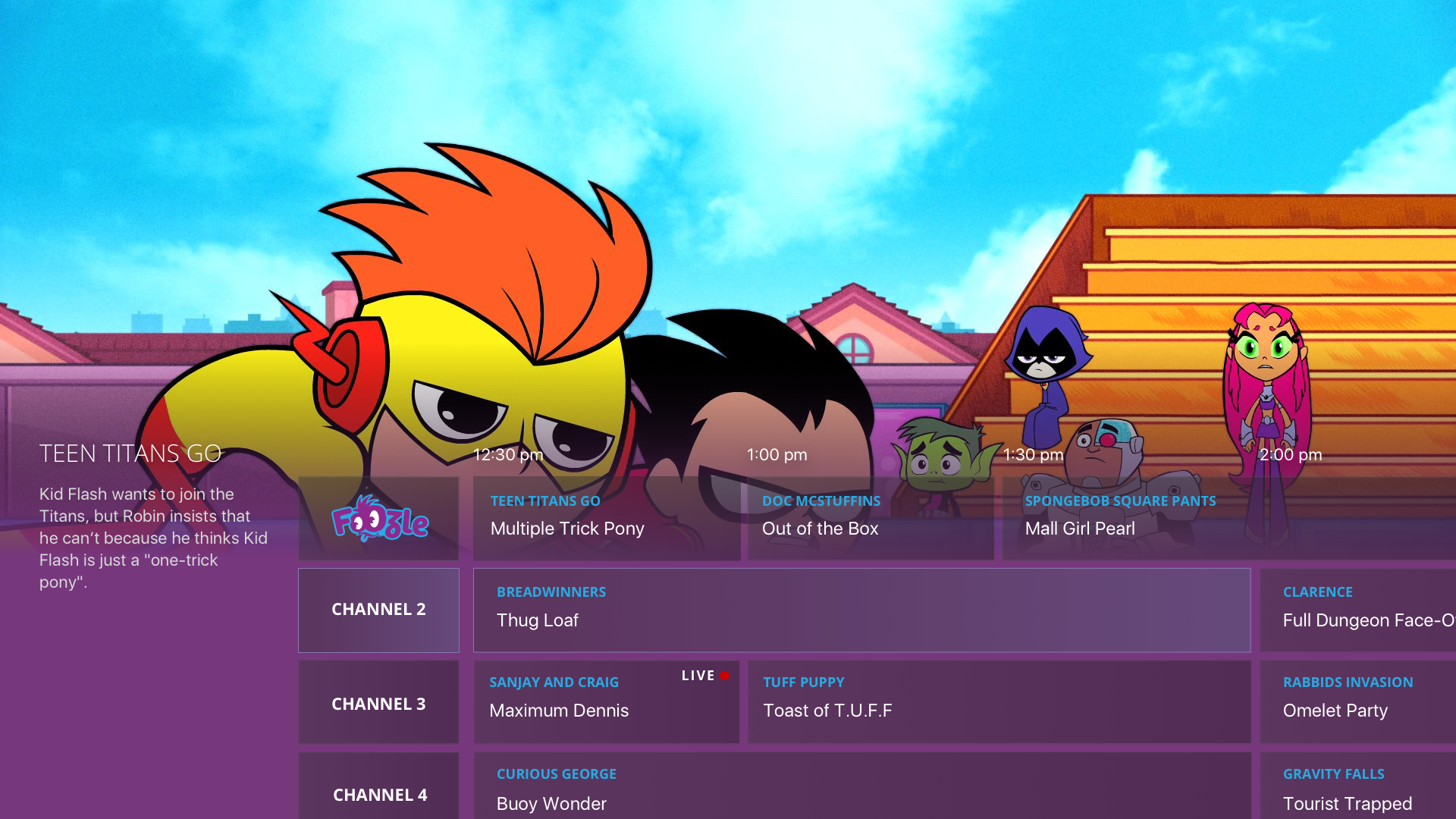
To support the eventual inclusion of a linear stream, we designed an On Now experience and electronic program guide (EPG). While the initial launch featured a single Foozle stream, the design anticipates future expansion with multiple streams based on genre, age group, characters, or content length, as partnerships and offerings grow.
04 On Now/EPG
Web Experience
In parallel with the streaming app and national TV block, I explored the web version of the platform as part of a small team at Sinclair Digital. Early work focused on the homepage, balancing minimal guidance with core requirements: a clean layout, an above-the-fold ad unit, navigation for Shows, Channel Schedule, and Watch Live, a large rotating hero carousel, trending content, an A–Z show list, and an optional live stream player.
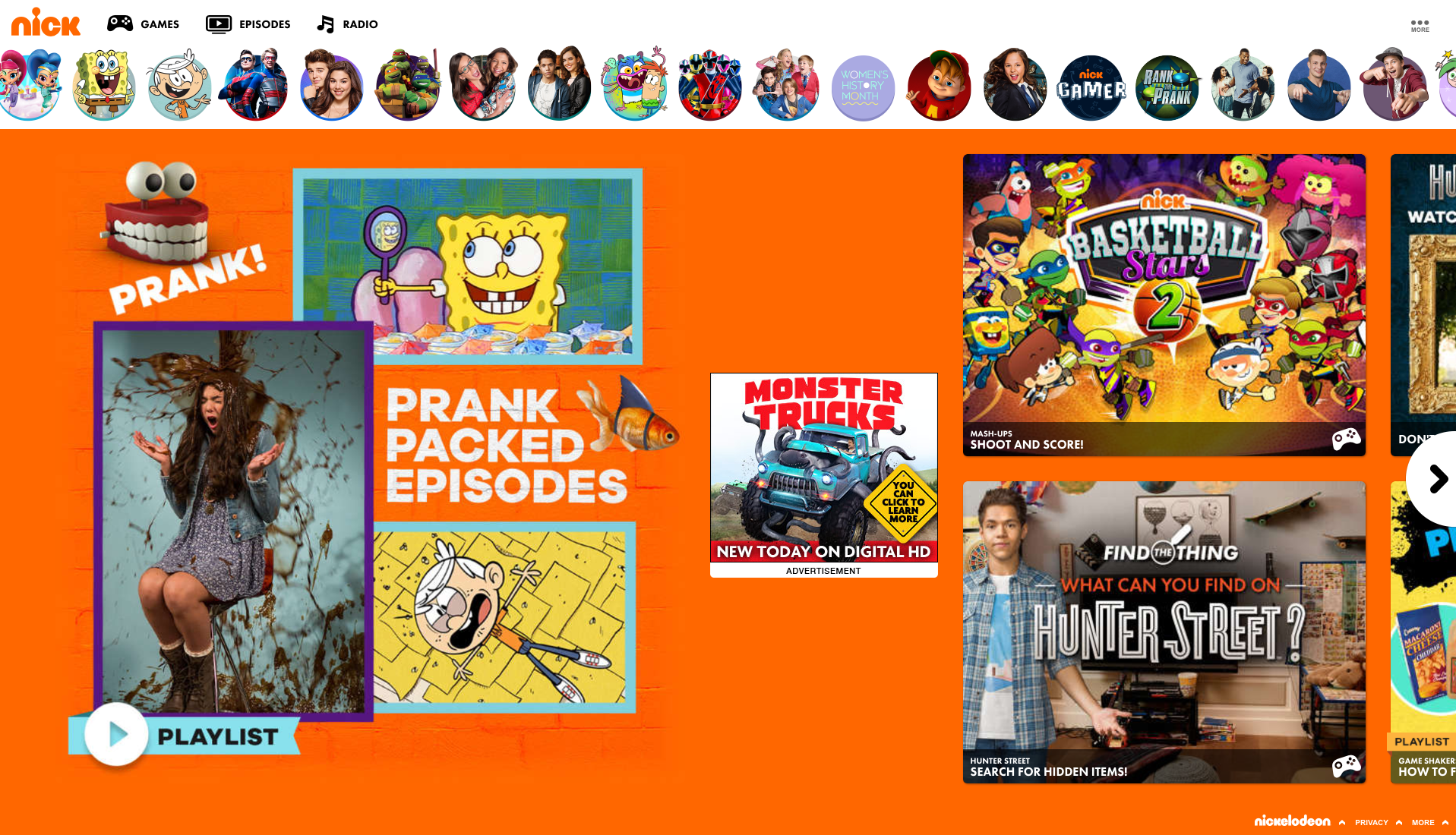
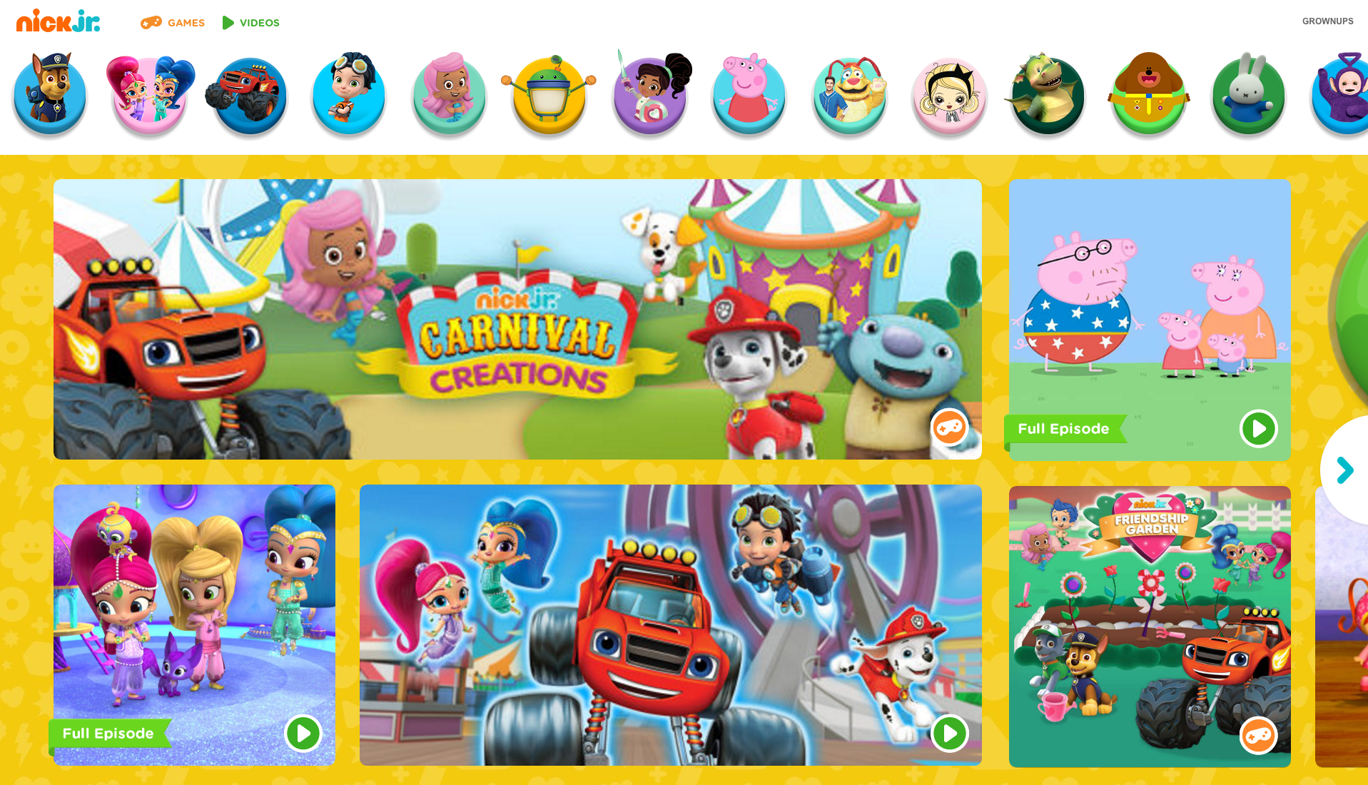
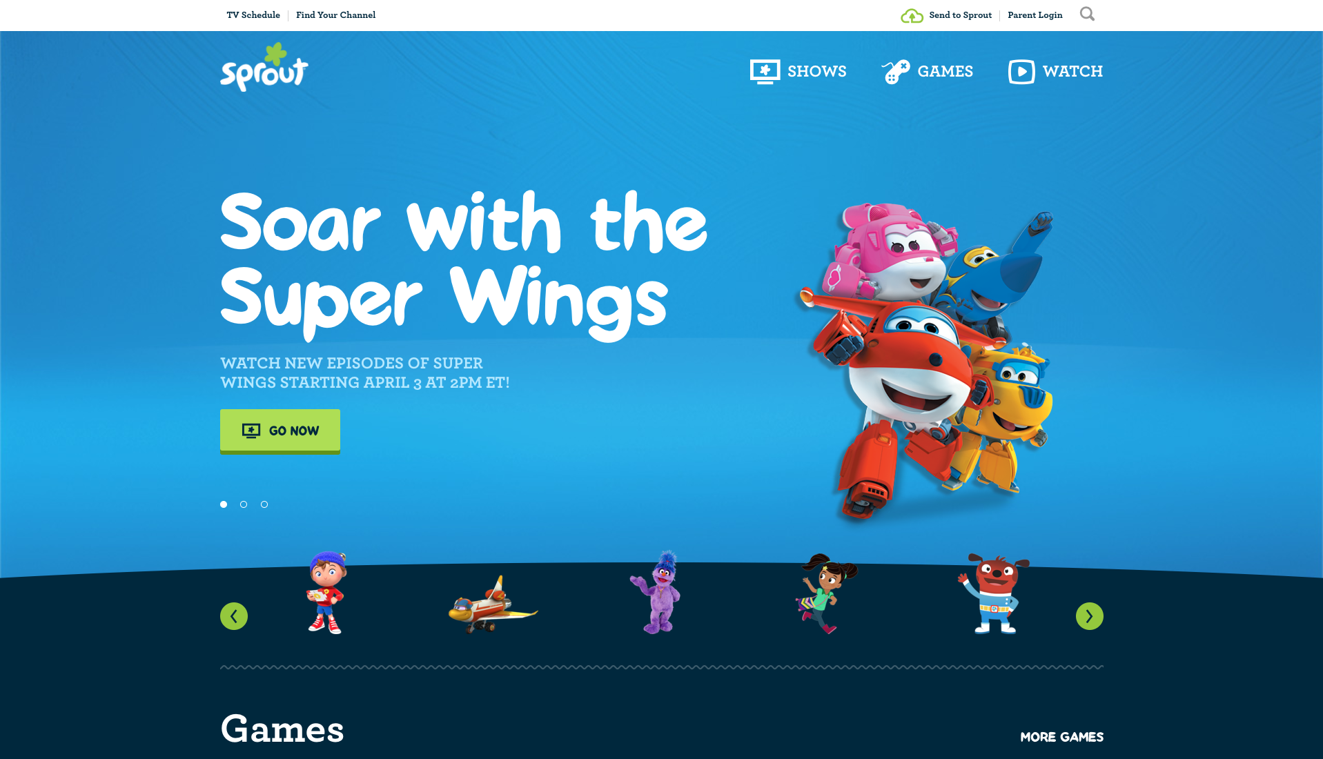
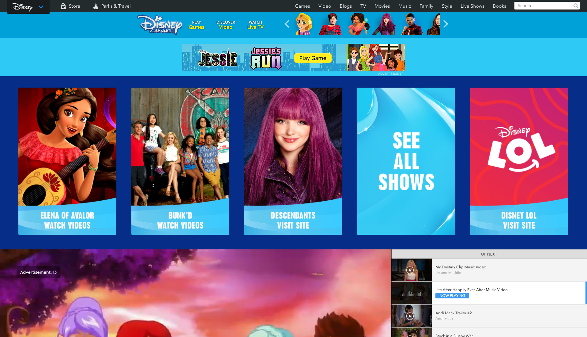
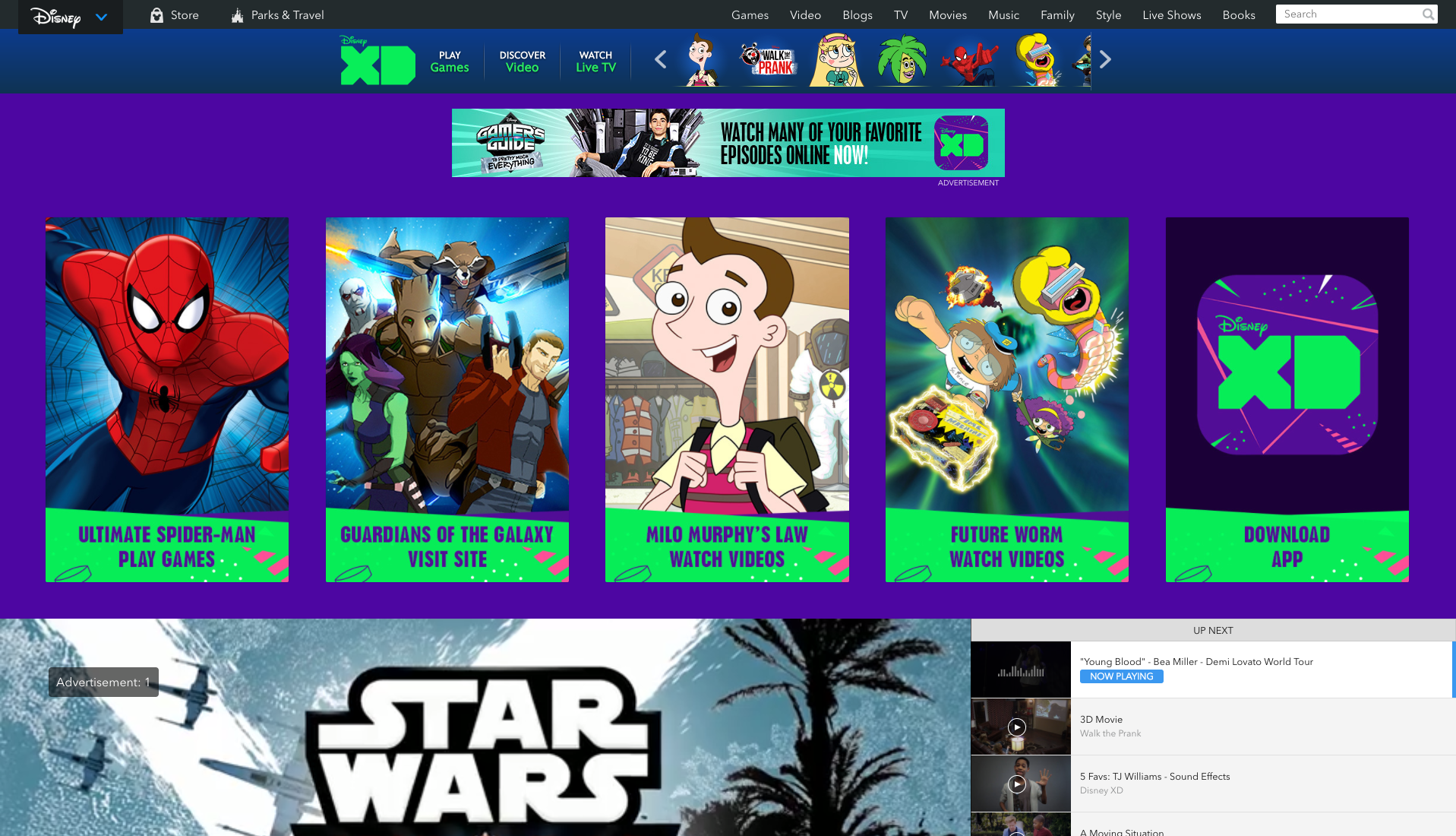
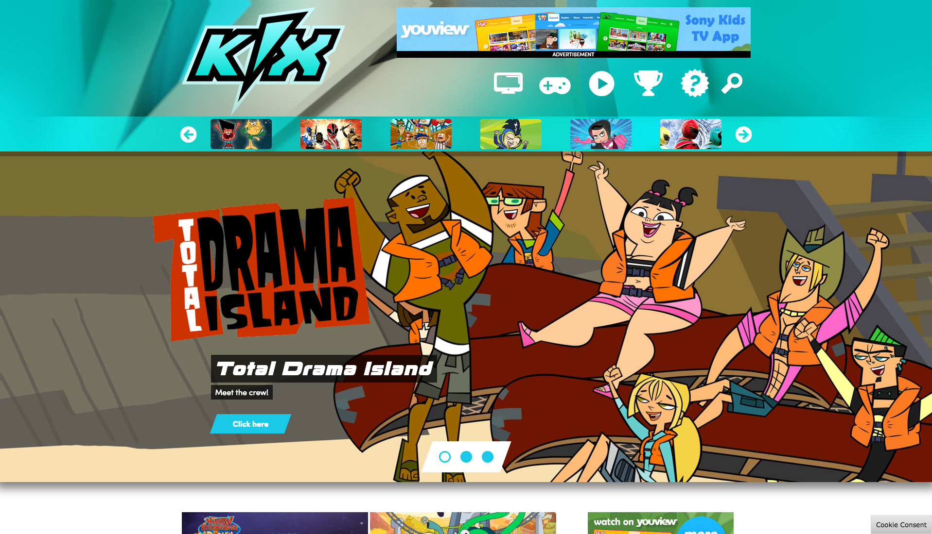
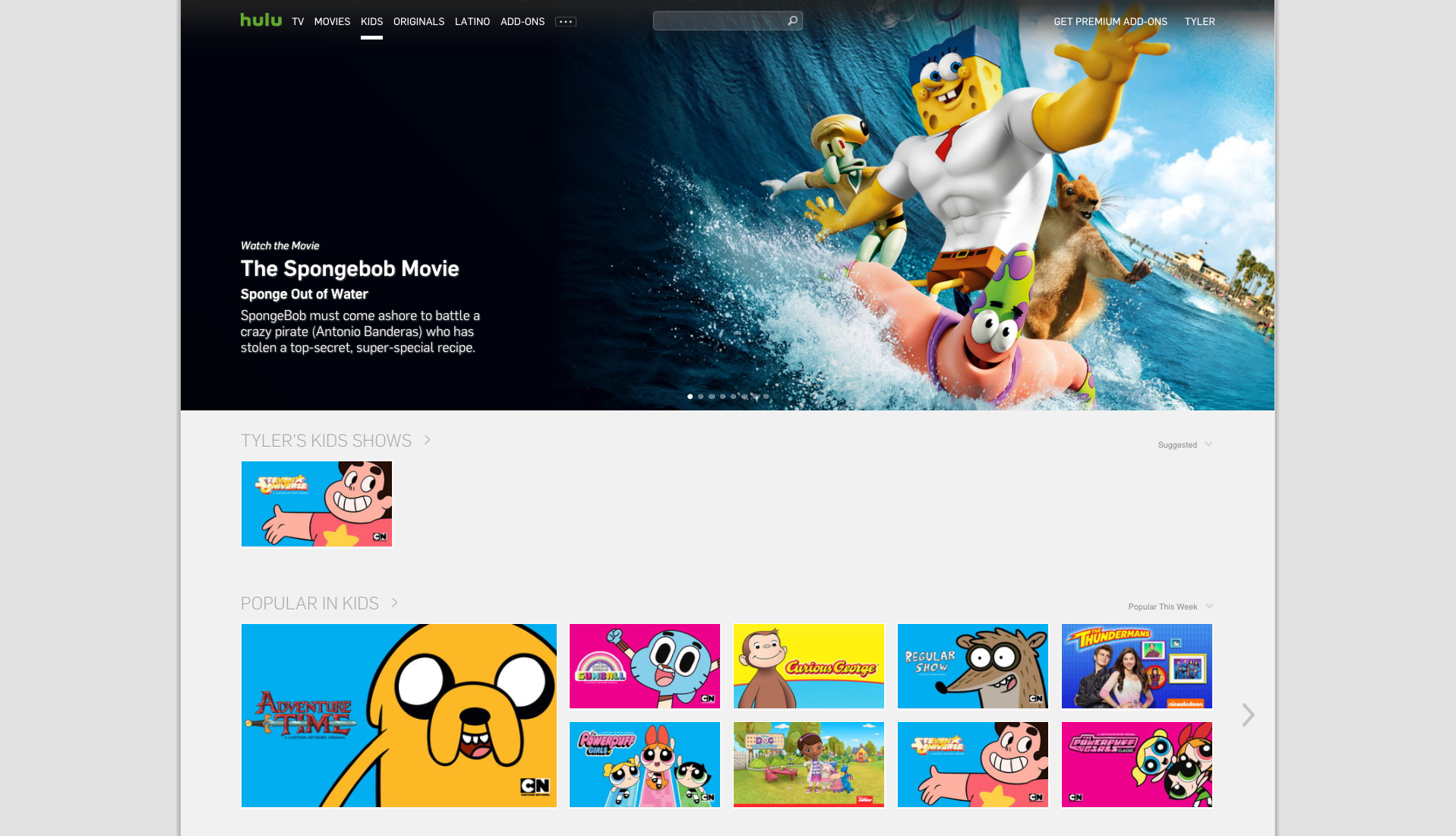

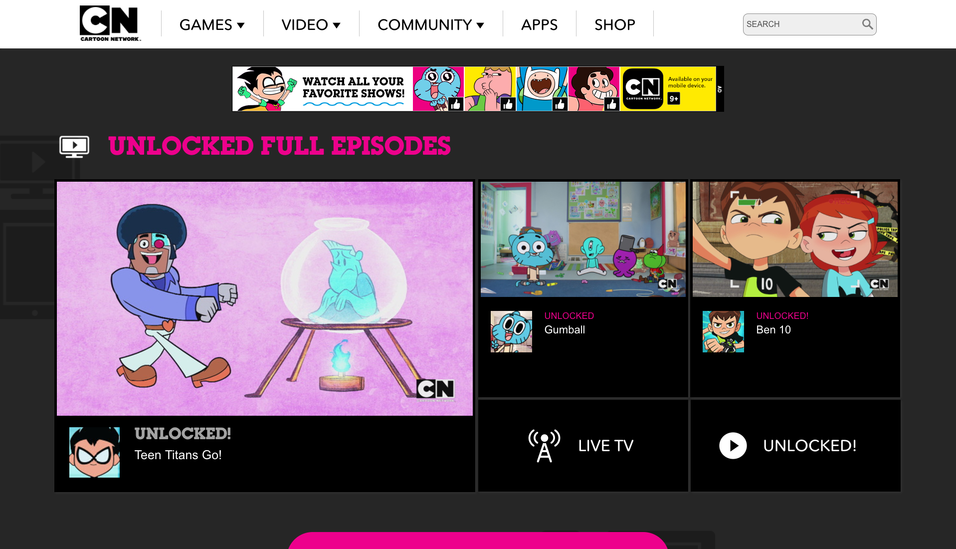
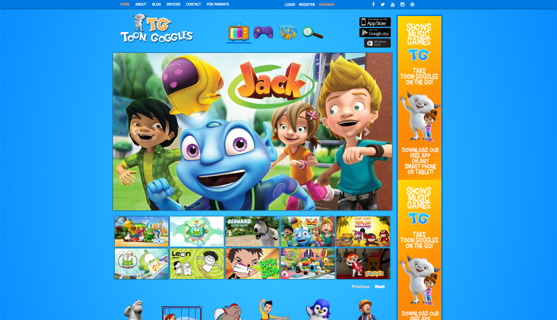
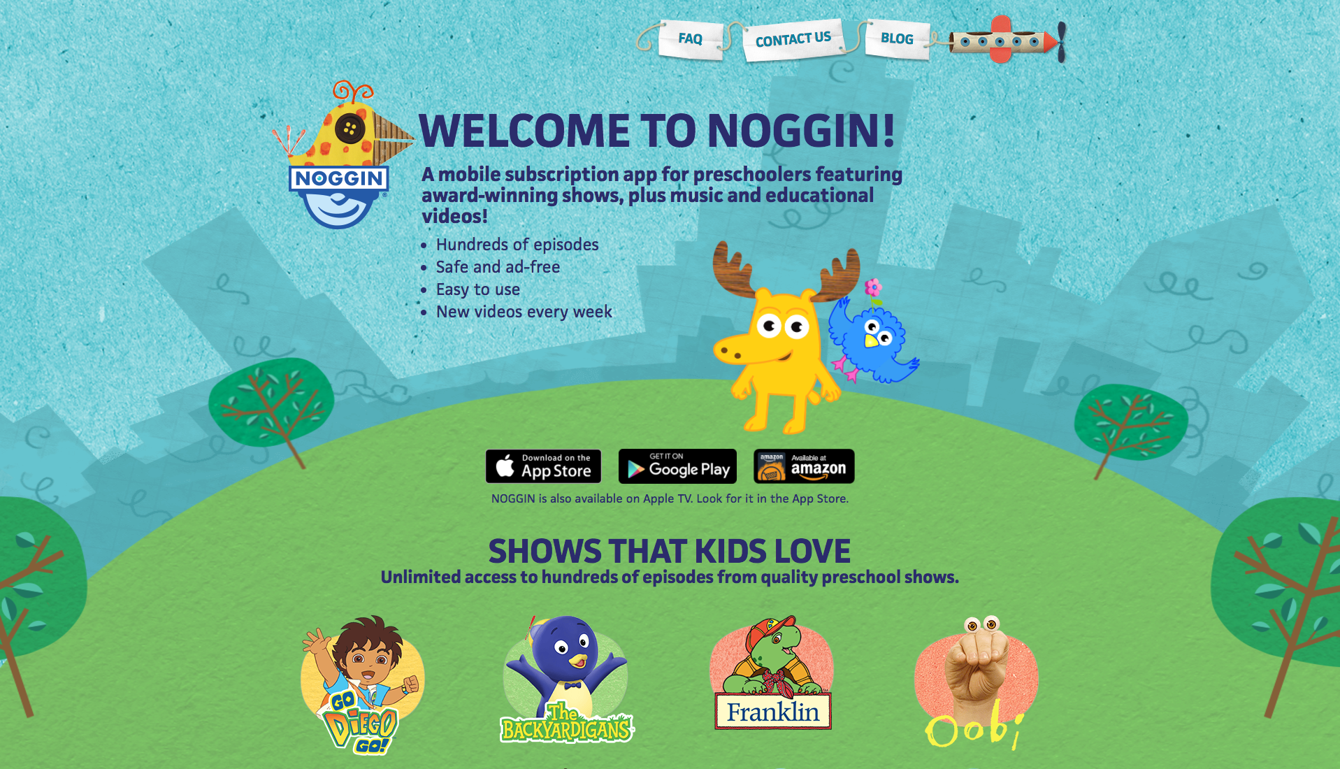
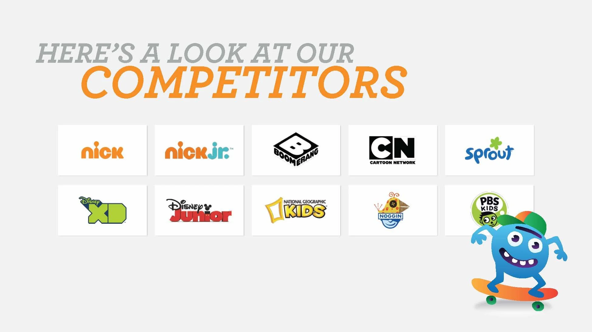
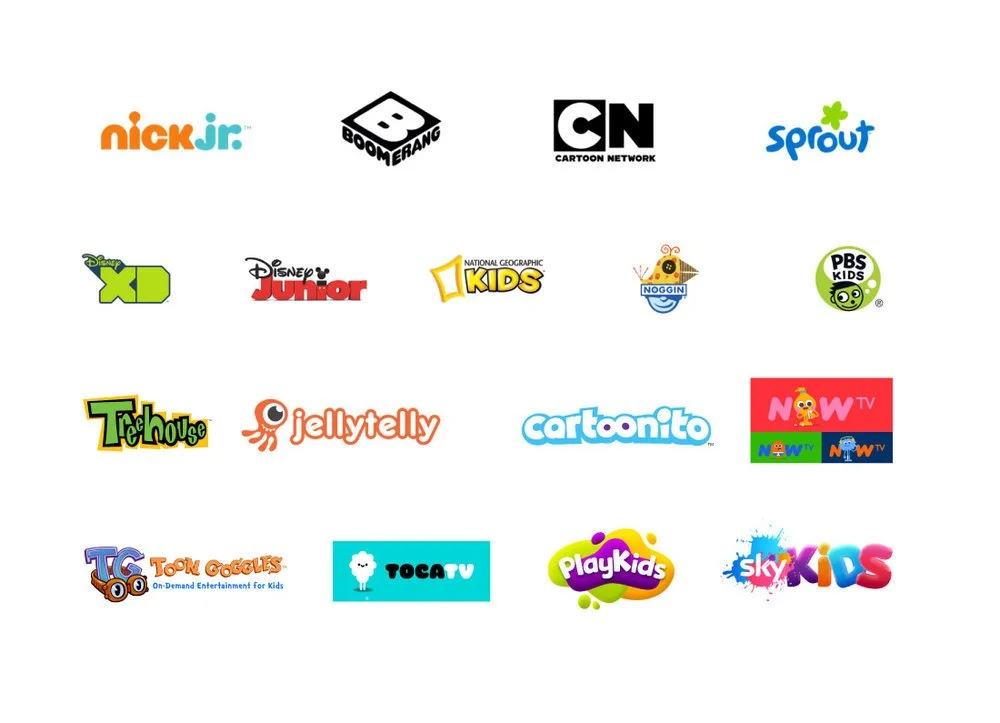
I began by researching competitors’ OTT apps to identify trends and standards. This included apps from Nickelodeon/Nick Jr., Sprout, Disney/Disney XD, Six, Hulu, Toon Goggles, Cartoon Network, PBS Kids, and Noggin.
Two key patterns emerged: first, the use of recognizable characters and large, intuitive graphics; helping children navigate even before they can read. Second, simplicity: content should be accessible in as few clicks as possible, with a largely single-page experience that allows users to quickly browse and switch between a broad range of content. These insights guided the design of our web experience, particularly in using licensed characters in teasers, navigation, and promotional elements.
01 COmpetitive analysis
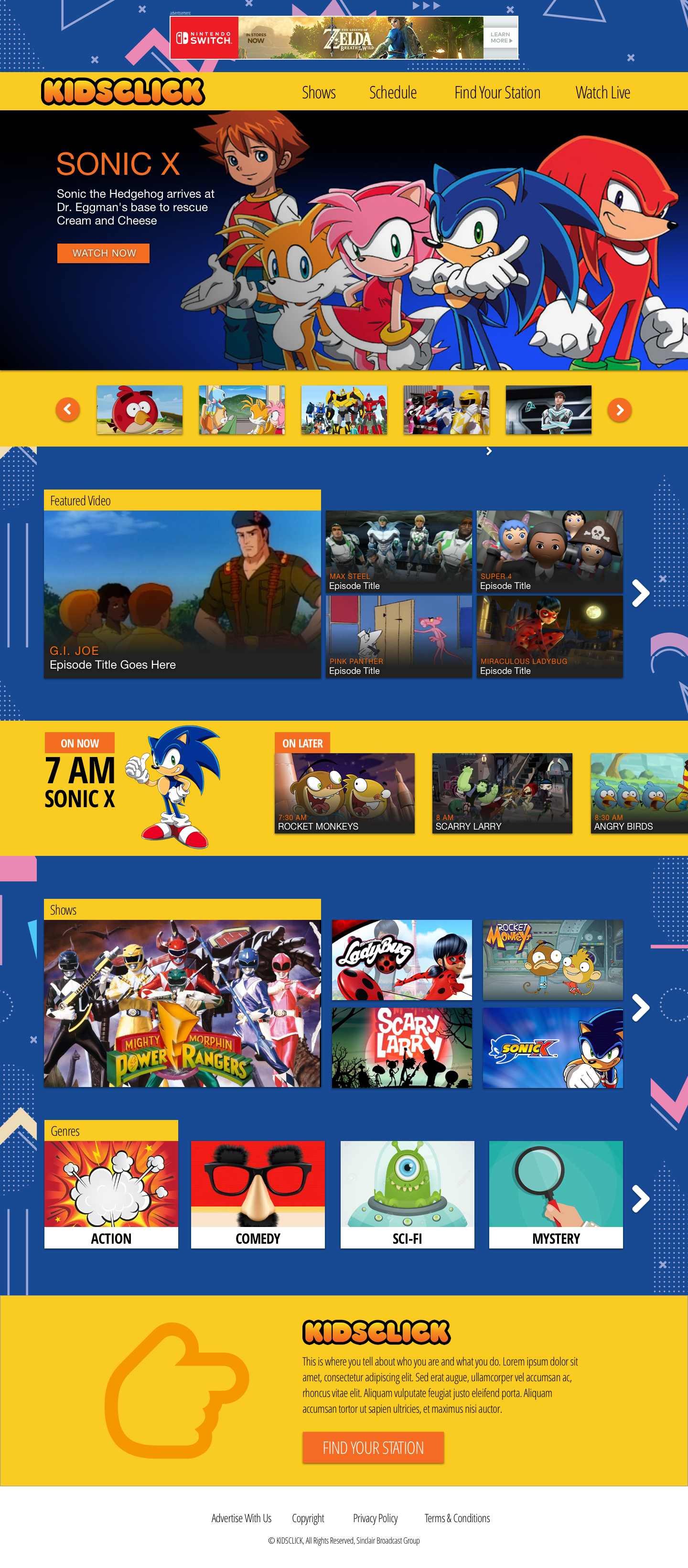
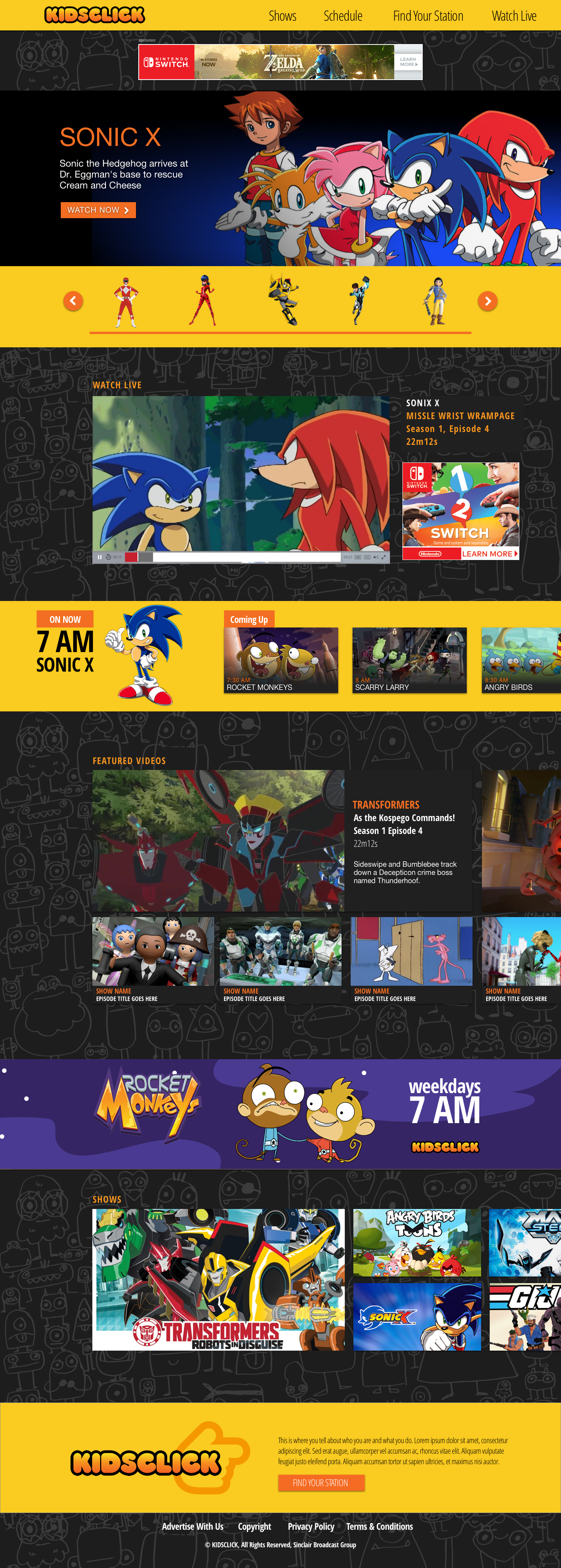
Option A: Immersive Panels – A full-screen, scroll-locking homepage that flips between sections. Features include a large content carousel, featured video cards with 300×250 ad placements, an A–Z show library with 300×600 ads, and a Who We Are / Find Your Station section for locating the Kidsclick broadcast block.
Option B: Discovery & Live – Focuses on content discovery and live viewing with a real-time schedule and quick access to genre sections. Includes multiple featured content areas, a screenshot-driven carousel for show navigation, featured videos, A–Z show library, top-of-page ad placements, and the Who We Are / Find Your Station section.
Option C: Live + Character Navigation – Emphasizes live viewing with character-driven navigation. Includes a linear stream player, content carousel, featured video cards with expanded details, integrated ads, A–Z show library, and the Who We Are / Find Your Station section.
02 Initial Concepts
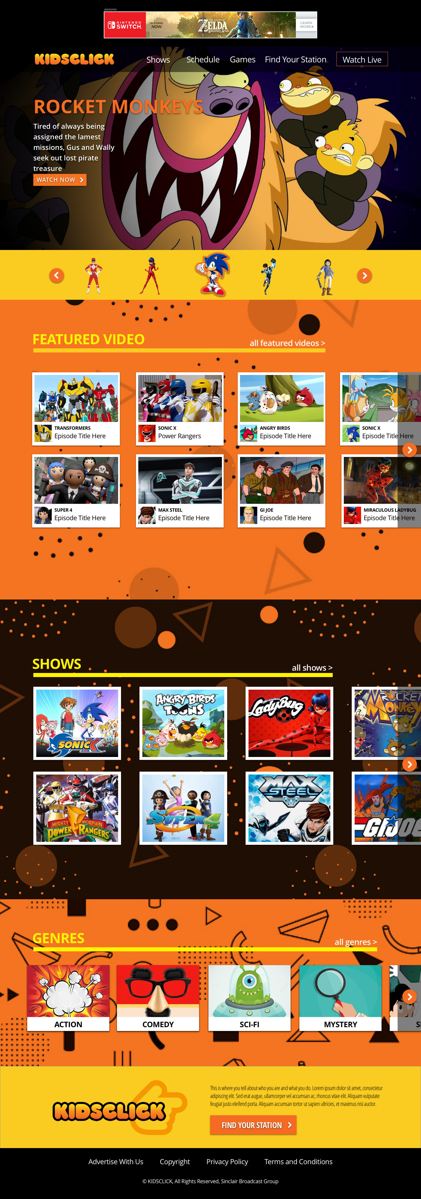
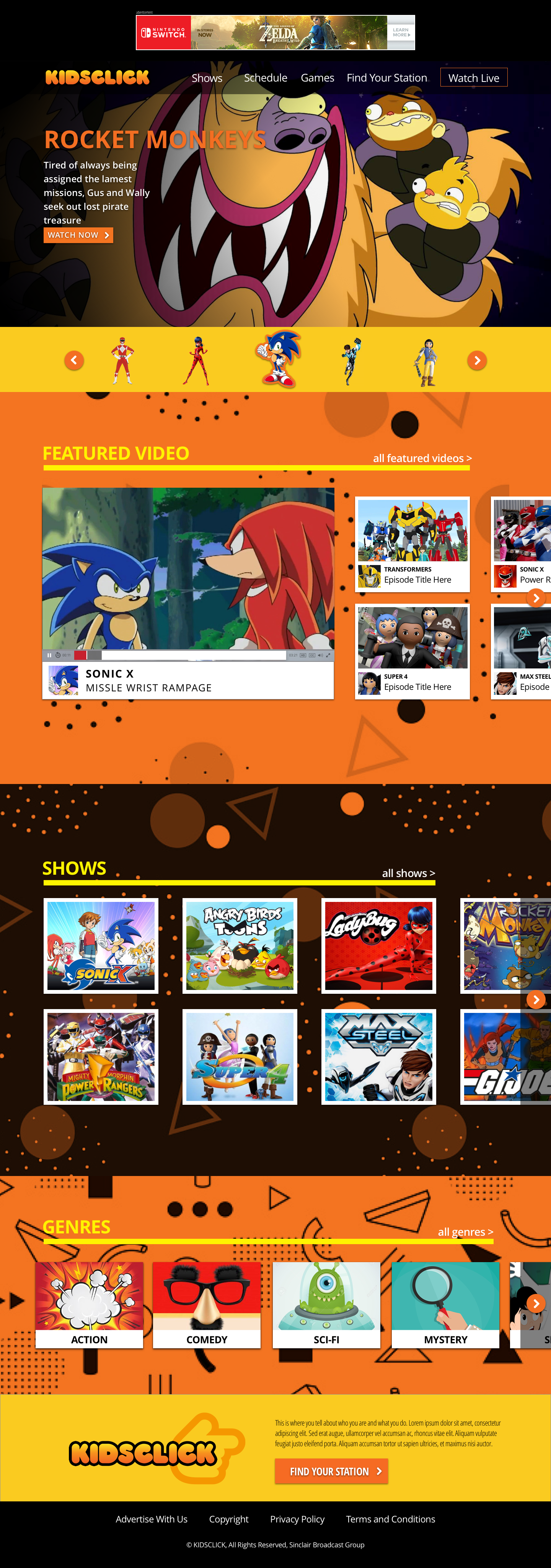
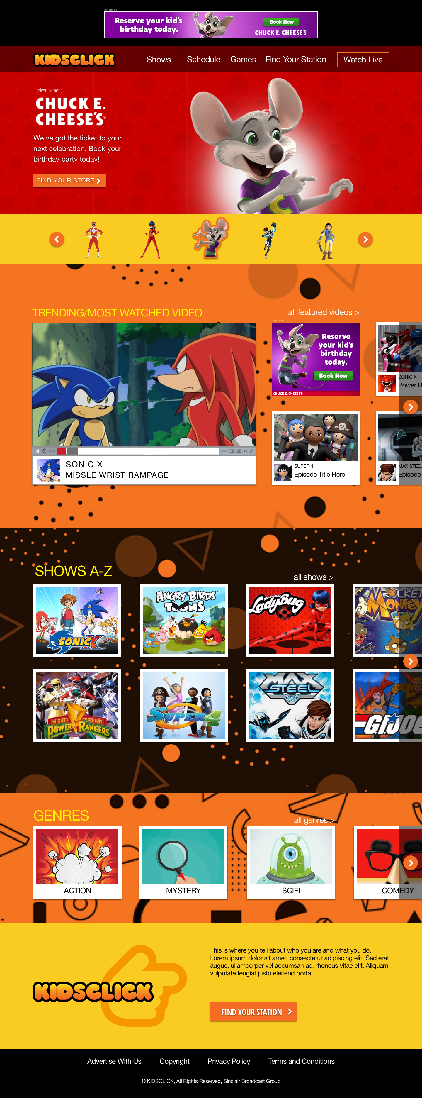
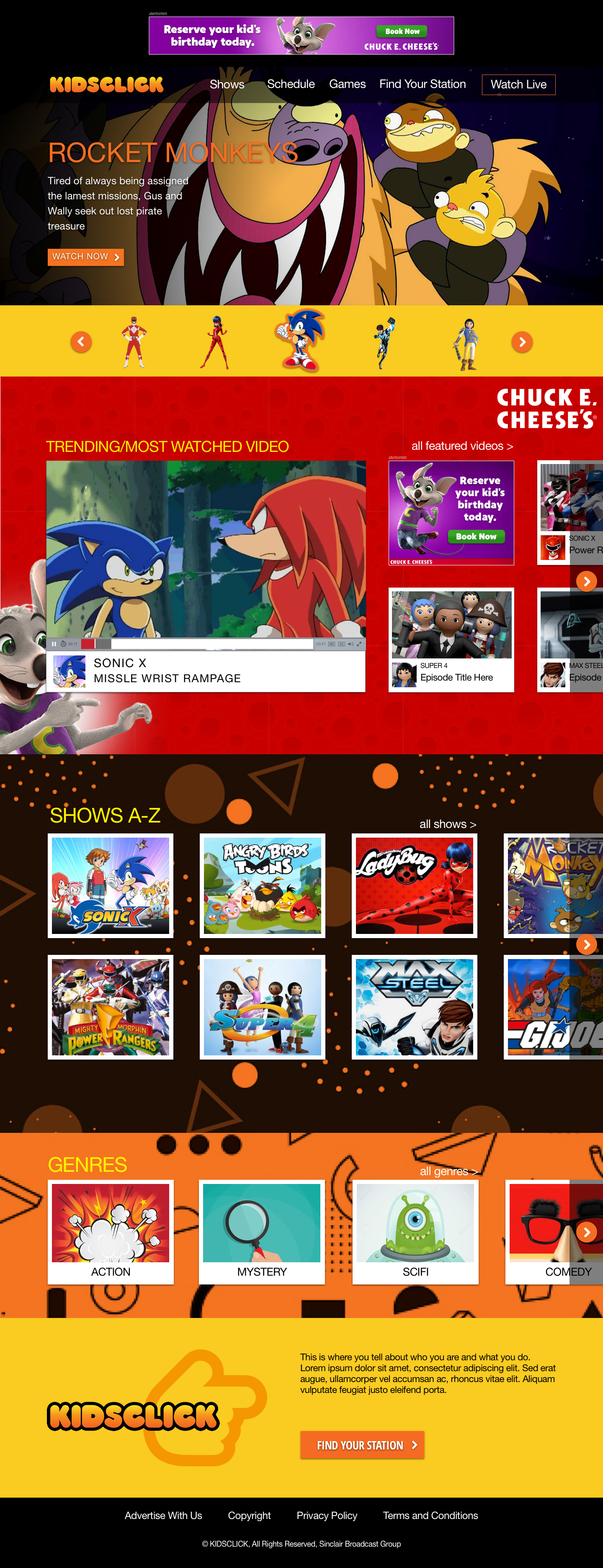
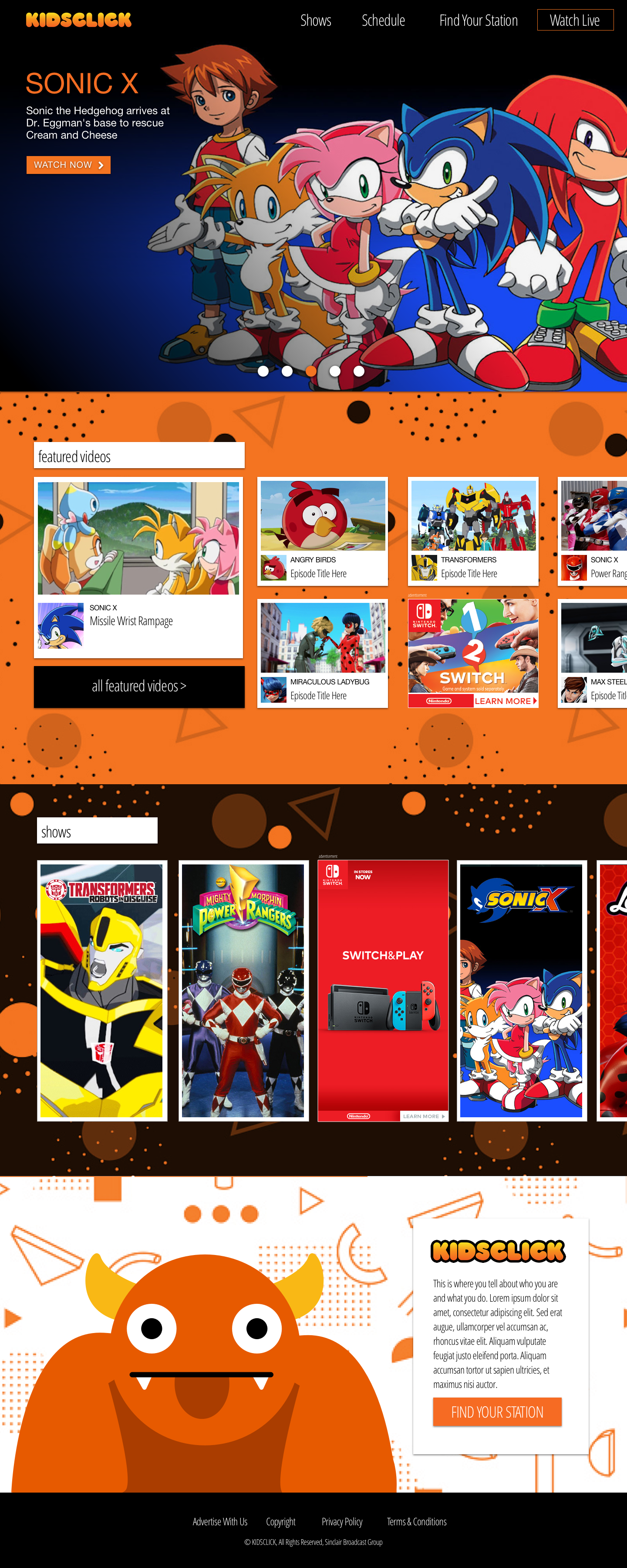
After reviewing initial concepts, the client chose a hybrid approach, combining elements from each design. The final homepage features an ad unit above the navigation, full-screen scroll-locking panels, and a large carousel using show characters to support recognition for younger audiences.
The layout includes 300×250 video cards (compatible with IAB ads), an A–Z show library, expandable genre sections, and a Who We Are / Find Your Station module highlighting the Kidsclick logo and “click” finger motif. Two versions were explored—one with featured video cards only and another with a live video player; the player version was selected to support future streaming expansion.
Because the platform launched as free and ad-supported, additional concepts were developed for homepage sponsorship and takeover units.