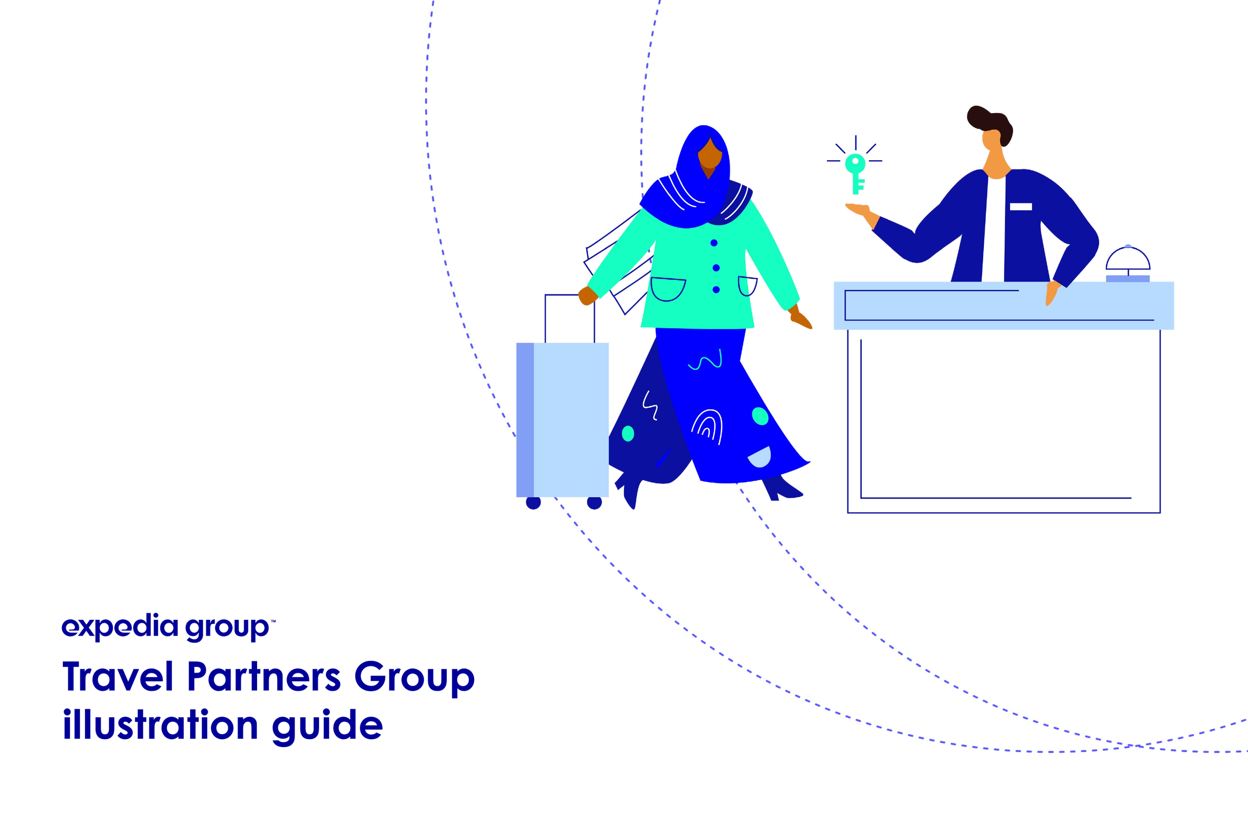
Expedia Group B2B
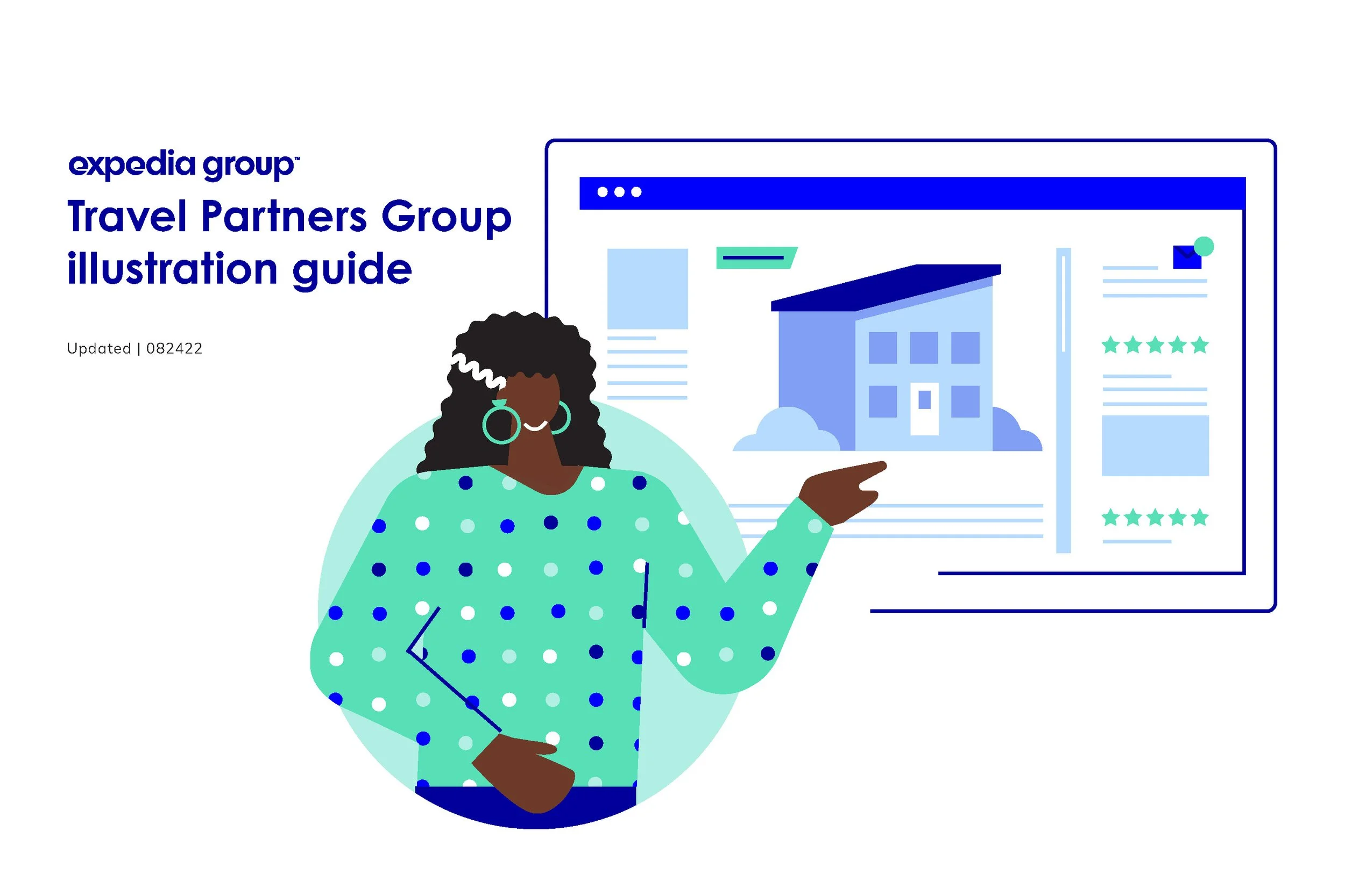
Illustration Guidelines
Brand
Drawing the business of travel

Client
Expedia Group
Role
Creative lead
Timeline
12 weeks
The Problem
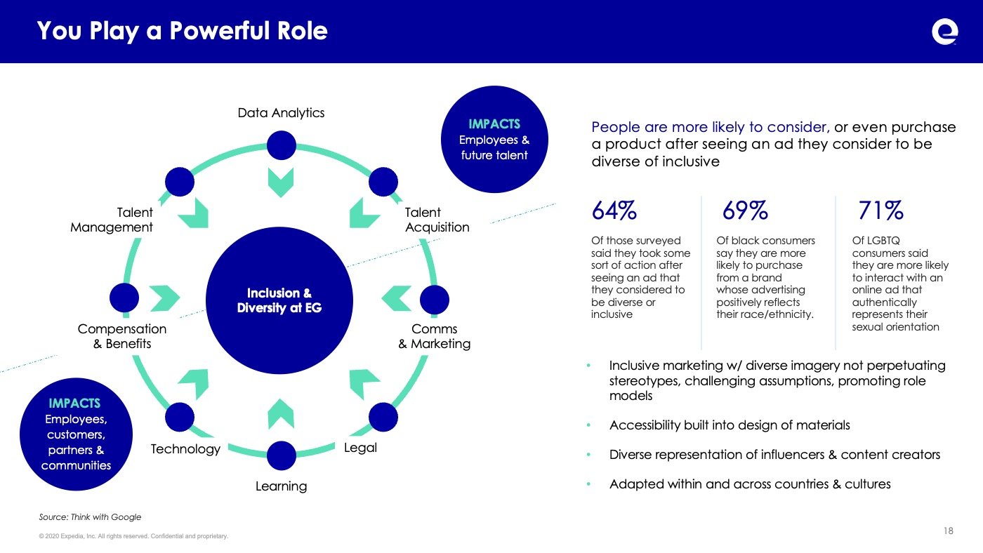
Expedia Group uses illustration everywhere, from products to marketing, print and web, internally and externally. However, the Travel Partners Group, the B2B pillar of Expedia Group who works directly with hotels and vacation rentals found themselves with different needs and ultimately a different audience than the B2C brand. This unique identity as well as a lack of a previously defined illustrative standards identified a need to create a guidelines for a consistent look and feel to the illustration that the team was using.
Considerations
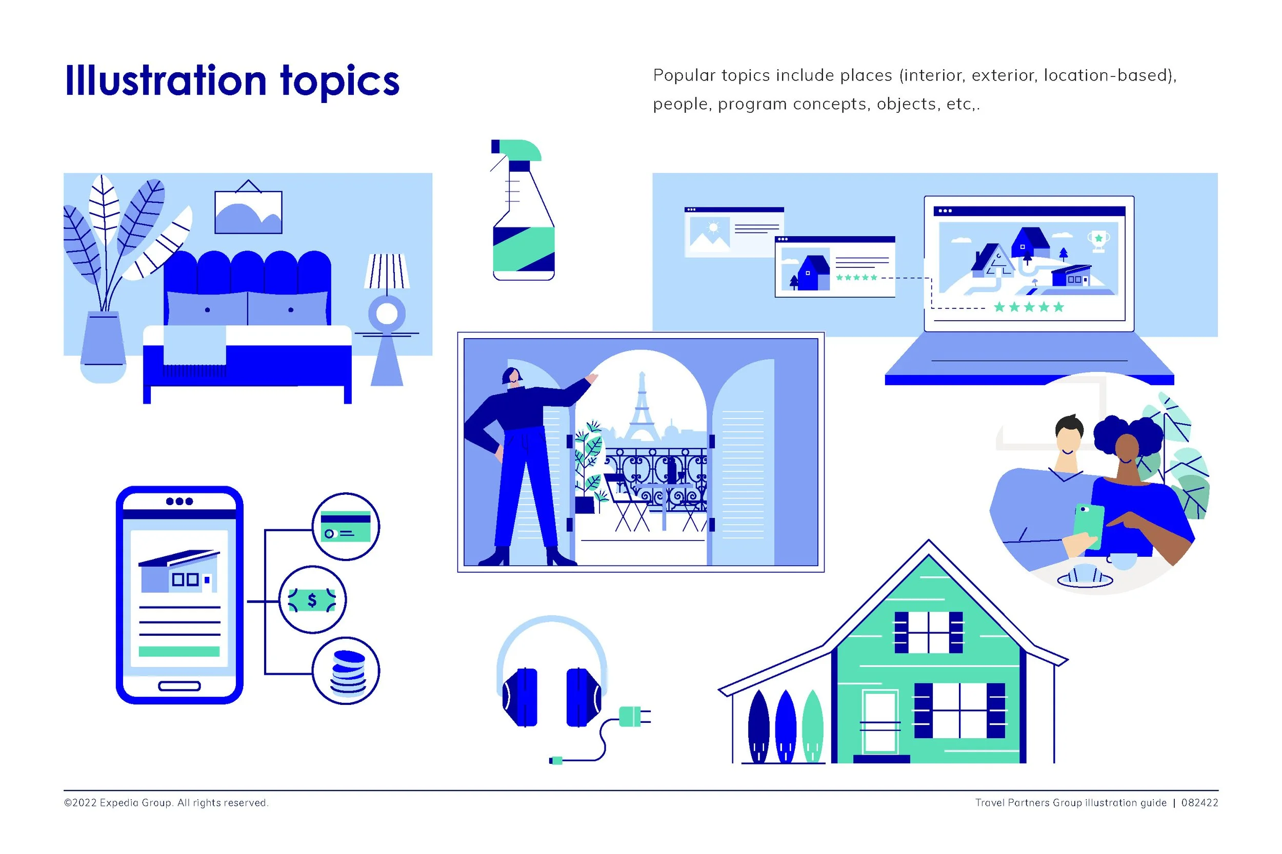
We began with a simple question; “Where do we use illustration” and the answer was everywhere. An exhaustive inventory found that every type of project that design touched either had used illustration in the past or had the potential to use it, from print to digital, product to marketing, it was everywhere. However there was no consistent style or application.
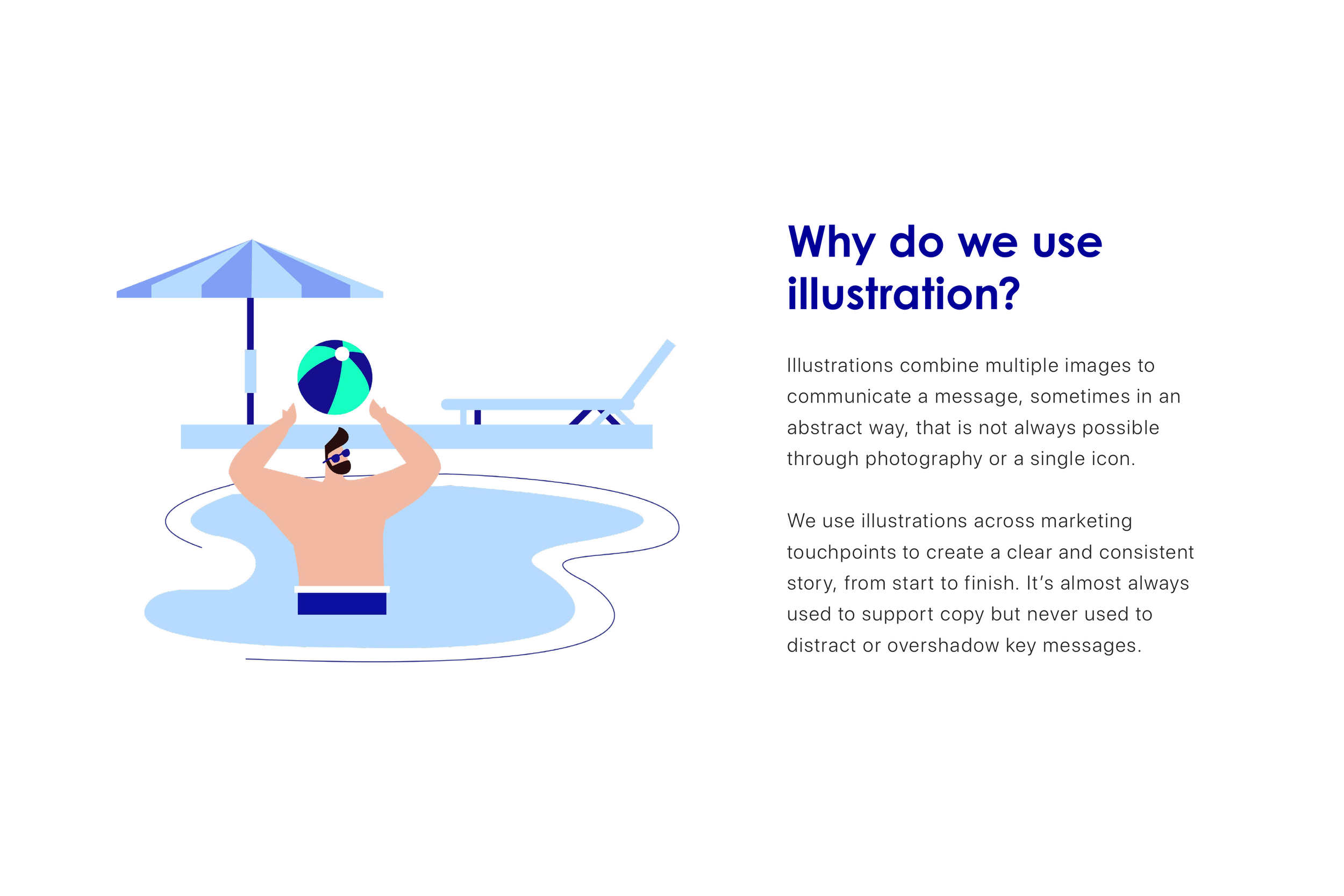
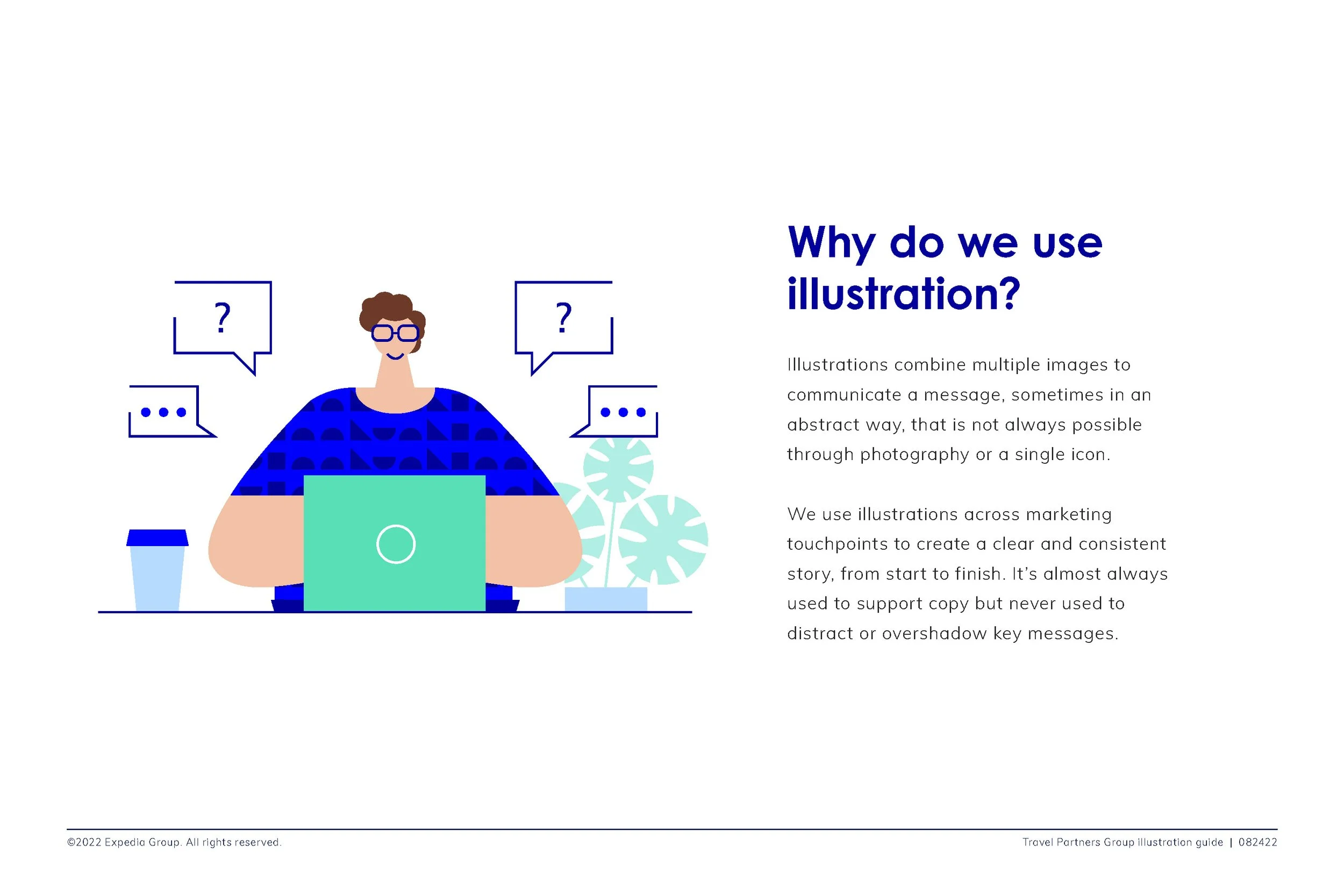
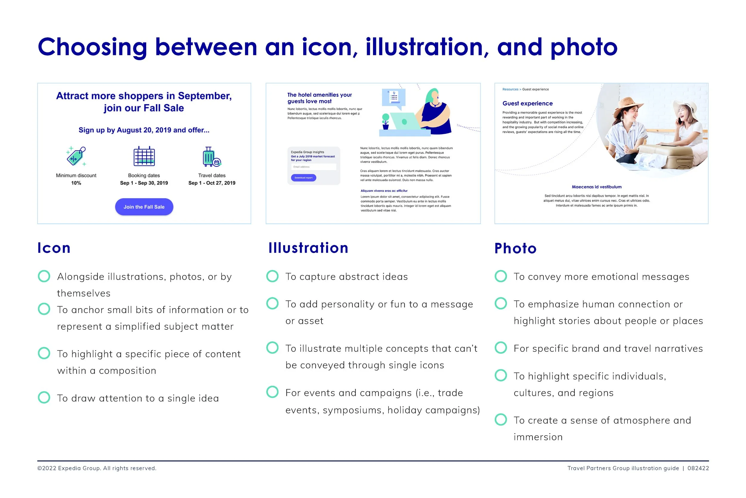
The next question was “Why do we use illustration” Answer: We use illustration across marketing touch points to support a cohesive, clear, and consistent story from start to finish. It's almost always used to support copy and should never distract or overshadow the key message
Criteria
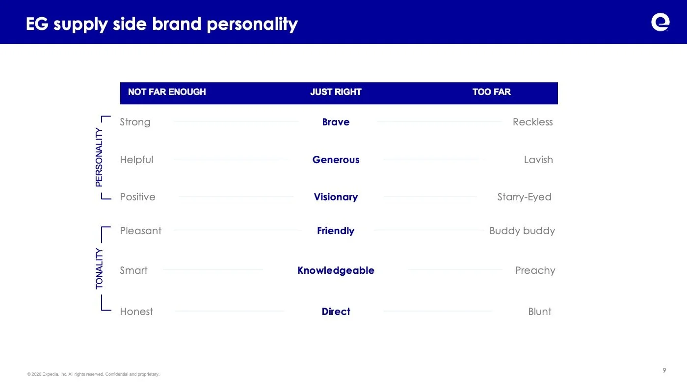
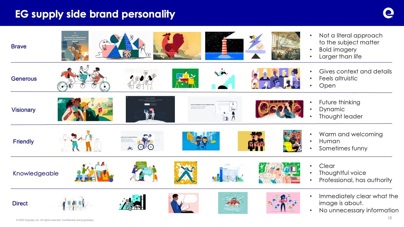
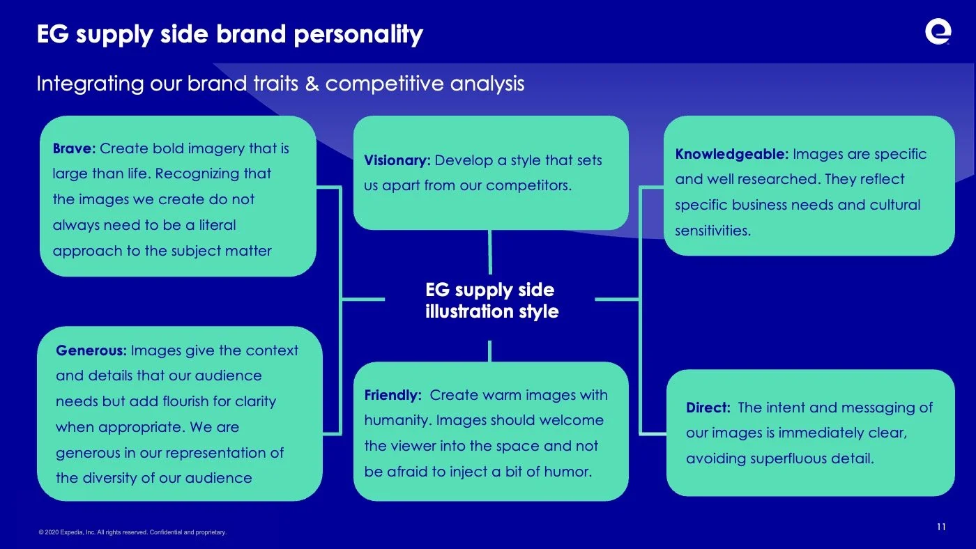
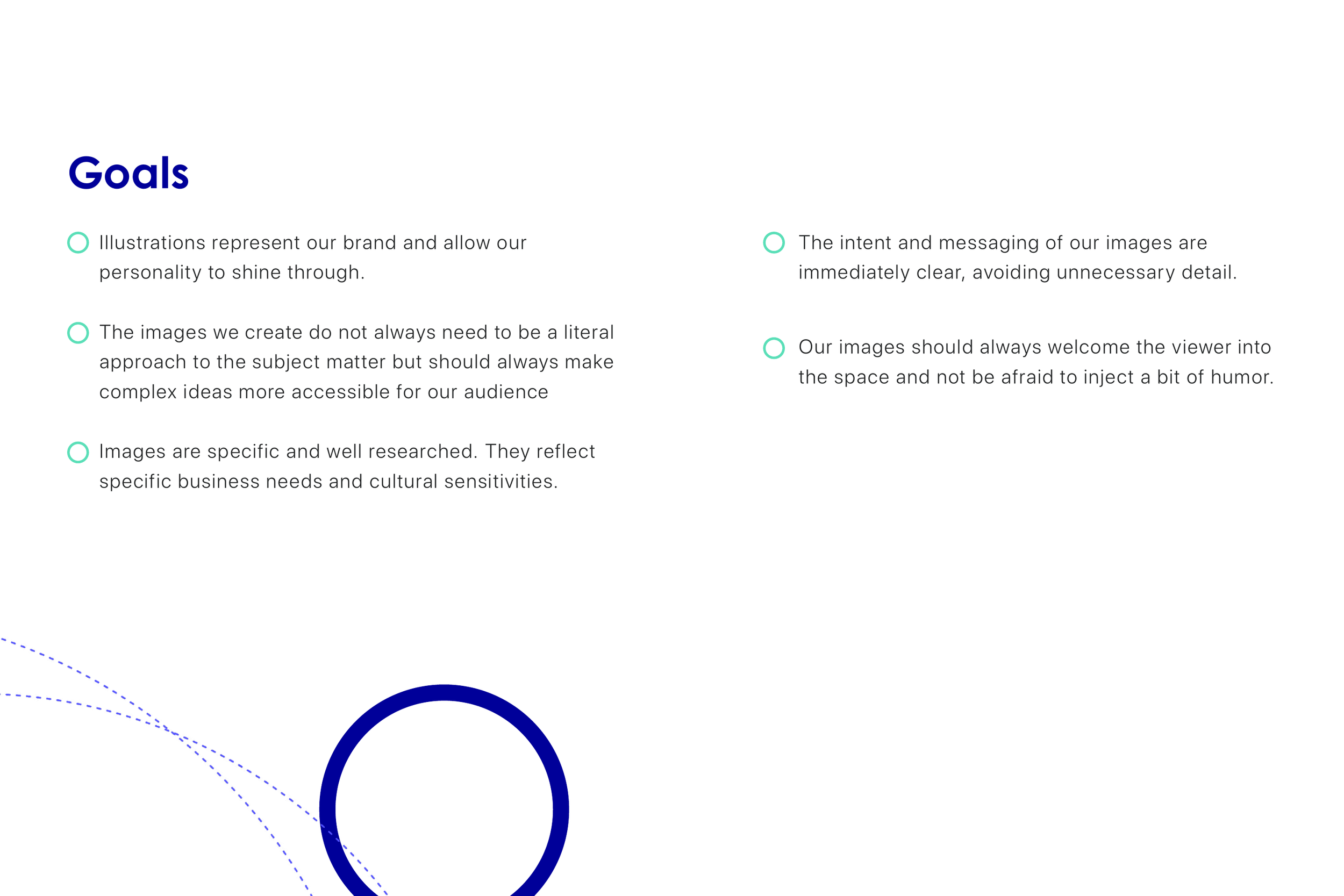
Reflects our brand personality and voice
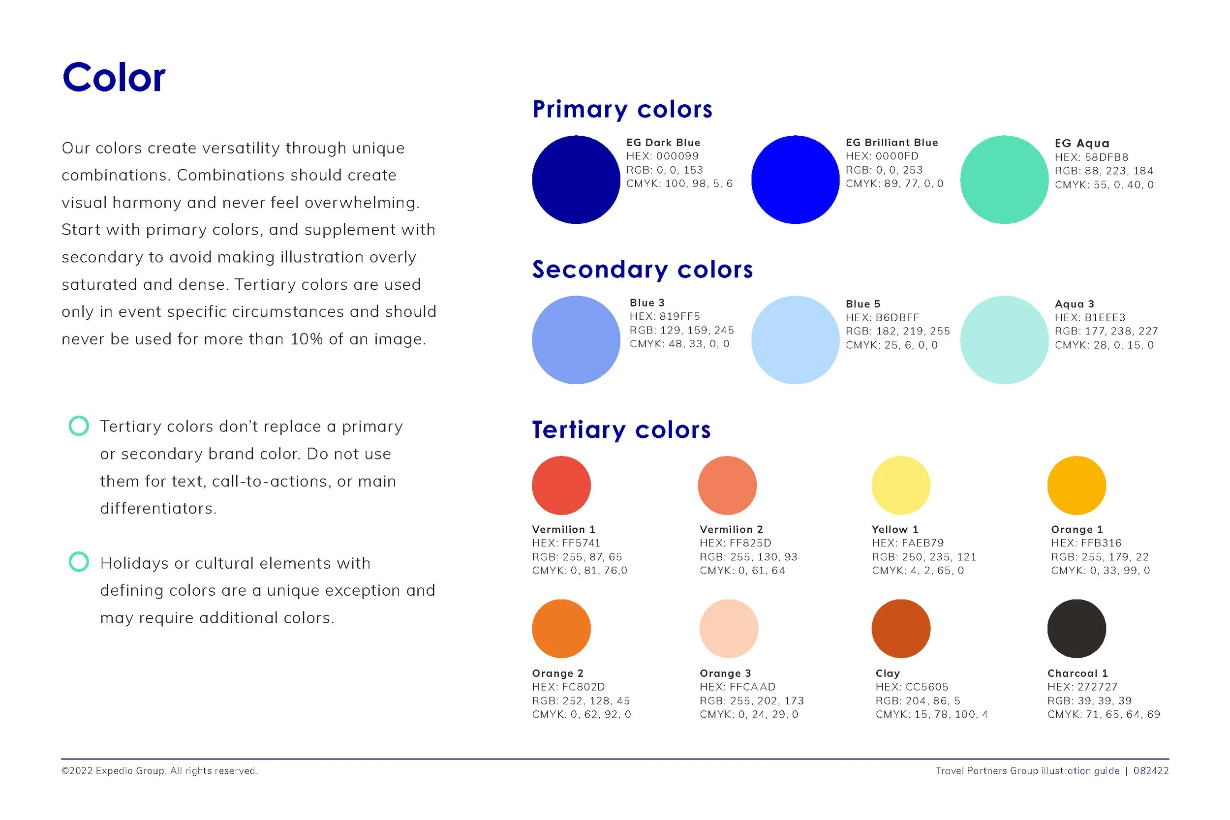
Use Expedia Group colors
Work across all touch points
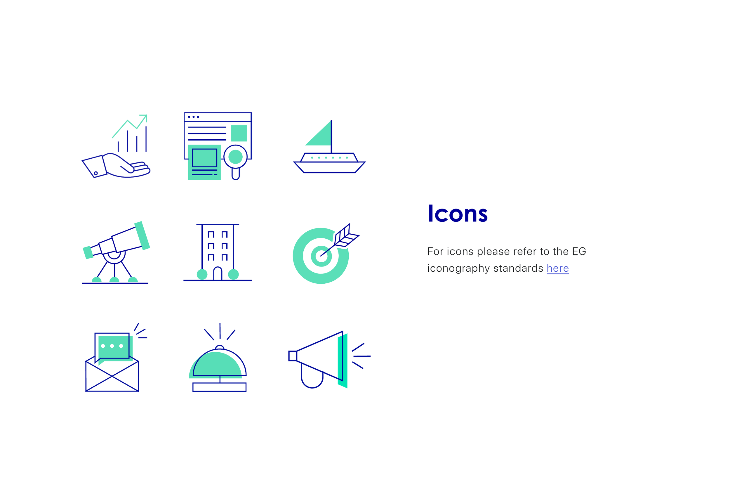
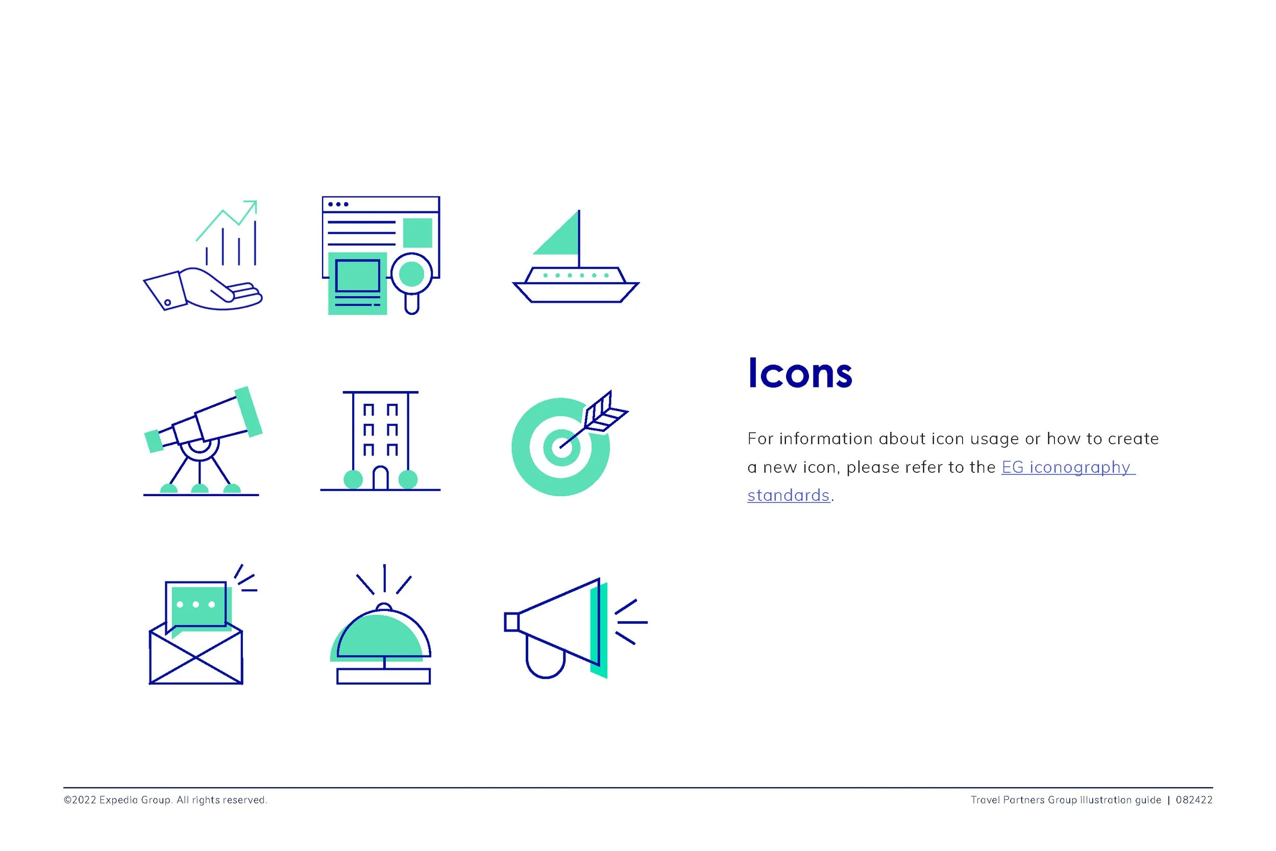
Align with our iconography
It can scale up or down depending on the context.
It can evolve with as we grow, and as we iterate on our marketing strategies and messages.
Work on mobile
Speak to the right audience
Aligns to our design principles
Focus Areas
I served as the primary designer during the research and exploration phases of the illustration guidelines, testing approaches, defining visual standards, and creating supporting documentation. As the project evolved, I presented the work to stakeholders and the broader organization while advising other designers on how to apply and adapt the style. Following the launch, I continued using the guidelines to develop new illustration assets, materials, and product experiences.
The Process

01. competitive Analysis
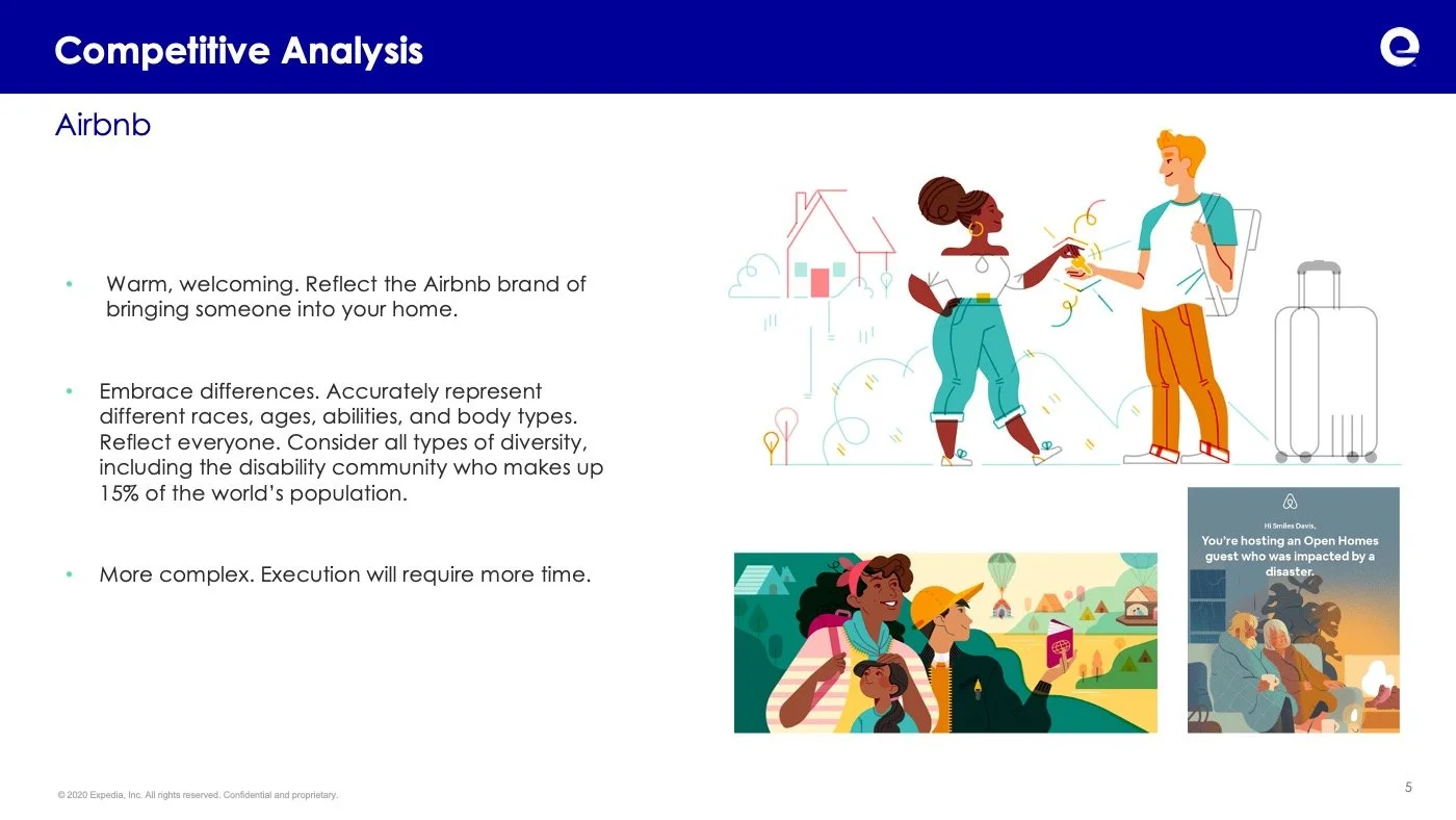
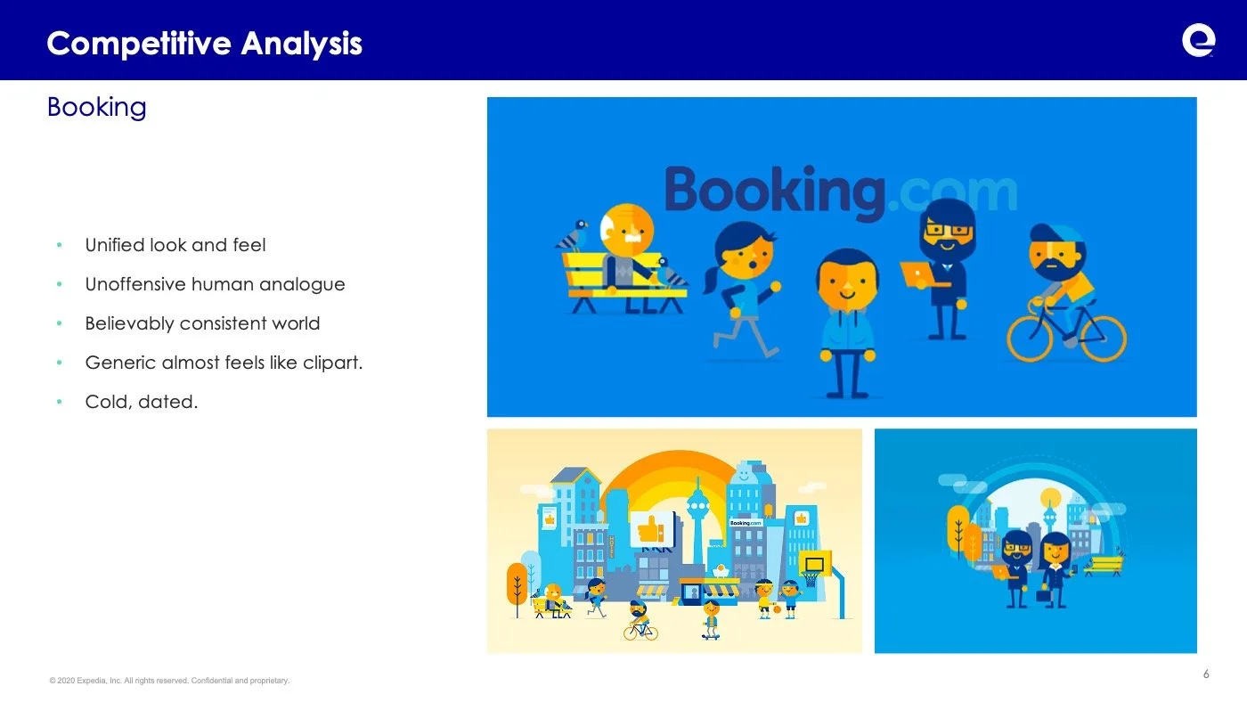
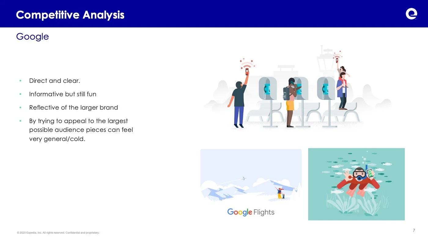
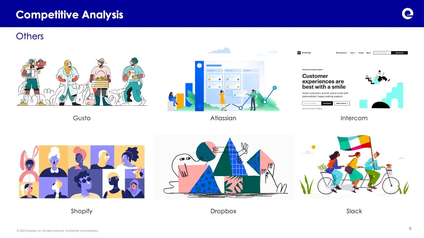
To understand how illustration was being used across both the travel industry and large technology companies, I conducted a competitive analysis of current trends and use cases. After gathering and reviewing examples, I created a matrix to evaluate how different approaches aligned with our core brand traits. These insights were then distilled into actionable principles that formed the foundation of the Travel Partner Group illustration methodology.
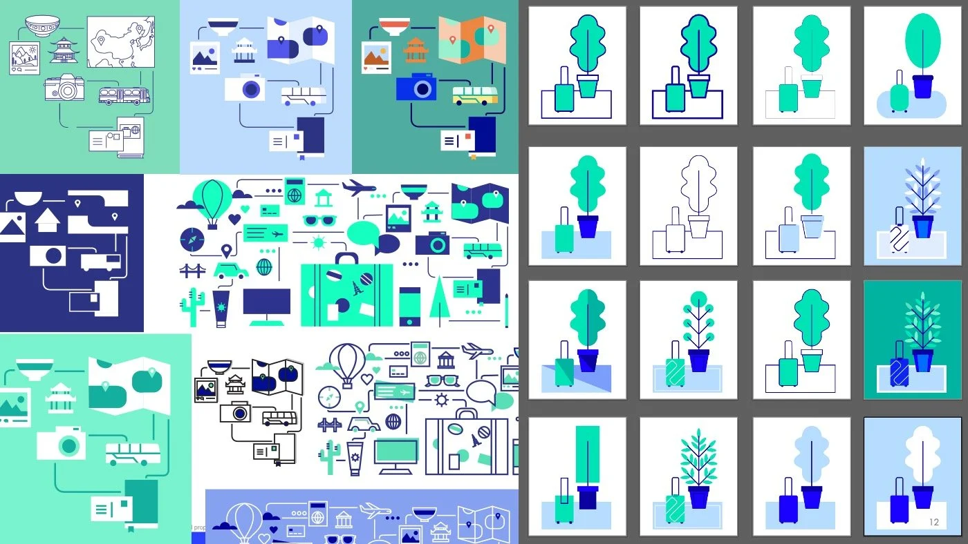
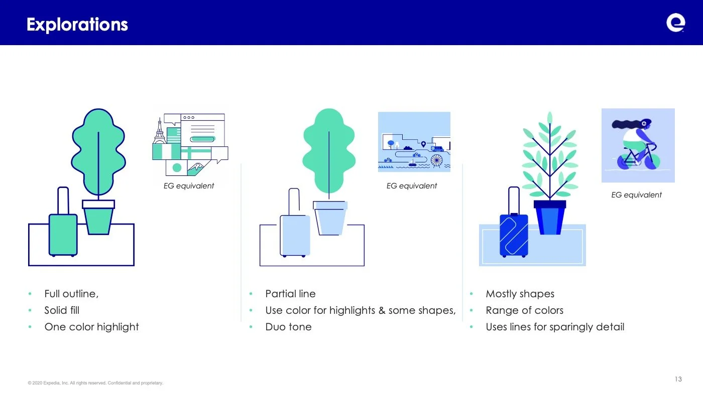
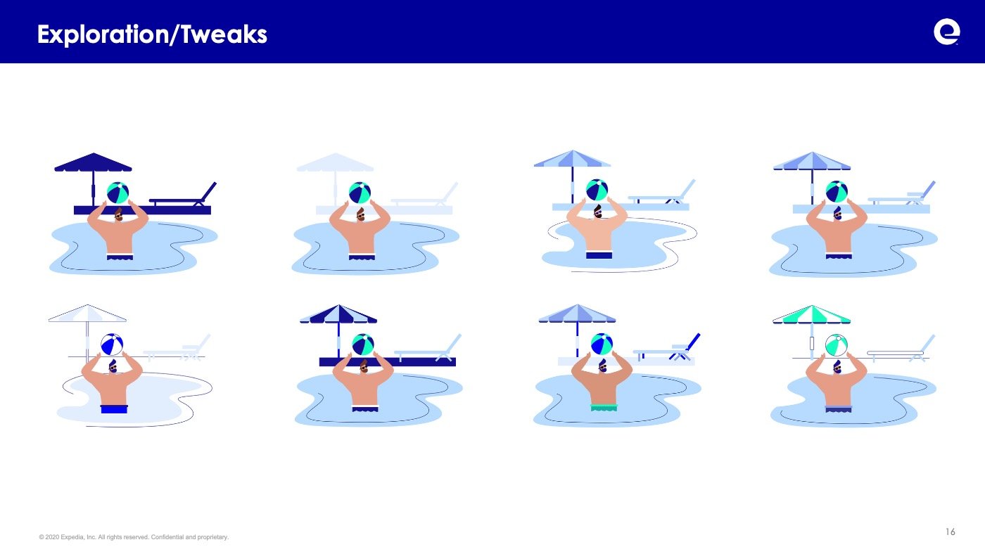
02. Exploration
I developed a series of illustrations and variations to narrow in on a style that would meet our goals and business needs, this included testing:
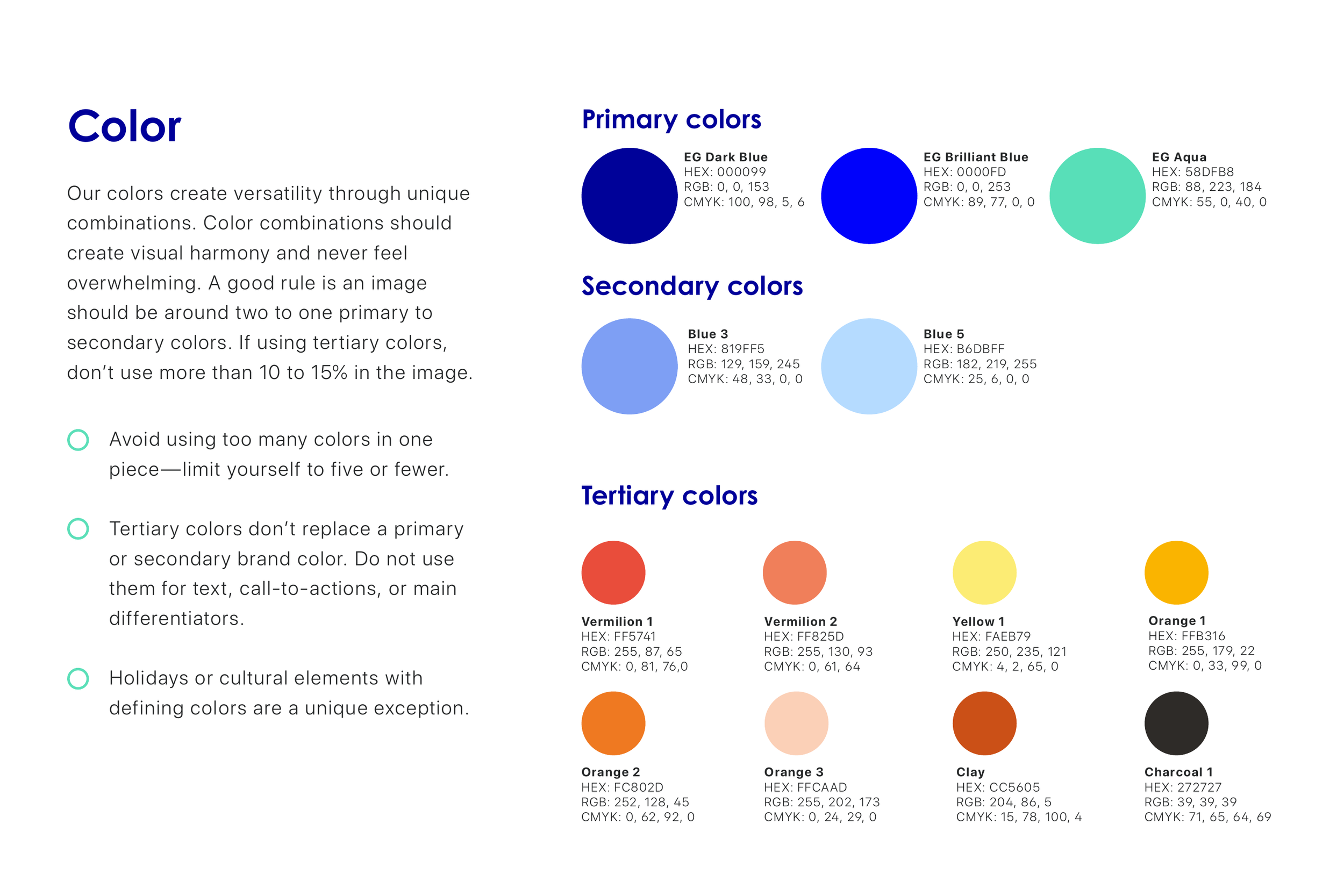
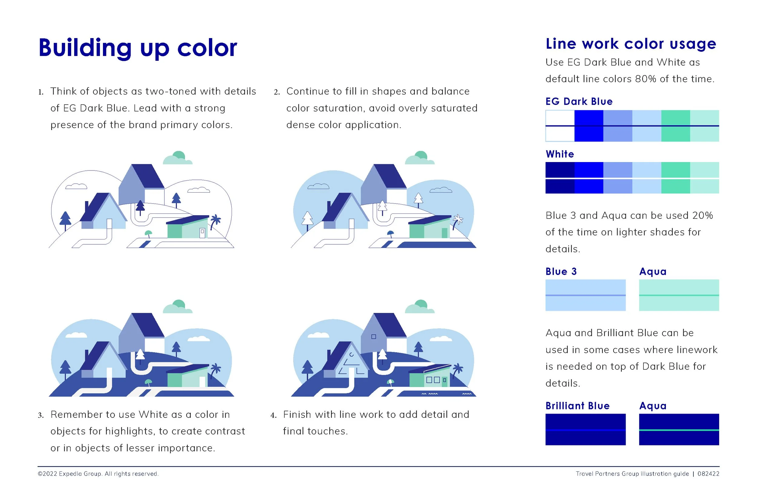
Color
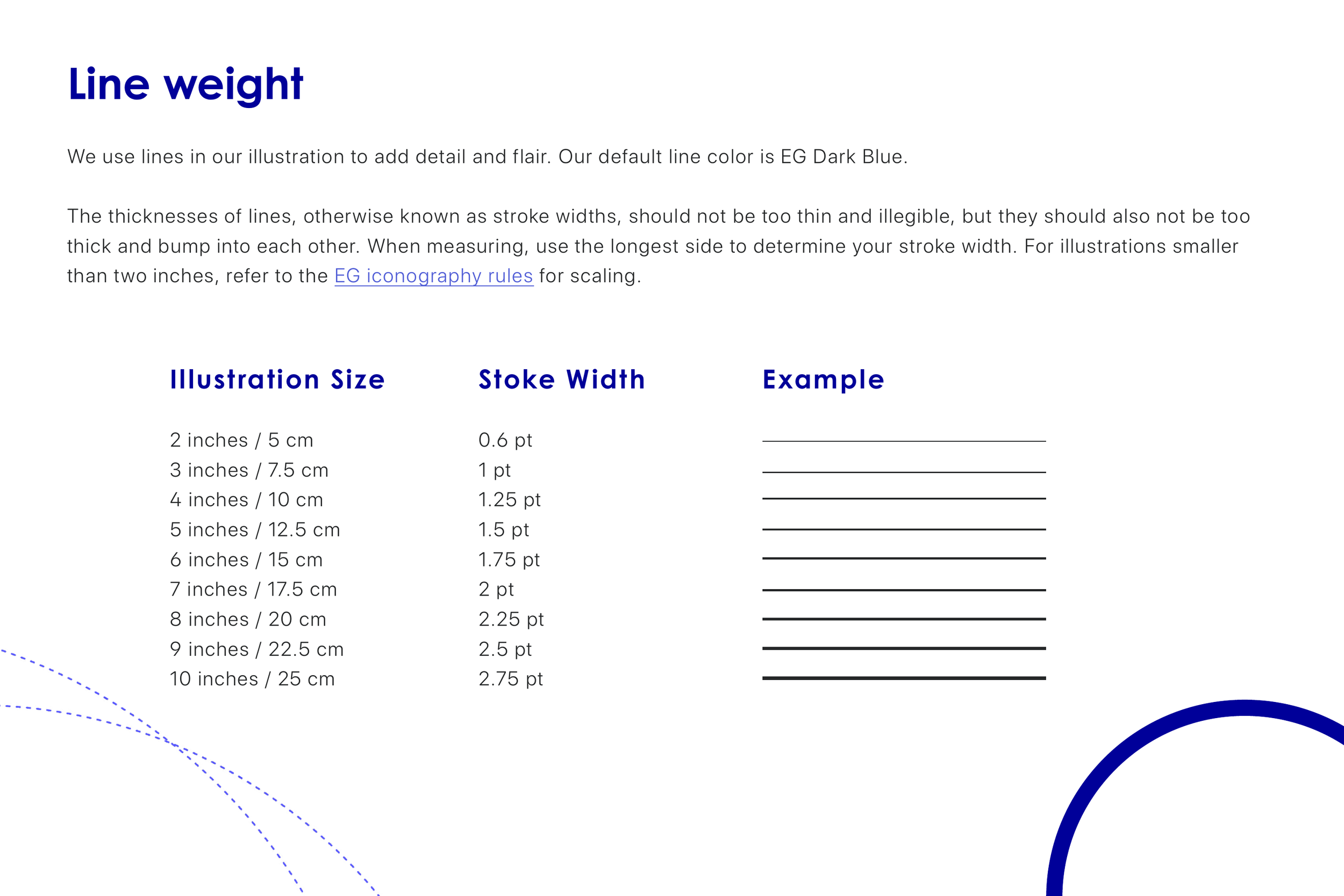
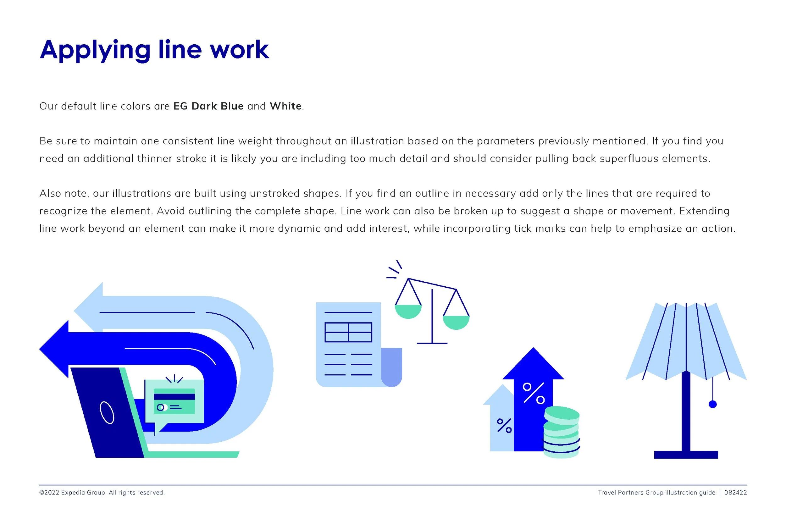
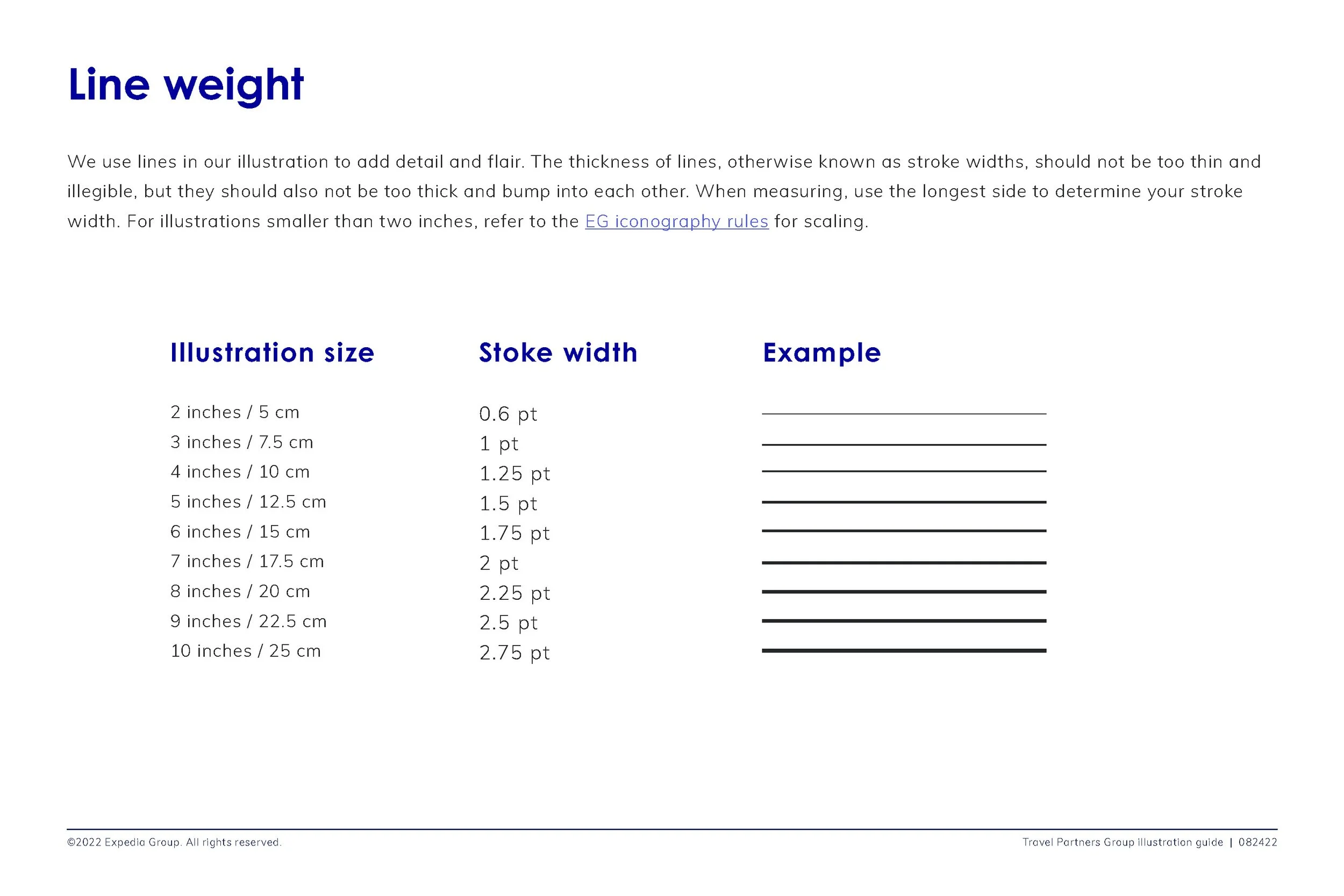
Line weight
Level of realism/abstraction
Amount of detail
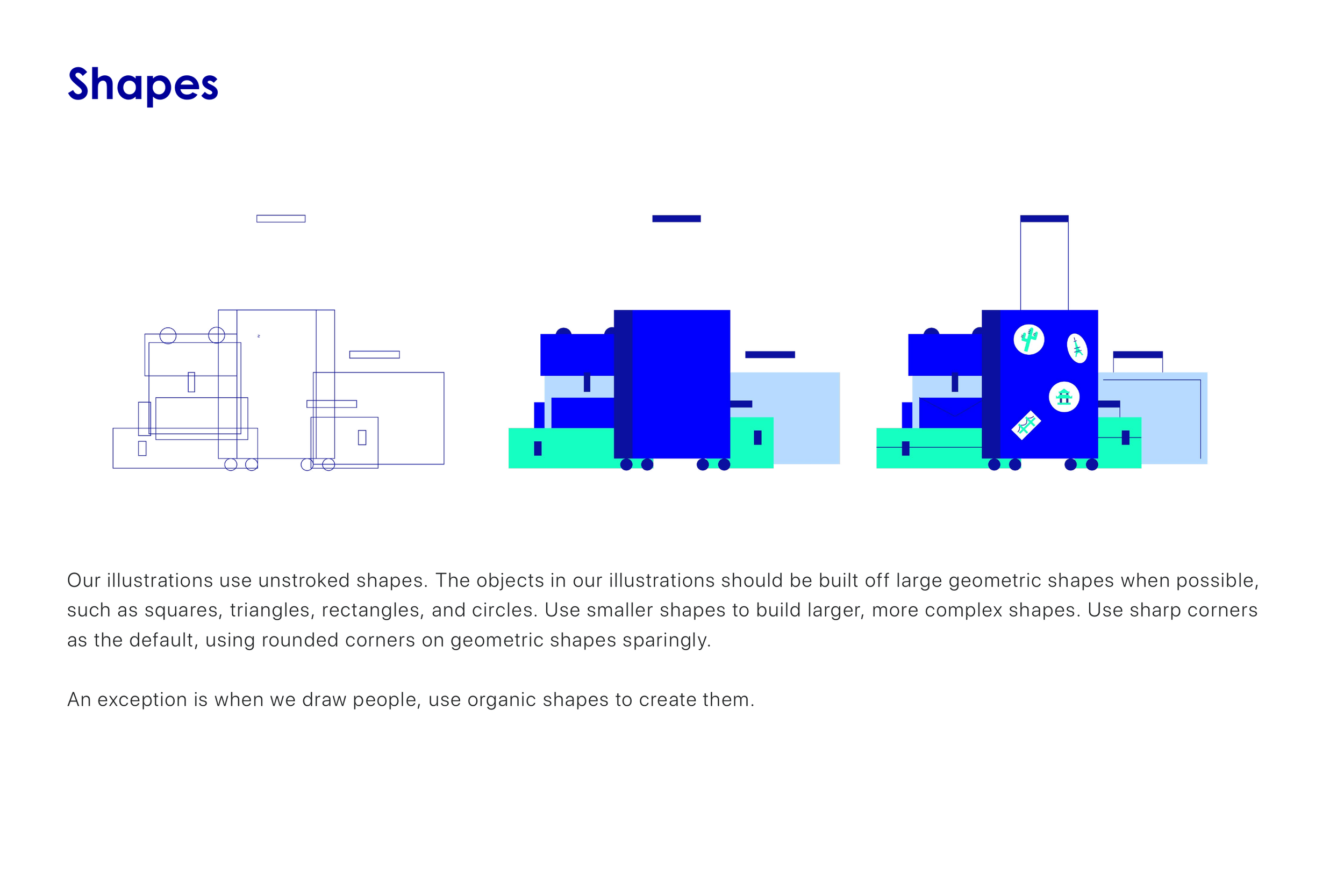
How we build objects
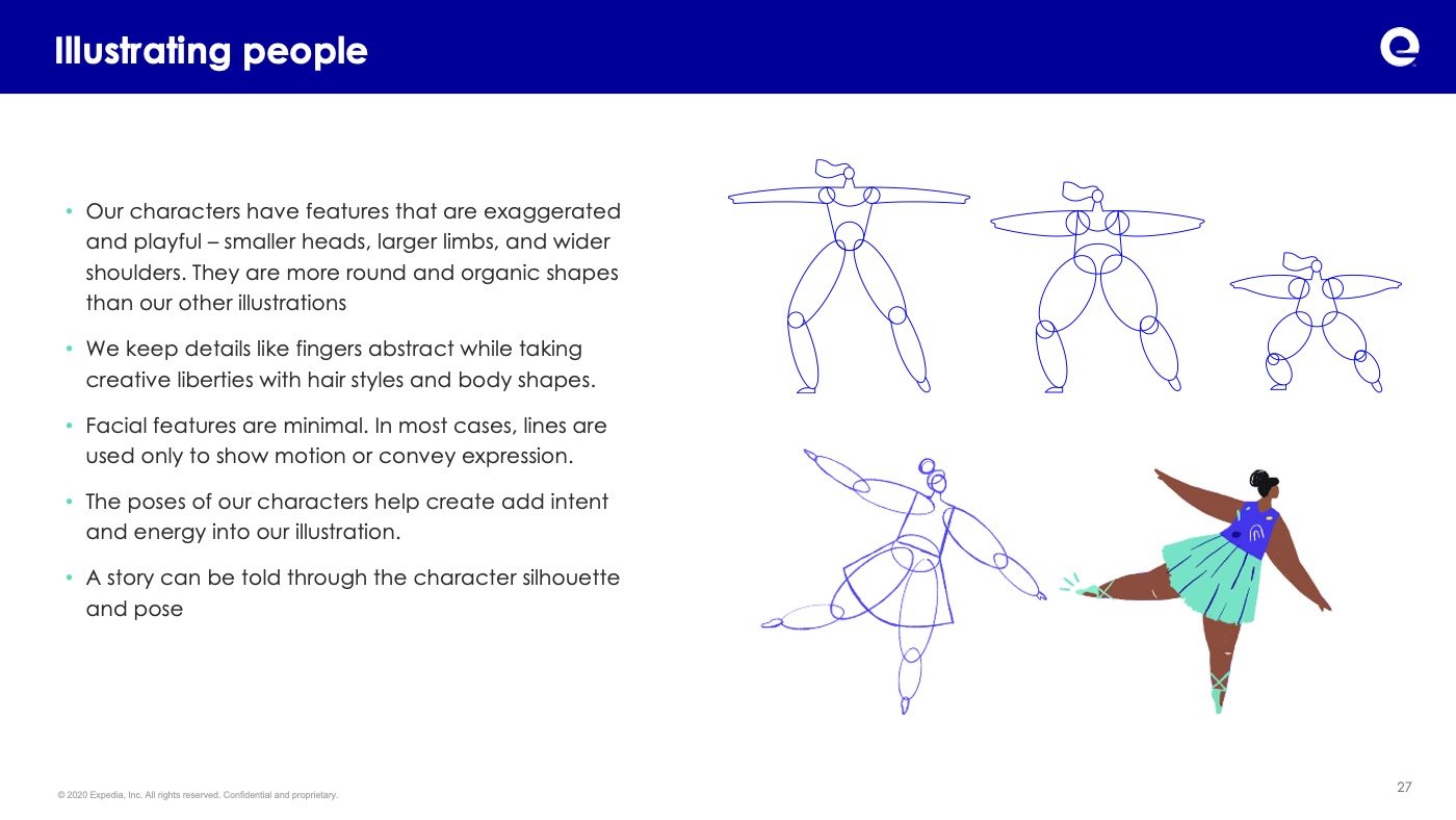
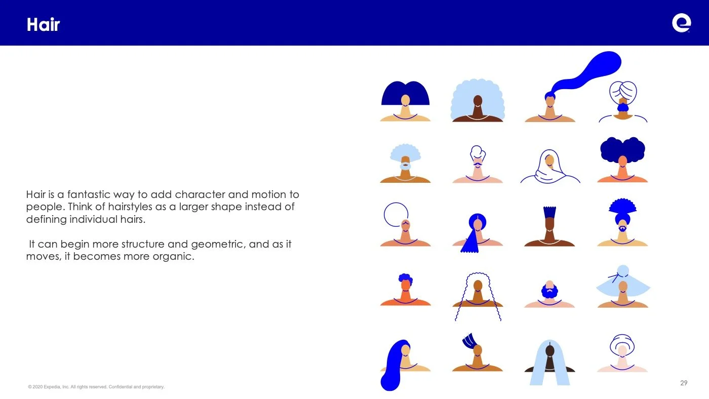
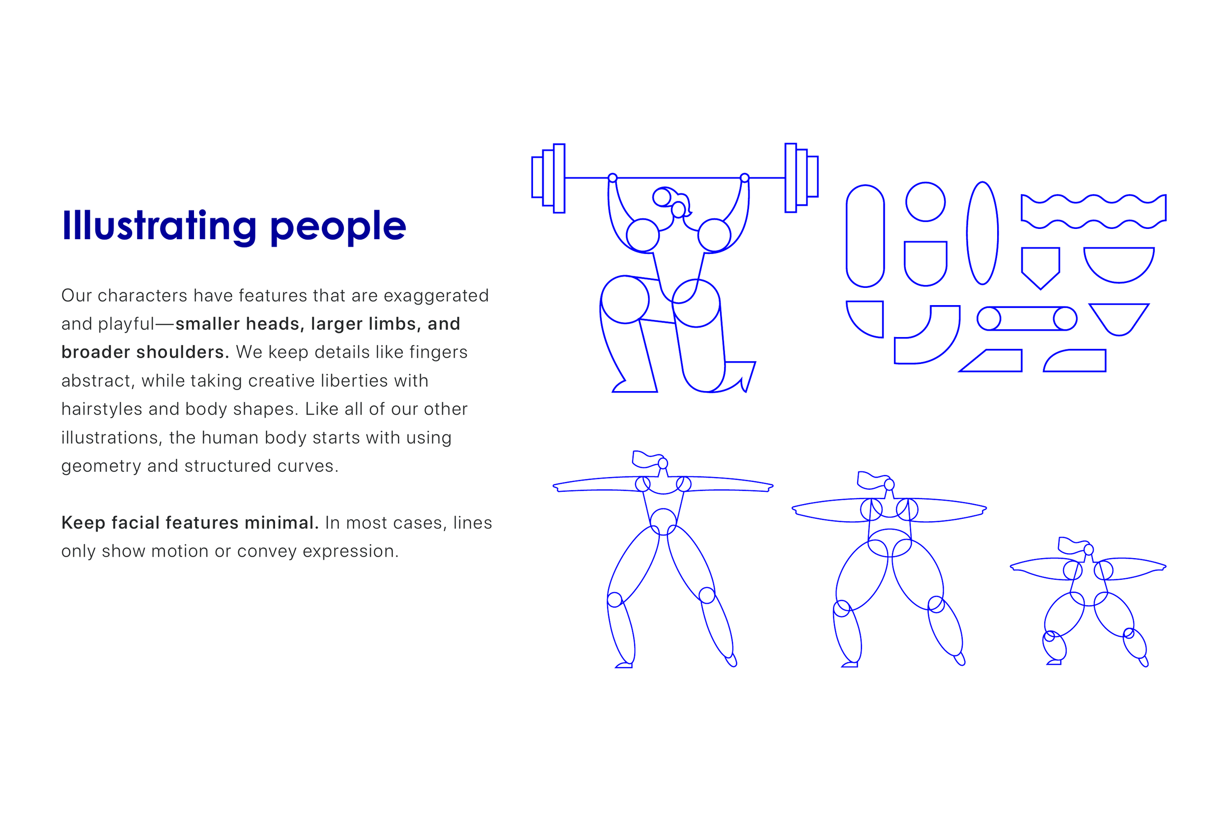
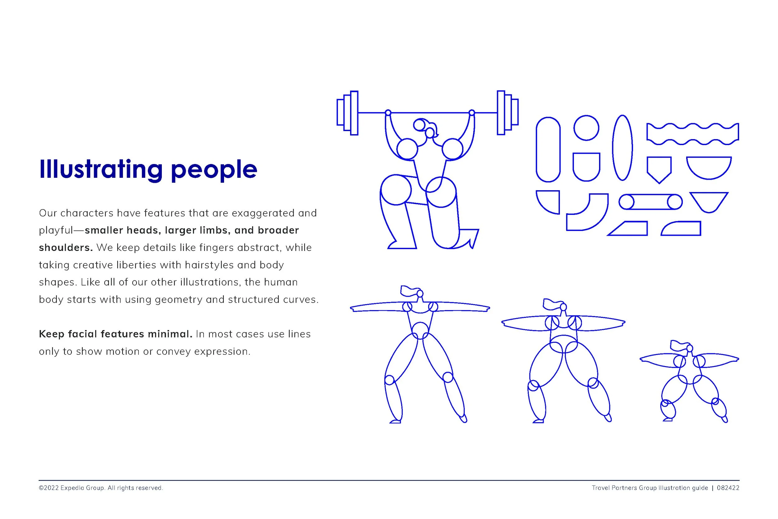
How we draw people
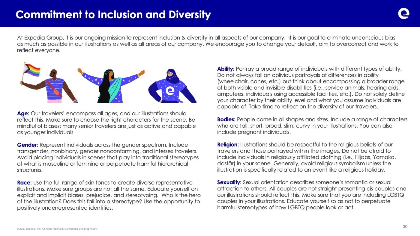
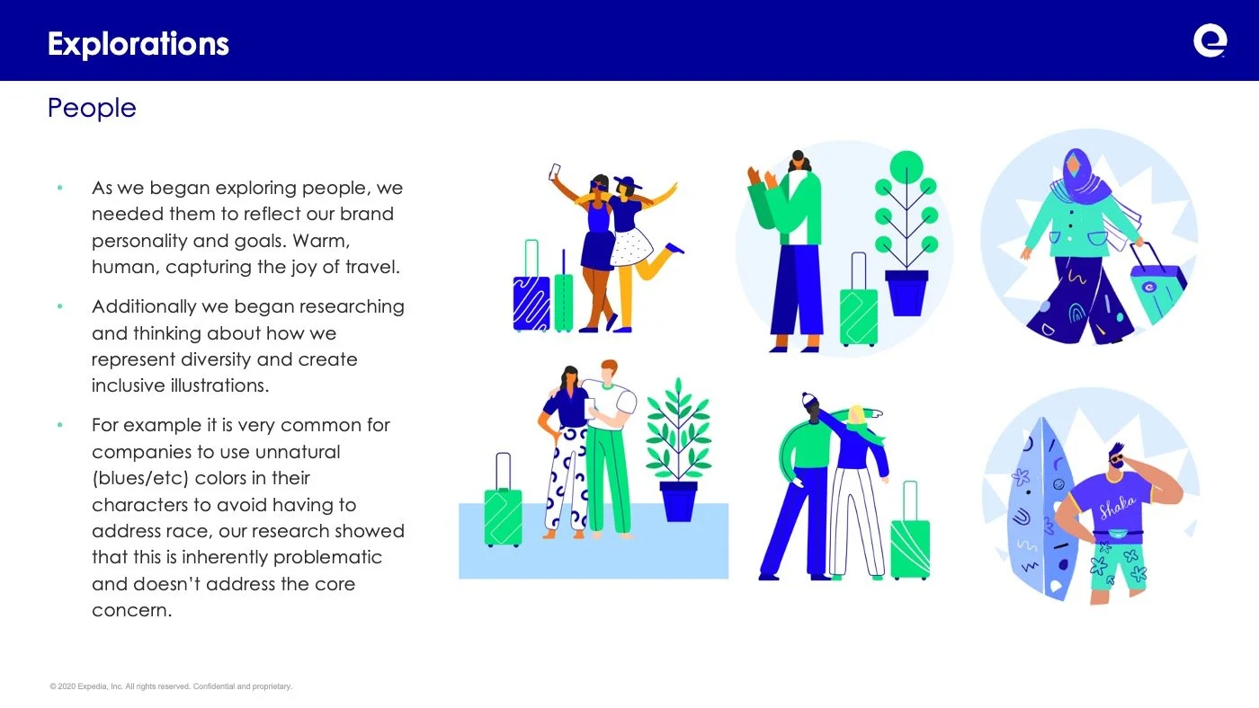
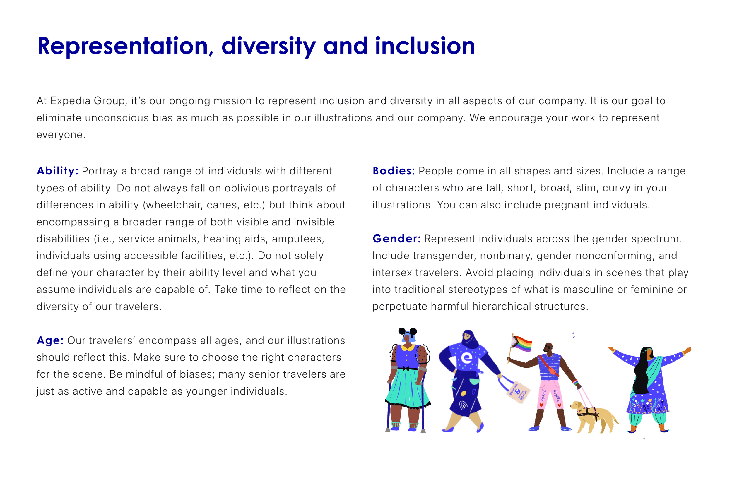
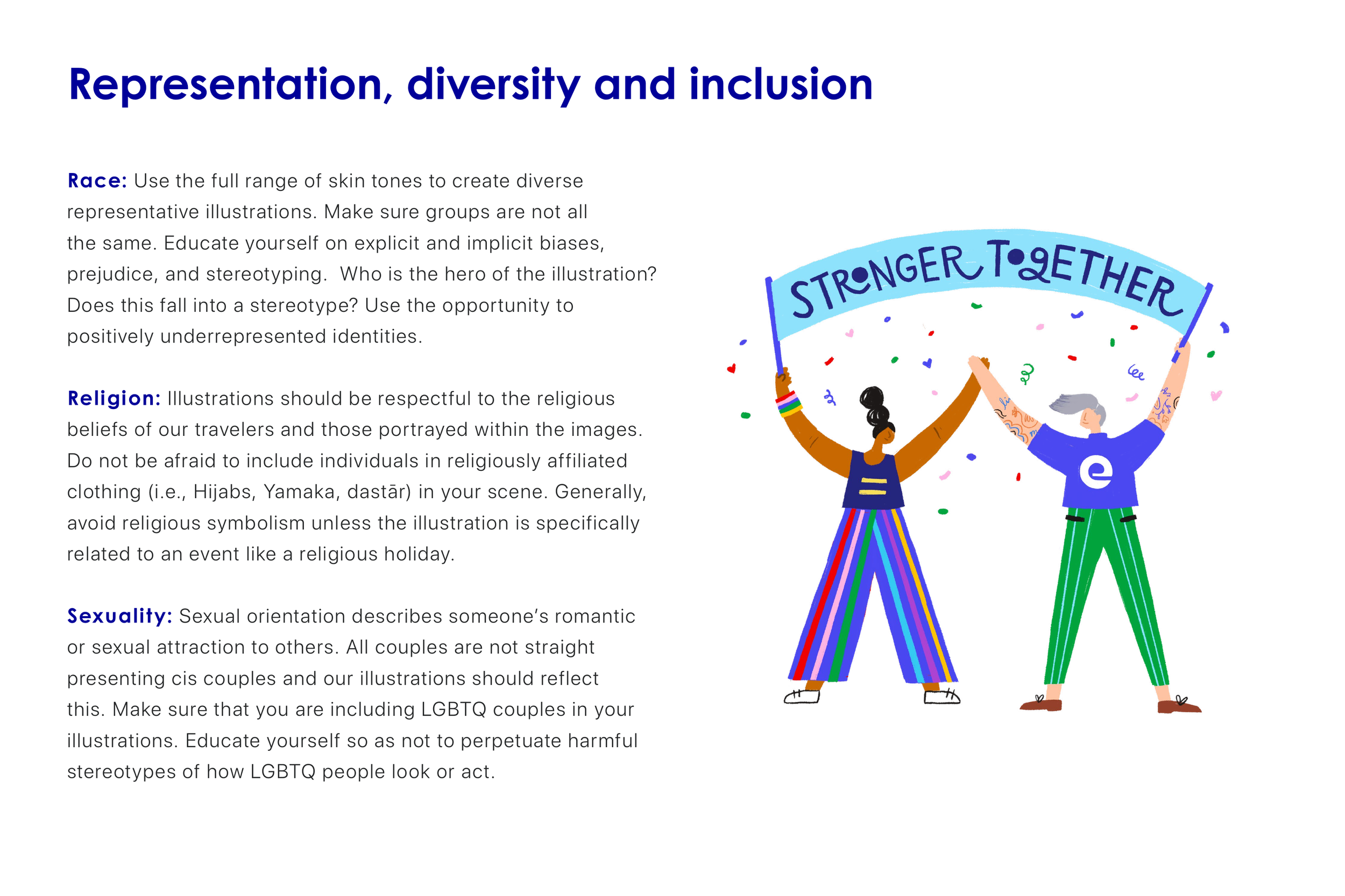
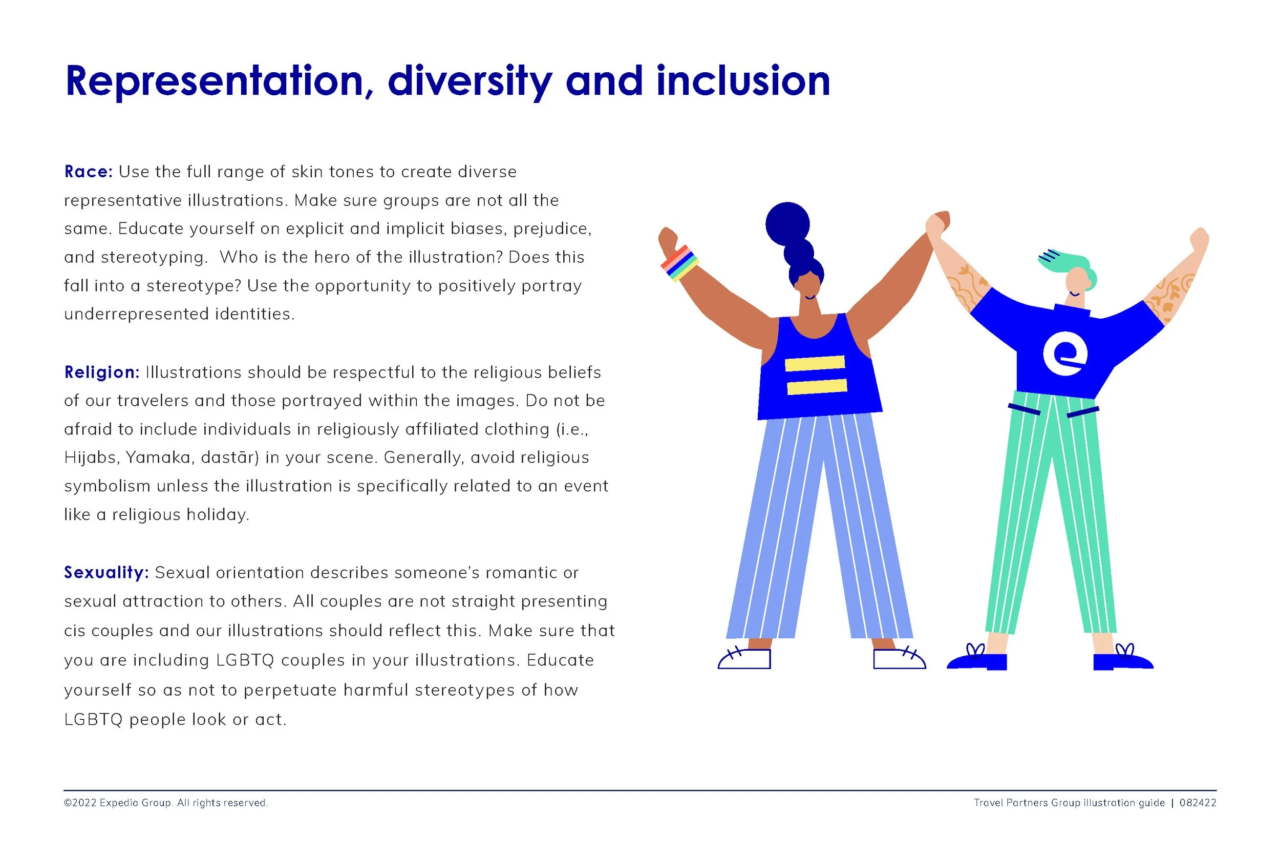
03. Diversity and Inclusion
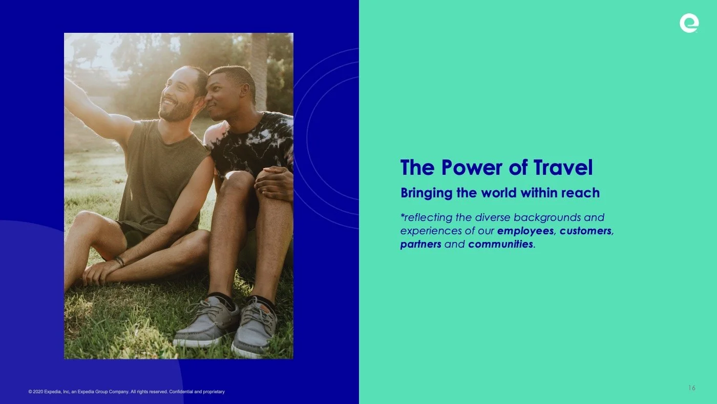
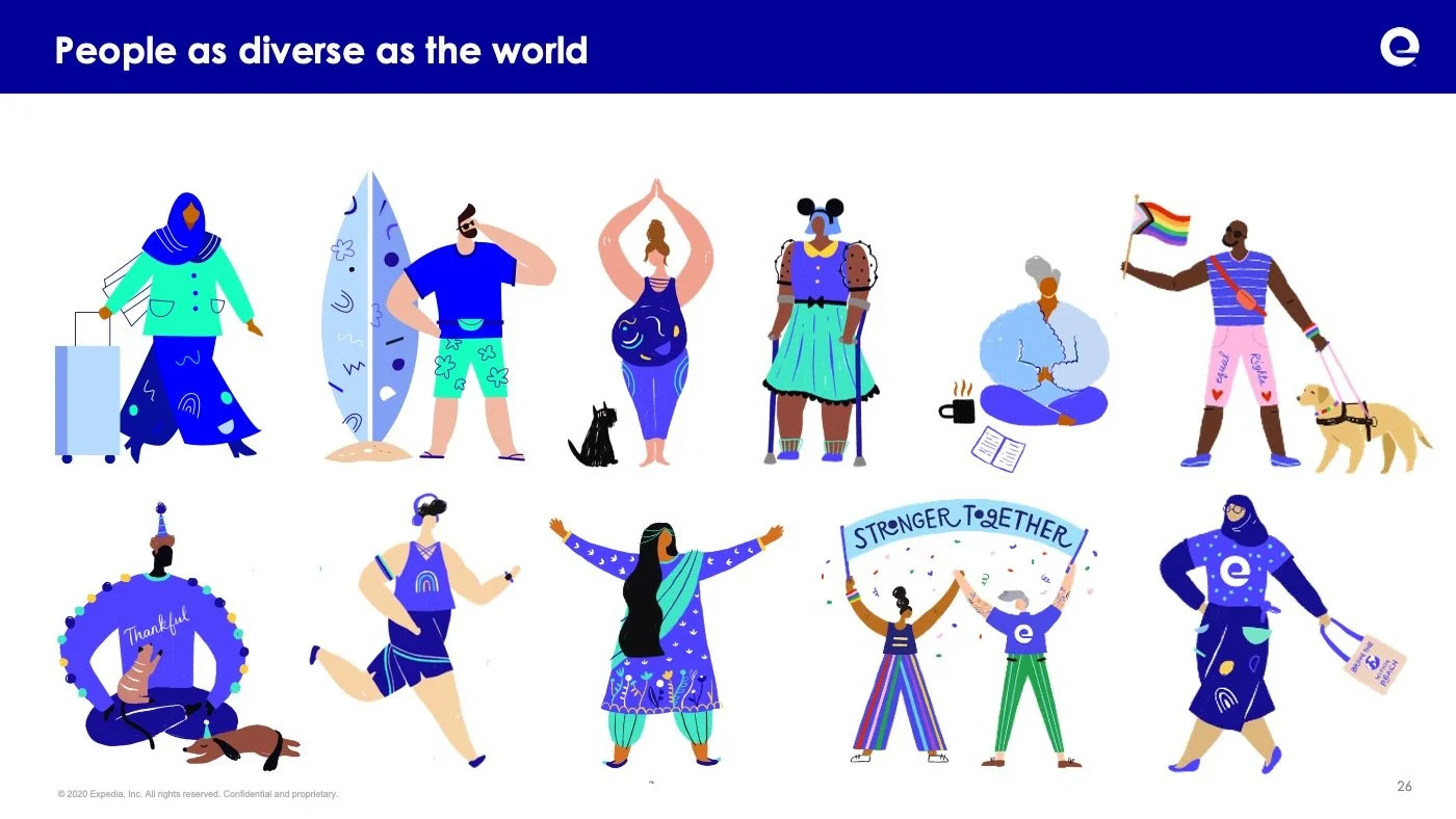
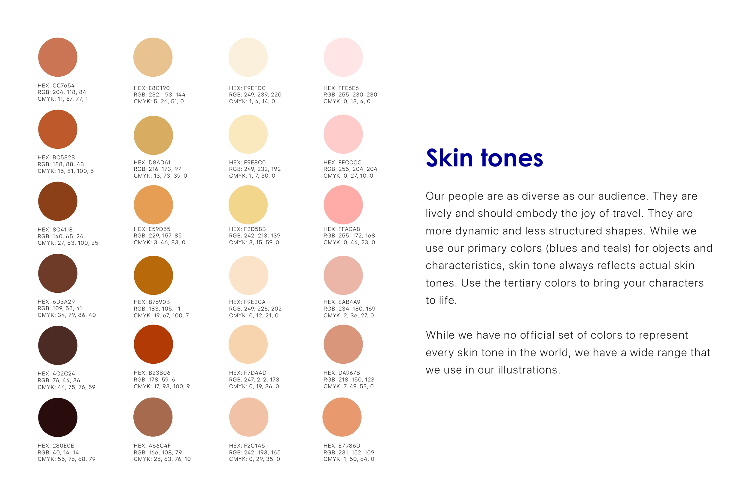
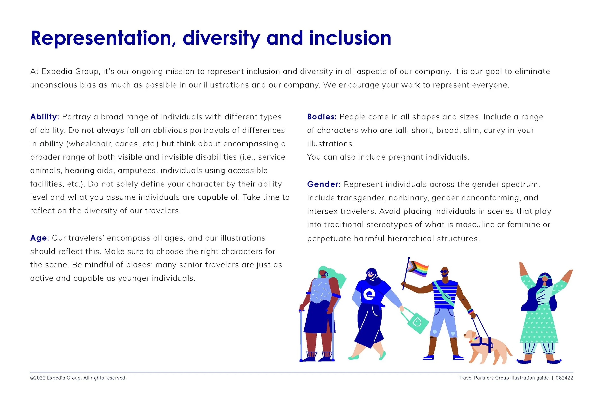
As a global company with a strong commitment to connecting people everywhere, it was important for us to make sure that we were establishing a standard and expectation of illustration that was diverse and reflected the world.
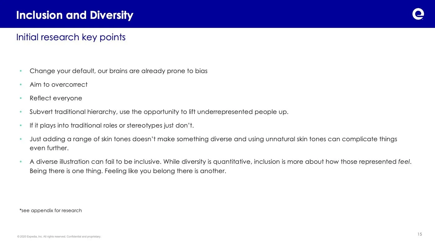
Both independently and working closely with the internal Inclusion and Diversity at Expedia we identified key takeaways, insights and actionable standards for how we could create inclusive visual expressions. These included:
Change your default, our brains are already prone to bias. If it plays into traditional roles or stereotypes just don’t.
Reflect everyone, aim to overcorrect
Subvert traditional hierarchy, use the opportunity to lift underrepresented people up.
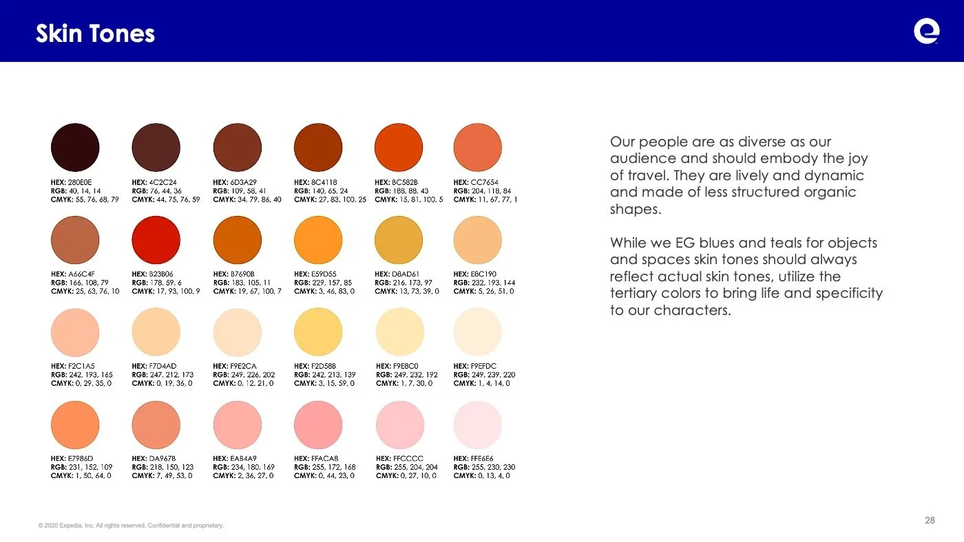
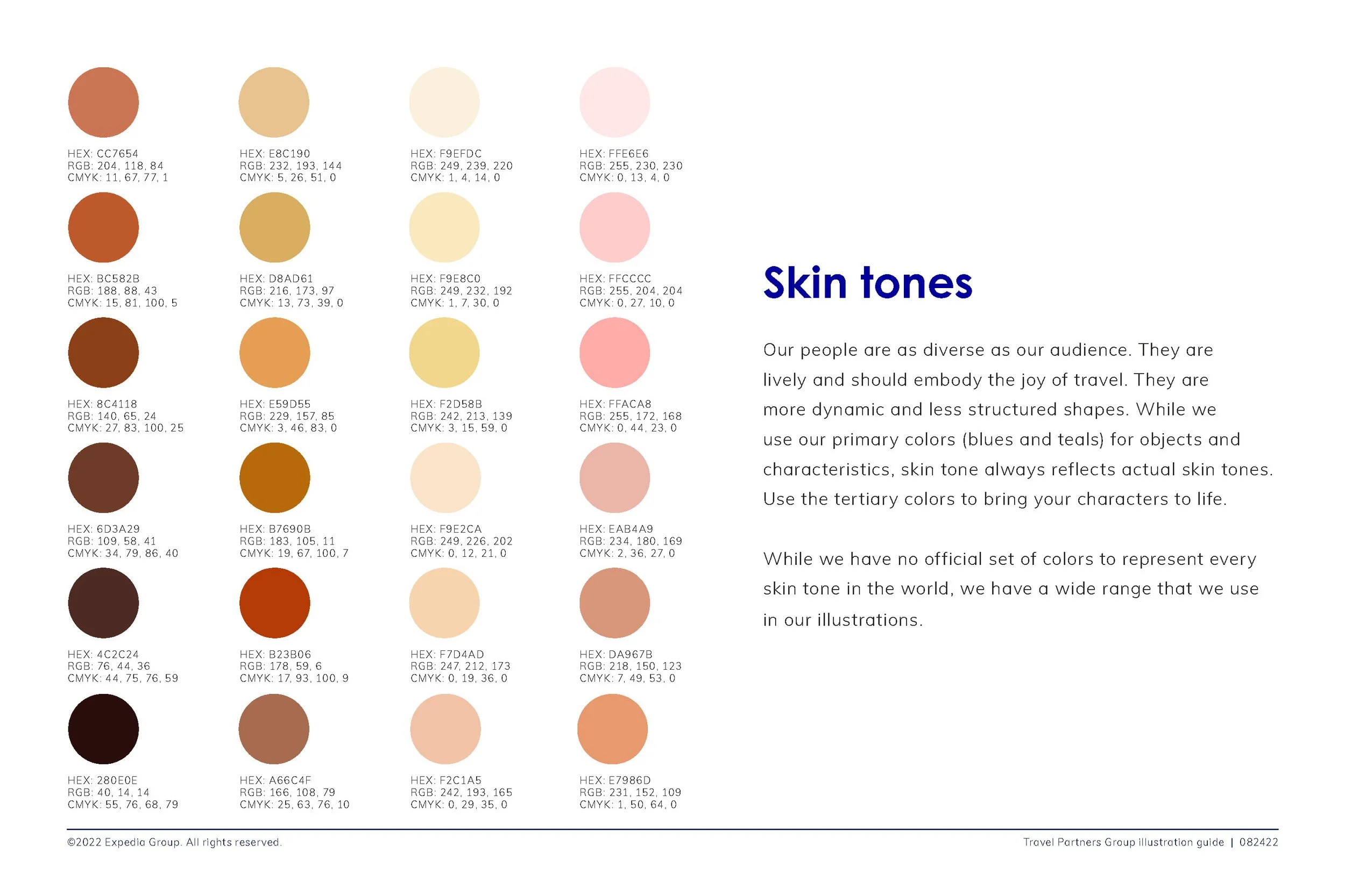
Just adding a range of skin tones doesn’t make something diverse and using unnatural skin tones can complicate things even further.
A diverse illustration can fail to be inclusive. While diversity is quantitative, inclusion is more about how those represented feel. Being there is one thing. Feeling like you belong there is another.
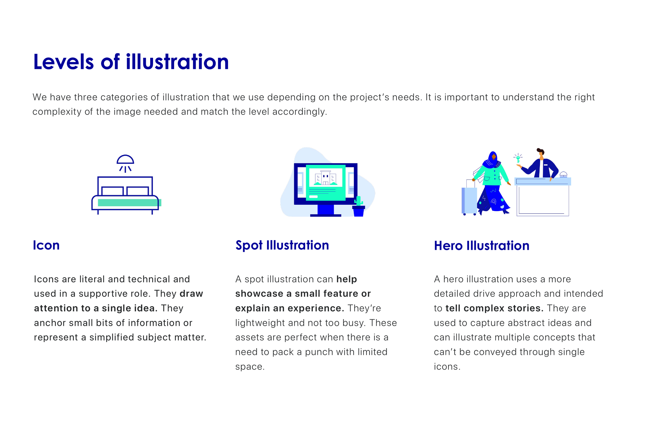
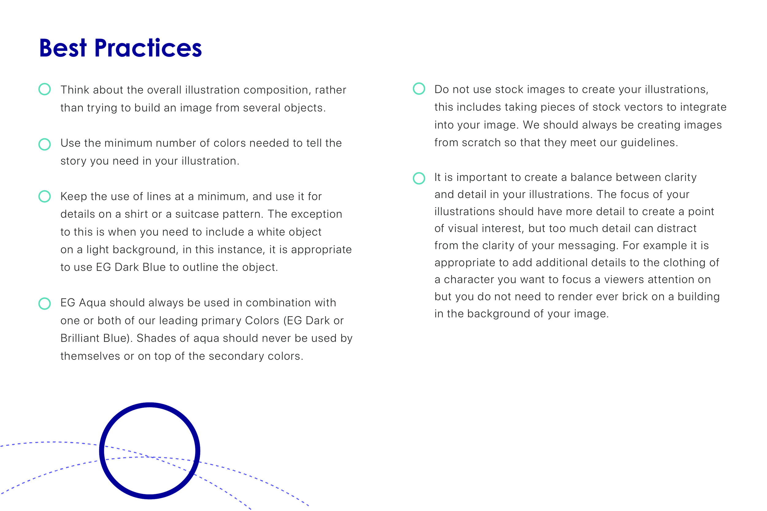
04. The Core
After extensive research and testing, we defined a set of core principles that guide the TPG illustration style:
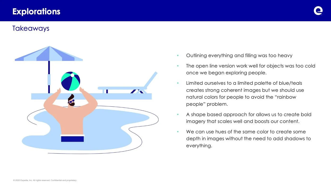
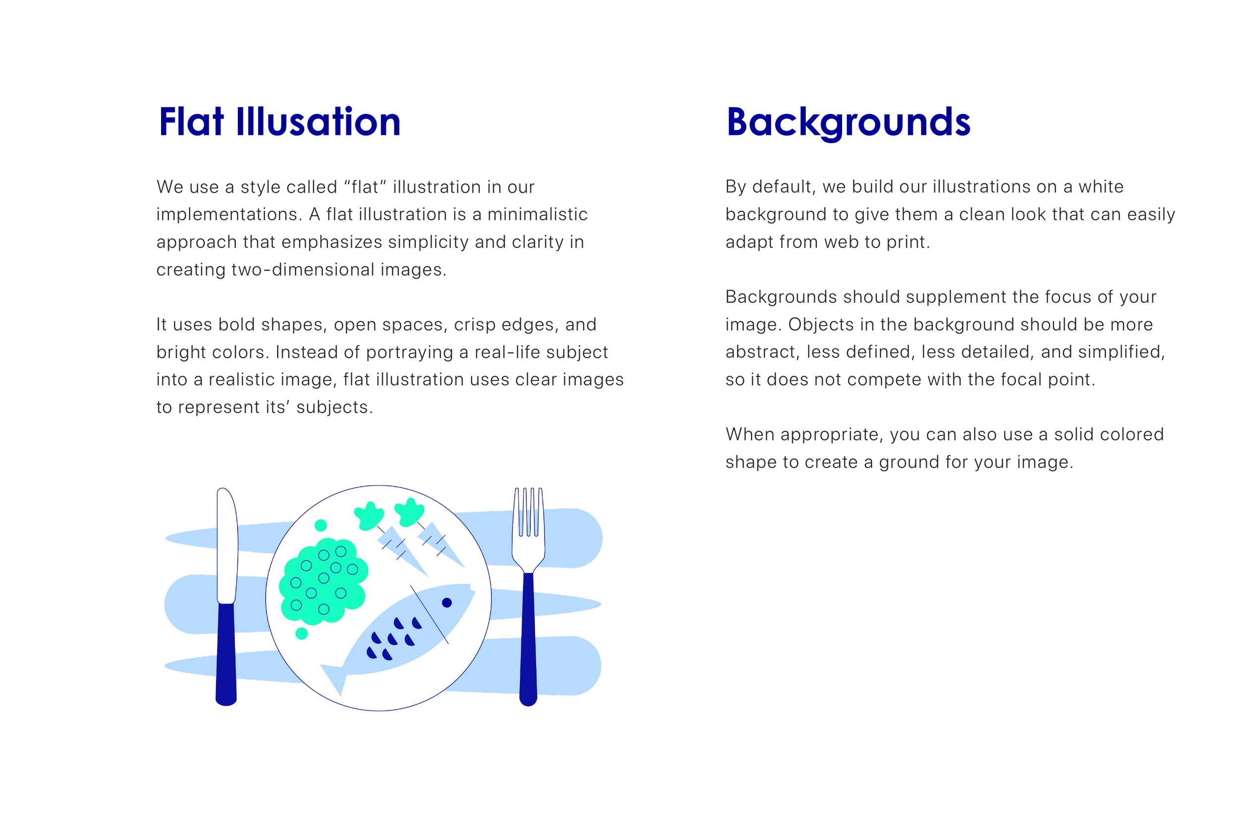
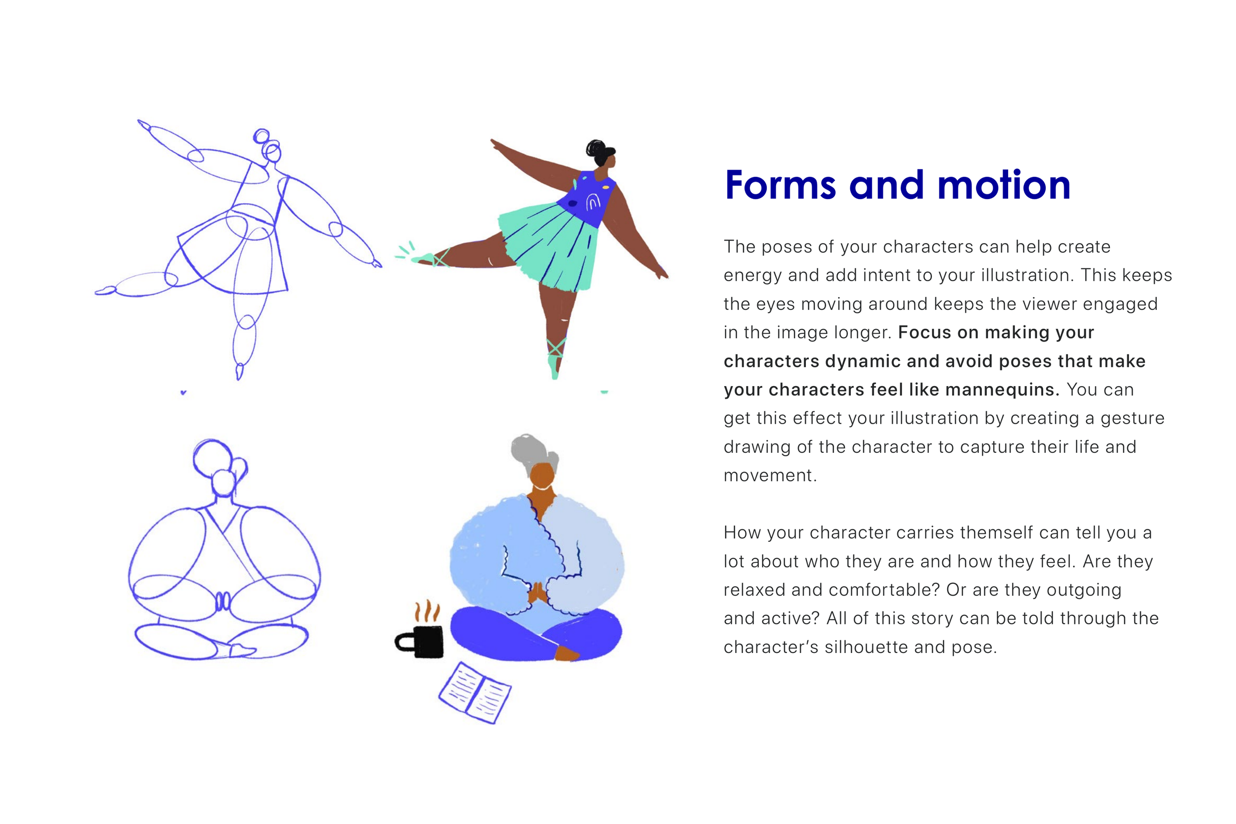
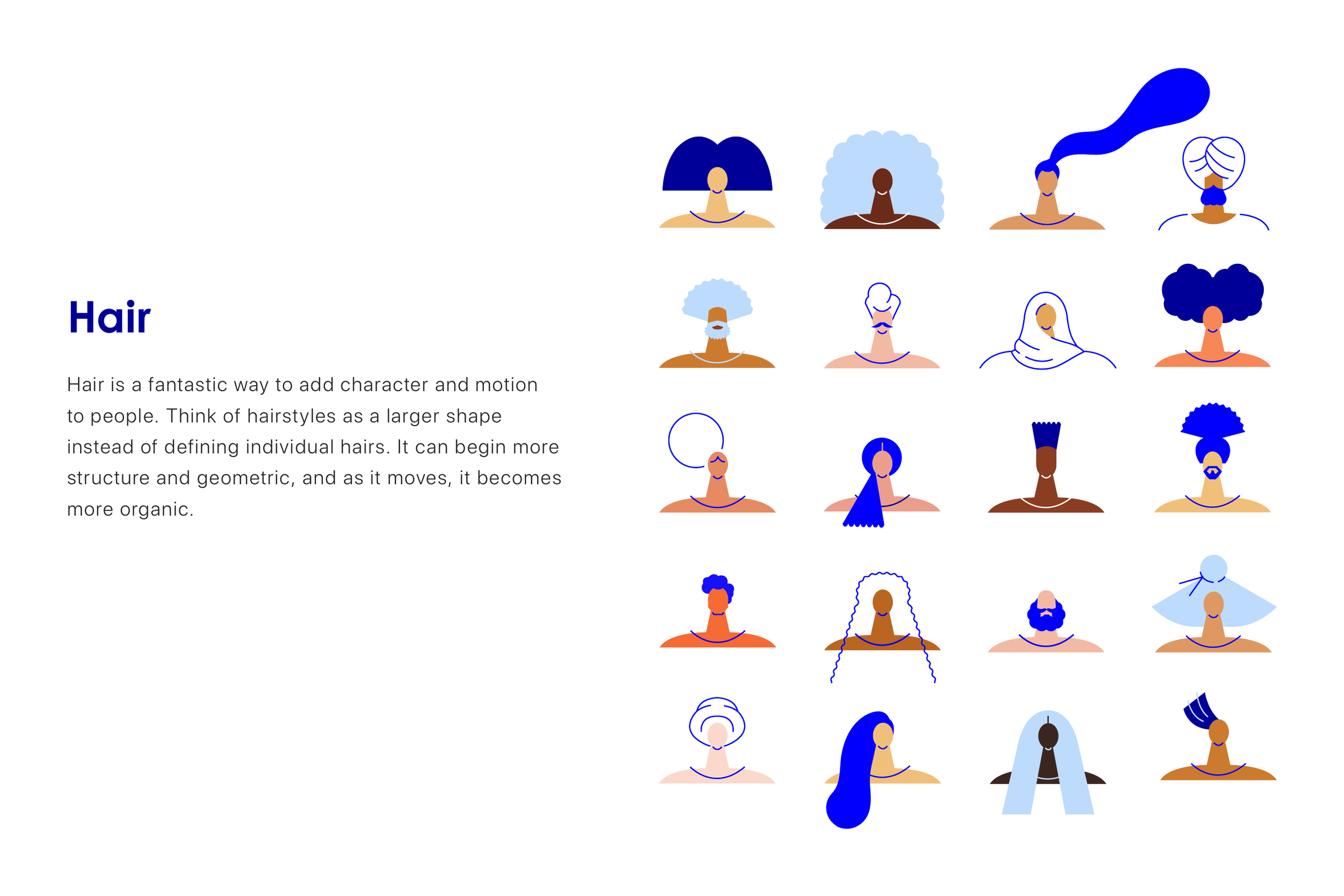
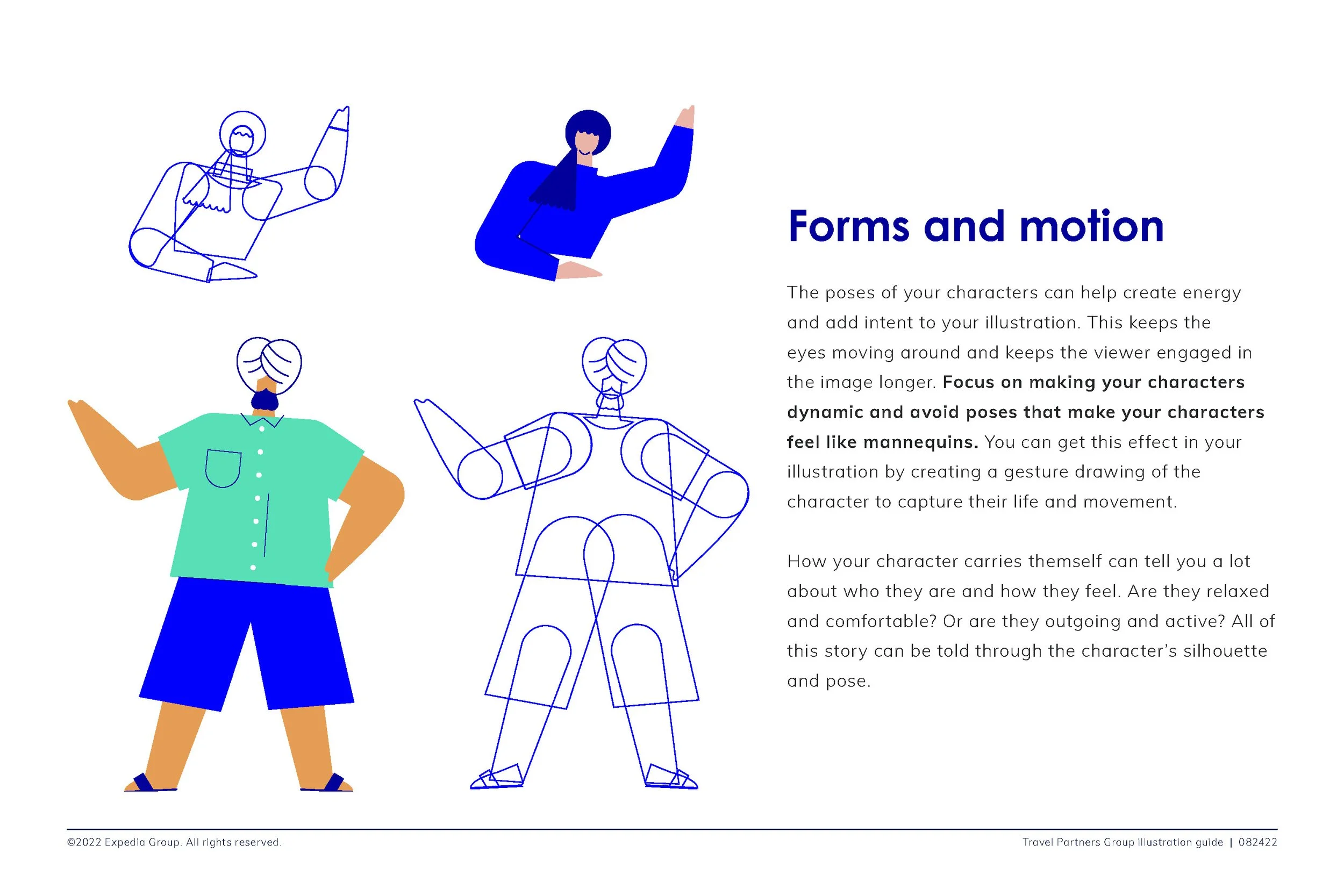
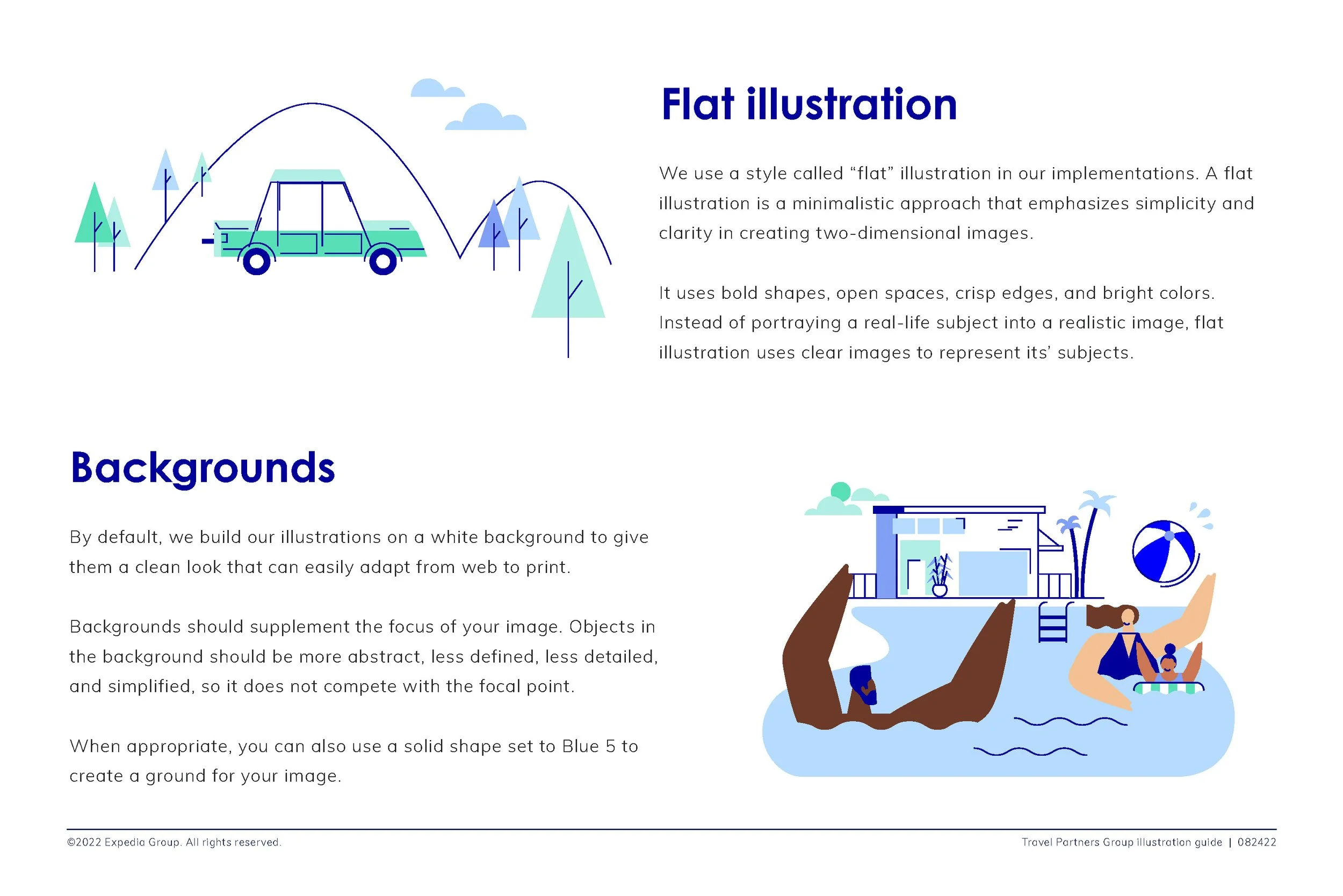
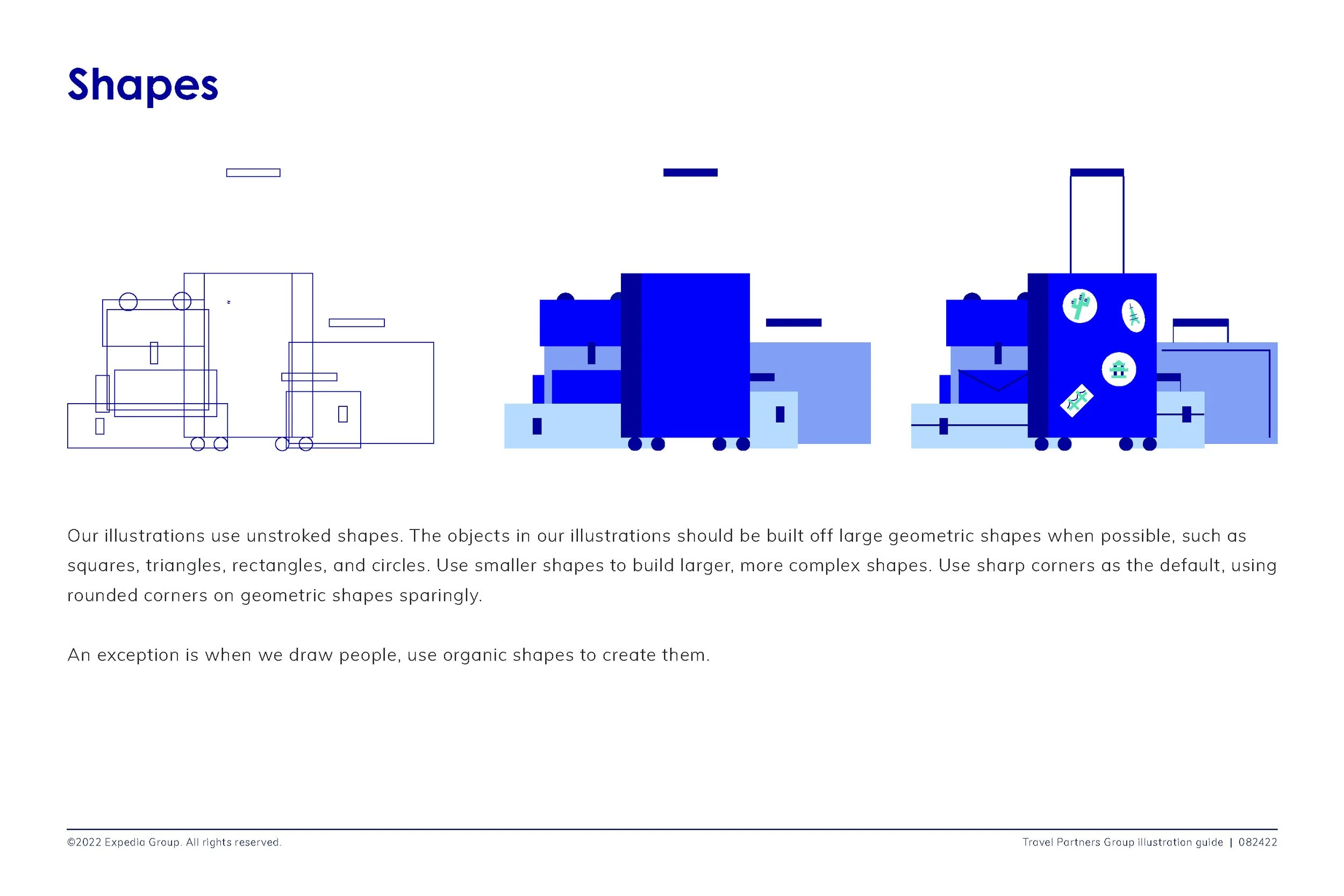
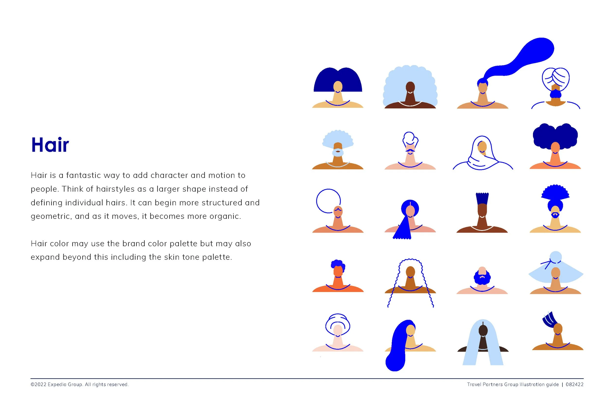
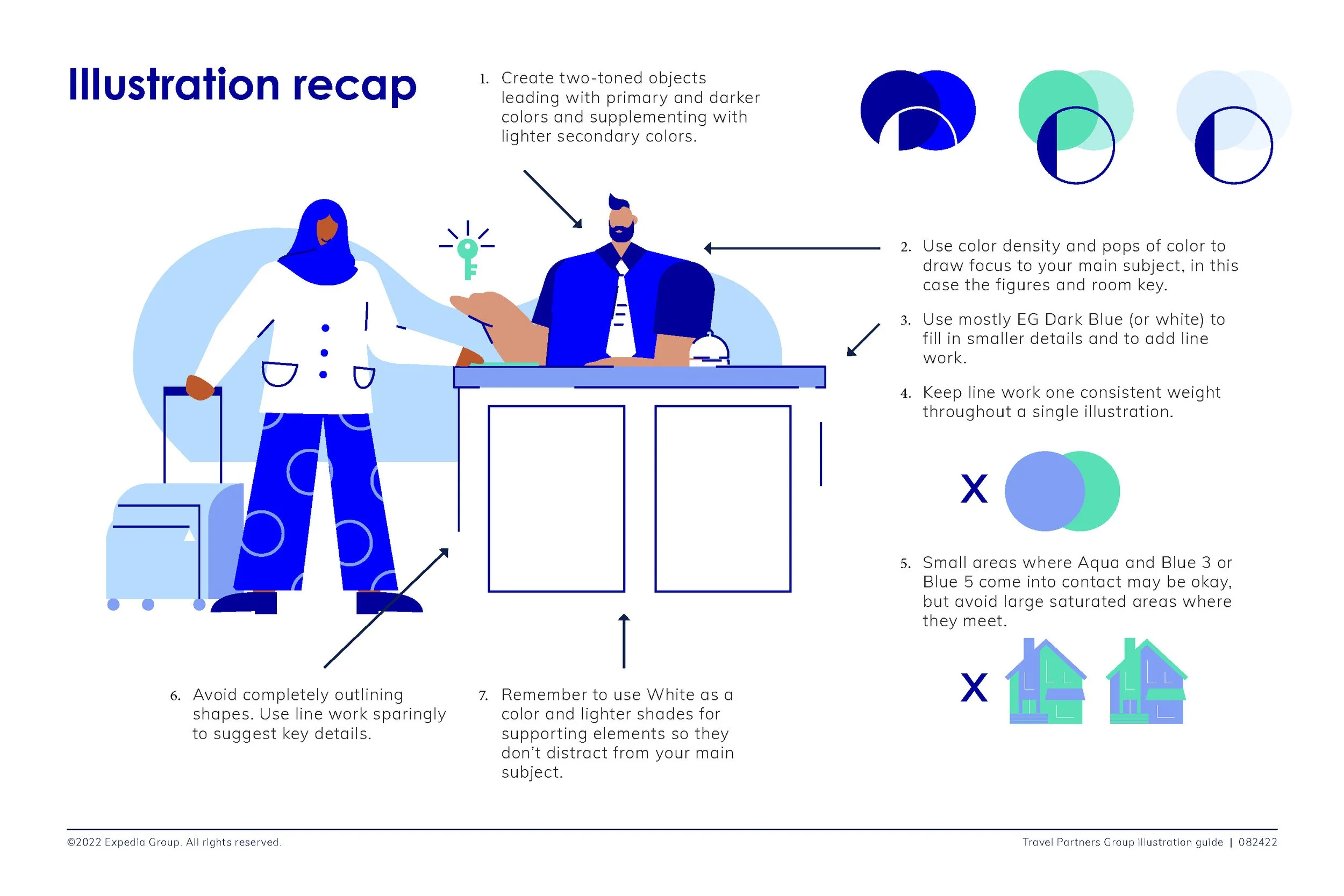
Structured objects, organic people: Environments and objects use more structured forms, while people are illustrated with softer, more organic shapes.
Organic grounding elements: Abstract organic shapes can be used to anchor or frame the scene.
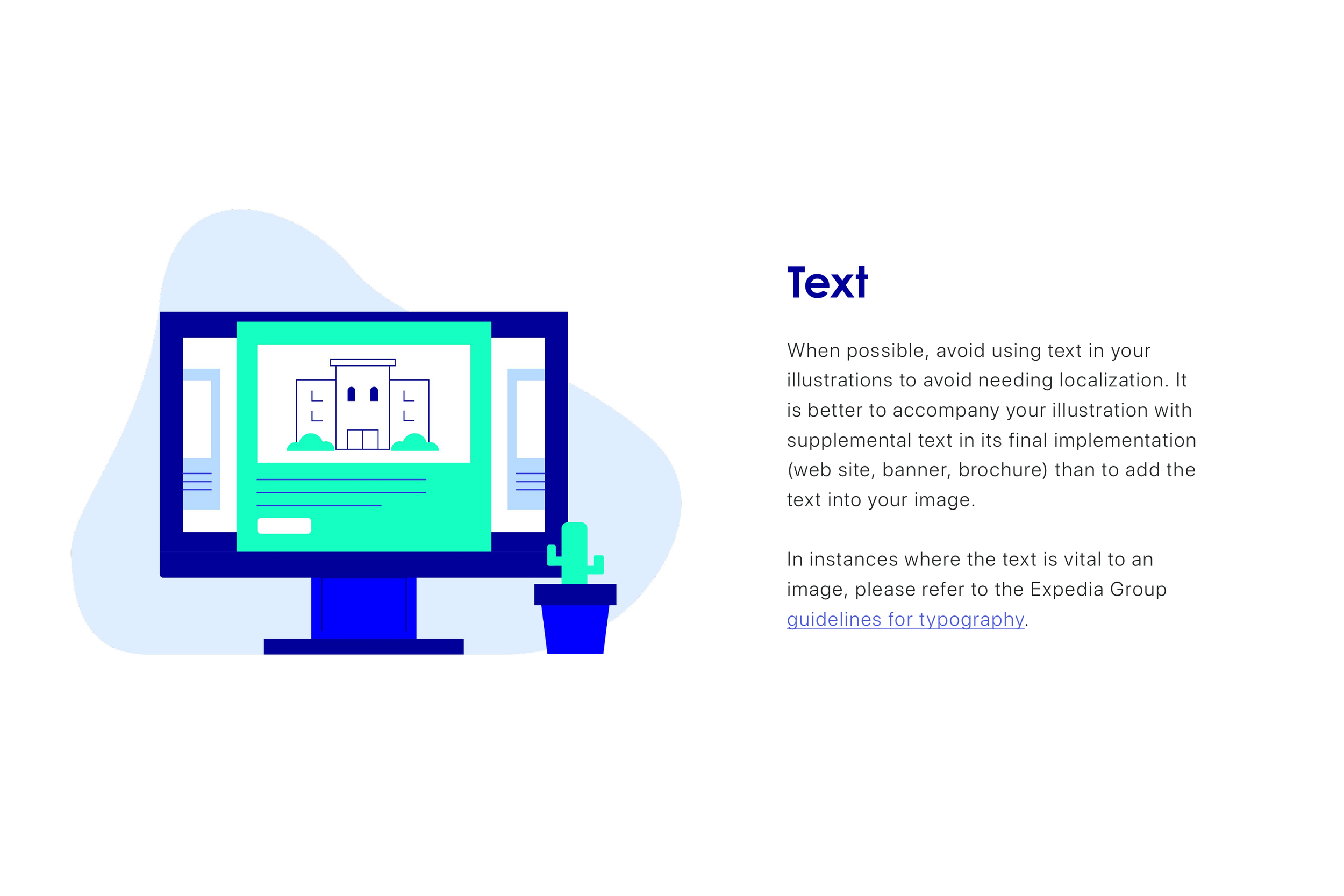
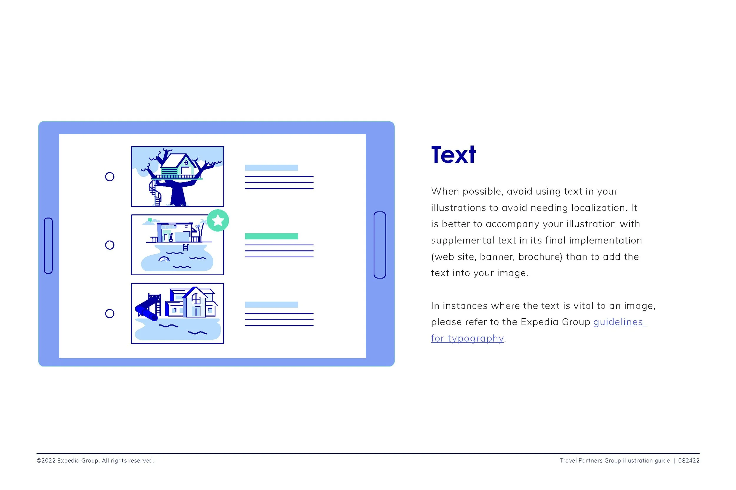
Simplified backgrounds: Minimal backgrounds keep attention on the primary subject.
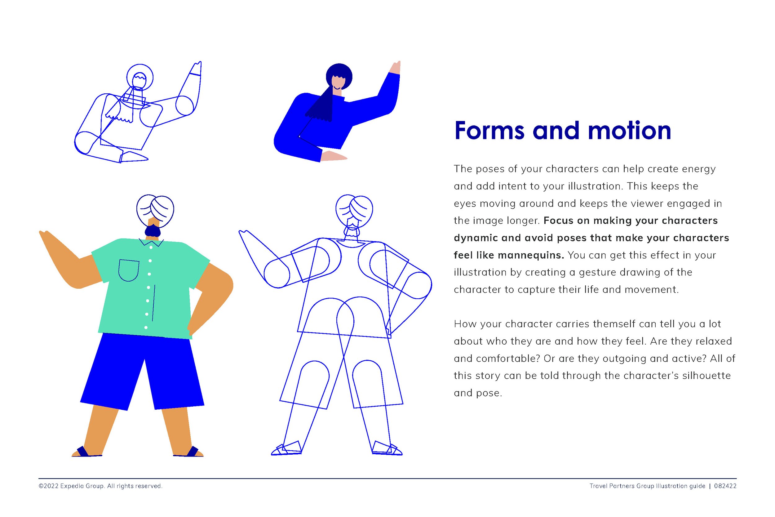
Expressive line work: Lines add personality, movement, and visual flair.
Focused color palette: A limited range of blues and teals defines the system, while people retain natural skin and hair tones.
Open, breathable layouts: Generous white space keeps illustrations clear and approachable.
The Solution
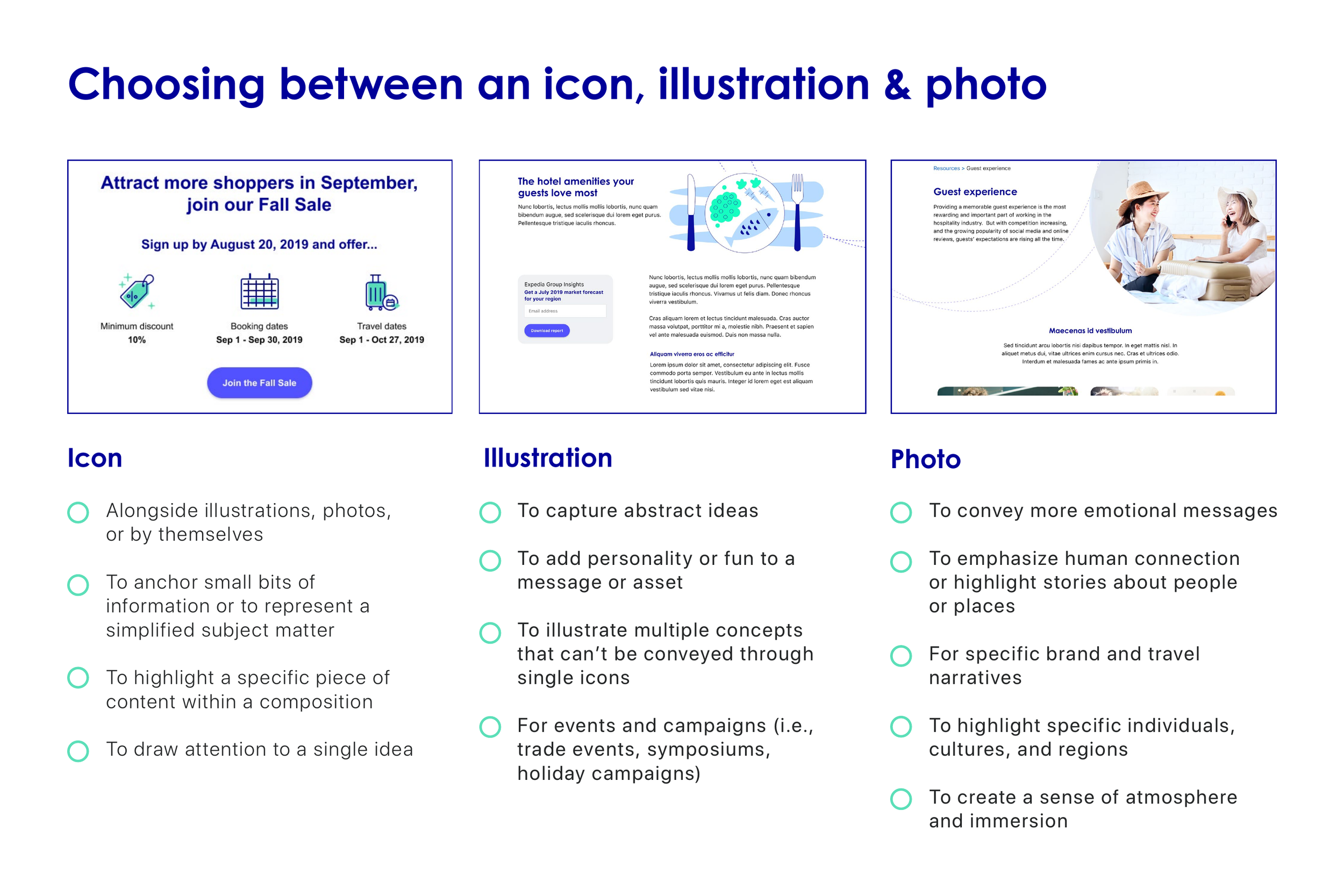
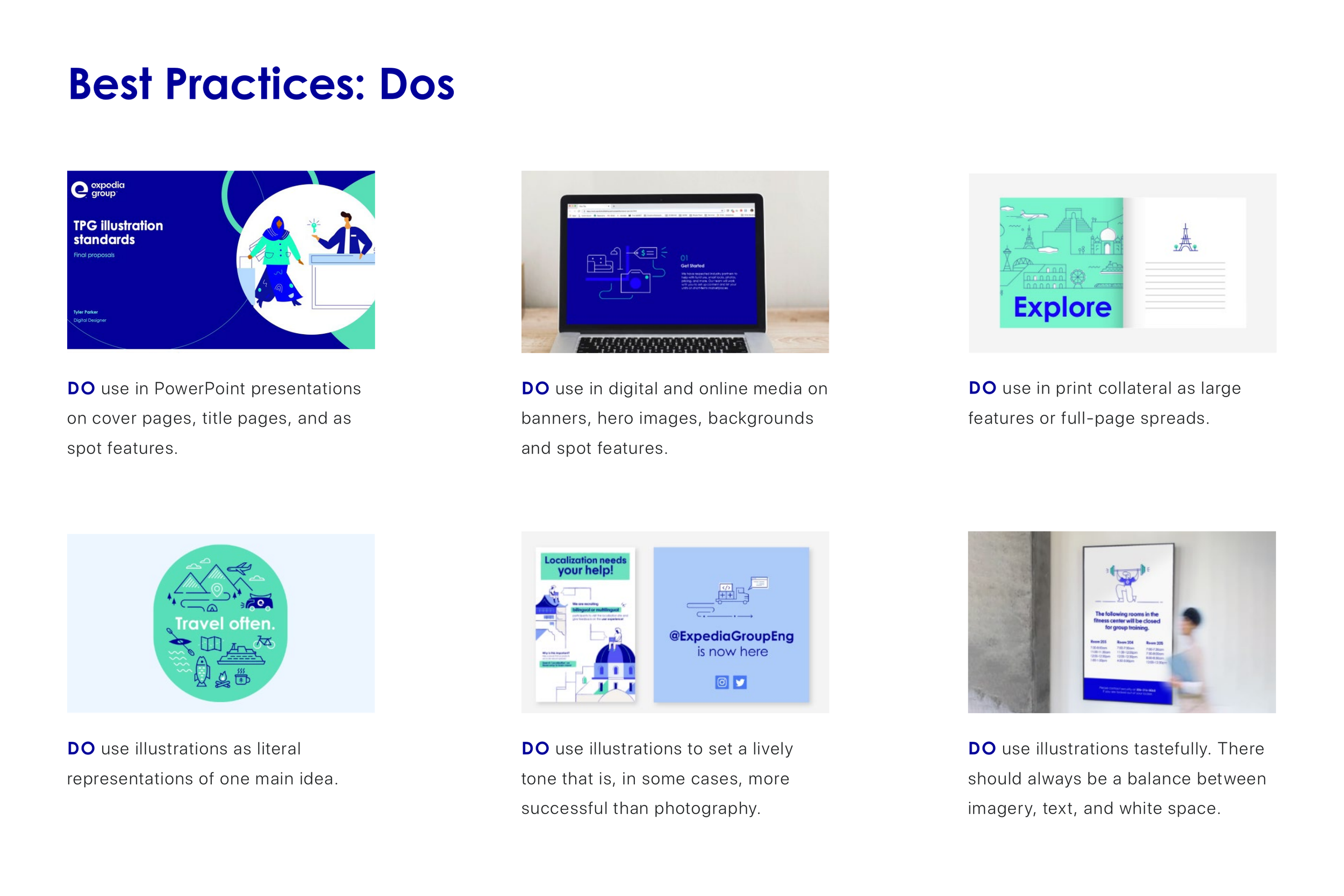
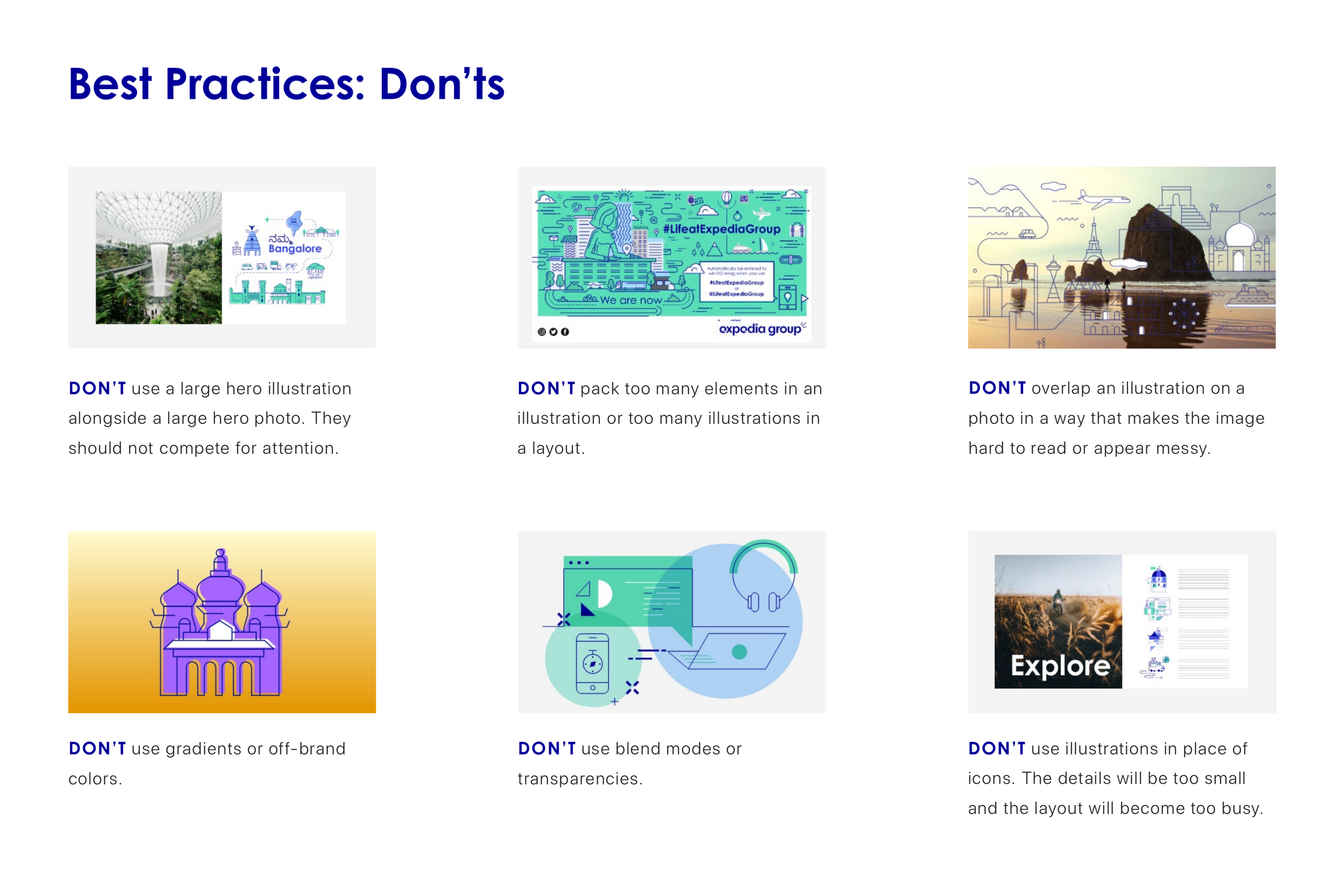
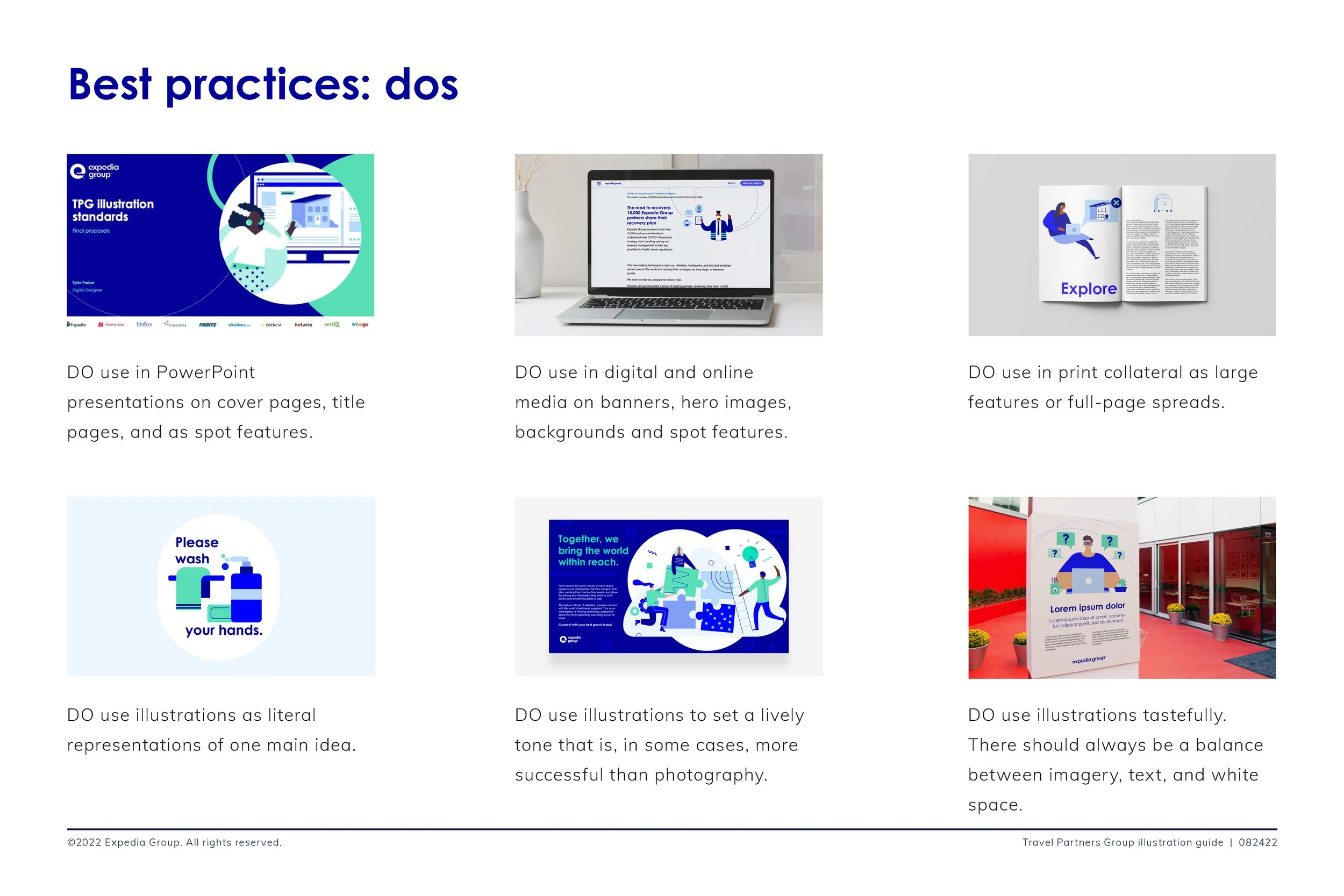
The TPG Illustration Guidelines establish a framework for creating illustrations that reinforce the Travel Partners Group brand while reflecting Expedia Group’s broader values. The guidelines outline standards for color, line weight, illustration style, and composition, as well as principles for depicting diverse and inclusive people and environments. They also include practical examples and best practices to help teams apply the system consistently across the partner platform.
EXpanded Guidelines
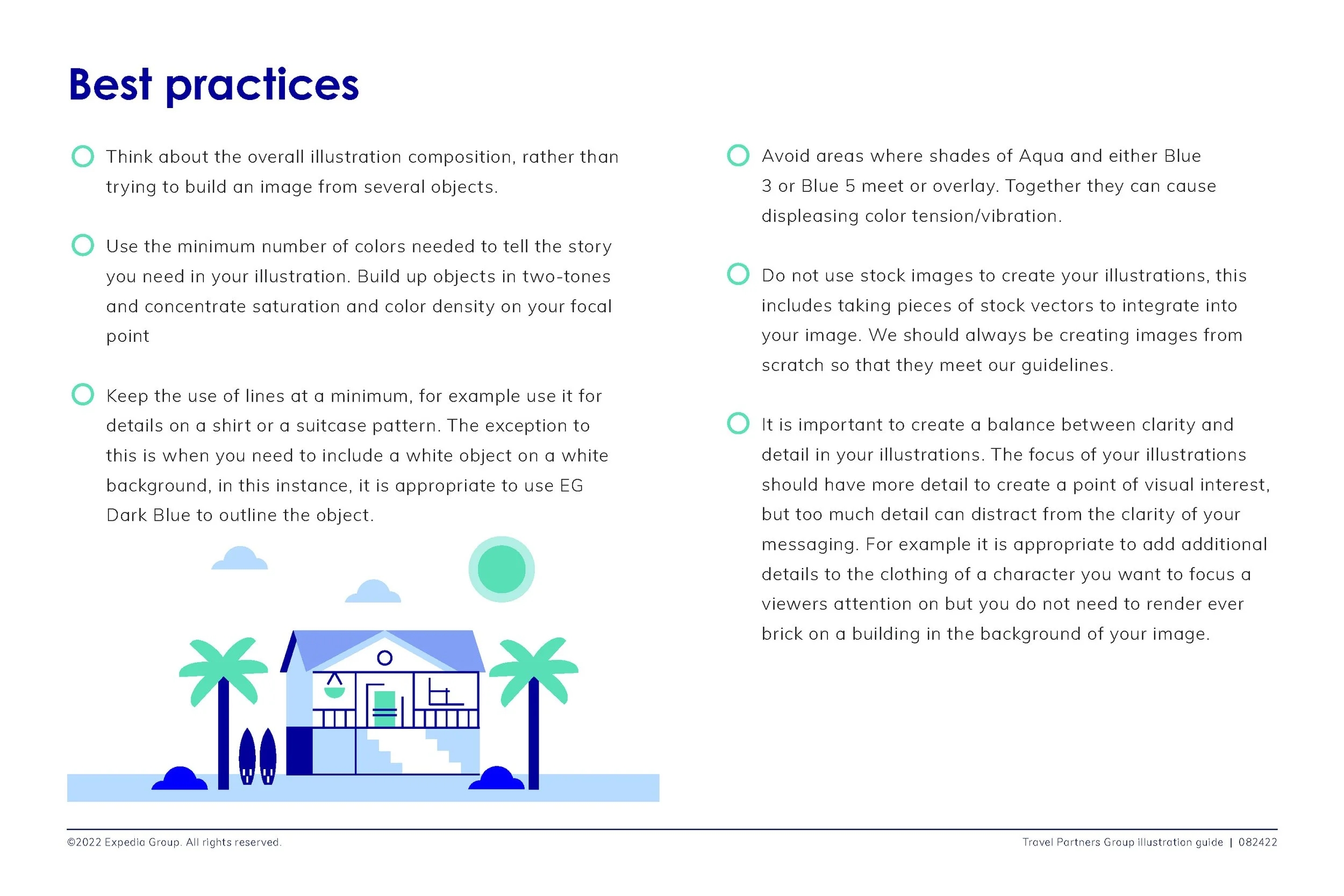
After the guidelines were in use for some time, opportunities emerged to refine and expand the system. Updates were made to better support evolving business needs, improve clarity for designers, and make the illustration style more flexible and scalable.
Key updates included:
Refining the construction approach, with clearer guidance on shapes and a stronger duotone treatment
Adjusting the use of secondary colors
Aligning the illustration style more closely across Expedia Group and its sub-brands
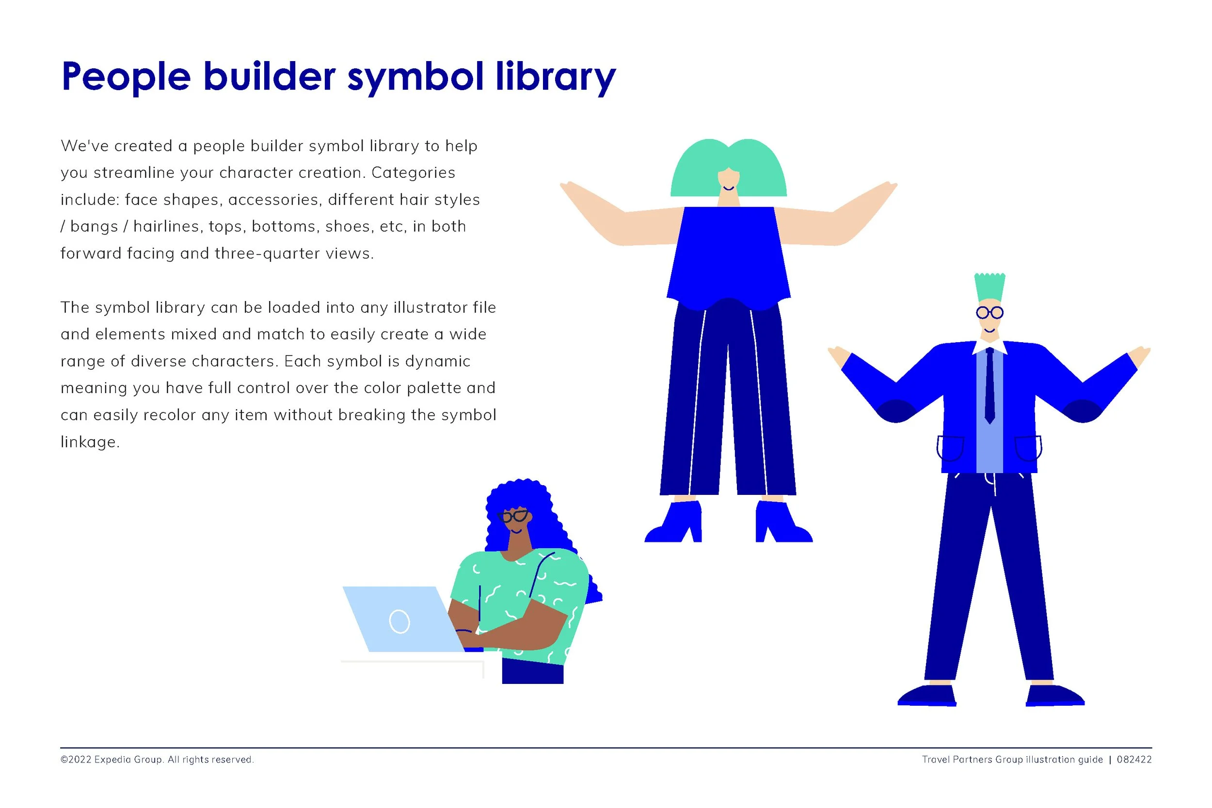
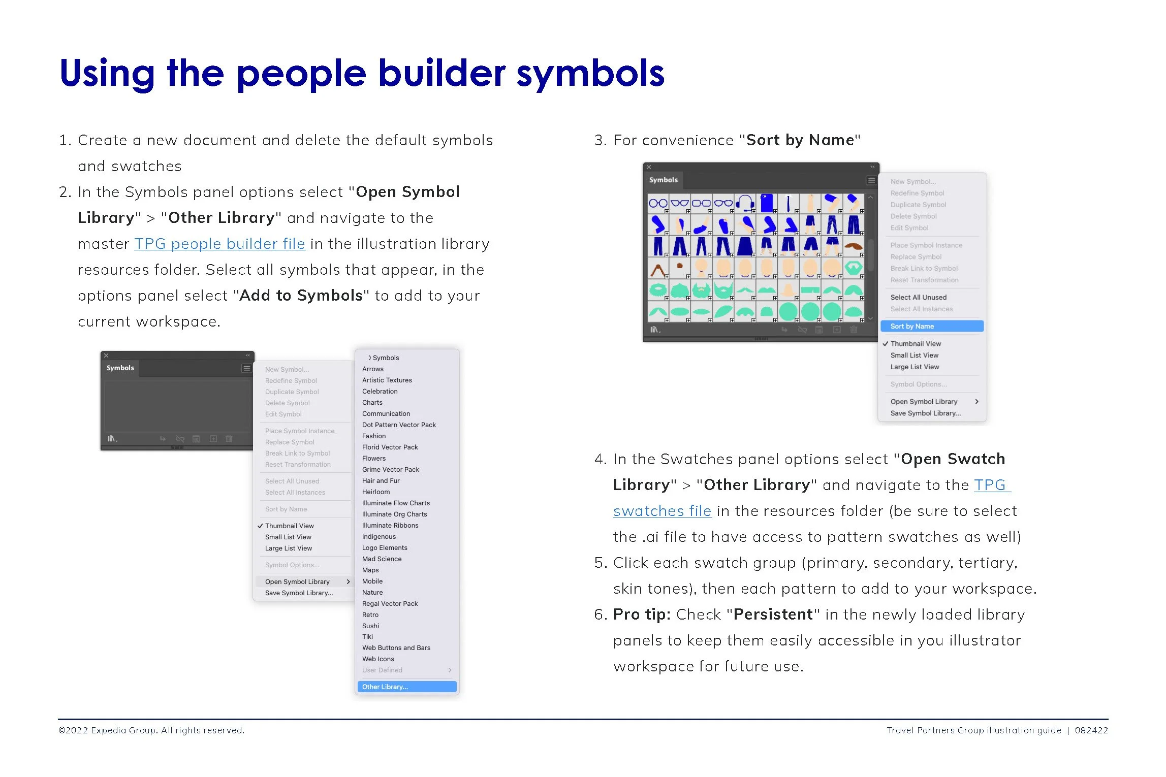
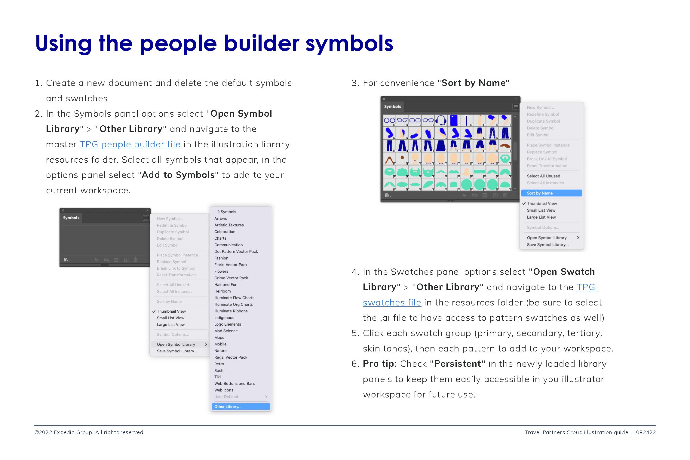
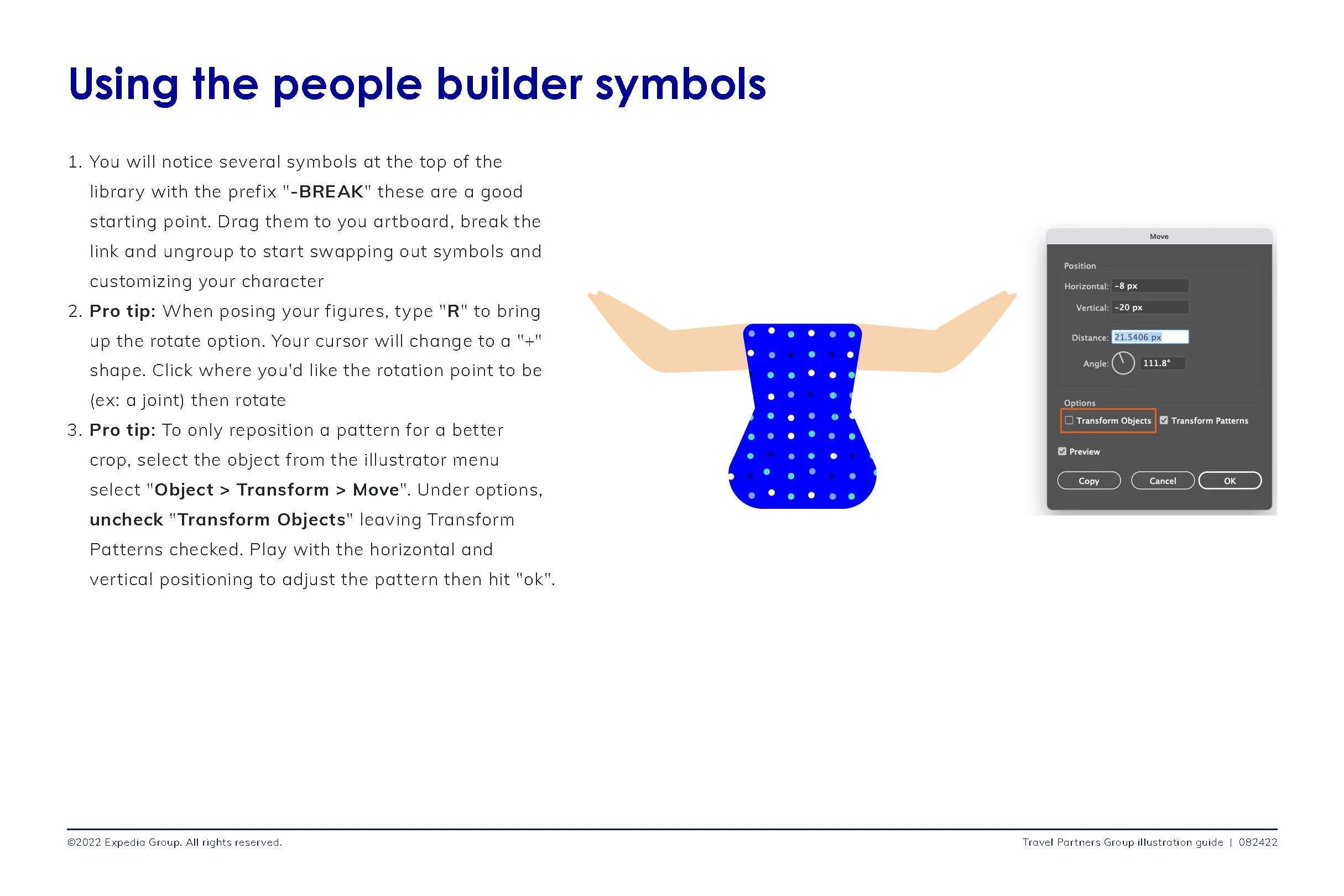
Introducing an illustration library and “people builder” tools to speed asset creation
Expanding best practices and adding more practical examples for designers


Brand Family Alignment
Since the Travel Partners Group encapsulated multiple brands the illustrations guidelines would go on to be adapted by other brands including VRBO, a vacation rental platform and Escapia, a vacation rental software for property managers. This allowed for consistency of voice across TPG while at the same time letting the individual voice of each brand to shine through.
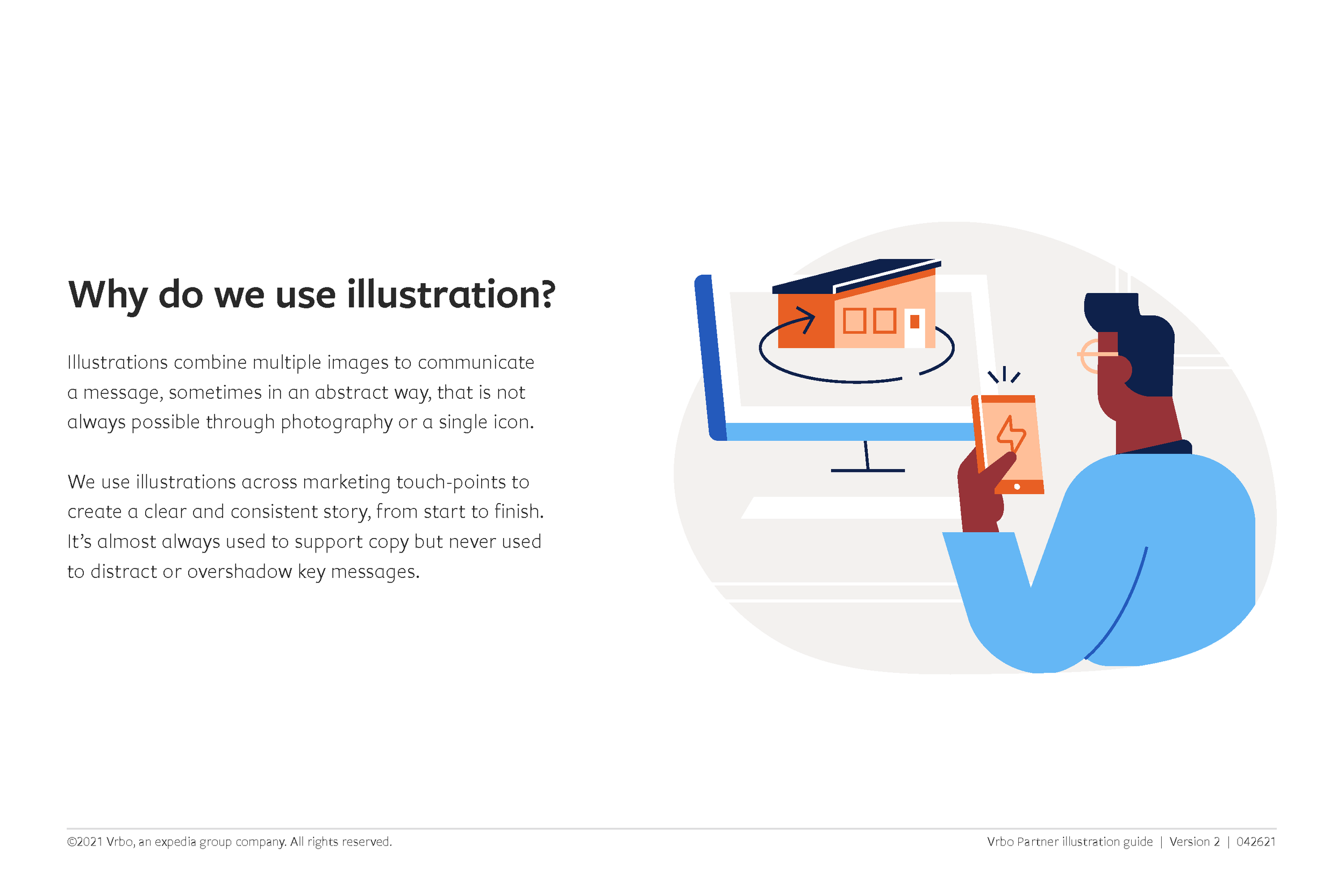
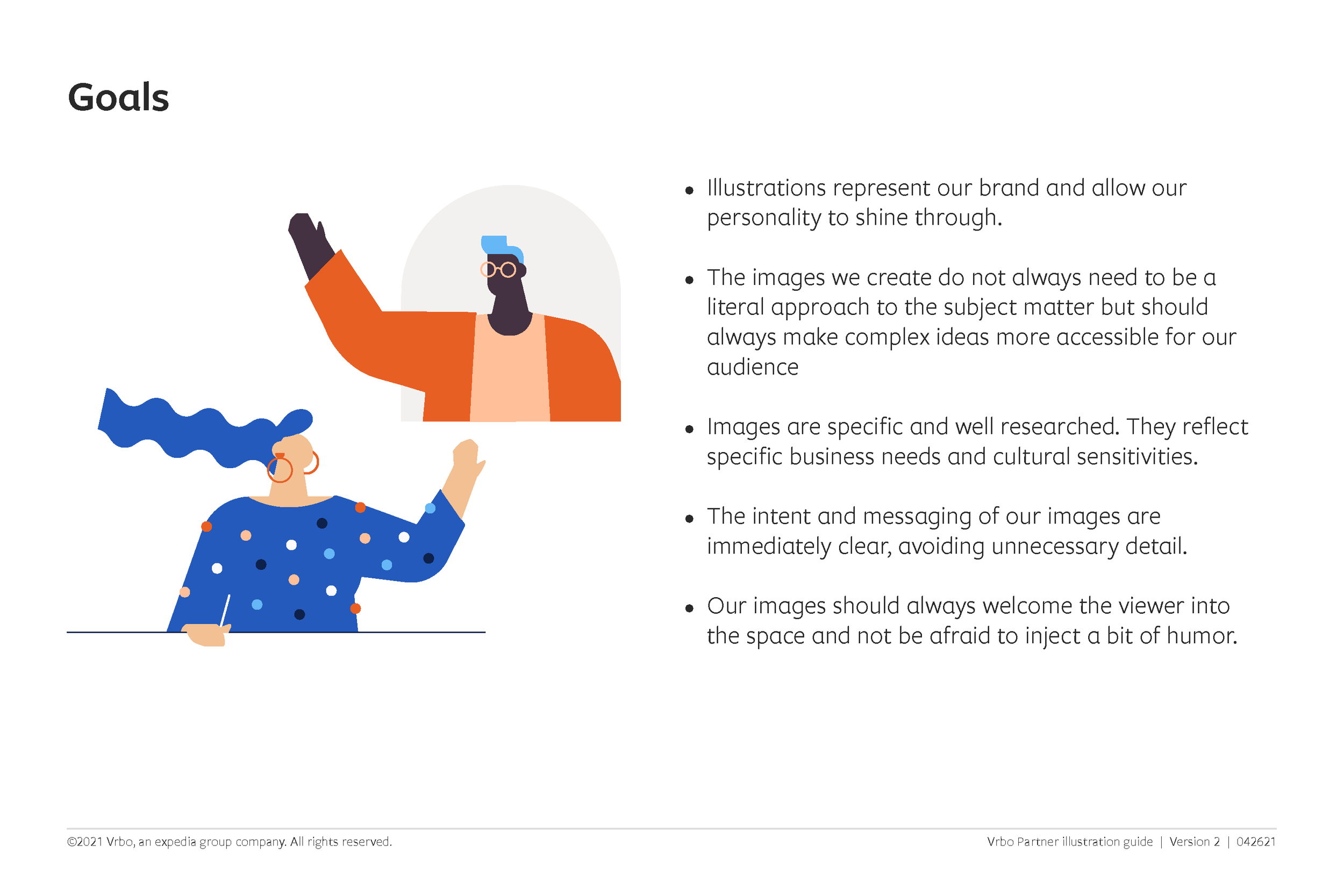
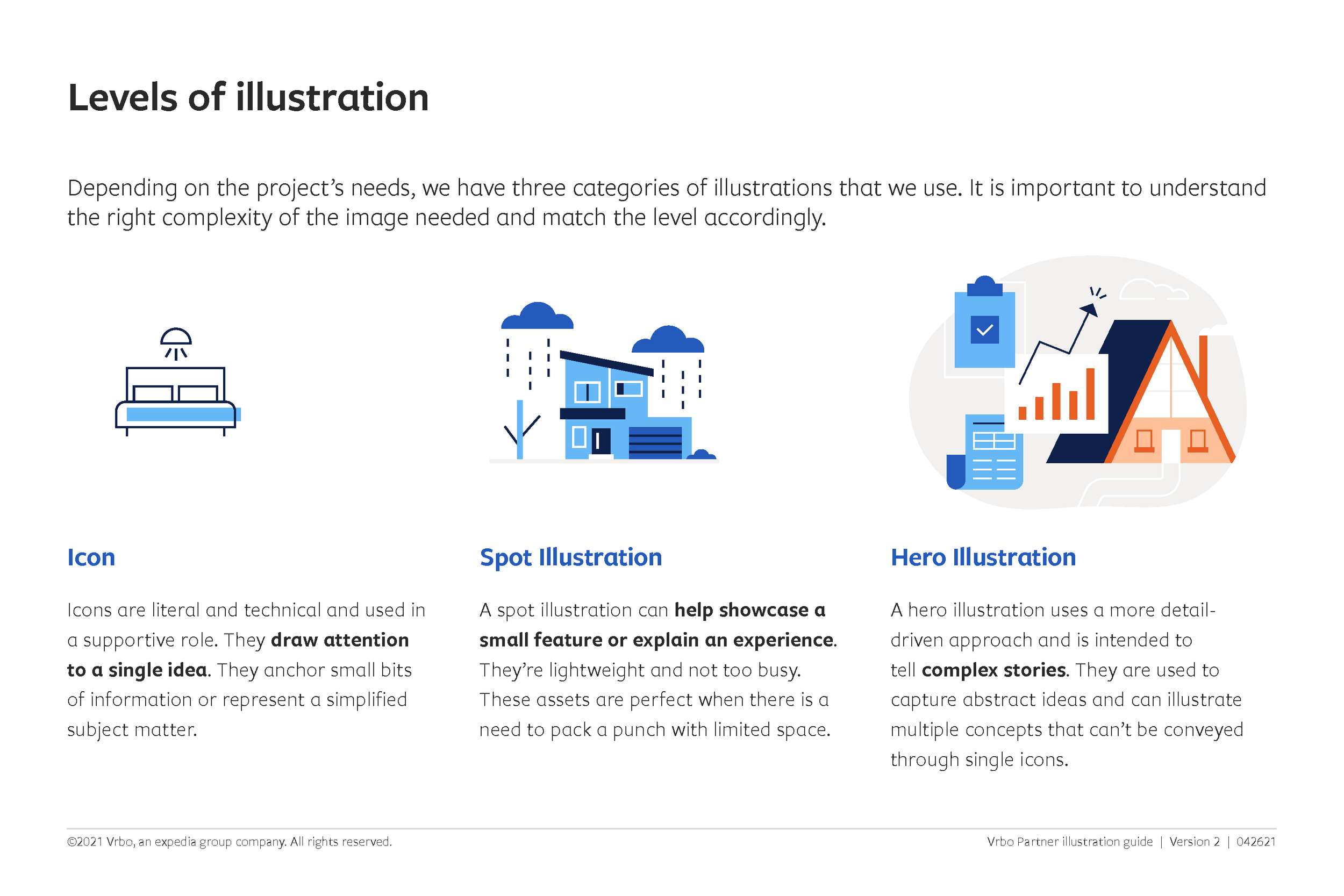
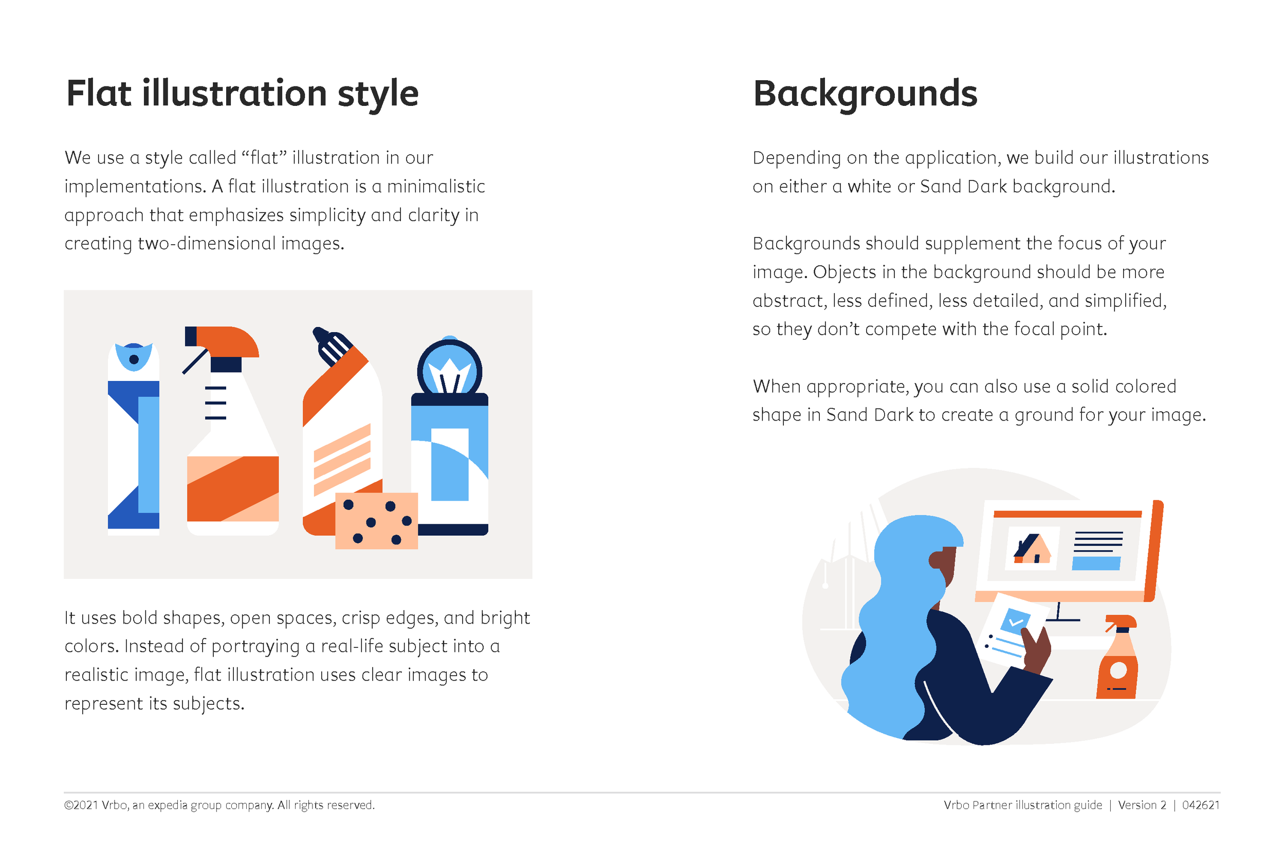
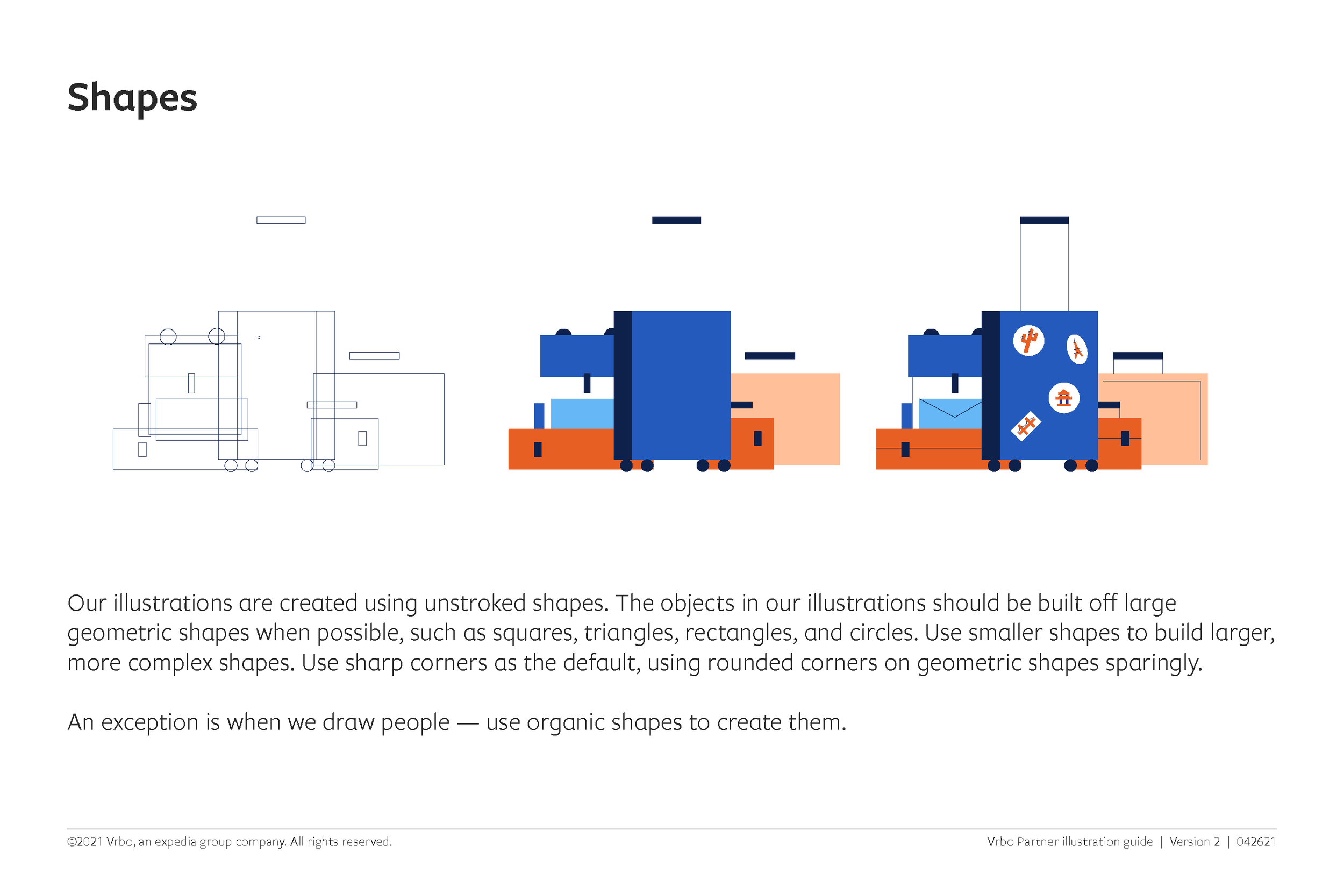
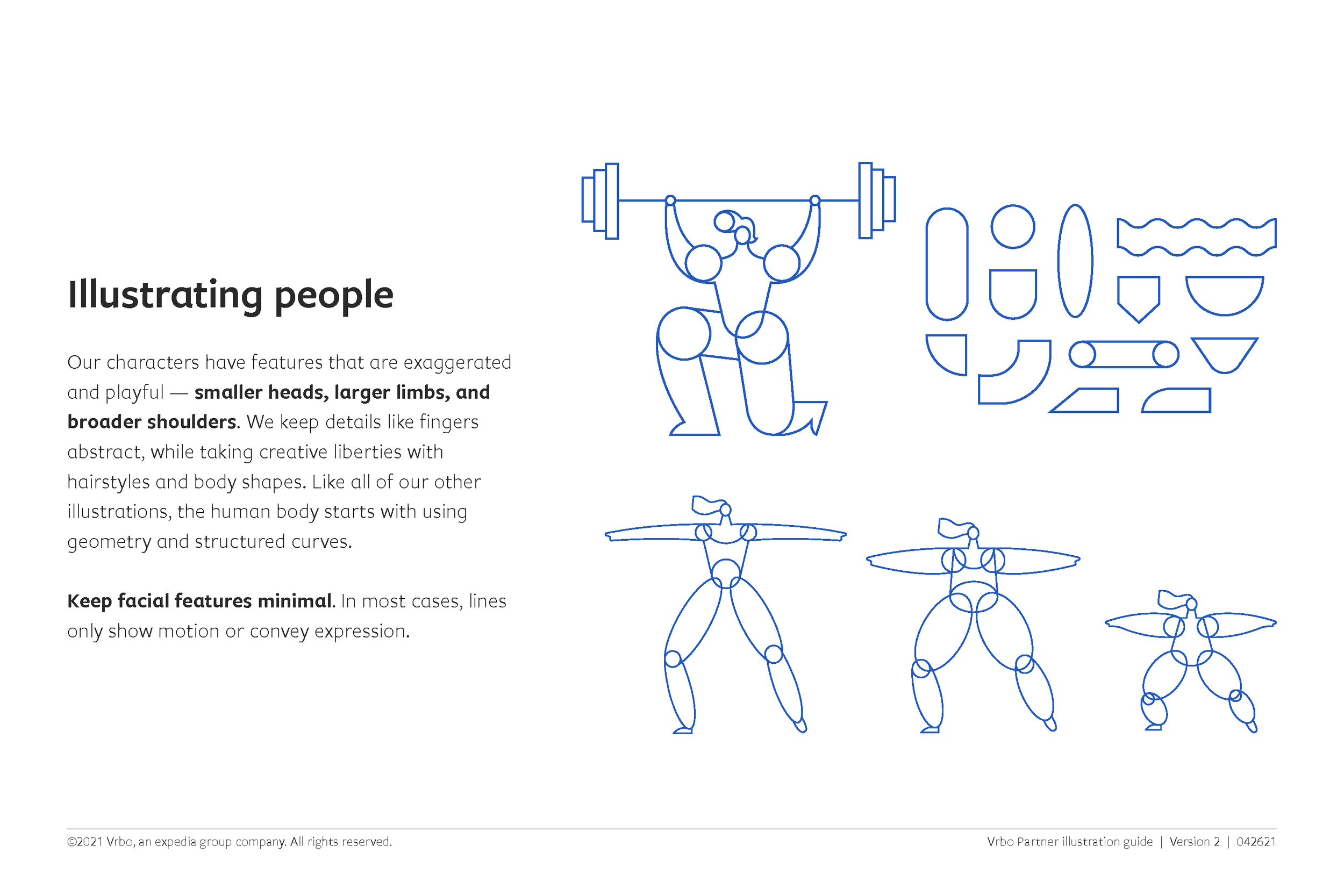
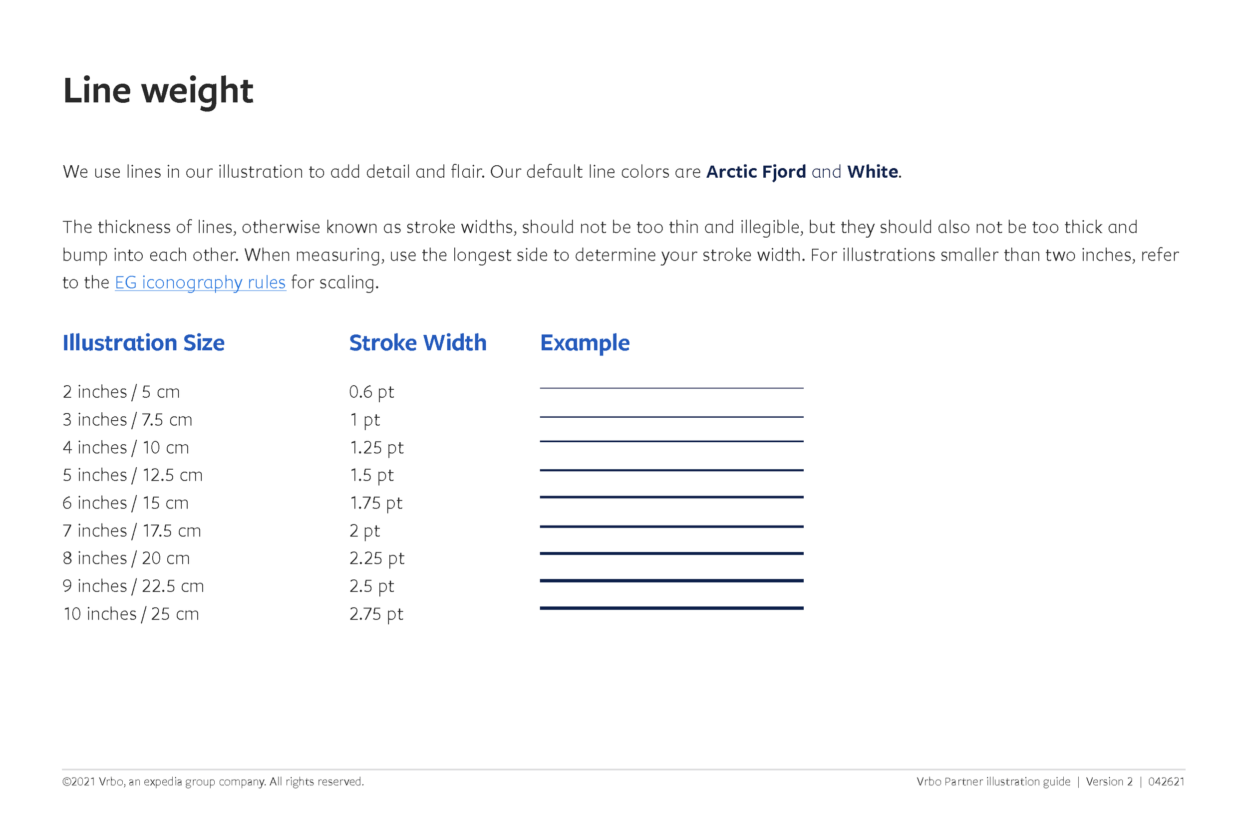
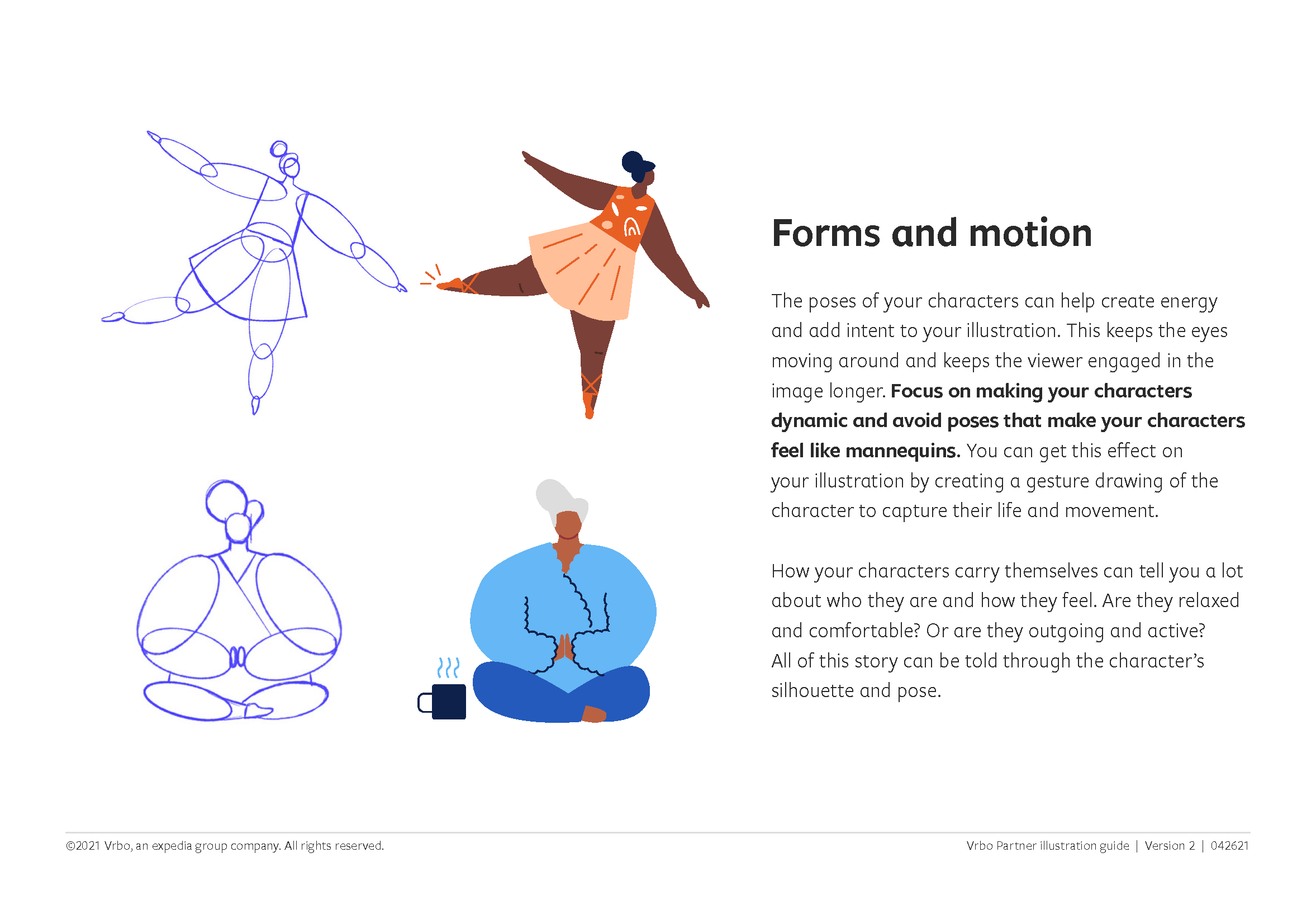
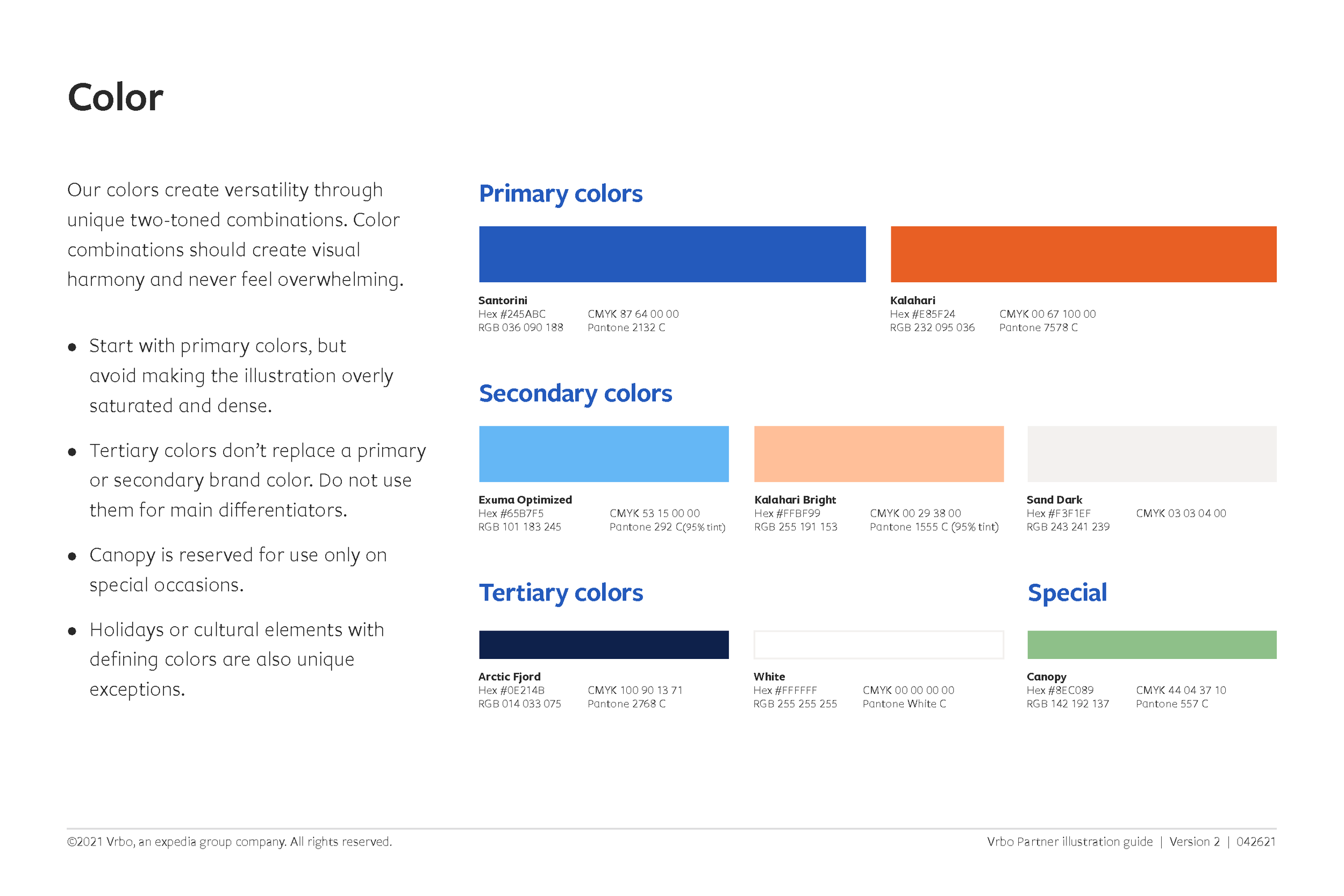
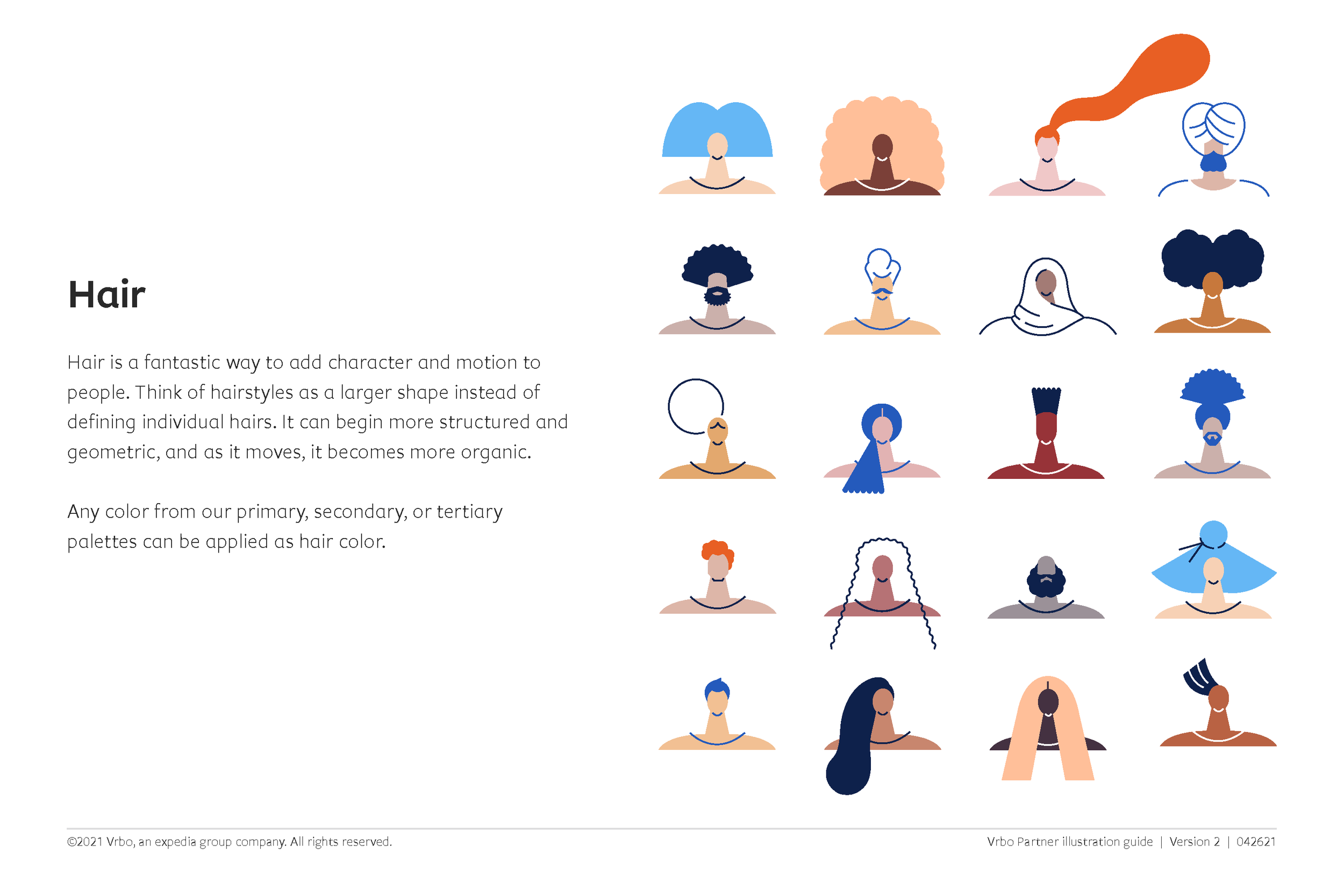
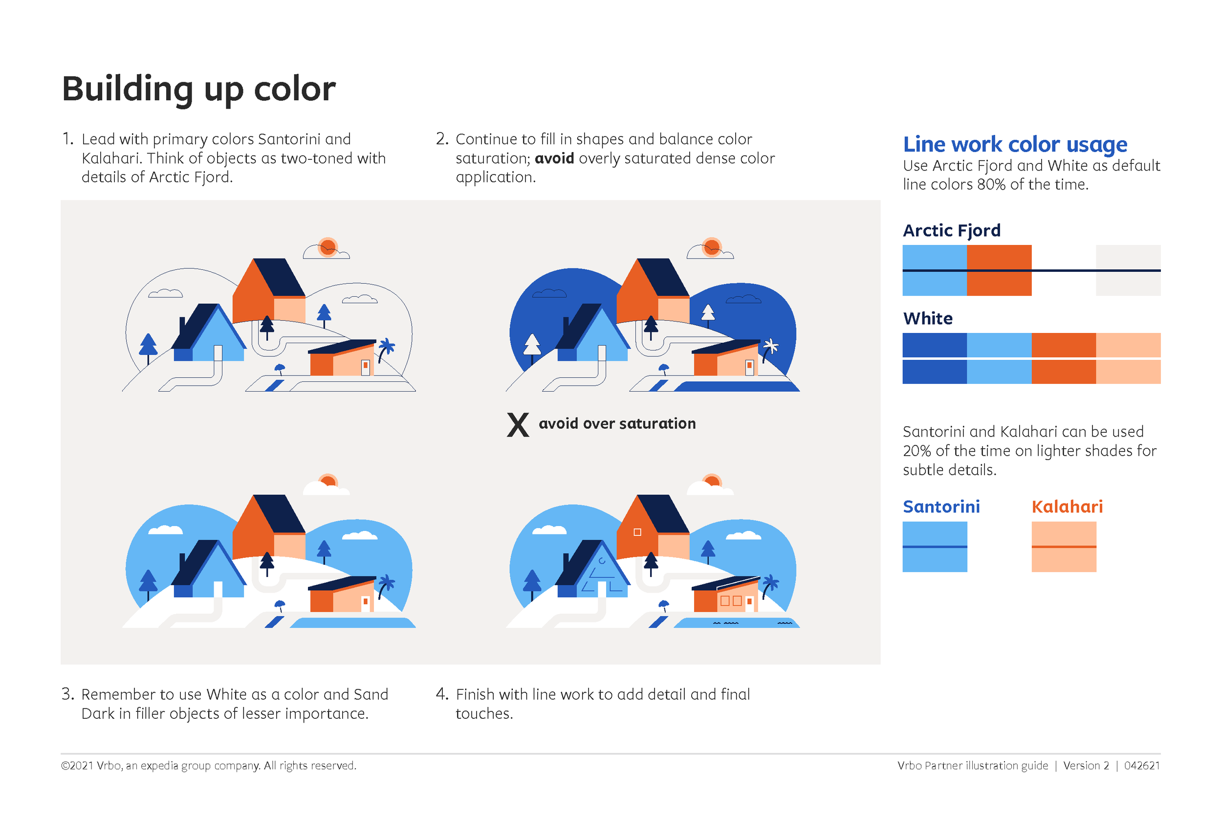
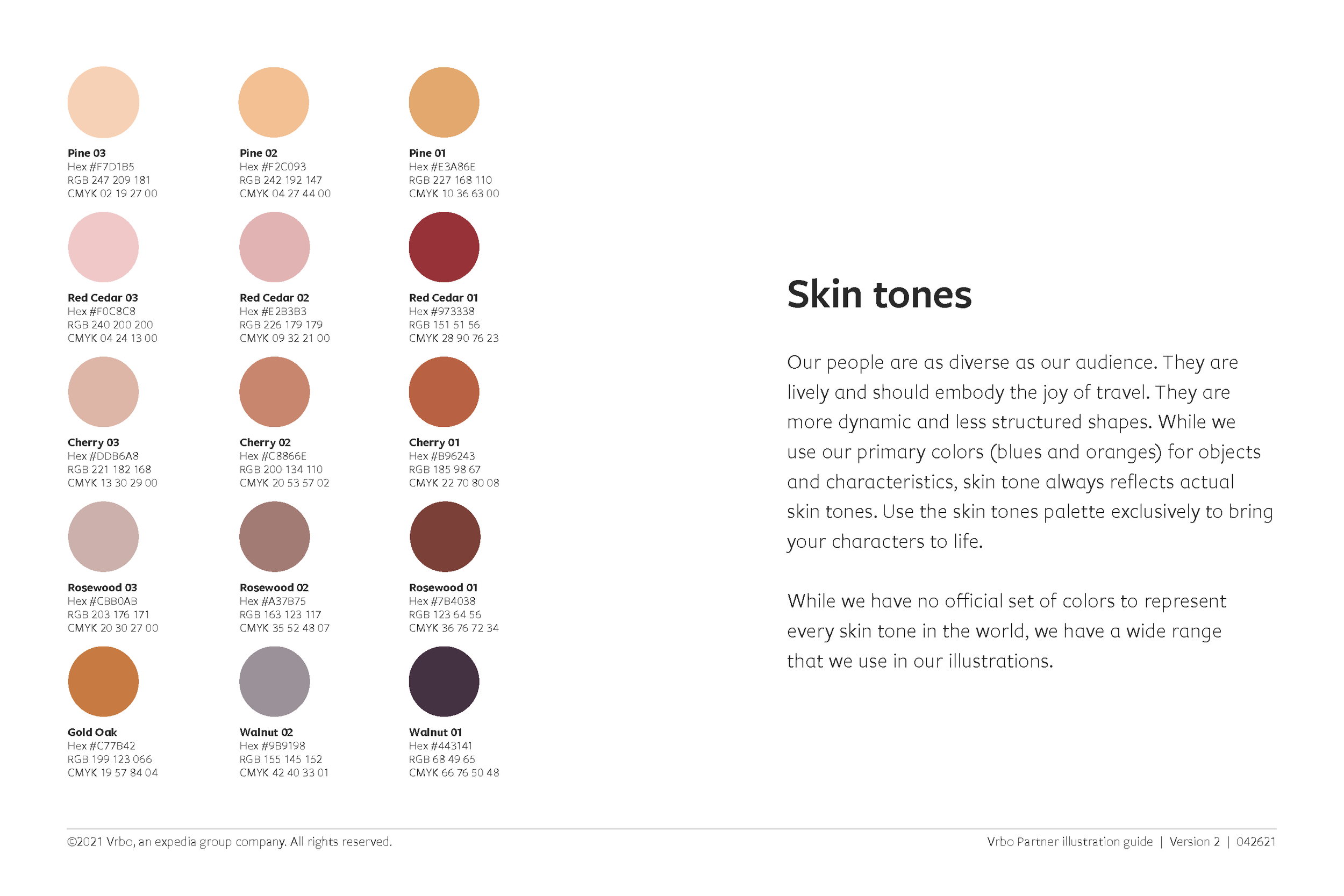
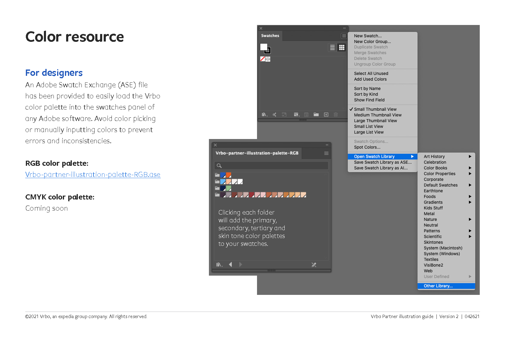
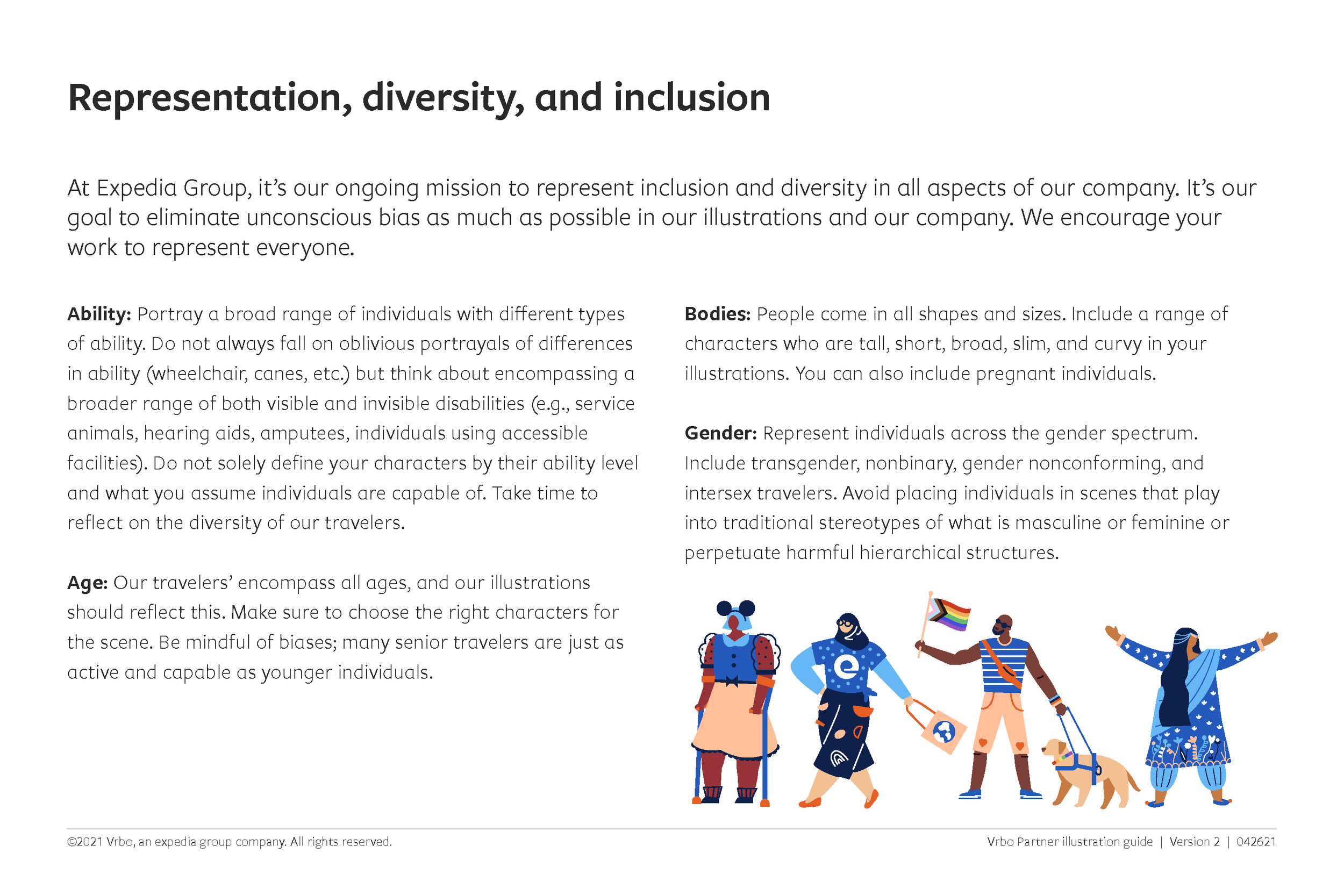
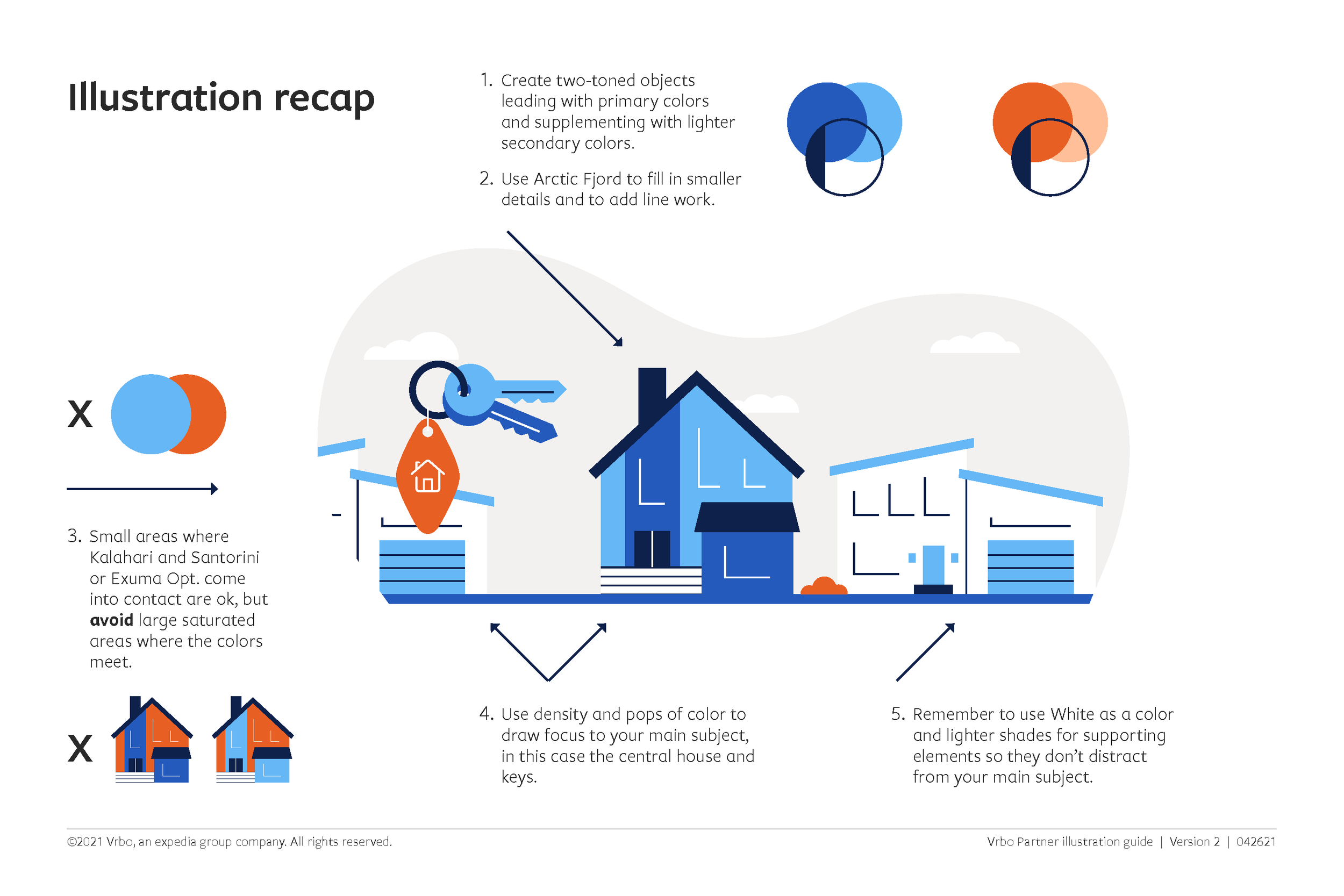
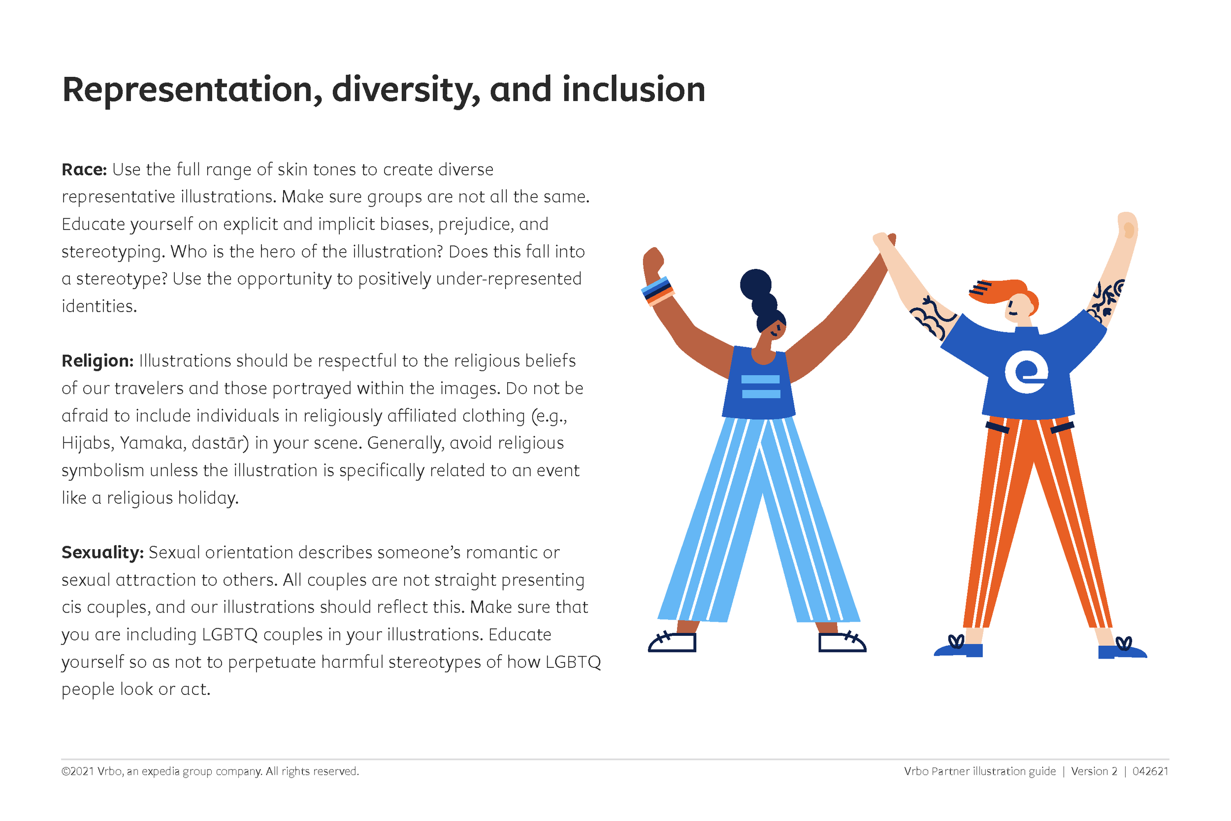
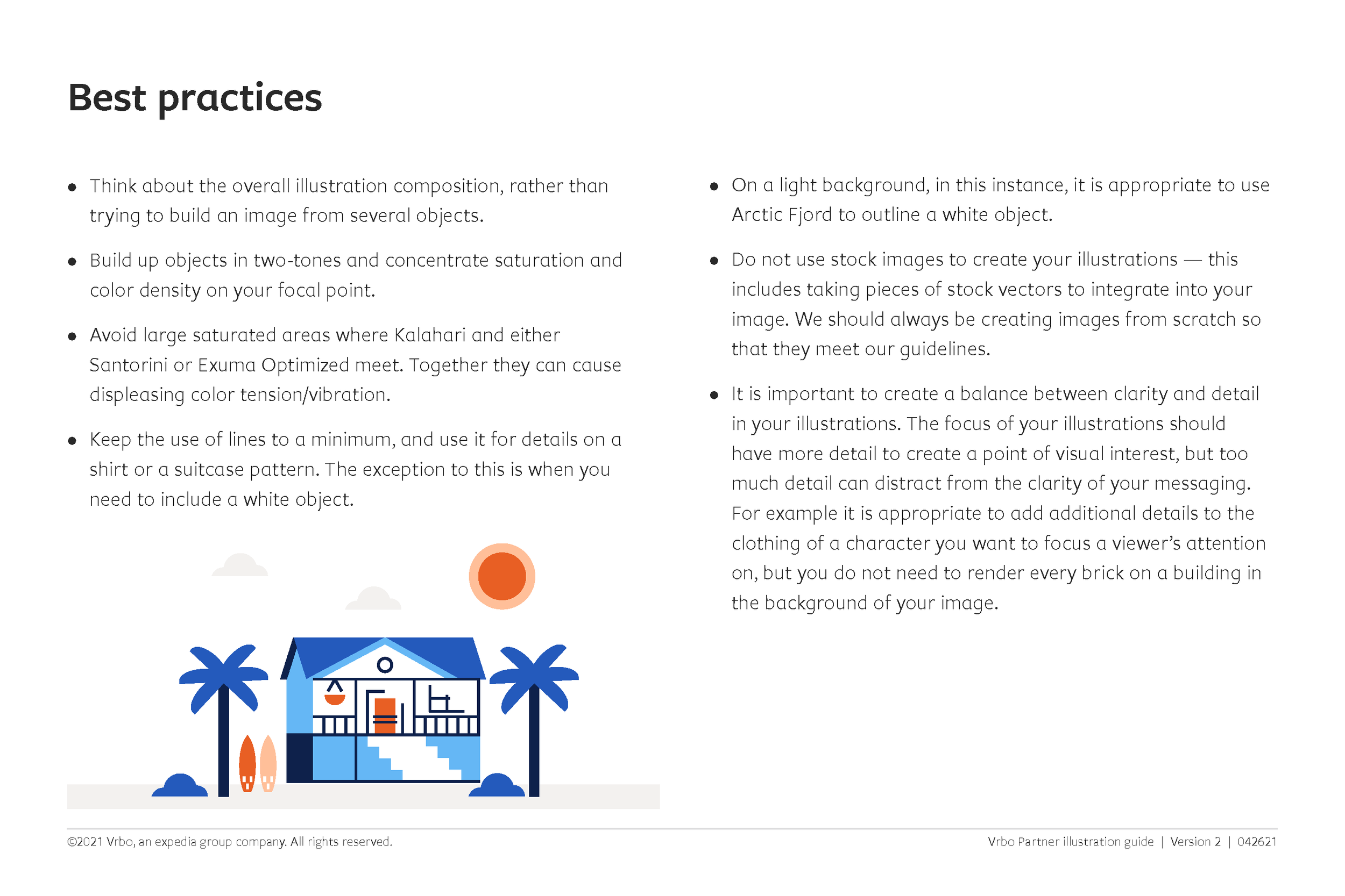
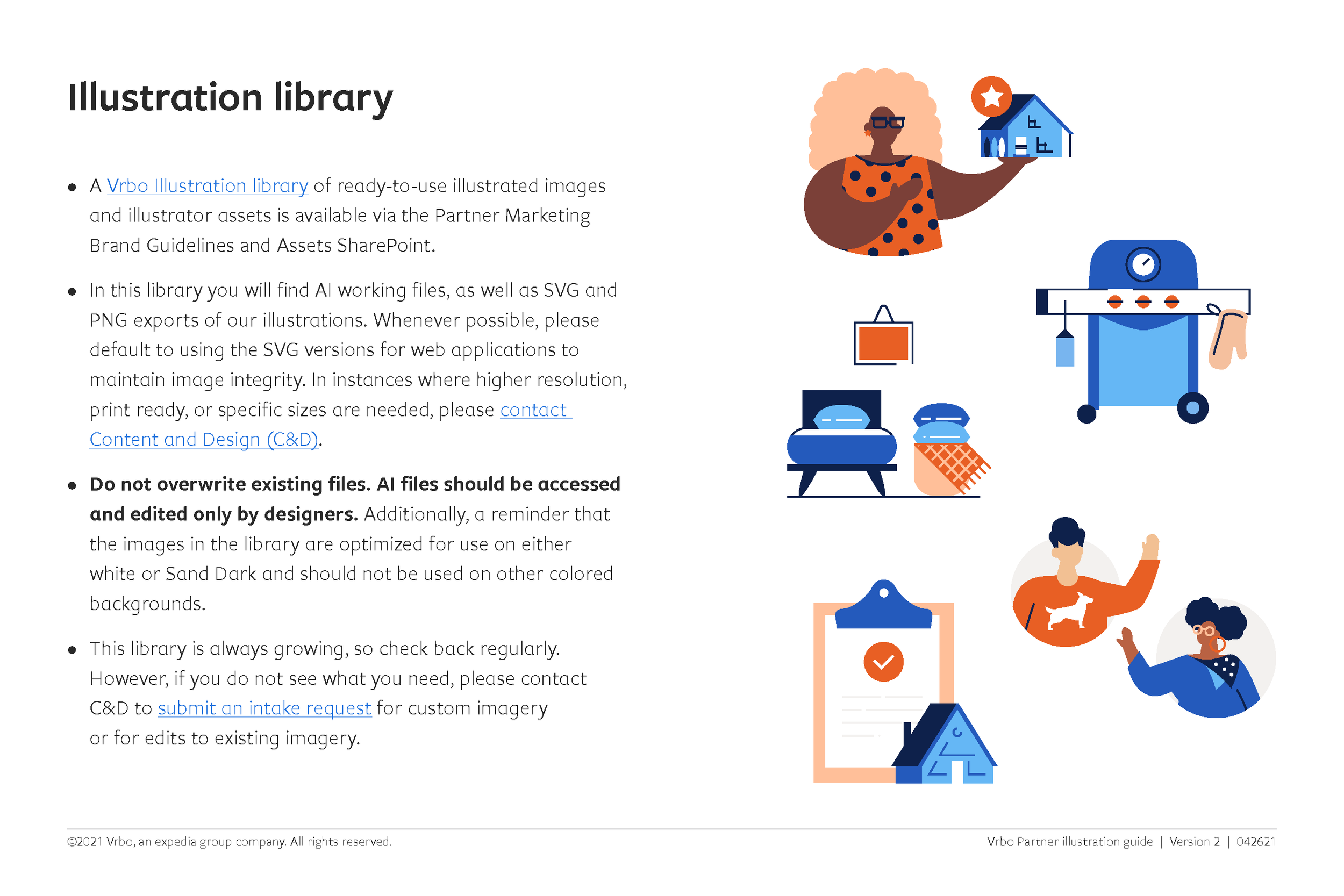


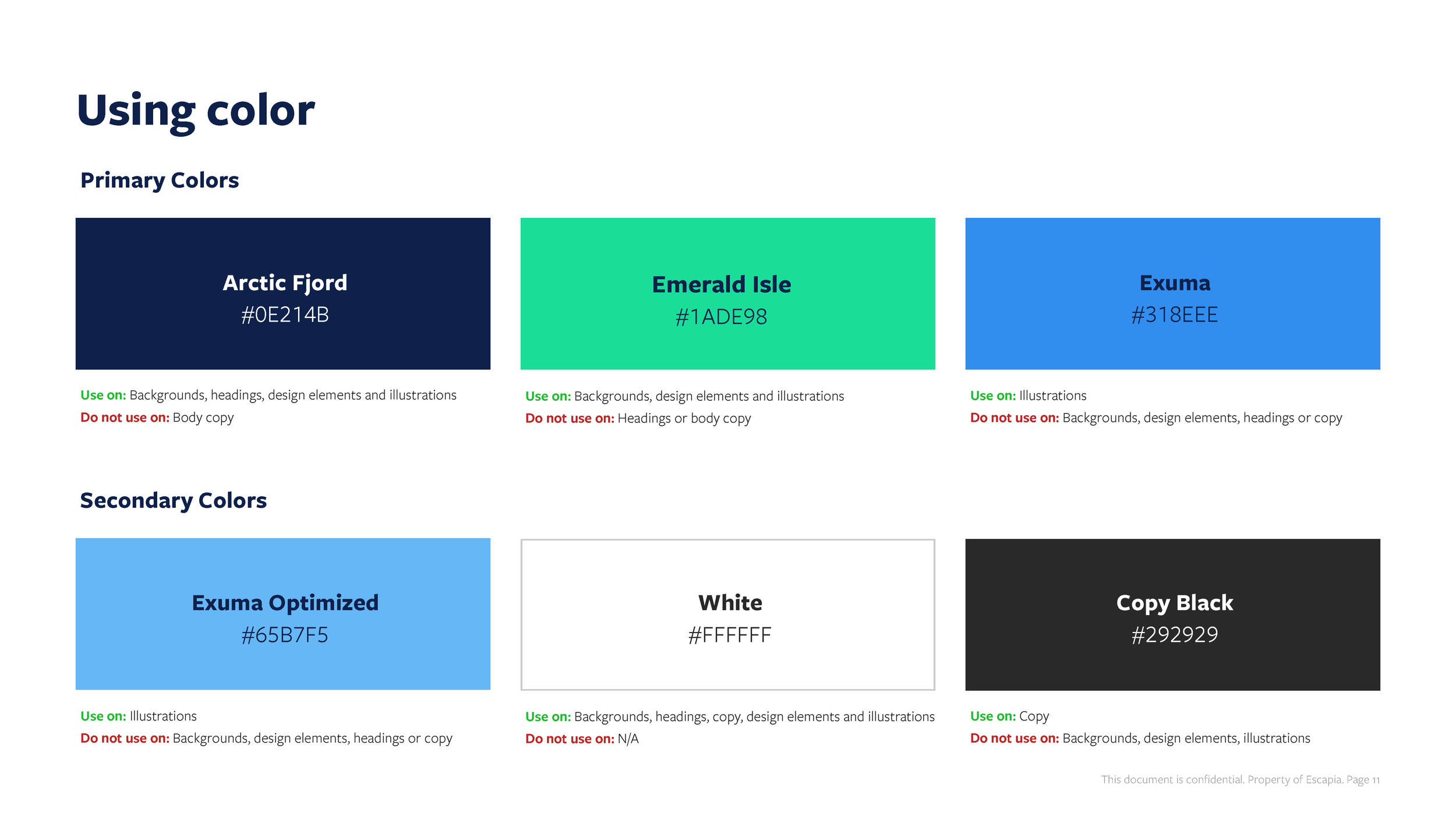


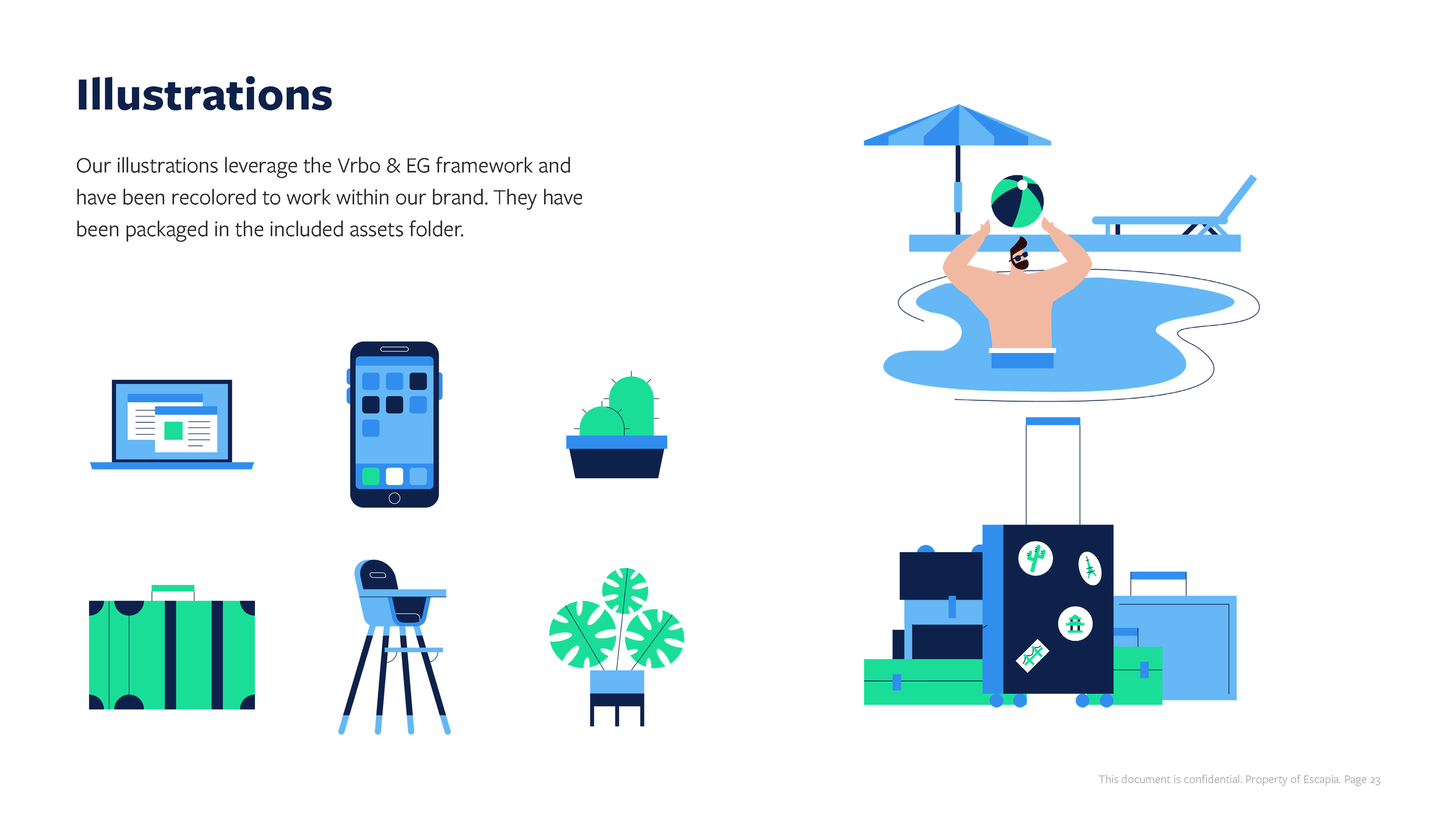


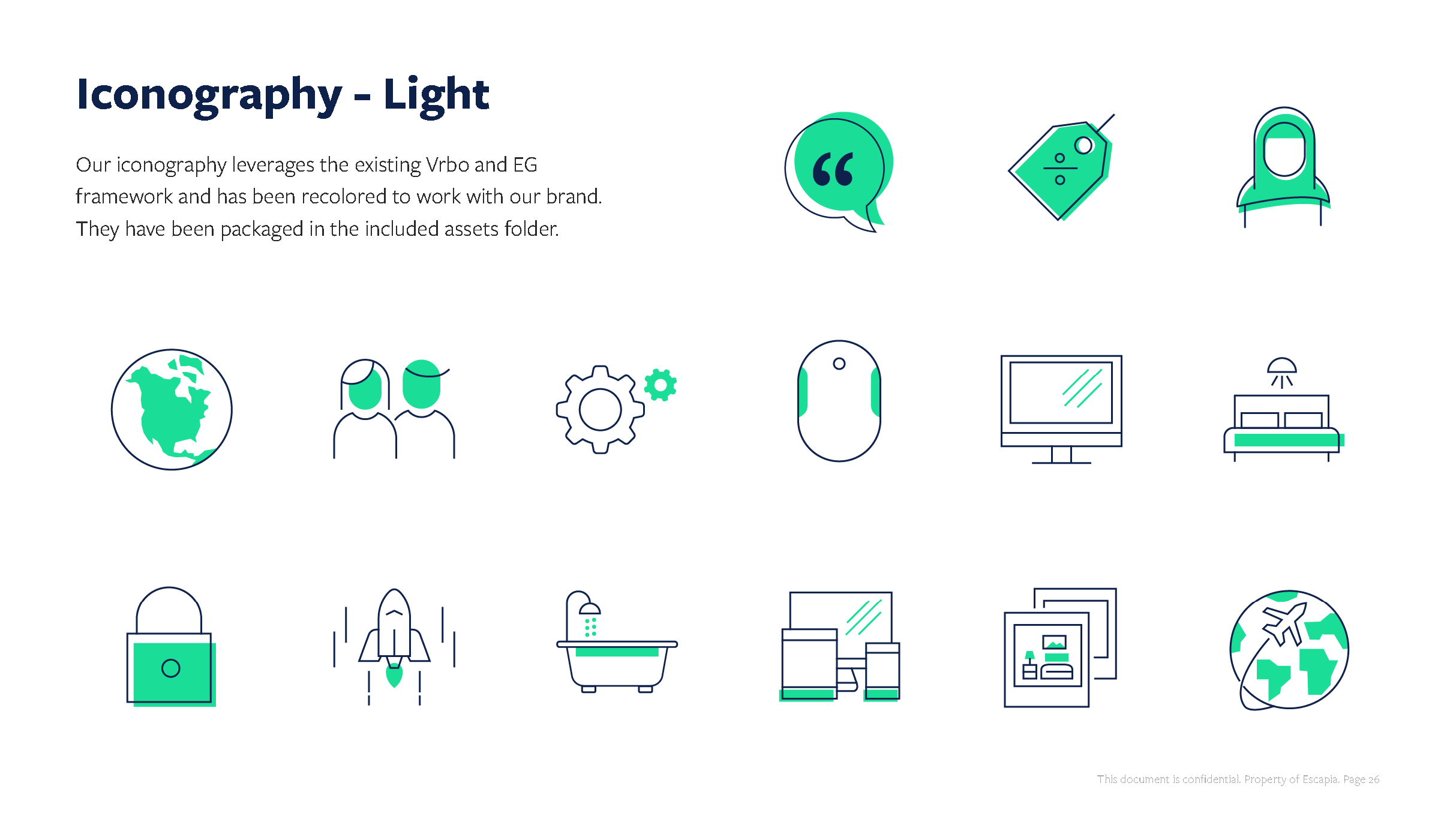
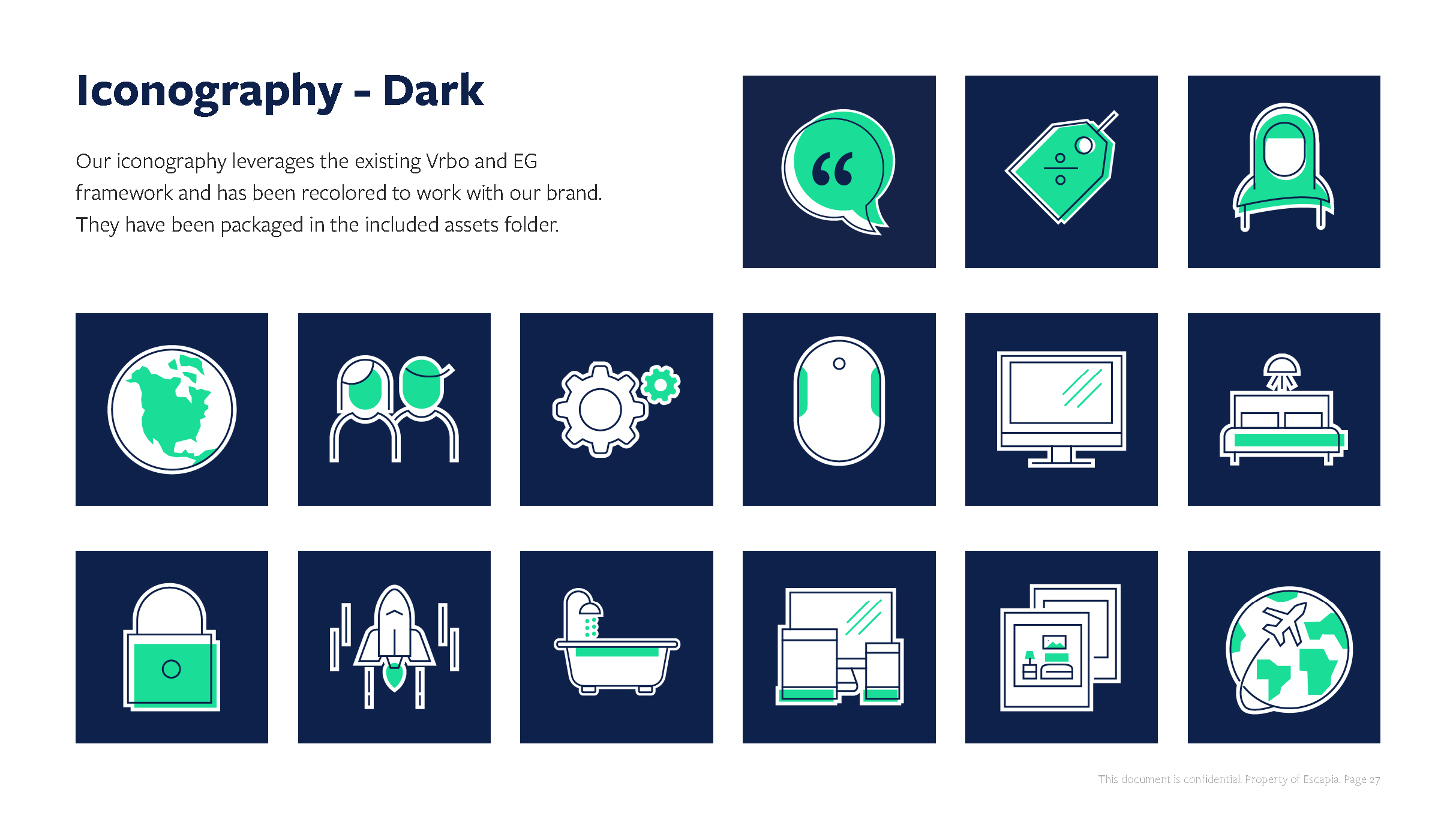

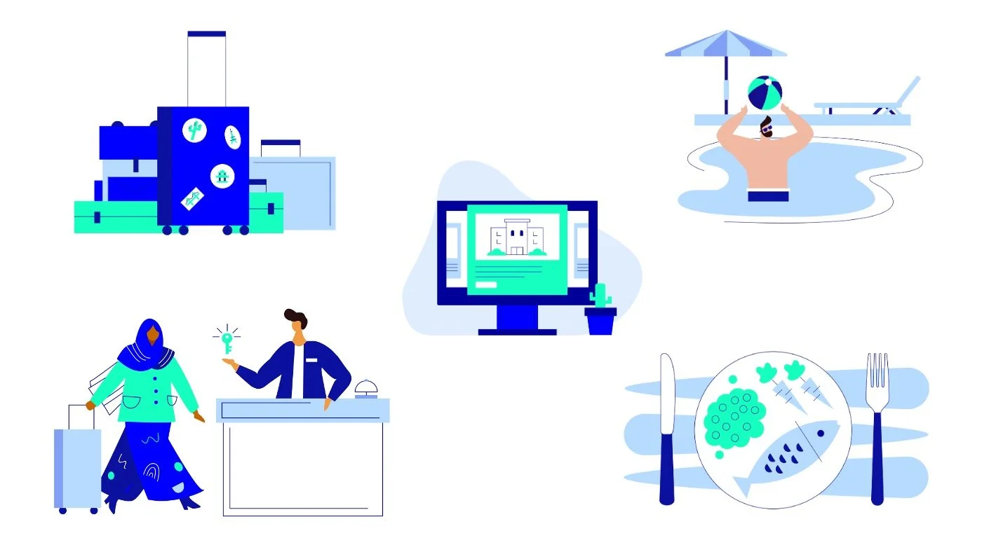
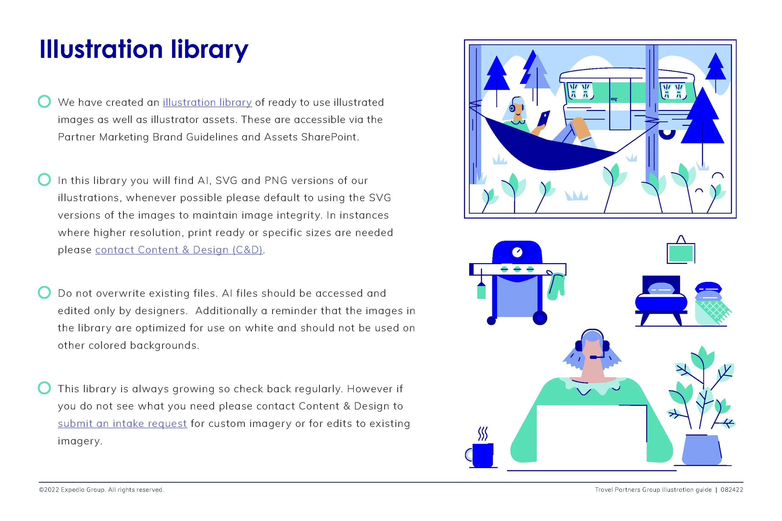
Illustration library
To better support both the design team and the broader marketing organization, we developed a library of finished illustrations and modular assets. The library combined illustrations created for past projects with new pieces developed specifically to expand the system.
The collection includes people, objects, technical concepts, and full scenes, providing marketing teams with ready-to-use illustrations in a self-service format. At the same time, vector source files allow designers to remix, reuse, and adapt individual elements to create new compositions.
This library significantly improved production efficiency, strengthened visual consistency across the brand, and provided a flexible alternative to stock photography.


Motion
Once the illustration guidelines were established, they became the foundation for expanding the visual system into motion. Using the standards as a framework, I developed animated videos that translated the illustration style into movement,bringing the brand to life while maintaining consistency across color, shapes, and character design.
B2B products and platforms often involve technical processes, data flows, or abstract concepts that are difficult to capture with real-world footage. Animation allowed us to visually simplify and illustrate these ideas through diagrams, motion, and metaphor, making complex topics easier to understand.
Guest Experience
Guest experience plays a key role in how travelers discover and choose a property. From booking to checkout, every interaction shapes how guests feel about their stay. Factors like service, cleanliness, refunds, and rebooking experiences all contribute to how a property is evaluated. By reviewing guest feedback and addressing common issues, properties can avoid negative signals and create better stays, improving both guest satisfaction and visibility in search results.
Visibility Factors
When travelers search for a place to stay, they expect to see options that match their needs and deliver a great experience. Showing the right properties at the right time is essential to building trust and helping travelers book with confidence. Visibility factors are the criteria that determine where a hotel appears in a traveler’s search results and understanding them can help properties reach the right guests.