
Kidsclick
Overview
Kidslick is Sinclair Broadcast Group's entry into children's programming via a national multi-platform programming block. Launching initially as a daily television block the service would eventually expand to be available on all screens, including broadcast television, online, pay TV, mobile and over-the-top (OTT).
In conjunction with the national television block a web version was also needed. As part of a small team within Sinclair Digital I was tasked with exploring what this web experience could look like.
Users
Initially we identified three persona as our primary users
1. Children 4-10
Digitally savvy but most importantly children so extra safety/privacy measure were important as well as simplicity. This would likely be the least prominent user.
2. Parents 24-34
Busy parents who want to be able to quickly get the content their children want to play, cord cutters, very familiar with other streaming services.
3. Parent 34+
May use less OTT apps/streaming services, more concerned about content.

Requirements
Before even branding was completed or content finalized a request came in to begin work on designing the homepage. The only guidelines/requirements given were:
- Ad unit above the fold
- Shows, Channel Schedule, Watch Live in navigation
- Large above the fold rotating carousel that would feature content/promotion/contest/advertising
- Top trending content
- Shows A-Z
- Potentially a live stream player
- Clean look.
My Role
As the sole UX/UI designer working closely with Kidsclick stakeholders and a creative director to design initial concepts for a web experience.
Competitive Analysis
I began the project by identifying and researching out competitors OTT apps, looking for standards and trends.
This included the apps for:
- Nickelodeon/Nick Jr
- Sprout
- Disney/Disney XD
- Six
- Hulu
- Toon Goggles
- Cartoon Network
- PBS Kids
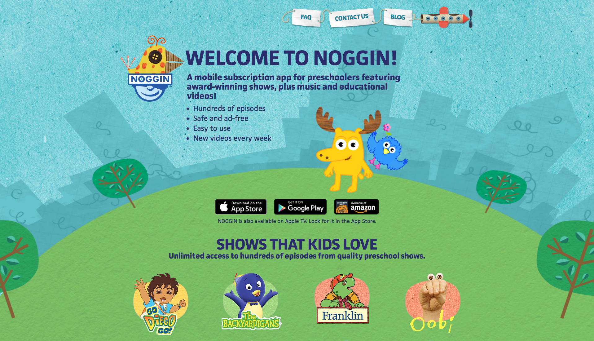
- Noggin

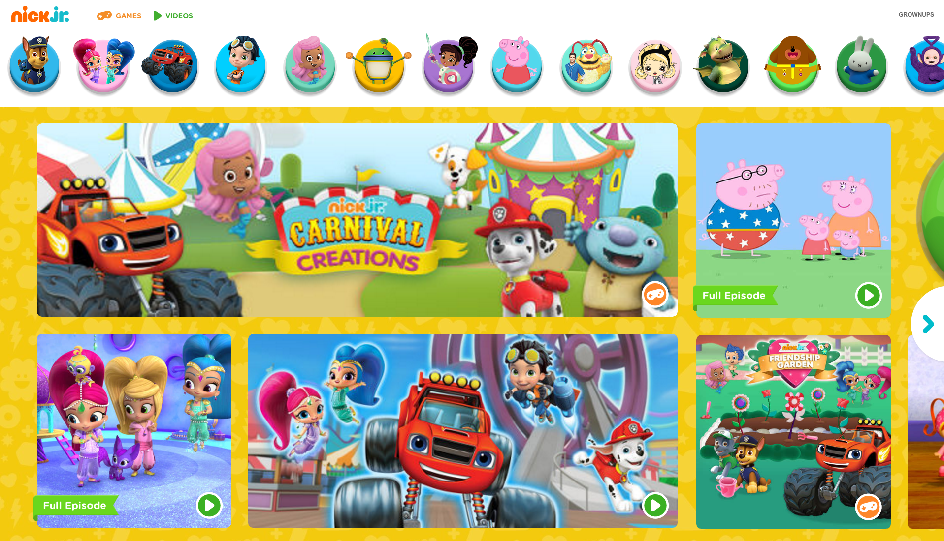
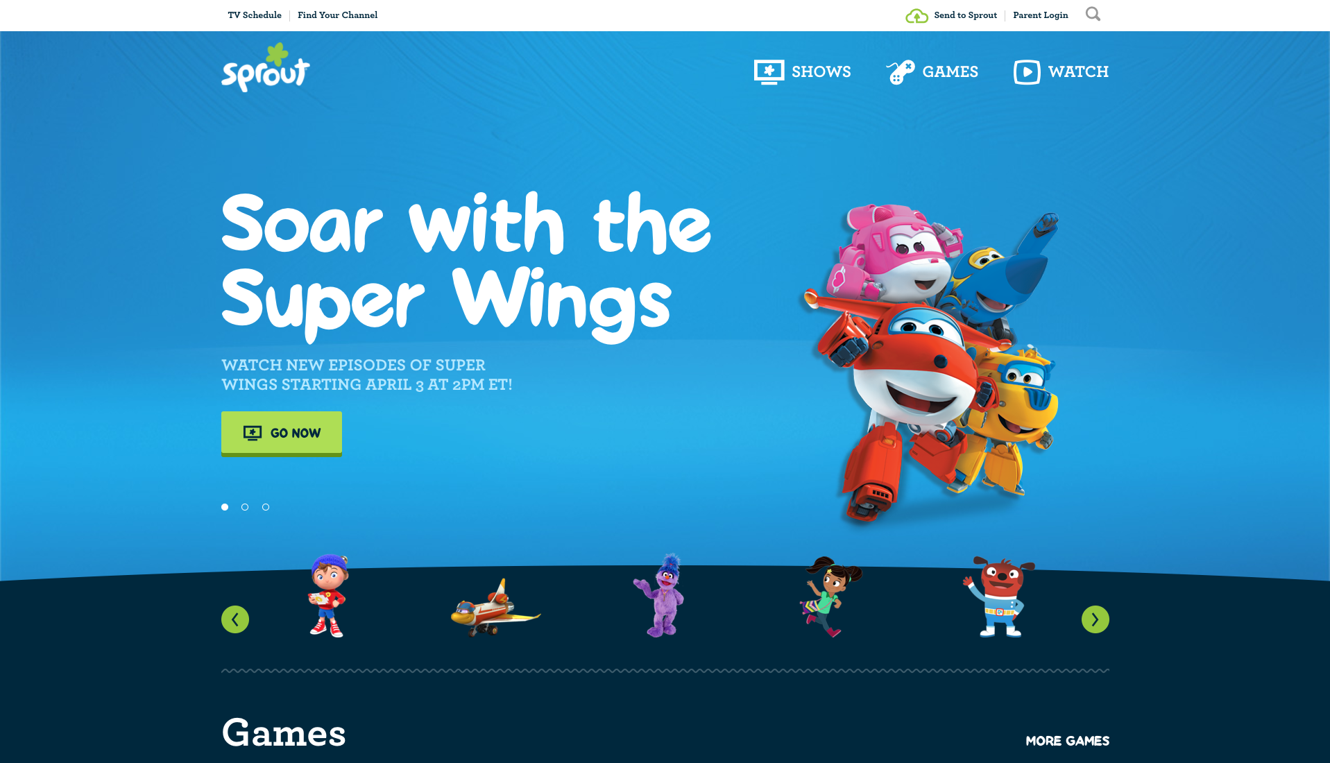

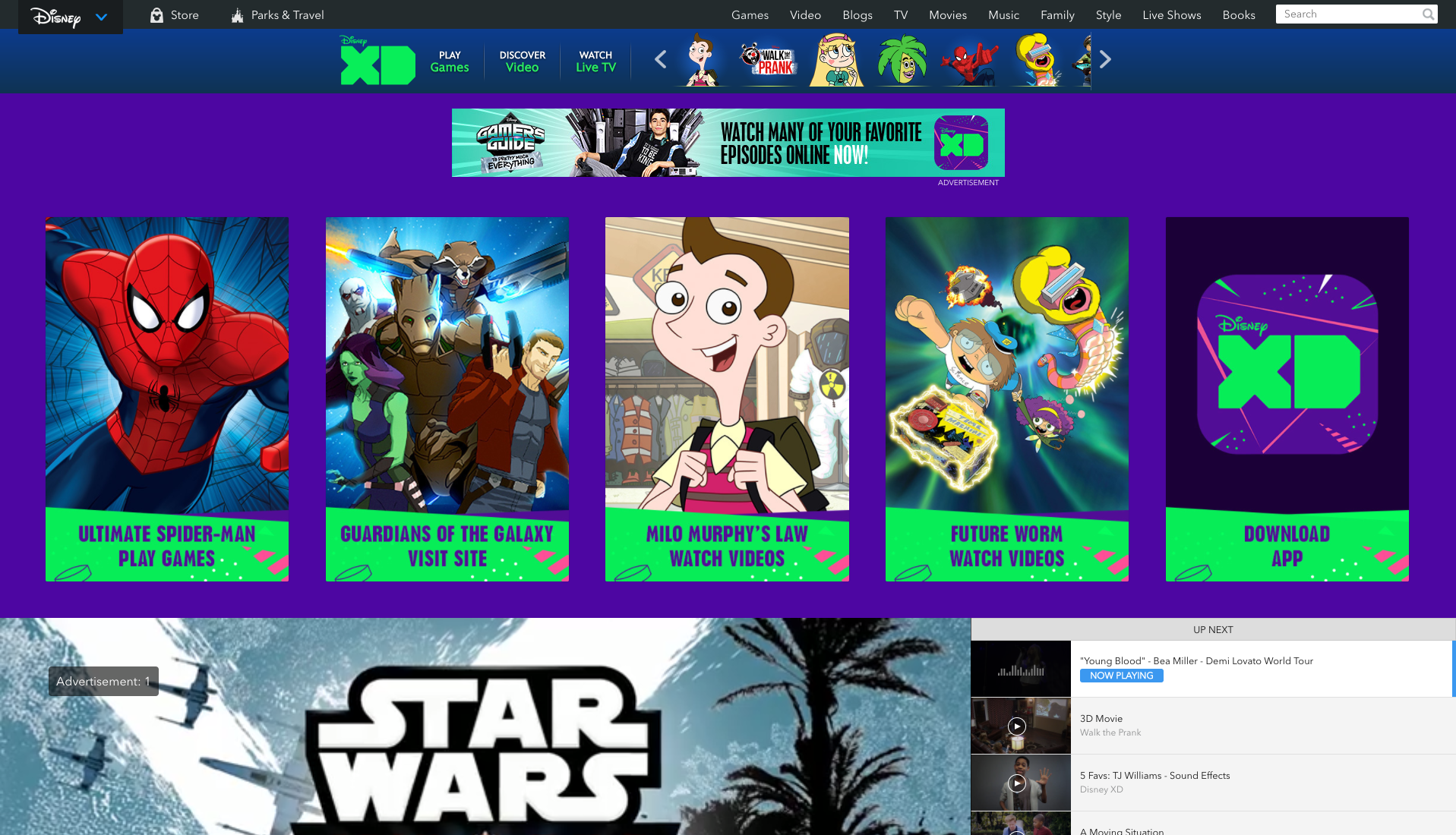
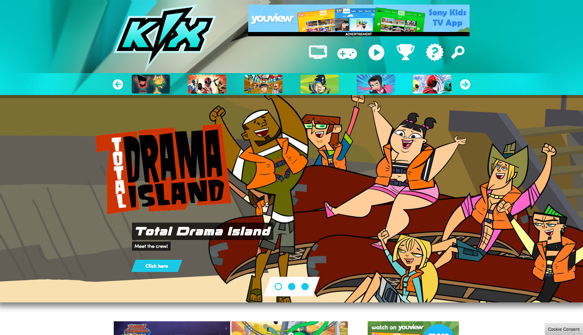
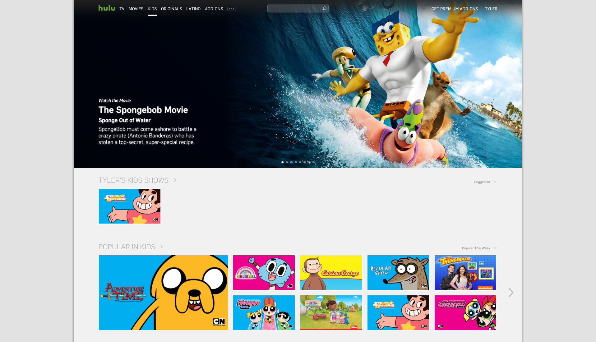
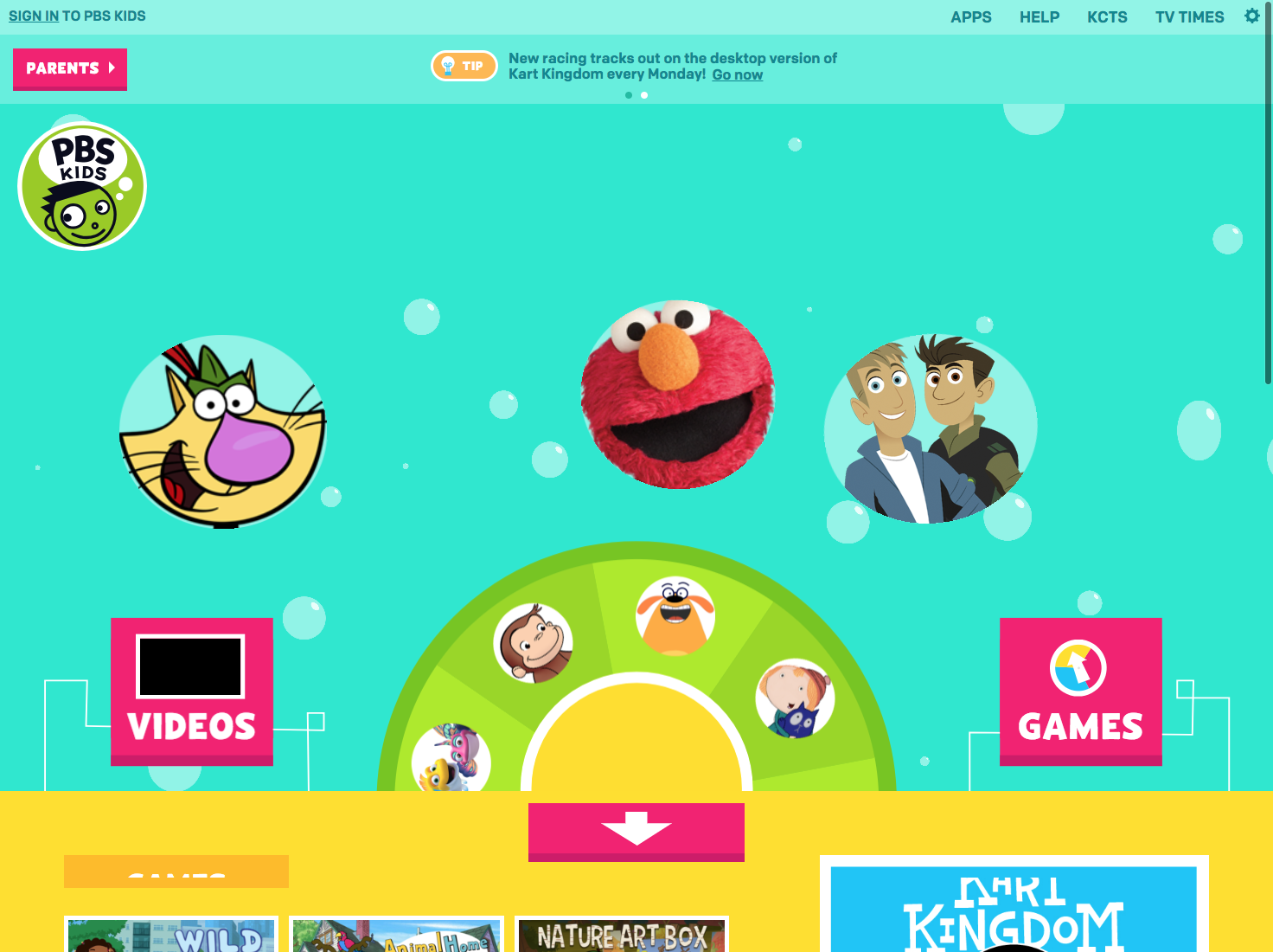
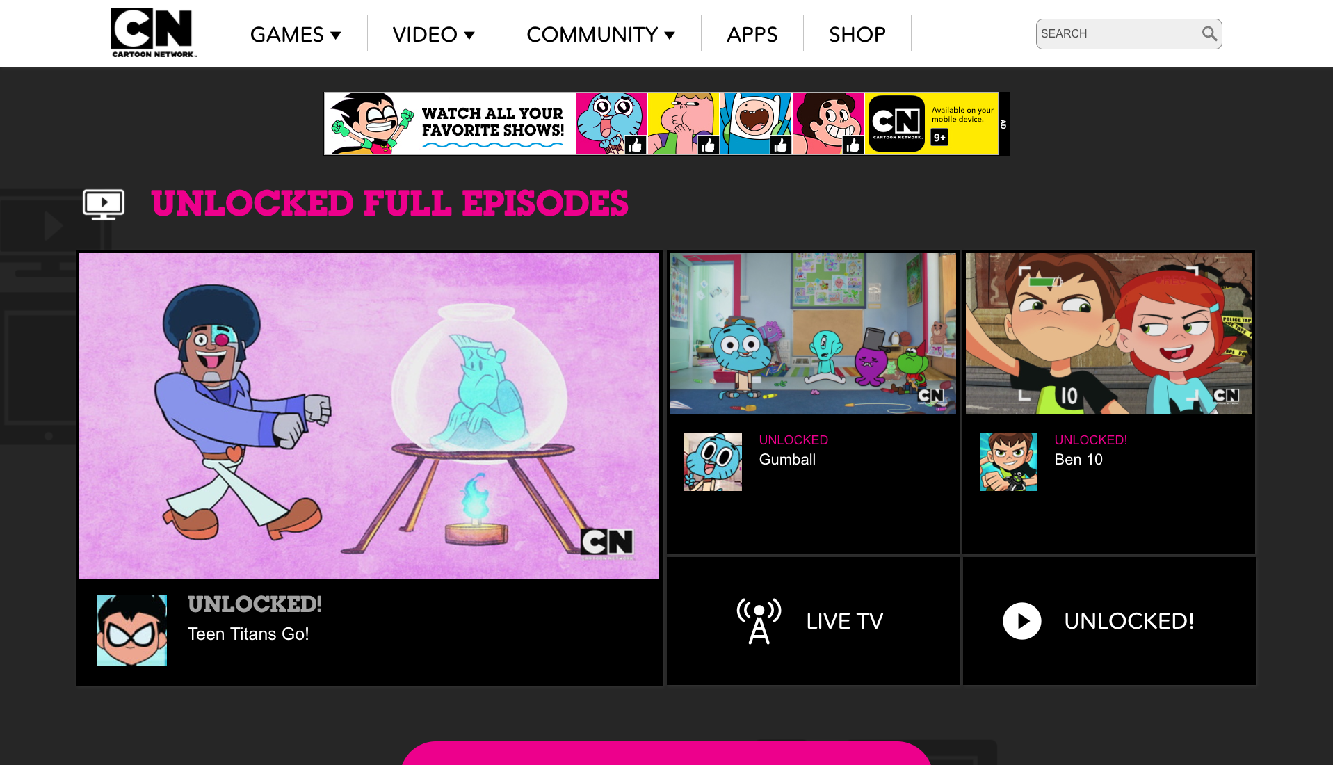
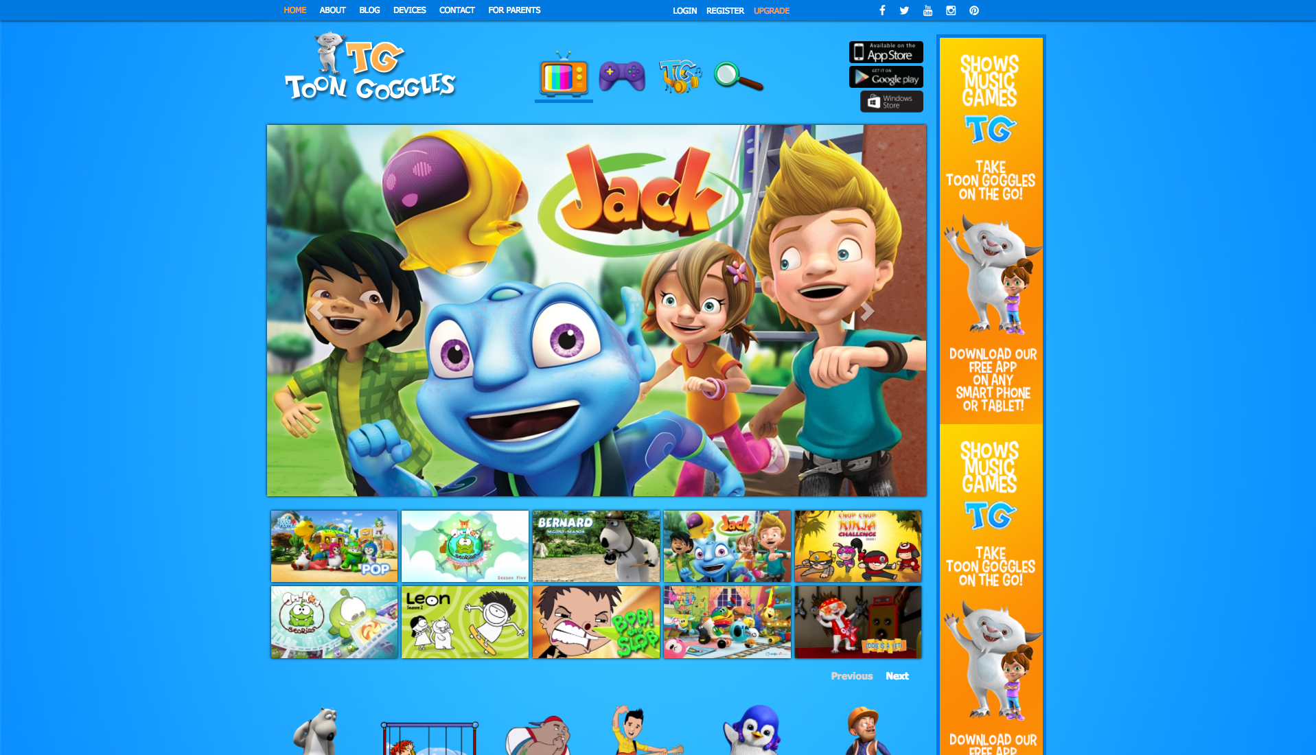
While examining the range of competitors there were several trends that I noticed. First being that whenever possible the sites would use recognizable characters and large easy to understand graphics, which makes sense when your audience is children, the child may not know what the words and titles mean but they very quickly can navigate to the characters that they know. I knew that whenever possible I'd want to bring in the use of the licensed properties in our experience be it in the teasers or navigation. The other aspect that was common was simplicity, the user should be able to access content in as few clicks as possible and additionally have a largely single page experience. User should be able to see a broad range of content quickly and easily go between said content.

V.5
Initial Design
Taking into account the stakeholder requirements as well as the information gleamed from the competitive analysis an initial design was created.
On Now/EPG
As I began working on the designs for the page a new requirement came in from stakeholders, the requirement that the page would be able to be built quickly and they would need at least an initial design that could be used as a sales tool to attract potential business partners and content providers. With this in mind there the requirements would be scaled back accordingly.
With that in mind we were still able to retain the following requirements
1. Ad unit above the navigation
2. Shows, Schedule, Find Your Station, Watch Live Navigation
3. Large rotating carousel to show important content
4. New/Featured content
5. Shows A-Z

V1
V1
With a version of the site that could be used for sales and easily developed for launch as needed finished and based on feedback from stakeholders I began working on a more complex version of the homepage that would be more of a nice to have approach.
Option A.
The primary concept of this site is that each "section" of the homepage would be full browser sized responsive and would "flip" to each on scroll.
Features
1. Large "panels" that lock on scroll to take full browser height
2. Large rotating carousel to show important content
3. Featured videos, cards are 300x250 allowing an IAB standard 300x250 ad to be trafficked in any of the locations. Cards also are marked with a character icon to take the user to a show page
4. Shows A-Z. Cards are 300x600 allowing an IAB standard 300x600 ad to be trafficked in any location.
5. Who we are/find your station, the stakeholders felt that though it was important for users to know where they could watch the Kidsclick television block on their local station even though they would be able to stream the content on the site.
Option B.
The aspects that set this design apart was a live updating schedule, multiple spots to feature content as well as a quick navigation to the content genre.
FEATURES
1. Ad unit above the navigation
2. Large carousel of carousel to show important content
3. Large carousel slider shows uses screenshots for navigation
4. Featured videos
5. Live schedule, links to live video stream
6. Shows A-Z
7. Genres for when content grows
8. Who we are/find your station, the stakeholders felt that though it was important for users to know where they could watch the Kidsclick television block on their local station even though they would be able to stream the content on the site.
Option C.
This version would include both a linear stream player for when content is live as well as the use of character icons as navigation
Features
1. Ad unit above the fold
2. Large carousel of carousel to show important content
3. Large carousel slider shows uses show characters for navigation
4. Live video stream and 300x250 IAB standard ad
5. Featured videos, large cards give more details could be used for newest or most important content.
6. Content promo
7. Shows A-Z
8. Who we are/find your station

V1.1
V1.1
After the initial review of these designs the clients wanted to choose components of each of the designs into a new homepage to move forward with.
The client wanted to combine:
Ad unit above the navigation
Large "panels" that lock on scroll to take full browser height
Large carousel slider shows uses show characters for navigation, playing off the idea that kids will recognize characters over text, screenshots.
Featured videos (in this case they were presented with a version with just the featured video cards and a version that also included a version with a live video player)
Featured videos, cards are 300x250 allowing an IAB standard 300x250 ad to be trafficked in any of the locations. Cards also are marked with a character icon to take the user to a show page
Shows A-Z, cards are 300x250 allowing an IAB standard 300x250 ad to be trafficked in any of the locations.
Genres for when content grows
Who we are/find your station. The client preferred the used of a logo and the finger (to "reflect the click in the name") rather than a character in this.
Ultimately the version with the video player was preferred due to the forward thinking and ultimate desire to focus more and more on the streaming market.
At launch the plan was for the site to be free to use and supported by advertising. Due to this an additional ad request came in, the ability to do a kind of homepage takeover or sponsor ship. Two options were developed.
Due to the need to start selling advertising on the site even before development and branding were complete a rudimentary version of a tablet and mobile versions that could be quickly adapted by development were needed.