Kidsclick Branding
Overview
Kidslick is Sinclair Broadcast Group's entry into children's programming via a national multi-platform programming block. Launching initially as a daily television block the service would eventually expand to be available on all screens, including broadcast television, online, pay TV, mobile and over-the-top (OTT).
I was chosen to to work as a designer on a branding team to create the logo mark as well as the overall look and feel of the brand.
When we were brought on to the project the name had not ever been determined, all the we know was that is was a children's programming service that would target children 4-10 and would encapsulate both a digital and linear television footprint.
Users
Initially we identified three persona as our primary users
1. Children 4-10
Digitally savvy but most importantly children so extra safety/privacy measure were important as well as simplicity
2. Parents 24-34
Busy parents who want to be able to quickly get the content their children want to play, cord cutters, very familiar with other streaming apps
3. Parent 34+
May use less OTT apps/streaming services, more concerned about content
Naming
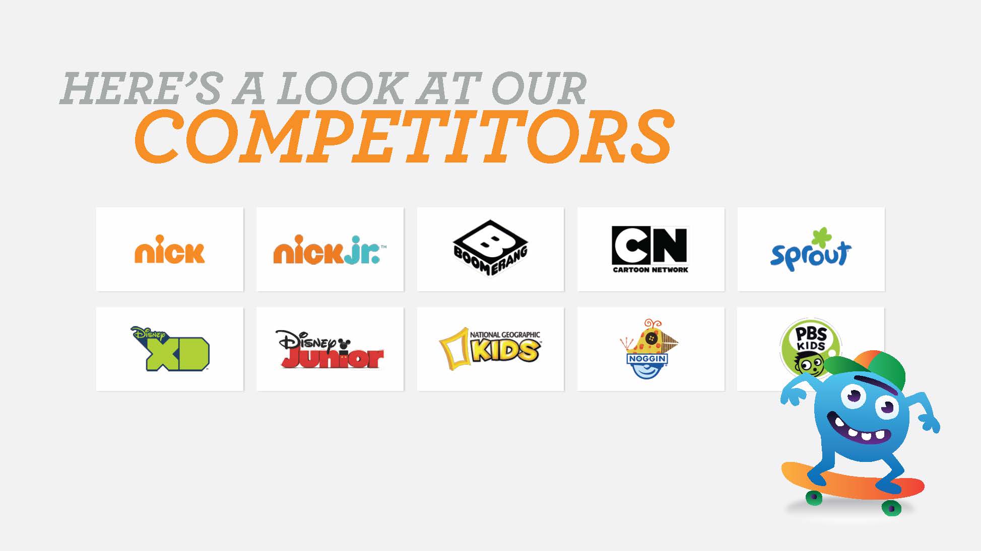
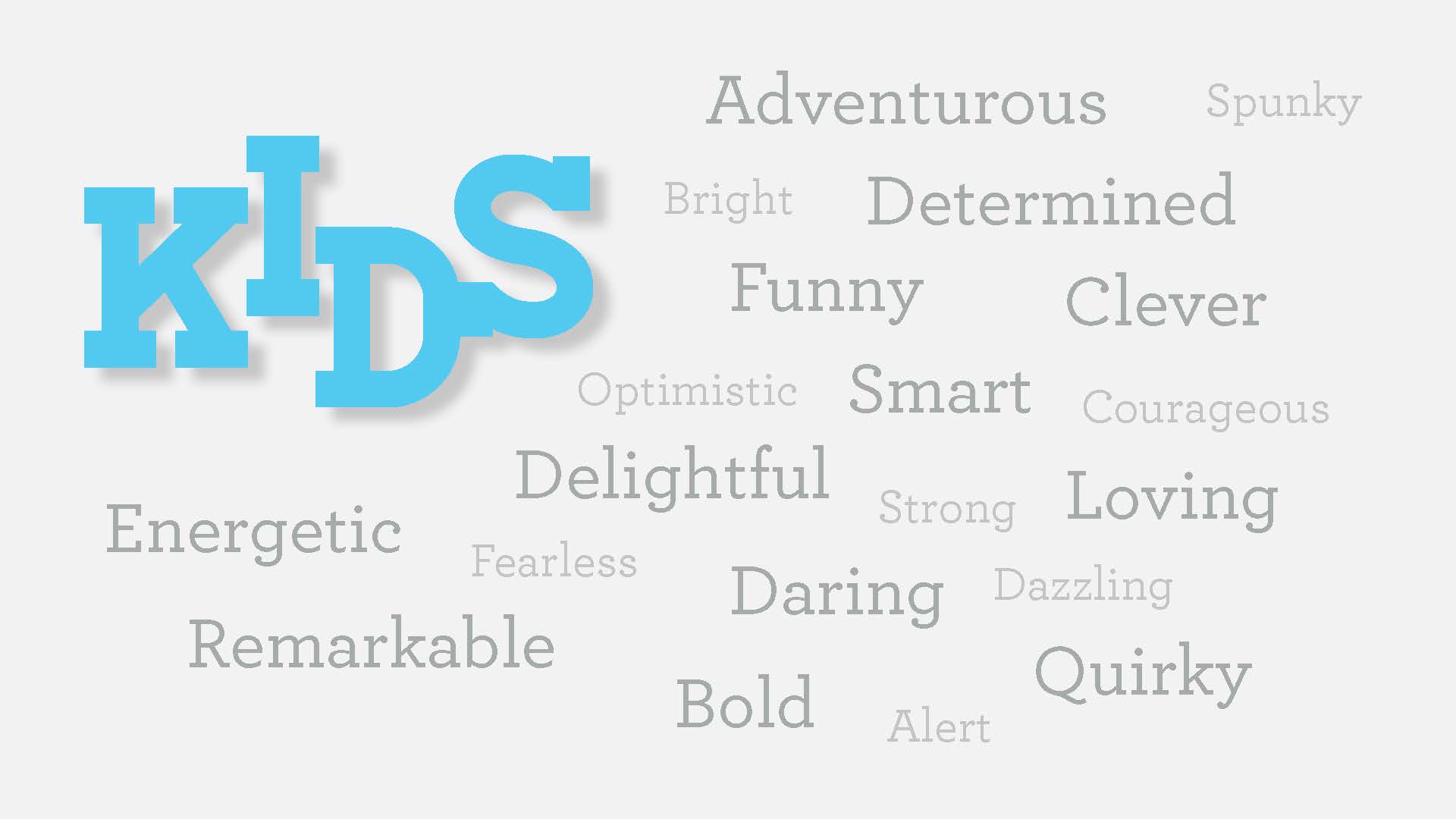
We began out exploration process we began by compiling descriptor words from our conversations with stakeholders, including works like Energetic, Bold and Quirky. In addition we collected a library of logos from competitors working in the same space.
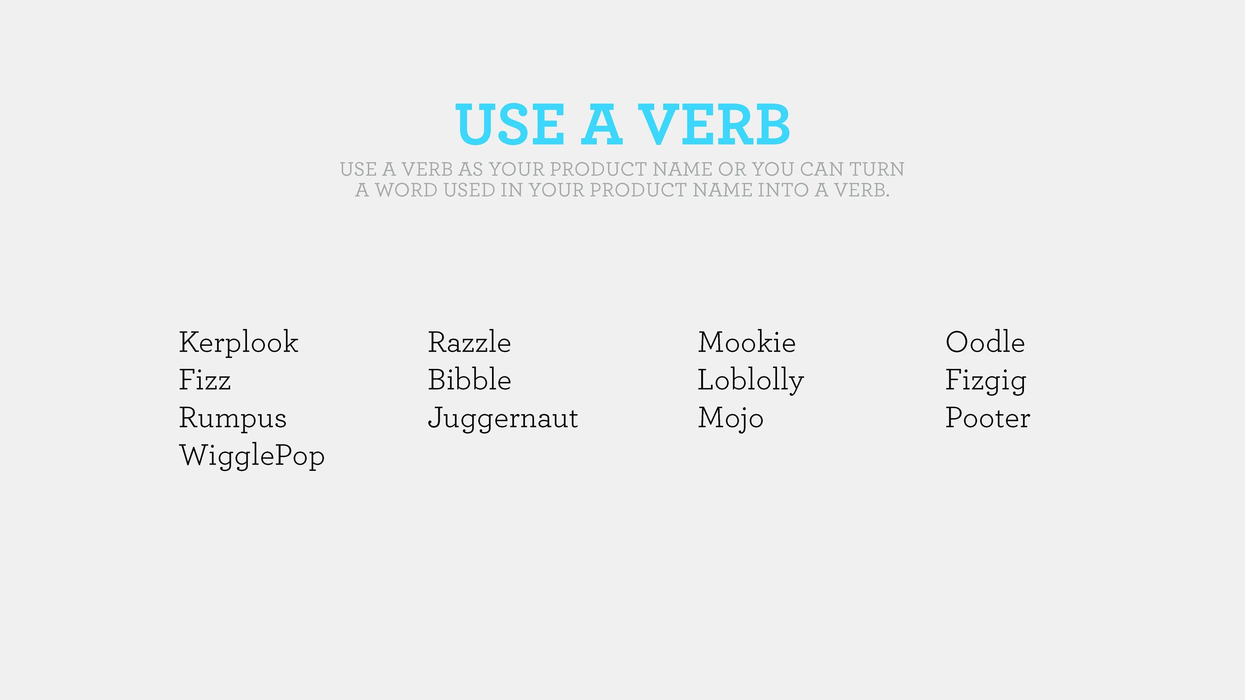
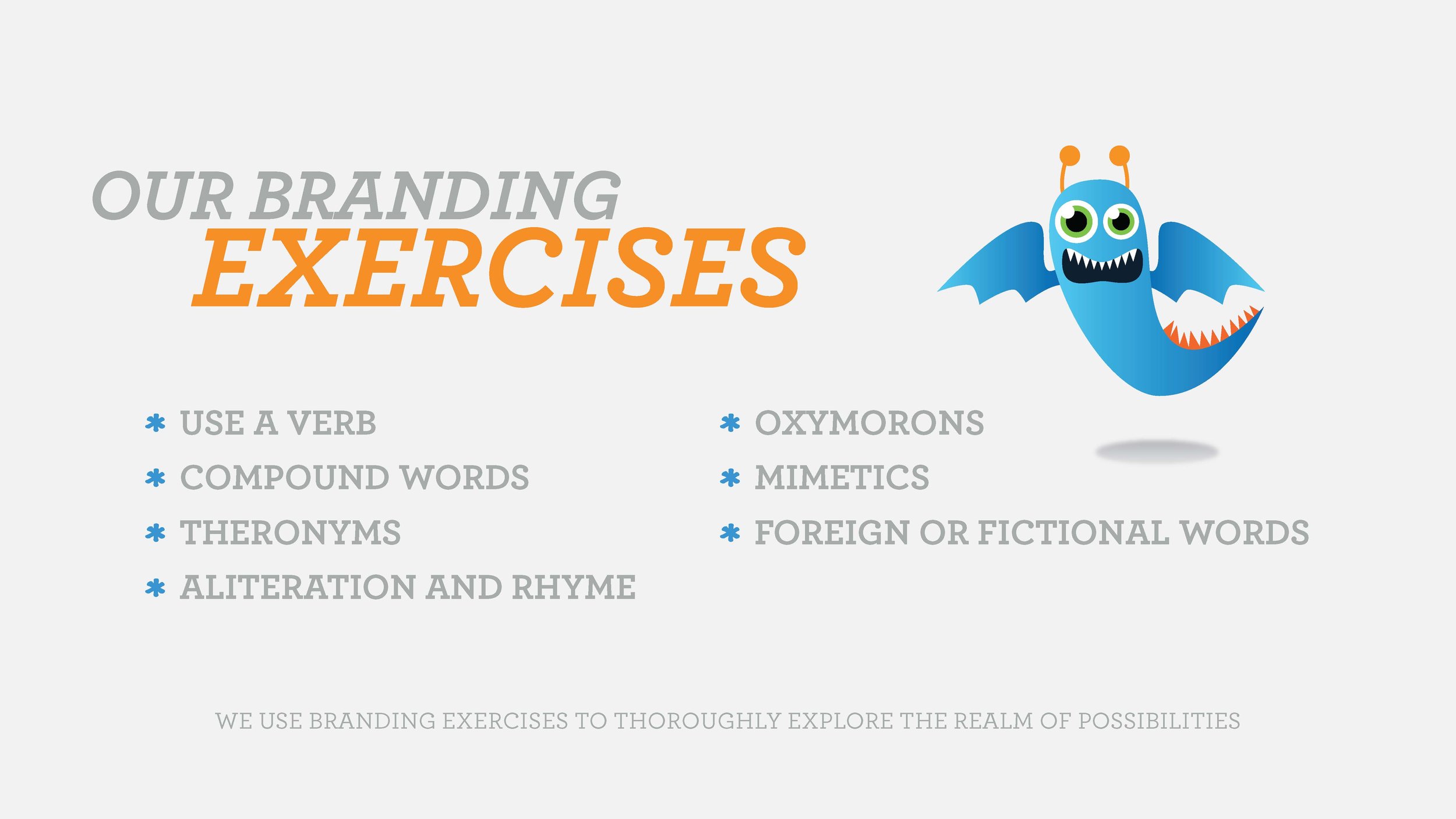
Following this we used a series of word games and exercises to create a list of potential names, which was eventually narrowed down to:
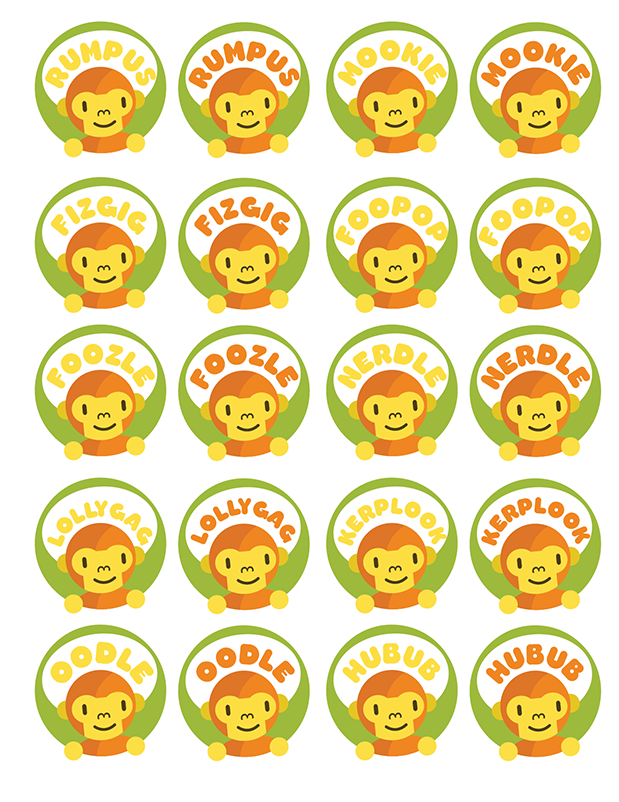
- Foozle
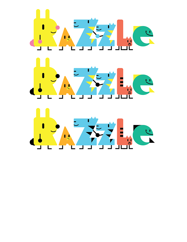
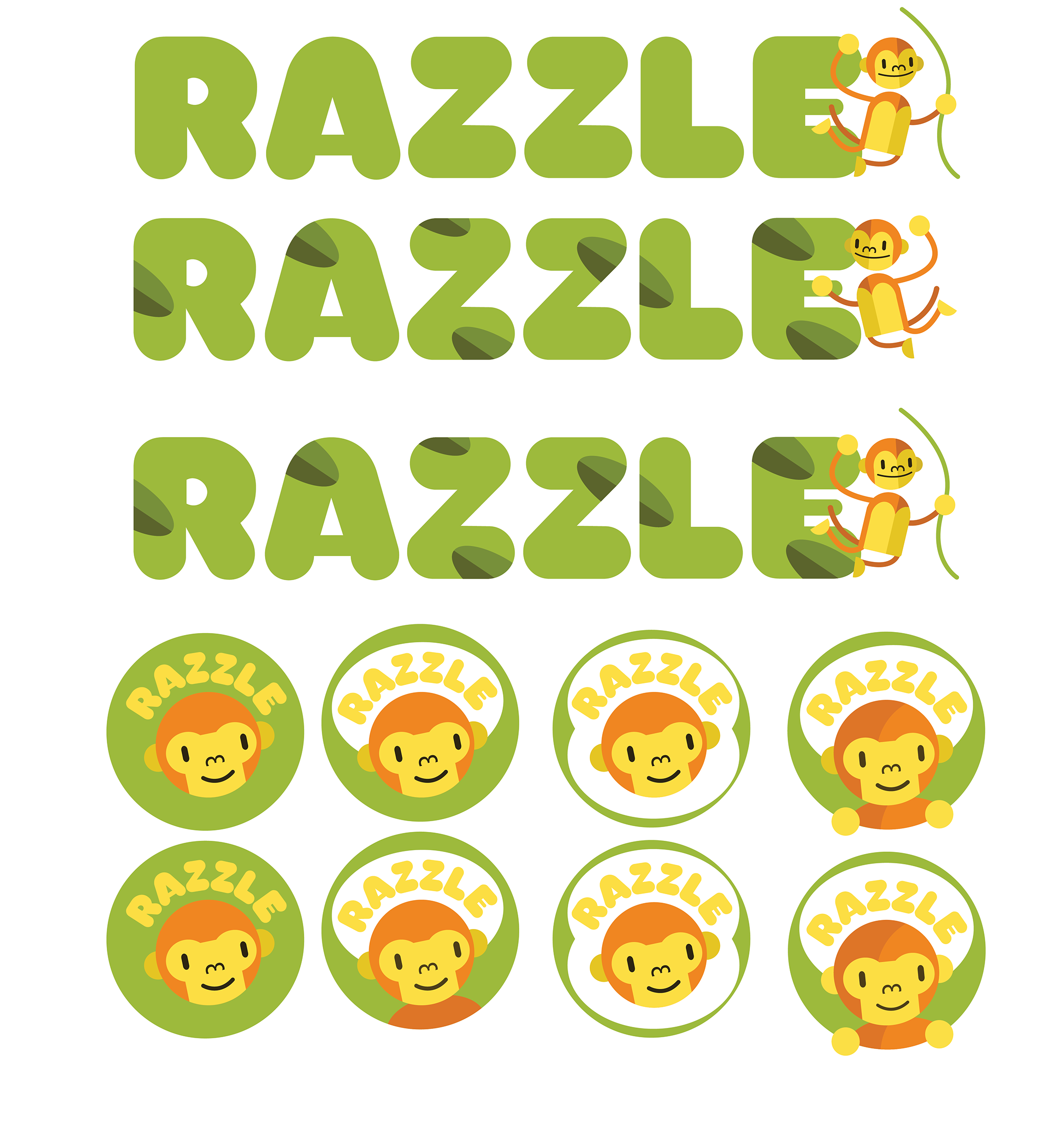
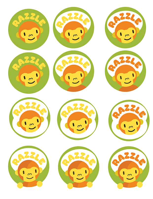
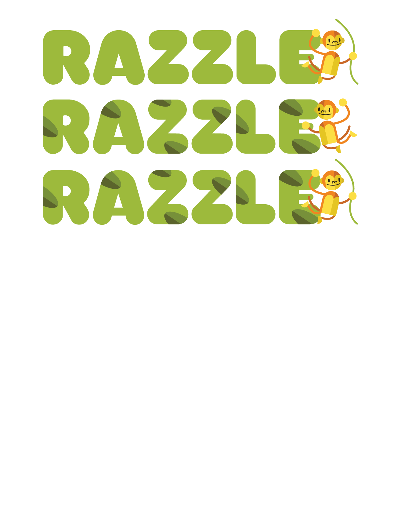
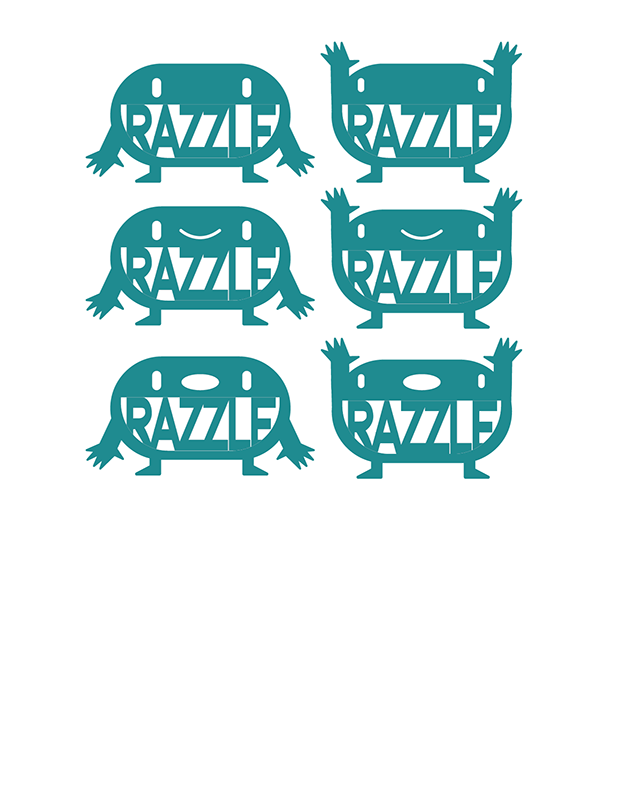
- Razzle
- Juggernaut
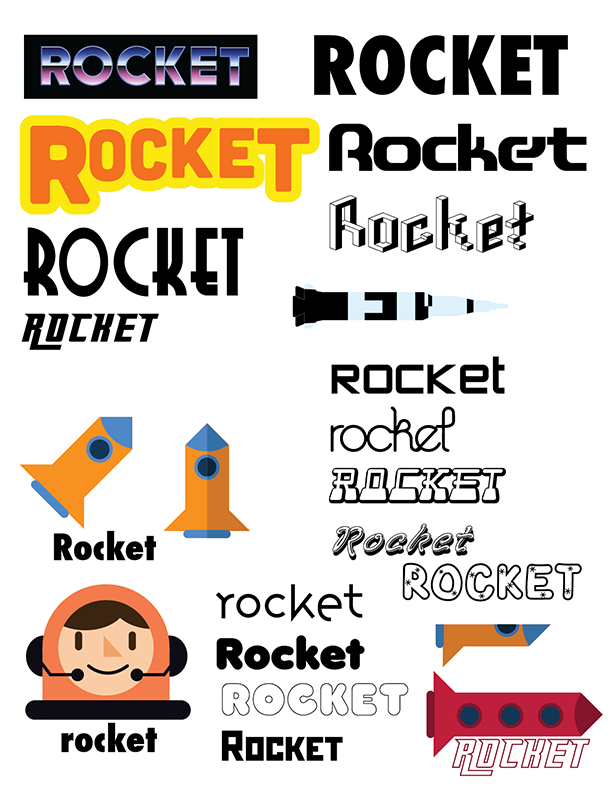
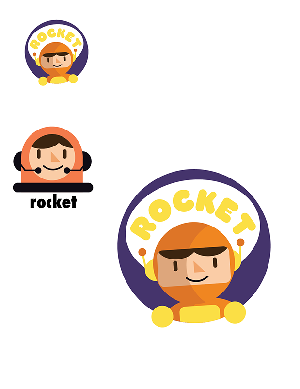
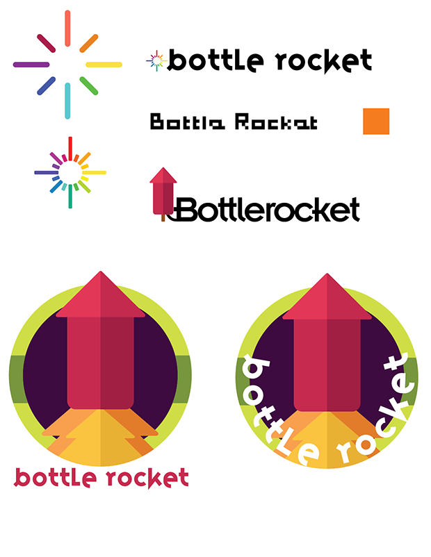
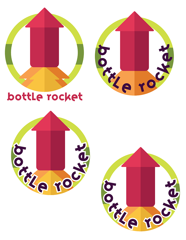
- Rocket/Rocket TV
- Go Gizmo
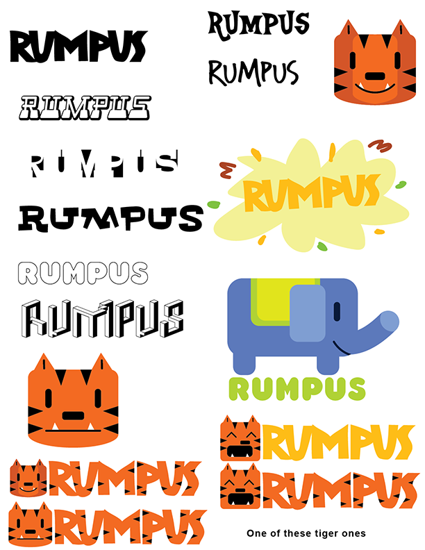
- Rumpus
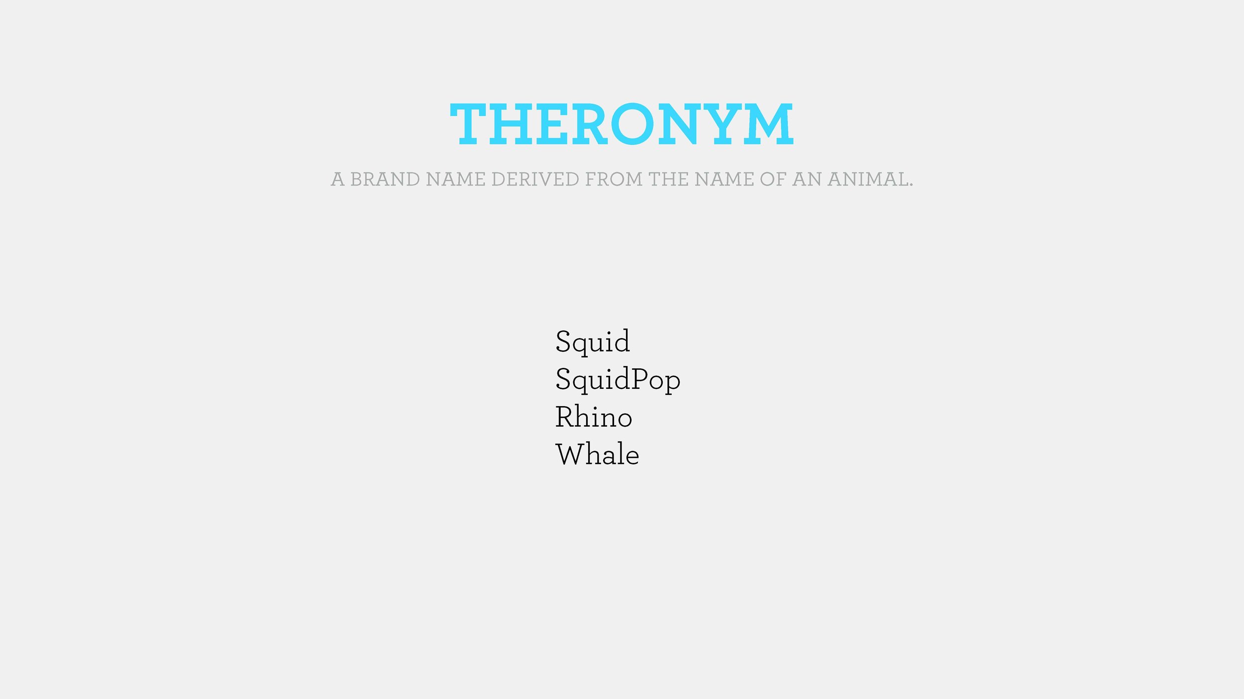
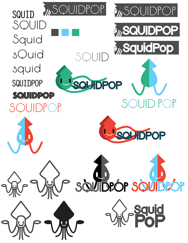
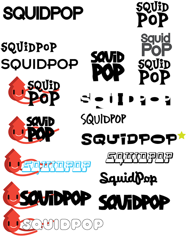
- Squidpop
I knew that I wanted to do some something with a character. This was a new brand and a character was an easy way to make the brand accessible to children and gave a lot of options for further branding assets and promotion.
My Role
As the visual designer working closely with Kidsclick stakeholders, an art director and a creative director to design the branding and look and feel of the Kidsclick brand
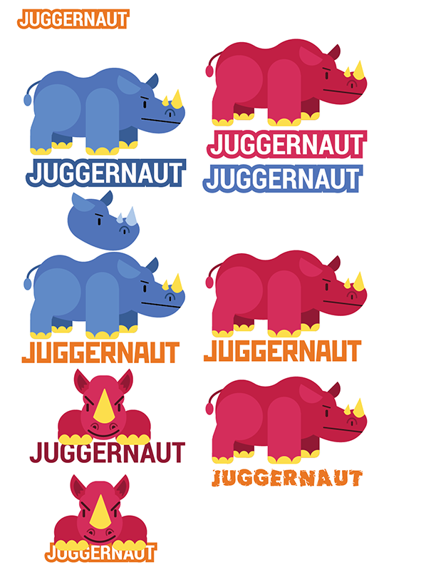
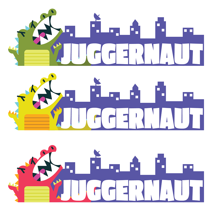

Juggernaut
Refining
At this point the names had been narrowed to 3 finalists
Juggernaut
Go Gizmo now Gizmo Go
Foozle
For my part I decided to focus on Juggernaut and refined the concepts that I had begun.
The branding process began with by creating a series of moodboard based on the word Juggernaut. The imagery that I was drawn to was bulky, chunky and action based. Words like hulking come to mind and images of creatures smashing through cities.
Based on my images I began looking at type options, typefaces that conveyed big, bold, and strong without feeling angry and aggressive.
Option A. Rhino
The first that I explored was a rhinoceros, fun fact a group of rhinos is called a crash which just felt right. While I initially began with the full body I eventually changed to the front view with a cropped body for ease of lockup and a more cohesive feeling between text and image.


One of the initial bits of feedback that I received was that the eyebrows made it too aggressive and ultimately the red was more successful than the blue, ultimately leading to the final submission of this content.
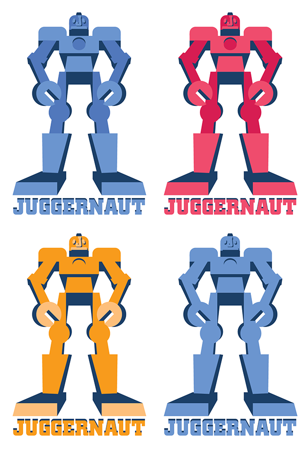
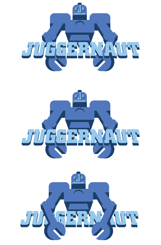
Option B. Robot
The second option that was explored was the giant robot, this option played more directly into the content that the service would be providing while at the same time skewing a little bit older. By forcing the perspective on the robot figure from a low viewpoint the size of the robot was able to feel larger and give a sense of towering scale.
After working on this option for a while there was a feeling that it felt too much like The Iron Giant so a version without the legs was tried.
Though several type lockups were tried the robot holding the type felt the cohesive.

Kidsclick
Take 2
After the initial design had been presented stakeholder informed us that the names that we had been working with had been scrapped and that the new name would be Kidsclick, encompassing "Kids" speaking specifically to the market and "Click" as in the action of selecting something.
At this point I found myself looking at our competitors again for inspiration, the things that I noticed where the use of bright color, chunky, bold and strong typography and often a character.
From I began a deep dive into just typography, keeping in mind what I was seeing in the client's competitors and the feelings that the client wanted to express with their brand. The words that the client gave me were: sticky, freedom, clean, create, destination. They also continued to stress that they wanted clean, flat and modern.


After exploring typography I began to explore a few general concepts to start to nail down what the client needed
Concept 1: "Clicking Kid"
In general I knew that I wanted to present options with characters. The advantage of characters was that they created an instant means for kids to connect with the brand, by creating a human analogue of a sort users would be able to project themselves upon the character. Additionally considering the relative generality of the brand name a character would allow the branding to stick out a bit more.
This option really emphasized the idea of a kid clicking. It began as a more representational approach before simplified to create a more accessible and wide reaching character.
Concept 2 "Geometric Monsters"
Taking this idea of using characters even further I developed a concept of 4 characters locked up with the text. These characters would be easy to utilize across platforms and easy to animate to create things like bumpers and promos. Additionally this option would be easy to merchandize in the future if successful.
My research showed that this sort of cute but a little off beat would be able to be accessible enough for the younger end of the audience while at the same time being off-beat enough to engage with older kids.


Option 3: "8-Bit"
Knowing that one of the largest competitors to children's television is video games and taking into account the popularity of things like Minecraft, retro-gaming and throwback graphics I wanted to develop an option based on 8 bit graphics. I began by researching the actual color palette available on the original Nintendo/Famicom. Ultimately feeling that sticking strictly to the grid and palette was a little too simplistic I allowed myself to bread the rules slightly create some dimensionality and interest.
After the first round of reviews the client came back with feedback.
The things that they responded to were:
Option 1:
Really liked the typeface, and especially liked the finger and felt that it really played off of the idea of the "click" motion. The client wondered if the finger was enough of a character to just use that.
Option 2:
The client really responded to this one, especially the characters but didn't feel like the typeface was quite right. They felt that the typeface was too reminiscent of Nickelodeon. Also felt that the text and characters should be more integrated.
Option 3:
The client was concerned with how this logo would play as a TV mark, ultimately the logo was not developed further.
Revisions


Revisions were made and the client was presented with two revised versions of Options 1&2. Over the course of review option 2 was dismissed over concerned that the characters were similar to the approach of a competitor.
Back To The Drawing Board
After the options were shared with other members of the clients team ultimately they decided that they would like to start the entire process over.
Knowing that the aspect that the client was most excited by was the idea of having a character I went back to the literal drawing board, spending an afternoon just doodling creatures as a means of inspiration.

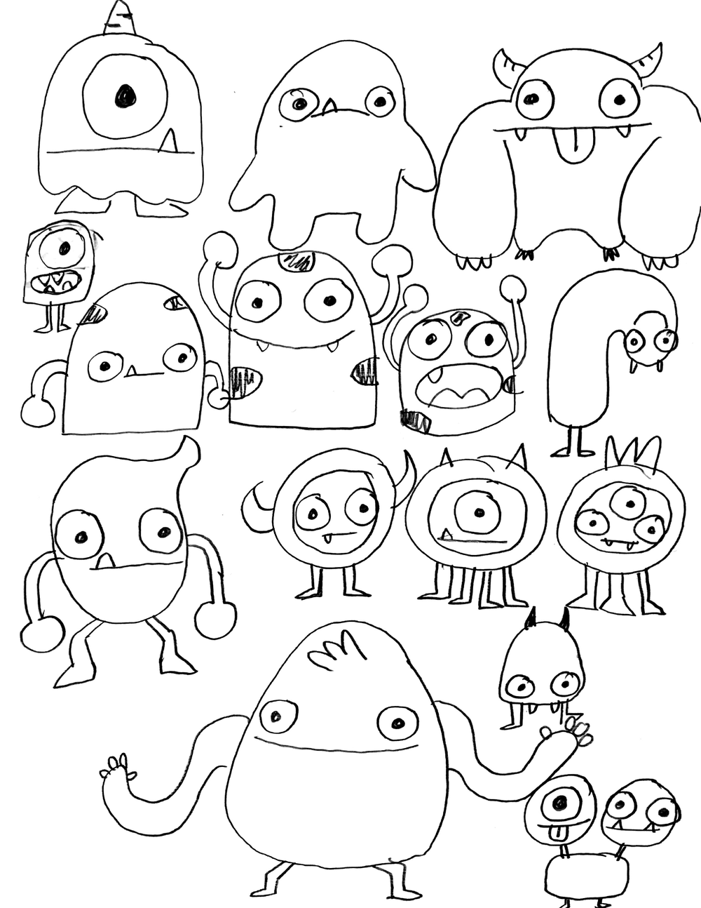


Next and showing these concepts to a few fellow designers I started to take some of the more successful characters and clean them up in Illustrator.
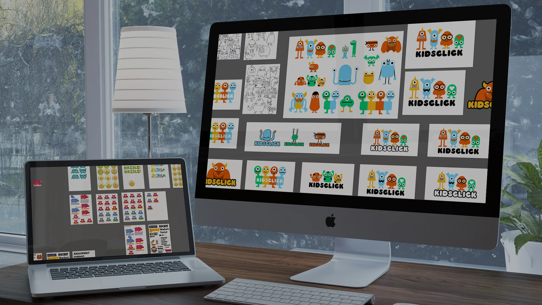
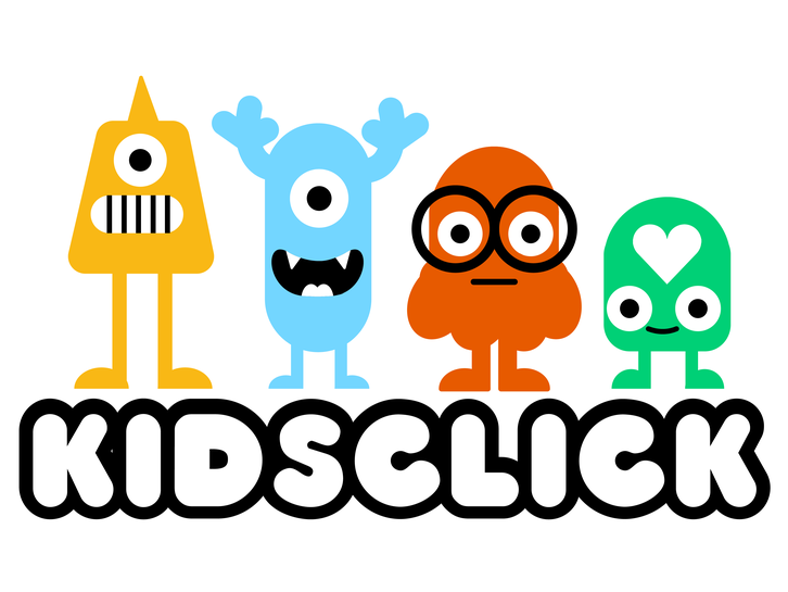
Option A: "Detailed Geometric Monsters"
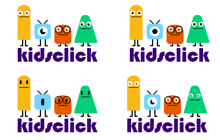
Knowing that the very simple Geometric Monsters were no longer an option but that the client liked this concept I decided to use the basic lockup but with more detailed characters, taking steps to make sure that they would stand out from the competition. Any one of these characters could be used on their own or with the group in promos, merchandise, bumpers, etc.
Again keeping in mind the importance of characters that would reach a broad range of children across age and gender.


Option B: "4 Heads"
This option was designed with in part with a concept of how it could be used in an OTT or mobile app experience. The idea being that each head could both symbolize the different aspects of the brand and offerings as well as being an interested way to navigate the experience and differentiate sections.
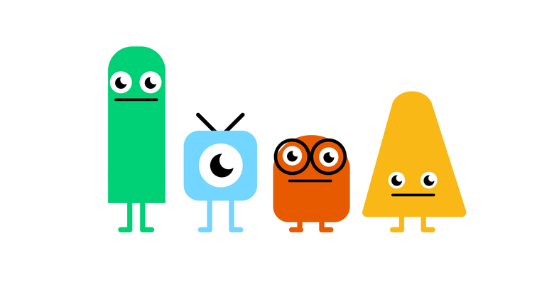
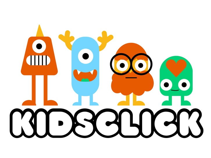
Option C "The Blobs"
Similar to Option A in that it was a simple series of charcters locked up with the logo.
Option D "Sketchy Monsters"
Option C was to give the client something very different. Rather than the clean and very vector versions previously presented the sketched versions were used directly instead with a slight offset of color. When my initial sketches were shared with other designers the thing that they were most responsive to was the energy that came with the quick sketch version, energy that could be embraced and utilized in the overall brand of KidsClick. The idea was that you could have any numbers of monsters that are swapped out in the lockup.
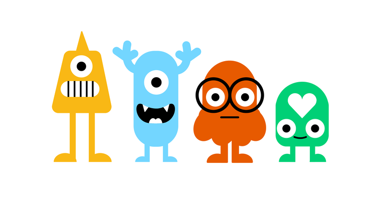
Option D: "The Big Guy"
The big orange monster, welcoming enough that a young viewer could hug him, weird enough that an older viewer could wear him on a shirt.
This is the creature that received the most warm reception from the client and so received the most tweaking. Knowing that the logo would also likely need to work as a TV bug I worked to create simplified options that could be used as a tv watermark.

