
FOOZLE
Overview
Foozle is an Apple TV app devoted to children's programming primarily consists of long-form animated series as well as some short-form content and aimed at children ages 4-10. It provide both free and subscription based programming as well as linear and on demand streaming content.
With plans to launch a children's property the internal design team at Sinclair Digital was tasked with creating initial concepts and designs for both the brand and product. As the company was already making a large play into the OTT market the Apple TV experience was fundamental to the initiative and worked on in close conjuction with the brand development.
Users
Initially we identified three persona as our primary users
1. Children 4-10
Digitally savvy but most importantly children so extra safety/privacy measure were important as well as simplicity
2. Parents 24-34
Busy parents who want to be able to quickly get the content their children want to play, cord cutters, very familiar with other streaming apps
3. Parent 34+
May use less OTT apps/streaming services, more concerned about content

Requirements
As the Foozle Apple TV app was being designed as the business and content plans were also being developed initial requirements were loose and sparse. The elements that were specifically called out for inclusion were:
Requirement 1: Home Screen
1. Large carousel of featured content
2. "What's New" carousel
3. Caterogies that link to category and show pages
Requirement 2: Home Screen Navigation
1. Explore: deeper navigation to genre sections
2. On Now: Links to live content
3. Search
4. Settings
Requirement 3: Genre Sections
1. Sections needed for a range of genres would include latest content and a grid of all show of said genre
Requirement 4: Show Page
1. Allow for multiple seasons
2. Latest Videos
3. Episodes
4. Clips
5. Related content
REQUIREMENT 5: PLAYER/EPG
1. Player with preview for scrubbing
2. Next up autoplaying video
3. Related content
4. EPG overlay for live content
5. On Now screen, player with EPG overlay
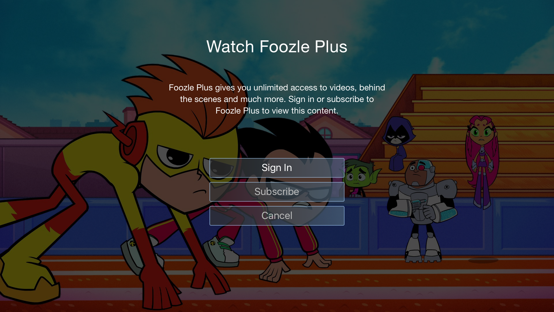
6. Paywall to allow for subscription service
REQUIREMENT 6: SETTINGS/ACTIVATION
1. Settings Screen
2. Activate Foozle
3. Subscribe to Foozle Plus
4. Subscription Terms
5. Previous Used Accounts
6. Password Entry
7. Sign Out
8. Legal
My Role
As the sole UX/UI designer working closely with Foozle stakeholders and a creative director to design initial concepts for at Apple TV app.
Competitive Analysis
I began the project by identifying and researching out competitors OTT apps, looking for standards and trends.
This included the apps for:
- Disney/Disney XD/ Disney Jr
- Nickelodeon/Nick Jr.
- Cartoon Network
- Sprout
- Boomerang
- PBS Kids
- Noggin
- Netflix
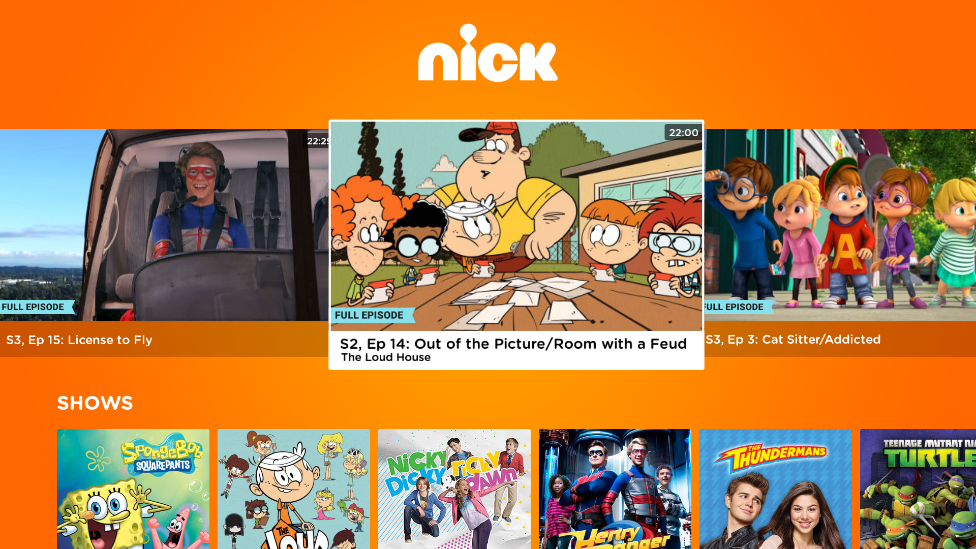
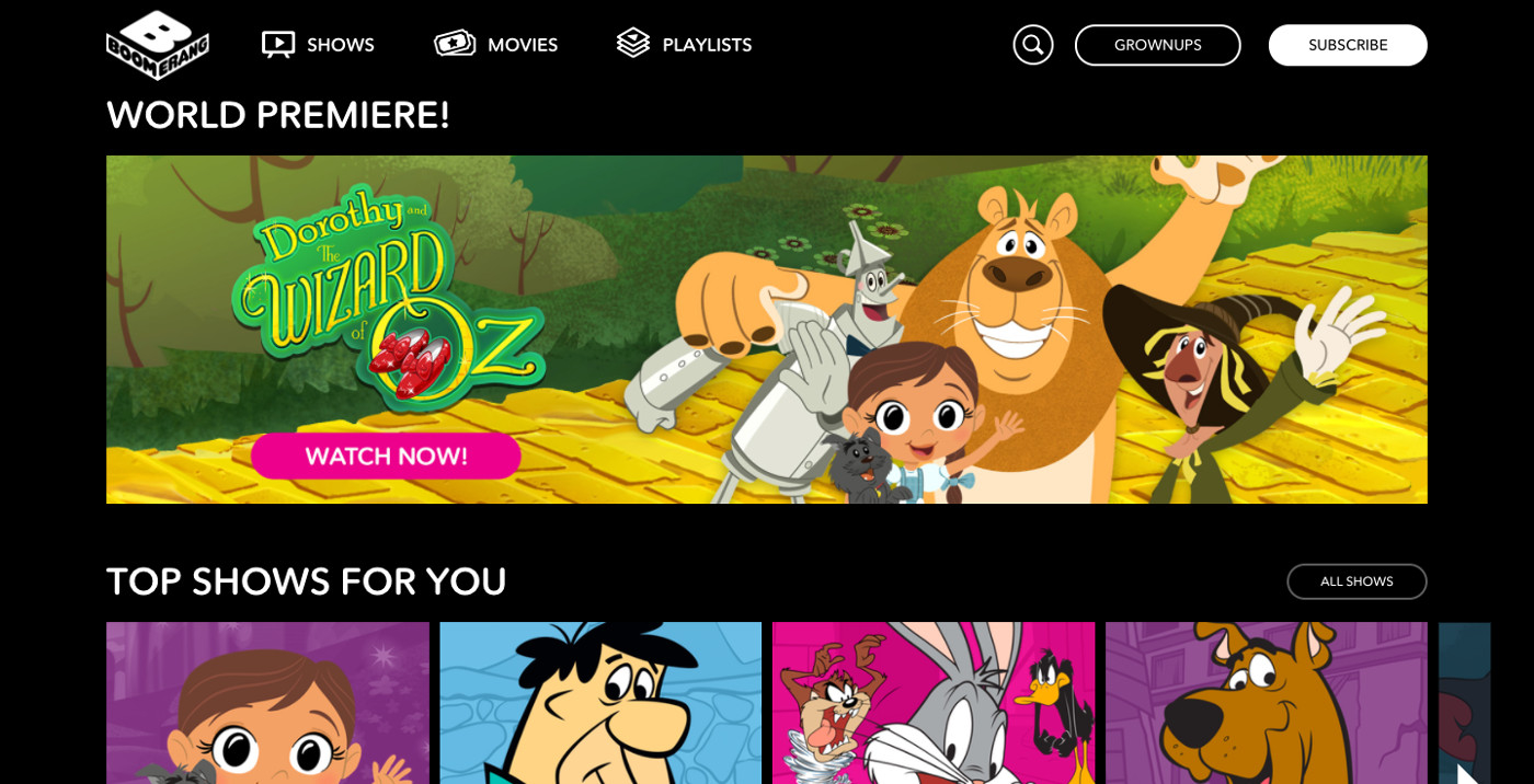
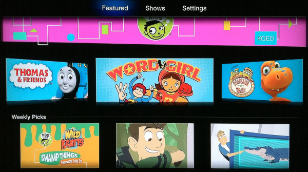
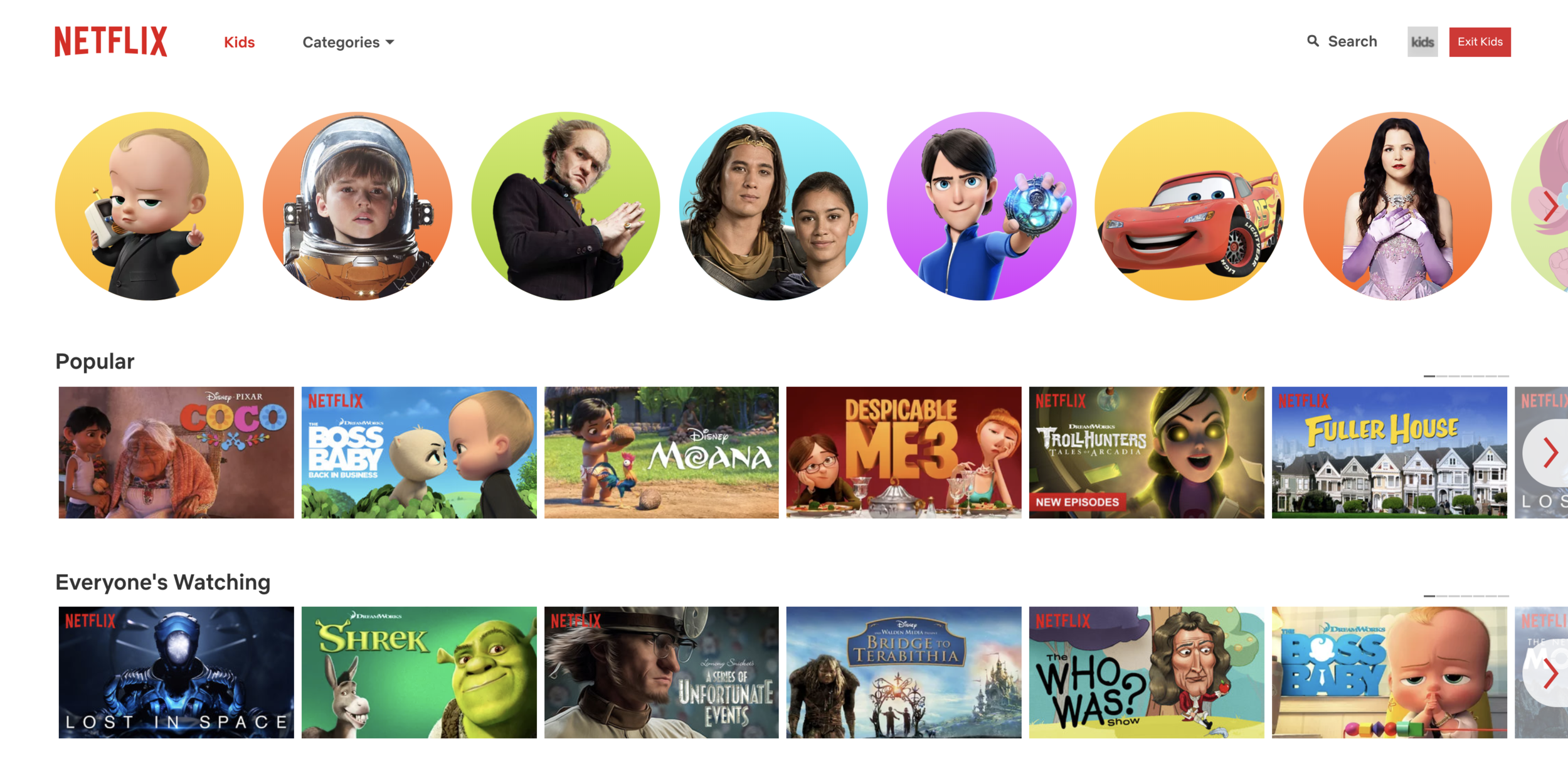
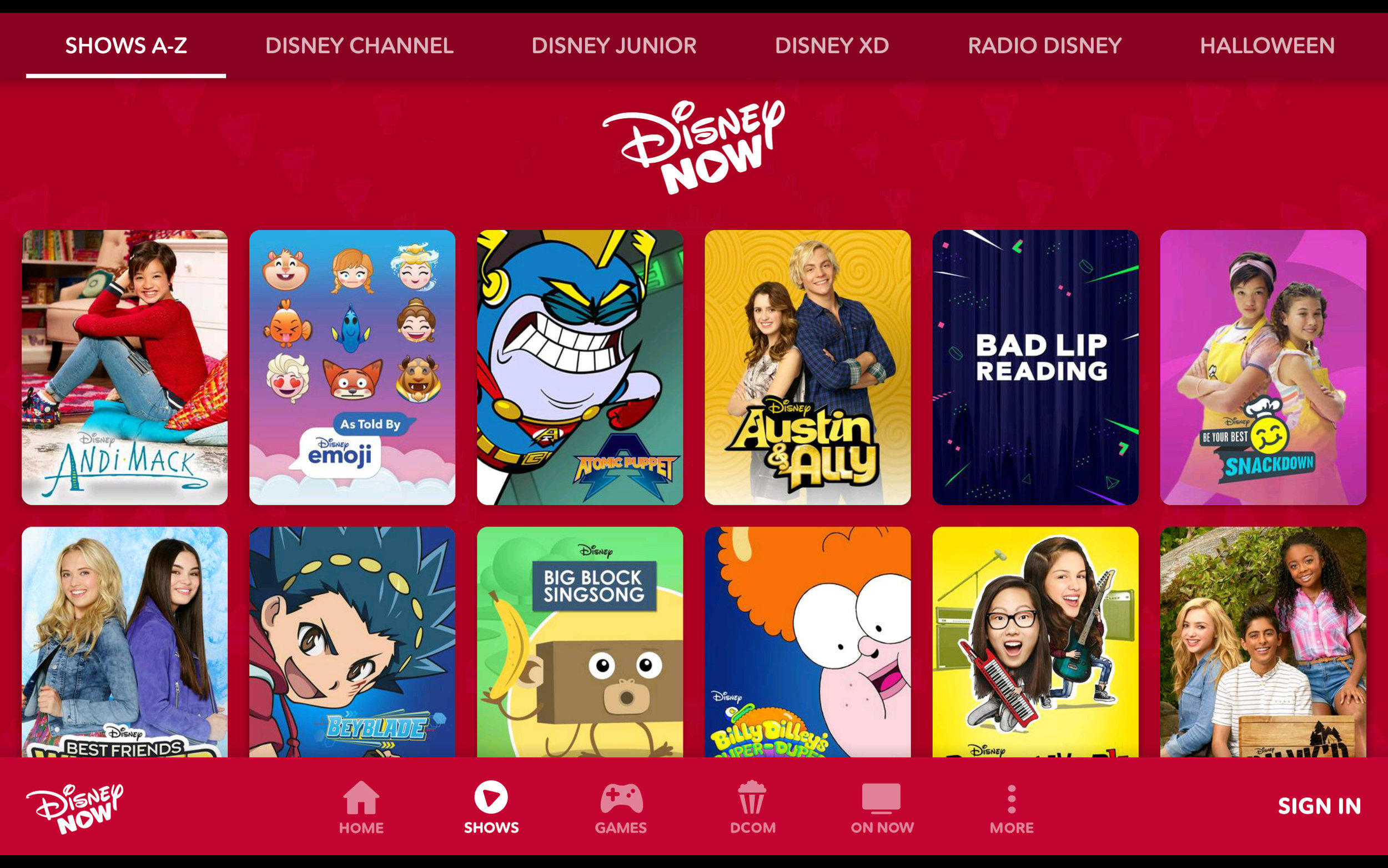
The most noticeable aspect all of the app experience was how similar they were. Most consisted of some sort of large teaser or featured content, a series of carousels or grids of content and deep dives into content based on show/season. This makes sense in considering that the users are largely either children or the parents of children and so keeping as much consistency between apps eases the barrier for the user.

Solution
Results
Due to the initial time and technology constraints for the launch of their new CMS we began with a focus just on the detail page design at 3 tiers based on the amount of content a client had.
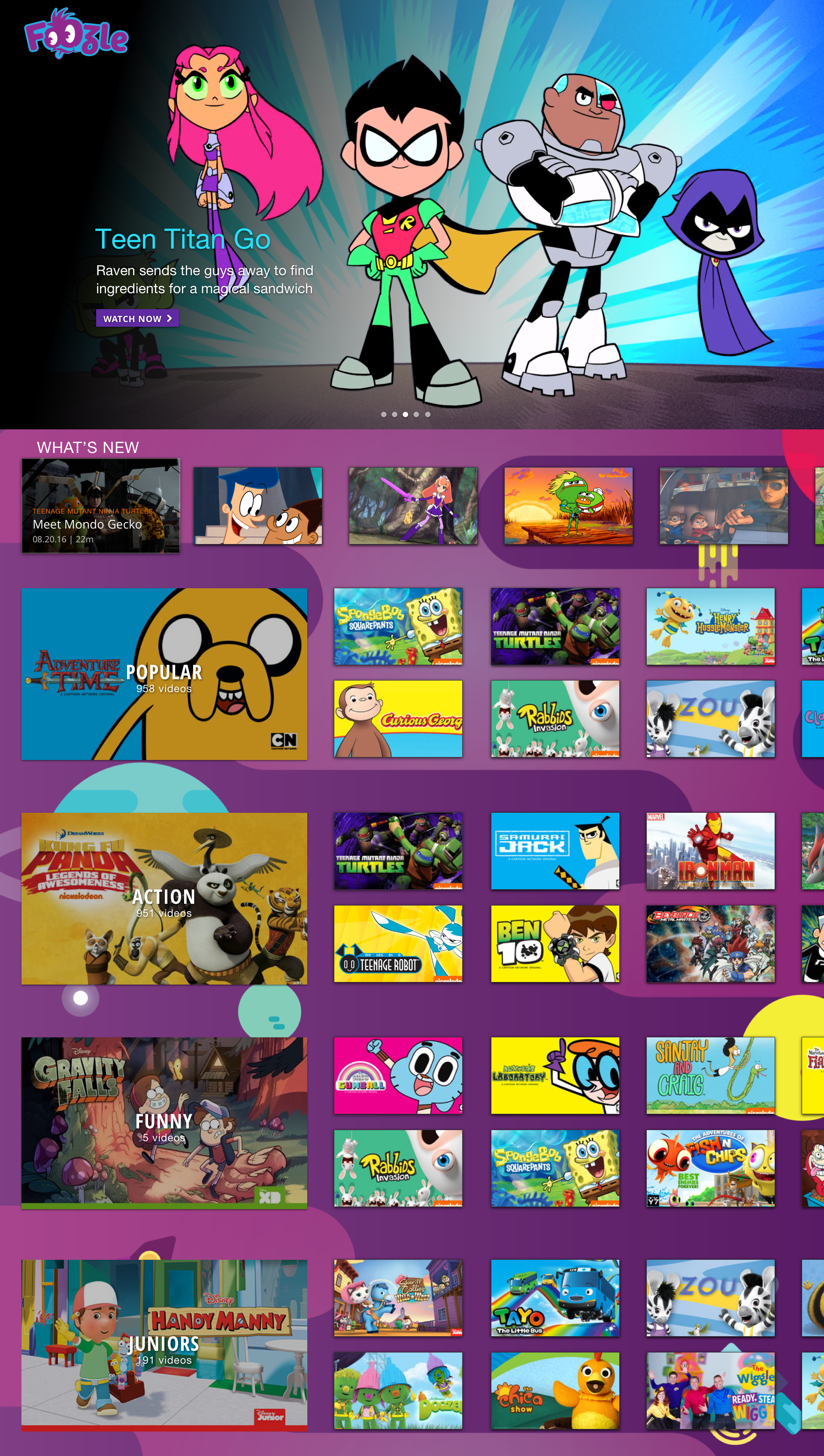
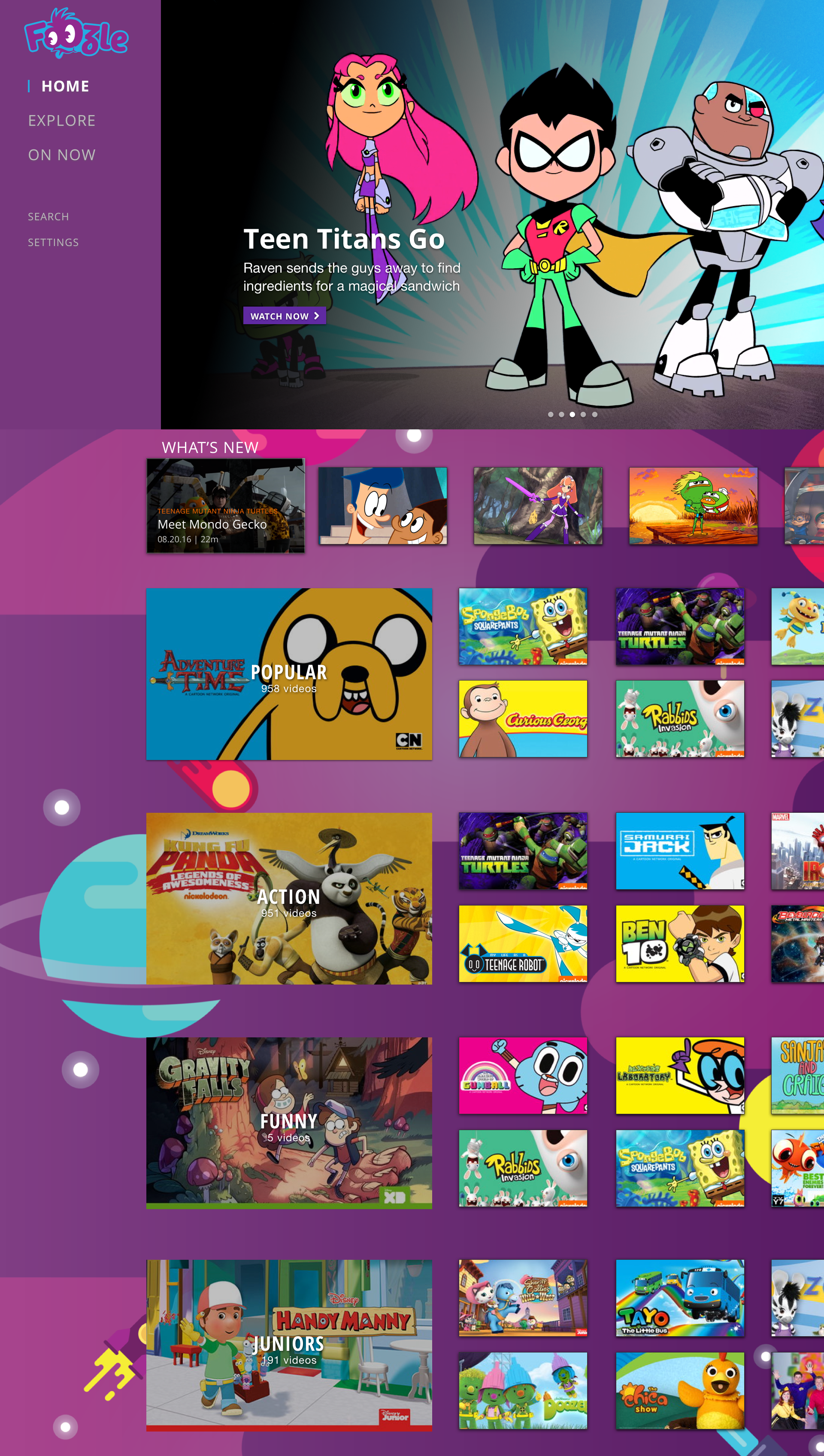
Home
The initial homepage was designed keeping in mind the requirements and users. Specifically the large hero carousel that would both promote featured content that also allows quick navigation to content for the user that just wants to start watching something.
Know that our users would see this page as their initial experience nearly every time they use the app we also wanted user to quickly discover the latest content. This was especially useful as the initial requirements did not ask for nor did technology allow for a favorites or show subscriptions.
For this design I identified 4 additional categories that were included for easy access as well, the "Popular" section, a popular convention found in competitors experiences, as well as the "Action" and "Funny" categories based on the most common types of content found and the "Junior" categories to allow easy access for our younger viewers and their parents.
Finally an expandable menu was added through which users could access the "Explore" experience, "On Now" content based on stakeholder requested feature that would be included in a future version, a search experience and the "Settings", which were likely a lesser used feature but that users would still want to easily access.
Genre Page
A hub for content in a related genre, a place for discovery of new content as well as a place for a user to find their favorite shows and newest episodes of said shows. This page includes a featured hero for promoted content, a carousel the most recently added content within this category as well as a grid of all shows that fit the genre criteria.

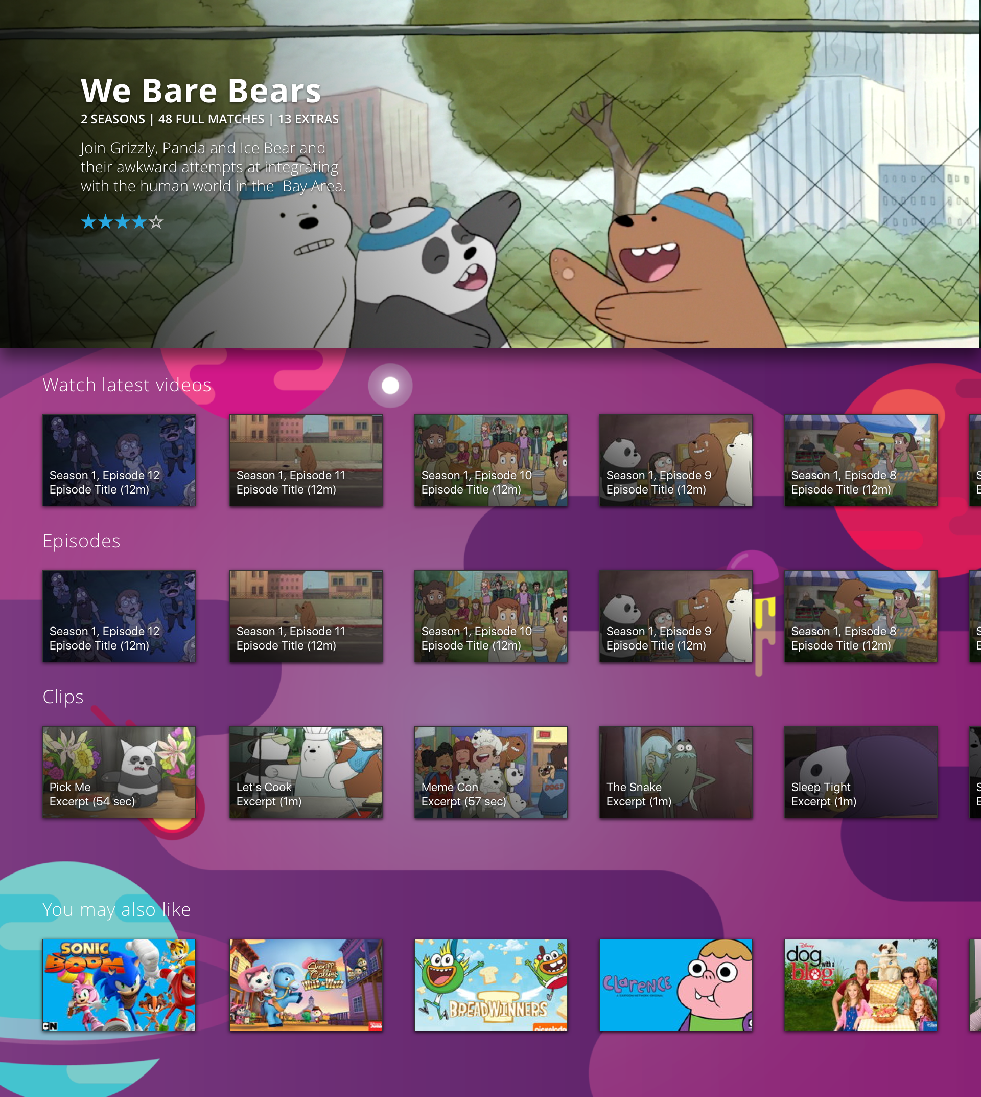
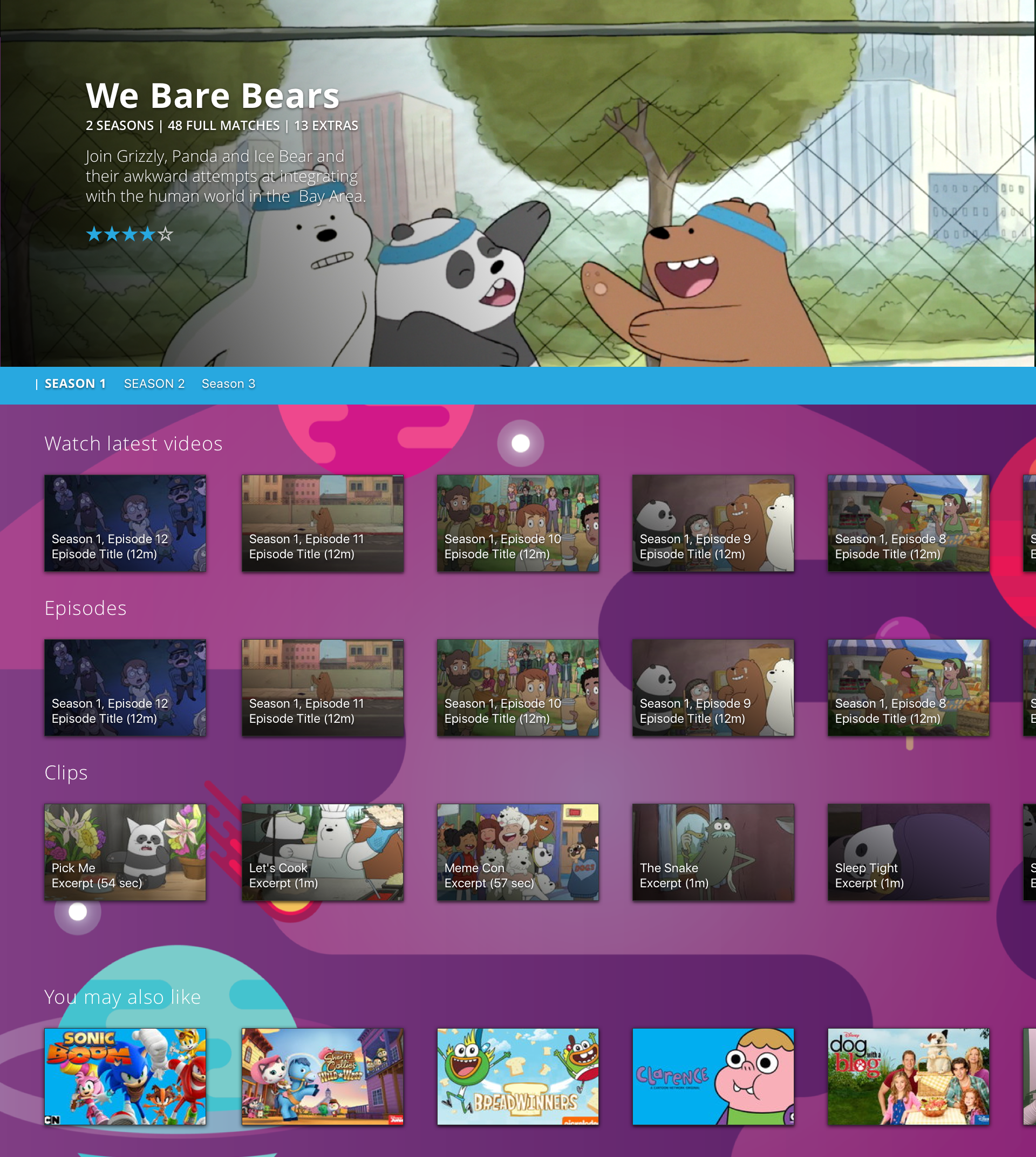
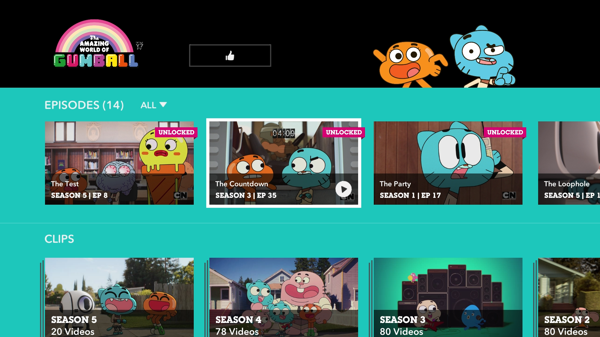
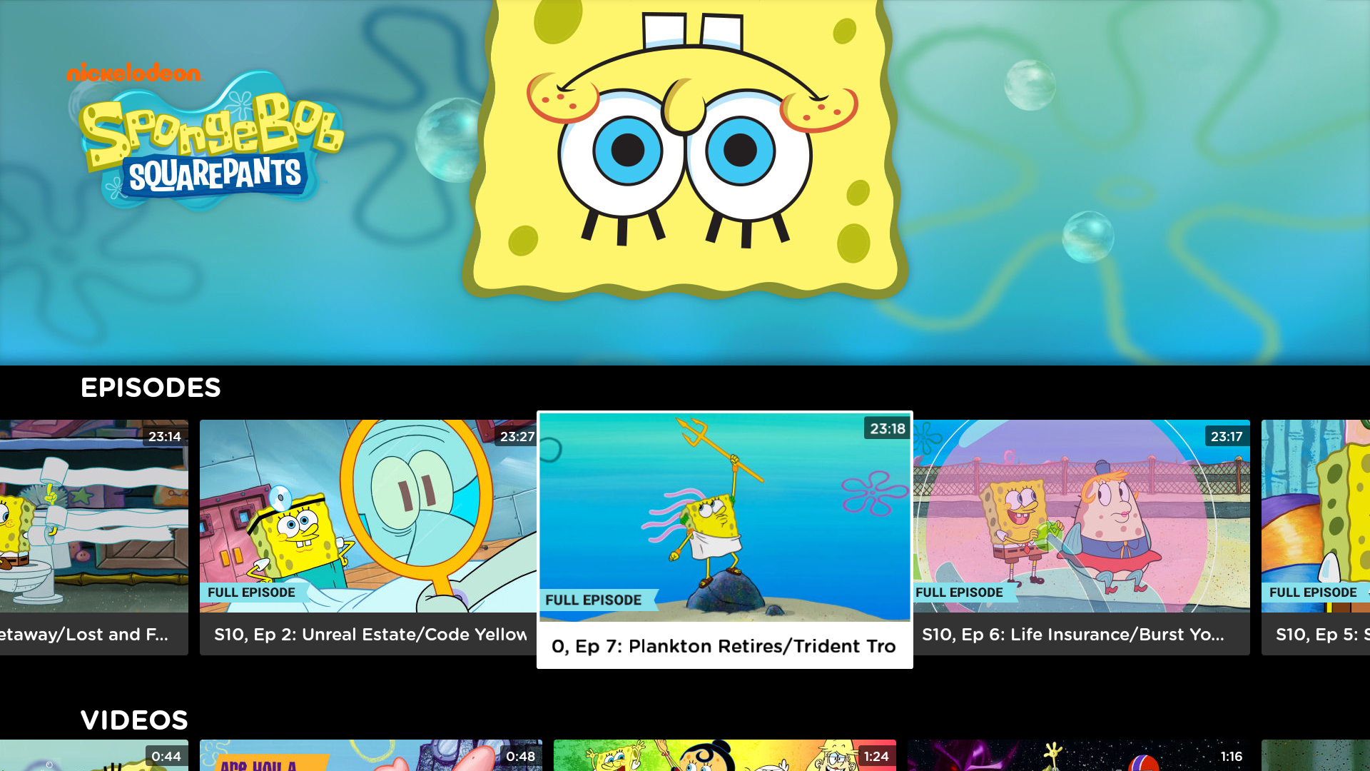
Show Page
Each show's content lives within it's own show page. In this instance it was important to design two version of this page based on the amount/kind of content.
Version 1: Show With Single season
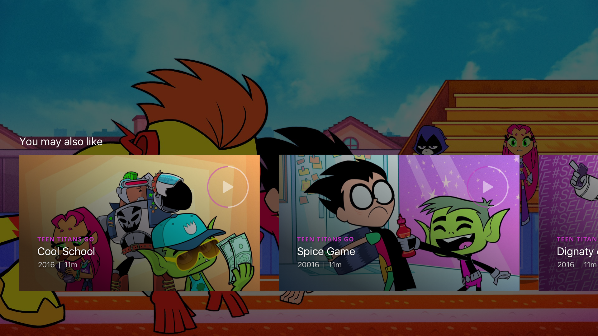
In this instance all "Episodes" of a given show are available in a single carousel, in addition "Clips" which would include excepts, previews and trailers and 'Watch Latest" category which aggregates both Episodes and Clips based on the most recent content. Finally a related content "You May Also Like" carousel to keep users engage and discovering new content based on their show preferences
Version 1: Show With Multple season
Knowing that a show with multiple seasons would also have a significant number of episodes a way to filter this content by season was proposed. When a season was selected all of the content populated on the page would be filtered to reflect the selected season.
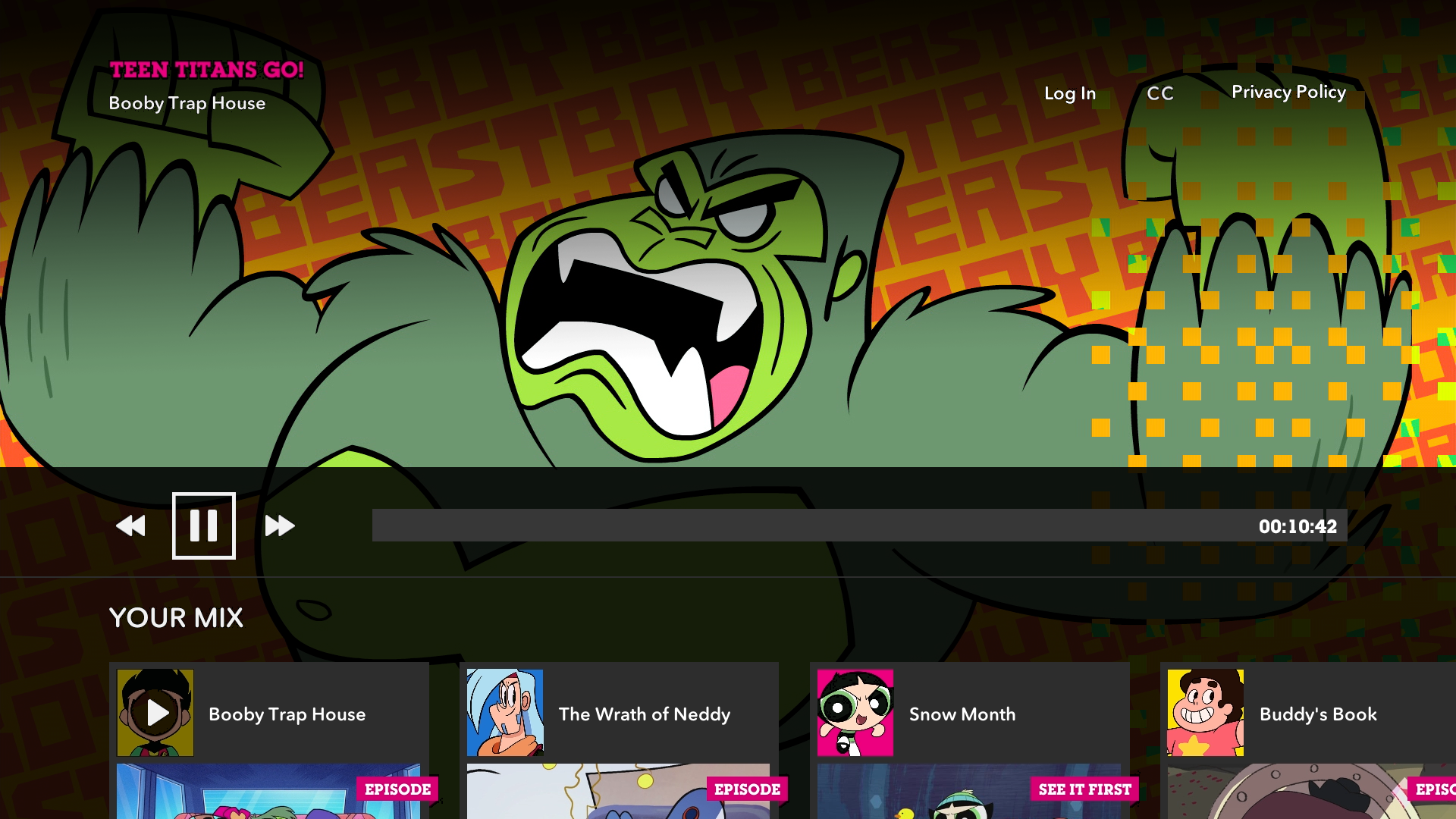
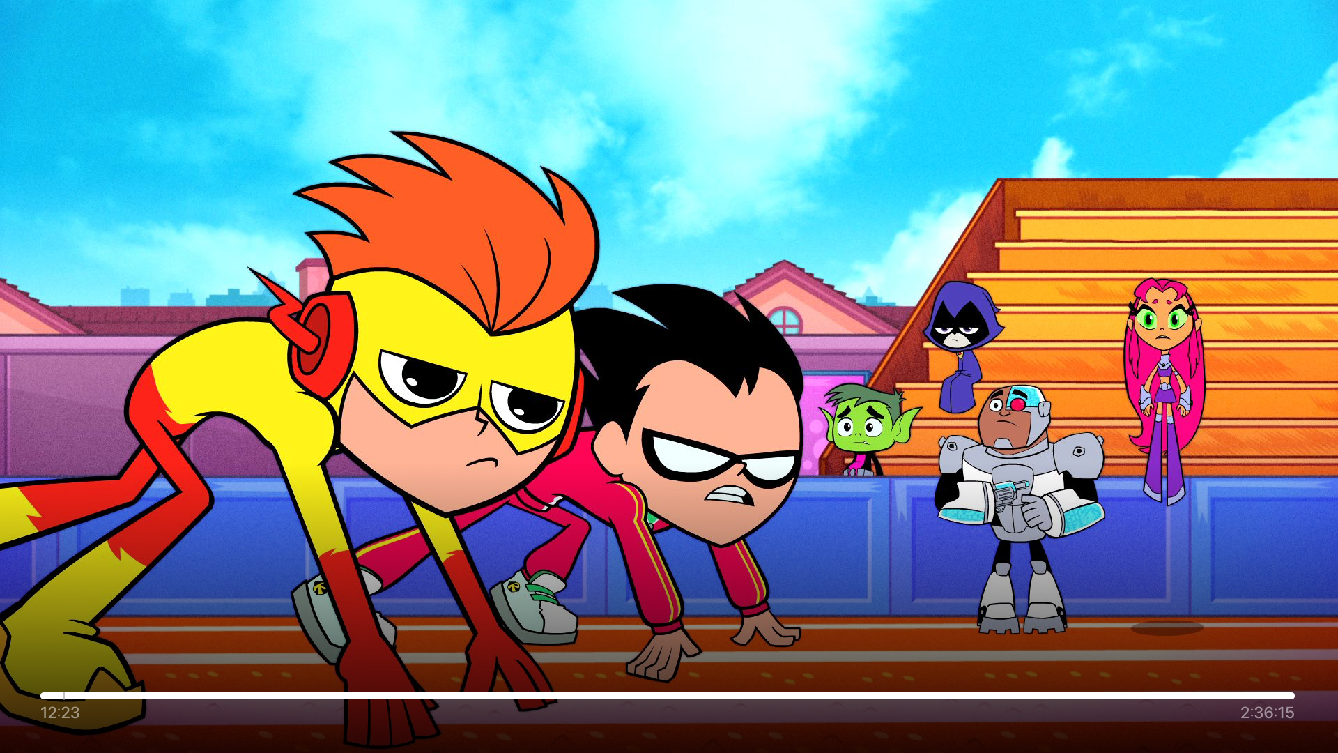
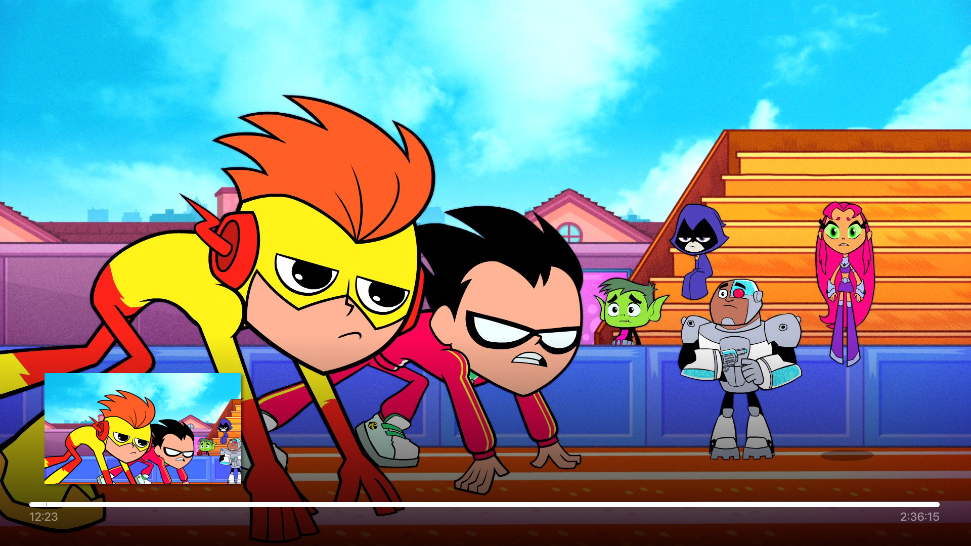
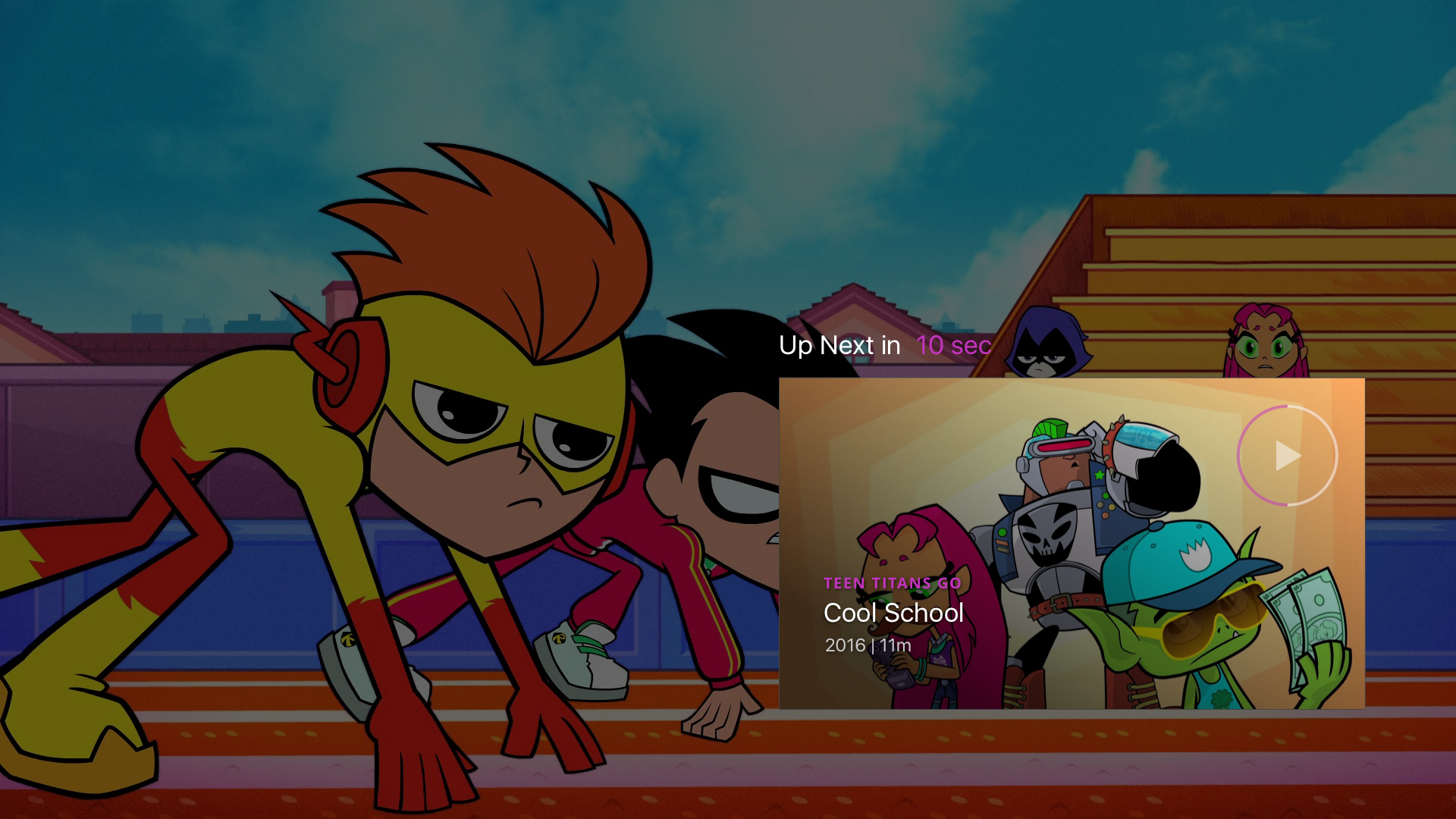
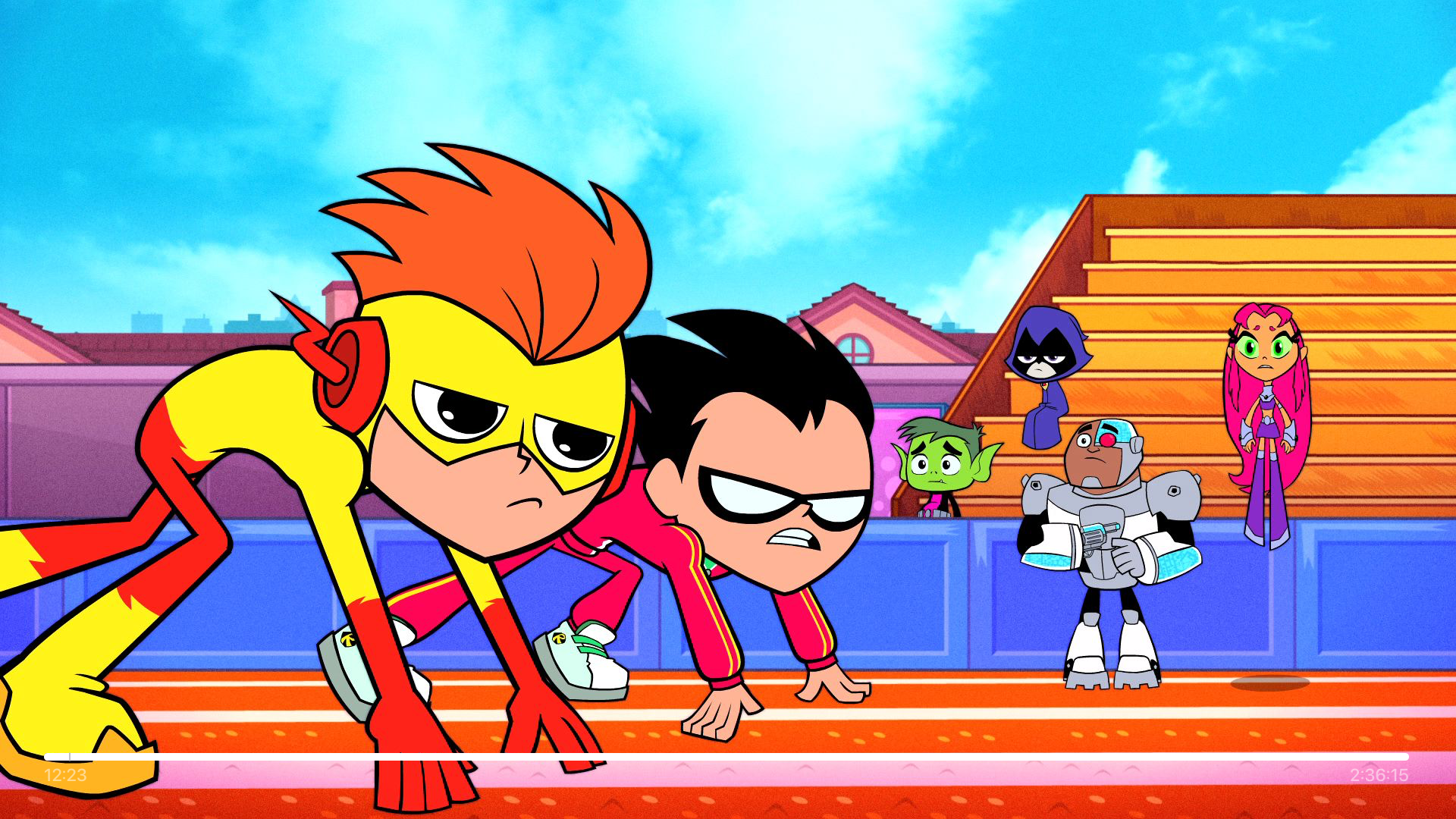
Watch Experience
Based on industry standards a full screen watch experience was designed that included standard pause and scrub as well as autoplaying the next episode when a piece of content was finished. Additionally the option to choose related content if a particular season/show was finished was design.

Search Experience
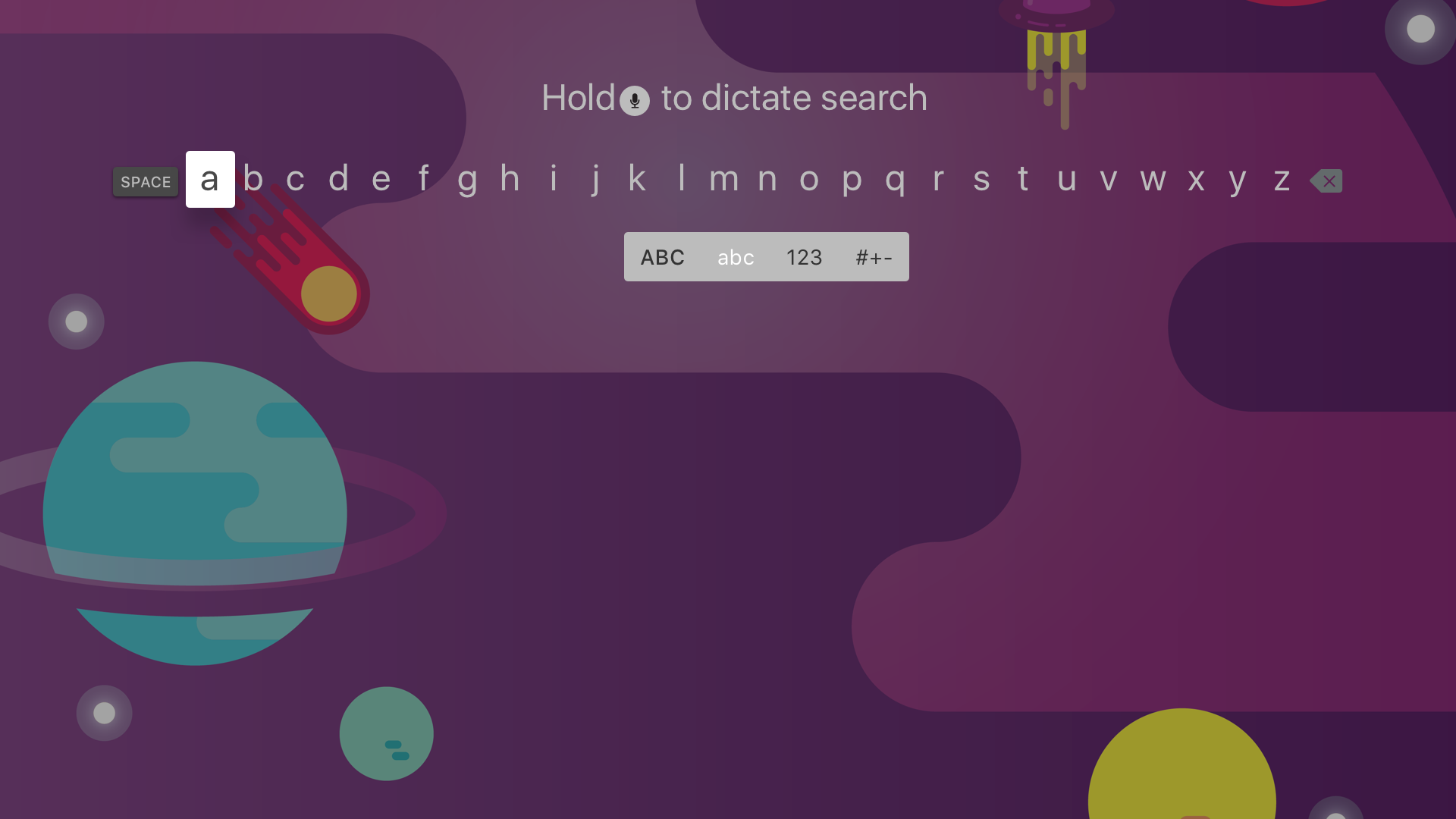
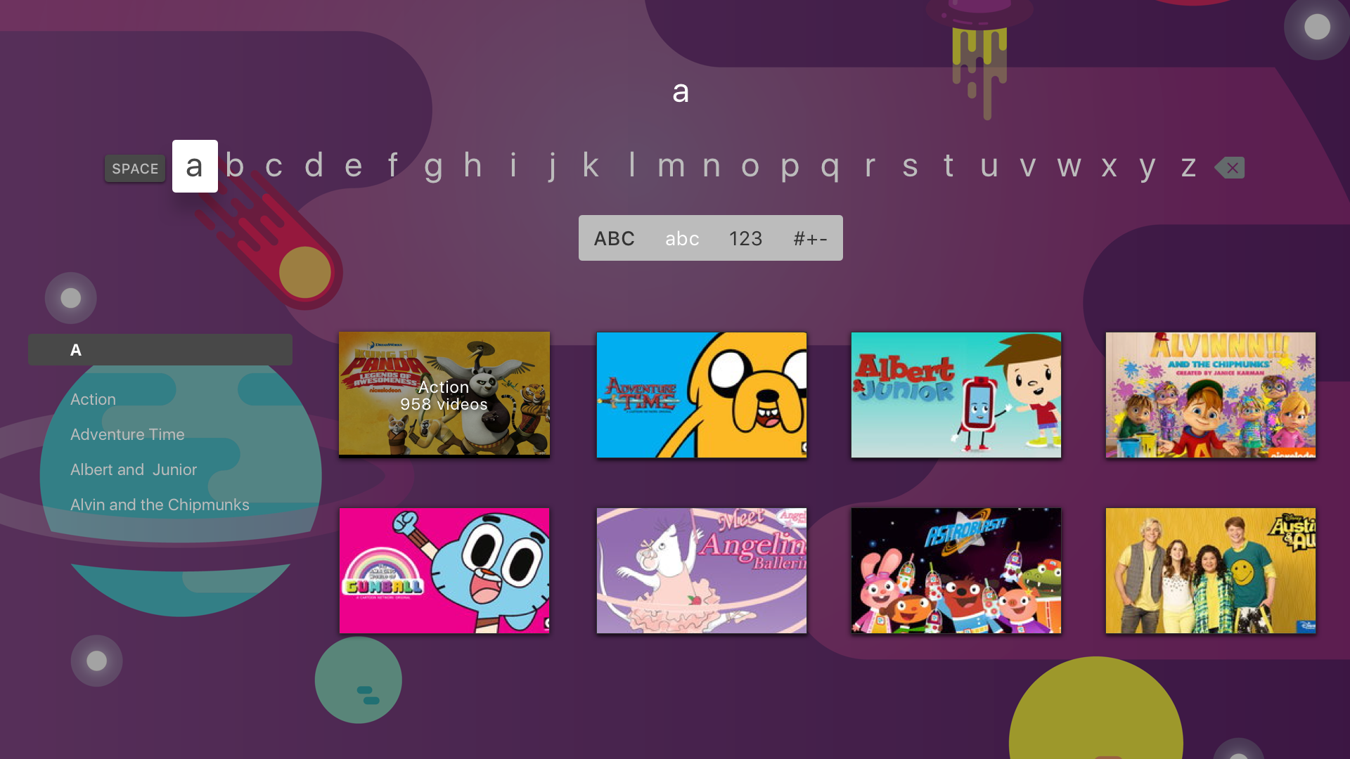
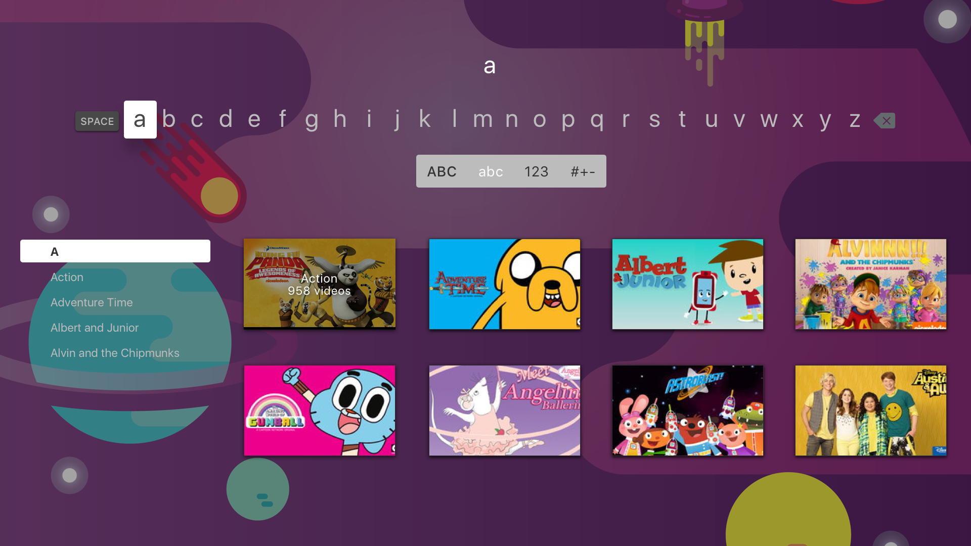
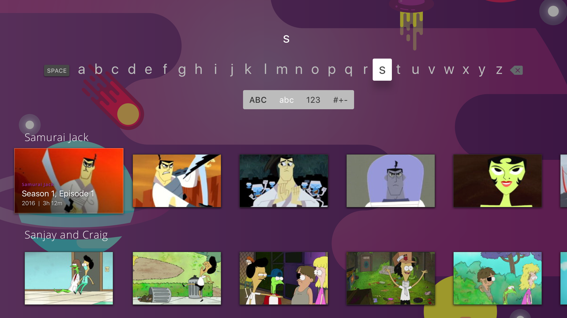
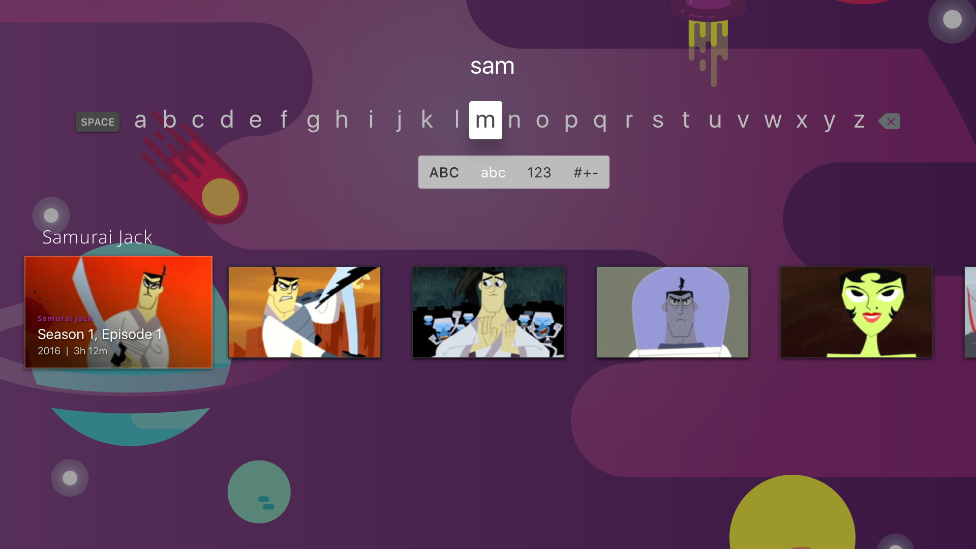
Not having clear definitions of the technology two versions of the search experience were designed.
Version 1: Search Show/Genre
The first option designed would first return any genre's that match the search input followed by cards for shows which would take the user to either the genre page of show page respectively. An autocomplete was available for users as they were typing as well.
Version 2: Search Show/Episode
The second option forgoes the genre result entirely and instead pulls shows with episodes that users can directly navigate to. The content would dynamically populate as the search words are input.

Future
Future Looking
Even before V1 would go into development additional feature requests were considered based on stakeholder asks.
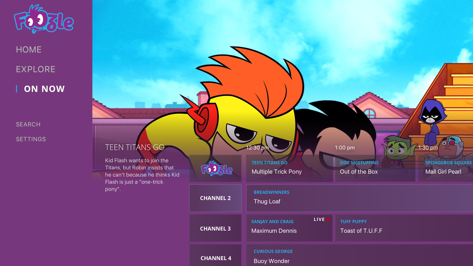
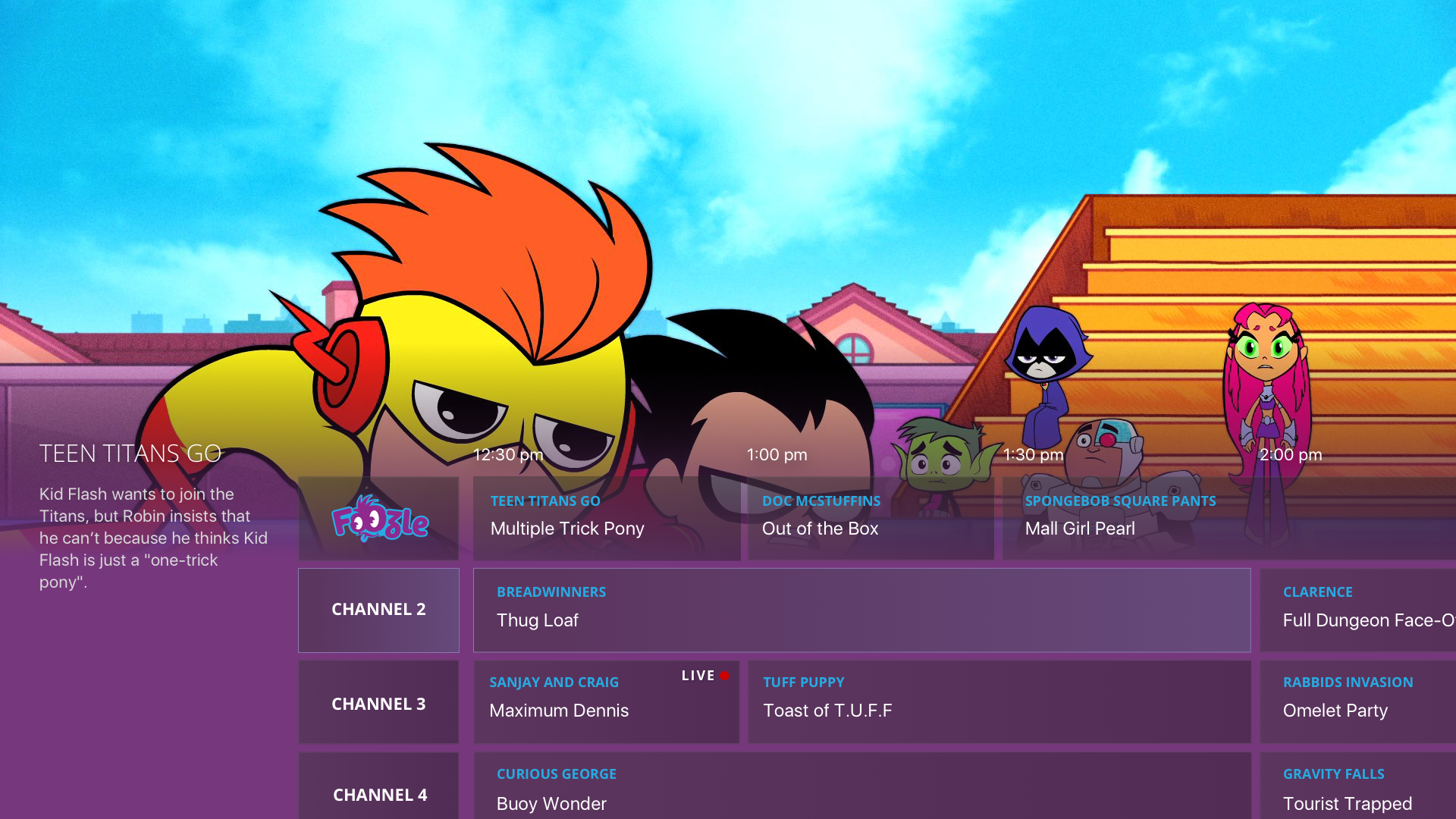
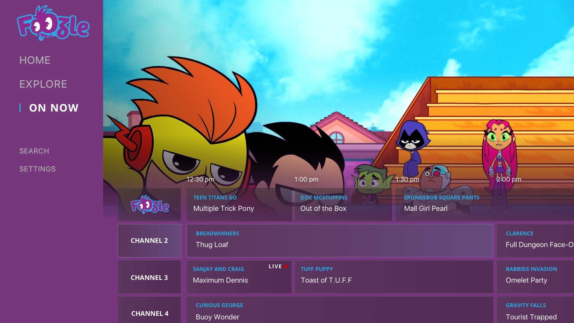
On Now/EPG
With the ultimate intent being an inclusion of a linear stream an EPG and On Now experience would need to be designed. Additionally while the original intent was to launch with just a Foozle linear stream over time the hope was to partner with content providers to create additional streams as well as to create additional Foozle streams that would be based on different kinds of content (genre, age group, character, length).
Explore Secondary Navigation
In addition to the simple simplified global navigation an Explore secondary option would be explored in the future. This would allow users to quickly flip through more additional or more refined genres/categories of content to discover new content based on their specific needs and taste.
