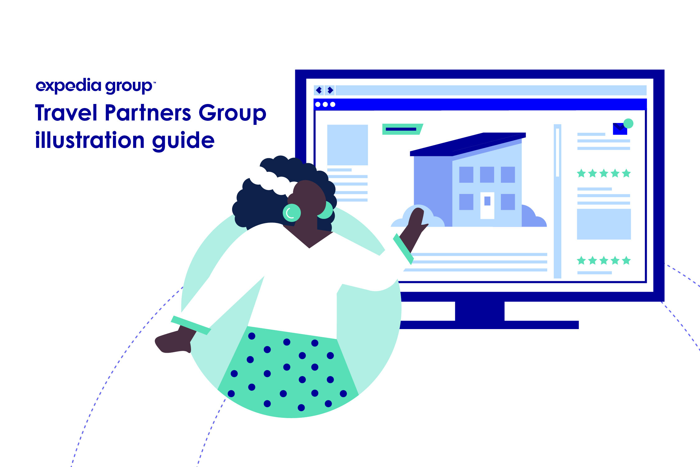
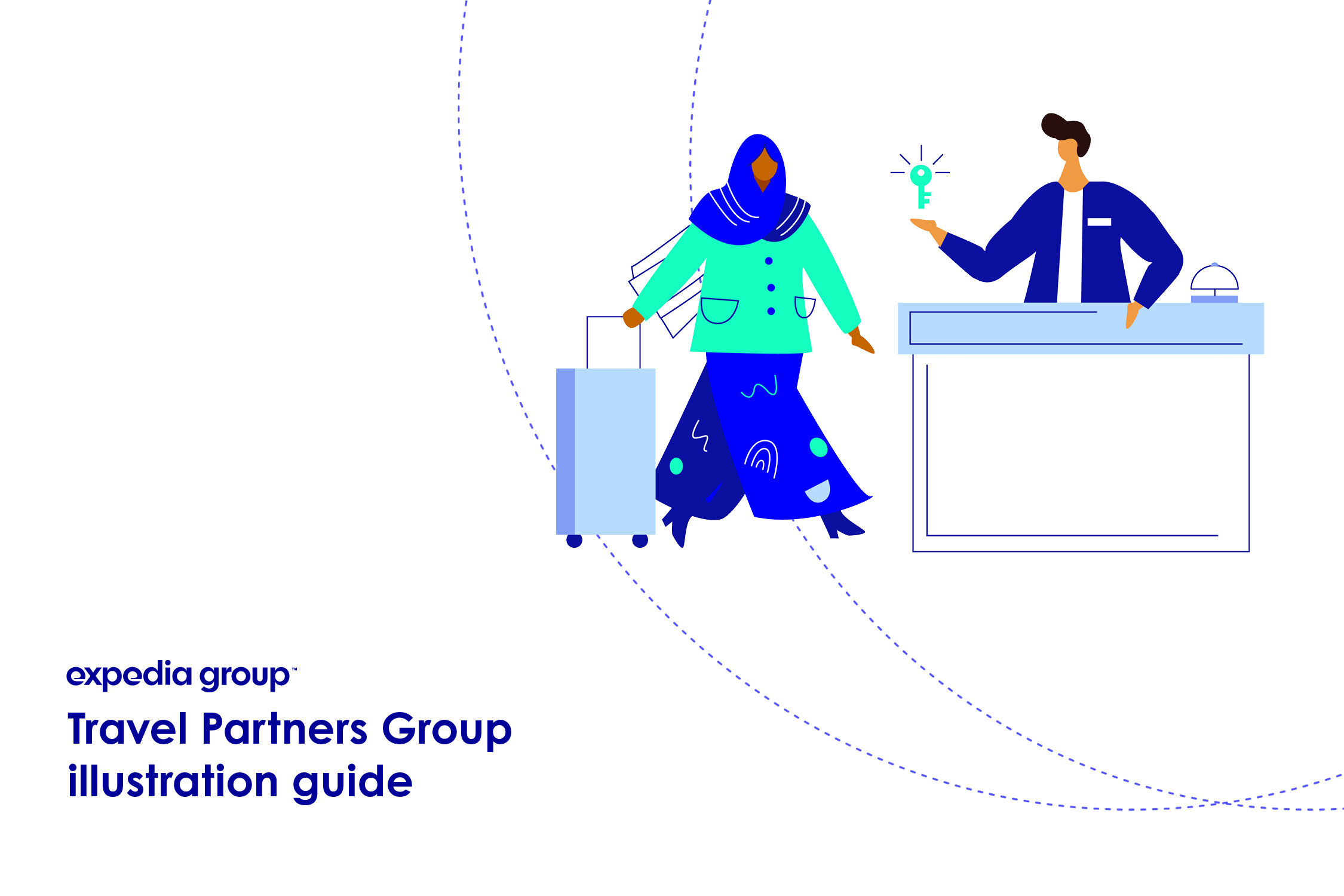
Expedia Group TPG Illustration Standards
Overview
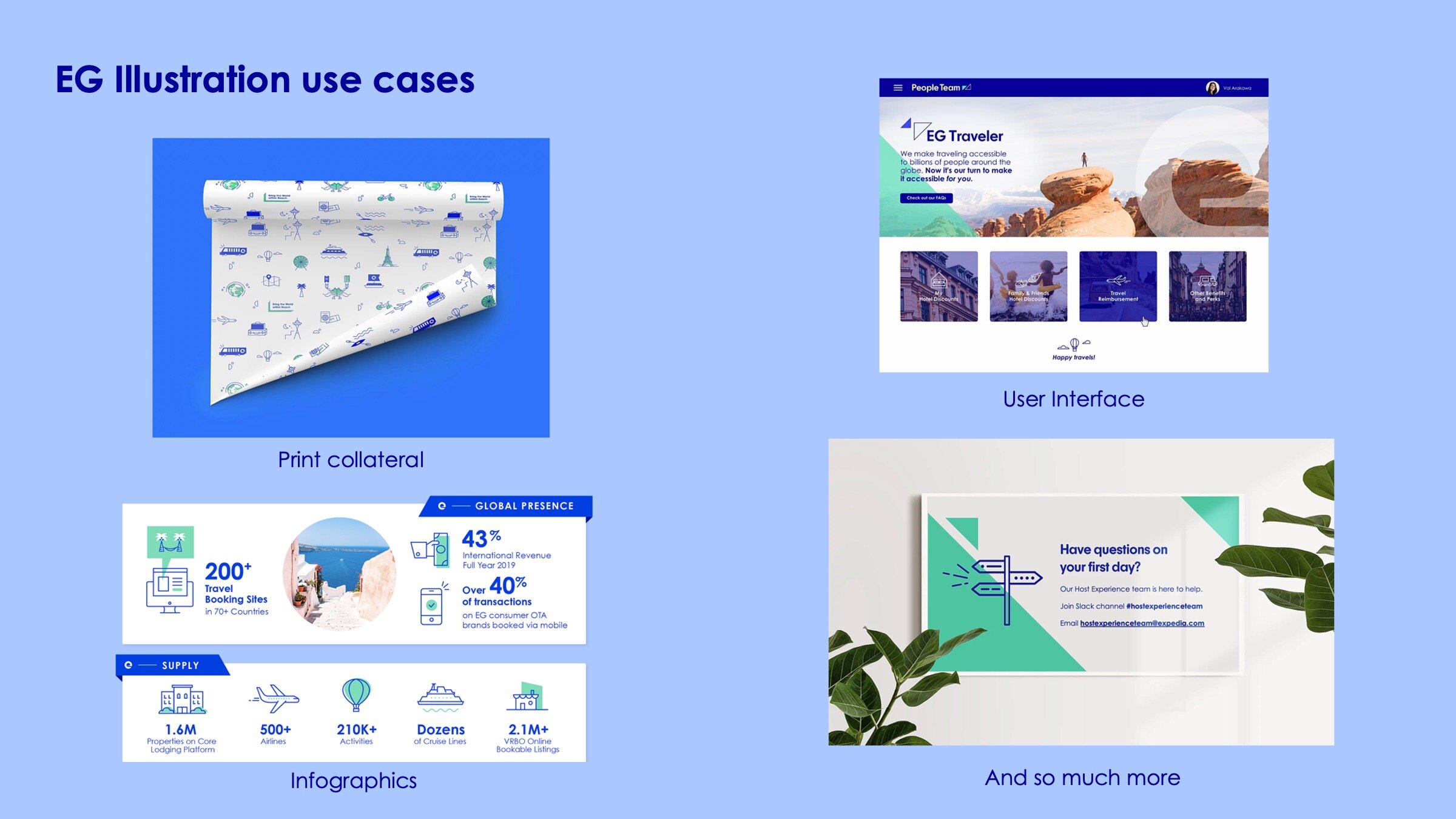
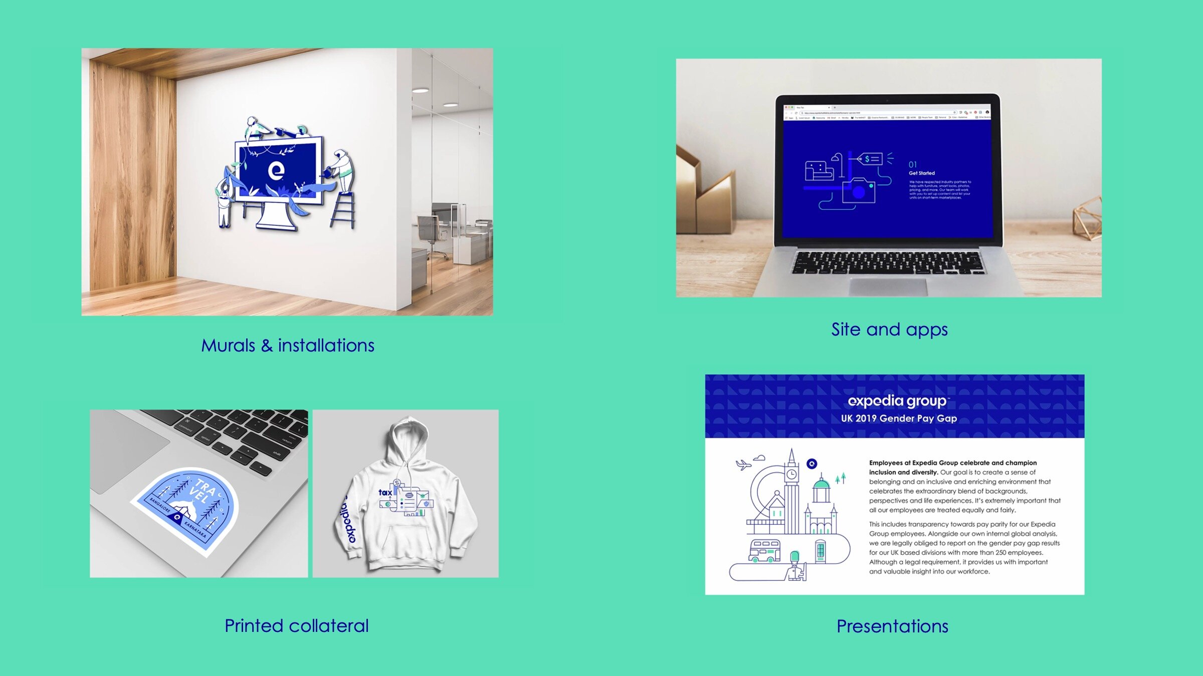
Expedia Group uses illustration everywhere, from products to marketing, print and web, internally and externally. However, the Travel Partners Group, the B2B pillar of Expedia Group who works directly with hotels and vacation rentals found themselves with different needs and ultimately a different audience than the primary brand. This unique identity as well as a lack of a previously defined illustrative identified a need to create a guidelines for a consistent look and feel to the illustration that the team was using.


My Role
I worked as the primary designer in the research and exploration faces of the illustration guidelines; testing, creating standards and documentation. As the project proceeded, I took on additional role of presenting the work stakeholders and the organization and leading/advising other designers on how to use and adapt the style. After the standards launch, I continued to utilize the illustration standards to create new assets, materials and products.
Considerations
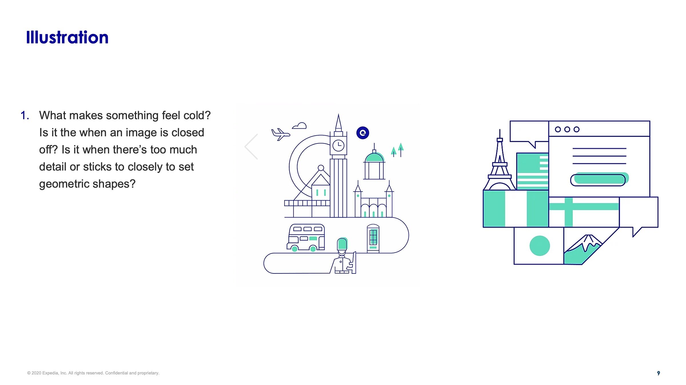
We began with a simple question; “Where do we use illustration” and the answer was everywhere. An exhaustive inventory found that every type of project that design touched either had used illustration in the past or had the potential to use it, from print to digital, product to marketing, it was everywhere. However there was no consistent style or application.
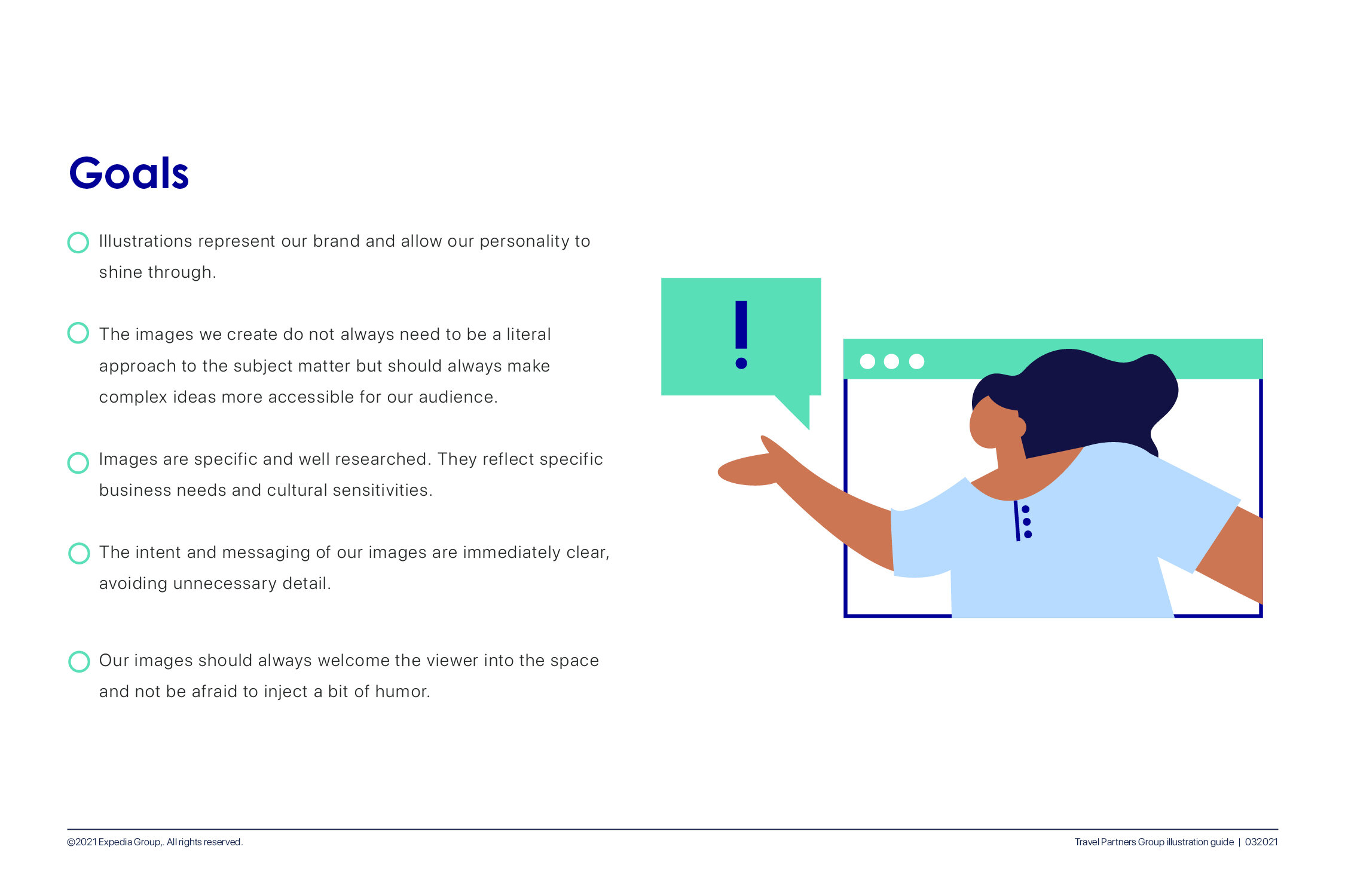
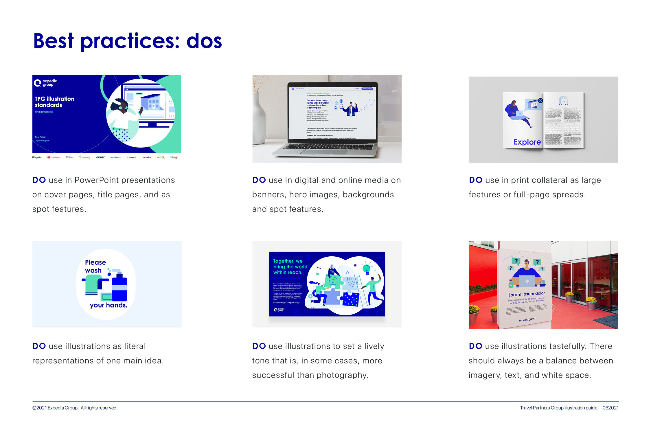
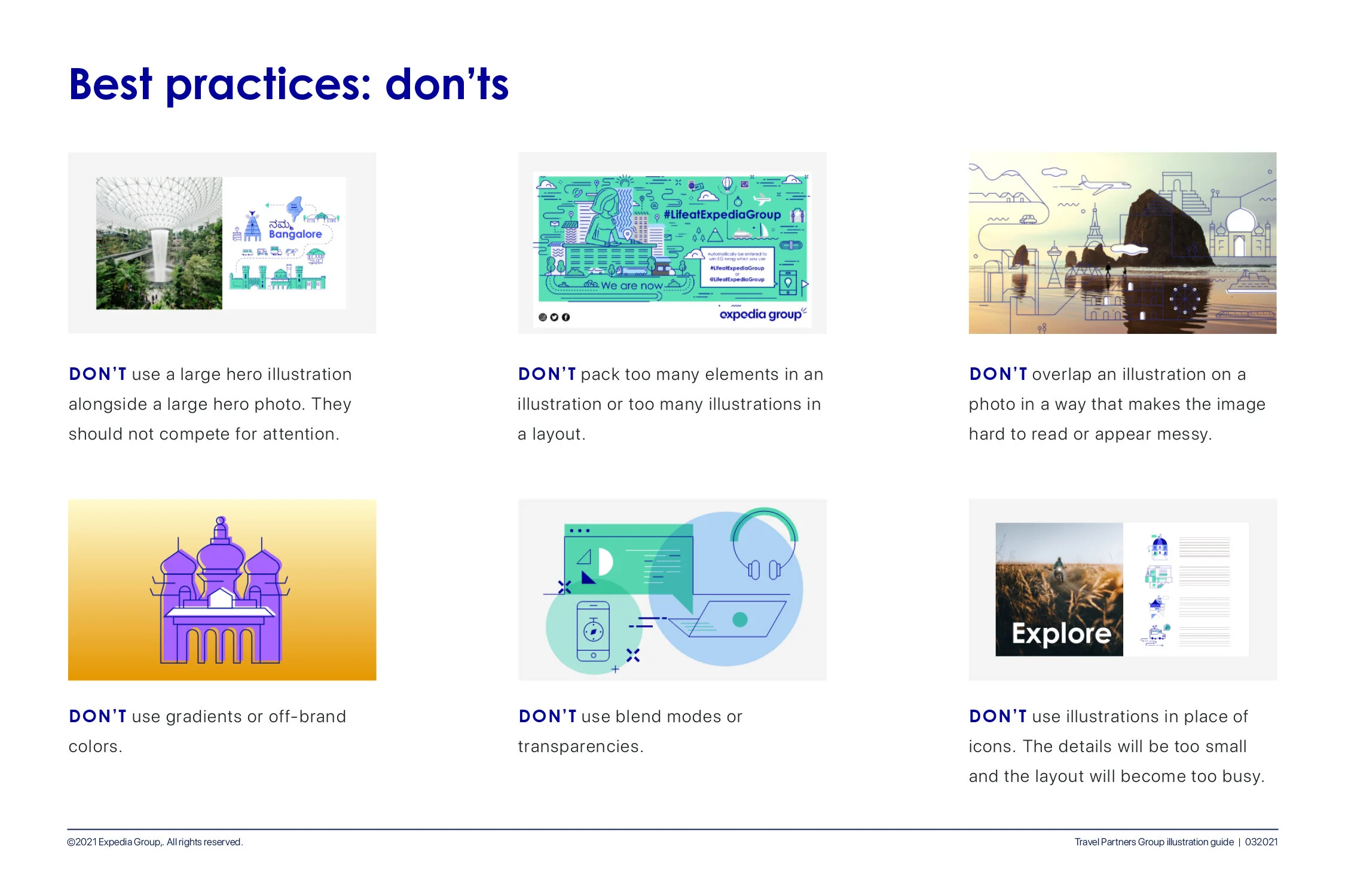
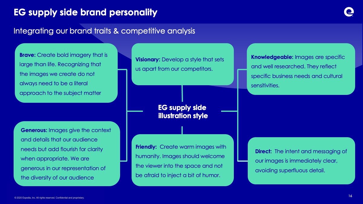
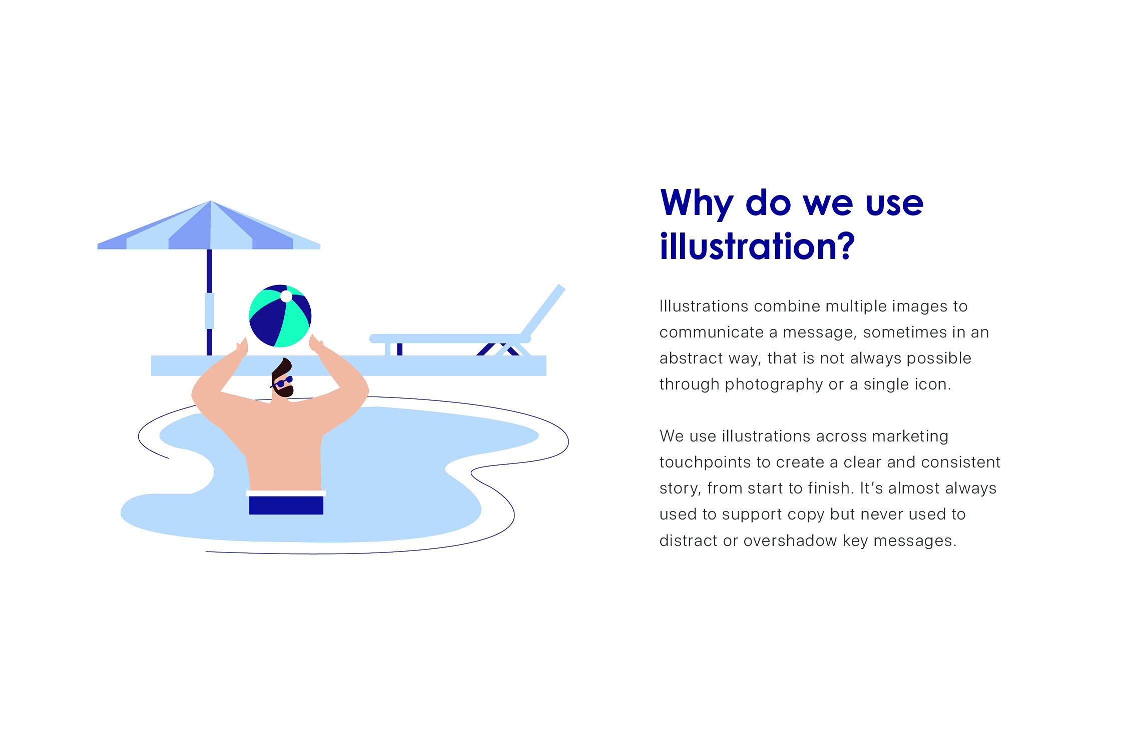
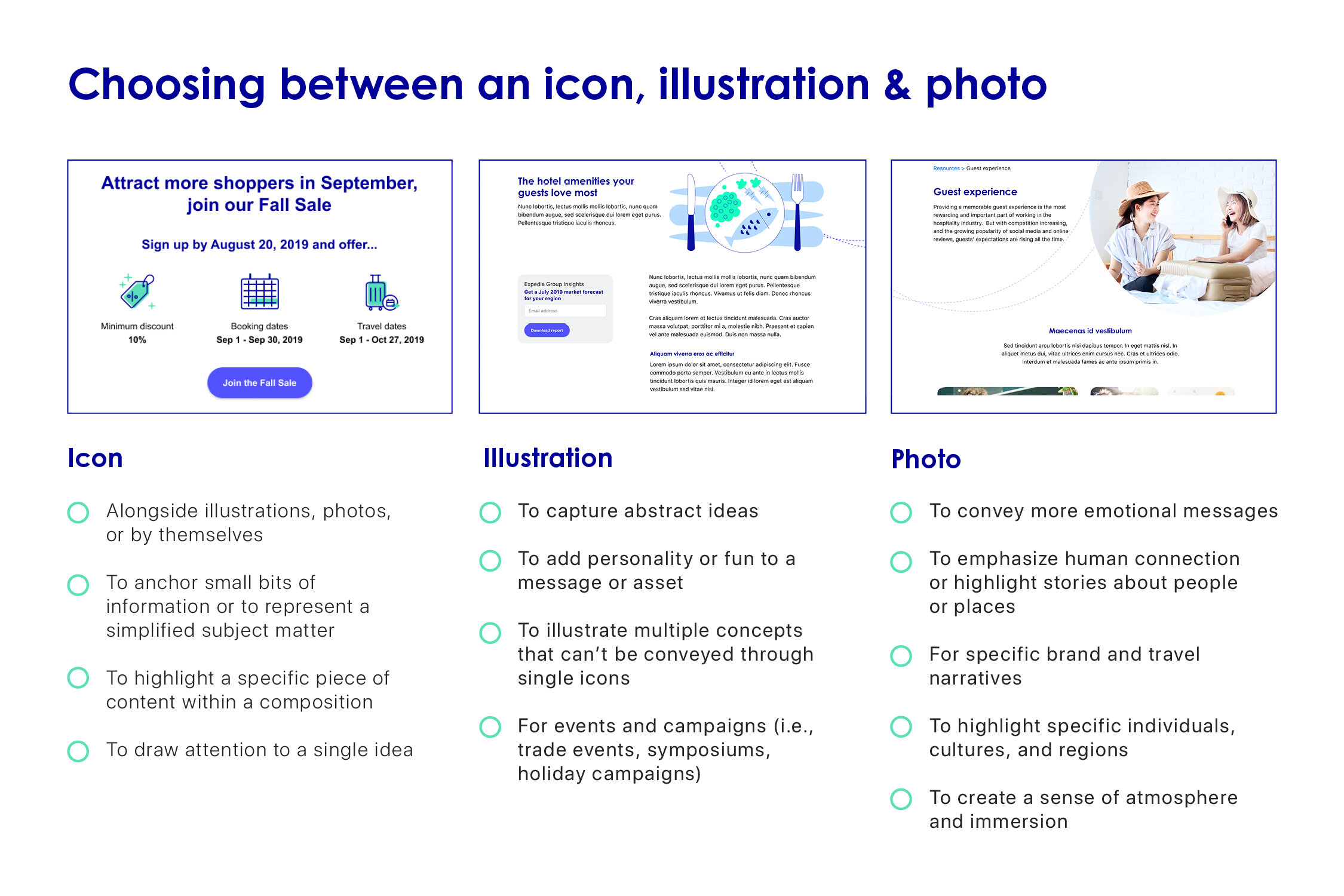
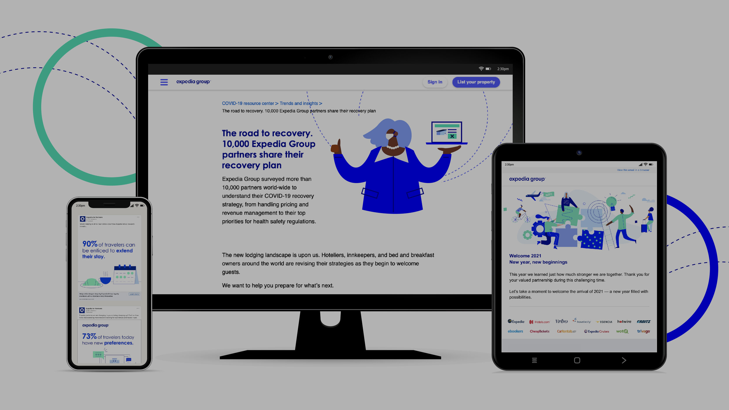
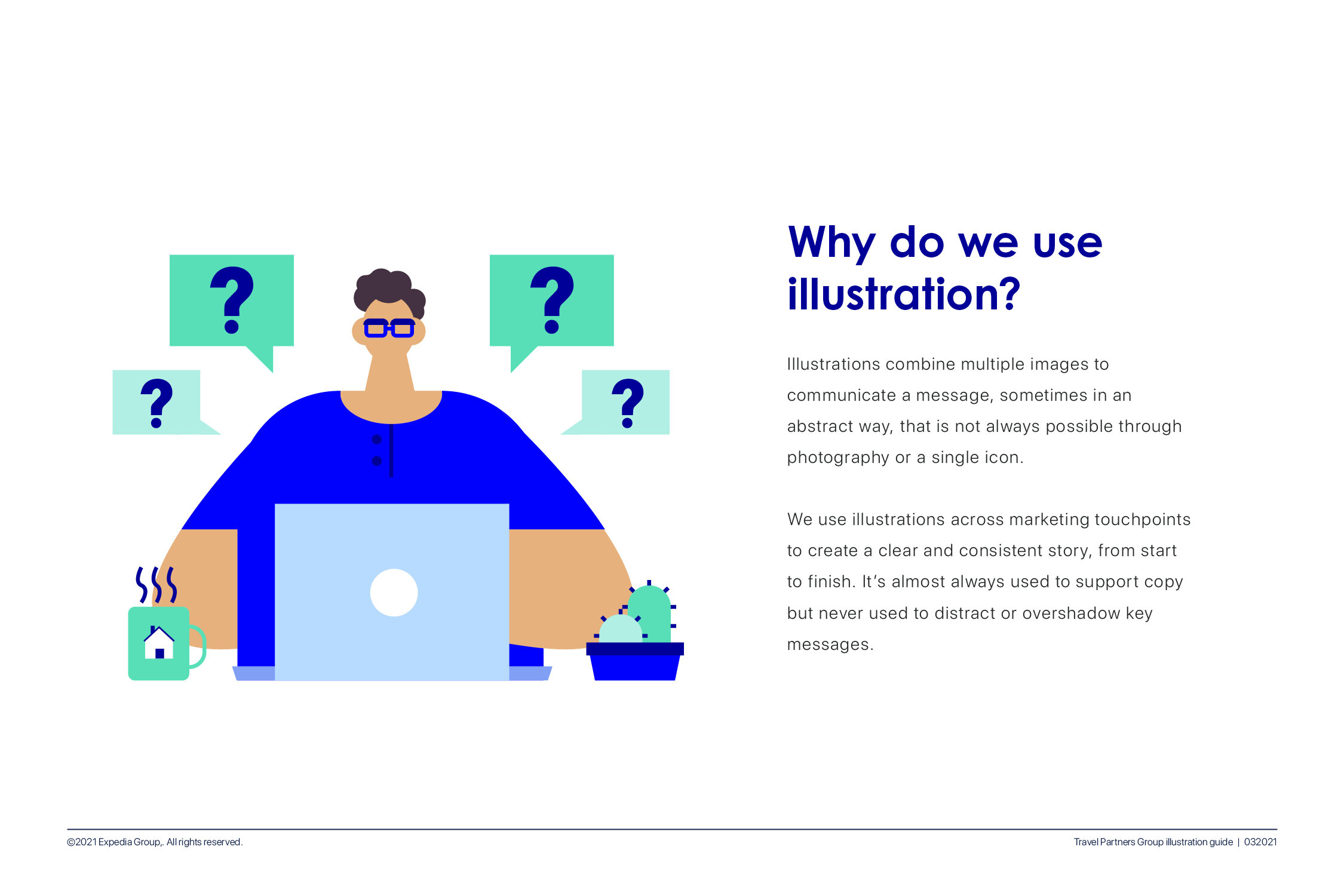
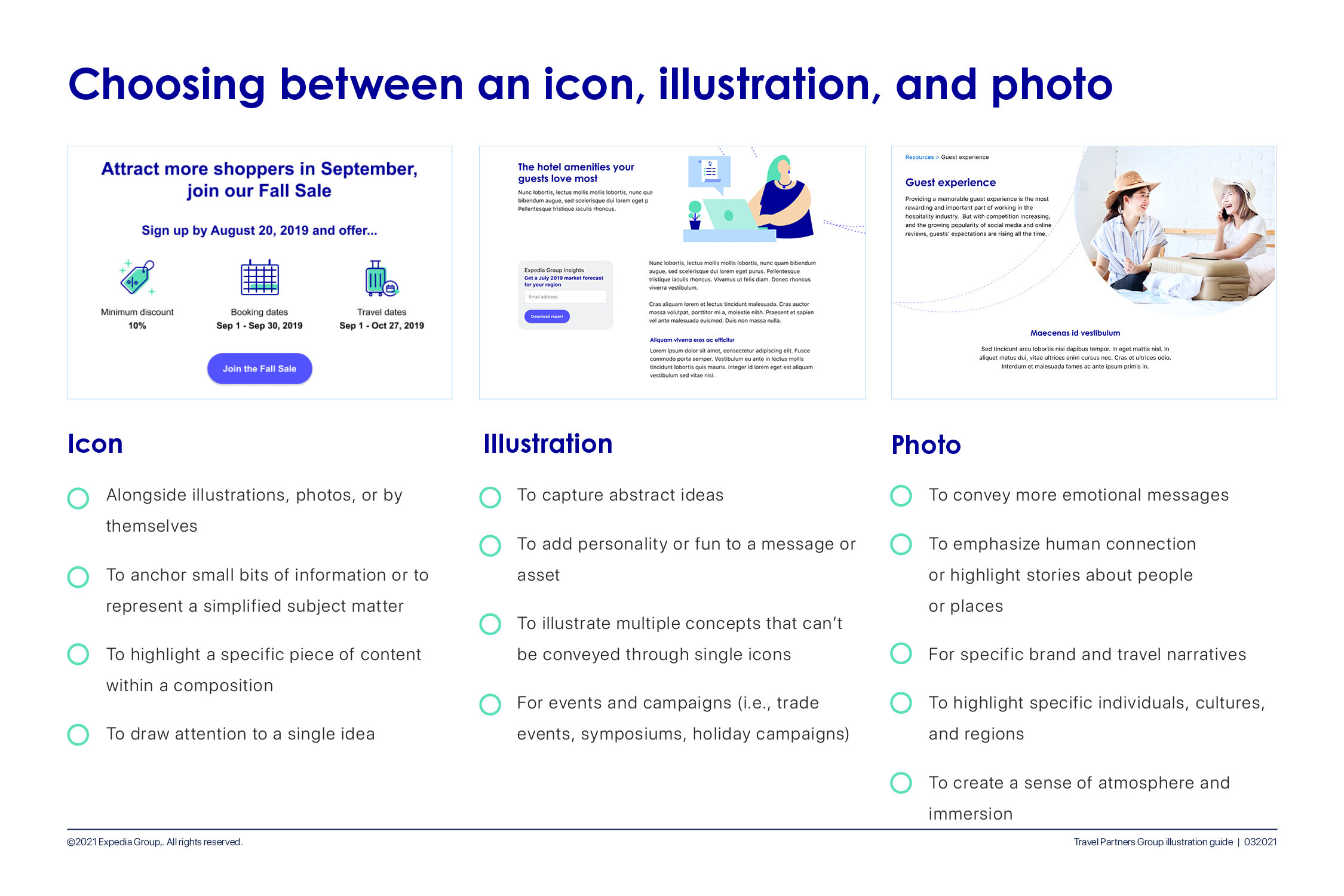
The next question was “Why do we use illustration” Answer: We use illustration across marketing touch points to support a cohesive, clear, and consistent story from start to finish. It's almost always used to support copy and should never distract or overshadow the key message

Criteria to Fullfill
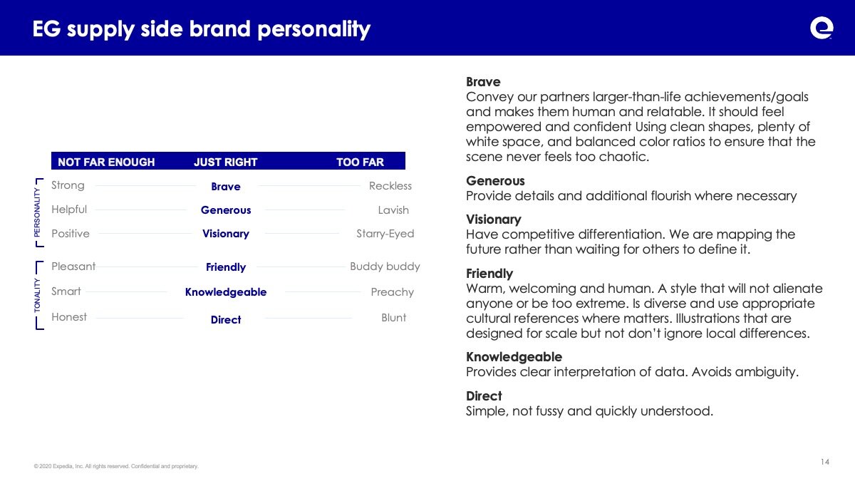
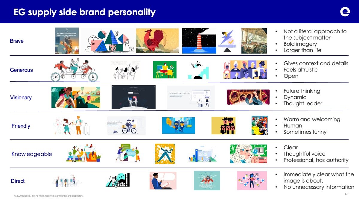
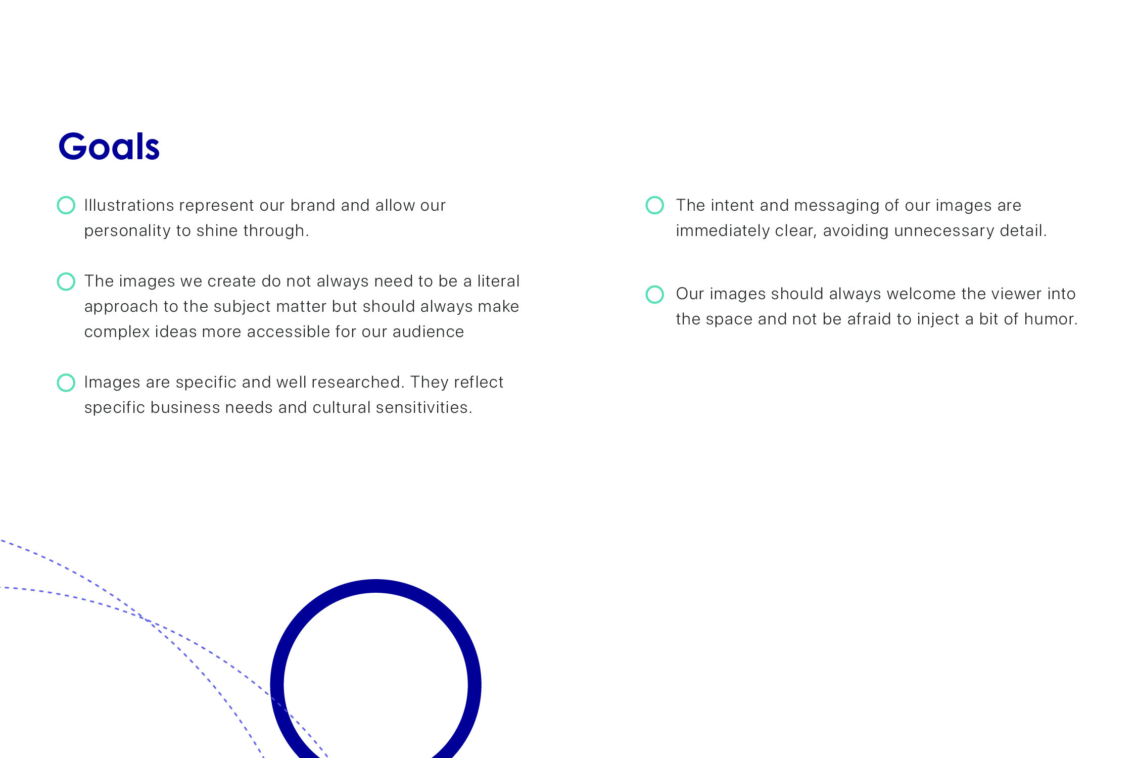
Reflects our brand personality and voice
Use Expedia Group colors
Work across all touch points
Align with our iconography
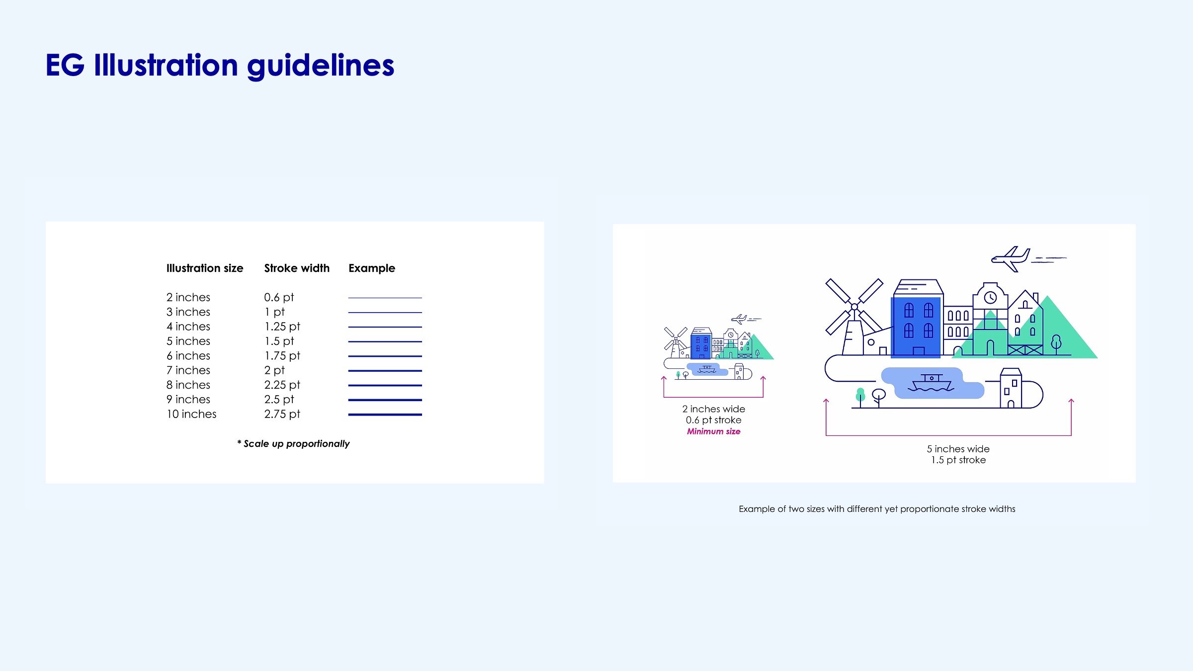
It can scale up or down depending on the context.
It can evolve with as we grow, and as we iterate on our marketing strategies and messages.
Work on mobile
Speak to the right audience
Aligns to our design principles

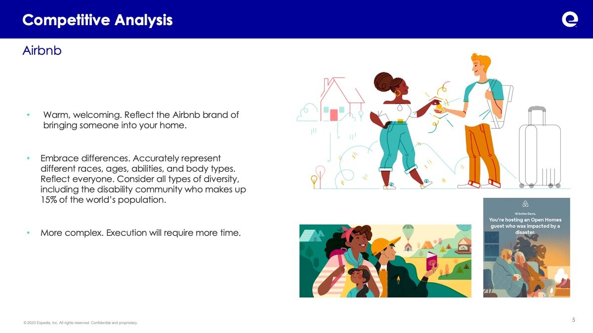
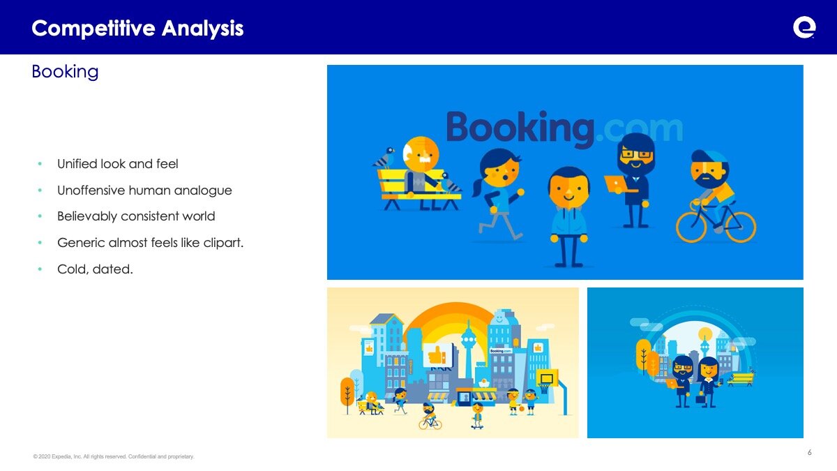
Competitive Analysis
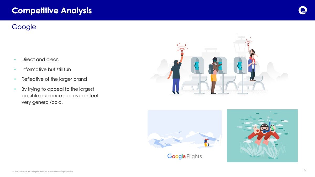
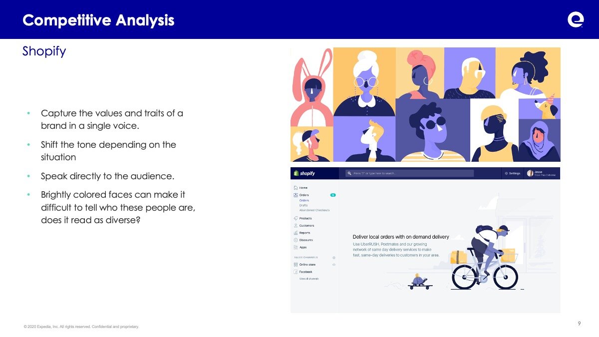
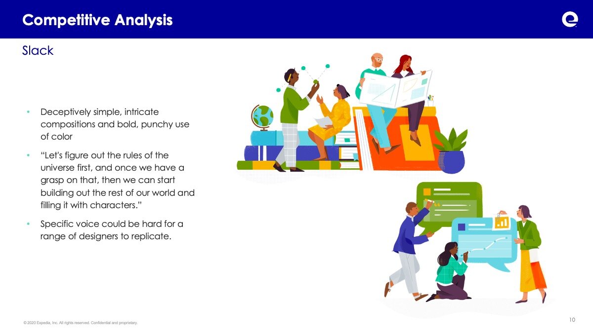
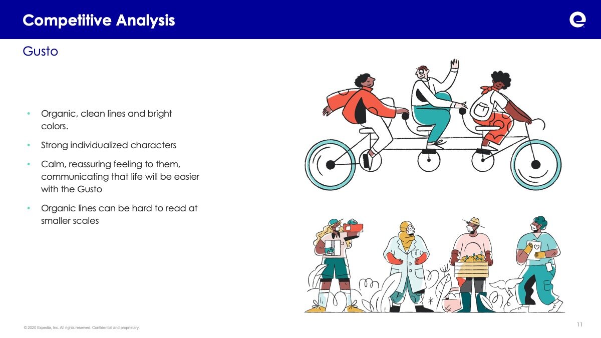
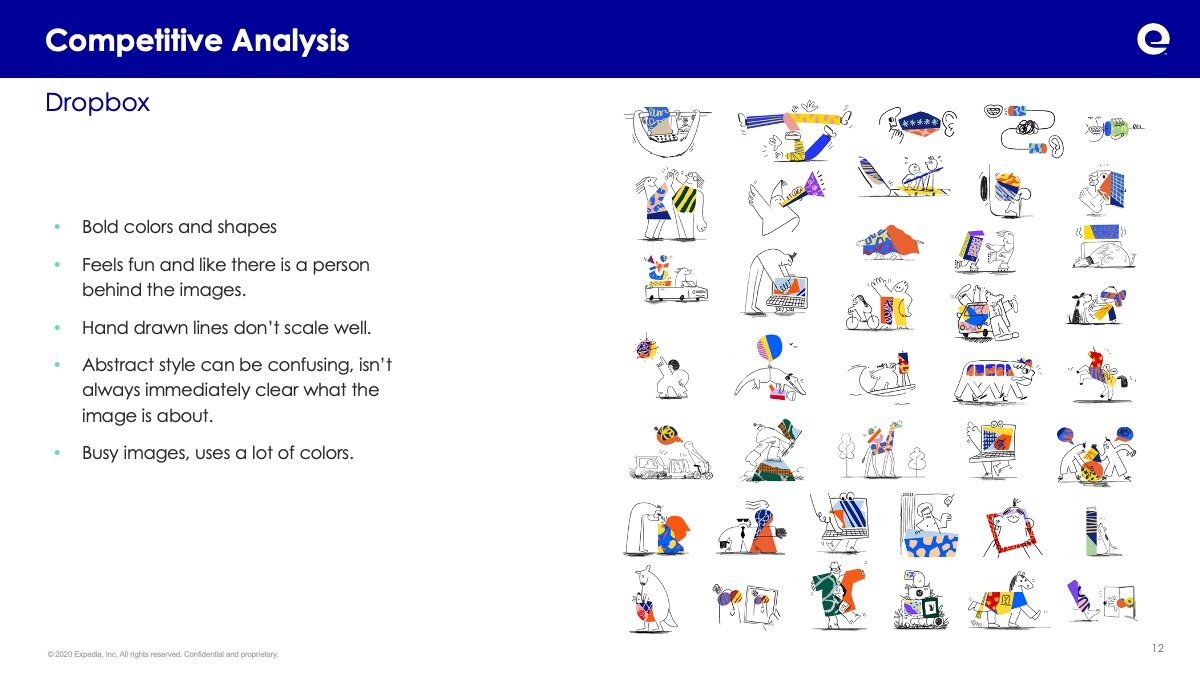
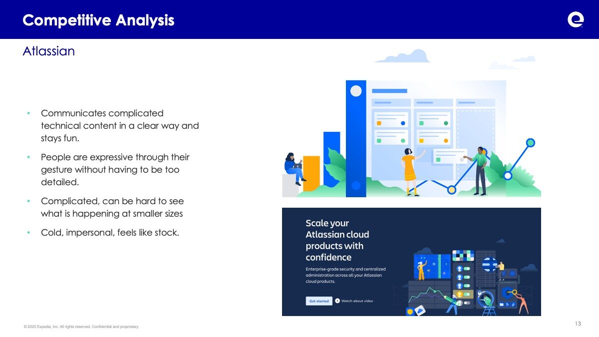
In order to understanding both how illustration was being use in both the travel and large tech industry a deep dive into current trends and use cases.
After compiling and examining the samples a matrix was created to determine how they could be applied to meet the core brand traits. And from there this information was distilled into actionable statements to create the framework of the voice of the Travel Partner Group illustration methodology.
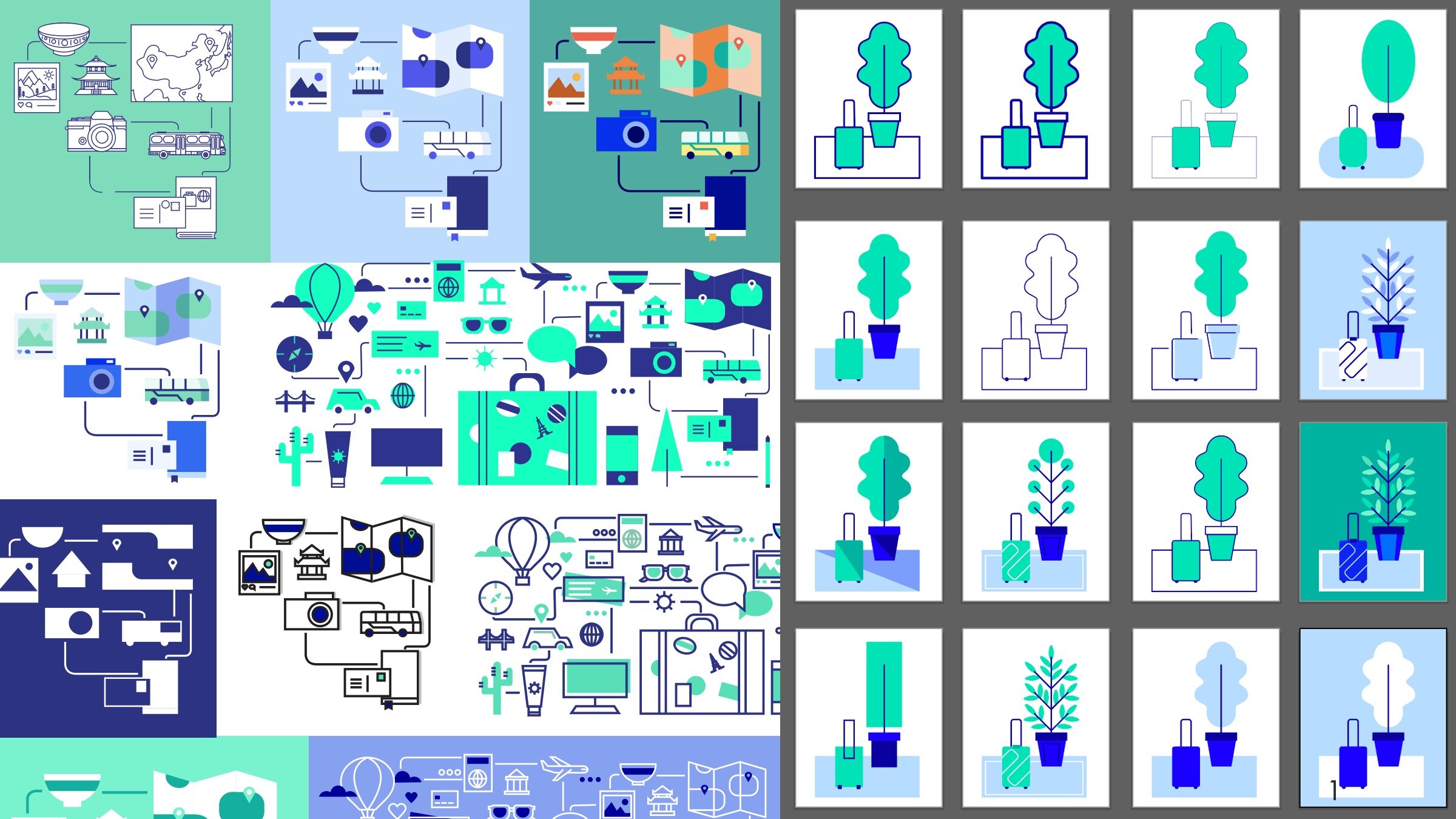
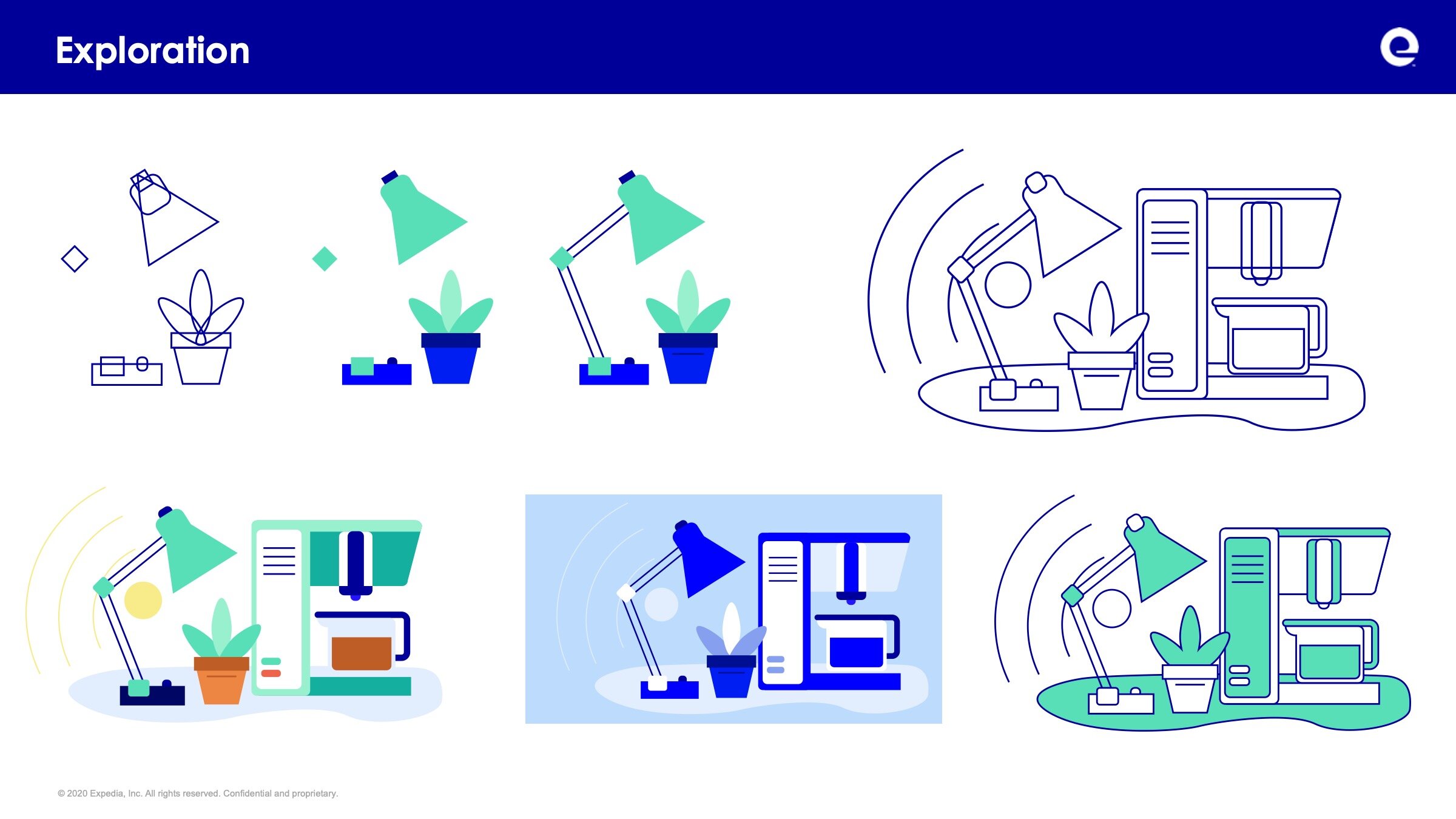
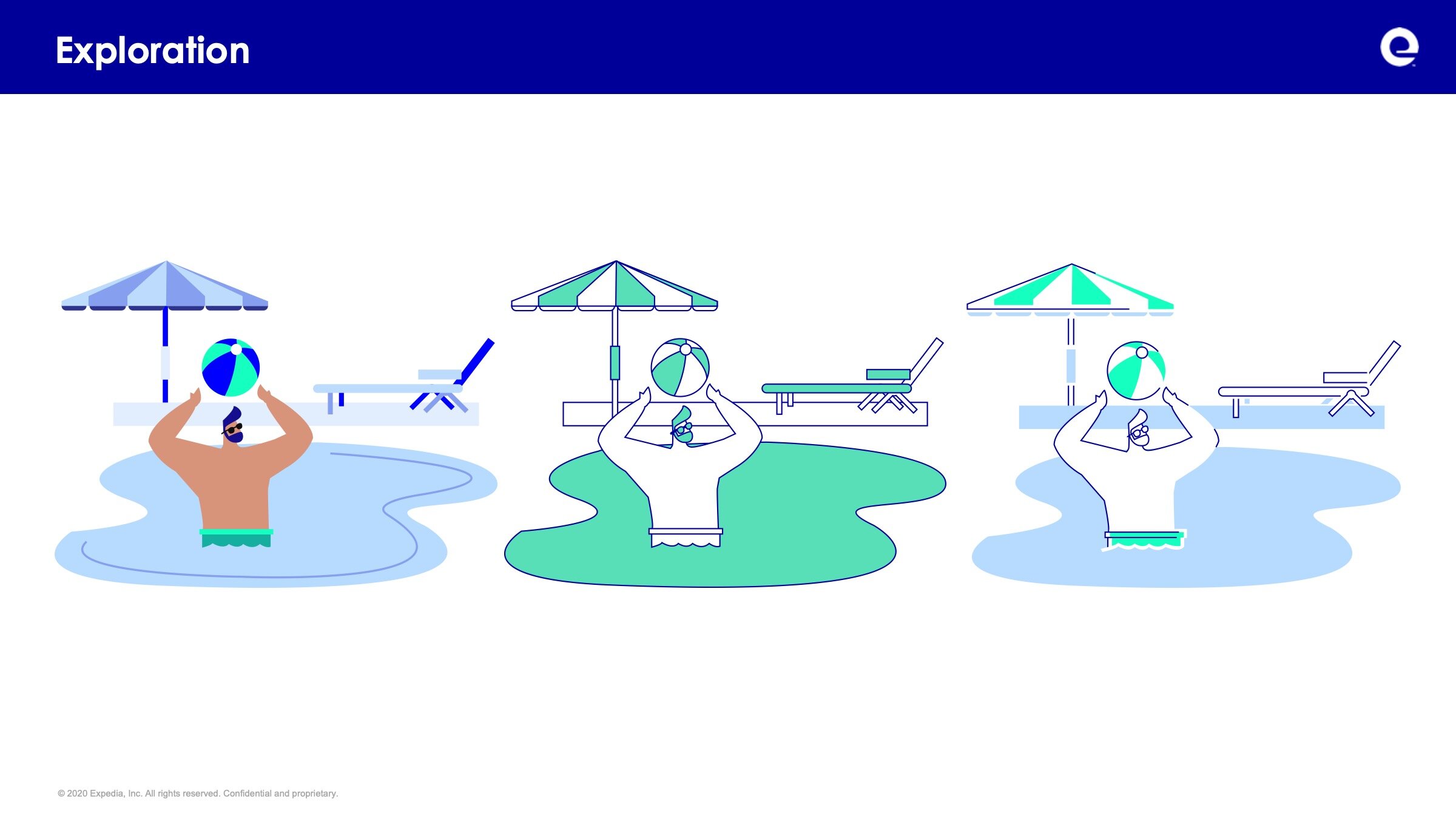
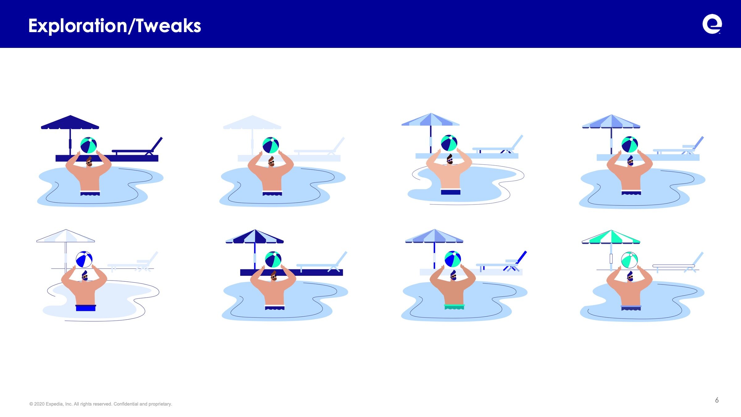
Exploration
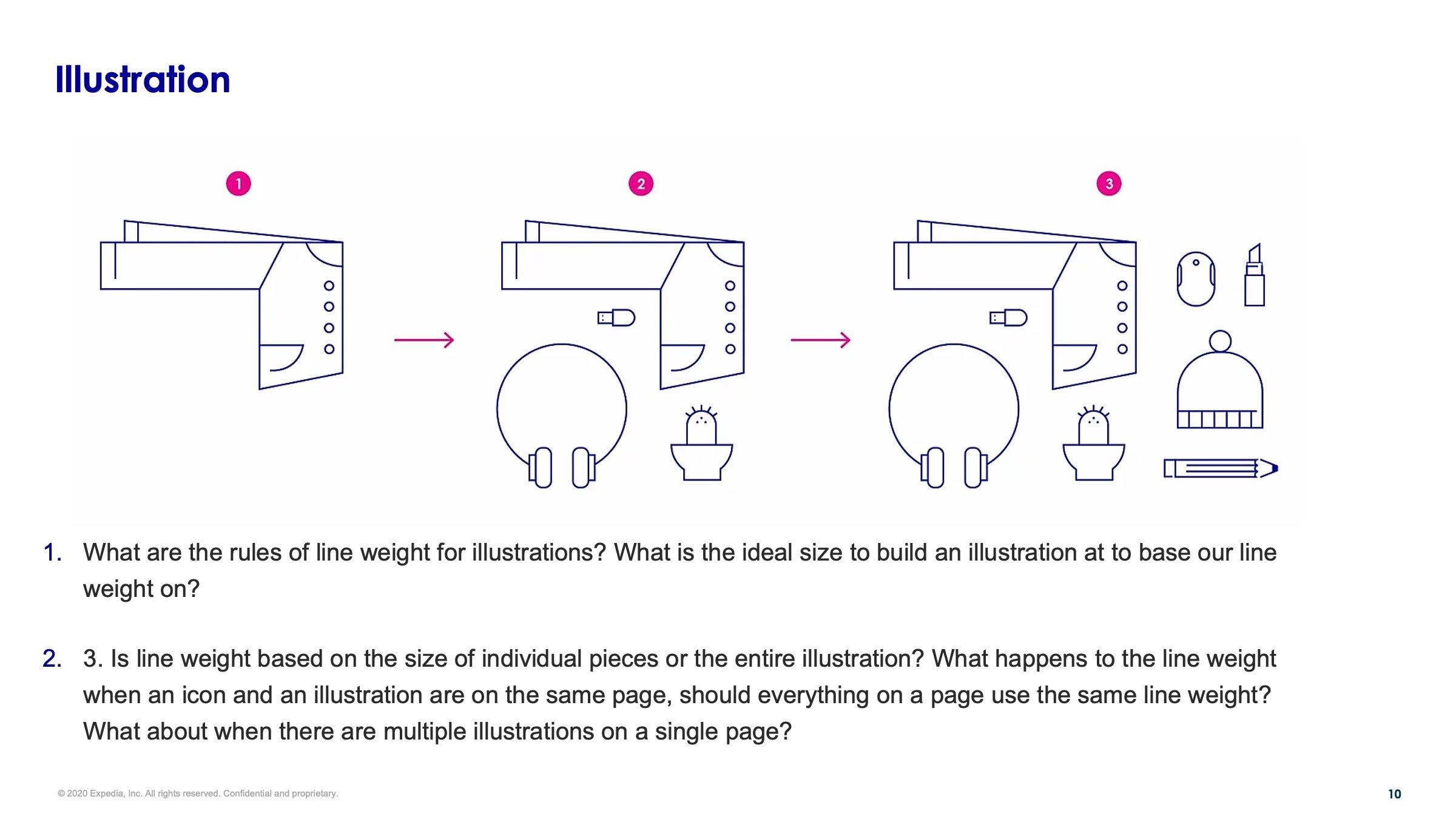
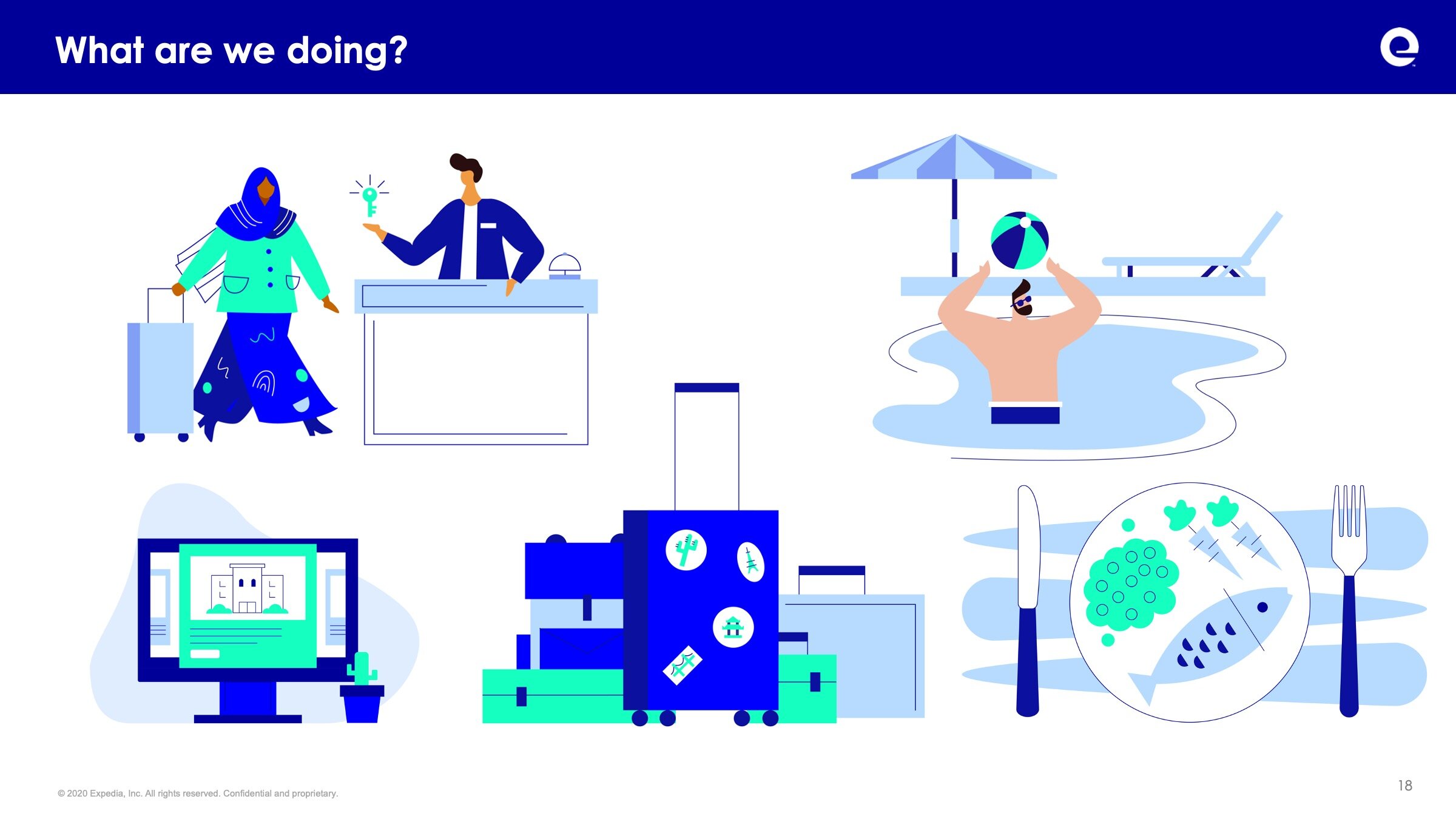
I developed a series of illustrations and variations to narrow in on a style that would meet our goals and business needs, this included testing:
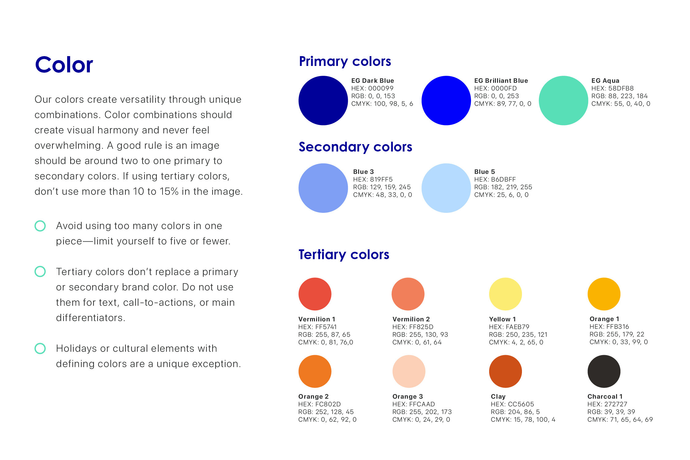
Color
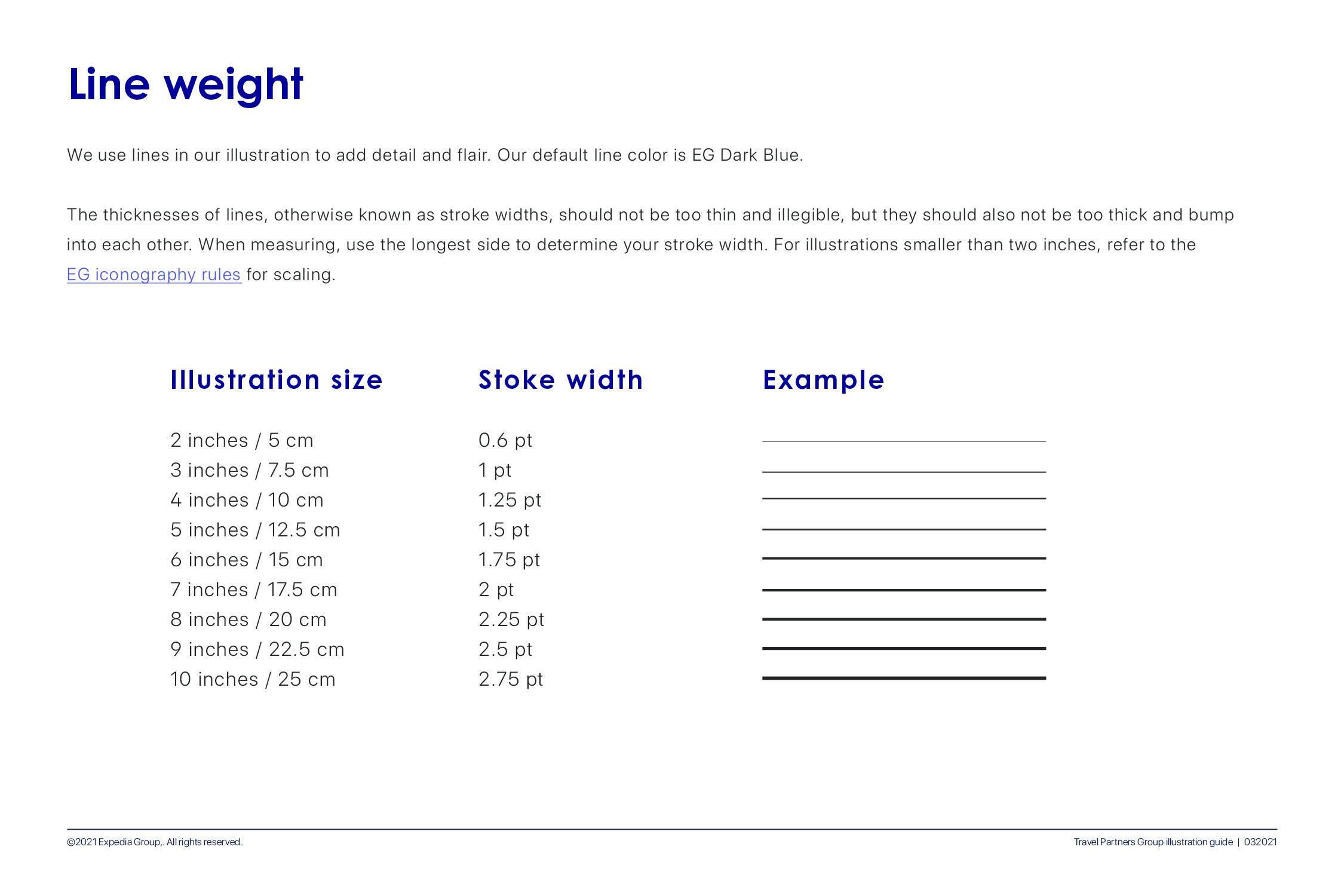
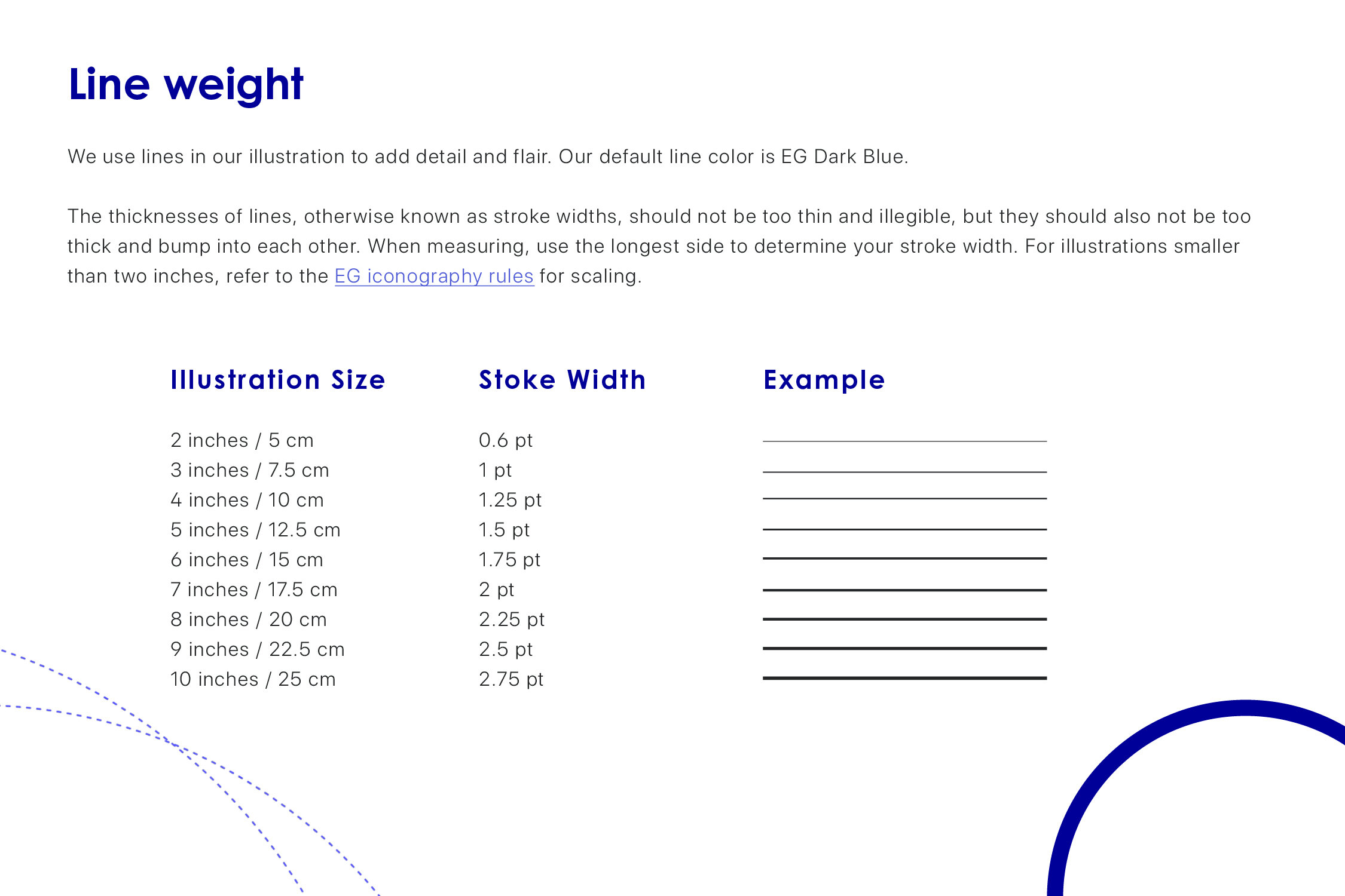
Line weight
Level of realism/abstraction
Amount of detail
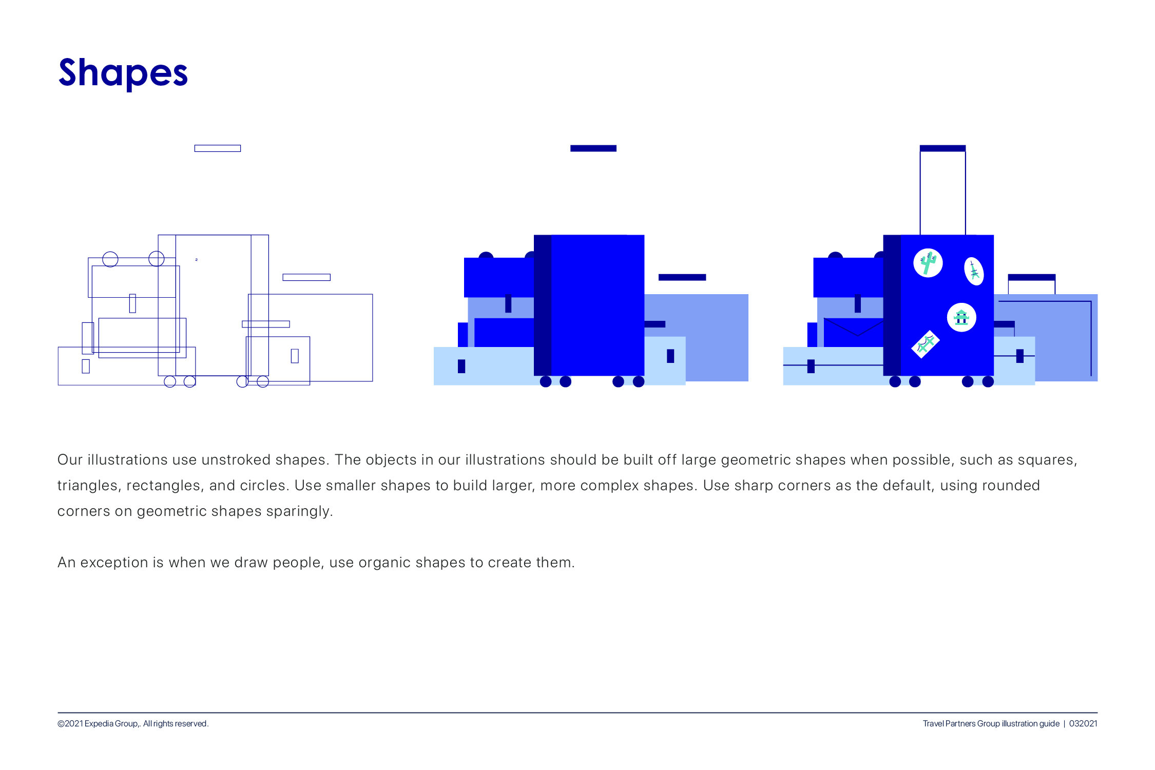
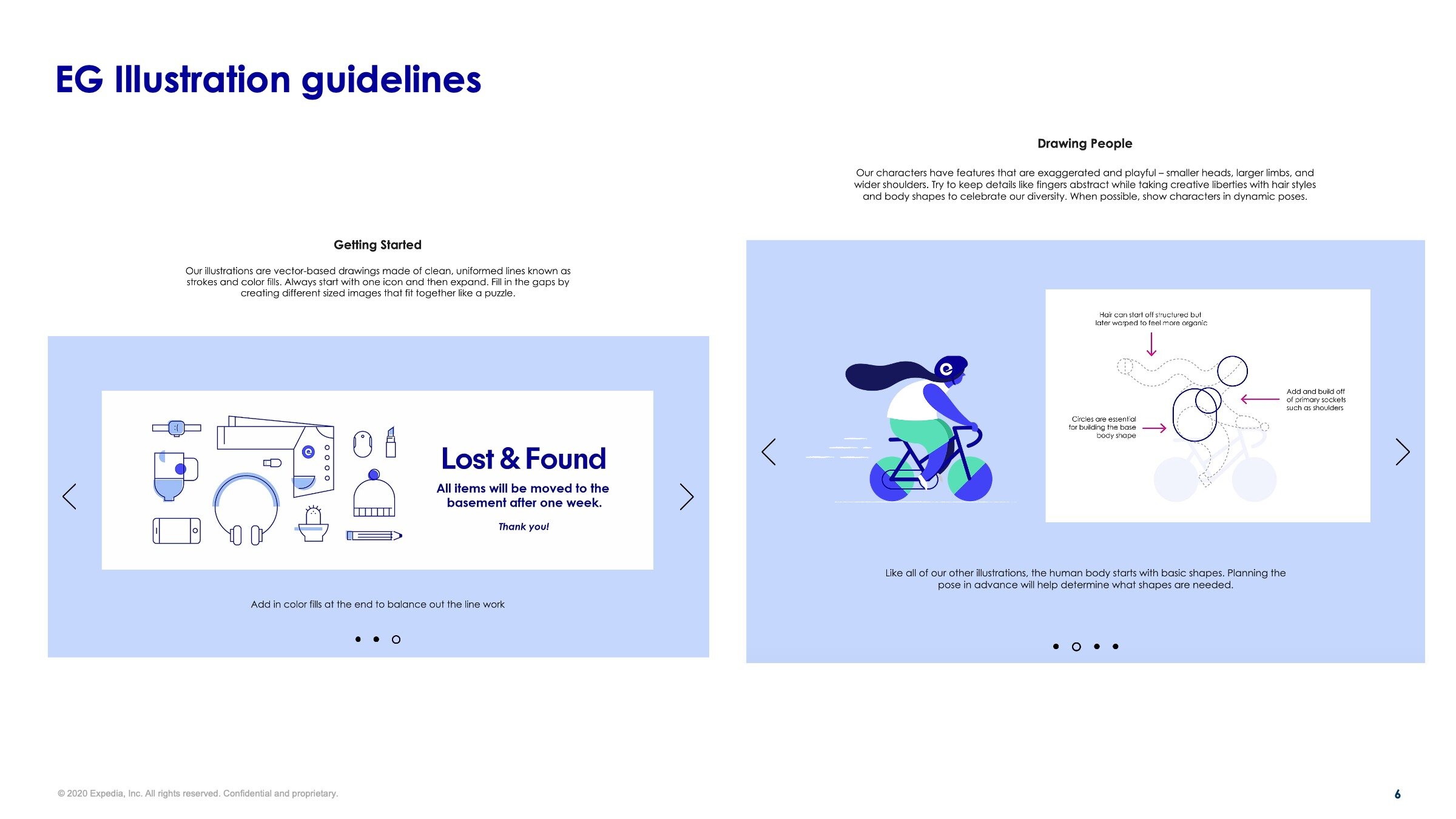
How we build objects
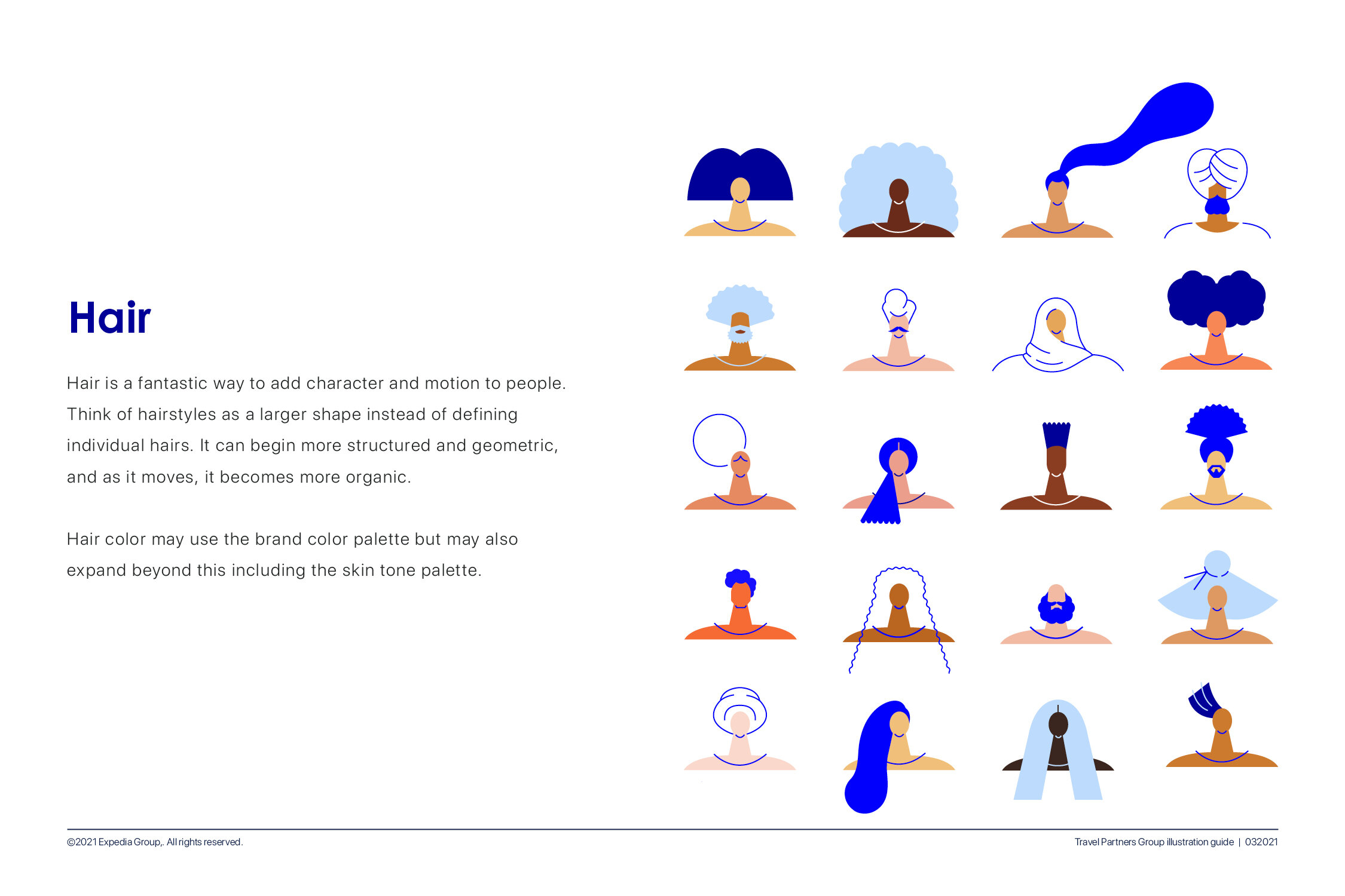
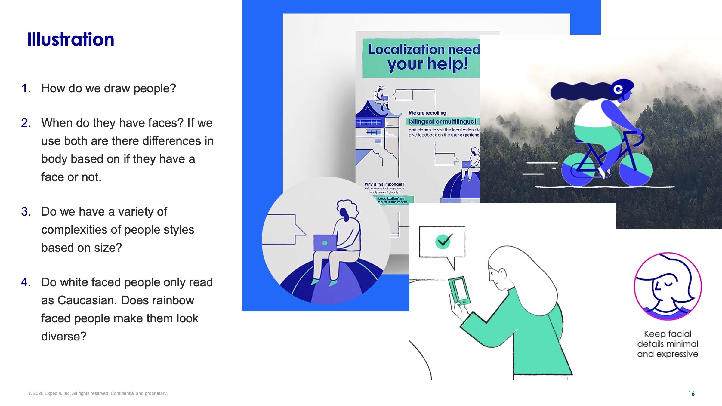
How we draw people
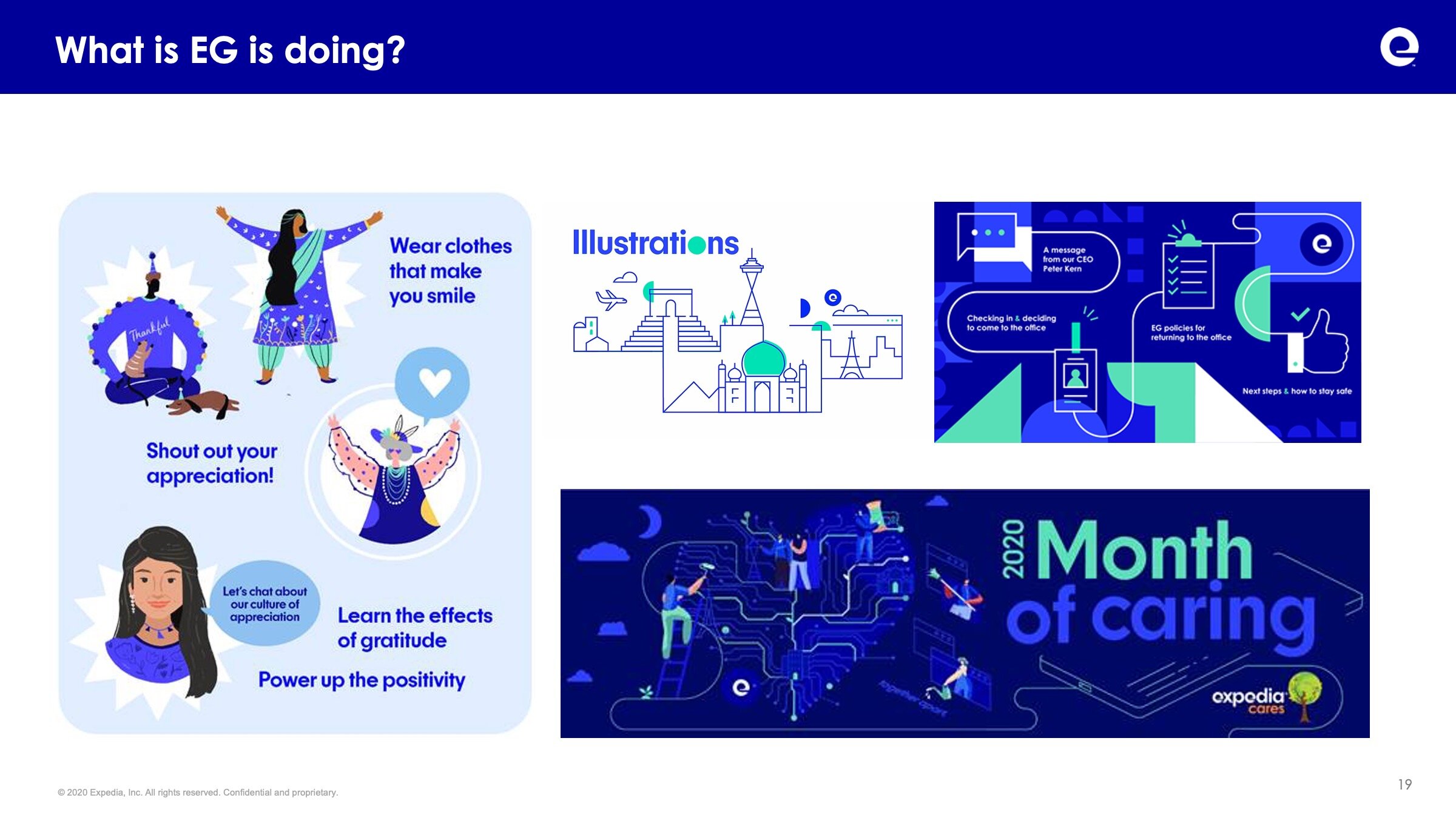
Collaboration with the Expedia Group Brand Team
While we were working on our illustration exploration at the same time the Expedia Group brand team was also working on aligning and refining their own visual identity and how they would build illustrations. While Travel Partner Group had a different ultimate audience than the EG Brand team did it, it still was important that there was coherence between the two. This included testing the despite serving different audiences if we could align completely. Ultimately after stress testing and audience research this was determined to not be the correct direction and so a divergence was needed.
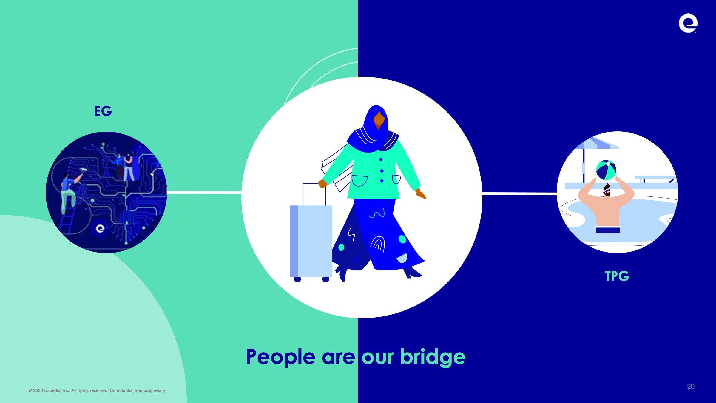
However after extensive collaboration between the two time and while ultimately there were places that TPG and the EG Brand team would diverge we can to a simple conclusion. People are our bridge. We are a people company and so the thing that would unite brand is how we depict people.
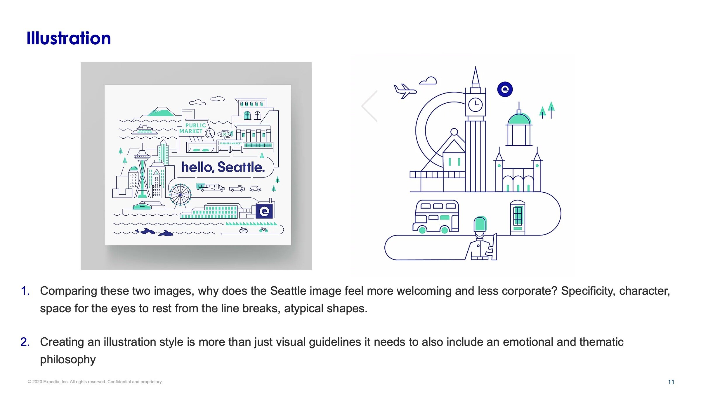
While the EG brand team would be using much more line, the proposed TPG style used more large flat geometric shapes and less detail.

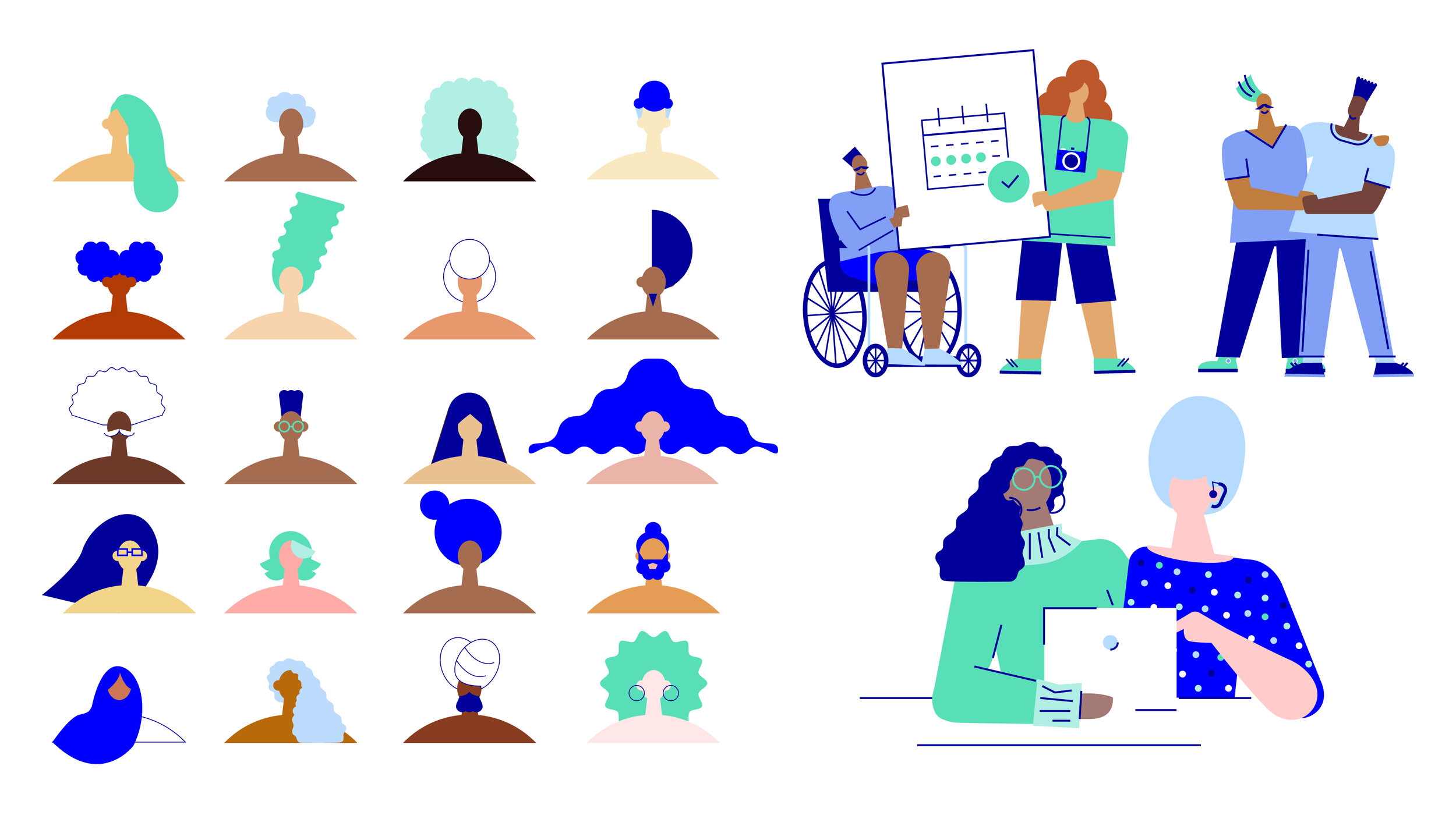
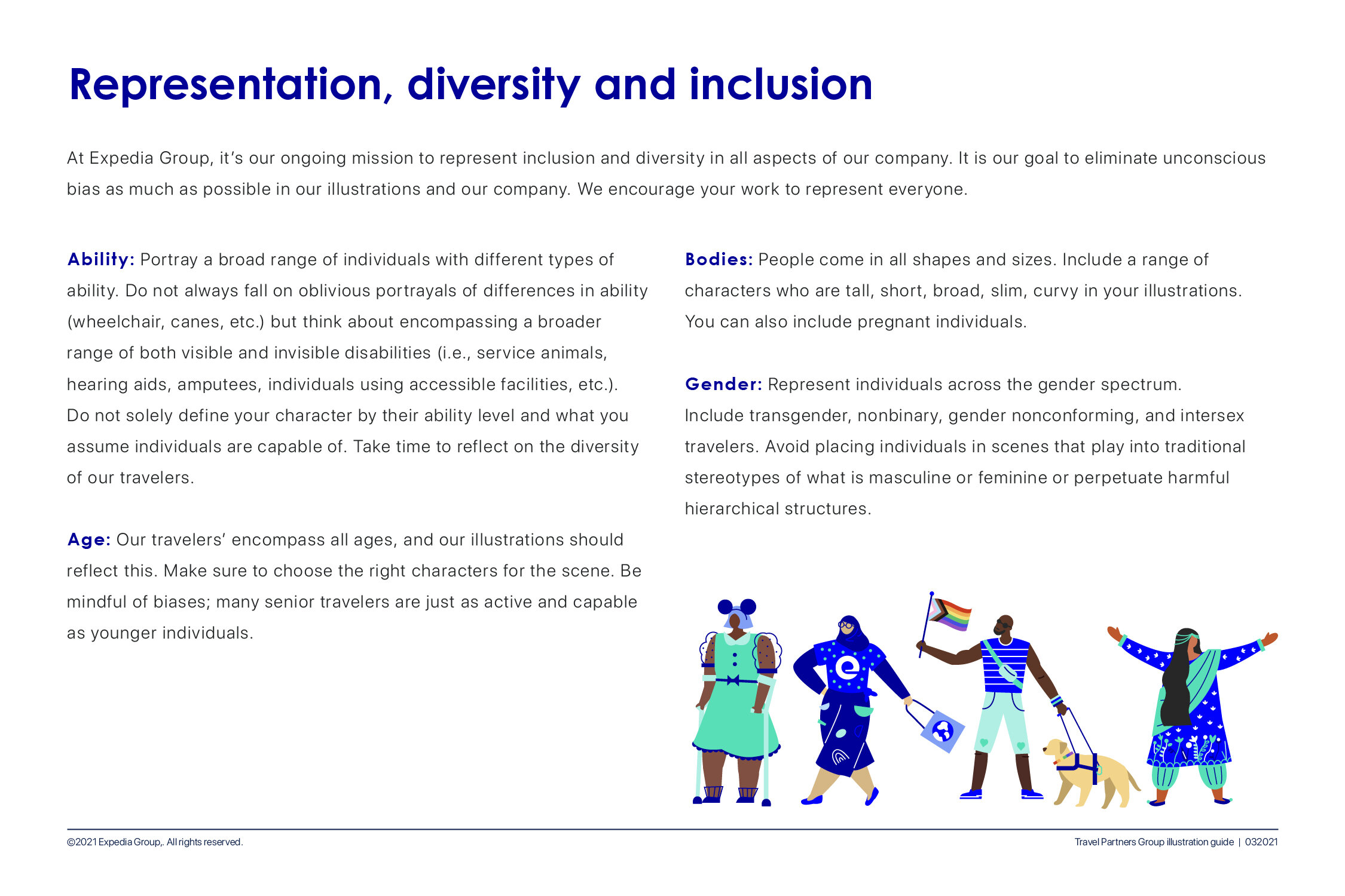
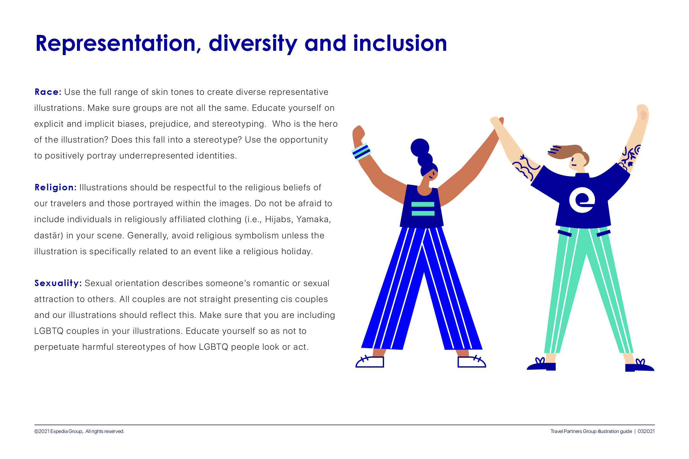
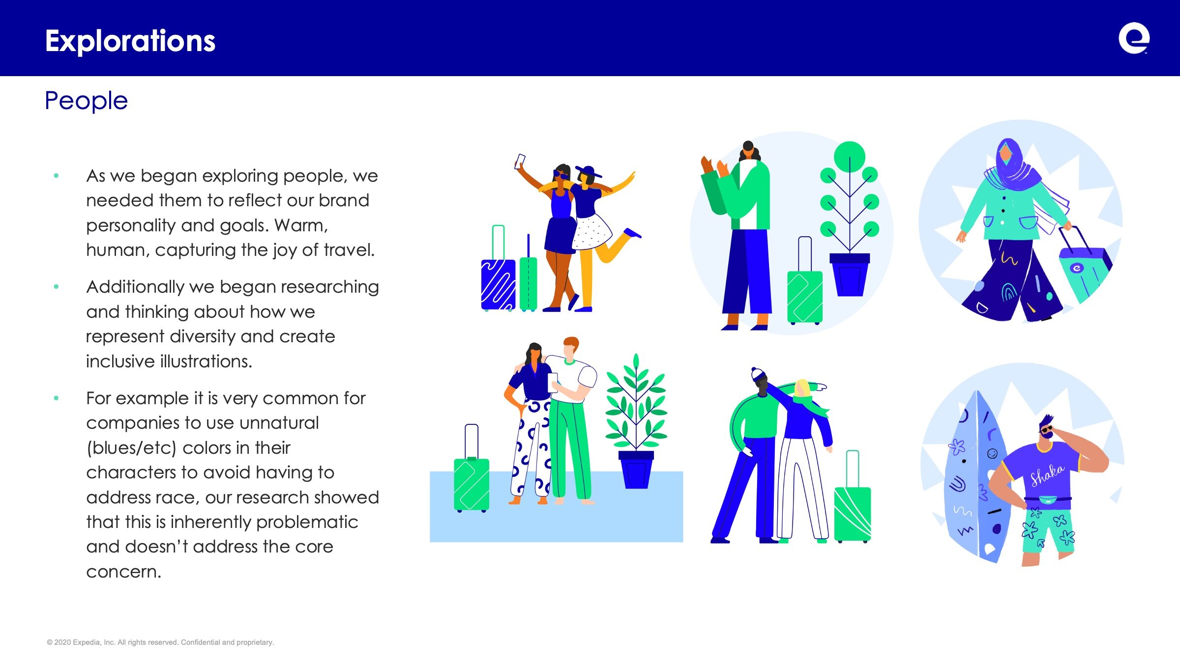
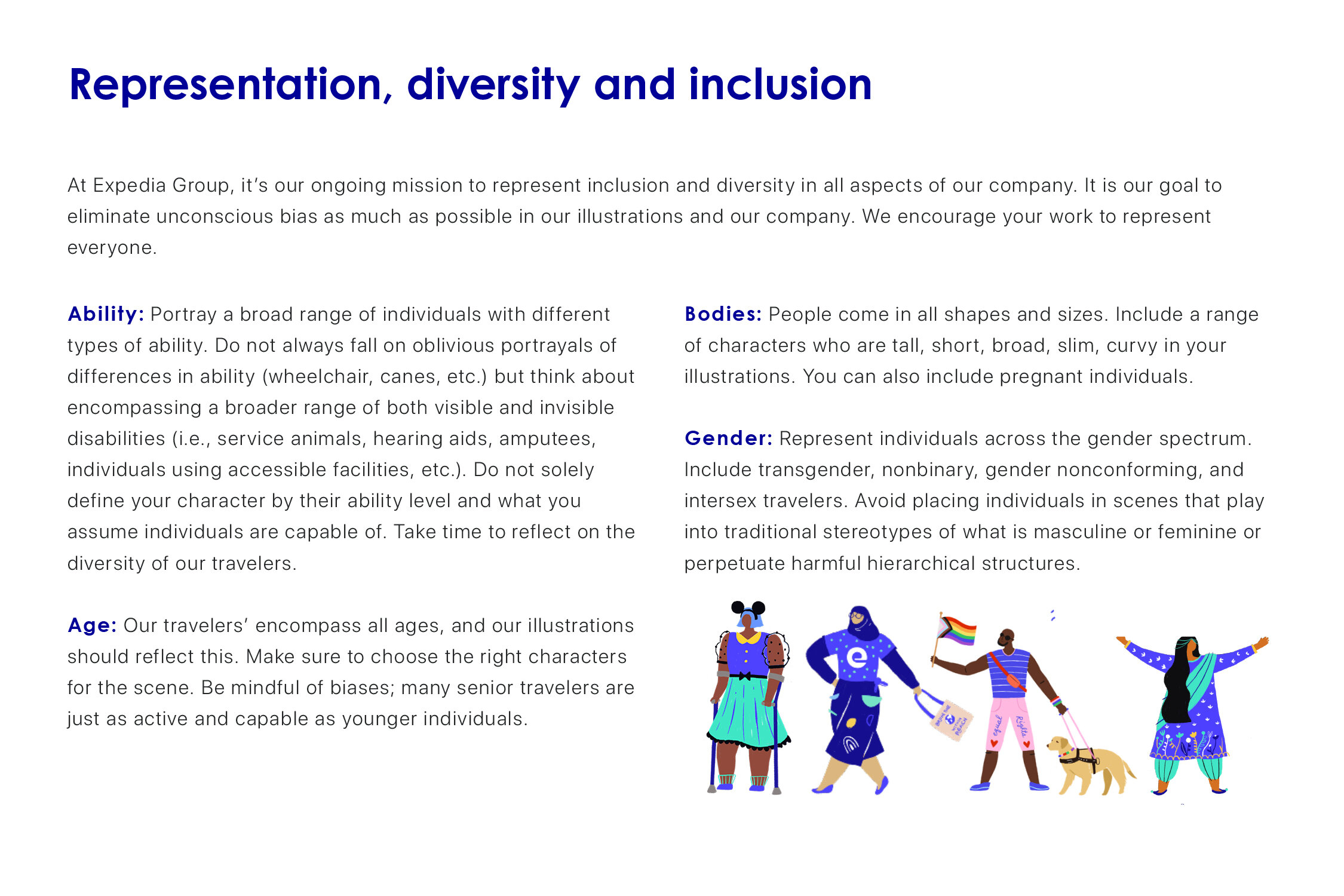
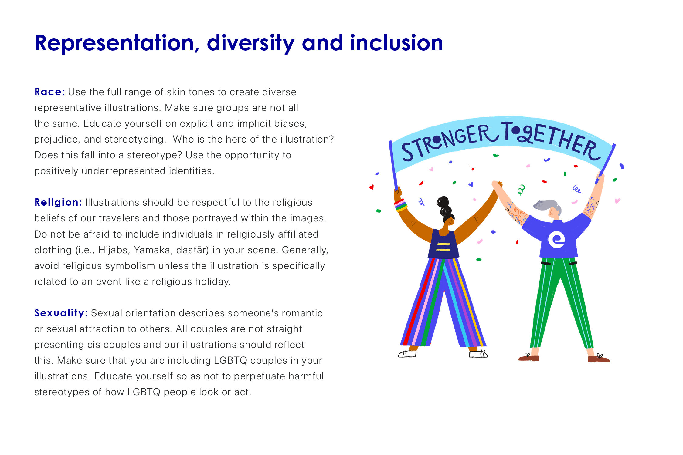
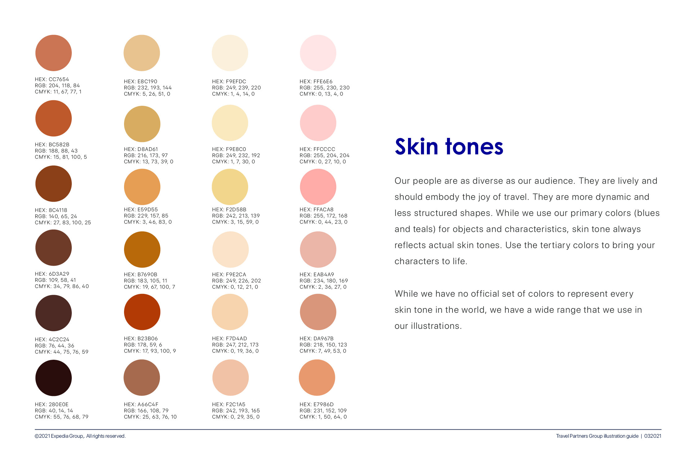
Diversity and Inclusion
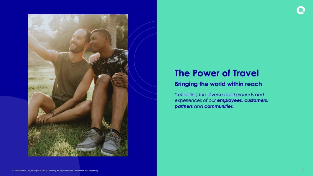
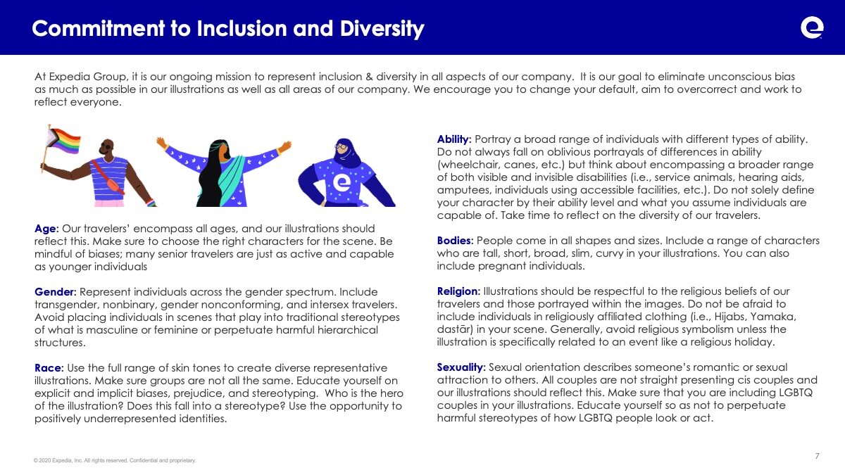
As a global company with a strong commitment to connecting people everywhere, it was incredibly important for us to make sure that we were establishing a standard and expectation of illustration that was diverse and reflected the world.
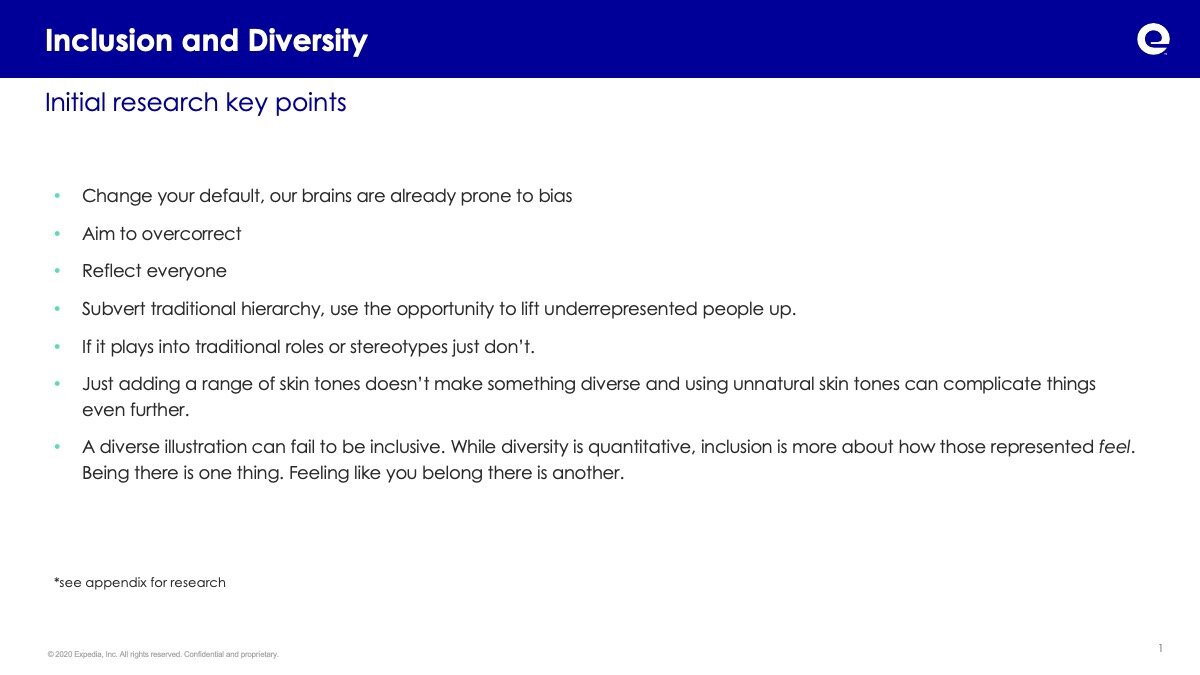
Both independently and working closely with the internal Inclusion and Diversity at Expedia we identified key takeaways, insights and actionable standards for how we could create inclusive visual expressions.
These included
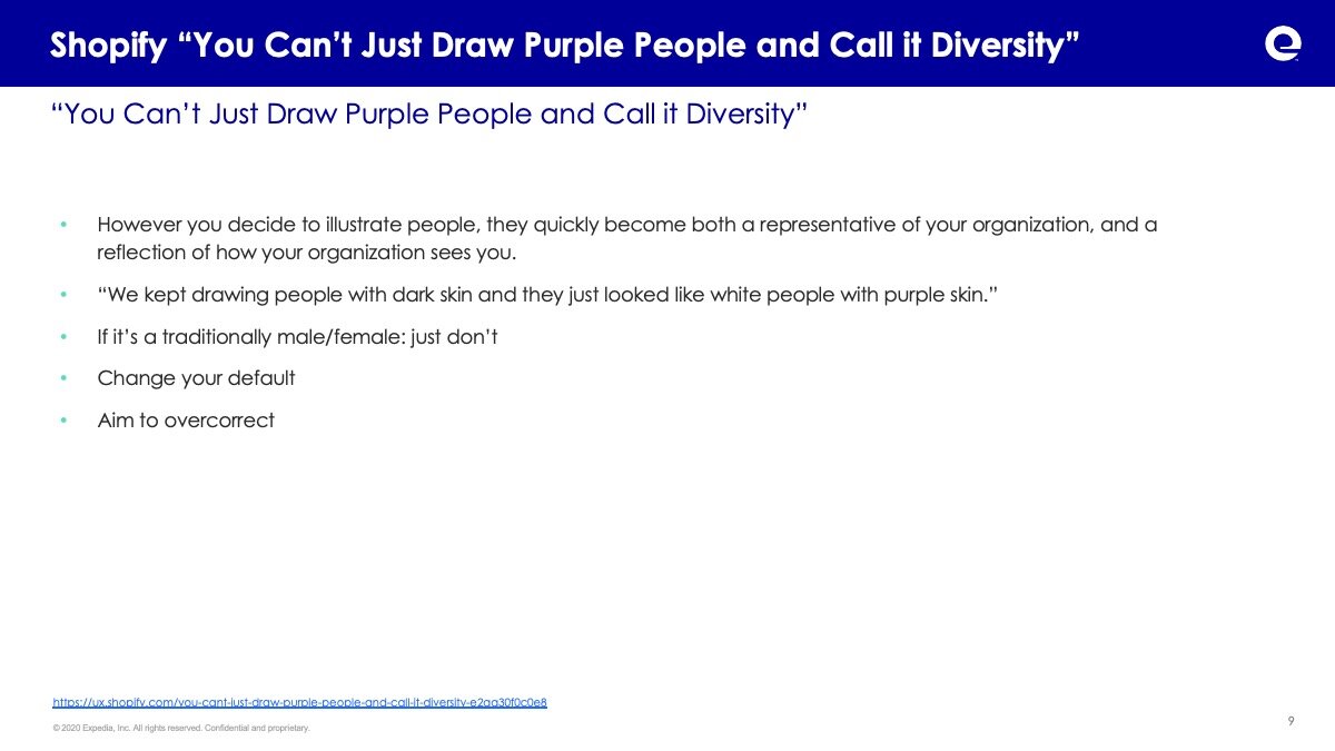
Change your default, our brains are already prone to bias
Aim to overcorrect
Reflect everyone
Subvert traditional hierarchy, use the opportunity to lift underrepresented people up.
If it plays into traditional roles or stereotypes just don’t.
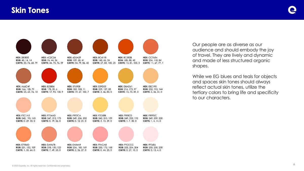
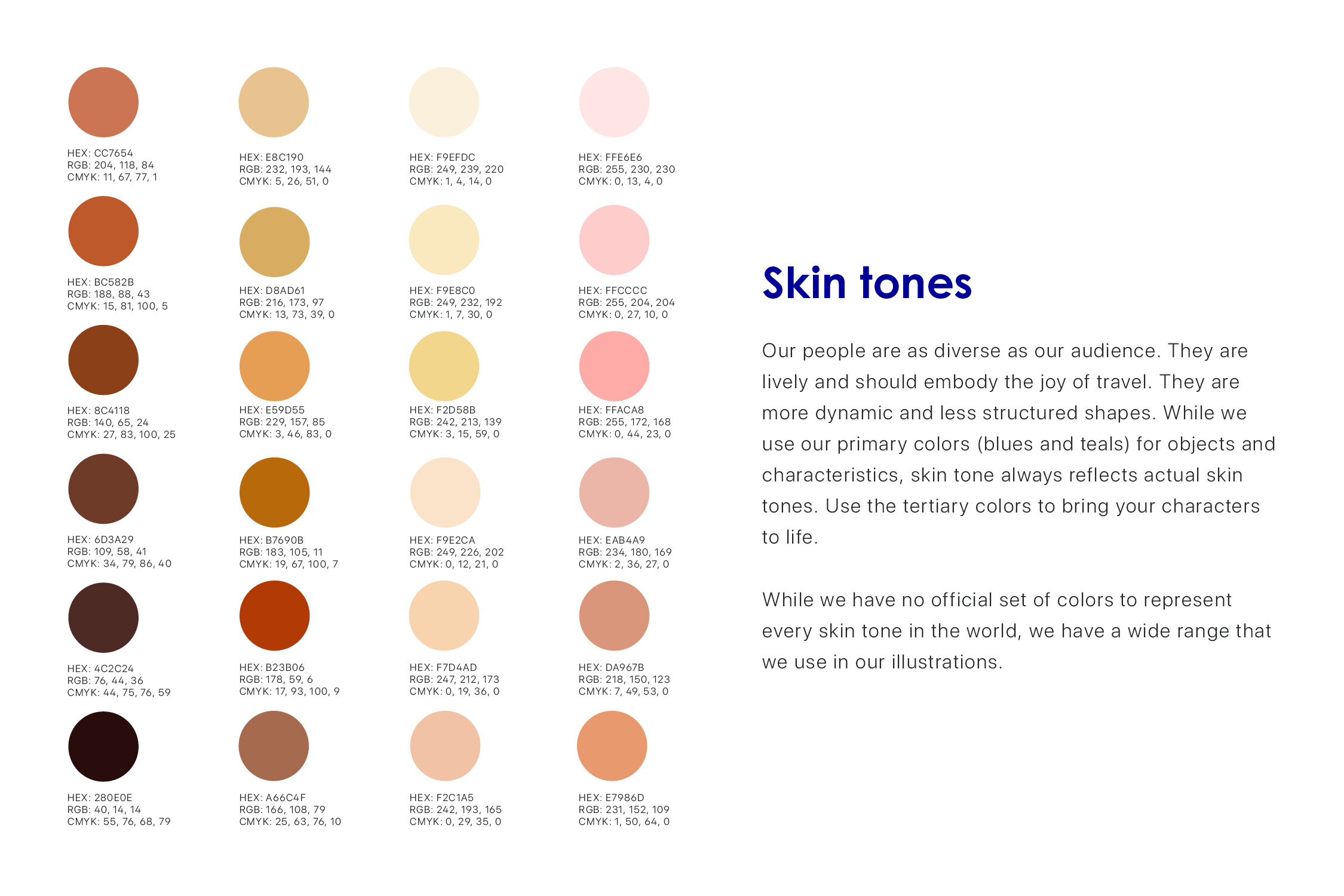
Just adding a range of skin tones doesn’t make something diverse and using unnatural skin tones can complicate things even further.
A diverse illustration can fail to be inclusive. While diversity is quantitative, inclusion is more about how those represented feel. Being there is one thing. Feeling like you belong there is another.
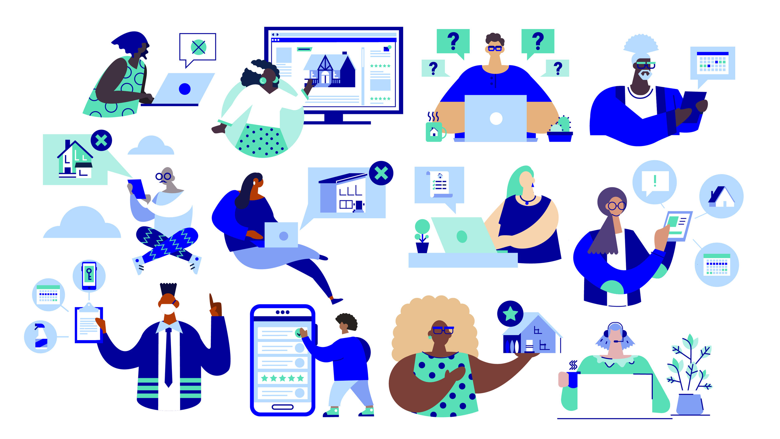
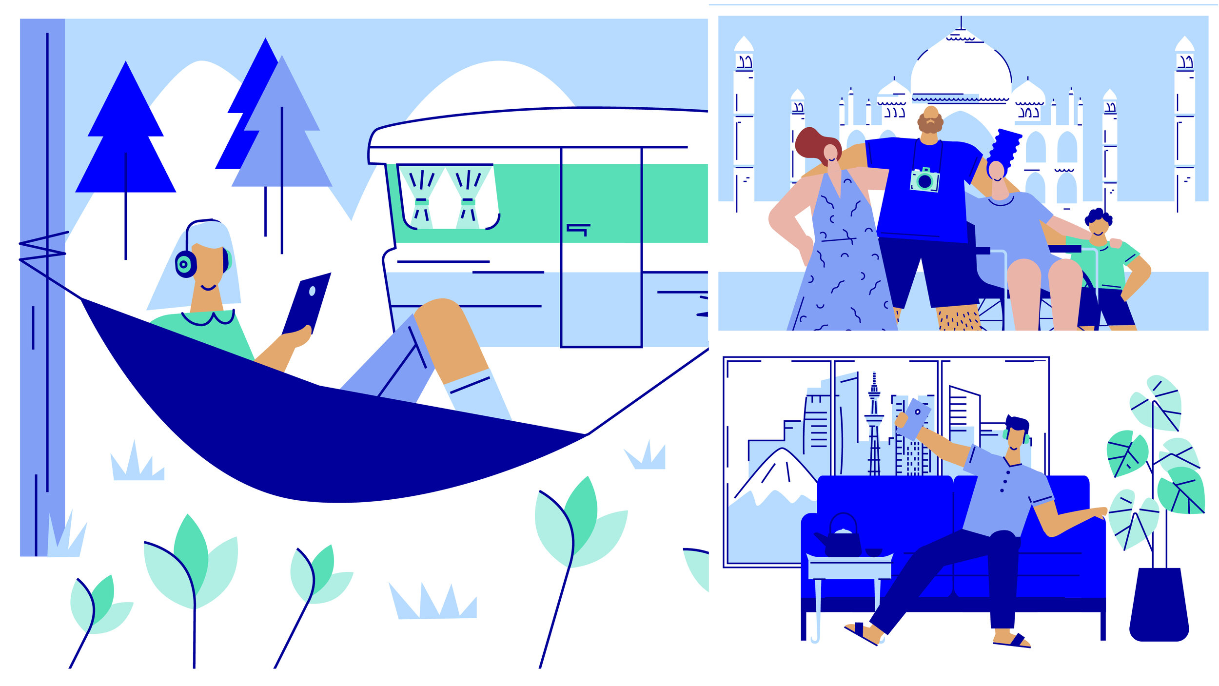
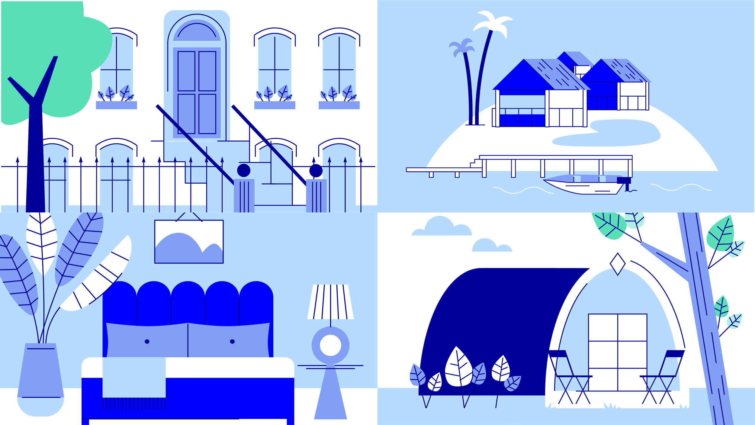
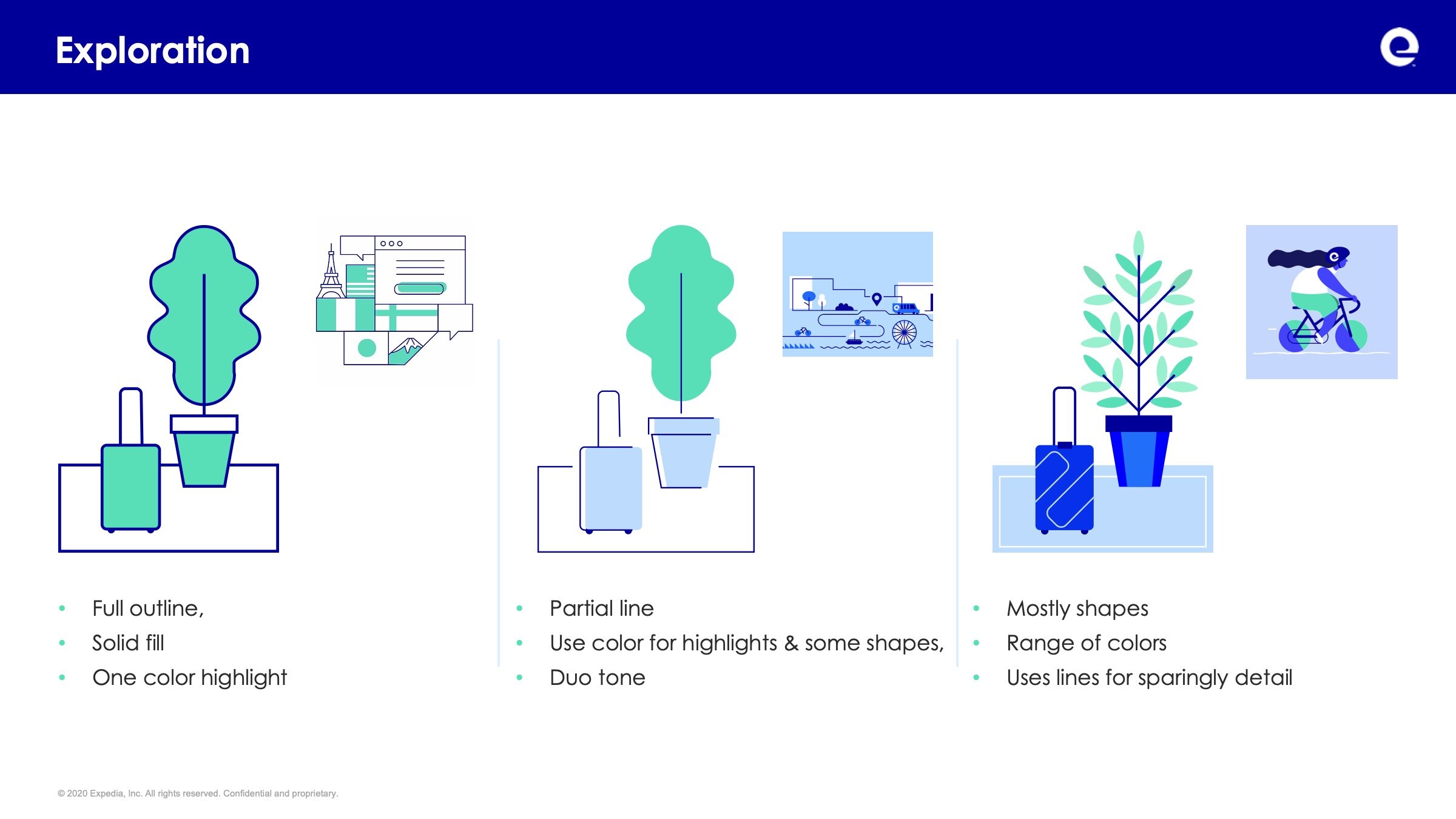
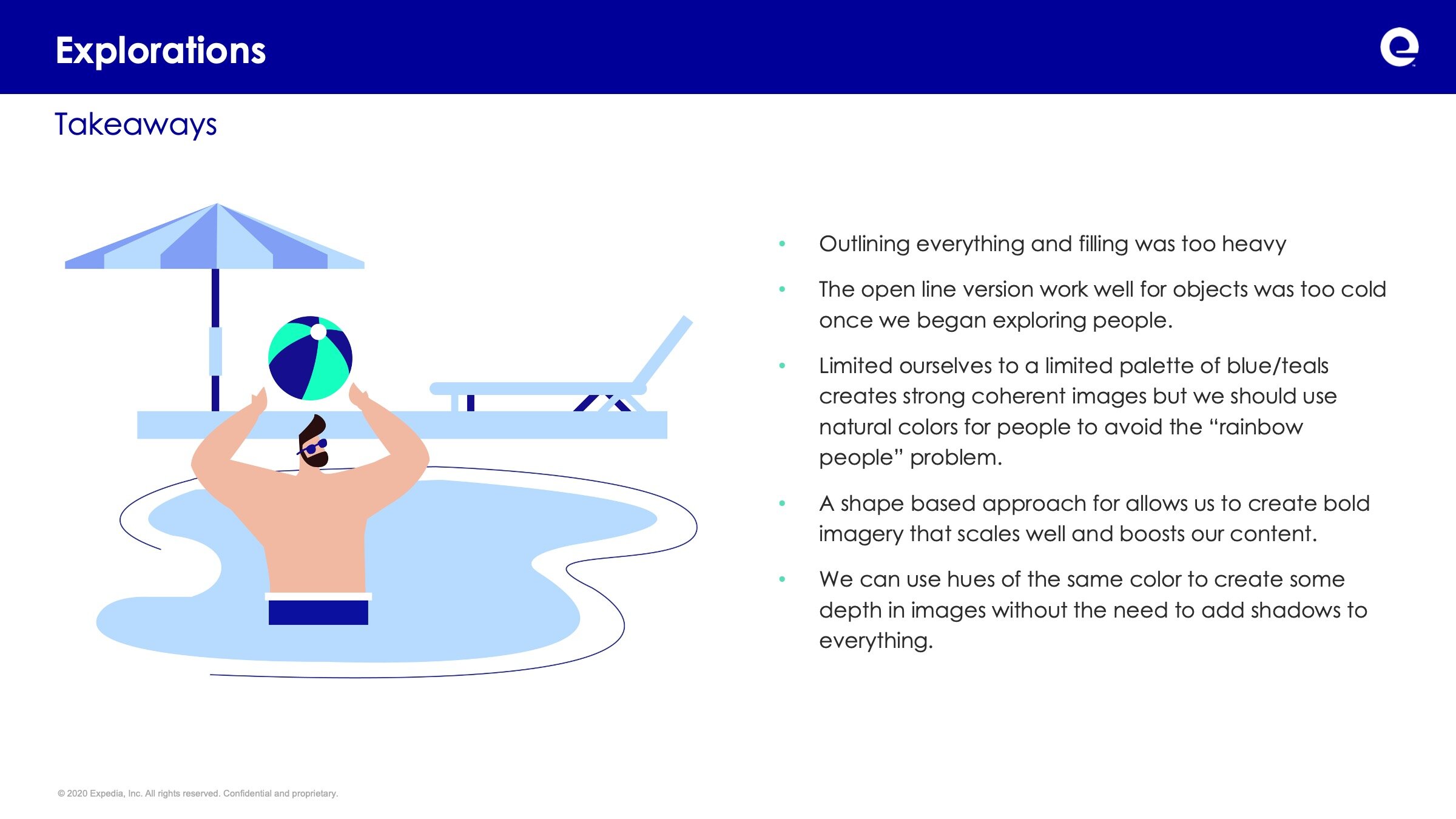
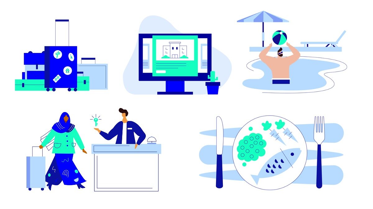
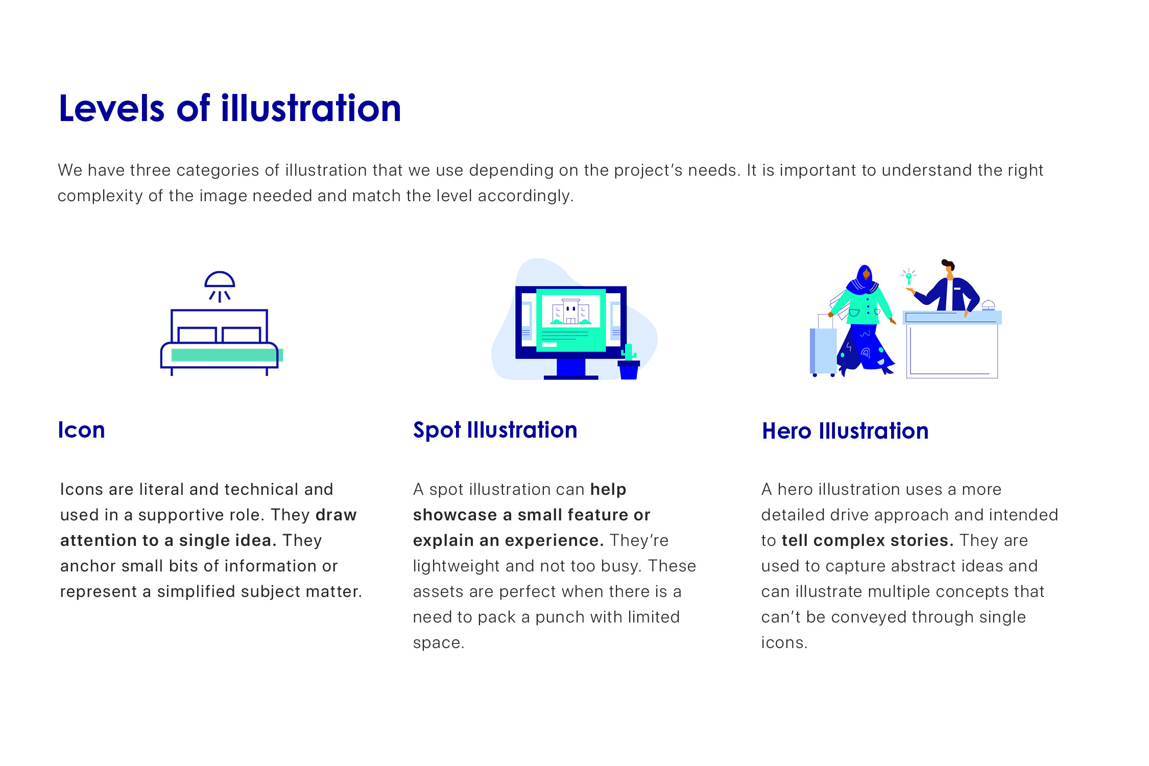
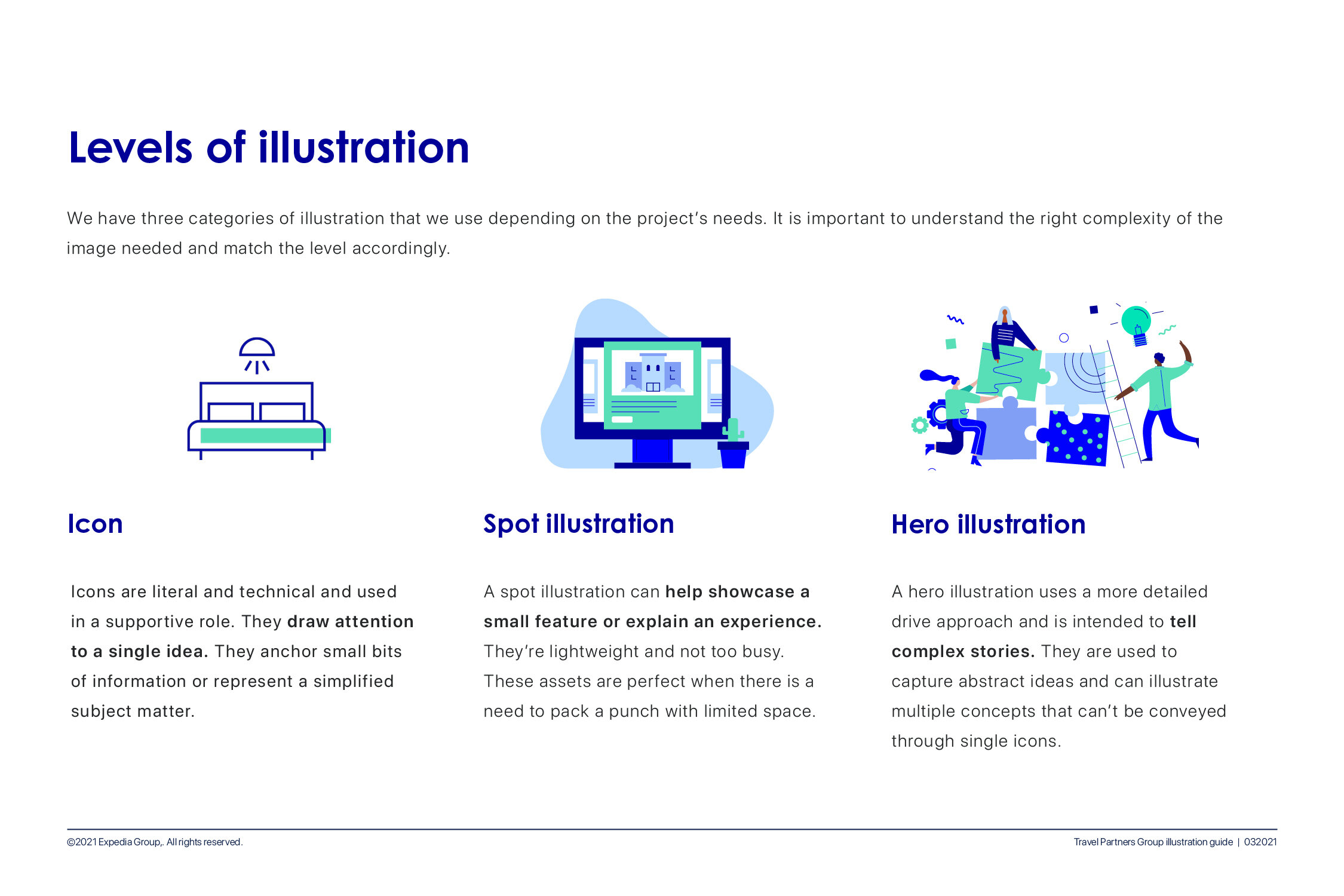
The core of TPG Illustration
Ultimately after extensive research and testing we came to a series of defining principles for what made a TPG Illustration. They were:
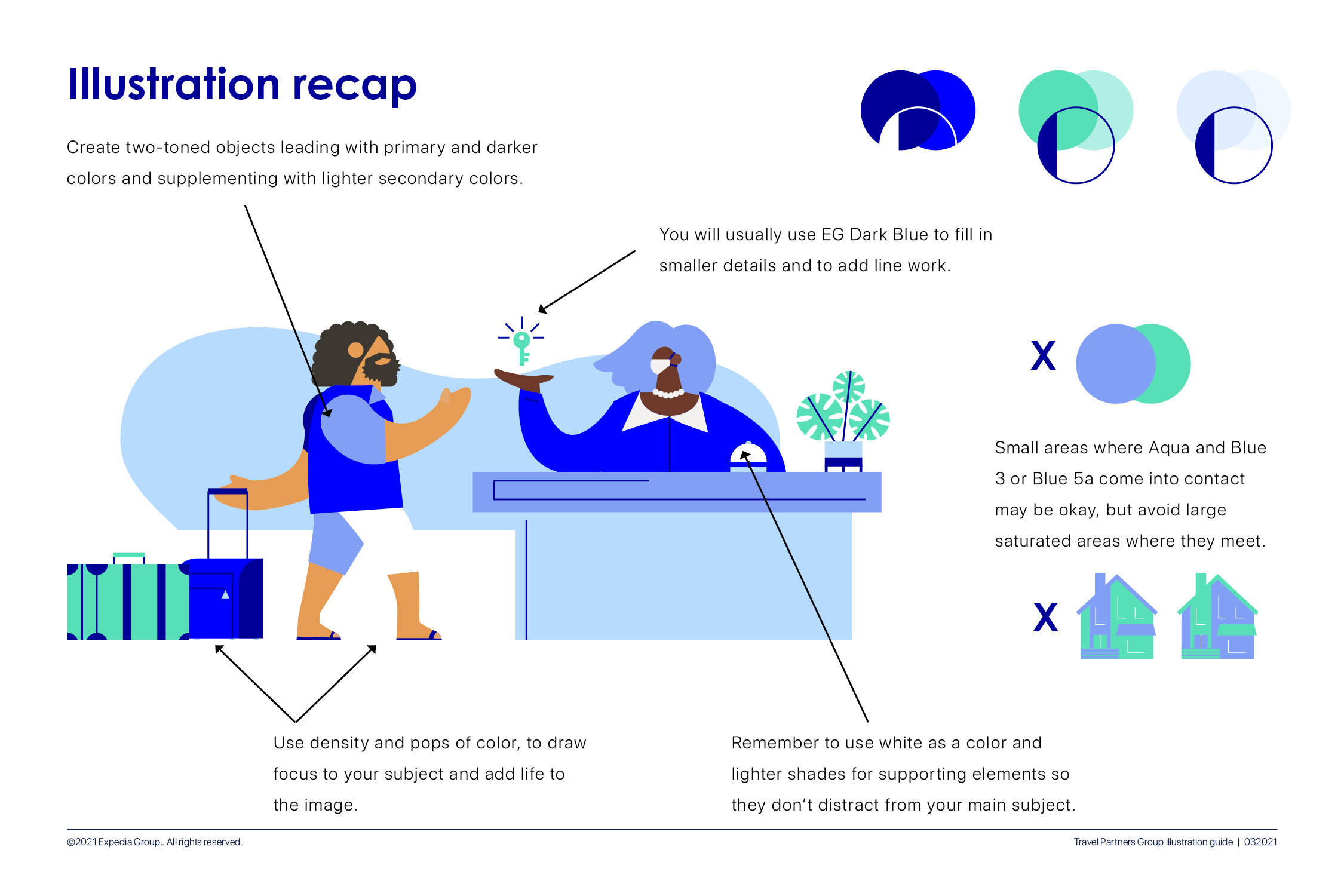
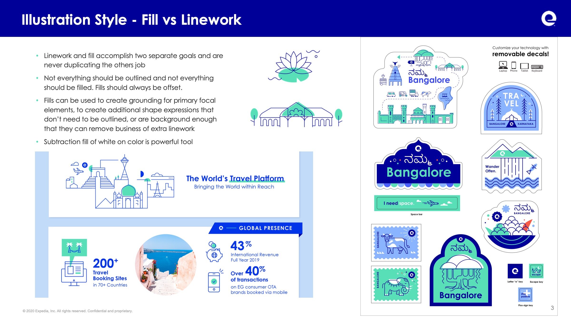
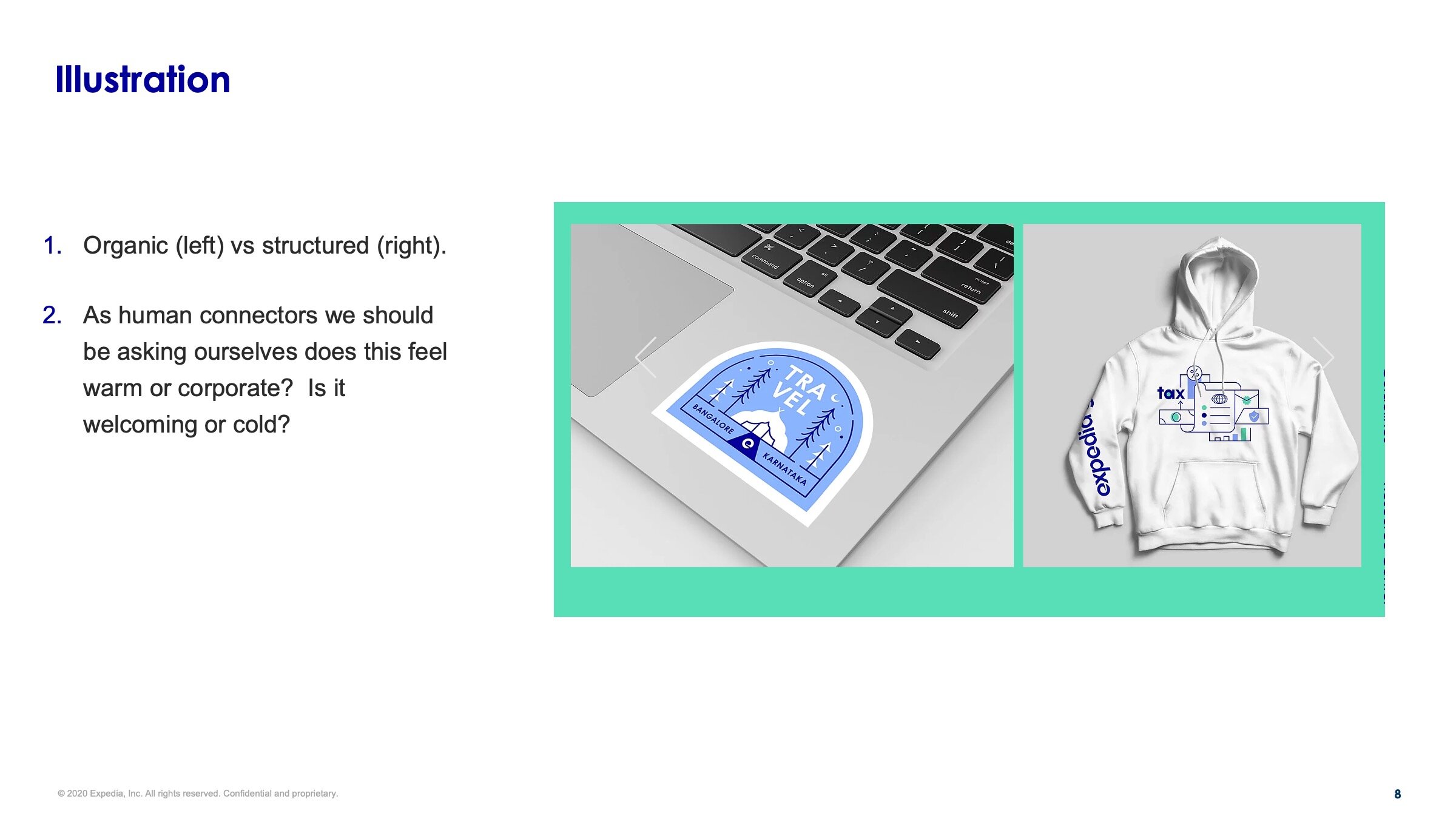
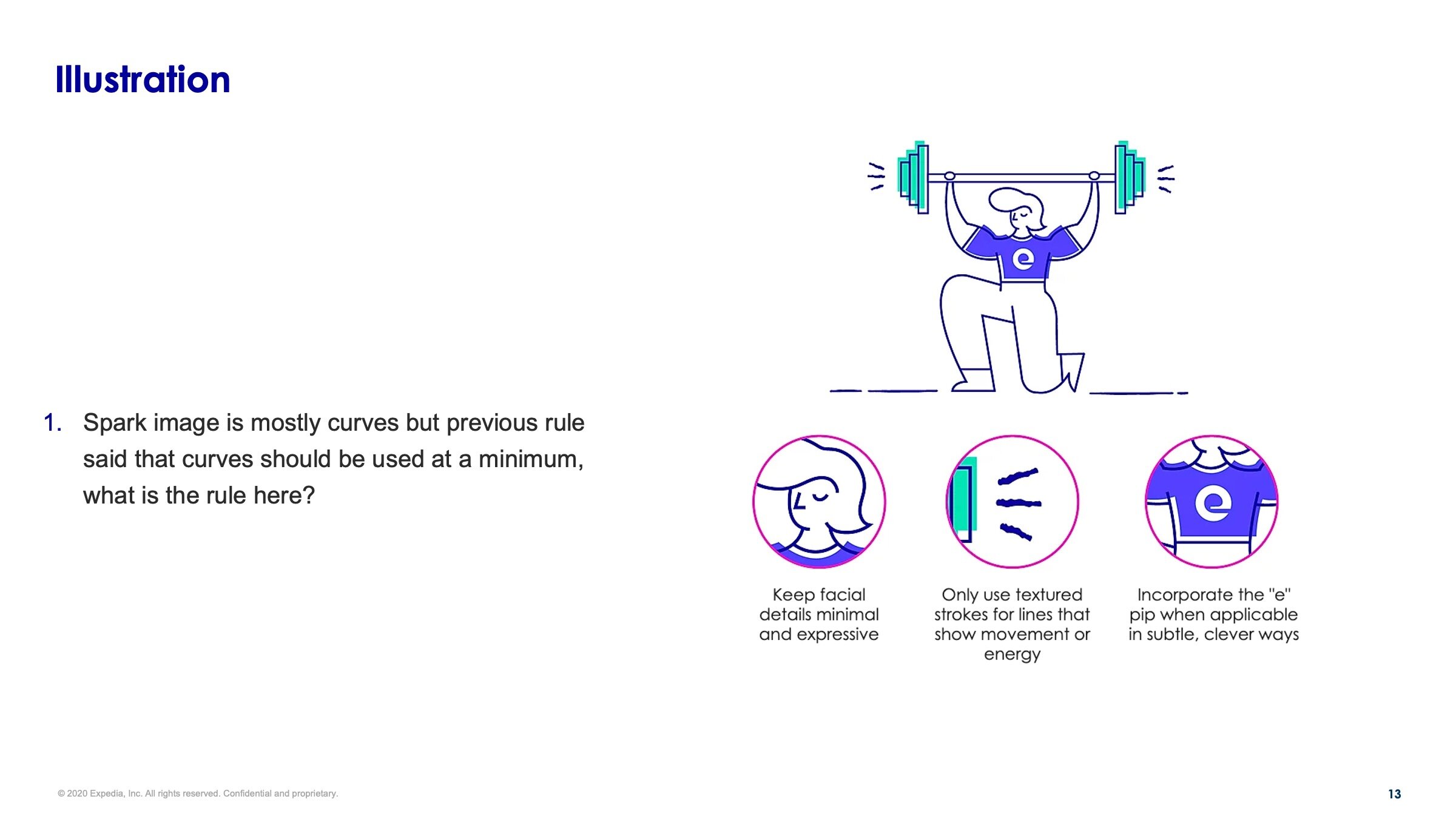
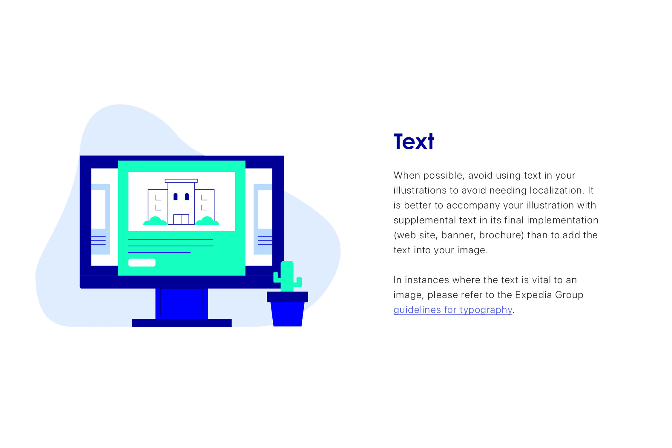
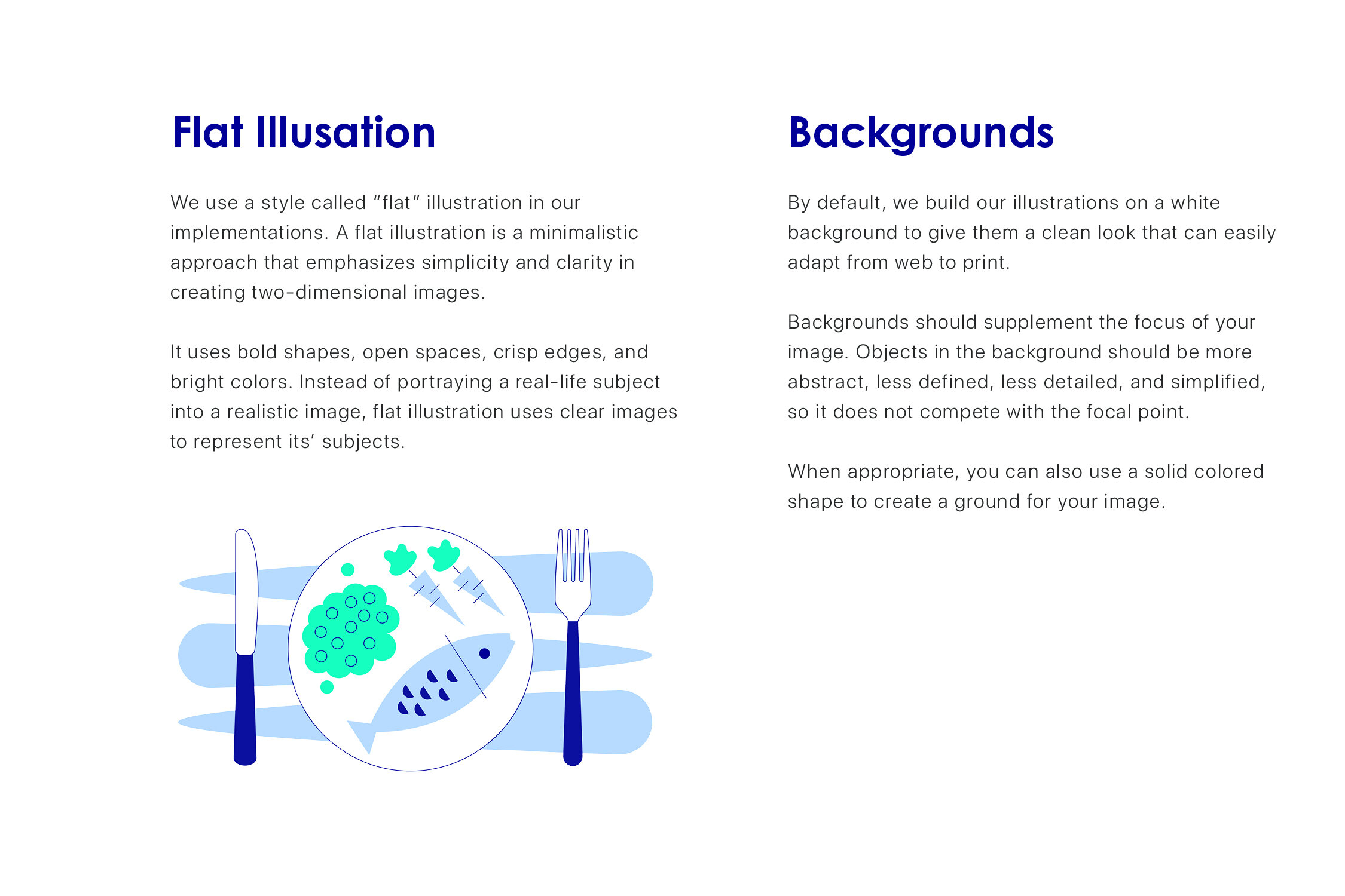
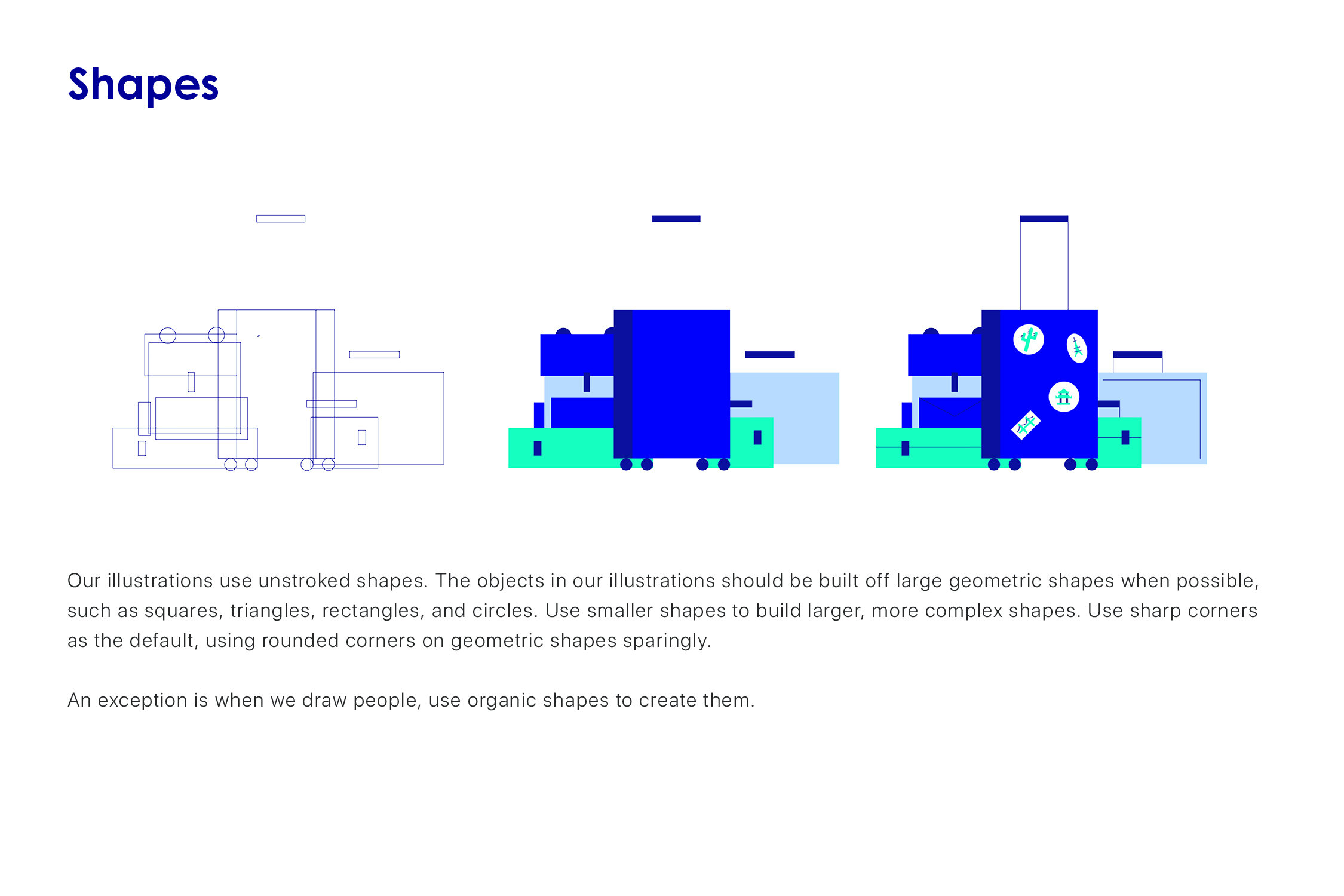
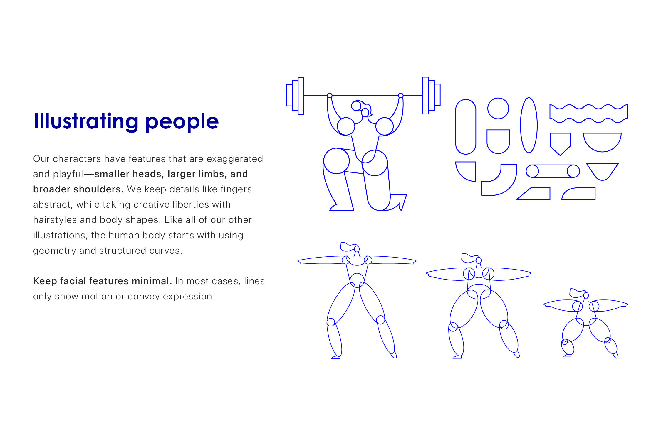
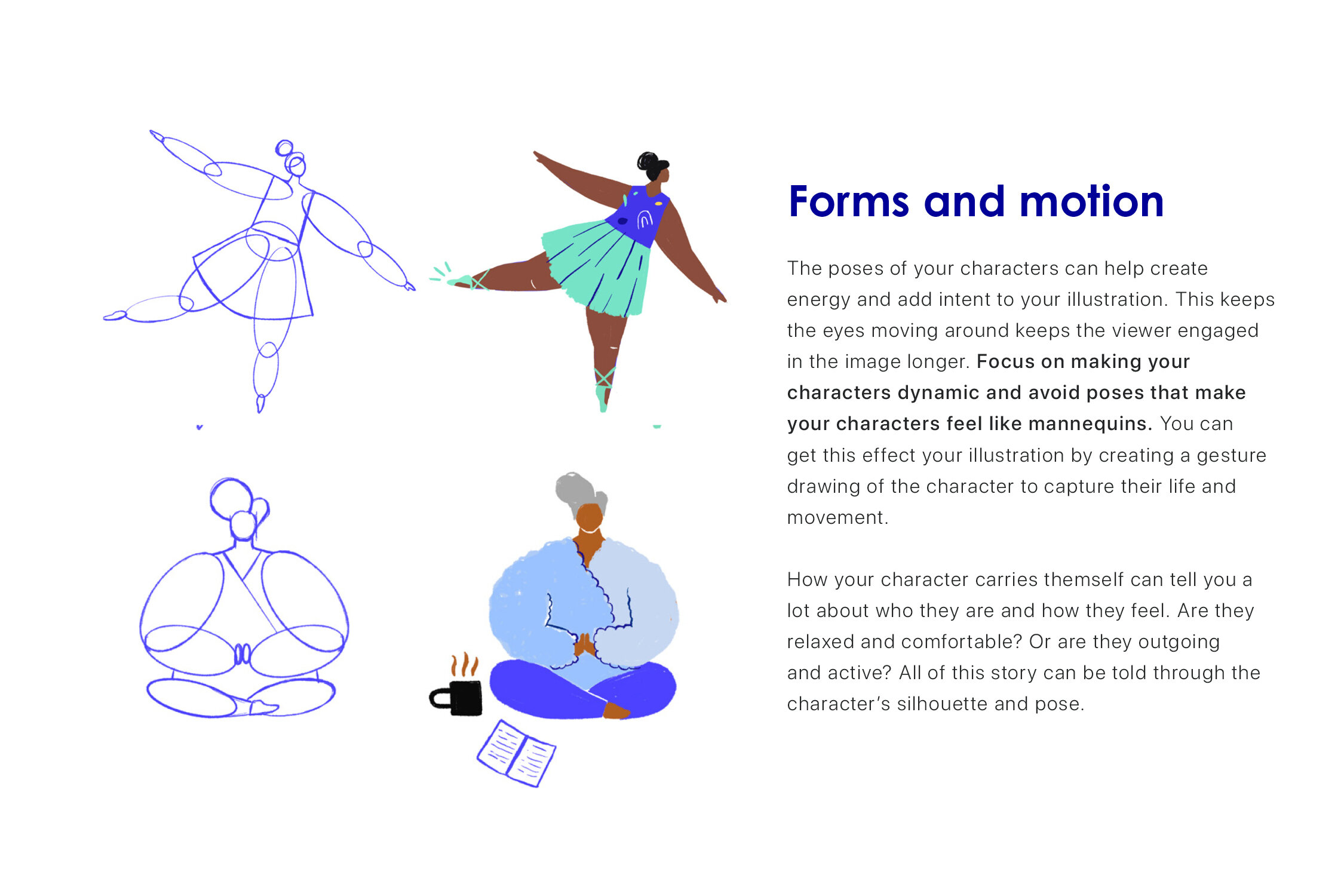
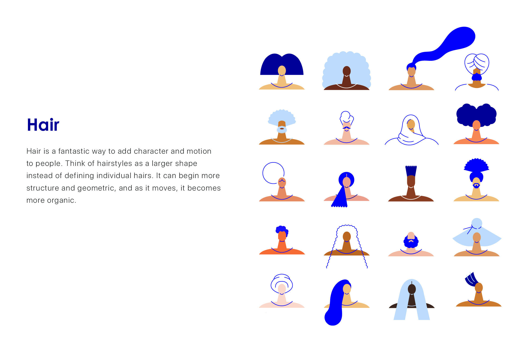
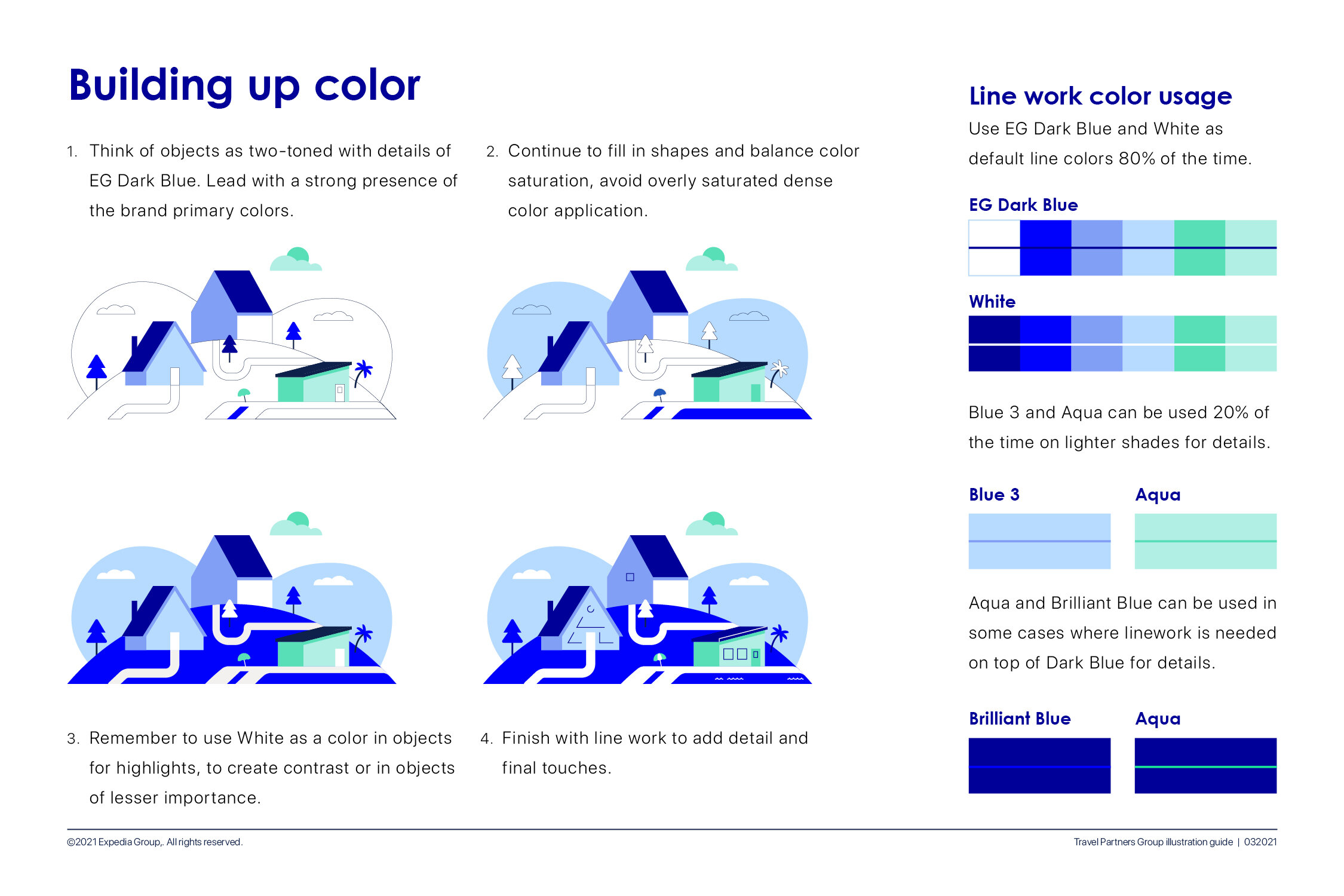
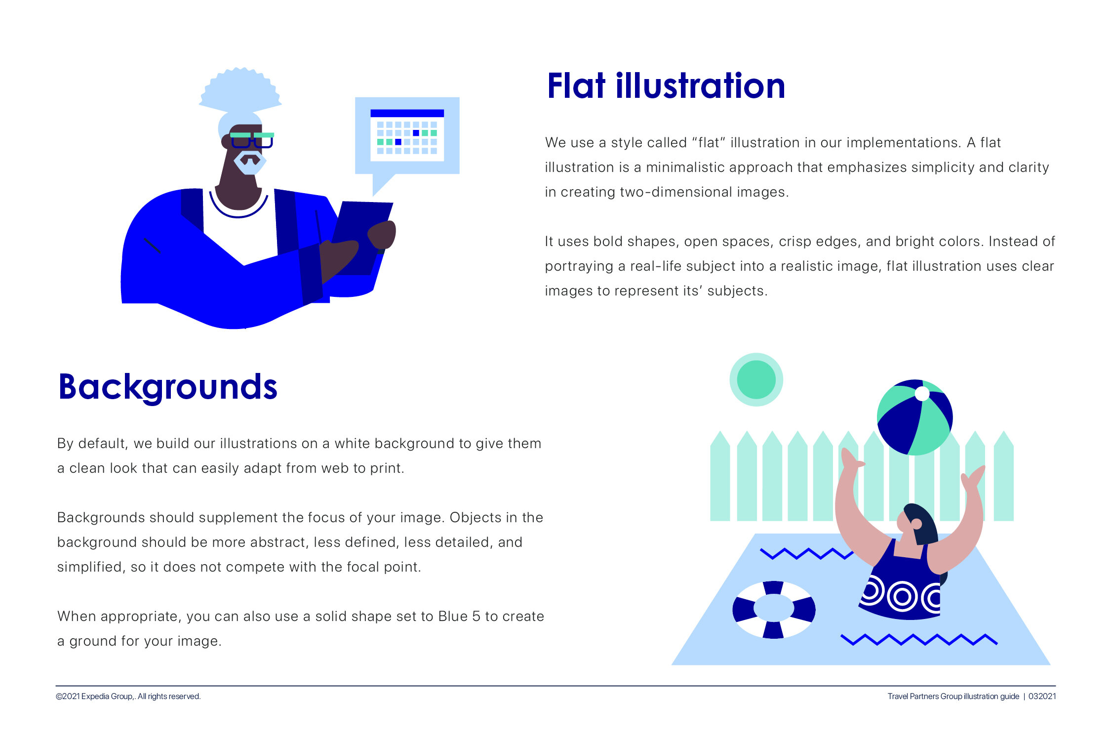
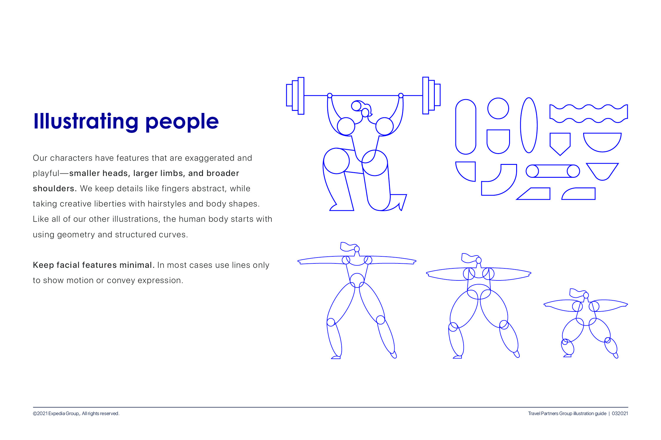
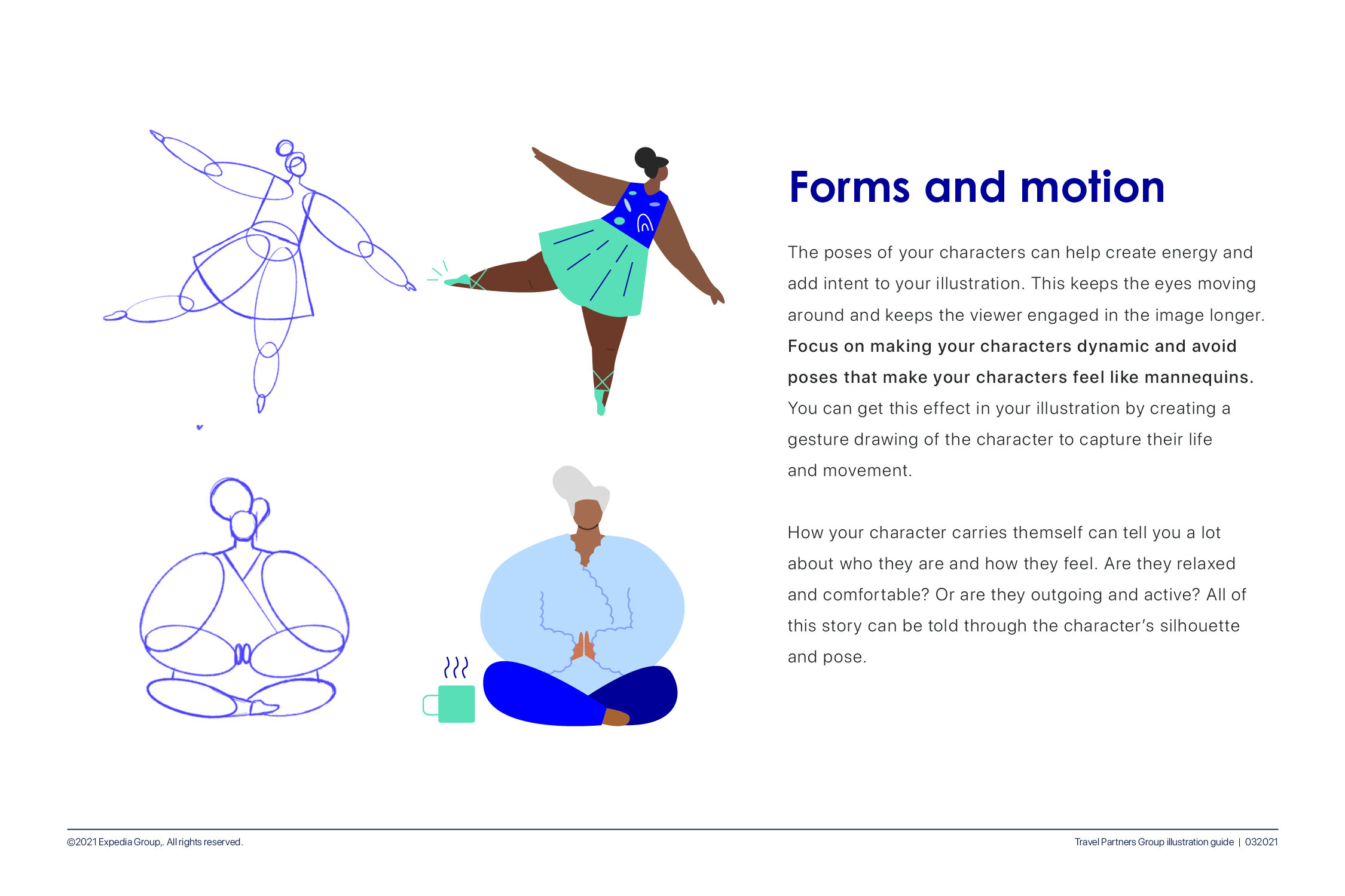
Objects are structured while people are more organic.
Organic shapes can also be used to ground the scene
Simplified background to draw attention to the focus
Line work used to add flair
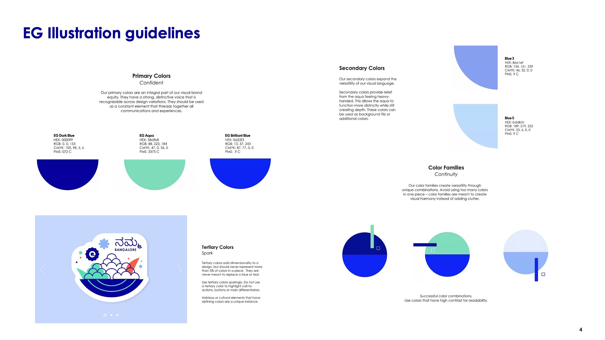
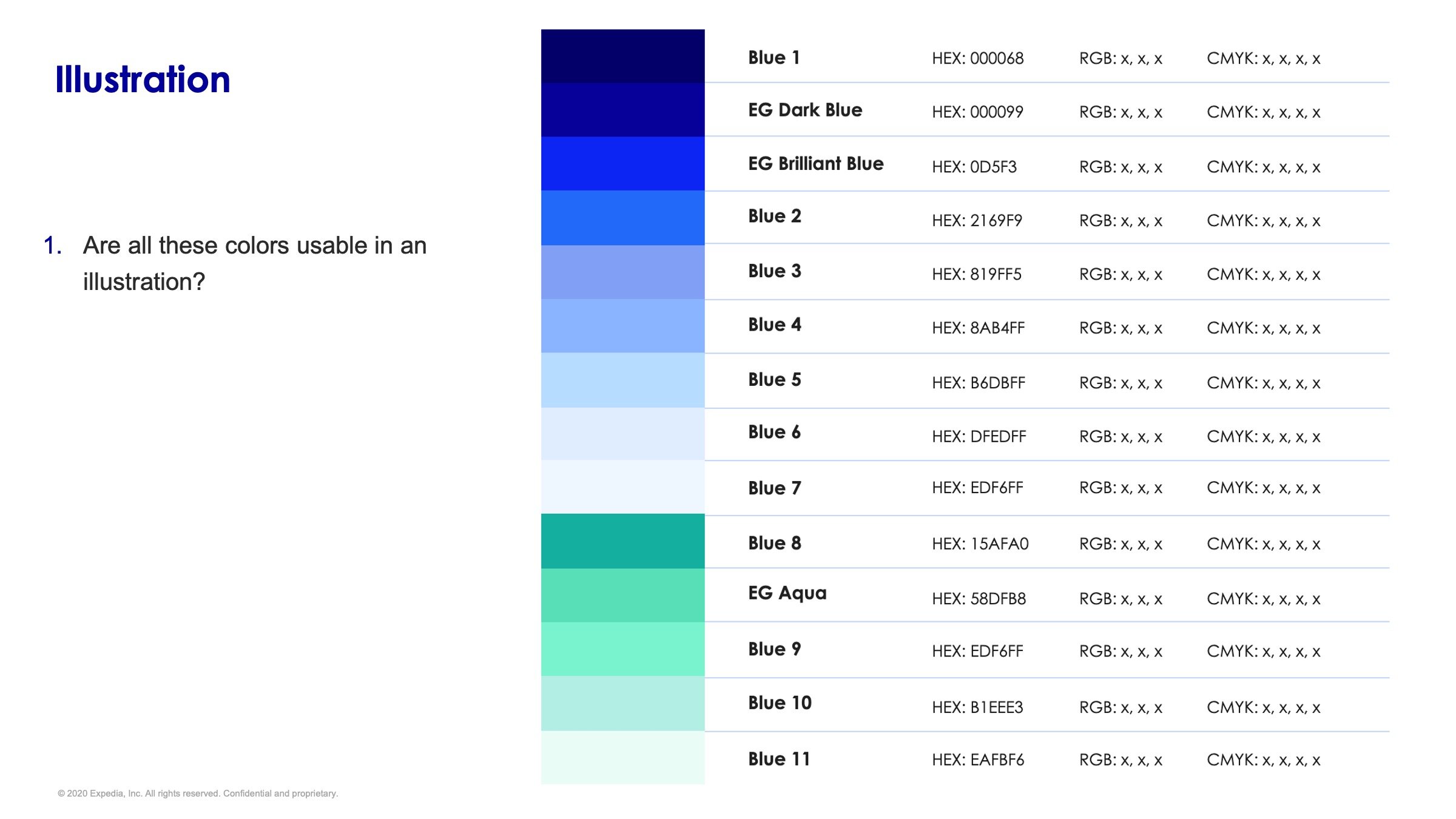
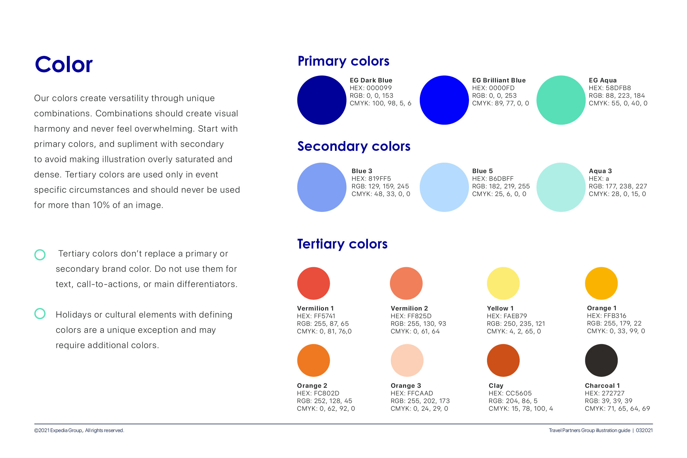
Limited color pallet of blues/teals, with the except of people which should always reflect realistic skin and hair tones
Plenty of open white space
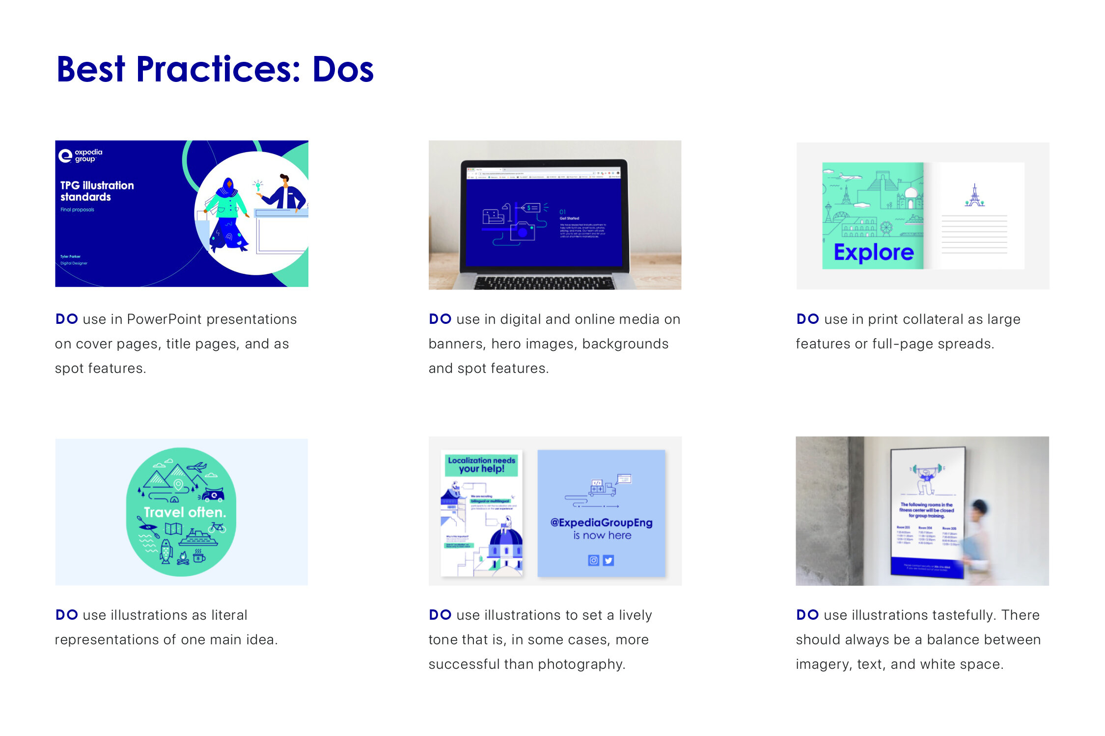
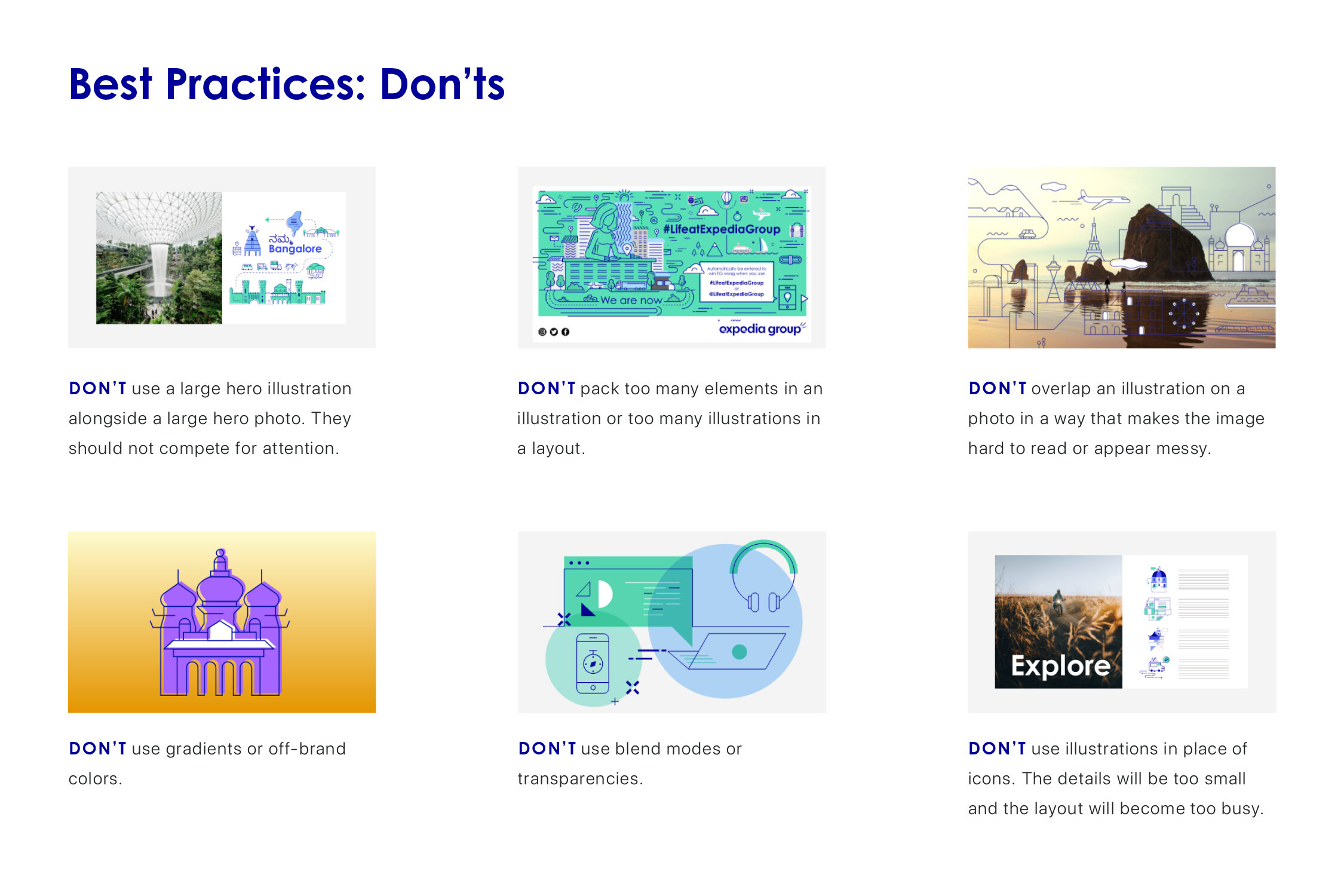
Our Guidelines
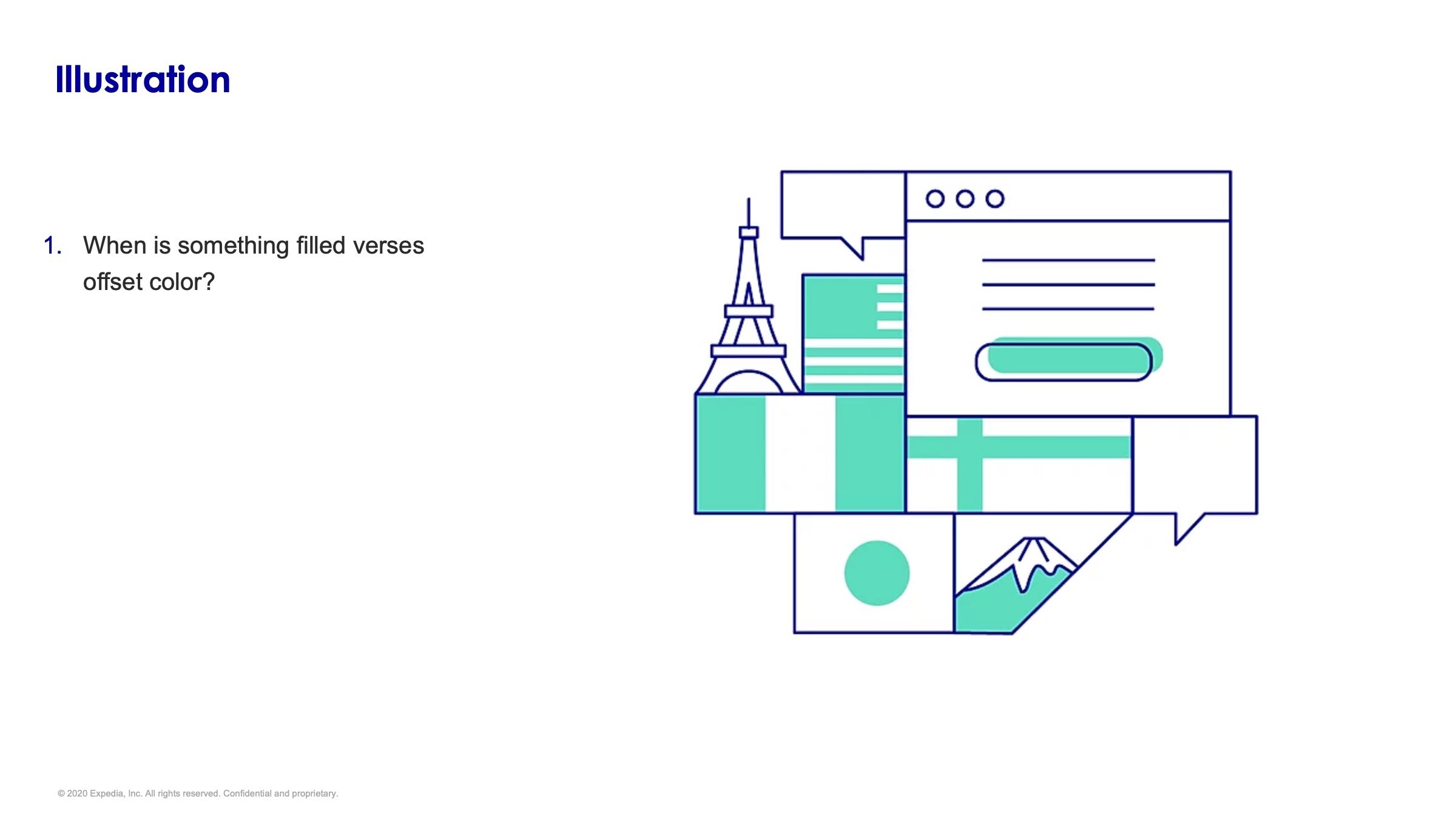
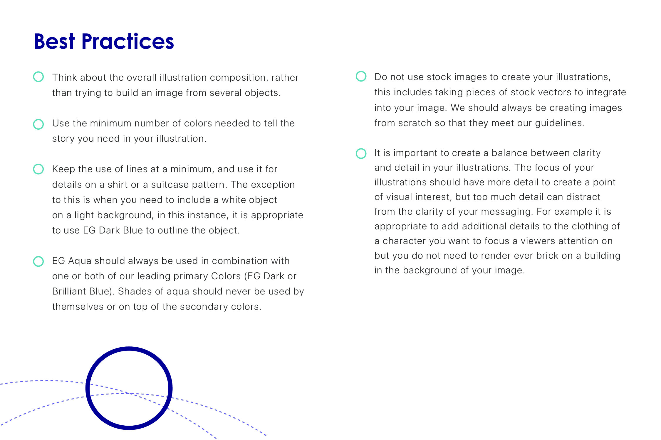
The TPG Illustration guidelines go into detail on how to build and use illustration to both stay on brand and to promote the ideals of Travel Partners Group and Expedia Group more broadly. This included guidelines on color, line-weight, type of illustration, how to create diverse and inclusive scenes and depictions of people along with examples and best practices.

Refinement and Updates


Expanded Guidelines
After 6 months in the wild it became apparent that there were tweaks, clarification and expansions that were needed in the guidelines in order to better meet the company needs. improve clarity for designers and make the style more adaptable.
This included:
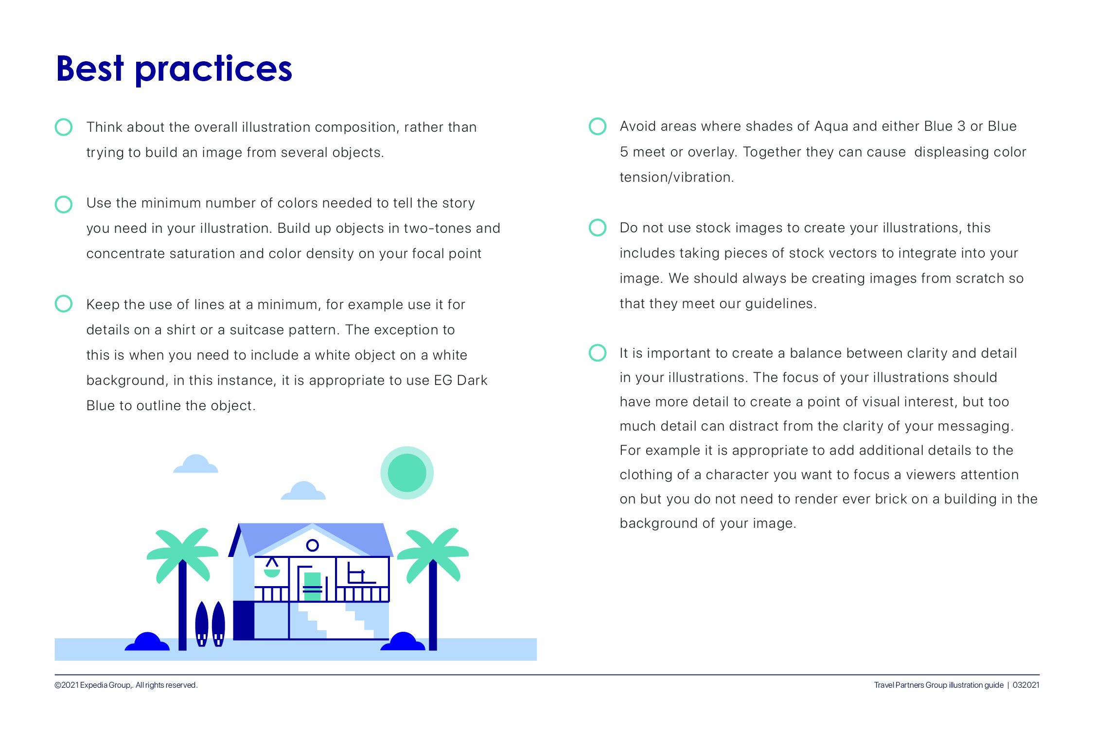
Small refinement on how we build, specifically more duotone approach
Slightly more use of secondary color
Closer alignment between TPG, VRBO and Escapia
More examples
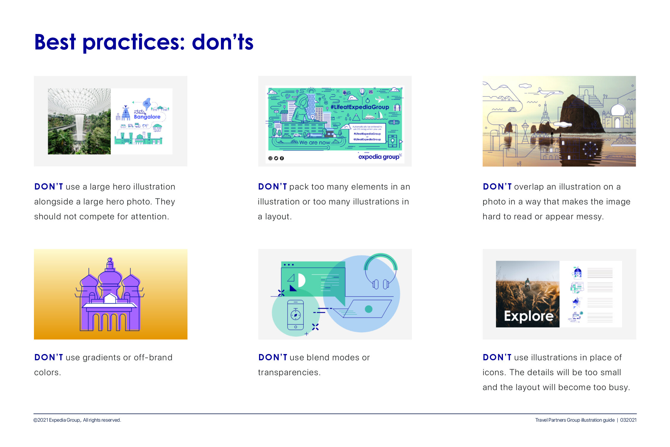
Expanded best practices
Additional Brands
Since the Travel Partners Group encapsulated multiple brands the illustrations guidelines would go on to be adapted by other brands including VRBO, a vacation rental platform and Escapia, a vacation rental software for property managers. This allowed for consistency of voice across TPG while at the same time letting the individual voice of each brand to shine through.
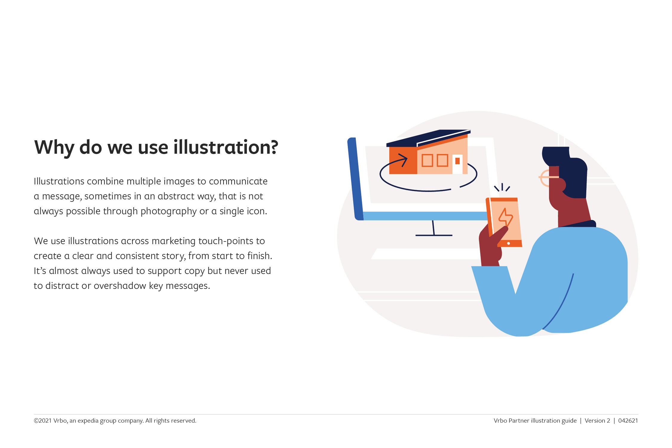
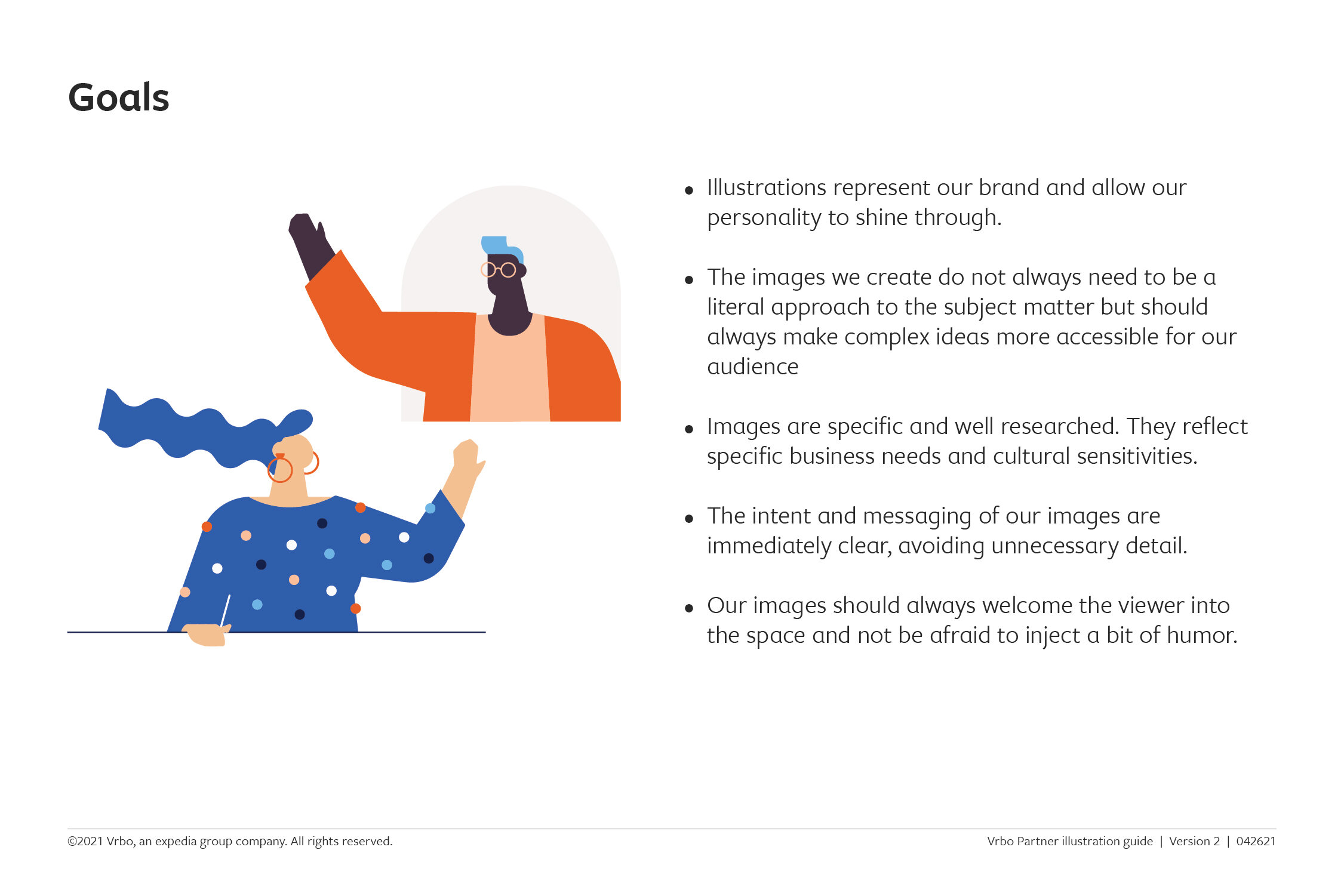
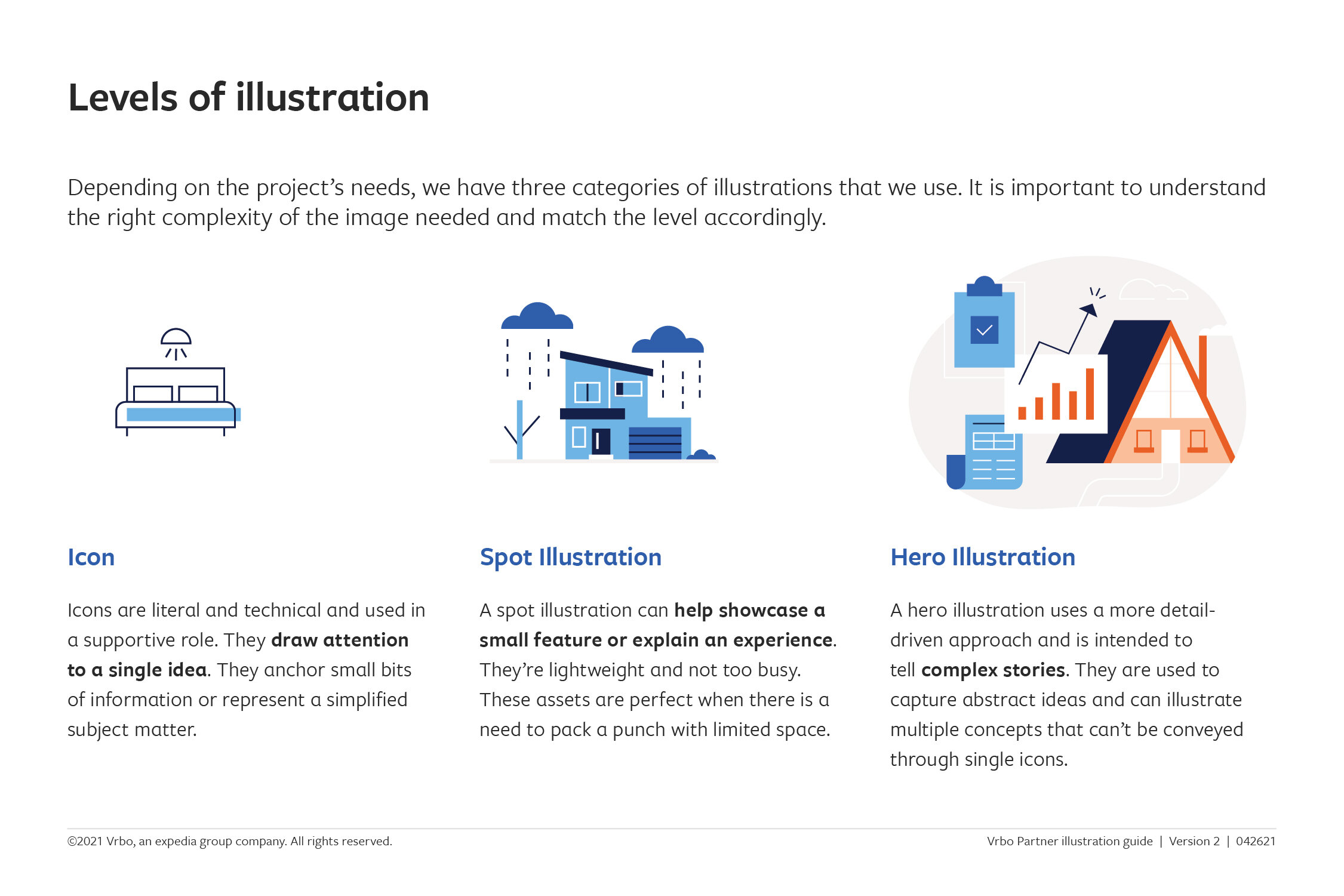
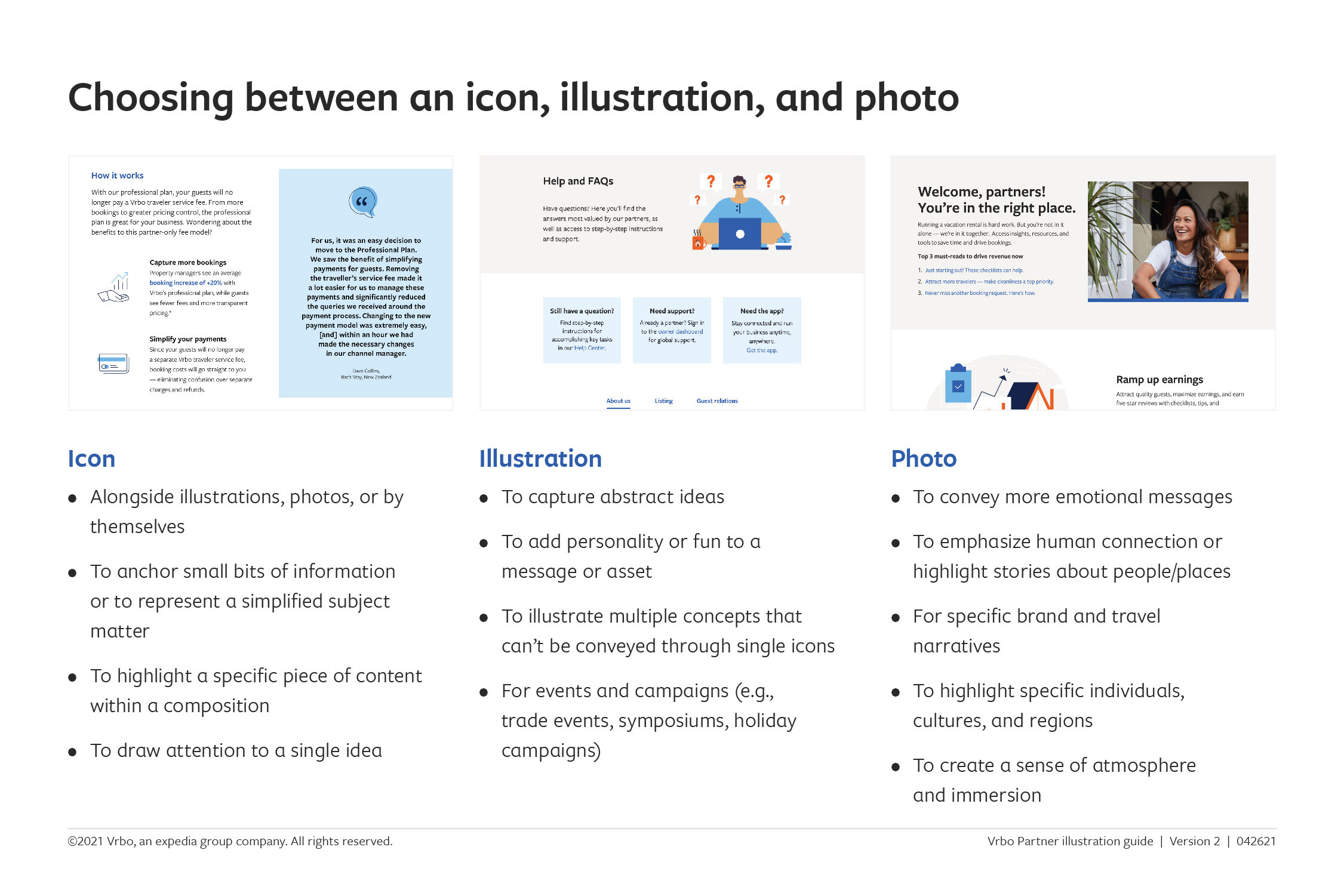
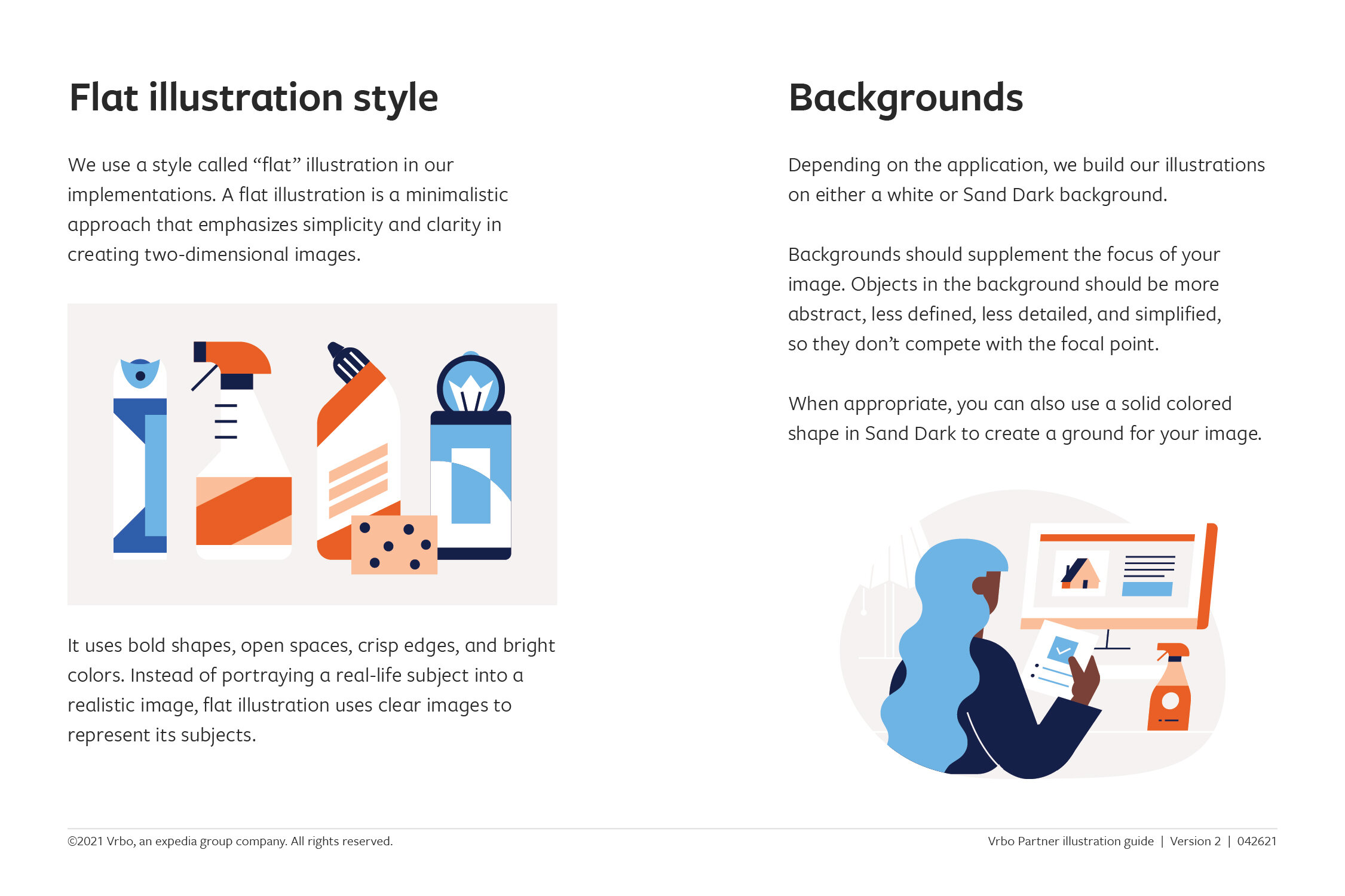
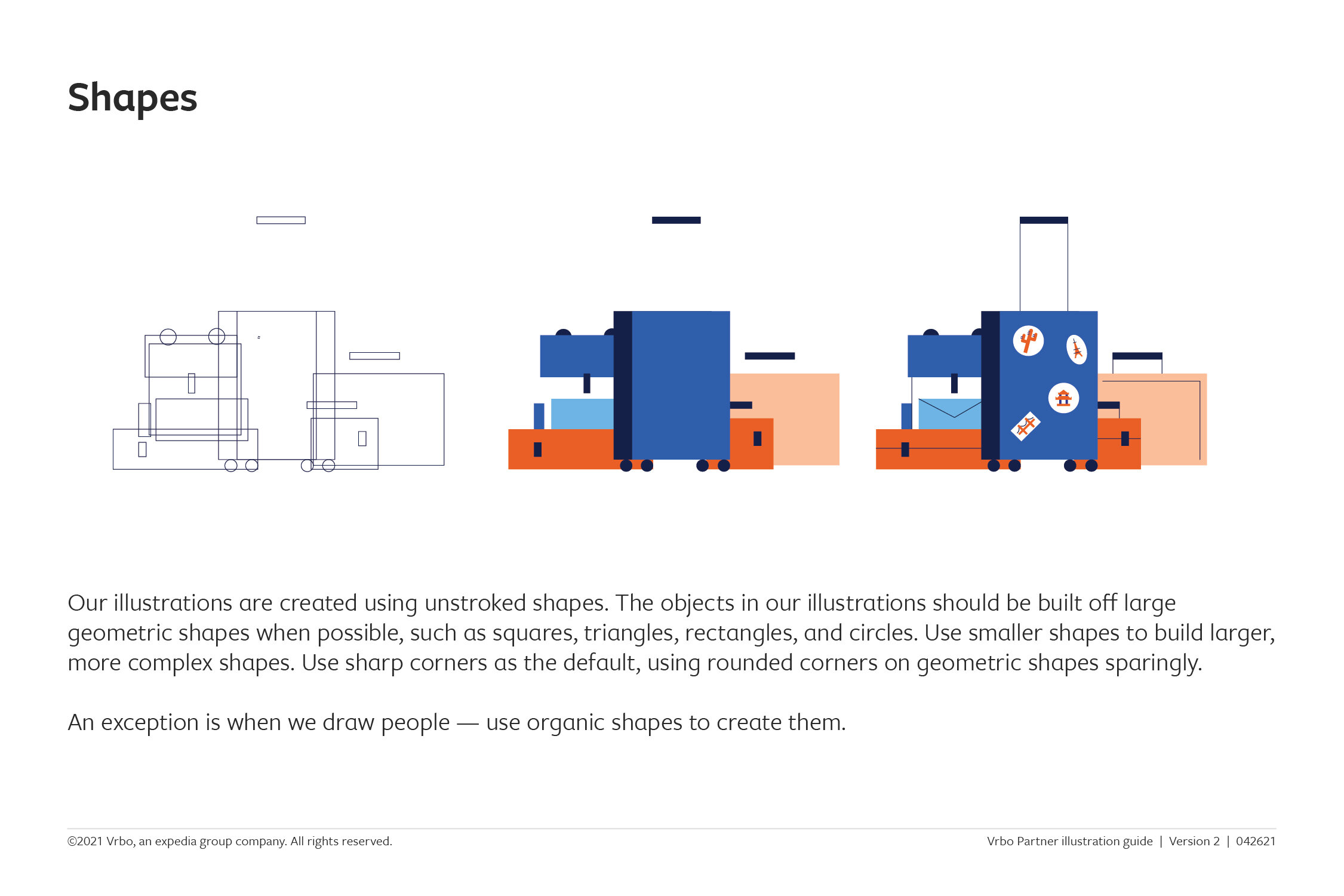
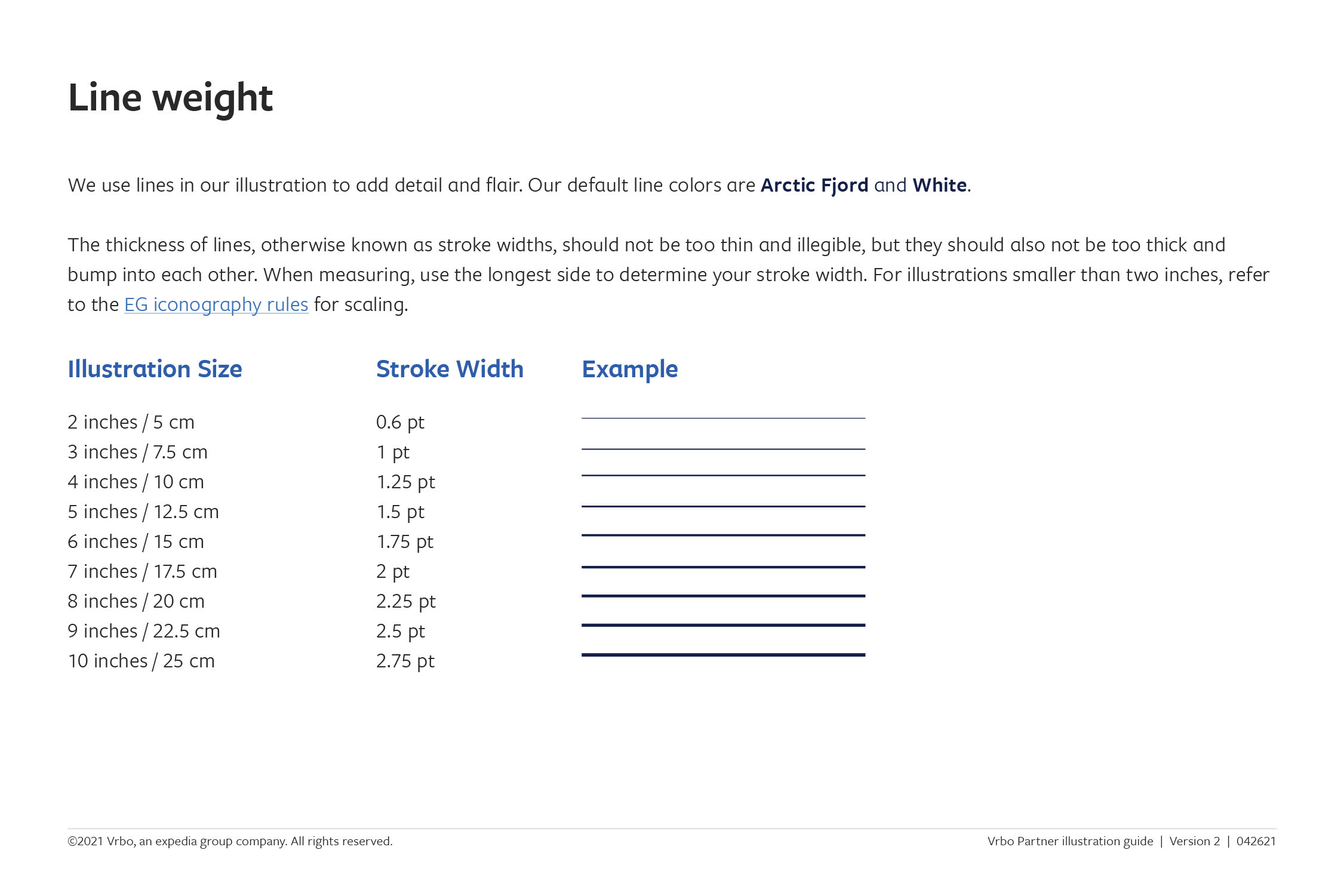
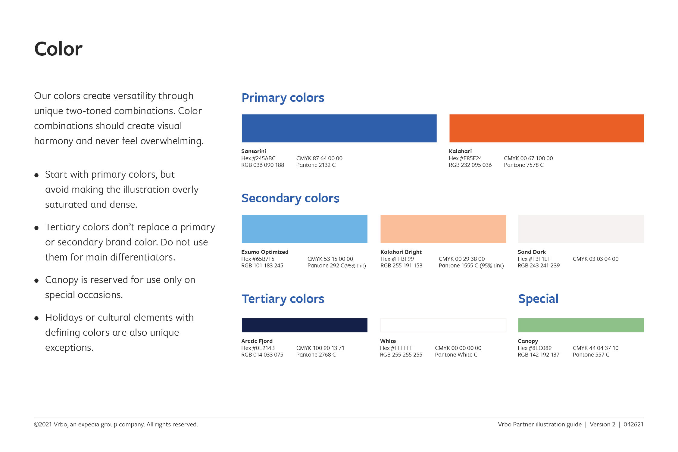
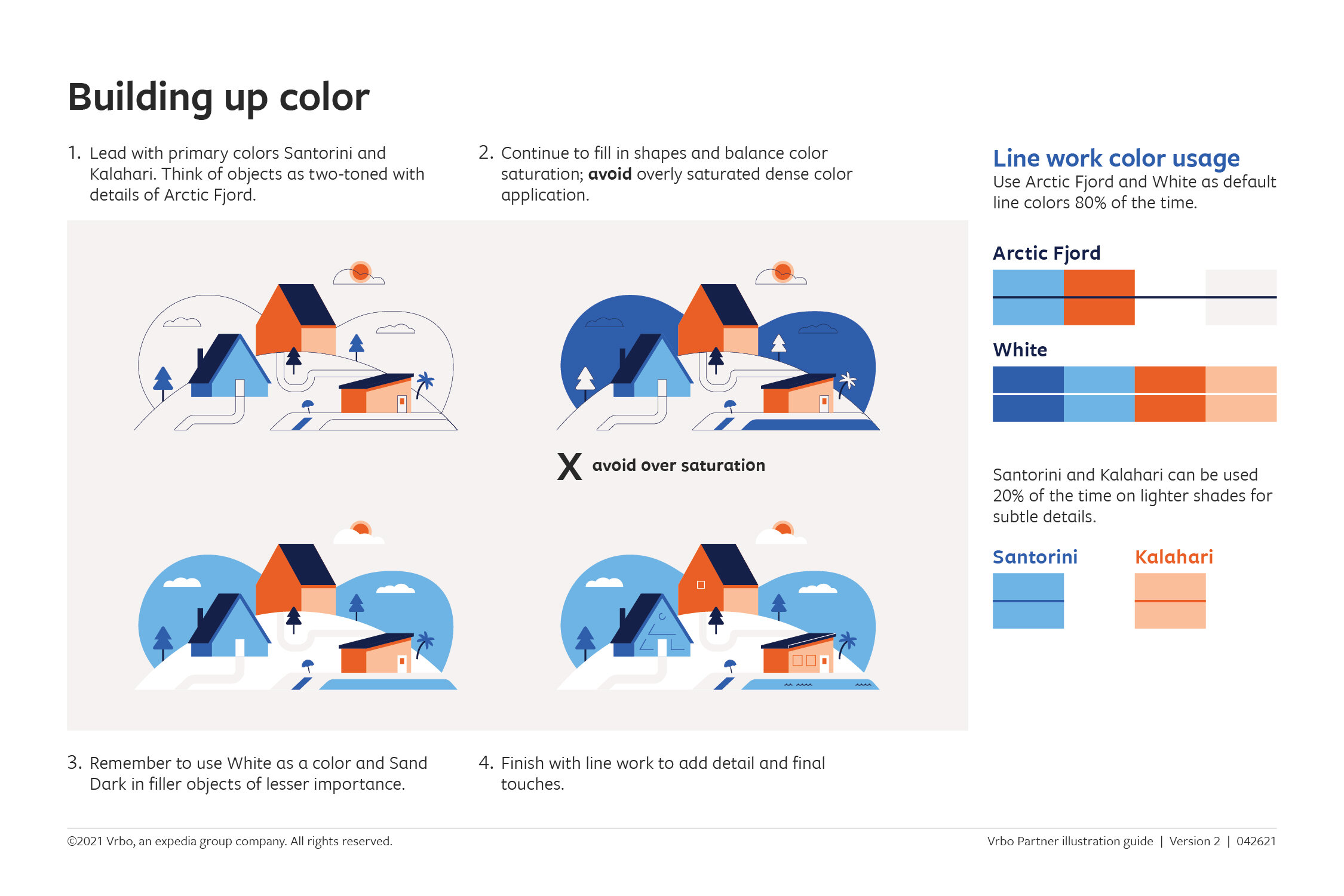
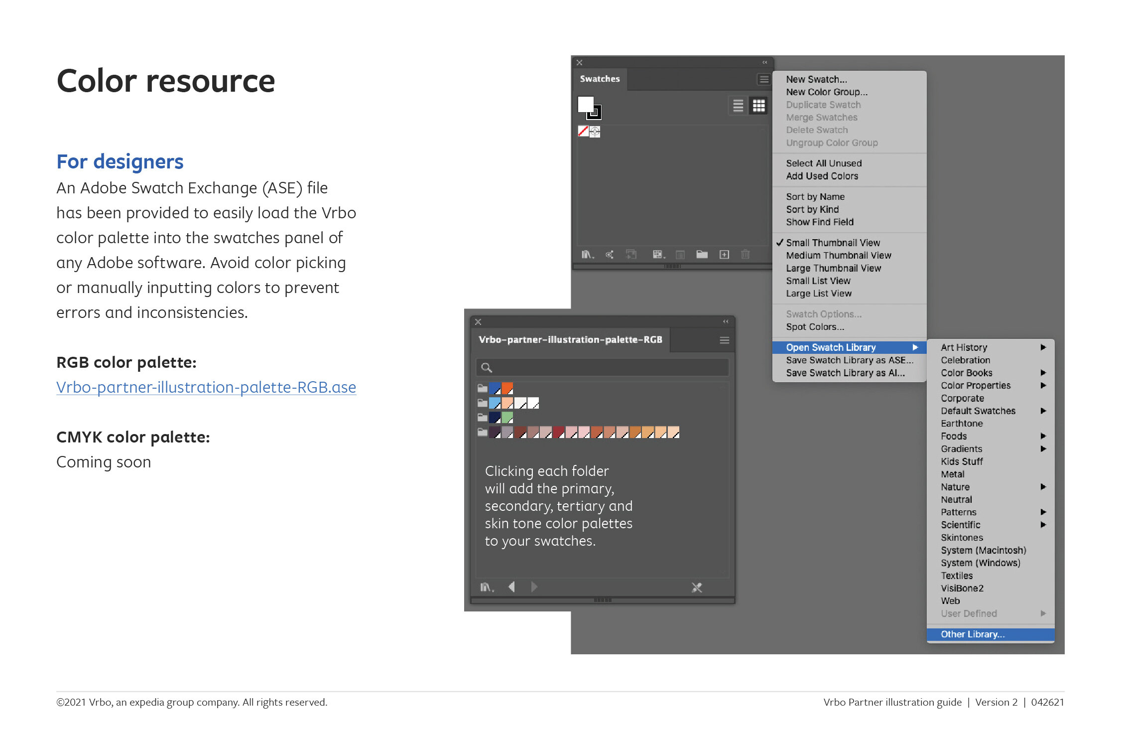
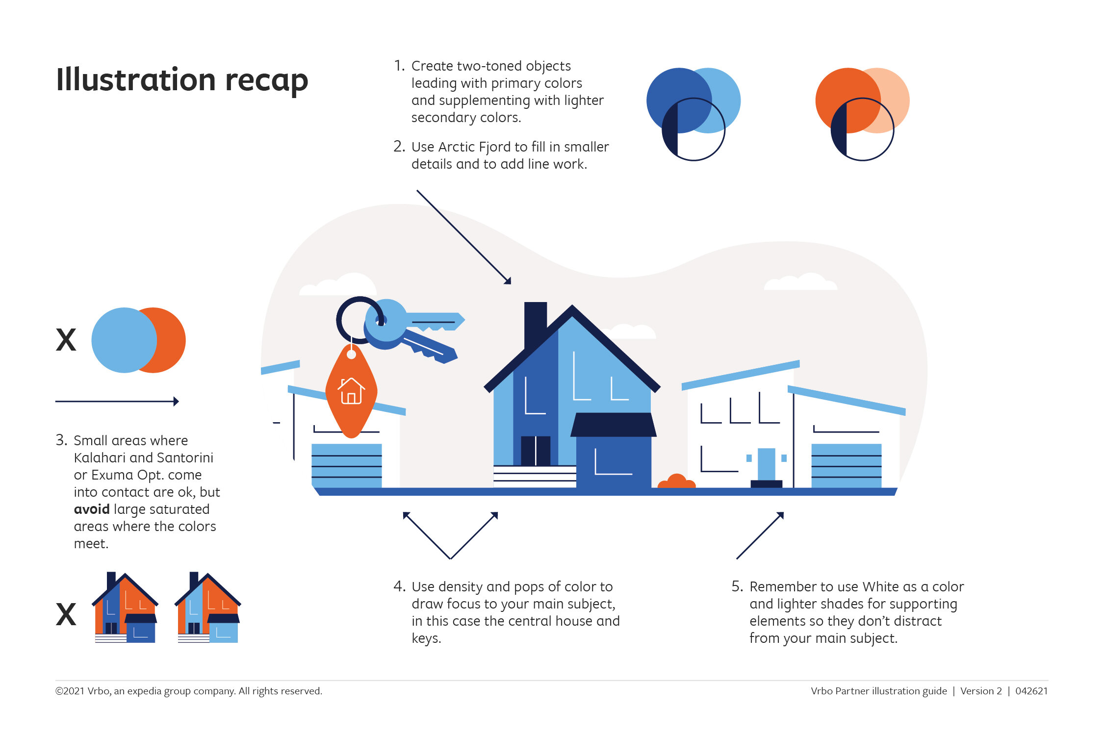
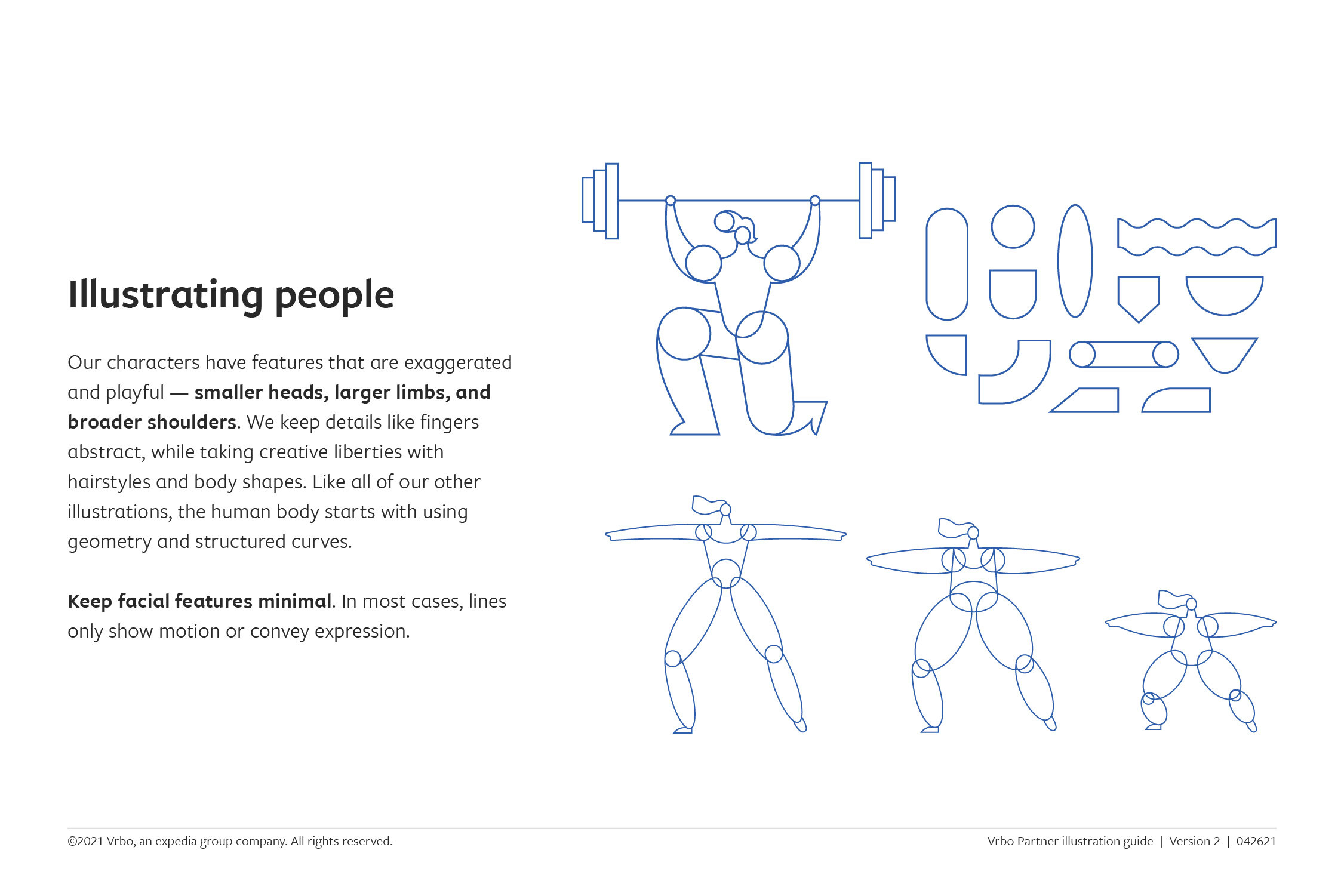
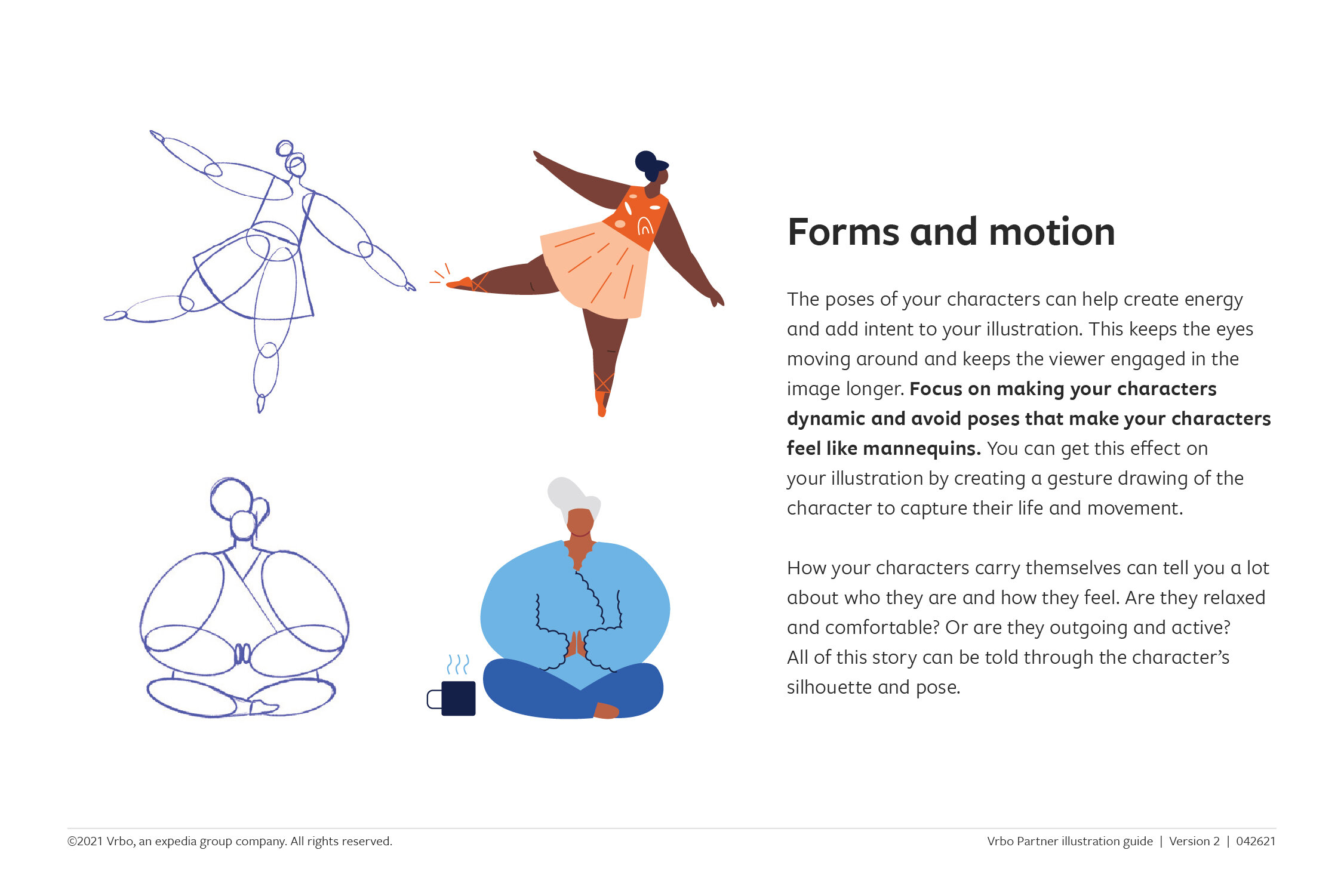
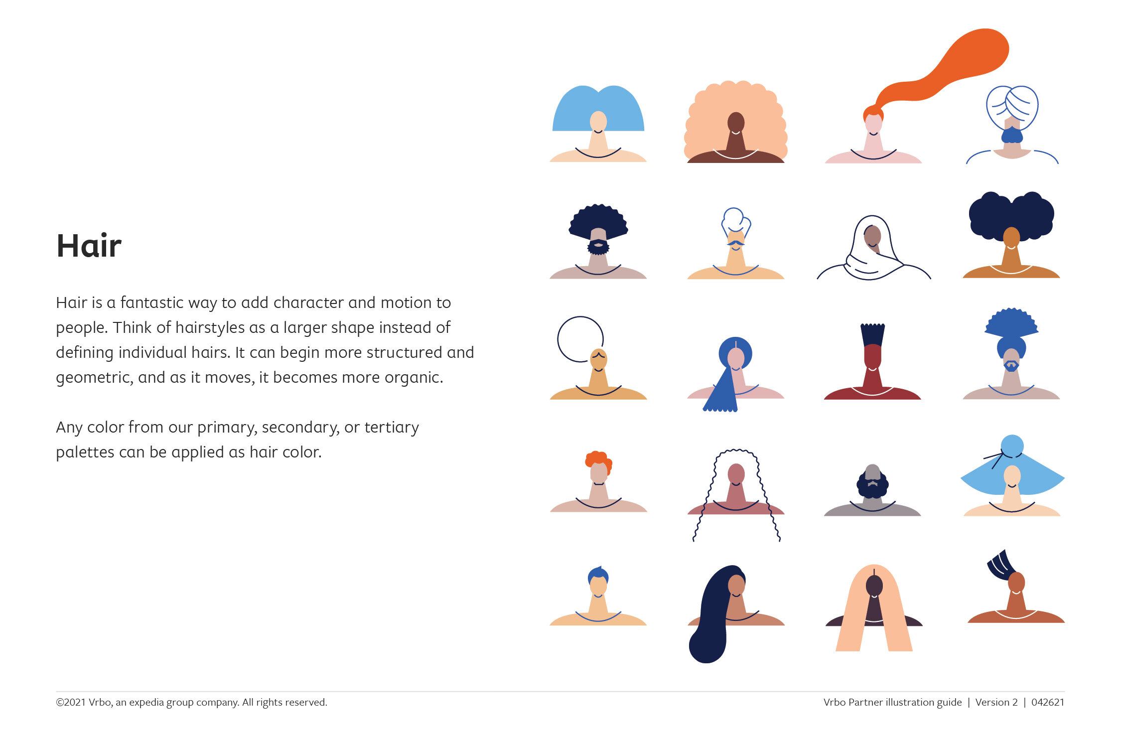
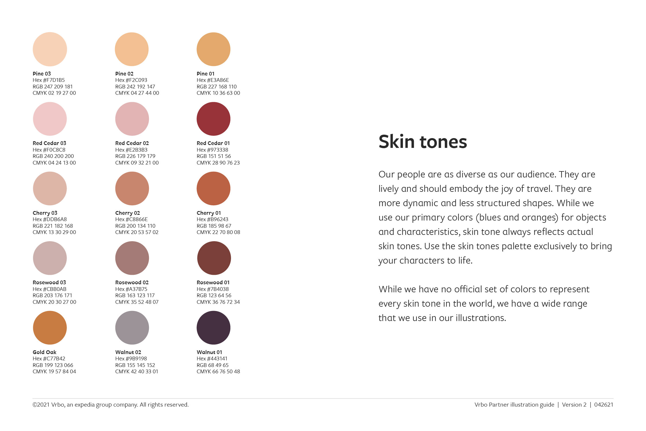
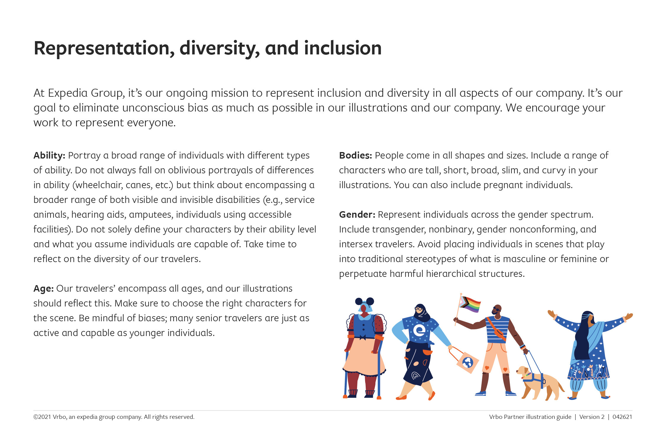
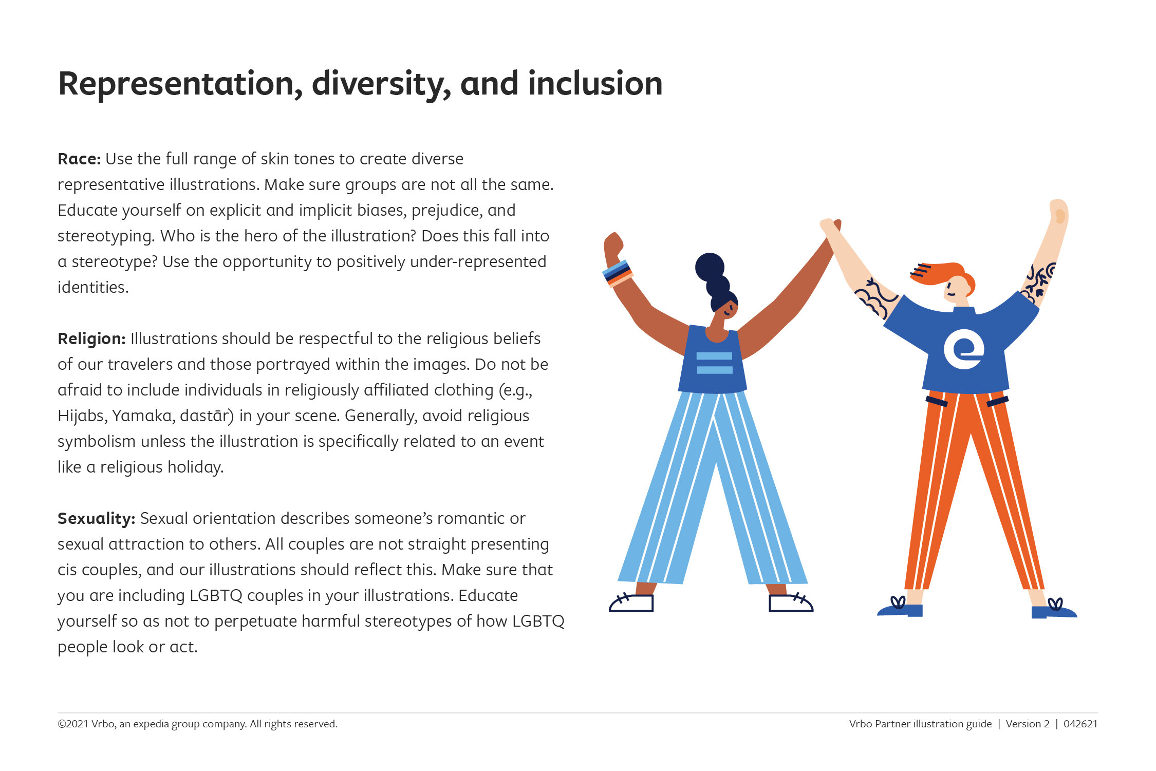
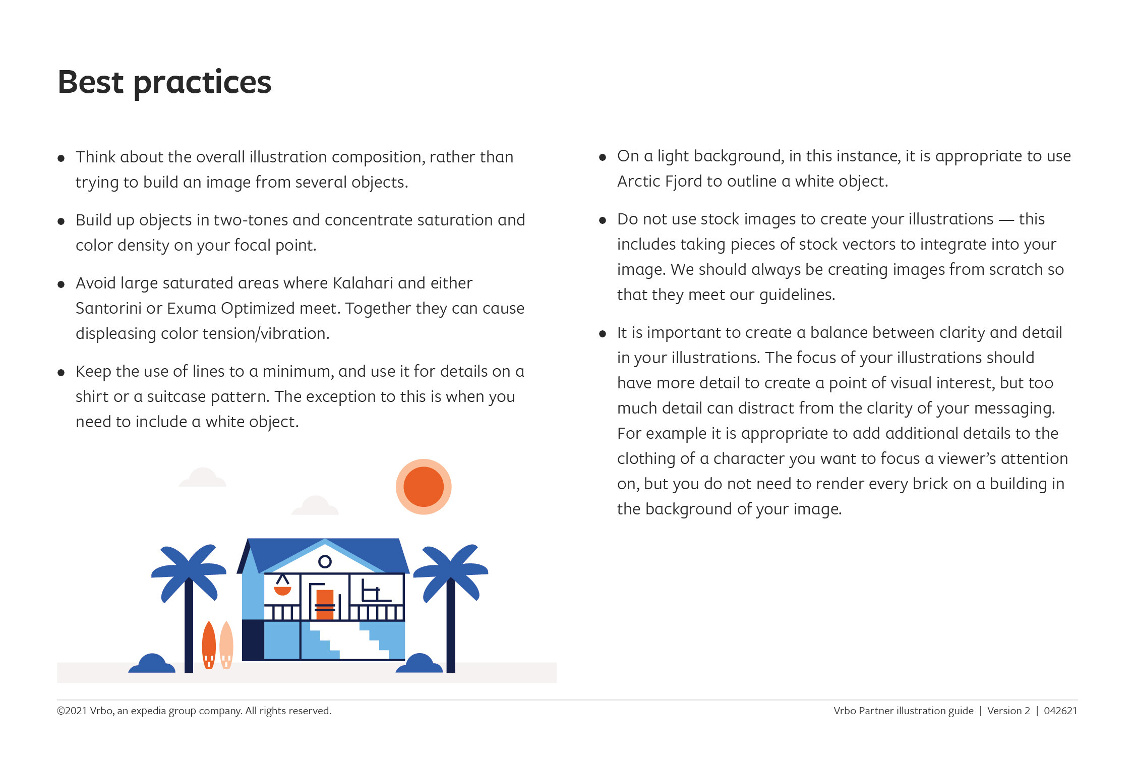
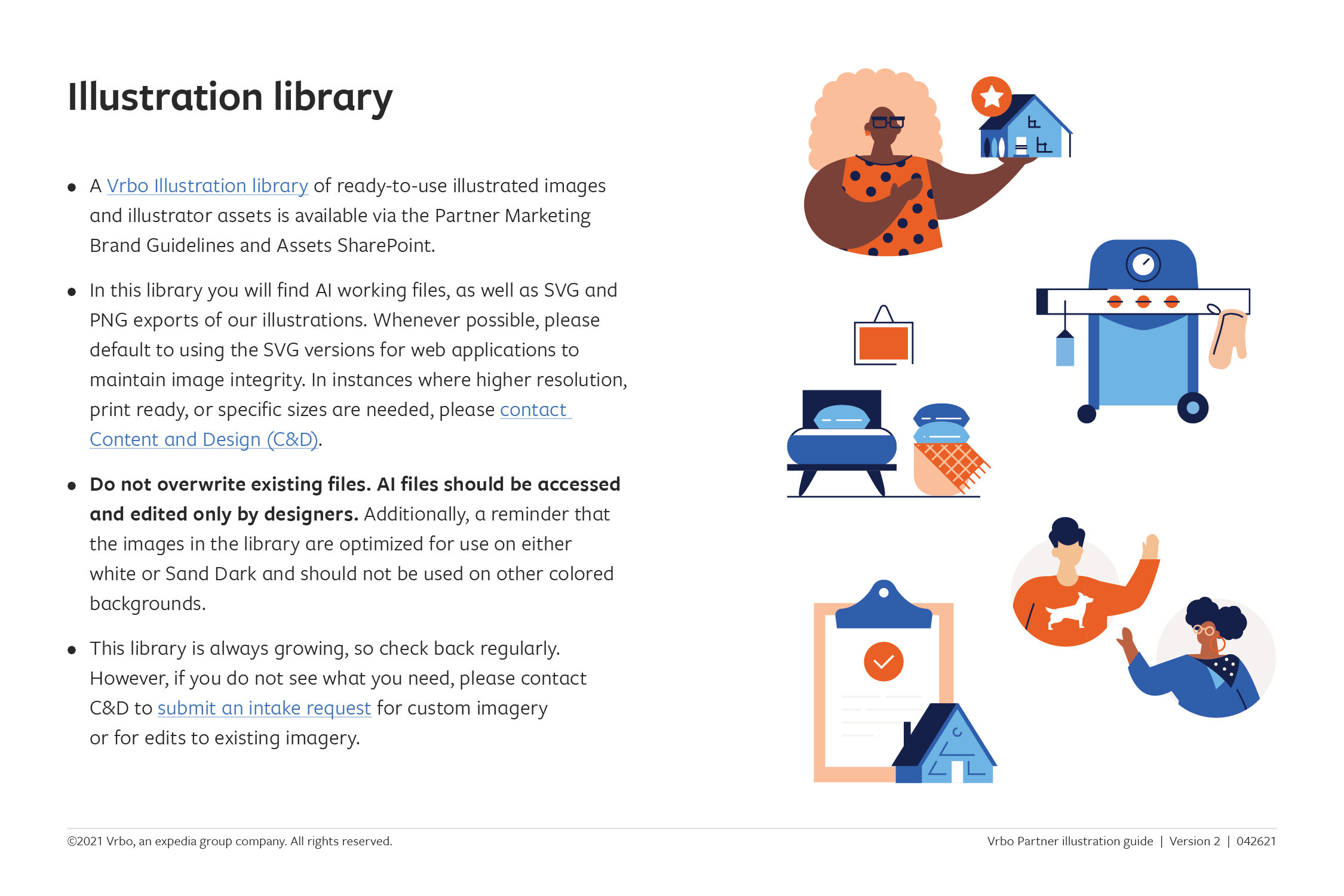
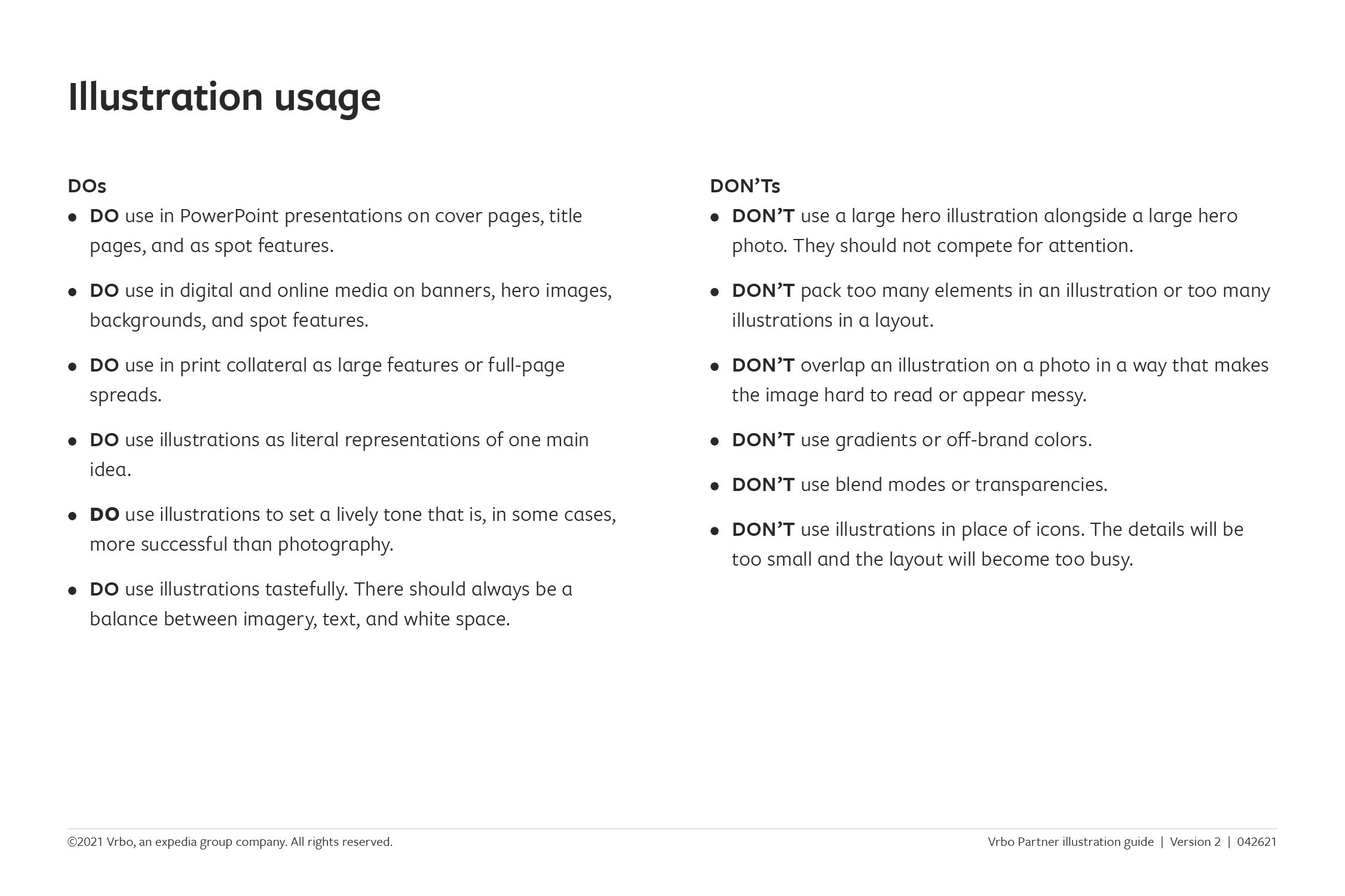

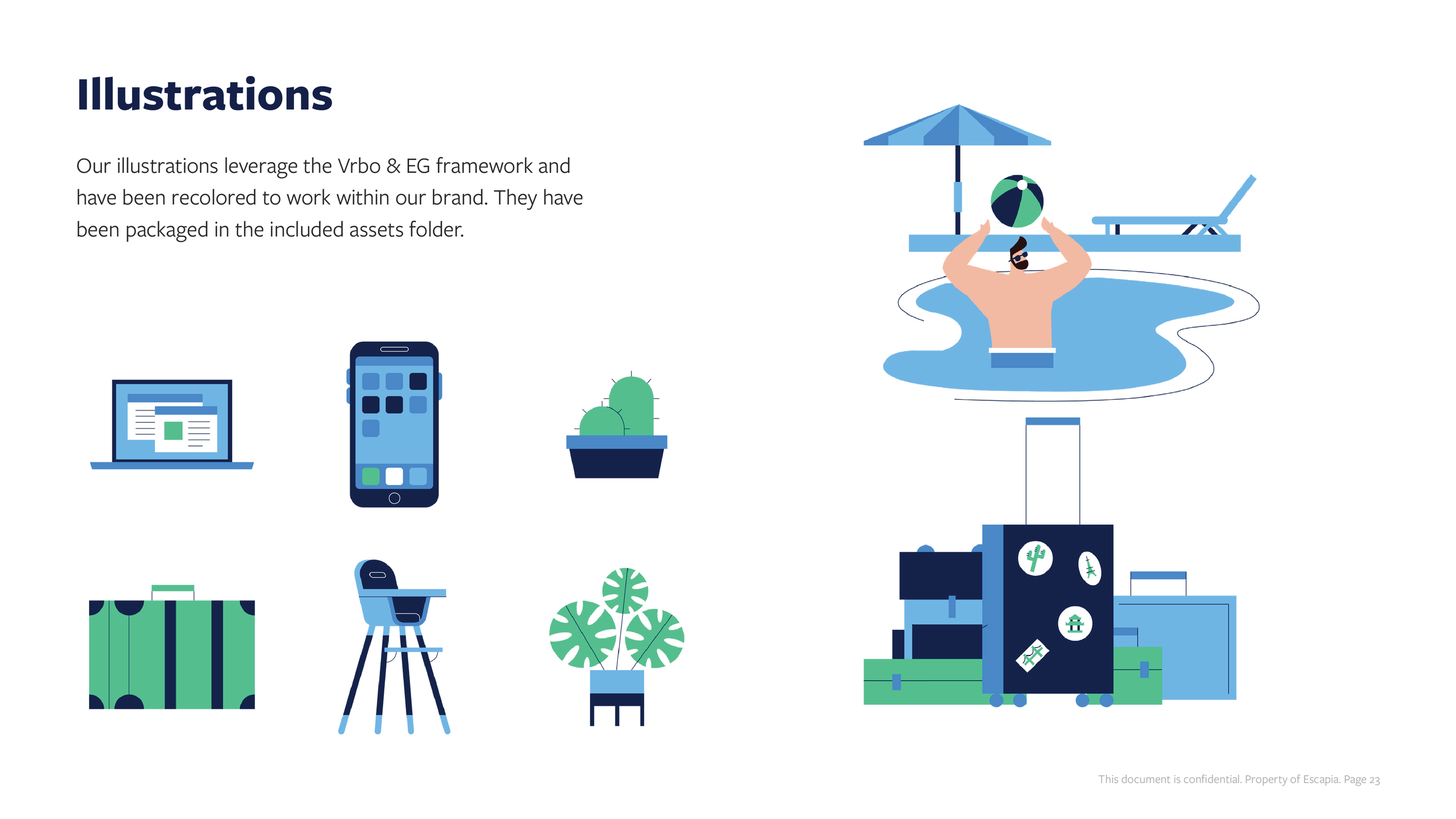


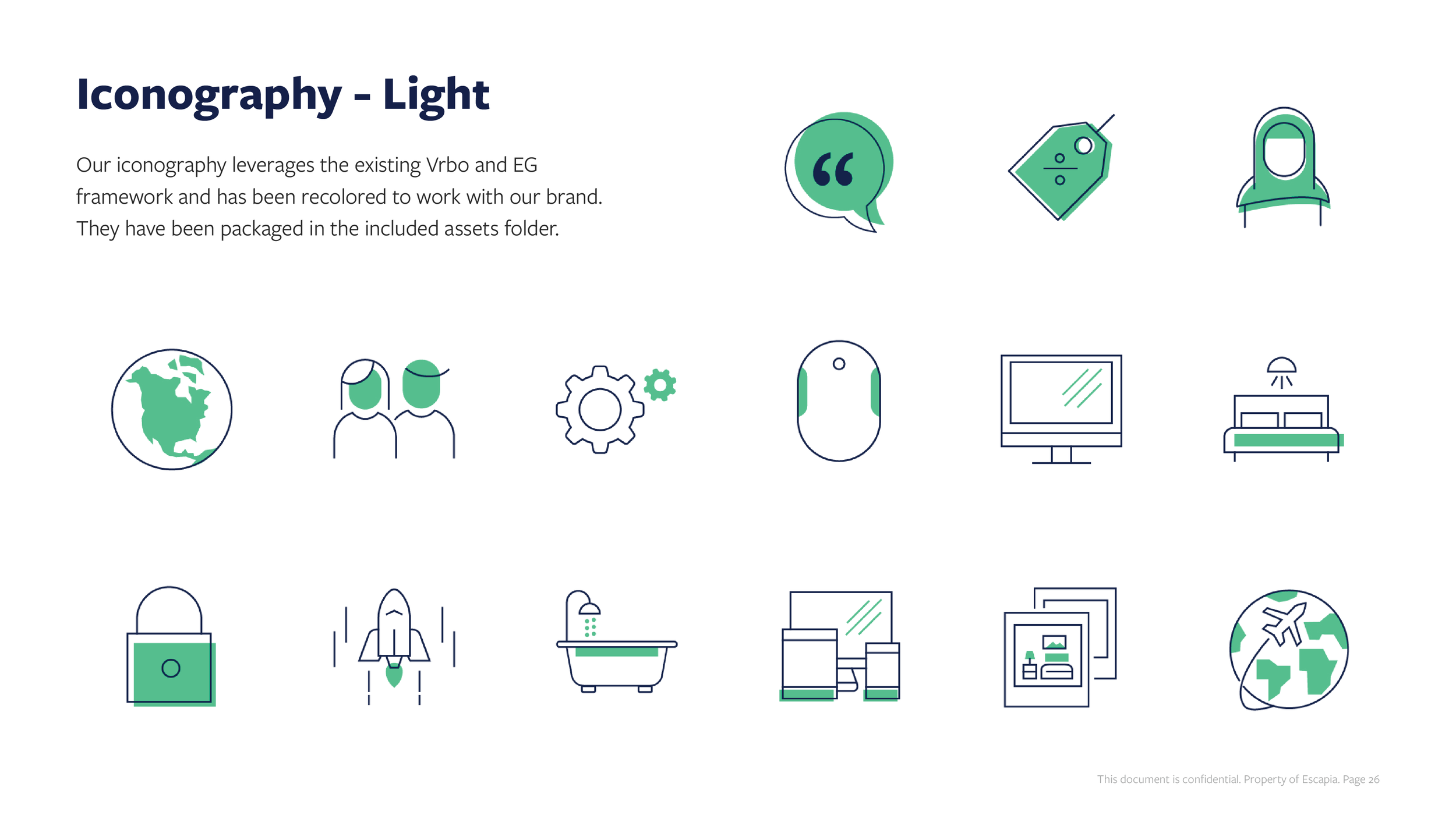
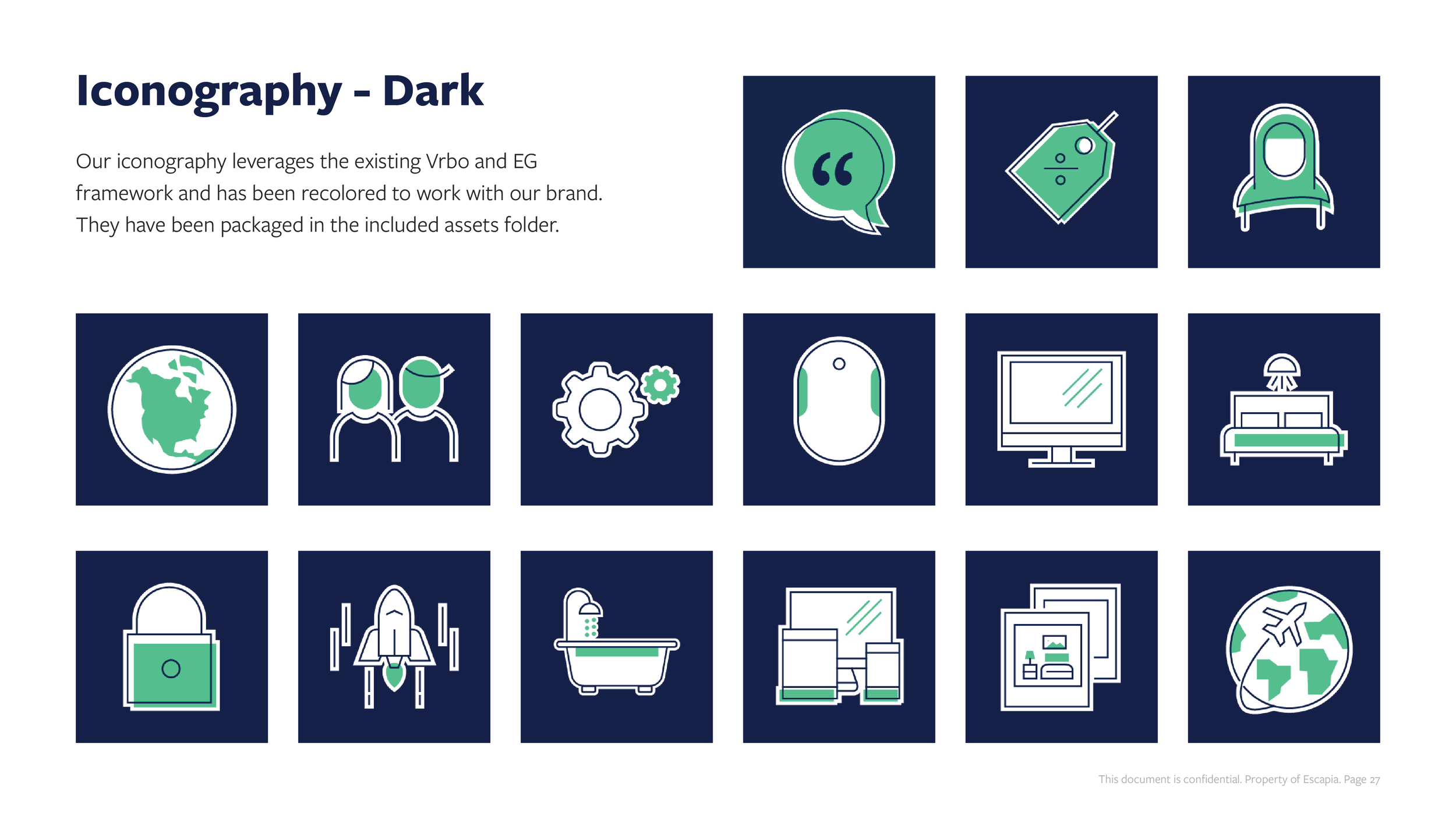

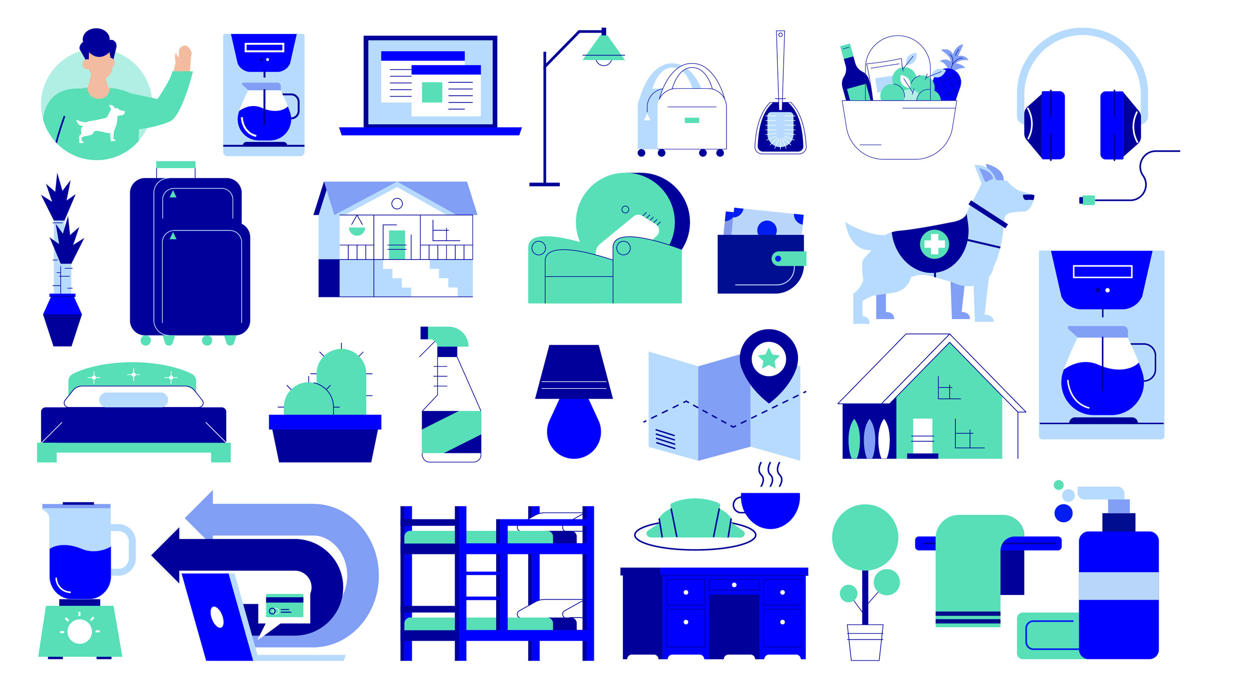
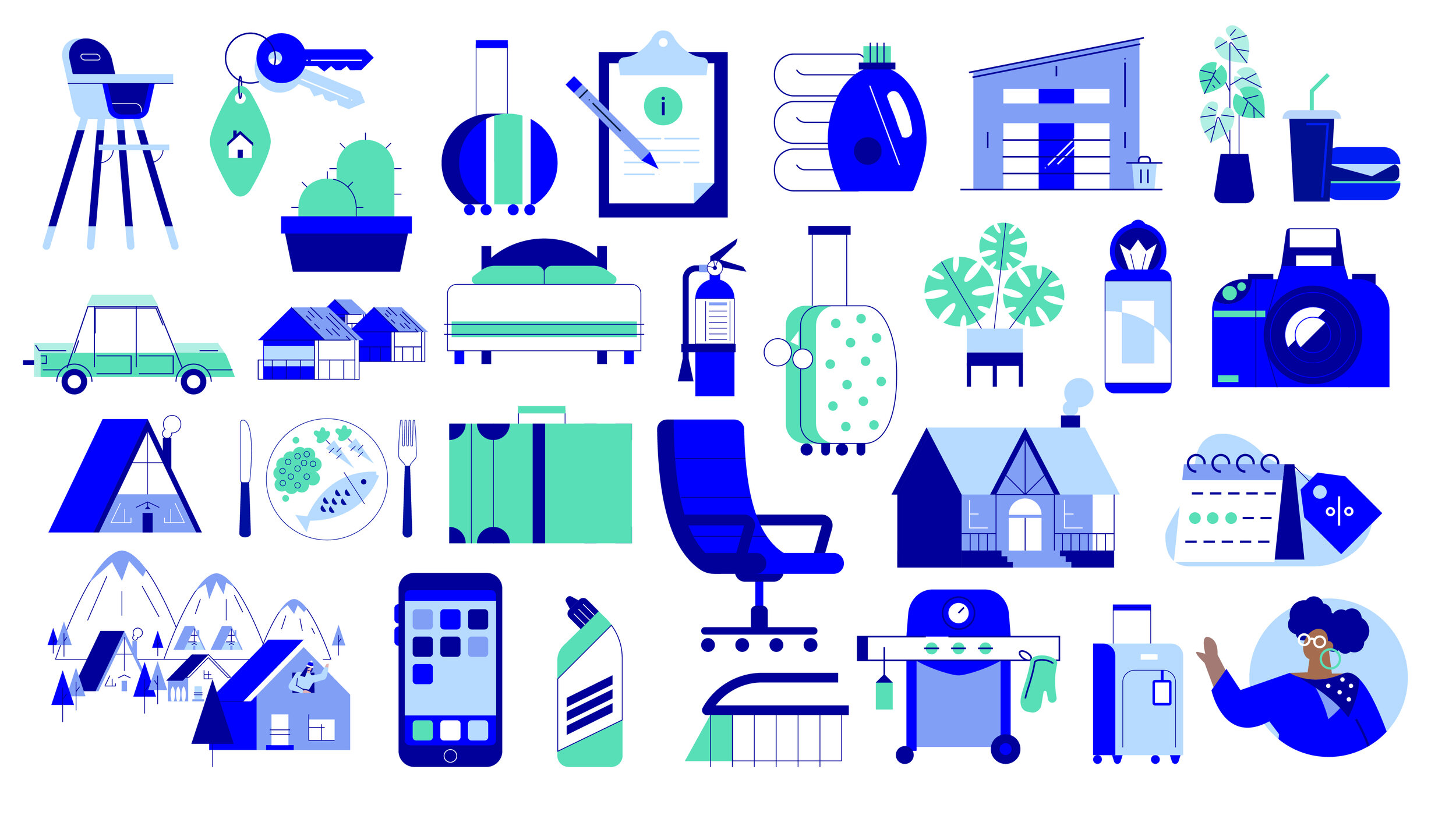
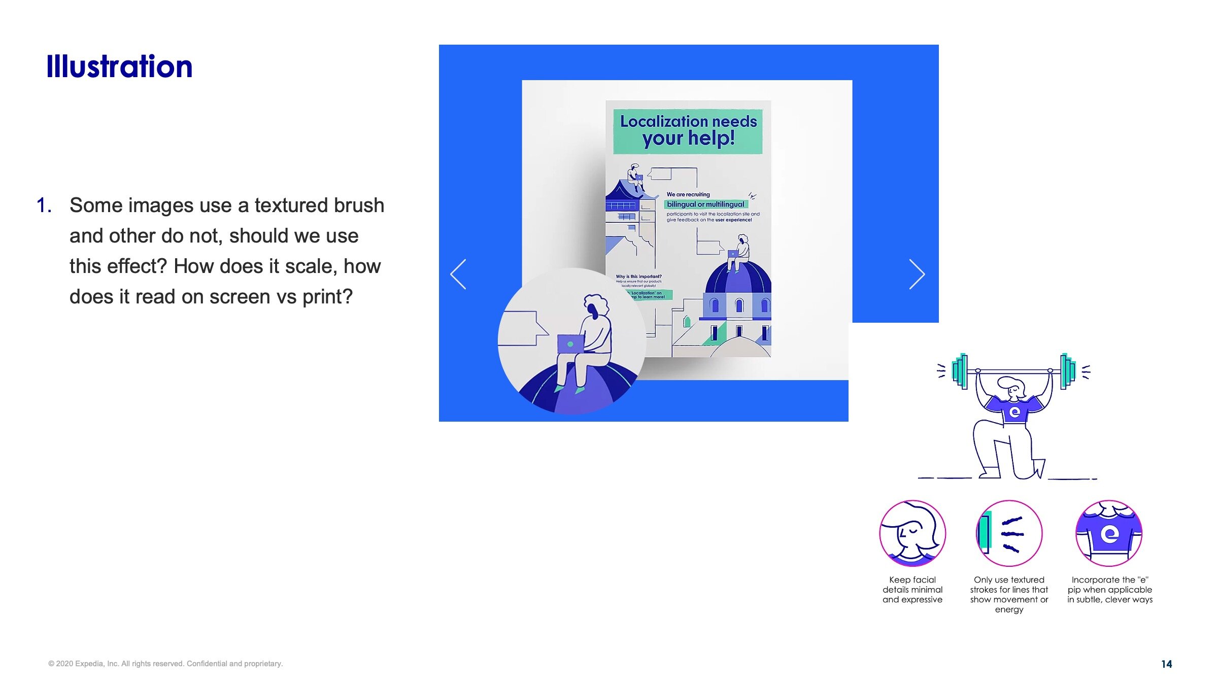
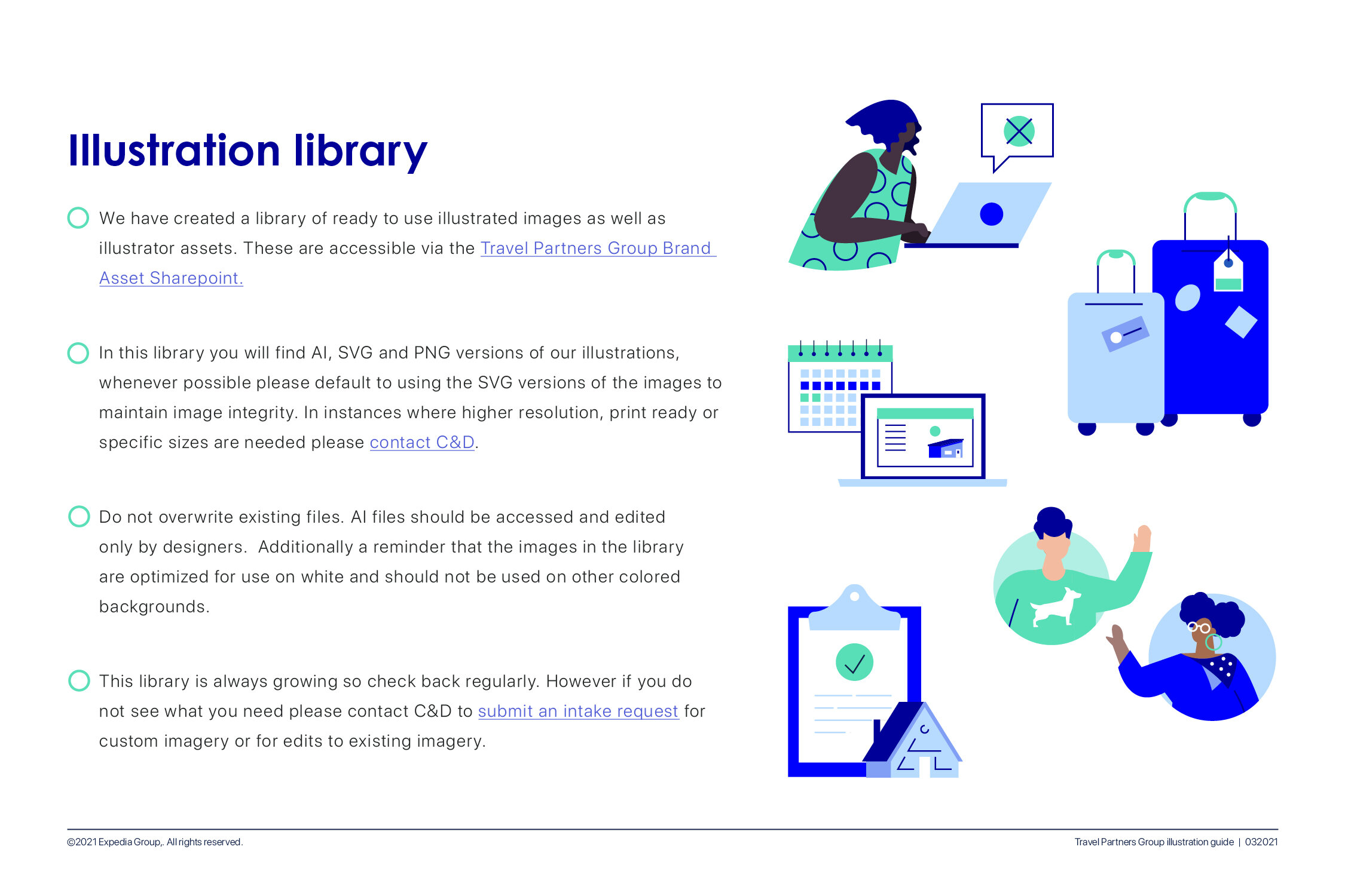
Illustration Library
To better meet the needs of both our design team as well as the larger marketing team a library of full finish illustrations and assets was create, this was created with a mix of illustrations that had been create for projects as well as new pieces that were created specifically for the library. With everything from people and objects to technical explorations and full scenes these approved illustrations are ready to use in a self service format for our marketing team. Meanwhile vector versions of all assets allowed our design team to remix, reuse, and repurpose parts of illustrations. Both of these vastly increased efficiency, furthered consistency across the brand and added an alternative to stock photography.