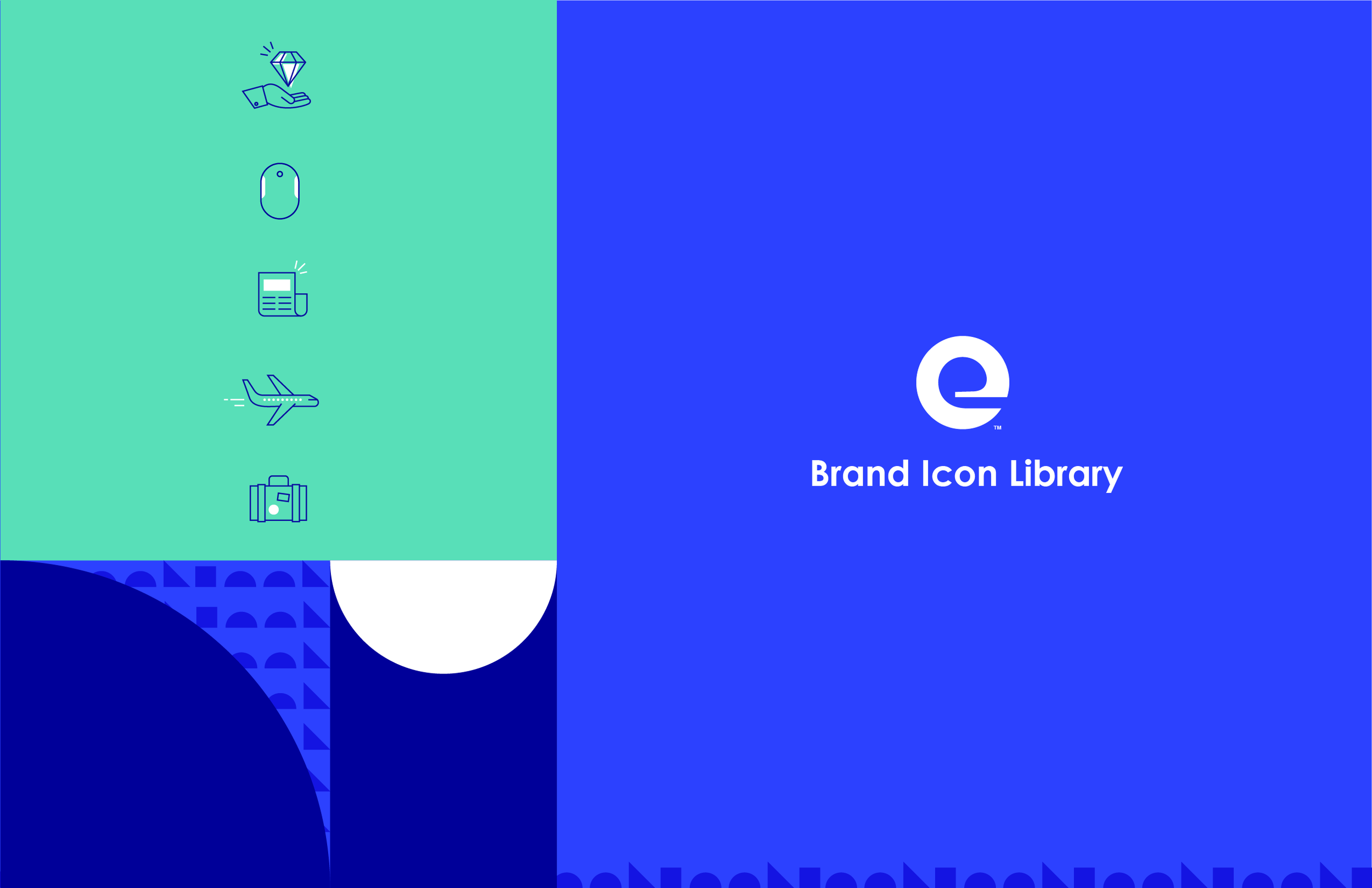
Expedia Group Icon Library
Overview
While undergoing a brand refresh In an effort to modernize, optimize and align the existing b2b icon library desperately needed to be updated.
At the same time we needed to examine at a core why we used these icons. Ultimately we decided Icons are literal and technical and are used in a supportive role. They draw attention to a single idea. They anchor small bits of information or represent a simplified subject matter.
These icons are used as pictograms in a broad range of place from more functional applications in email communications, presentations and signage to more decorative applications in event materials, social ads and merchandise.
My Role
As lead designer on the B2B marketing team I oversee brands and maintain design standards within the team and across all assets. I develop visual styles for global campaign strategies and adapt/adjust for regional marketing assets and develop usage guidelines.

Existing icons
The existing icon library approach was heavy and dated. It didn’t scale well and use a shadow effect. They were too complicated and just didn’t reflect the evolution of the brand identity.
Updated Icons
The new solution was a dramatic change to drastically to the way icons were created and at their core reflected these values:
Simplify Our icons only use as many lines as needed to capture the essence of each subject matter. Keep in mind – eliminating lines does not mean it has to be boring.
Start with the Basics Use fundamental shapes such as squares, triangles, and circles. Stick to 90 or 45 degree angles when possible. Round edges or use curves sparingly.
Connect & Combine Merge line work and combine shapes to create less work for your eyes. Subtle continuation and closure results in clever, efficient icons.
Add Spark: Though simple, our icons can still have personality and feel unique to Expedia Group. Include "spark" when an icon feels incomplete or imbalanced. Stick to flat design and never use perspective.
Furthermore the icons use
Simplified color scheme: Removing black and grays the updated scheme used exclusively blue and teal. This would come in especially useful when a later creating dark mode versions of the icons swapping blue for white.
Blue is used for all line work.
Aqua is used for adding details, fills and accents. Fills used an offset to not feel stiff and contained.
Removal of all shadow effects.
Reduction in the amount of detail overall
